uni-app实战之社区交友APP(3)Vue.js和uni-app基础
文章目录
- 前言
- 一、基础组件、CSS选择器和flex布局的使用
-
- 1.view、text组件和动画的使用
- 2.uni-app中的CSS选择器
- 3.flex布局基础
- 二、数据渲染和动态绑定
-
- 1.数据渲染
- 2.class和style绑定
- 3.条件渲染
- 4.列表渲染
- 三、事件和属性处理
-
- 1.事件处理器
- 2.监听属性
- 3.计算属性
- 总结
前言
本文主要介绍了uni-app和Vue的基础使用:
基础组件的使用,CSS选择器的类型,flex布局的常见用法;
数据渲染、条件渲染、列表渲染,class和style的动态绑定;
事件处理的绑定,属性的监听和计算属性。
一、基础组件、CSS选择器和flex布局的使用
1.view、text组件和动画的使用
view是视图容器,类似于传统html中的div,用于包裹各种元素内容;
template语句块中应该包含1个顶层view块,将所有的组件和元素等放入该view块,而不能在template块中存在多个view块或其他组件,否则不能正常编译。
view常见属性和含义如下:
| 属性名 | 类型 | 默认值 | 含义 |
|---|---|---|---|
| hover-class | String | none | 指定按下去的样式类,当 hover-class=“none” 时,没有点击态效果 |
| hover-stop-propagation | Boolean | false | 指定是否阻止本节点的祖先节点出现点击态 |
| hover-start-time | Number | 50 | 按住后多久出现点击态,单位毫秒 |
| hover-stay-time | Number | 400 | 手指松开后点击态保留时间,单位毫秒 |
hover-class属性测试如下:
新建页面demo.vue用于测试,如下:
<template>
	<view>
		<view class="view-box" hover-class="view-box-hover">view组件view>
	view>
template>

<script>
	export default {

		data() {

			return {


			}
		},
		methods: {


		}
	}
script>

<style>
	.view-box{

		width: 200upx;
		height: 200upx;
		background: #8A6DE9;
		color: #FFFFFF;
		margin: 100upx;
	}
	.view-box-hover{

		background: #ff0000;
		color: #000000;
	}
style>
pages.json修改如下:
{

	"pages": [ //pages数组中第一项表示应用启动页,参考:https://uniapp.dcloud.io/collocation/pages
		{

		    "path" : "pages/demo/demo",
		    "style" :
		    {

		        "navigationBarTitleText": "view和text组件",
		        "enablePullDownRefresh": false
		    }

		}
		,{

			"path": "pages/index/index",
			"style": {

				// "navigationBarTitleText": "uni-app"
			}
		}
	    ,{

            "path" : "pages/news/news",
            "style" :
            {

                "navigationBarTitleText": "",
                "enablePullDownRefresh": false
            }

        }
        ,{

            "path" : "pages/msg/msg",
            "style" :
            {

                "navigationBarTitleText": "",
                "enablePullDownRefresh": false
            }

        }
        ,{

            "path" : "pages/my/my",
            "style" :
            {

                "navigationBarTitleText": "",
                "enablePullDownRefresh": false
            }

        }

    ],
	"globalStyle": {

		"navigationBarTextStyle": "black",
		"navigationBarTitleText": "Community Dating",
		"navigationBarBackgroundColor": "#FFFFFF",
		"backgroundColor": "#FFFFFF"
	},
	"tabBar": {

		"color":"#323232",
		"selectedColor":"#ED6384",
		"backgroundColor":"#FFFFFF",
		"borderStyle": "black",
		"list": [
			{

				"pagePath": "pages/index/index",
				"text": "首页",
				"iconPath": "static/tabbar/index.png",
				"selectedIconPath": "static/tabbar/indexed.png"
			},
			{

				"pagePath": "pages/news/news",
				"text": "动态",
				"iconPath": "static/tabbar/news.png",
				"selectedIconPath": "static/tabbar/newsed.png"
			},
			{

				"pagePath": "pages/msg/msg",
				"text": "消息",
				"iconPath": "static/tabbar/paper.png",
				"selectedIconPath": "static/tabbar/papered.png"
			},
			{

				"pagePath": "pages/my/my",
				"text": "我的",
				"iconPath": "static/tabbar/home.png",
				"selectedIconPath": "static/tabbar/homed.png"
			}
		]
	}
}
显示:
可以看到,在鼠标按下时,样式发生改变,为view-box-hover中定义的样式。
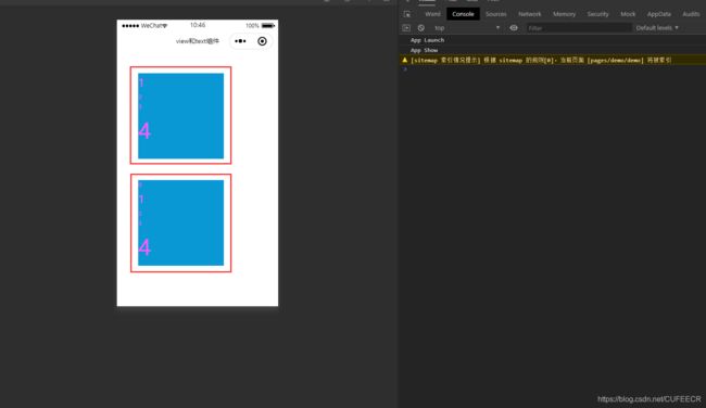
再测试hover-stay-time属性,如下:
<template>
	<view>
		<view class="view-box animate__animated" hover-class="view-box-hover animate__bounceIn">view组件-默认时间view>
		<view class="view-box animate__animated" hover-class="view-box-hover animate__bounceIn" hover-stay-time="1200">view组件-自定义时间view>
	view>
template>

<script>
	export default {

		data() {

			return {


			}
		},
		methods: {


		}
	}
script>

<style>
	.view-box{

		width: 200upx;
		height: 200upx;
		background: #8A6DE9;
		color: #FFFFFF;
		margin: 100upx;
	}
	.view-box-hover{

		background: #ff0000;
		color: #000000;
	}
style>
显示:
可以看到,两个view组件点击动画和样式持续的时间不一致。
text是文本组件,用于包裹文本内容。
支持\n方式换行。
常见属性和含义如下:
| 属性名 | 类型 | 默认值 | 含义 | 平台差异说明 |
|---|---|---|---|---|
| selectable | Boolean | false | 文本是否可选 | App、H5 |
| user-select | Boolean | false | 文本是否可选 | 微信小程序 |
| space | String | 无 | 显示连续空格 | App、H5、微信小程序 |
| decode | Boolean | false | 是否解码 | App、H5、微信小程序 |
测试如下:
<template>
	<view>
		<text :selectable="true">游子征衣慈母线,此是太平桑下恋。\n岛夷卉服亦人情,何故云鬟偏教战。\n街头日日闻点兵,子弟家家尽远征。\n倾城欢送皇军出,夹道狂呼万岁声。\n众里抽针奉巾帨,不敢人前轻掩袂。\n一帨千人下一针,施与征夫作兰佩。\n大神并赐护身符,应有勋名答彼姝。\n比户红颜能爱国,军前壮士喜捐躯。\n拔刀自诩男儿勇,海陆空军皆贵宠。\n白足长怜鹿女痴,文身只是虾夷种。\n徐福乘舟去不回,至今人爱说蓬莱。\n岂知富士山头雪,终化昆明池底灰。\n八纮一宇言语好,到处杀人如刈草。\n蛇吞象骨恐难消,火入松心还自燎。\n荜路戎车势无两,水碧金膏看在掌。\n明年《薤露》泣荒原,一例桃根随画桨。\n千人针变万人坑,尺布何能召五丁。\n罗什当筵食蒺刺,佛图隔阵讶风铃。\n四海争传新秩序,河间织女停机杼。\n秦都闾左已空闺,夏后中兴无半旅。\n君不见樱花上野少人看,银座歌声夜向阑。\n板屋沉沉嫠妇叹,朱旗犹梦定三韩。text>
	view>
template>

<script>
	export default {

		data() {

			return {


			}
		},
		methods: {


		}
	}
script>

<style>

style>
显示:
可以看到,实现了文字跨行显示,并且支持选择文字。
2.uni-app中的CSS选择器
uni-app中支持的选择器如下:
| 选择器 | 举例 | 举例说明 |
|---|---|---|
| .class | .intro | 选择所有拥有 class=“intro” 的组件 |
| #id | #firstname | 选择拥有 id=“firstname” 的组件 |
| element | view | 选择所有 view 组件 |
| element, element | view, checkbox | 选择所有文档的 view 组件和所有的 checkbox 组件 |
| ::after | view::after | 在 view 组件后边插入内容,仅微信小程序和App生效 |
| ::before | view::before | 在 view 组件前边插入内容,仅微信小程序和App生效 |
简单使用如下:
<template>
<view>
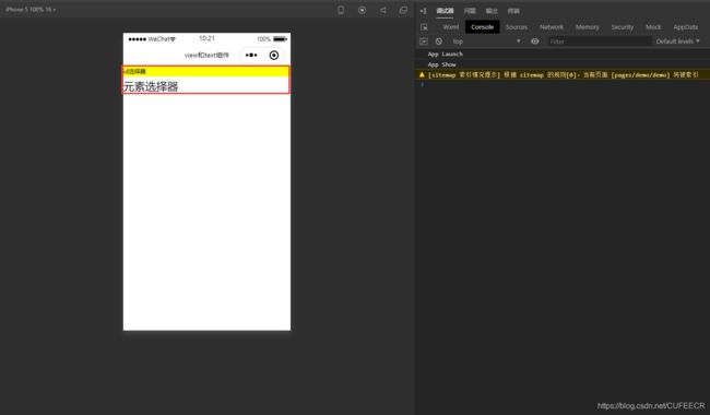
<view id="view-box">id选择器view>
<text>元素选择器text>
view>
template>
<script>
export default {
data() {
return {
}
},
methods: {
}
}
script>
<style>
#view-box {
background: yellow;
}
text {
font-size: 50rpx;
}
style>
显示:
再看一些CSS3中的选择器。
如下:
<template>
	<view>
		<view class="box">
			<view>1view>
			<view>2view>
			<view>3view>
		view>
	view>
template>

<script>
	export default {

		data() {

			return {


			}
		},
		methods: {


		}
	}
script>

<style>
	.box {

		background: #0A98D5;
		margin: 100upx;
		width: 400upx;
		height: 400upx;
		color: #ff55ff;
	}
	.box>view:nth-child(1) {

		font-size: 50upx;
	}
	.box>view:nth-child(2) {

		font-size: 75upx;
	}
	.box>view:nth-child(3) {

		font-size: 100upx;
	}
style>
显示:
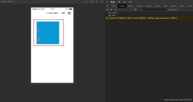
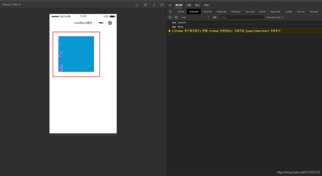
显然,使用nth-child实现了给父组件中多个相同子组件定义不同的样式。
如果父组件中存在不同类型的子组件时,需要使用nth-of-type,如下:
<template>
	<view>
		<view class="box">
			<text>0text>
			<view>1view>
			<view>2view>
			<view>3view>
		view>
	view>
template>

<script>
	export default {

		data() {

			return {


			}
		},
		methods: {


		}
	}
script>

<style>
	.box {

		background: #0A98D5;
		margin: 100upx;
		width: 400upx;
		height: 400upx;
		color: #ff55ff;
	}
	.box>view:nth-of-type(1) {

		font-size: 50upx;
	}
	.box>view:nth-of-type(2) {

		font-size: 75upx;
	}
	.box>view:nth-of-type(3) {

		font-size: 100upx;
	}
style>
显示:
显然,也实现了对view子组件定位渲染样式。
再实现给第一个和最后一个子元素设置样式,如下:
<template>
	<view>
		<view class="box1">
			<view>1view>
			<view>2view>
			<view>3view>
			<view>4view>
		view>
		<view class="box2">
			<text>0text>
			<view>1view>
			<view>2view>
			<view>3view>
			<view>4view>
		view>
	view>
template>

<script>
	export default {

		data() {

			return {


			}
		},
		methods: {


		}
	}
script>

<style>
	.box1, .box2 {

		background: #0A98D5;
		margin: 100upx;
		width: 400upx;
		height: 400upx;
		color: #ff55ff;
	}
	.box1>view:first-child {

		font-size: 50upx;
	}
	.box1>view:last-child {

		font-size: 100upx;
	}
	.box2>view:first-of-type {

		font-size: 50upx;
	}
	.box2>view:last-of-type {

		font-size: 100upx;
	}
style>
显示:
可以看到,和前面一样,如果子组件相同,则使用first-child和last-child;
如果子组件不完全相同,则使用first-of-type和last-of-type。
还可以使用奇偶选择器,如下:
<template>
	<view>
		<view class="box1">
			<view>1view>
			<view>2view>
			<view>3view>
			<view>4view>
			<view>5view>
			<view>6view>
			<view>7view>
			<view>8view>
		view>
		<view class="box2">
			<text>0text>
			<view>1view>
			<view>2view>
			<view>3view>
			<view>4view>
			<view>5view>
			<view>6view>
			<view>7view>
			<view>8view>
		view>
	view>
template>

<script>
	export default {

		data() {

			return {


			}
		},
		methods: {


		}
	}
script>

<style>
	.box1, .box2 {

		background: #0A98D5;
		margin: 100upx;
		width: 400upx;
		height: 400upx;
		font-size: 30upx;
		color: #aa0000;
	}
	.box1>view:nth-child(2n-1) {

		background: #F0AD4E;
	}
	.box1>view:nth-child(2n) {

		background: #0000ff;
	}
	.box2>view:nth-of-type(odd) {

		background: #F0AD4E;
	}
	.box2>view:nth-of-type(even) {

		background: #0000ff;
	}
style>
显示:
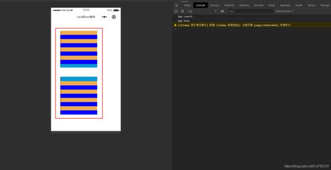
可以看到,可以使用2n、2n-1或者odd、even实现就奇偶选择器;
也可以根据需要选择nth-child和nth-of-type。
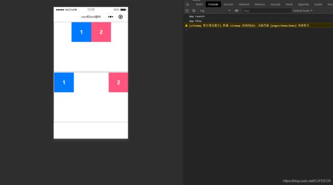
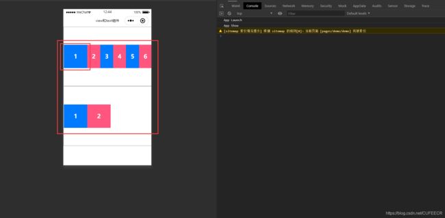
3.flex布局基础
为支持跨平台,uni-app推荐使用Flex布局,这是CSS3支持的布局方式,可以查看文档https://uniapp.dcloud.net.cn/frame?id=flex布局,使用时直接指定display: flex;即可。
测试如下:
<template>
	<view>
		<view class="box">
			<view class="box-item">1view>
			<view class="box-item">2view>
			<view class="box-item">3view>
			<view class="box-item">4view>
			<view class="box-item">5view>
			<view class="box-item">6view>
		view>
	view>
template>

<script>
	export default {

		data() {

			return {


			}
		},
		methods: {


		}
	}
script>

<style>
	.box {

		width: 100%;
		height: 500upx;
		border: 5upx solid #CCCCCC;
		display: flex;
	}
	.box-item {

		color: #FFFFFF;
		height: 200upx;
		width: 200upx;
		line-height: 200upx;
		font-size: 50upx;
		font-weight: bold;
		text-align: center;
	}
	.box-item:nth-of-type(odd) {

		background: #007AFF;
	}
	.box-item:nth-of-type(even) {

		background: #ff557f;
	}
style>
显示:
可以看到,采用了flex布局后,所有盒子都挤到一行。
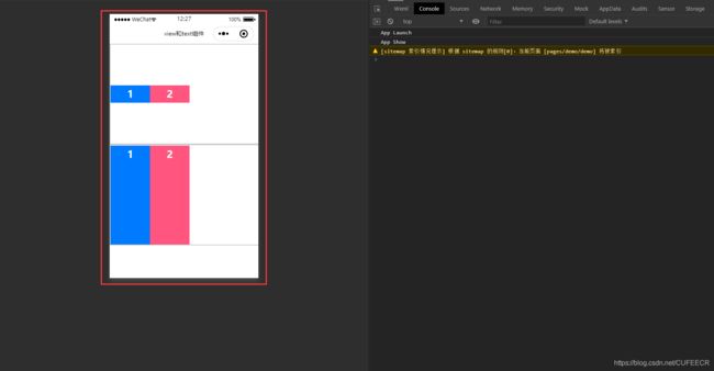
可以实现自动换行,用到flex-wrap属性,并且有多种换行方式,如下:
<template>
	<view>
		<view class="box1">
			<view class="box-item">1view>
			<view class="box-item">2view>
			<view class="box-item">3view>
			<view class="box-item">4view>
			<view class="box-item">5view>
			<view class="box-item">6view>
		view>
		<view class="box2">
			<view class="box-item">1view>
			<view class="box-item">2view>
			<view class="box-item">3view>
			<view class="box-item">4view>
			<view class="box-item">5view>
			<view class="box-item">6view>
		view>
	view>
template>

<script>
	export default {

		data() {

			return {


			}
		},
		methods: {


		}
	}
script>

<style>
	.box1 {

		width: 100%;
		height: 500upx;
		border: 5upx solid #CCCCCC;
		display: flex;
		flex-wrap: wrap;
	}
	.box2 {

		width: 100%;
		height: 500upx;
		border: 5upx solid #CCCCCC;
		display: flex;
		flex-wrap: wrap-reverse;
	}
	.box-item {

		color: #FFFFFF;
		height: 200upx;
		width: 200upx;
		line-height: 200upx;
		font-size: 50upx;
		font-weight: bold;
		text-align: center;
	}
	.box-item:nth-of-type(odd) {

		background: #007AFF;
	}
	.box-item:nth-of-type(even) {

		background: #ff557f;
	}
style>
显示:
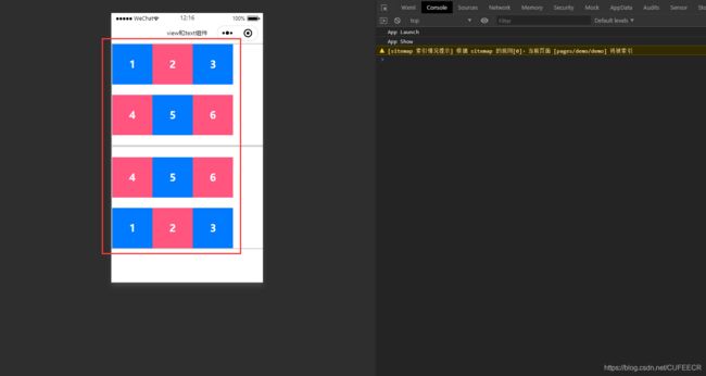
展示了2种换行方式。
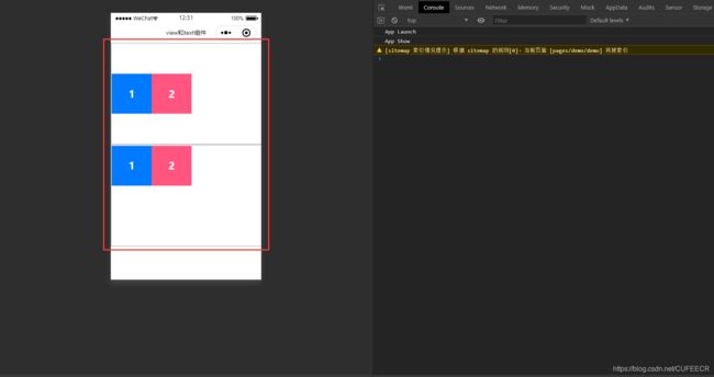
还可以设置分布样式,此时需要用到justify-content属性,如下:
<template>
	<view>
		<view class="box1">
			<view class="box-item">1view>
			<view class="box-item">2view>
		view>
		<view class="box2">
			<view class="box-item">1view>
			<view class="box-item">2view>
		view>
	view>
template>

<script>
	export default {

		data() {

			return {


			}
		},
		methods: {


		}
	}
script>

<style>
	.box1 {

		width: 100%;
		height: 500upx;
		border: 5upx solid #CCCCCC;
		display: flex;
		justify-content: center;
	}
	.box2 {

		width: 100%;
		height: 500upx;
		border: 5upx solid #CCCCCC;
		display: flex;
		justify-content: space-between;
	}
	.box-item {

		color: #FFFFFF;
		height: 200upx;
		width: 200upx;
		line-height: 200upx;
		font-size: 50upx;
		font-weight: bold;
		text-align: center;
	}
	.box-item:nth-of-type(odd) {

		background: #007AFF;
	}
	.box-item:nth-of-type(even) {

		background: #ff557f;
	}
style>
显示:
实现了居中分布和两端分布。
还能实现垂直居中或者填充满父组件,需要用到align-items属性,如下:
<template>
	<view>
		<view class="box1">
			<view class="box-item">1view>
			<view class="box-item">2view>
		view>
		<view class="box2">
			<view class="box-item">1view>
			<view class="box-item">2view>
		view>
	view>
template>

<script>
	export default {

		data() {

			return {


			}
		},
		methods: {


		}
	}
script>

<style>
	.box1 {

		width: 100%;
		height: 500upx;
		border: 5upx solid #CCCCCC;
		display: flex;
		align-items: center;
	}
	.box2 {

		width: 100%;
		height: 500upx;
		border: 5upx solid #CCCCCC;
		display: flex;
		align-items: stretch;
	}
	.box-item {

		color: #FFFFFF;
		width: 200upx;
		font-size: 50upx;
		font-weight: bold;
		text-align: center;
	}
	.box-item:nth-of-type(odd) {

		background: #007AFF;
	}
	.box-item:nth-of-type(even) {

		background: #ff557f;
	}
style>
显示:
还可以实现子组件中文本的水平和垂直居中,如下:
<template>
	<view>
		<view class="box1">
			<view class="box-item">1view>
			<view class="box-item">2view>
		view>
		<view class="box2">
			<view class="box-item">1view>
			<view class="box-item">2view>
		view>
	view>
template>

<script>
	export default {

		data() {

			return {


			}
		},
		methods: {


		}
	}
script>

<style>
	.box1 {

		width: 100%;
		height: 500upx;
		border: 5upx solid #CCCCCC;
		display: flex;
		align-items: center;
	}
	.box2 {

		width: 100%;
		height: 500upx;
		border: 5upx solid #CCCCCC;
		display: flex;
		align-items: stretch;
	}
	.box-item {

		color: #FFFFFF;
		height: 200upx;
		width: 200upx;
		line-height: 200upx;
		font-size: 50upx;
		font-weight: bold;
		display: flex;
		justify-content: center;
		align-items: center;
	}
	.box-item:nth-of-type(odd) {

		background: #007AFF;
	}
	.box-item:nth-of-type(even) {

		background: #ff557f;
	}
style>
显示:
可以使用flex-direction属性实现垂直排列,如下:
<template>
	<view>
		<view class="box1">
			<view class="box-item">1view>
			<view class="box-item">2view>
		view>
		<view class="box2">
			<view class="box-item">1view>
			<view class="box-item">2view>
			<view class="box-item">3view>
		view>
	view>
template>

<script>
	export default {

		data() {

			return {


			}
		},
		methods: {


		}
	}
script>

<style>
	.box1 {

		width: 100%;
		height: 500upx;
		border: 5upx solid #CCCCCC;
		display: flex;
		justify-content: center;
		align-items: center;
	}
	.box2 {

		width: 100%;
		height: 500upx;
		border: 5upx solid #CCCCCC;
		display: flex;
		flex-direction: column;
		align-items: center;
	}
	.box-item {

		color: #FFFFFF;
		height: 200upx;
		width: 200upx;
		font-size: 50upx;
		font-weight: bold;
		display: flex;
		justify-content: center;
		align-items: center;
	}
	.box-item:nth-of-type(odd) {

		background: #007AFF;
	}
	.box-item:nth-of-type(even) {

		background: #ff557f;
	}
style>
显示:
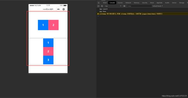
说明:
设置flex-direction属性为column时,justify-content和align-items设置的方向与一般情况相反,即前者设置垂直方向、后者设置水平方向。
flex-shrink属性用于设置组件是否被压缩,如下:
<template>
	<view>
		<view class="box1">
			<view class="box-item">1view>
			<view class="box-item">2view>
			<view class="box-item">3view>
			<view class="box-item">4view>
			<view class="box-item">5view>
			<view class="box-item">6view>
		view>
		<view class="box2">
			<view class="box-item">1view>
			<view class="box-item">2view>
		view>
	view>
template>

<script>
	export default {

		data() {

			return {


			}
		},
		methods: {


		}
	}
script>

<style>
	.box1 {

		width: 100%;
		height: 500upx;
		border: 5upx solid #CCCCCC;
		display: flex;
		justify-content: center;
		align-items: center;
	}
	.box2 {

		width: 100%;
		height: 500upx;
		border: 5upx solid #CCCCCC;
		display: flex;
		align-items: center;
	}
	.box-item {

		color: #FFFFFF;
		height: 200upx;
		width: 200upx;
		font-size: 50upx;
		font-weight: bold;
		display: flex;
		justify-content: center;
		align-items: center;
	}
	.box-item:nth-of-type(odd) {

		background: #007AFF;
	}
	.box-item:nth-of-type(even) {

		background: #ff557f;
	}
	.box-item:first-of-type {

		flex-shrink: 0;
	}
style>
显示:
显然,第一个组件未被压缩。
可以实现子组件宽度平均分配,第一种方式指定width: 50%;,如下:
<template>
	<view>
		<view class="box1">
			<view class="box-item">1view>
			<view class="box-item">2view>
		view>
		<view class="box2">
			<view class="box-item">1view>
			<view class="box-item">2view>
		view>
	view>
template>

<script>
	export default {

		data() {

			return {


			}
		},
		methods: {


		}
	}
script>

<style>
	.box1 {

		width: 100%;
		height: 500upx;
		border: 5upx solid #CCCCCC;
		display: flex;
		justify-content: center;
		align-items: center;
	}
	.box2 {

		width: 100%;
		height: 500upx;
		border: 5upx solid #CCCCCC;
		display: flex;
		align-items: center;
	}
	.box-item {

		color: #FFFFFF;
		height: 200upx;
		width: 50%;
		font-size: 50upx;
		font-weight: bold;
		display: flex;
		justify-content: center;
		align-items: center;
	}
	.box-item:nth-of-type(odd) {

		background: #007AFF;
	}
	.box-item:nth-of-type(even) {

		background: #ff557f;
	}
	.box-item:first-of-type {

		flex-shrink: 0;
	}
style>
显示:
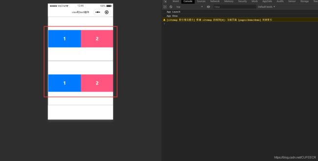
但是显然这种方式不方便,需要每次计算百分比,可以指定flex属性即可,如下:
<template>
	<view>
		<view class="box1">
			<view class="box-item">1view>
			<view class="box-item">2view>
		view>
		<view class="box2">
			<view class="box-item">1view>
			<view class="box-item">2view>
			<view class="box-item">3view>
		view>
	view>
template>

<script>
	export default {

		data() {

			return {


			}
		},
		methods: {


		}
	}
script>

<style>
	.box1 {

		width: 100%;
		height: 500upx;
		border: 5upx solid #CCCCCC;
		display: flex;
		justify-content: center;
		align-items: center;
	}
	.box2 {

		width: 100%;
		height: 500upx;
		border: 5upx solid #CCCCCC;
		display: flex;
		align-items: center;
	}
	.box-item {

		color: #FFFFFF;
		height: 200upx;
		flex: 1;
		font-size: 50upx;
		font-weight: bold;
		display: flex;
		justify-content: center;
		align-items: center;
	}
	.box-item:nth-of-type(odd) {

		background: #007AFF;
	}
	.box-item:nth-of-type(even) {

		background: #ff557f;
	}
	.box-item:first-of-type {

		flex-shrink: 0;
	}
style>
显示:
显然,此时更灵活。
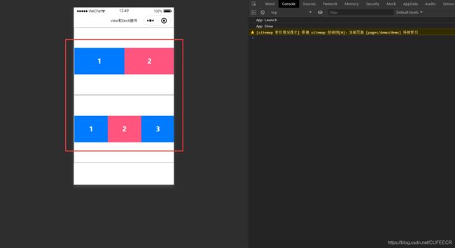
还可以指定其他尺寸比例,如下:
<template>
<view>
<view class="box1">
<view class="box-item">1view>
<view class="box-item">2view>
view>
<view class="box2">
<view class="box-item">1view>
<view class="box-item">2view>
<view class="box-item">3view>
view>
view>
template>
<script>
export default {
data() {
return {
}
},
methods: {
}
}
script>
<style>
.box1 {
width: 100%;
height: 500upx;
border: 5upx solid #CCCCCC;
display: flex;
justify-content: center;
align-items: center;
}
.box2 {
width: 100%;
height: 500upx;
border: 5upx solid #CCCCCC;
display: flex;
align-items: center;
}
.box-item {
color: #FFFFFF;
height: 200upx;
flex: 1;
font-size: 50upx;
font-weight: bold;
display: flex;
justify-content: center;
align-items: center;
}
.box-item:nth-of-type(odd) {
background: #007AFF;
}
.box-item:nth-of-type(even) {
background: #ff557f;
}
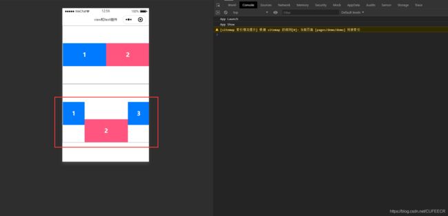
.box2 .box-item:nth-last-of-type(1) {
flex: 1;
}
.box2 .box-item:nth-last-of-type(2) {
flex: 2;
}
.box2 .box-item:nth-last-of-type(3) {
flex: 1;
}
style>
显示:
此时设置了第二个父组件中3个子组件的宽度比为1:2:1。
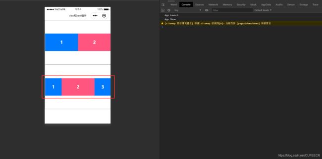
align-self属性可以给某个子组件设置对齐方式,如下:
<template>
	<view>
		<view class="box1">
			<view class="box-item">1view>
			<view class="box-item">2view>
		view>
		<view class="box2">
			<view class="box-item">1view>
			<view class="box-item">2view>
			<view class="box-item">3view>
		view>
	view>
template>

<script>
	export default {

		data() {

			return {


			}
		},
		methods: {


		}
	}
script>

<style>
	.box1 {

		width: 100%;
		height: 500upx;
		border: 5upx solid #CCCCCC;
		display: flex;
		justify-content: center;
		align-items: center;
	}
	.box2 {

		width: 100%;
		height: 500upx;
		border: 5upx solid #CCCCCC;
		display: flex;
		align-items: center;
	}
	.box-item {

		color: #FFFFFF;
		height: 200upx;
		flex: 1;
		font-size: 50upx;
		font-weight: bold;
		display: flex;
		justify-content: center;
		align-items: center;
	}
	.box-item:nth-of-type(odd) {

		background: #007AFF;
	}
	.box-item:nth-of-type(even) {

		background: #ff557f;
	}
	.box2 .box-item:nth-last-of-type(1) {

		flex: 1;
	}
	.box2 .box-item:nth-last-of-type(2) {

		flex: 2;
		align-self: flex-end;
	}
	.box2 .box-item:nth-last-of-type(3) {

		flex: 1;
	}
style>
显示:
给第二个子组件设置了不一样的对齐方式。
二、数据渲染和动态绑定
1.数据渲染
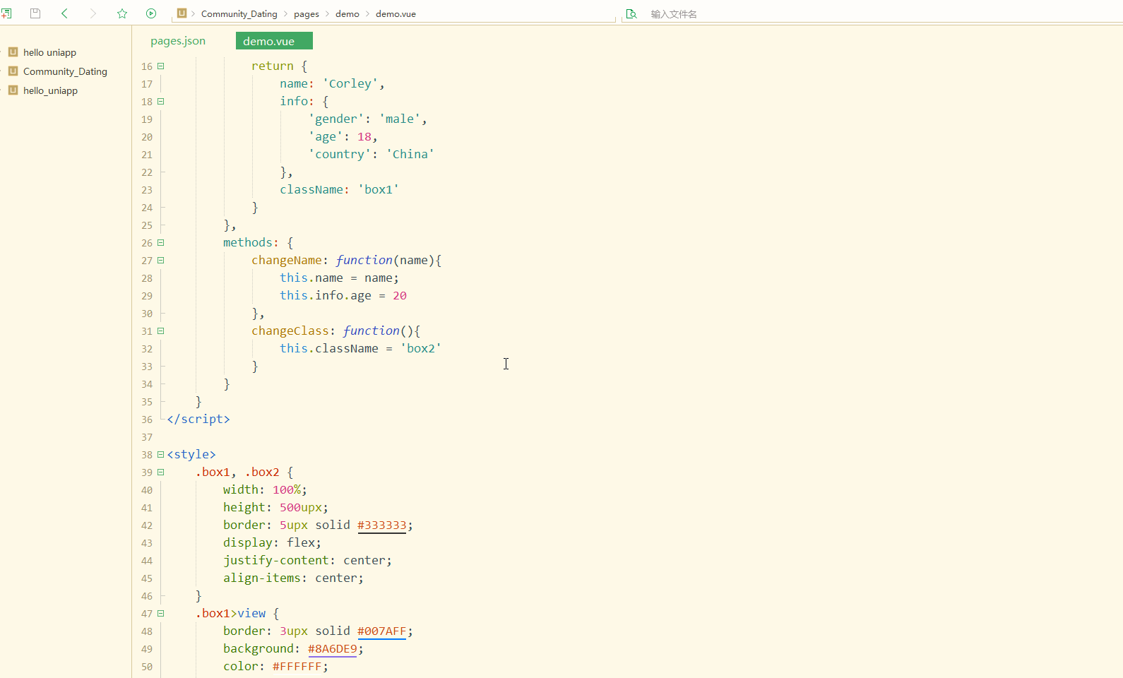
数据渲染需要使用Vue中的语法,数据定义在script语句块中的data属性中,并提倡以函数的形式返回,在页面中用{ {}}包含,即可渲染数据。
如下:
<template>
	<view>
		<view class="box">
			<view>{
    {name}}view>
			<view>{
    {info}}view>
			<view>{
    {info.gender}}view>
		view>
	view>
template>

<script>
	export default {

		data() {

			return {

				name: 'Corley',
				info: {

					'gender': 'male',
					'age': 18,
					'country': 'China'
				}
			}
		},
		methods: {


		}
	}
script>

<style>
	.box {

		width: 100%;
		height: 500upx;
		border: 5upx solid #333333;
		display: flex;
		justify-content: center;
		align-items: center;
	}
	.box>view {

		border: 3upx solid #007AFF;
		background: #8A6DE9;
		color: #FFFFFF;
		font-weight: bold;
		font-size: 40upx;
		flex: 1;
		height: 500upx;
		display: flex;
		justify-content: center;
		align-items: center;
	}
style>
显示:
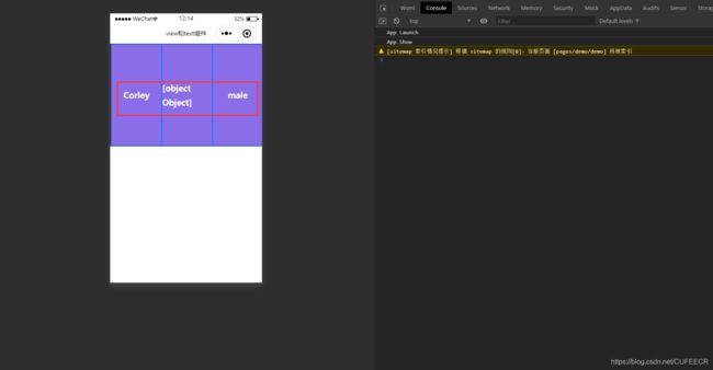
显然,将数据渲染到了页面中;
数据可以是字符串、数值型、对象等。
还可以实现动态变化和修改,如下:
<template>
	<view>
		<view :class="className">
			<view>{
    {name}}view>
			<view>{
    {info}}view>
			<view>{
    {info.age}}view>
		view>
		<button type="default" @tap="changeName('Corlin')">修改名字button>
		<button type="default" @tap="changeClass()">修改classbutton>
	view>
template>

<script>
	export default {

		data() {

			return {

				name: 'Corley',
				info: {

					'gender': 'male',
					'age': 18,
					'country': 'China'
				},
				className: 'box1'
			}
		},
		methods: {

			changeName: function(name){

				this.name = name;
				this.info.age = 20
			},
			changeClass: function(){

				this.className = 'box2'
			}
		}
	}
script>

<style>
	.box1, .box2 {

		width: 100%;
		height: 500upx;
		border: 5upx solid #333333;
		display: flex;
		justify-content: center;
		align-items: center;
	}
	.box1>view {

		border: 3upx solid #007AFF;
		background: #8A6DE9;
		color: #FFFFFF;
		font-weight: bold;
		font-size: 40upx;
		flex: 1;
		height: 500upx;
		display: flex;
		justify-content: center;
		align-items: center;
	}
	.box2>view {

		border: 3upx solid #007AFF;
		background: #ff5500;
		color: #ffff7f;
		font-weight: bold;
		font-size: 40upx;
		flex: 1;
		height: 500upx;
		display: flex;
		justify-content: center;
		align-items: center;
	}
style>
显示:
显然,可以修改普通数据;
也能通过修改class来改变样式,要动态改变组件的属性时,属性前加v-bind:或:,例如v-bind:class和:class。
2.class和style绑定
为节约性能,将 Class 与 Style 的表达式通过 compiler 硬编码到 uni-app 中,实现动态修改class和style属性。
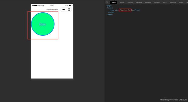
简单使用如下:
<template>
	<view>
		<view class="box" :class="['bor', 'fs']">
			box
		view>
	view>
template>

<script>
	export default {

		data() {

			return {

			}
		},
		methods: {


		}
	}
script>

<style>
	.box {

		width: 400upx;
		height: 400upx;
		border-radius: 100%;
		background: #00FF7F;
		color: #FFFFFF;
		display: flex;
		justify-content: center;
		align-items: center;
		font-size: 50upx;
	}
	.bor {

		border: 10upx solid #007AFF;
	}
	.fs{

		font-size: 70upx;
	}
style>
显示:
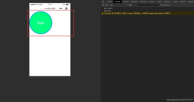
可以看到,以数组的形式给组件定义了多个class,从而实现了多个样式。
还可以绑定为变量,并通过事件控制,如下:
<template>
	<view>
		<view class="box" :class="[cls1, cls2]">
			box
		view>
	view>
template>

<script>
	export default {

		data() {

			return {

				cls1: 'bor',
				cls2: 'fs'
			}
		},
		methods: {


		}
	}
script>

<style>
	.box {

		width: 400upx;
		height: 400upx;
		border-radius: 100%;
		background: #00FF7F;
		color: #FFFFFF;
		display: flex;
		justify-content: center;
		align-items: center;
		font-size: 50upx;
	}
	.bor {

		border: 10upx solid #007AFF;
	}
	.fs{

		font-size: 70upx;
	}
style>
可以达到与之前同样的效果。
也可以实现三元运算符,如下:
<template>
	<view>
		<view class="box" :class="[age>15?cls1:'', gender=='female'?cls2:'']">
			box
		view>
	view>
template>

<script>
	export default {

		data() {

			return {

				cls1: 'bor',
				cls2: 'fs',
				age: 18,
				gender: 'male'
			}
		},
		methods: {


		}
	}
script>

<style>
	.box {

		width: 400upx;
		height: 400upx;
		border-radius: 100%;
		background: #00FF7F;
		font-size: 50upx;
		display: flex;
		justify-content: center;
		align-items: center;
	}
	.bor {

		border: 10upx solid #007AFF;
	}
	.fs{

		font-size: 70upx;
		color: #8A6DE9;
	}
style>
显示:

显然,当条件满足时就会增加class、并渲染相应的样式。
还能通过条件来判断class,如下:
<template>
	<view>
		<view class="box" :class="{
      'bor':isBor}">
			box
		view>
	view>
template>

<script>
	export default {

		data() {

			return {

				cls1: 'bor',
				cls2: 'fs',
				age: 18,
				gender: 'male',
				isBor: true
			}
		},
		methods: {


		}
	}
script>

<style>
	.box {

		width: 400upx;
		height: 400upx;
		border-radius: 100%;
		background: #00FF7F;
		font-size: 50upx;
		display: flex;
		justify-content: center;
		align-items: center;
	}
	.bor {

		border: 10upx solid #007AFF;
	}
	.fs{

		font-size: 70upx;
		color: #8A6DE9;
	}
style>
与前面的效果相同。
当:后面的条件为true时,就会动态添加:前面的class。
可以同时添加多个条件,如下:
<template>
	<view>
		<view class="box" :class="{
      'bor':isBor, 'fs': isFs}">
			box
		view>
	view>
template>

<script>
	export default {

		data() {

			return {

				cls1: 'bor',
				cls2: 'fs',
				age: 18,
				gender: 'male',
				isBor: true,
				isFs: true
			}
		},
		methods: {


		}
	}
script>

<style>
	.box {

		width: 400upx;
		height: 400upx;
		border-radius: 100%;
		background: #00FF7F;
		font-size: 50upx;
		display: flex;
		justify-content: center;
		align-items: center;
	}
	.bor {

		border: 10upx solid #007AFF;
	}
	.fs{

		font-size: 70upx;
		color: #8A6DE9;
	}
style>
显示:
可以看到,同时判断了多个条件并添加了多个class。
动态绑定style的用法如下:
<template>
	<view>
		<view class="box" :style="{
        'color': color, 'font-size': size+'px'}">
			box
		view>
	view>
template>

<script>
	export default {

		data() {

			return {

				color: '#333333',
				size: 50
			}
		},
		methods: {


		}
	}
script>

<style>
	.box {

		width: 400upx;
		height: 400upx;
		border-radius: 100%;
		background: #00FF7F;
		font-size: 50upx;
		display: flex;
		justify-content: center;
		align-items: center;
	}
style>
显示:
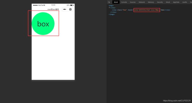
显然,已经渲染出定义的样式。
3.条件渲染
条件渲染也是使用Vue中的v-if实现。
如下:
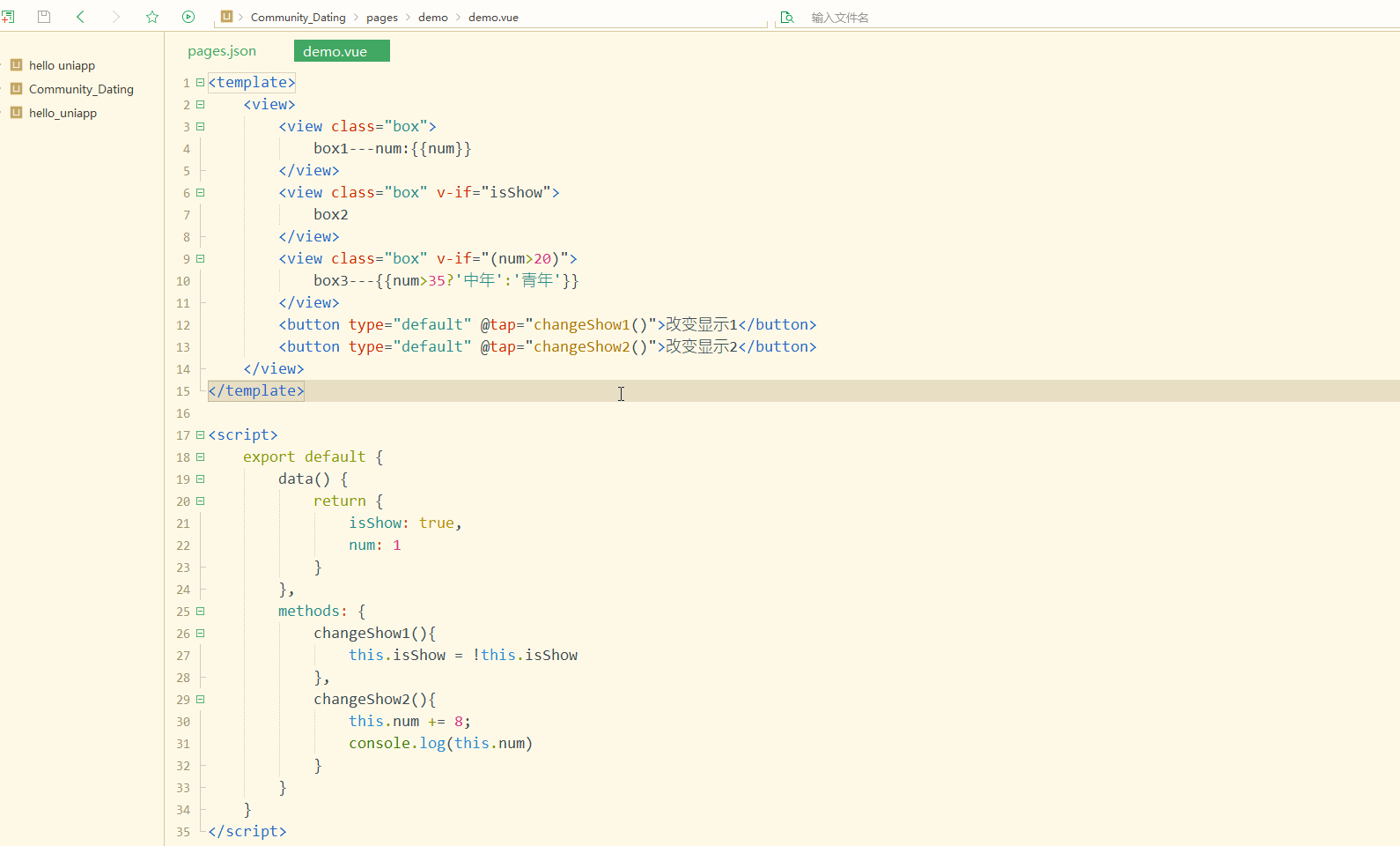
<template>
	<view>
		<view class="box">
			box1---num:{
    {num}}
		view>
		<view class="box" v-if="isShow">
			box2
		view>
		<view class="box" v-if="(num>20)">
			box3---{
    {num>35?'中年':'青年'}}
		view>
		<button type="default" @tap="changeShow1()">改变显示1button>
		<button type="default" @tap="changeShow2()">改变显示2button>
	view>
template>

<script>
	export default {

		data() {

			return {

				isShow: true,
				num: 1
			}
		},
		methods: {

			changeShow1(){

				this.isShow = !this.isShow
			},
			changeShow2(){

				this.num += 8;
				console.log(this.num)
			}
		}
	}
script>

<style>
	.box {

		width: 400upx;
		height: 200upx;
		background: #00FF7F;
		font-size: 50upx;
		display: flex;
		justify-content: center;
		align-items: center;
	}
style>
传给v-if的既可以是布尔值变量,也可以是逻辑表达式,同时可以动态渲染;
在组件中的数据渲染中,也能是三元运算符。
显示:
可以看到,实现了条件渲染。
v-show也能实现条件显示,满足条件再显示,如下:
<template>
	<view>
		<view class="box">
			box1---num:{
    {num}}
		view>
		<view class="box" v-show="isShow">
			box2
		view>
		<view class="box" v-show="(num>20)">
			box3---{
    {num>35?'中年':'青年'}}
		view>
		<button type="default" @tap="changeShow1()">改变显示1button>
		<button type="default" @tap="changeShow2()">改变显示2button>
	view>
template>

<script>
	export default {

		data() {

			return {

				isShow: true,
				num: 1
			}
		},
		methods: {

			changeShow1(){

				this.isShow = !this.isShow
			},
			changeShow2(){

				this.num += 8;
				console.log(this.num)
			}
		}
	}
script>

<style>
	.box {

		width: 400upx;
		height: 200upx;
		background: #00FF7F;
		font-size: 50upx;
		display: flex;
		justify-content: center;
		align-items: center;
	}
style>
显示的效果与v-if现同。
但是两者存在一定的区别:
v-if是真正的条件渲染,满足条件才进行渲染;
而v-show是不管是否条件成立都会渲染元素,符合条件就显示,不符合条件就相当于设置display属性为none,即将元素隐藏。
两者的进一步比较可参考https://blog.csdn.net/happy81997/article/details/106135153。
还可以嵌套和
和
可以参考文档https://uniapp.dcloud.io/frame?id=template-block。
使用如下:
<template>
	<view>
		<view class="box">
			box1---num:{
    {num}}
		view>
		<template v-if="isShow">
			<view class="box">
				box2
			view>
		template>
		<template v-if="(num<18)">
			<view class="box">
				box3---'未成年'
			view>
		template>
		<template v-else-if="(num<35)">
			<view class="box">
				box3---'青年'
			view>
		template>
		<template v-else>
			<view class="box">
				box3---'中老年'
			view>
		template>
		<button type="default" @tap="changeShow1()">改变显示1button>
		<button type="default" @tap="changeShow2()">改变显示2button>
	view>
template>

<script>
	export default {

		data() {

			return {

				isShow: true,
				num: 1
			}
		},
		methods: {

			changeShow1() {

				this.isShow = !this.isShow
			},
			changeShow2() {

				this.num += 5;
				console.log(this.num)
			}
		}
	}
script>

<style>
	.box {

		width: 400upx;
		height: 200upx;
		background: #00FF7F;
		font-size: 50upx;
		display: flex;
		justify-content: center;
		align-items: center;
	}
style>
显示:
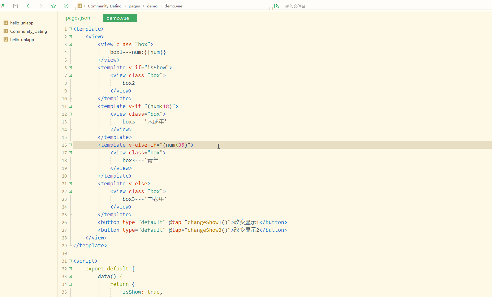
可以看到,也能实现条件渲染。
4.列表渲染
使用v-for实现列表渲染,可以对数组或对象进行遍历。
可查看文档https://uniapp.dcloud.io/use?id=列表渲染。
循环一维数组如下:
<template>
	<view>
		<text class="ls">单个取值text>
		<view class="ls">{
    {list1[0]}}view>
		<view class="ls">{
    {list1[1]}}view>
		<view class="ls">{
    {list1[2]}}view>
		<text class="ls">循环遍历text>
		<view class="ls" v-for="(val, index) in list1" :key="index">{
    {index}} - {
    {val}}view>
	view>
template>

<script>
	export default {

		data() {

			return {

				list1: ['Basketball', 'Football', 'Ping-Pong']
			}
		},
		methods: {


		}
	}
script>

<style>
	.ls {

		font-size: 50upx;
	}
style>
为了指定列表中项目的唯一的标识符,一般会指定:key属性。
显示:
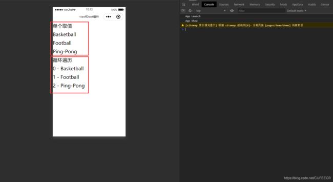
显然,数组可以根据下标单个取值,也能通过循环获取到每个元素及其下标。
列表中的元素也可以是对象,如下:
<template>
	<view>
		<view class="ls" v-for="(val, index) in list2" :key="index">{
    {index}}:{
    {val.name}}-{
    {val.count}}view>
	view>
template>

<script>
	export default {

		data() {

			return {

				list1: ['Basketball', 'Football', 'Ping-Pong'],
				list2: [{

						'name': 'Basketball',
						'count': 3
					},
					{

						'name': 'Football',
						'count': 5
					},
					{

						'name': 'Ping-Pong',
						'count': 8
					},
				]
			}
		},
		methods: {


		}
	}
script>

<style>
	.ls {

		font-size: 50upx;
	}
style>
显示:
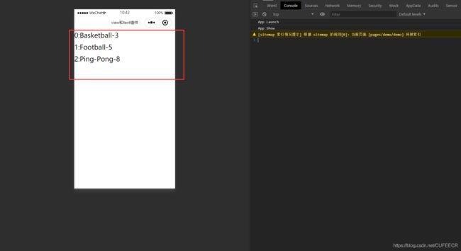
遍历到了对象的属性。
还可以列表和对象多层嵌套,如下:
<template>
	<view>
		<view class="ls" v-for="(val, index) in list2" :key="index">{
    {index}}:{
    {val.name}}-{
    {val.count}}view>
		<view class="ls" v-for="(val, index) in list3" :key="index">
			<view class="ls">{
    {index}}:{
    {val.province}}view>
			<view v-for="(v, i) in val.city" :key="i">{
    {i}}-{
    {v}}view>
		view>
	view>
template>

<script>
	export default {

		data() {

			return {

				list1: ['Basketball', 'Football', 'Ping-Pong'],
				list2: [{

						'name': 'Basketball',
						'count': 3
					},
					{

						'name': 'Football',
						'count': 5
					},
					{

						'name': 'Ping-Pong',
						'count': 8
					},
				],
				list3: [
					{

						province: '广东',
						city: ['广州', '深圳', '佛山']
					},
					{

						province: '四川',
						city: ['成都', '绵阳', '宜宾']
					}
				]
			}
		},
		methods: {


		}
	}
script>

<style>
	.ls {

		font-size: 50upx;
	}
style>
显示:

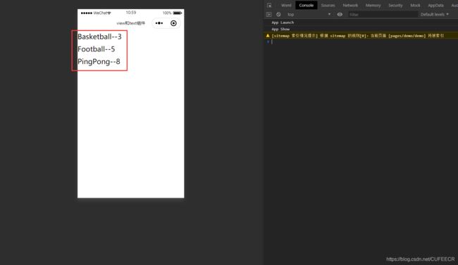
也可以单独遍历对象,直接遍历对象的键和值即可,如下:
<template>
	<view>
		<view class="ls" v-for="(val, key) in obj" :key="key">
			{
    {key}}--{
    {val}}
		view>
	view>
template>

<script>
	export default {

		data() {

			return {

				list1: ['Basketball', 'Football', 'Ping-Pong'],
				list2: [{

						'name': 'Basketball',
						'count': 3
					},
					{

						'name': 'Football',
						'count': 5
					},
					{

						'name': 'Ping-Pong',
						'count': 8
					},
				],
				list3: [
					{

						province: '广东',
						city: ['广州', '深圳', '佛山']
					},
					{

						province: '四川',
						city: ['成都', '绵阳', '宜宾']
					}
				],
				obj: {

					Basketball: 3,
					Football: 5,
					PingPong: 8
				}
			}
		},
		methods: {


		}
	}
script>

<style>
	.ls {

		font-size: 50upx;
	}
style>
显示:
也可以使用
如下:
<template>
	<view>
		<block v-for="(val, key) in obj" :key="key">
			<view class="ls">
				{
    {key}}--{
    {val}}
			view>
		block>
	view>
template>

<script>
	export default {

		data() {

			return {

				list1: ['Basketball', 'Football', 'Ping-Pong'],
				list2: [{

						'name': 'Basketball',
						'count': 3
					},
					{

						'name': 'Football',
						'count': 5
					},
					{

						'name': 'Ping-Pong',
						'count': 8
					},
				],
				list3: [{

						province: '广东',
						city: ['广州', '深圳', '佛山']
					},
					{

						province: '四川',
						city: ['成都', '绵阳', '宜宾']
					}
				],
				obj: {

					Basketball: 3,
					Football: 5,
					PingPong: 8
				}
			}
		},
		methods: {


		}
	}
script>

<style>
	.ls {

		font-size: 50upx;
	}
style>
效果与之前相同。
三、事件和属性处理
1.事件处理器
事件处理器用于处理点击、长按、表单输入、提交表单等事件。
可参考文档https://uniapp.dcloud.io/vue-basics?id=eventhandler。
如下:
<template>
	<view>
		<view class="box" @tap="clickEvent">按钮view>
	view>
template>

<script>
	export default {

		data() {

			return {


			}
		},
		methods: {

			clickEvent(){

				console.log('clicked')
			}
		}
	}
script>

<style>
	.box {

		background-color: #0A98D5;
		color: #8A6DE9;
		width: 85%;
		margin: auto;
		height: 80upx;
		font-size: 50upx;
		border-radius: 20upx;
		border: 3upx solid #F0AD4E;
		display: flex;
		justify-content: center;
		align-items: center;
	}
style>
@tap和@click都是绑定点击事件。
显示:
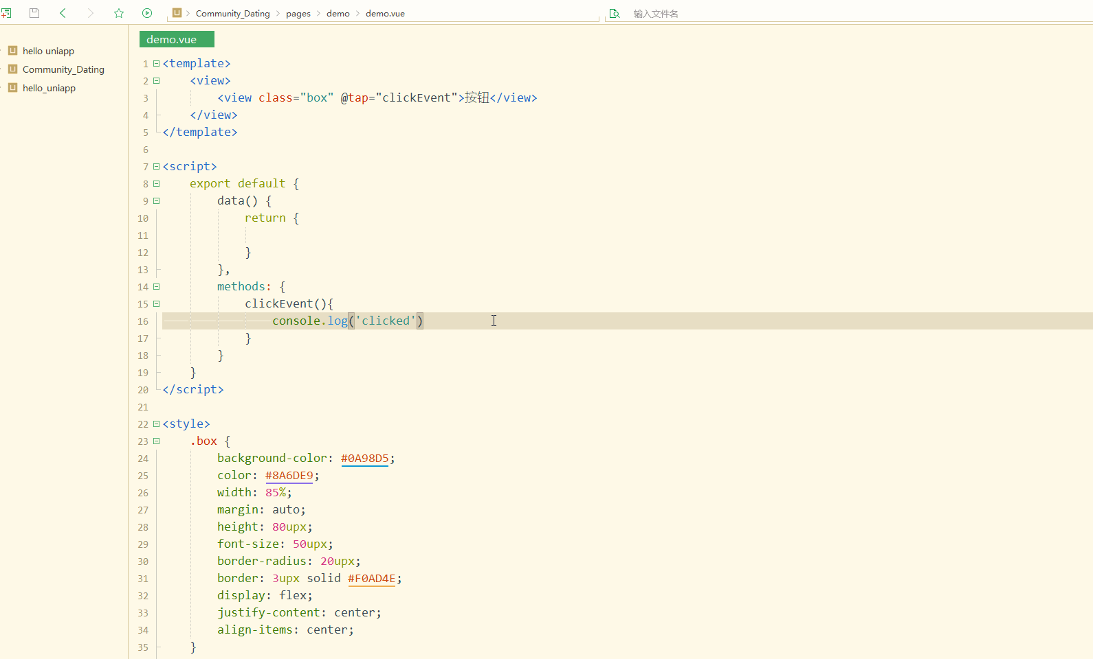
可以看到,每次点击时,都会在控制台输出信息,这也可以作为调试的重要方式。
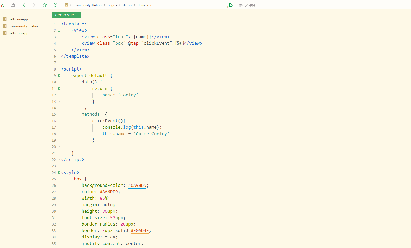
通过事件可以动态改变属性,如下;
<template>
	<view>
		<view class="font">{
    {name}}view>
		<view class="box" @tap="clickEvent">按钮view>
	view>
template>

<script>
	export default {

		data() {

			return {

				name: 'Corley'
			}
		},
		methods: {

			clickEvent(){

				console.log(this.name);
				this.name = 'Cuter Corley'
			}
		}
	}
script>

<style>
	.box {

		background-color: #0A98D5;
		color: #8A6DE9;
		width: 85%;
		margin: auto;
		height: 80upx;
		font-size: 50upx;
		border-radius: 20upx;
		border: 3upx solid #F0AD4E;
		display: flex;
		justify-content: center;
		align-items: center;
	}
	.font {

		font-size: 70upx;
		border: 5upx solid #ff00ff;
		padding: 15upx;
		display: flex;
		justify-content: center;
		align-items: center;
	}
style>
显示:
现实现阻止冒泡事件。
先观察冒泡事件如下:
<template>
	<view>
		<view class="box1" @tap="box1Event()">
			Outside
			<view class="box2" @tap="box2Event()">Insideview>
		view>
	view>
template>

<script>
	export default {

		data() {

			return {

			}
		},
		methods: {

			box1Event(){

				console.log('Clicked Outside');
			},
			box2Event(){

				console.log('Clicked Inside');
			}
		}
	}
script>

<style>
	.box1 {

		background-color: #0A98D5;
		color: #aa007f;
		width: 100%;
		height: 500upx;
		font-size: 40upx;
		display: flex;
		justify-content: center;
		align-items: center;
	}
	.box2 {

		width: 300upx;
		height: 300upx;
		background-color: #09BB07;
		color: #FFFFFF;
		font-size: 40upx;
		display: flex;
		justify-content: center;
		align-items: center;
	}
style>
显示:
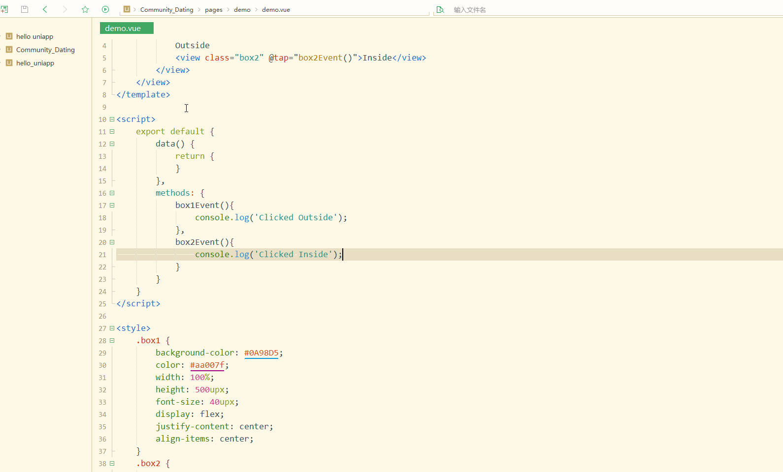
可以看到,在点击外部盒子时,只触发外部盒子的事件;
但是在点击内部盒子时,会同时触发外部盒子和内部盒子的事件。
解决方式如下:
<template>
	<view>
		<view class="box1" @tap.stop="box1Event()">
			Outside
			<view class="box2" @tap.stop="box2Event()">Insideview>
		view>
	view>
template>

<script>
	export default {

		data() {

			return {

			}
		},
		methods: {

			box1Event(){

				console.log('Clicked Outside');
			},
			box2Event(){

				console.log('Clicked Inside');
			}
		}
	}
script>

<style>
	.box1 {

		background-color: #0A98D5;
		color: #aa007f;
		width: 100%;
		height: 500upx;
		font-size: 40upx;
		display: flex;
		justify-content: center;
		align-items: center;
	}
	.box2 {

		width: 300upx;
		height: 300upx;
		background-color: #09BB07;
		color: #FFFFFF;
		font-size: 40upx;
		display: flex;
		justify-content: center;
		align-items: center;
	}
style>
即给事件增加.stop属性即可。
显示:
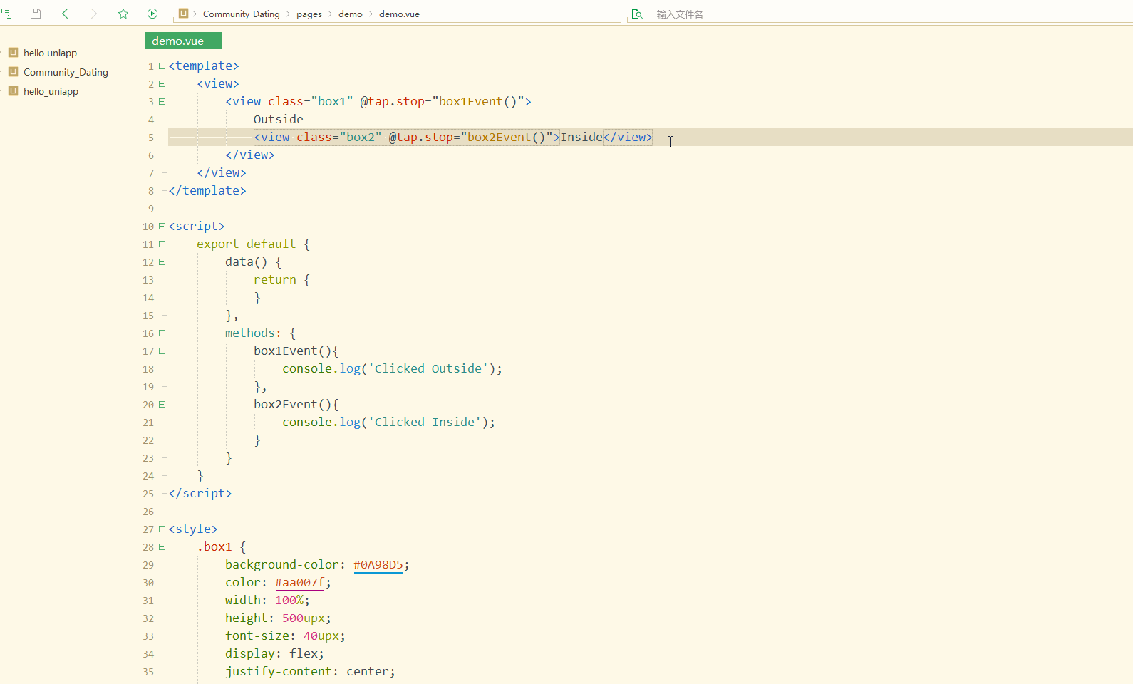
可以看到,内部和外部盒子的事件相互独立,即阻止了冒泡事件。
2.监听属性
监听属性在watch属性中定义,实现与被监听的属性同名的方法,其参数值即为属性的值。
如下:
<template>
	<view>
		<view class="font">{
    {num}}view>
		<button type="default" @tap="changeNum()">按钮button>
	view>
template>

<script>
	export default {

		data() {

			return {

				num: 1
			}
		},
		watch: {

			num(val){

				console.log(val)
			}
		},
		methods: {

			changeNum(){

				this.num += 5;
			}
		},
	}
script>

<style>
	.font {

		font-size: 50upx;
	}
style>
显示:
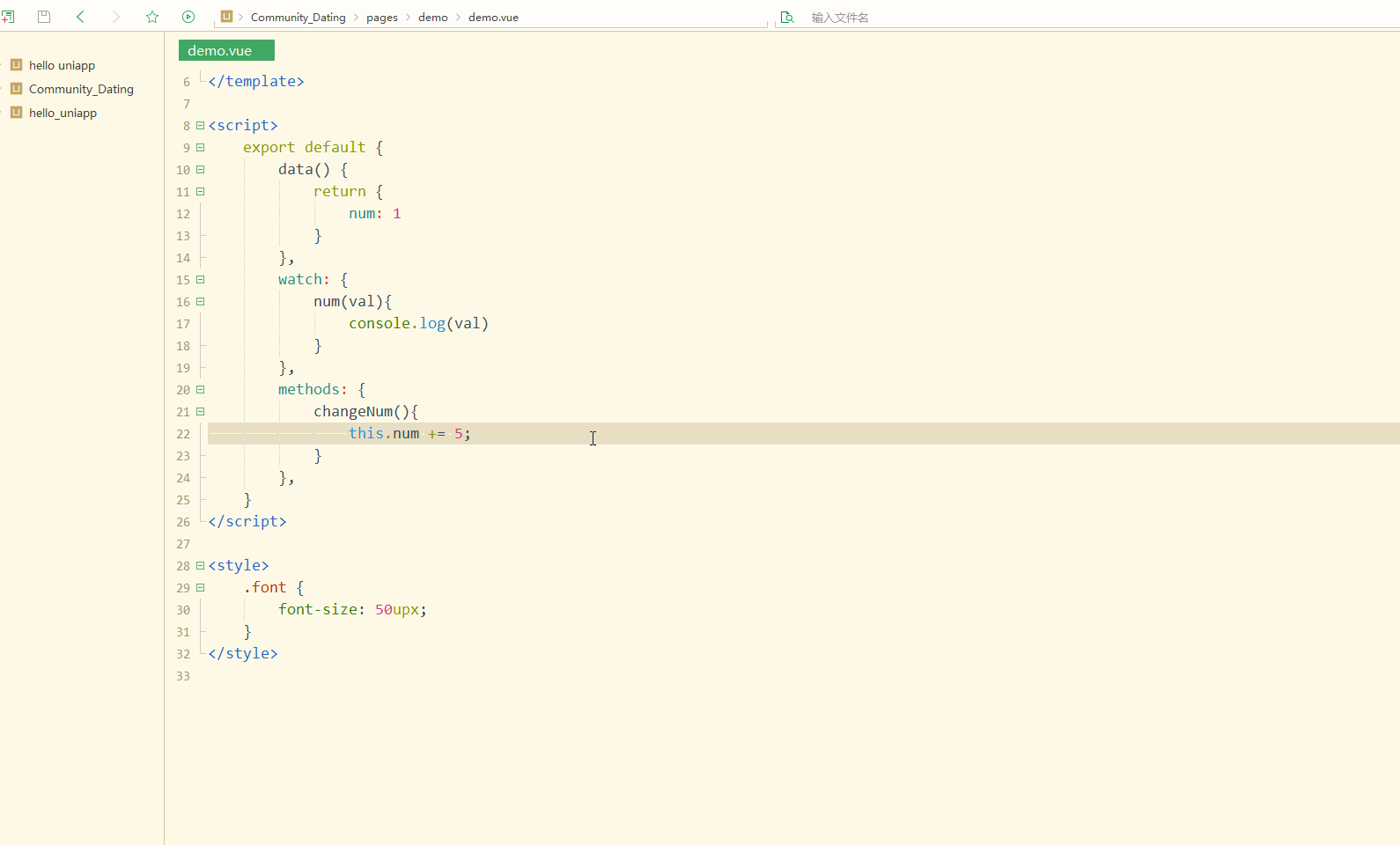
可以看到,实现了对属性的实时监听。
可以实现当数值达到某个值时显示某些元素和不显示某些元素,如下:
<template>
	<view>
		<view class="font">{
    {num}}view>
		<view class="font">{
    {num>20?'Good':'Come on'}}view>
		<button type="default" @tap="changeNum()">按钮button>
	view>
template>

<script>
	export default {

		data() {

			return {

				num: 1
			}
		},
		watch: {

			num(val){

				console.log(val)
			}
		},
		methods: {

			changeNum(){

				this.num += 5;
			}
		},
	}
script>

<style>
	.font {

		font-size: 50upx;
	}
style>
显示:

显然,实现了不同的显示。
属性监听可以用于组件中实时监听某个值并通知父组件修改某个值。
3.计算属性
计算属性在computed中定义,每一个计算属性都包含一个getter和一个setter,默认是利用getter来读取。所有getter和setter的this上下文自动地绑定为 Vue 实例。
具体可参考文档https://uniapp.dcloud.io/vue-basics?id=计算属性和侦听器和https://cn.vuejs.org/v2/guide/computed.html。
例如,要实现区别化地显示重量,可以如下:
<template>
	<view>
		<view class="font">
			{
    {weight>1000?(weight/1000)+'kg':weight+'g'}}
		view>
		<button type="default" @tap="changeWeight()">按钮button>
	view>
template>

<script>
	export default {

		data() {

			return {

				weight: 150
			}
		},
		methods: {

			changeWeight(){

				this.weight += 300;
			}
		},
	}
script>

<style>
	.font {

		font-size: 50upx;
	}
style>
显示:
可以看到,达到了目标,但是页面中有过多的计算代码,不利于维护,此时就可以使用计算属性。
如下:
<template>
	<view>
		<view class="font">
			{
    {transWeight}}
		view>
		<button type="default" @tap="changeWeight()">按钮button>
	view>
template>

<script>
	export default {

		data() {

			return {

				weight: 150
			}
		},
		computed: {

			transWeight(){

				return this.weight>1000?(this.weight/1000)+'kg':this.weight+'g';
			}
		},
		methods: {

			changeWeight(){

				this.weight += 300;
			}
		},
	}
script>

<style>
	.font {

		font-size: 50upx;
	}
style>
达到了与之前一样的效果。
数据的处理和格式化等一般会通过计算属性实现。
总结
作为以Vue为基础的框架,uni-app很多方面都依赖于Vue的用法,因此要想更高效地进行uni-app跨端开发,掌握Vue基础用法是很有必要的,只有将其灵活地应用于uni-app项目中,才能达到事半功倍的效果。