CSS属性
CSS属性
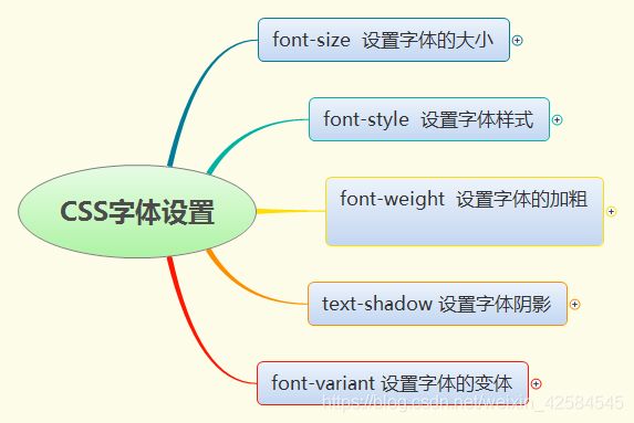
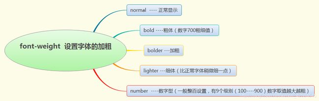
(一)对字体设置
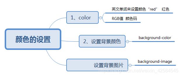
(二)颜色的设置
(三)背景设置和边框设置
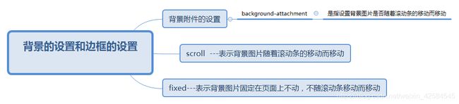
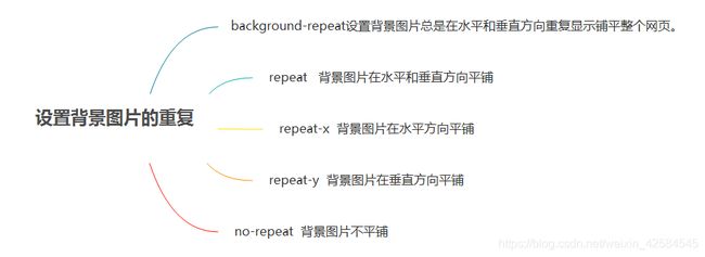
设置背景图片的重复
背景图片的位置设置
background-position
关键字            百分比              位置说明
top left          0%  0%              左上位置
top center        50%  0%             靠上居中
top right         100%  0%            右上位置
left  center      0%  50%             靠左居中
center center     50%  50%            正中位置
right center      100%  50%           靠右居中
bottom  left      0%  100%            左下位置
bottom  center    50%  100%            靠下居中
bottom  right     100%  100%           右下位置
边框的设置
边框的样式
border-style
基本语法
border-style
border-top-style
border-bottom-style
border-left-style
border-right-style
取值:
none  没有边框
dotted  点线
dashed  虚线
solid   实线
double  双实线
groove  凹型线
ridge   凸型线
inset   嵌入式
outset  嵌出式
取同一个值:四条边框线是同一个线型
取两个值:上下边框使用第一个取值,左右边框使用第二个取值
取三个值: 上边框取第一个值,左右取第二个值,下边框取第三个值
取4个值:上第一个值,右取第二个值,下取第三个值,左取第四个值
边框的属性设置和边距/填充
边框的宽度
  border-width
  基本语句:
border-width
border-top-width
border-bottom-width
border-left-width
border-right-width
取值;
thin  ----细边框
medium  ---中等边框
thick--粗边框
长度---数字
边框的颜色
border-color

  基本设置语法:
   border-color
   border-top-color
   border-bottom-color
   border-left-color
   border-right-color

   取值
   英文单词  “red”代表红色
   RGB  颜色码
边框的综合设置和边距
border
边距指的是设置网页中某个元素的四边和网页中其他元素之间的空白距离
上边距  margin-top
下边距  margin-bottom
左边距  margin-left
右边距  margin-right
复合设置 margin

取值:
  数字----长度
  百分比---是相对于上一级元素的百分比,允许是负数
  auto ---自动提取边框的值,默认值
边框的圆角
border-radius设置边框圆角

border-radius:50px;
先把边框设置后再设置圆角
div { border:2px solid; border-radius:25px;  }
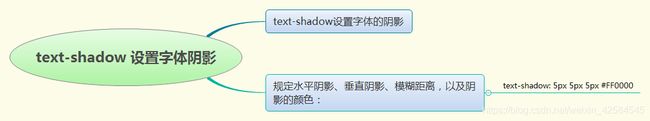
边框的阴影
box-shadow: 10px 10px 5px #888888;//添加阴影
X方向的偏移像素
Y方向的偏移像素
模糊的像素值
阴影颜色
填充
用来设置边框和其内部的元素之间的空白距离

上边距  padding-top
下边距  padding-bottom
左边距  padding-left
右边距  padding-right
复合设置 padding

取值:
数字---长度
百分比
(四)css对文字的排版
调整字符间距
  letter-spacing
  用来控制字符之间的间距,这个间距实际上就是在浏览器中所显示的字符间的空格距离。
取值:
  normal ---表示正常显示(默认)
  长度--可以使用负数,带上单位
  单位px(像素)
添加文字的修饰
为文字添加如下划线,删除线等修饰
  text-decoration
  属性的取值:
  underline----添加下划线
  overline---添加上划线
  line-through--添加删除线
  blink---添加闪烁效果(只能在Netscape的浏览器中正常显示)
 none--没有任何的修饰
文本的对齐方式
text-align
用来控制文本的排列和对齐方式

属性的取值:
left--左对齐
right--右对齐
center--居中对齐
justify--两端对齐
段落的缩进设置
text-indent
  用来控制每个段落的首行缩进的距离。
  属性取值:
  长度(数字)带上单位
  百分比相对于上一级元素的宽度
行高的设置
line-height
  用来控制文本内容之间行间距
  属性取值
  normal---浏览器默认的行高
  数字--设置行高带上单位
  百分比----表示行高是该元素字体大小的百分比
放大缩小位移
Transform
transform:rotate(30deg);//旋转30度
transform:translate(50px,100px) 把元素从左侧移动 50 像素,从顶端移动 100 像素
transform:scale(2,4) 把宽度转换为原始尺寸的 2 倍,把高度转换为原始高度的 4 倍。
transform:skew(30deg,20deg) 围绕 X 轴把元素翻转 30 度,围绕 Y 轴翻转 20 度。
(五)动画
Animation
格式:animation:myfirst 5s;(myfirst动画名,5s动画时间)
@keyframes myfirst
{ 0% {background: red;}
25% {background: yellow;}
50% {background: blue;}
100% {background: green;} }
@keyframes myfirst
{ from {background: red;}
to {background: yellow;}}
过渡动画
transition
格式:transition: width 2s; (应用于宽度,时间2秒)
div{transition:width 5s;
		width:100px;height:100px;
		background:red;}
div:hover { width:300px; } 先定义一个层的hover  鼠标进入后把宽度改为300px  则就会看到过渡动画
(六)补充属性