Vue.extend实现全局Toast提示组件和Dialog对话框组件封装
Vue.extend实现全局Toast提示组件和Dialog对话框组件封装
Vue.extend() 使用
Vue.extend 属于 Vue 的全局 API,相比常用的 Vue.component 写法,使用 Vue.extend 步骤更加繁琐一些,但是在一些独立组件开发场景中,Vue.extend + $mount 这对组合使一些动态渲染或者使用 js 全局调用的组件变得更加灵活
Vue.extend() 方法返回一个组件构造器,通过组件构造器创建组件实例,该实例的参数是一个包含组件选项的对象,用来在实例上扩展属性和方法
Vue.js官网全局 API 介绍:

Vue.extend 实现 Toast 提示组件封装
在 components 目录下新建 Toast 文件夹作为 Toast 组件文件,新建 index.vue 和 index.js 文件进行组件封装,并在 main.js 中将组件挂载到 vue 原型上实现全局使用
components/Toast/index.vue:
<template>
    <div id="toast">
        <p :class="[type ? `toast-${type}` : '', size ? `toast-${size}` : '']">
            {
     {
      message }}
        </p>
    </div>
</template>

<script>
export default {

    name: 'toast',
    data() {

        return {

            //显示类型(success,info,warning,error),默认为info
            type: 'info',
            //显示大小(default,small,big),默认为default
            size: 'default',
            //显示文字内容
            message: '',
            //显示时间,默认为3000
            duration: 3000
        }
    },
    mounted() {

        //指定时间后销毁组件
        setTimeout(() => {

            this.$destroy(true)  //销毁组件
            this.$el.parentNode.removeChild(this.$el)  //父元素中移除dom元素($el为组件实例)
        }, this.duration)
    }
}
</script>

<style lang='less' scoped>
    #toast {

        position: fixed;
        top: 10px;
        left: 50%;
        transform: translateX(-50%);
        z-index: 9999;
        p {

            border-radius: 4px;
        }
        .toast-success {

            background-color: #F0F9EB;
            color: #67C23A;
            border: 1px solid #E1F3D8;
        }
        .toast-info {

            background-color: #F4F4F5;
            color: #909399;
            border: 1px solid  #EBEEF5;
        }
        .toast-warning {

            background-color: #FDF6EC;
            color: #E6A23C;
            border: 1px solid #FAECD8;
        }
        .toast-error {

            background-color: #FEF0F0;
            color: #F56C6C;
            border: 1px solid #FDE2E2;
        }
        .toast-default {

            padding: 12px 35px;
            font-size: 16px;
        }
        .toast-small {

            padding: 10px 30px;
            font-size: 14px;
        }
        .toast-big {

            padding: 14px 40px;
            font-size: 18px;
        }
    }
</style>
components/Toast/index.js:
import Vue from 'vue'
import Toast from './index.vue'

//创建Toast构造器
let ToastConstrutor = Vue.extend(Toast)
let instance

const toast = function(options = {
     }) {

    //设置默认参数为对象,如果参数为字符串,参数中message属性等于该参数
    if(typeof options === 'string') {

        options = {

            message: options
        }
    }
    //创建实例
    instance = new ToastConstrutor({

        data: options
    })
    //将实例挂载到body下
    document.body.appendChild(instance.$mount().$el)
}

export default toast
main.js:
import Vue from 'vue'
import App from './App.vue'
import Less from 'less'
import router from './router'

//引入Toast组件
import Toast from './components/Toast'

Vue.use(Less)
Vue.config.productionTip = false

//将Toast组件挂载到vue原型上
Vue.prototype.$toast = Toast

new Vue({

  router,
  render: h => h(App),
}).$mount('#app')
在需要使用 Toast 组件的地方调用 this.$toast() 并传入参数使用
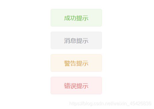
//传入对象参数
this.$toast({

	type: 'success',
    size: 'default',
    message: '成功提示',
    duration: 3000
})
this.$toast({

    type: 'info',
    size: 'default',
    message: '消息提示',
    duration: 3000
})
this.$toast({

    type: 'warning',
    size: 'default',
    message: '警告提示',
    duration: 3000
})
this.$toast({

    type: 'error',
    size: 'default',
    message: '错误提示',
    duration: 3000
})

//传入字符串参数(该参数会做为参数中message属性的值)
this.$toast('提示消息')
效果:
Vue.extend 实现 Dialog 对话框组件封装
在 components 目录下新建 Dialog 文件夹作为 Dialog 组件文件,新建 index.vue 和 index.js 文件进行组件封装,并在 main.js 中将组件挂载到 vue 原型上实现全局使用
components/Dialog/index.vue:
<template>
    <div id="dialog">
        <div class="dialog-box">
            <p class="title">{
     {
      title }}</p>
            <p class="content">{
     {
      content }}</p>
            <div class="btn-box">
                <button class="left-btn" @click="cancel">{
     {
      left_buttton }}</button>
                <button class="right-btn" @click="ok">{
     {
      right_buttton }}</button>
            </div>
        </div>
    </div>
</template>

<script>
export default {

    name: 'dialog',
    data() {

        return {

            //显示标题,默认为“提示”
            title: '提示',
            //显示内容
            content: '',
            //左按钮显示文本,默认为“取消”
            left_buttton: '取消',
            //右按钮显示文本,默认为“确定”
            right_buttton: '确定'
        }
    },
    methods: {

        //点击取消按钮
        cancel() {

            this.onCancel()  //点击取消的回调函数
            this.$destroy(true)  //销毁组件
            this.$el.parentNode.removeChild(this.$el)  //父元素中移除dom元素($el为组件实例)
        },
        //点击确定按钮
        ok() {

            this.onOk()  //点击确定的回调函数
            this.$destroy(true)  //销毁组件
            this.$el.parentNode.removeChild(this.$el)  //父元素中移除dom元素($el为组件实例)
        }
    }
}
</script>

<style lang='less' scoped>
    #dialog {

        position: fixed;
        top: 0;
        left: 0;
        right: 0;
        bottom: 0;
        background-color: rgba(0, 0, 0, 0.2);
        z-index: 9999;
        .dialog-box {

            width: 400px;
            border-radius: 2px;
            background-color: #fff;
            position: absolute;
            top: 100px;
            left: 50%;
            transform: translateX(-50%);
            padding: 20px 30px;
            box-sizing: border-box;
            .title {

                font-size: 20px;
                margin-bottom: 15px;
                text-align: center;
            }
            .content {

                font-size: 16px;
                line-height: 22px;
            }
            .btn-box {

                width: 100%;
                height: 70px;
                padding-top: 32px;
                padding-left: 170px;
                box-sizing: border-box;
                button {

                    width: 65px;
                    height: 38px;
                    font-size: 16px;
                    margin-left: 20px;
                    border-radius: 2px;
                    border: none;
                    outline: none;
                    cursor: pointer;
                }
                .left-btn {

                    background-color: #DCDFE6;
                    color: #606266;
                }
                .right-btn {

                    background-color: #409EFF;
                    color: #fff;
                }
            }
        }
    }
</style>
components/Dialog/index.js:
import Vue from 'vue'
import Dialog from './index.vue'

//创建Dialog构造器
let DialogConstrutor = Vue.extend(Dialog)
let instance

const dialog = function(options = {
     }) {

    //设置默认参数为对象,如果参数为字符串,参数中message属性等于该参数,回调函数为空
    if(typeof options === 'string') {

        options = {

            content: options,
            onOk: () => {
     },
            onCancel: () => {
     }
        }
    }
    //创建实例
    instance = new DialogConstrutor({

        data: options
    })
    //将实例挂载到body下
    document.body.appendChild(instance.$mount().$el)
}

export default dialog
main.js:
import Vue from 'vue'
import App from './App.vue'
import Less from 'less'
import router from './router'

//引入Dialog组件
import Dialog from './components/Dialog'

Vue.use(Less)
Vue.config.productionTip = false

//将Dialog组件挂载到vue原型上
Vue.prototype.$dialog= Dialog

new Vue({

  router,
  render: h => h(App),
}).$mount('#app')
在需要使用 Dialog 组件的地方调用 this.$dialog) 并传入参数使用
//传入对象参数
this.$dialog({

    title: '提示',
    content: '这是一段提示信息',
    left_buttton: '取消',
    right_buttton: '确定',
    onOk: () => {

        console.log('ok');
    },
    onCancel: () => {

        console.log('cancel');
    }
})

//传入字符串参数(该参数会做为参数中content属性的值,回调函数为空)
this.$dialog('这是一段提示信息')
效果:
