数据图表可视化
According to the World Economic Forum, the world produces 2.5 quintillion bytes of data every day. With so much data, it’s become increasingly difficult to manage and make sense of it all. It would be impossible for any person to wade through data line-by-line and see distinct patterns and make observations.
根据世界经济论坛的数据 ,世界每天产生2.5亿字节的数据。 拥有如此多的数据,变得越来越难以管理和理解所有内容。 任何人都不可能逐行浏览数据并看到不同的模式并进行观察。
Data visualization is one of the data science processes; that is, a framework for approaching data science tasks. After data is collected, processed, and modeled, the relationships need to be visualized for the conclusions.
数据可视化是数据科学过程之一; 即,用于处理数据科学任务的框架。 在收集,处理和建模数据之后,需要对关系进行可视化以得出结论。
We use data visualization as a technique to communicate insights from data through visual representation. Our main goal is to distill large datasets into visual graphics to allow for a straightforward understanding of complex relationships within the data.
我们使用数据可视化作为一种技术,通过可视化表示传达来自数据的见解。 我们的主要目标是将大型数据集提取为可视图形,以便直接了解数据中的复杂关系。
So now, we know data visualization can provide insight that traditional descriptive statistics cannot. Our big question is how to choose the right chart for the data?
因此,现在,我们知道数据可视化可以提供传统描述性统计不能提供的见解。 我们的主要问题是如何为数据选择正确的图表?
This note will give us an overview of the different chart types. For each type of chart, we will introduce a short description. We then discuss when to use it and when we should avoid using it. Next, we will look at some Python code for implementation. I only present the primary principle; the full version will be provided at the end of this article.
本说明将概述不同的图表类型。 对于每种类型的图表,我们将简要介绍。 然后,我们讨论何时使用它以及何时应避免使用它。 接下来,我们将看一些用于实现的Python代码。 我只介绍主要原则; 完整版本将在本文结尾处提供。
I hope this note is interesting enough to pick up the slack. Let’s hop to it.
我希望此笔记足够有趣,可以弥补这一不足。 让我们跳到它。
您想讲什么故事? (What story do you want you to tell?)
Before making a chart, it’s essential to understand why we need one. Graphs, plots, maps, and diagrams help people understand complex data, find patterns, identify trends, and tell stories. Think about the message we want to share with our audience. Here, I group the charts by their data visualization functions, that is, what we want our charts to communicate with our audience. While each chart’s allocation into specific functions isn’t a perfect system, it still works as a useful guide for selecting a chart based on our analysis or communication needs.
在制作图表之前,必须了解我们为什么需要一个图表。 图形,曲线图,地图和图表可帮助人们理解复杂的数据,查找模式,识别趋势并讲故事。 考虑一下我们想与听众分享的信息。 在这里,我通过图表的数据可视化功能(即我们希望图表与受众交流)对图表进行分组。 尽管每个图表分配到特定功能上并不是一个完美的系统,但它仍然可以作为根据我们的分析或沟通需求选择图表的有用指南。
The first part of this note will introduce us to different charts to display the connection between variables, the trend over time, and the relative order of variables within category(ies)
本说明的第一部分将向我们介绍不同的图表,以显示变量之间的联系,随时间的趋势以及类别中变量的相对顺序。
关系 (Relationship)
1. Scatter plot using Matplotlib2. Marginal Histogram3. Scatter plot using Seaborn4. Pair Plot in Seaborn5. Heat Map
1.使用Matplotlib2进行散点图。 边际直方图3。 使用Seaborn4的散点图。 Seaborn5中的配对图。 热图
随时间变化的数据 (Data over Time)
6. Line Chart7. Area Chart8. Stack Area Chart9. Area Chart Unstacked
6.折线图7。 面积图8。 堆栈面积图9。 区域图未堆叠
排行 (Ranking)
10. Vertical Bar Chart11. Horizontal Bar Chart12. Multi-set Bar Chart13. Stack Bar Chart14. Lollipop Chart
10.垂直条形图11。 水平条形图12。 多组条形图13。 堆栈条形图14。 棒棒糖图
The second part of this note will introduce us to different chart types use to compare variables and their distribution.
本说明的第二部分将向我们介绍用于比较变量及其分布的不同图表类型。
分配 (Distribution)
15. Histogram16. Density Curve with Histogram17. Density Plot18. Box Plot19. Strip Plot20. Violin Plot21. Population Pyramid
15.直方图16。 带直方图的密度曲线17。 密度图18。 箱线图19。 带状图20。 小提琴图21。 人口金字塔
比较 (Comparisons)
22. Bubble Chart23. Bullet Chart24. Pie Chart25. Net Pie Chart26. Donut Chart27. TreeMap28. Diverging Bar29. Choropleth Map30. Bubble Map
22.气泡图23。 项目符号图24。 饼图25。 净饼图26。 甜甜圈图27。 树图28。 分流栏29。 Choropleth Map 30。 气泡图
关系 (Relationship)
We use a relationship method to display a connection or correlation between two or more variables.
我们使用一种关系方法来显示两个或多个变量之间的联系或相关性。
When assessing a relationship between data sets, we are trying to understand how two or more data sets combine and interact with each other.
在评估数据集之间的关系时,我们试图了解两个或更多数据集如何组合并彼此交互。
This relationship is called correlation, and it can be positive or negative, meaning that the variables considered might be supportive or working against each other.
这种关系称为相关性,它可以是正数或负数,意味着所考虑的变量可能是相互支持的或相互影响的。
1.使用Matplotlib进行散点图 (1. Scatter plot using Matplotlib)
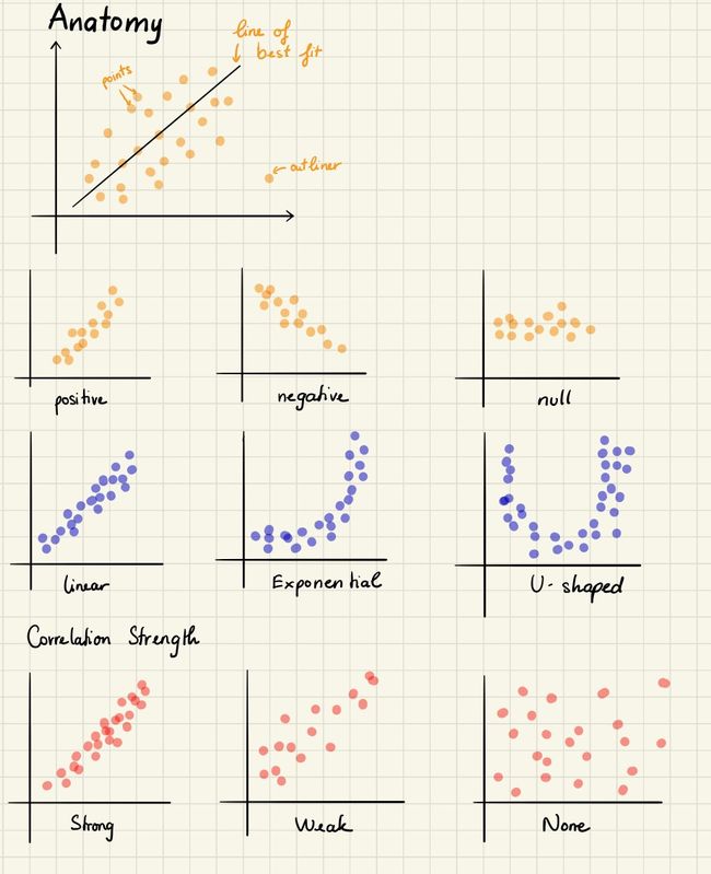
Author 作者A scatter plot is a type of chart that is often used in statistics and data science. It consists of multiple data points plotted across two axes. Each variable depicted in a scatter plot would have various observations. It can be an advantageous chart type whenever we see any relationship between the two data sets.
散点图是统计和数据科学中经常使用的一种图表。 它由在两个轴上绘制的多个数据点组成。 散点图中描绘的每个变量将具有各种观察结果。 每当我们看到两个数据集之间的任何关系时,它都是一种有利的图表类型。
We use a scatter plot to identify the data’s relationship with each variable (i.e., correlation or trend patterns.) It also helps in detecting outliers in the plot.
我们使用散点图来识别数据与每个变量的关系(即相关性或趋势模式)。这也有助于检测图中的离群值。
In machine learning, scatter plots are often used in regression, where x and y are continuous variables. They are also used in clustering scatters or outlier detection.
在机器学习中,散点图通常用于回归,其中x和y是连续变量。 它们还用于聚类分散或离群值检测。
Scatter plots are not suitable if we are interested in observing time patterns.
如果我们对观察时间模式感兴趣,则散点图不适合。
A scatter plot is used with numerical data or numbers. So, if we have categories such as three divisions, five products, etc., a scatter plot would not reveal much.
散点图与数字数据或数字一起使用。 因此,如果我们具有三个部门,五个产品等类别,则散点图不会显示太多。
Python实现 (Python Implementation)
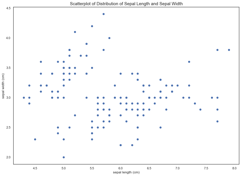
We use the Iris dataset for visualization.
我们使用虹膜数据集进行可视化。
plt.scatter(iris_df['sepal length (cm)'], iris_df['sepal width (cm)'])
plt.title('Scatterplot of Distribution of Sepal Length and Sepal Width', fontsize=15)
plt.xlabel('sepal length (cm)')
plt.ylabel('sepal width (cm)')2.边际直方图 (2. Marginal Histogram)
Marginal histograms are histograms added to the margin of each axis of a scatter plot for analyzing the distribution of each measure.
边际直方图是添加到散点图各轴边缘的直方图,用于分析每个度量的分布。
We use a marginal histogram to assess the relationship between two variables and examine their distributions. Putting marginal histograms in scatter plots or adding marginal bars on highlighted tables makes the visualization interactive, informative, and impressive.
我们使用边际直方图来评估两个变量之间的关系并检查它们的分布。 将边际直方图放在散点图中或在突出显示的表格上添加边际条形图,使可视化具有交互性,信息量和令人印象深刻。
Python实现 (Python Implementation)
# A seaborn jointplot shows bivariate scatterplots and univariate histograms in the same figure
p = sns.jointplot(iris_df['sepal length (cm)'], iris_df['sepal width (cm)'], height=10)3.使用Seaborn的散点图 (3. Scatter plot using Seaborn)
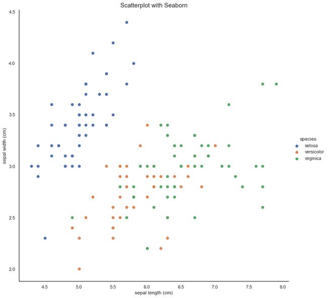
Our goal here is to produce a legend to understand the differences between groups. We will use seaborn’s FacetGrid to color the scatterplot by species.
我们的目标是产生一个图例,以了解组之间的差异。 我们将使用seaborn的FacetGrid按物种对散点图进行着色。
sns.FacetGrid(iris_df, hue=’species’, size=10) \
 .map(plt.scatter, ‘sepal length (cm)’, ‘sepal width (cm)’) \
 .add_legend()
plt.title(‘Scatterplot with Seaborn’, fontsize=15)4. Seaborn中的配对图 (4. Pair plot in Seaborn)
Another useful seaborn plot is pairplot, which shows the bivariate relationship between each pair of features. From the pair plot, we’ll see that the Iris-setosa species is separated from the other two across all feature combinations.
另一个有用的seaborn图是pairplot ,它显示了每对pairplot之间的双变量关系。 从对图中,我们可以看到鸢尾(Iris-setosa)物种在所有特征组合中都与其他两个物种分开。
sns.pairplot(iris_df.drop(“target”, axis=1), hue=”species”, height=3)5.热图 (5. Heat map)
A heatmap is a graphical representation of data that uses a system of color-coding to represent different values. Heatmaps are useful for cross-examining multivariate data, through placing variables in rows and columns and coloring cells within the table.
热图是使用颜色编码系统表示不同值的数据的图形表示。 热图可用于交叉检查多元数据,方法是将变量放置在行和列中,并为表格中的单元格上色。
Author 作者All the rows are one category (labels displayed on the left side), and all the columns are another category (labels displayed on the bottom). The individual rows and columns are divided into the subcategories, which all match each other in a matrix. The cells within the table either contain color-coded categorical data or numerical data based on a color scale. Data in a cell demonstrates the relationship between two variables in the connecting row and column.
所有行都是一个类别(标签显示在左侧),所有列都是另一类别(标签显示在底部)。 各个行和列分为子类别,它们在一个矩阵中彼此匹配。 该表中的单元格包含颜色编码的分类数据或基于色标的数字数据。 单元格中的数据演示了连接的行和列中两个变量之间的关系。
Heatmaps are useful for showing variance across multiple variables, revealing any patterns, displaying whether any variables are similar, and detecting any correlations between them.
热图可用于显示多个变量之间的方差,显示任何模式,显示任何变量是否相似以及检测它们之间的任何相关性。
Heatmap can be super useful when we want to see which intersections of the categorical values have a higher concentration of the data than others.
当我们要查看分类值的哪些交集比其他交集具有更高的数据集中度时,热图可能会非常有用。
Heatmaps are better suited to displaying a more generalized view of numerical data. It is harder to accurately tell the differences between color shades and extract specific data points (unless we include the cells’ raw data).
热图更适合于显示更通用的数值数据视图。 很难准确分辨出颜色之间的差异并提取特定的数据点(除非我们包括单元格的原始数据)。
Heatmaps can also show the changes in data over time if one of the rows or columns is set to time intervals. An example of this would be to use a heatmap to compare the temperature changes across the year in the city(ies), to see the hottest or coldest places. So the rows contain each month, the columns indicate hours, and the cells would have the temperature values.
如果将行或列之一设置为时间间隔,则热图还可以显示数据随时间的变化。 例如,可以使用热图比较城市中全年的温度变化,以查看最热或最冷的地方。 因此,行包含每个月,列表示小时,单元格将具有温度值。
Data Viz with Python and R 使用Python和R的Data VizPython实现 (Python Implementation)
We use the World Happiness Report dataset from Kaggle. I cleaned the data and combined all files into the happiness_rank.csv file. You can download and clean the data or download the final result here. I recommend you check out my data cleaning codes on Github.
我们使用来自Kaggle的世界幸福报告数据集。 我清理了数据,并将所有文件合并到了happiness_rank.csv文件中。 您可以在此处下载和清除数据或下载最终结果。 我建议您在Github上查看我的数据清理代码。
sns.heatmap(happy[usecols].corr(),linewidths=0.25,
            vmax=0.7,square=True,cmap="Blues",
            linecolor='w',annot=True,annot_kws={"size":8},
mask=mask, cbar_kws={"shrink": .9})随时间变化的数据 (Data over time)
Sometimes it isn’t enough to know that a relationship exists between variables; in some cases, better analysis is possible if we can also visualize when the relationship took place. Because relationships are denoted with links between variables, the date/time appears as a link property. This visualization method shows data over the period to find trends or changes over time.
有时仅仅知道变量之间存在关系是不够的。 在某些情况下,如果我们还可以可视化关系发生的时间,则可以进行更好的分析。 因为关系是用变量之间的链接表示的,所以日期/时间显示为链接属性。 这种可视化方法显示了一段时间内的数据,以查找随时间变化的趋势或变化。
6.折线图 (6. Line Chart)
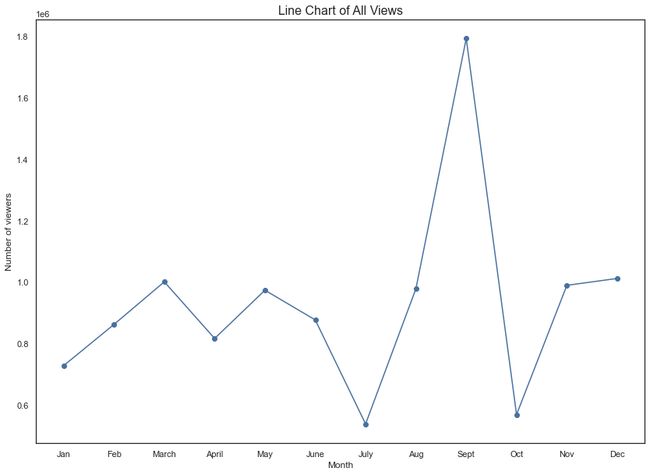
Line charts are used to display quantitative values over a continuous interval or period.
折线图用于显示连续间隔或一段时间内的定量值。
Line charts are drawn by first plotting data points on a cartesian coordinate grid and then connecting them. Typically, the y-axis has a quantitative value, while the x-axis is a timescale or a sequence of intervals. The direction of the lines on the graph works as an excellent metaphor for the data: an upward slope indicates increasing values, and a downward slope indicates where values have decreased. The line’s journey across the graph can create patterns that reveal trends in a dataset.
通过首先在笛卡尔坐标网格上绘制数据点,然后将它们连接起来来绘制折线图。 通常,y轴具有定量值,而x轴是时间刻度或间隔序列。 图上线条的方向很好地隐喻了数据:向上的斜率指示值增加,而向下的斜率指示值减少的位置。 线在图形上的行程可以创建揭示数据集中趋势的模式。
Line charts are most frequently used to show trends and analyze how the data has changed over time.
折线图最常用于显示趋势并分析数据随时间的变化。
Line charts are best for continuous data as it connects many variables that all belong to the same category.
折线图最适合连续数据,因为它连接了许多都属于同一类别的变量。
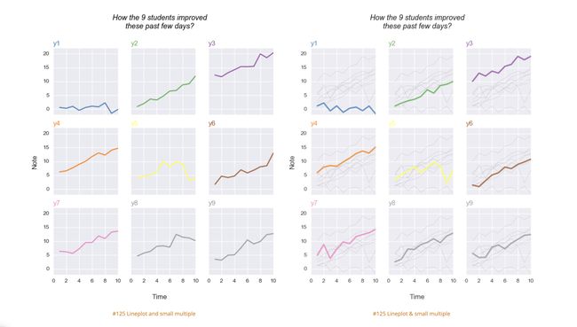
The Python Chart Gallery Python图表库When grouped with other lines or other data series, individual lines can be compared. However, we should avoid using more than four lines per graph, as this makes the chart more cluttered and harder to read. A solution to this is to split our chart into multiples subplots.
与其他行或其他数据系列分组时,可以比较各个行。 但是,我们应该避免在每个图形上使用多于4条线,因为这会使图形更加混乱并且难以阅读。 解决方案是将图表拆分为多个子图。
Python实现 (Python Implementation)
Suppose we have a dataset containing information about Medium members. We want to see the trend of articles that have been read in 2019.
假设我们有一个包含有关Medium成员信息的数据集。 我们希望看到2019年已阅读文章的趋势。
plt.plot(data['Month'], data['All Views'], color='#4870a0', marker='o')7.面积图 (7. Area Chart)
The idea of an area chart is based on the line chart. The colored region shows us the development of a variable over time.
面积图的概念基于折线图。 彩色区域向我们展示了变量随时间的变化。
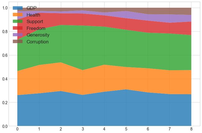
Area charts are ideal for clearly illustrating the magnitude of change between two or more data points. For example, the happiness score has six generating divisions; we would like to see each of these divisions’ contributions.
区域图非常适合清晰地说明两个或多个数据点之间的变化幅度。 例如,幸福感分数有六个生成部分; 我们希望看到每个部门的贡献。
Matplotlib Cheat Sheet Matplotlib备忘单Moreover, if we are interested in the portion generated by each division and not that much of the total amount of the division self, we can use a 100% stacked area chart. This will show each division’s percentage contribution over time.
此外,如果我们对每个分区生成的部分感兴趣,而不是对分区自身总量的感兴趣,则可以使用100%堆叠面积图。 这将显示每个部门随时间的百分比贡献。
Area charts are not the best choice if we want to present fluctuating values, like the stock market or price changes.
如果我们要显示波动的值(例如股票市场或价格变化),则面积图不是最佳选择。
Python实现 (Python Implementation)
Here, we want to present an accumulative number of external views over time.
在这里,我们要介绍一段时间内累积的外部视图数量。
plt.stackplot(data['Month'], data['External Views'], colors='#7289da', alpha=0.8)7.堆栈面积图 (7. Stack Area Chart)
The idea of a stack area chart is based on the simple area charts. It displays the value of several groups on the same graphic. Values of each group are displayed on top of each other. The entire graph represents the total of all data plotted over time.
堆栈面积图的概念基于简单面积图。 它在同一图形上显示几个组的值。 每个组的值都显示在彼此的顶部。 整个图形表示随时间绘制的所有数据的总数。
The stacked area chart type is a powerful chart as it allows grouping of data and seeing trends over a selected date range.
堆积面积图类型是一种功能强大的图表,它允许对数据进行分组并查看选定日期范围内的趋势。
Stacked area charts use the areas to convey whole numbers, so they do not work for negative values.
堆叠面积图使用面积来传达整数,因此它们不适用于负值。
Stacked area charts are colorful and fun, but we should use them with caution because they can quickly become a mess. We shouldn’t stack together more than five categories.
堆积面积图丰富多彩而且有趣,但是我们应该谨慎使用它们,因为它们会很快变得一团糟。 我们不应将五个类别叠加在一起。
Python实现 (Python Implementation)
plt.stackplot(data['Month'], data['Internal Views'], data['External Views'],
              alpha=0.75,
              colors=['#7289da','#f29fa9'],
labels=['Internal Views', 'External Views'])9.区域图未堆叠 (9. Area Chart Unstacked)
Unlike a stack area chart, an area chart unstacked shows the overlap of several groups on the same graphic.
与堆叠面积图不同,未堆叠的面积图显示同一图形上多个组的重叠。
x = data['Internal Views']
y = data['External Views']# plot the data
ax.plot(x, color='#49a7c3', alpha=0.3, label='Internal Views')
ax.plot(y, color='#f04747', alpha=0.3, label='External Views')# fill the areas between the plots and the x axis
# this can create overlapping areas between lines
ax.fill_between(x.index, 0, x, color='blue', alpha=0.2)
ax.fill_between(x.index, 0, y, color='red', alpha=0.2)排行 (Ranking)
A visualization method displays the relative order of data values.
可视化方法显示数据值的相对顺序。
条形图 (Bar Chart)
Bar charts are among the most frequently used chart types. As the name suggests, a bar chart is composed of a series of bars illustrating a variable’s development.
条形图是最常用的图表类型之一。 顾名思义,条形图由一系列说明变量发展的条形图组成。
There are four types of bar charts: horizontal bar chart, verticle bar chart, group bar chart, and stacked bar chart.
条形图有四种类型:水平条形图,垂直条形图,组条形图和堆叠条形图。
Bar charts are great when we want to track the development of one or two variables over time. One axis of the chart shows the specific categories being compared, and the other axis represents a measured value.
当我们想跟踪一个或两个变量随时间的变化时,条形图非常有用。 图表的一个轴显示要比较的特定类别,另一个轴代表测量值。
A simple bar chart isn’t suitable when we have a single period breakdown of a variable. For example, if I want to portray the main business lines that contributed to a company’s revenues, I wouldn’t use a bar chart. Instead, I would create a pie chart or one of its variations.
当我们对变量进行单周期细分时,简单的条形图不适用。 例如,如果我要描绘对公司收入有贡献的主要业务,则不会使用条形图。 相反,我将创建一个饼图或其变体之一。
10.垂直条形图 (10. Vertical Bar Chart)
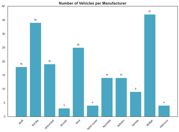
Vertical bar charts (column chart) are distinguished from histograms, as they do not display continuous developments over an interval. Vertical bar chart’s discrete data is categorical and therefore answers the question of “how many?” in each category.
垂直条形图(柱形图)与直方图有所区别,因为它们在一定的时间间隔内不显示连续的变化。 垂直条形图的离散数据是分类数据,因此回答了“多少?”的问题。 在每个类别中。
Vertical bar charts are typically used to compare several items in a specific range of values. So it is ideal for comparing a single category of data between individual sub-items, for example, corresponding revenue between regions.
垂直条形图通常用于比较特定值范围内的多个项目。 因此,比较单个子项目之间的单个数据类别(例如,区域之间的相应收入)是理想的。
Python实现 (Python Implementation)
We use mpg_ggplot2 data frame. It is a rectangular collection of variables (in the columns) and observations (in the rows). mpg contains observations collected by the US Environmental Protection Agency on 38 popular models of car.
我们使用mpg_ggplot2数据帧。 它是变量(在列中)和观察值(在行中)的矩形集合。 mpg包含美国环境保护署收集的关于38种流行车型的观察结果。
Python实现 (Python Implementation)
Here, we want to compare car models.
在这里,我们要比较汽车型号。
plt.bar(value_count.index, value_count.values, color='#49a7c3')11.水平条形图 (11. Horizontal bar chart)
Horizontal bar charts represent the data horizontally. The data categories are shown on the y-axis, and the data values are shown on the x-axis. The length of each bar is equal to the value corresponding to the data category, and all bars go across from left to right.
水平条形图水平表示数据。 数据类别显示在y轴上,数据值显示在x轴上。 每个条的长度等于与数据类别对应的值,并且所有条从左到右穿过。
Python Implementation (Python Implementation)
plt.barh(value_count.index, value_count.values, color='#b28eb2')13.多组条形图 (13. Multi-set Bar Chart)
Also known as a Grouped Bar Chart or Clustered Bar Chart.
也称为分组条形图或群集条形图。
This variation of a bar chart is used when two or more data series are plotted side-by-side and grouped under categories, all on the same axis.
当两个或多个数据系列并排绘制并按类别分组时,都使用条形图的这种变化,它们都在同一轴上。
We use multi-set bar charts to compare grouped variables or categories to other groups with those same variables or category types.
我们使用多组条形图将分组的变量或类别与具有相同变量或类别类型的其他组进行比较。
The downside of group bar charts is that they become harder to read the more bars we have in one group.
组条形图的不利之处在于,它们变得难以阅读一组中更多条形图。
Python实现 (Python Implementation)
ax = views.plot.bar(rot=0,color='#E6E9ED',width=1, figsize=(14,8))
ax = df.plot.bar(rot=0, ax=ax, color=['#7289da', '#dd546e', '#99aab5', '#f3c366'],
width=0.8, figsize=(14,8))13.堆栈条形图 (13. Stack Bar Chart)
Unlike a multi-set bar chart that displays their bars side-by-side, stacked bar charts segment their bars. Stacked bar charts are used to show how a broader category is divided into smaller categories and what the relationship of each part has on the total amount.
与多组条形图并排显示的条形图不同,堆叠式条形图将条形图分段。 堆叠的条形图用于显示如何将较宽的类别划分为较小的类别,以及各个部分与总量的关系。
Stacked bar charts place each value for the segment after the previous one. The total value of the bar is all the segment values added together. It is ideal for comparing the total amounts across each group/segmented bar.
堆叠的条形图将细分的每个值放在前一个值之后。 条的总和是所有细分值的总和。 比较每个组/分段条上的总量非常理想。
One major flaw of Stacked bar charts is that they become harder to read the more segments each bar has. Also, comparing each component to each other is difficult, as they are not aligned on a common baseline.
堆积条形图的一个主要缺陷是,它们变得难以阅读每个条形图具有的更多细分。 而且,很难将每个组件彼此进行比较,因为它们没有在同一基线上对齐。
Python实现 (Python Implementation)
rect1 = plt.bar(data['Month'] ,data['Internal Views'],
                width=0.5, color='lightblue')
rect2 = plt.bar(data['Month'], data['External Views'],
width=0.5, color='#1f77b4')14.棒棒糖图 (14. Lollipop Chart)
Lollipop chart serves a similar purpose as an ordered bar chart in a visually pleasing way. We use lollipop charts to show the relationship between a numerical variable and another numerical or categorical variable.
棒棒糖图表在视觉上令人愉悦,其功能与订购条形图相似。 我们使用棒棒糖图表来显示数值变量与另一个数值或类别变量之间的关系。
The lollipop chart is often claimed to be useful compared to a standard bar chart if we are dealing with a large number of values and when values are all high, such as in the 80–90% range (out of 100%). Then a broad set of tall columns can be visually aggressive.
如果我们要处理大量值并且值都很高时(例如80-90%的范围(超过100%)),则通常认为棒棒糖图与标准条形图相比是有用的。 然后,一系列高大的柱子可能会在视觉上具有侵略性。
If our data has unsorted bars of very similar length — it is harder to compare the sizes of two very identical lollipops than standard bars.
如果我们的数据具有长度非常相似的未排序条形图,那么与标准条形图相比,很难比较两个完全相同的棒棒糖的大小。
Python Implementation
Python实现
(markerline, stemlines, baseline) = plt.stem(value_count.index, value_count.values)That’s it for the first part. The code is available on Github. We will continue with distributions and comparisons on part two.
就是第一部分。 该代码在Github上可用。 我们将在第二部分继续进行分布和比较。
So far, we know that data visualization is a quick, easy way to convey concepts universally — and we can experiment with different scenarios by making slight adjustments.
到目前为止,我们知道数据可视化是一种普遍表达概念的快速,简便的方法-我们可以通过稍作调整来尝试不同的方案。
There are dozens of tools for data visualization and data analysis — these range from simple — zero codings required (Tableau) to complex — coding required (JaveScript). Not every tool is right for every person looking to learn visualization techniques, and not every tool can scale to industry or enterprise purposes.
有数十种用于数据可视化和数据分析的工具,范围从简单的零编码( Tableau )到复杂的编码( JaveScript )。 并非每种工具都适合希望学习可视化技术的每个人,也不是每种工具都能满足行业或企业目的。
My favorite professor told me that “Good data visualization theory and skills will transcend specific tools and products.” When we learn this skill, focus on best practices, and explore our style when it comes to visualizations and dashboards. Data visualization isn’t going away anytime soon, so it’s essential to build a foundation of analysis and storytelling, and exploration that you can carry with regardless of the tools or software you end up using.
我最喜欢的教授告诉我:“良好的数据可视化理论和技能将超越特定的工具和产品。” 当我们学习该技能时,请专注于最佳实践,并在可视化和仪表板方面探索我们的风格。 数据可视化不会很快消失,因此建立分析和讲故事以及探索的基础非常重要,无论最终使用什么工具或软件,都可以随身携带。
If you want to dig deeper into this particular topic, here are some excellent places to start.
如果您想更深入地研究这个特定主题,那么这里是一些不错的起点。
Information is Beautiful
信息很美
Visualizing data
可视化数据
Data Visualization Catalogue
数据可视化目录
Color Hex
颜色十六进制
Matplotlib Cheat Sheet
Matplotlib备忘单
How to make a heatmap with Seaborn in Python?
如何在Python中使用Seaborn制作热图?
翻译自: https://towardsdatascience.com/data-visualization-how-to-choose-the-right-chart-part-1-d4c550085ea7
数据图表可视化
