简介
柱状图一般用于,当我们都有一组分类变量以及每个类别的定量值,而我们关注的主要重点是定量值的大小时。
应该在柱状图背景保留横网格线,便于比较我们关注的值。
当分类label过长时,最好选择横向柱状图,避免出现旋转label,保持文字阅读方向与图形方向的统一性。
应该注意对柱状图进行排序(大小,分类变量,分布心态)。
当分类数据过多时,可以选择棒棒糖图(点图 + 点到坐标轴连线)或热图
ggplot2中柱状图的基本绘制函数有geom_bar() 和 geom_col(),其中geom_bar() 产生的柱状图映射是经过统计变换的(count, ..prop..);geom_col()是不经过统计变换的,代表的就是该分类变量的实际值。
1. 美学映射
x
y
alpha
colour
fill
group
linetype
size
ggplot2中柱状图的基本绘制函数有geom_bar() 和 geom_col(),其中geom_bar() 产生的柱状图映射是经过统计变换的(count, ..prop..);geom_col()是不经过统计变换的,代表的就是该分类变量的实际值。
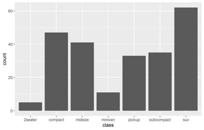
2. 简单柱状图
ggplot() + geom_bar(data = mpg, aes(x = class), stat = "count")
以每个x在数据集中出现的总数为y轴。
排序
ggplot2中一般数据和视觉元素映射是分开的,如果需要对柱状图排序,就需要对数据进行排序处理。 数据排序 柱状图排序
data_sorted <- mpg %>%
group_by(class) %>%
summarise(count = n()) %>%
mutate(class = fct_reorder(class, count))
ggplot() + geom_bar(data =data_sorted, aes(x = class, y = count),
stat = "identity")

外框颜色和填充颜色
ggplot() + geom_bar(data = mpg, aes(x = class), stat = "count",
fill = "white", colour="dodgerblue")

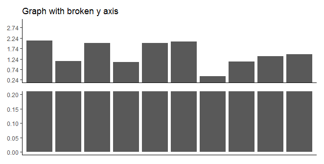
坐标轴中断
当柱状图非常高,展示时可以选择截断坐标轴,形成只有底部和上部的中断柱状图。
水平柱状图
当数据分组标签名字过长时,有一种方法是将label旋转,这样它们就不会互相重叠。
film <- data.frame(
 RANK =c(1,2,3,4,5),
 Title = c("Star Wars: The Last Jedi",
 "Jumanji_Welcome to the Jungle",
 "Pitch Perfect",
 "The Greatest Showman",
 "Ferdinand"),
 Weekend_gross = c(71565498, 36169328, 19928525, 805843, 7316746))
p <- ggplot() +  geom_bar(data = data_sorted,
 aes(x = Title2, y = Weekend_gross2),
 stat = "identity",
 width = 0.5,
 position = position_dodge(width = 0.9))
 p + theme(axis.text.x = element_text(angle = 45,
 vjust = 1,
 hjust = 1,
 size = 10),
 axis.text.y = element_text(size = 10))
但一般过长的名字,旋转后可读性也并不好,而且还破坏了整个图片中字符的水平排列一致性,所以比较好的解决办法是将坐标轴旋转( coord_flip()),生成水平柱状图。
library(tidyverse)
data_sorted <- film %>%
 mutate(Title2 = fct_reorder(Title, Weekend_gross),
 Weekend_gross2 = Weekend_gross/1000000)
ggplot() +  geom_bar(data = data_sorted,
 aes(x = Title2, y = Weekend_gross2),
 stat = "identity",
 width = 0.5,
 position = position_dodge(width = 0.9)) +
theme(panel.grid.major.x = element_line(colour = "black"),
 panel.background = element_blank(),
 axis.line.y = element_blank(),
 axis.title.y = element_blank()) +
 coord_flip()

误差线
- 标准差(sd)是描述性统计里用来表示数据本身均值范围的,两倍标准差范围以外就可能是异常值了,标准差的使用不牵扯均值对比推测,仅仅是描述性的。 2. 标准误(se)表示样本平均数对总体平均数的变异程度,反映抽样误差的大小,是量度结果精密度的指标。
注: 95%置信区间是用的Mean ± 2*SE,即ci。
箱线图和柱状图的误差线
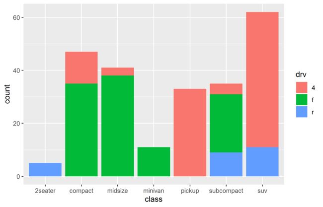
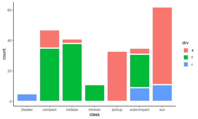
3. 堆叠柱状图
ggplot() + geom_bar(data = mpg, aes(x = class, fill = drv), stat = "count")
堆叠组块间留空
利用lwd参数增加外框线宽度,然后将外框线颜色和背景色统一,就可以形成堆叠间有间隔的柱状图。
ggplot() + geom_bar(data = mpg, aes(x = class, group = drv, fill = drv),
 stat = "count", lwd = 1.5, colour = "white") +
 theme_classic()
百分比堆叠图
- 比较各组中每个类别出现次数在该组中占的百分比
ggplot() + geom_bar(data = mpg, aes(x = class, fill = factor(cyl)),
 position = "fill")

- 比较各组中每个类别实际值在该组中占的百分比
data <- mpg %>%
 group_by(class, cyl) %>%
 summarise(count = n())
ggplot() + geom_bar(data =data, aes(x = class, y = count, fill = factor(cyl)),
 stat = "identity",
 position = "fill")
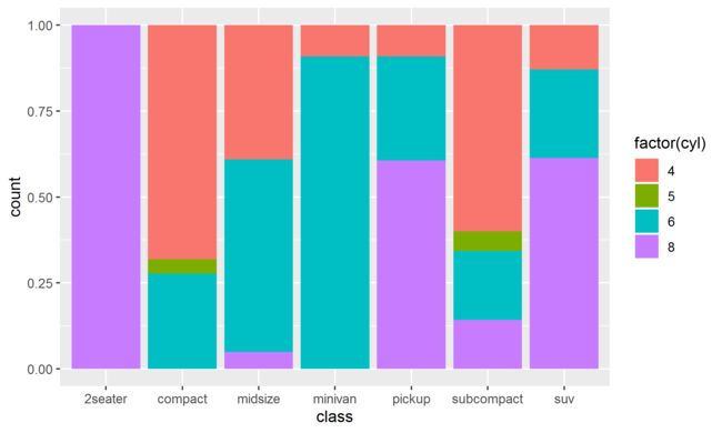
tips:由于数据集data中的count就是数据集mpg中每个组别的出现次数,因此值是图片是一样的。
堆叠柱状图连线
求出连线起点和终点坐标,用segment或line
ggalluvial
4. 并排柱状图
position = "dodge"
ggplot() + geom_bar(data = mpg,aes(x = class, fill=factor(cyl)), position="dodge")

position_dodge2()
2seater中的cyl在分组4,5和6上没有值,因此柱状图中2seater占据了x轴上4个位子的宽度。可以用position_dodge2解决, 其中的参数preserve = "single"使每个柱子宽度相同并居中,preserve = "total"结果与position_dodge相同。
ggplot() + geom_bar(data = mpg, aes(x = class, fill=factor(cyl)),
 position = position_dodge2(padding = 0,
 preserve = "single"))

并排柱状图的误差线
并排的柱状图误差线和单个的相同,但需要注意一些参数。
- position_dodge() 用position_dodge() 产生的并排柱状图,首先,需要给误差线一个分组依据,然后进行的potion调试:
data <- mpg %>%
 group_by(class, cyl) %>%
 summarise(count = n())
ggplot() + geom_col(data = data, aes(x = class, y = count, fill=factor(cyl)),
 position = position_dodge()) +
 geom_errorbar(data = data, aes(x = class,  ymin = count - 1, ymax = count + 1,
 group = factor(cyl)),
 width= 0.2,
 position = position_dodge(0.9))

由于width是根据柱子的宽度产生的,所以其宽度是不同的,我觉得应该有参数可以固定宽度,但是没有找到。
- position_dodge2() 同样的,position_dodge2()生成的并排柱状图,其error_bar()的position同样需要调试。
data <- mpg %>%
 group_by(class, cyl) %>%
 summarise(count = n())

ggplot() + geom_col(data = data, aes(x = class, y = count, fill = factor(cyl)),
 position = position_dodge2(padding = 0, preserve = "single")) +
 geom_errorbar(data = data, aes(x = class,
 ymin = count - 1,
 ymax = count + 1),
position = position_dodge2(padding = 0.5, preserve = "single"))

5. 棒棒糖图
a. 一个分组变量
data <- mpg %>%
group_by( manufacturer) %>%
summarise(count = n())
# 设置连线的起点Y坐标为0
data$ymin <- rep(0, 15)
ggplot(data = data) + geom_point(aes(x = manufacturer,
y = count),size = 5) +
geom_segment(aes(x = manufacturer, y = ymin,
xend = manufacturer, yend = count)) +
# 设置y轴从0开始
scale_y_continuous(expand = c(0,0))+
# 由于x轴名字有重叠,旋转坐标轴变成横向
coord_flip() +
theme(panel.background = element_blank(), # 去掉背景格子
# 显示x平行网格线
panel.grid.major.x = element_line(colour = "black"),
# 显示x轴坐标
axis.line.x = element_line(colour = "black"),
axis.title.y = element_blank())

[图片上传失败...(image-ae516e-1582459796851)]
b. 分组中再分组
data <- mpg %>%
group_by( manufacturer, cyl) %>%
summarise(count = n())
data$ymin <- rep(0, times = 32)
# 将两个分组信息合并生成新的分组,此时
data$group <- paste(data$manufacturer, data$cyl, sep="_")
theme <- theme(panel.background = element_blank(), # 去掉背景格子
# 显示x平行网格线
panel.grid.major.x = element_line(colour = "black"),
# 显示x轴坐标
axis.line.x = element_line(colour = "black"),
axis.title.y = element_blank())
ggplot(data = data) + geom_point(aes(x = group, y = count,
color = factor(cyl)),
size = 5) +
geom_segment(aes(x = group, y = ymin,
xend = group, yend = count)) +
scale_y_continuous(limits =c(0, 25) ,expand = c(0,0))+
coord_flip() + theme
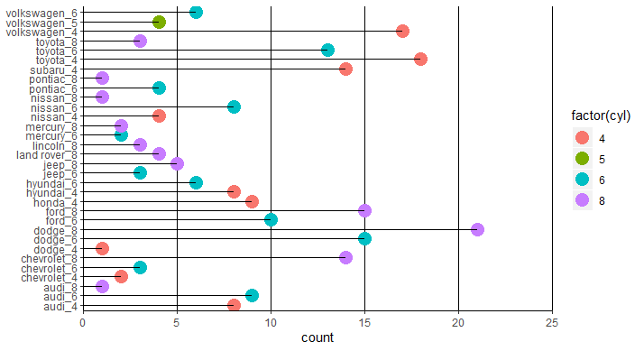
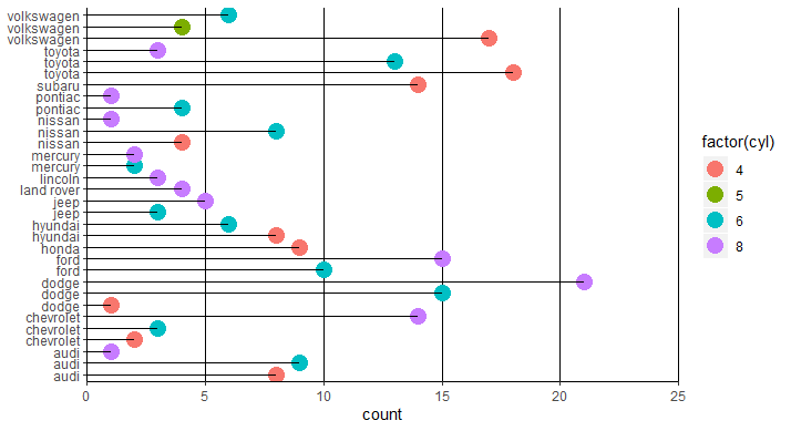
但x轴的labels就变成了合并后的文字,解决办法:
1.修改x轴信息
data <- mpg %>%
group_by( manufacturer, cyl) %>%
summarise(count = n())
data$ymin <- rep(0, times = 32)
as.integer()
data$index <- as.integer(rownames(data))
theme <- theme(panel.background = element_blank(), # 去掉背景格子
# 显示x平行网格线
panel.grid.major.x = element_line(colour = "black"),
# 显示x轴坐标
axis.line.x = element_line(colour = "black"),
axis.title.y = element_blank())
ggplot(data = data) + geom_point(aes(x = index, y = count,
color = factor(cyl)),
size = 5) +
geom_segment(aes(x = index, y = ymin,
xend = index, yend = count)) +
scale_y_continuous(limits =c(0, 25) ,expand = c(0,0)) +
# 修改坐标轴信息
scale_x_continuous(breaks = data$index,
labels = data$manufacturer) +
coord_flip() + theme
2.对分组变量添加label信息
data <- mpg %>%
group_by( manufacturer, cyl) %>%
summarise(count = n())
data$ymin <- rep(0, times = 32)
data$manufacturer <- factor(as.integer(rownames(data)),
labels = data$manufacturer)
theme <- theme(panel.background = element_blank(), # 去掉背景格子
# 显示x平行网格线
panel.grid.major.x = element_line(colour = "black"),
# 显示x轴坐标
axis.line.x = element_line(colour = "black"),
axis.title.y = element_blank())
ggplot(data = data) + geom_point(aes(x = manufacturer, y = count,
color = factor(cyl)),
size = 5) +
geom_segment(aes(x = manufacturer, y = ymin,
xend = manufacturer, yend = count)) +
scale_y_continuous(limits =c(0, 25) ,expand = c(0,0)) +
coord_flip() + theme
3.structure() - Attributes信息
所有对象都可以具有任意其他属性。可以将它们视为该列表和命名列表构成的数据框。 可以使用attr()单独访问属性,也可以使用attribute()一次访问所有属性列表。而structure()函数是R中给对象赋予Attributes的函数。
names, character vector of element names
labels
class, used to implement the S3 object system, described in the next section
dim, used to turn vectors into high-dimensional structures
data <- mpg %>%
group_by( manufacturer, cyl) %>%
summarise(count = n())
data$ymin <- rep(0, times = 32)
data$index <- fct_inseq(rownames(data))
# 添加Attributes - 也是labels
labels <- structure(data$manufacturer,
labels = data$index)
theme <- theme(panel.background = element_blank(), # 去掉背景格子
# 显示x平行网格线
panel.grid.major.x = element_line(colour = "black"),
# 显示x轴坐标
axis.line.x = element_line(colour = "black"),
axis.title.y = element_blank())
ggplot(data = data) + geom_point(aes(x = index, y = count,
color = factor(cyl)),
size = 5) +
geom_segment(aes(x = index, y = ymin,
xend = index, yend = count)) +
scale_y_continuous(limits =c(0, 25) ,expand = c(0,0)) +
scale_x_discrete(labels = labels) +
coord_flip() + theme
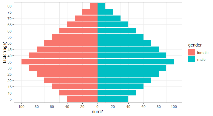
6. 金字塔图
金字塔图的核心就是找到需要分开的变量,然后以它为依据对数据进行正和负变换,然后将正负坐标轴强制设置成对应的正值。
set.seed(13)
data <- data.frame(num = rep(c(seq(from = 10, to = 100, by = 10),
rev(seq(from = 40, to = 90, by = 10))),
times = 2),
age = rep(seq(from = 80, to = 5, by = -5),
times = 2),
gender = rep(c("male", "female"), each = 16))
# 根据性别对num赋值
data$num2 <- ifelse(data$gender == "male",
data$num *1,
data$num * -1)
ggplot(data = data) + geom_col(aes(x = factor(age),
y = num2,
fill = gender)) +
scale_y_continuous(breaks = seq(from = -100, to = 100,
by = 20),
labels = c(seq(100, 0, -20),
seq(20, 100, 20))) +
coord_flip() + theme_bw()