1、npm init;
2、npm install gulp;
3、npm install --save-dev gulp-autoprefixer;(安装gulp-autoprefixer )
4、配置gulpfile.js文件;
我的gulpfile.js文件内容:
const gulp = require('gulp');
const autoprefixer = require('gulp-autoprefixer');

gulp.task('default', () =>
    gulp.src('./before/css.css')
        .pipe(autoprefixer({
            browsers: ['> 5%'], // 重要配置 详见下面
            cascade: false //  是否美化属性值
        }))
        .pipe(gulp.dest('./before/dist'))
);
我的package.json文件内容:
{
  "name": "css3post",
  "version": "1.0.0",
  "description": "",
  "main": "index.js",
  "dependencies": {
    "gulp-autoprefixer": "^3.1.1",
    "gulp": "^3.9.1"
  },
  "devDependencies": {
    "gulp-autoprefixer": "^3.1.1"
  },
  "scripts": {
    "test": "echo \"Error: no test specified\" && exit 1"
  },
  "author": "",
  "license": "ISC"
}
5、gulp (因为gulpfile.js文件中gulp.task为'default',所以这里可以直接输入gulp就可以执行了)
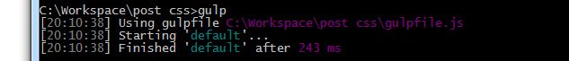
Paste_Image.png
完成前的css文件:
.circularA{
    width: 100px;
    height:100px;
    border: 1px solid #000;
    border-radius: 10px;
    background-color: #6633FF;
    text-align: center;
    line-height: 100px;
    margin: 10px;
}
.circularB{
    width: 100px;
    height:100px;
    border: 1px solid #000;
    border-radius: 50%;
    background-color: #FF6699;
    text-align: center;
    line-height: 100px;
    margin: 10px;
}
.shadow{
    background-color: white;
    box-shadow: 0 4px 8px 0 rgba(0, 0, 0, 0.2), 0 6px 20px 0 rgba(0, 0, 0, 0.19);
    text-align: center;
    margin: 10px;
    width: 50%;
    height: 50%;
    color: #666;
    transform: rotate(-7deg);
}
.shadow>img{
    width: 90%;
    height: 90%;
    margin-top: 20px;
}

.change2d{

    color: #666;
    text-align: center;
    width: 300px;
    margin: 150px;
    box-shadow: 0 4px 8px 0 rgba(0, 0, 0, 0.2), 0 6px 20px 0 rgba(0, 0, 0, 0.19);
    transform: rotate(9deg);

  }
.change2d>img{
    margin-top: 20px;
    width: 90%;
    height: auto;
    color: #666;
    cursor: pointer;

}
.change2d:hover{
    transform: matrix(1.5,0,0,1.5,50,50);
    transition: all 1s;
}
.change3d{

    color: #666;
    text-align: center;
    width: 300px;
    margin: 150px;
    box-shadow: 0 4px 8px 0 rgba(0, 0, 0, 0.2), 0 6px 20px 0 rgba(0, 0, 0, 0.19);

}
.change3d>img{
    margin-top: 20px;
    width: 90%;
    height: auto;
    color: #666;
    cursor: pointer;

}
.ct-3d{

    perspective: 160;
    perspective-origin:150% center;

}
.change3d:hover{
    transform:rotateX(5deg) translate3d(250px,50px,10px);
    transition: all 1s;
}
.bgGradient{
    width: 400px;
    height: 400px;
    border-radius: 50%;
    background: repeating-radial-gradient(red ,green,blue 10%);
}
.transitionEg{
    width: 300px;
    height: 500px;
    margin: 50px 10px 10px 150px;
    transform-style:preserve-3d;
}
.transitionEg img{
    position: absolute;
    top: 0;
    left: 0;
    width: 300px;
    height: 400px;

}
.transitionEg img:nth-child(1){
    z-index: 1;
    opacity: .6;

}
.transitionEg img:nth-child(2){
    z-index: 2;

    transform: scaleZ(3) rotateX(45deg);

}
.transitionEg h3{
    position: absolute;
    top: 80%;
    left: 20%;

}
.transitionCt{
    position: relative;

    perspective: 4200;
    cursor: pointer;

}
.transitionCt:hover{

    perspective: 2200;
    transition: all 2s;
}
.btn{
    margin: 20px 10px 200px 10px;
    display: inline-block;
    padding: 15px 25px;
    font-size: 24px;
    font-weight: bolder;
    cursor: not-allowed;
    text-align: center;
    color: #fff;
    border-radius: 15px;
    background-color: #4caf39;
    box-shadow: 0 20px #999;
}
@keyframes myfirstAnimation {
    from { }
    to{
        background-color: #0c8e35;
        box-shadow: 0 2px #666;
        transform: translateY(12px);
    }
}
.btn{

    animation: myfirstAnimation 2s linear 1.5s infinite;

}
.animateEg{
    height: 100px;
    width: 400px;
}
完成后的css文件:
.circularA{
    width: 100px;
    height:100px;
    border: 1px solid #000;
    border-radius: 10px;
    background-color: #6633FF;
    text-align: center;
    line-height: 100px;
    margin: 10px;
}
.circularB{
    width: 100px;
    height:100px;
    border: 1px solid #000;
    border-radius: 50%;
    background-color: #FF6699;
    text-align: center;
    line-height: 100px;
    margin: 10px;
}
.shadow{
    background-color: white;
    box-shadow: 0 4px 8px 0 rgba(0, 0, 0, 0.2), 0 6px 20px 0 rgba(0, 0, 0, 0.19);
    text-align: center;
    margin: 10px;
    width: 50%;
    height: 50%;
    color: #666;
    -webkit-transform: rotate(-7deg);
    transform: rotate(-7deg);
}
.shadow>img{
    width: 90%;
    height: 90%;
    margin-top: 20px;
}

.change2d{

    color: #666;
    text-align: center;
    width: 300px;
    margin: 150px;
    box-shadow: 0 4px 8px 0 rgba(0, 0, 0, 0.2), 0 6px 20px 0 rgba(0, 0, 0, 0.19);
    -webkit-transform: rotate(9deg);
    transform: rotate(9deg);

  }
.change2d>img{
    margin-top: 20px;
    width: 90%;
    height: auto;
    color: #666;
    cursor: pointer;

}
.change2d:hover{
    -webkit-transform: matrix(1.5,0,0,1.5,50,50);
    transform: matrix(1.5,0,0,1.5,50,50);
    -webkit-transition: all 1s;
    transition: all 1s;
}
.change3d{

    color: #666;
    text-align: center;
    width: 300px;
    margin: 150px;
    box-shadow: 0 4px 8px 0 rgba(0, 0, 0, 0.2), 0 6px 20px 0 rgba(0, 0, 0, 0.19);

}
.change3d>img{
    margin-top: 20px;
    width: 90%;
    height: auto;
    color: #666;
    cursor: pointer;

}
.ct-3d{

    -webkit-perspective: 160;

    perspective: 160;
    -webkit-perspective-origin:150% center;
    perspective-origin:150% center;

}
.change3d:hover{
    -webkit-transform:rotateX(5deg) translate3d(250px,50px,10px);
    transform:rotateX(5deg) translate3d(250px,50px,10px);
    -webkit-transition: all 1s;
    transition: all 1s;
}
.bgGradient{
    width: 400px;
    height: 400px;
    border-radius: 50%;
    background: -webkit-repeating-radial-gradient(red ,green,blue 10%);
    background: repeating-radial-gradient(red ,green,blue 10%);
}
.transitionEg{
    width: 300px;
    height: 500px;
    margin: 50px 10px 10px 150px;
    -webkit-transform-style:preserve-3d;
    transform-style:preserve-3d;
}
.transitionEg img{
    position: absolute;
    top: 0;
    left: 0;
    width: 300px;
    height: 400px;

}
.transitionEg img:nth-child(1){
    z-index: 1;
    opacity: .6;

}
.transitionEg img:nth-child(2){
    z-index: 2;

    -webkit-transform: scaleZ(3) rotateX(45deg);

    transform: scaleZ(3) rotateX(45deg);

}
.transitionEg h3{
    position: absolute;
    top: 80%;
    left: 20%;

}
.transitionCt{
    position: relative;

    -webkit-perspective: 4200;

    perspective: 4200;
    cursor: pointer;

}
.transitionCt:hover{

    -webkit-perspective: 2200;

    perspective: 2200;
    -webkit-transition: all 2s;
    transition: all 2s;
}
.btn{
    margin: 20px 10px 200px 10px;
    display: inline-block;
    padding: 15px 25px;
    font-size: 24px;
    font-weight: bolder;
    cursor: not-allowed;
    text-align: center;
    color: #fff;
    border-radius: 15px;
    background-color: #4caf39;
    box-shadow: 0 20px #999;
}
@-webkit-keyframes myfirstAnimation {
    from { }
    to{
        background-color: #0c8e35;
        box-shadow: 0 2px #666;
        -webkit-transform: translateY(12px);
        transform: translateY(12px);
    }
}
@keyframes myfirstAnimation {
    from { }
    to{
        background-color: #0c8e35;
        box-shadow: 0 2px #666;
        -webkit-transform: translateY(12px);
        transform: translateY(12px);
    }
}
.btn{

    -webkit-animation: myfirstAnimation 2s linear 1.5s infinite;

    animation: myfirstAnimation 2s linear 1.5s infinite;

}
.animateEg{
    height: 100px;
    width: 400px;
}
HTML文件:
Title
圆角
圆形
美丽的风景
鼠标放上去我会放大
鼠标放上去我会移动和旋转


鼠标放上来我会慢慢动
关于 browsers选项还可填写browsers: ['since 2010'] 等。具体详见:https://github.com/browserslist/browserslist#queries
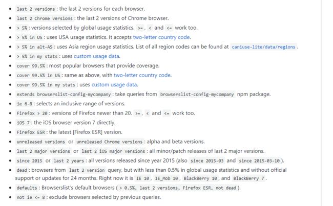
image.png
**本文版权归本人即笔名:该账户已被查封 所有,如需转载请注明出处。谢谢! *