本文为大地瓜原创,欢迎知识共享,转载请注明出处。
虽然你不注明出处我也没什么精力和你计较。
作者微信号:christgreenlaw
2017-10-12日更新:
苹果官网删除了本文档,已经找不到这个文档了,好在我还有pdf版,现共享给大家。
链接:http://pan.baidu.com/s/1i5GKG9v 密码:9g6z
正如文档的名字,UIKit中的用户界面目录,其实简单的来讲,这篇文档就是把常见的界面组件列了个目录,大概介绍,而不深入。
About Views
Views are the building blocks for constructing your user interface. Rather than using one view to present your content, you are more likely to use several views, ranging from simple buttons and text labels to more complex views such as table views, picker views, and scroll views. Each view represents a particular portion of your user interface and is generally optimized for a specific type of content. By building view upon view, you get a view hierarchy.
Purpose. Views allow users to:
- Experience app content
- Navigate within an app
Implementation. Views are implemented in the UIView class and discussed in UIView Class Reference.
Configuration. Configure views in Interface Builder, in the View section of the Attributes Inspector. A few configurations cannot be made through the Attributes Inspector, so you must make them programmatically. You can set other configurations programmatically, too, if you prefer.
Content of Views
所有的UIKit中的view都是UIView的子类。当预先定义好的view不能满足需求时,你可以自定义view来进行绘图和事件处理。
Use the Mode (contentMode) field to specify how a view lays out its content when its bounds change. This property is often used to implement resizable controls. Instead of redrawing the contents of the view every time its bounds change, you can use this property to specify that you want to scale the contents or pin them to a particular spot on the view.
The Tag (tag) field serves as an integer that you can use to identify view objects in your app.
Behavior of Views
By default, the User Interaction Enabled (userInteractionEnabled) checkbox is selected, which means that user events—such as touch and keyboard—are delivered to the view normally. When the checkbox is unselected, events intended for the view are ignored and removed from the event queue.
默认情况下the User Interaction Enabled (userInteractionEnabled) checkbox是选中的,也就是说,用户的事件--例如触摸和键盘--都正常的传递给view。当这个checkbox不被选中时,view的事件就被忽略了,从事件队列中被移除。
The Multiple Touch (multipleTouchEnabled) checkbox is unselected by default, which means that the view receives only the first touch event in a multi-touch sequence. When selected, the view receives all touches associated with a multitouch sequence.
The Multiple Touch (multipleTouchEnabled) checkbox默认是不选中的,意味着view在multi-touch序列中只会接受第一个touch事件。当选中时,就会接受所有与multitouch序列相关的touch。
Views have a number of properties related to drawing behavior:
- The Opaque (opaque) checkbox tells the drawing system how it should treat the view. If selected, the drawing system treats the view as fully opaque, which allows the drawing system to optimize some drawing operations and improve performance. If unselected, the drawing system composites the view normally with other content. You should always disable this checkbox if your view is fully or partially transparent.
The Opaque (opaque) checkbox 告诉绘图系统应该如何处理view。选中的话,绘图系统将view视为完全不透明,这会让绘图系统优化一些绘图操作,提升性能。如果没选中,绘图系统就正常地将其和其他内容绘制到一起。如果你的view是全透明或半透明的,你总是应该disable这个CheckBox。
- If the Hidden (hidden) checkbox is selected, the view disappears from its window and does not receive input events.
If the Hidden (hidden) checkbox选中了,这个view就从window上消失了,不会接受任何输入事件。
- When the Clears Graphics Context (clearsContextBeforeDrawing) checkbox is selected, the drawing buffer is automatically cleared to transparent black before the view is drawn. This behavior ensures that there are no visual artifacts left over when the view’s contents are redrawn.
When the Clears Graphics Context (clearsContextBeforeDrawing) checkbox 选中时,在view绘制之前,绘图buffer自动清除为透明的黑色。这个行为保证了当view的内容重绘时,不会有多余的可视化内容。
- Selecting the Clip Subviews (clipsToBounds) checkbox causes subviews to be clipped to the bounds of the view. If unselected, subviews whose frames extend beyond the visible bounds of the view are not clipped.
选中 the Clip Subviews (clipsToBounds) checkbox 会导致subview被view的边界所剪切。如果不选中,即使subview的frame如果超出了view的可视区域,也不会被剪切。
- When the Autoresize Subviews (autoresizesSubviews) checkbox is selected, the view adjusts the size of its subviews when its bounds change.
当the Autoresize Subviews (autoresizesSubviews) checkbox 选中时,view会自动在bounds改变时调整subview的大小。
Appearance of Views
Background Color and Alpha
Adjusting the Alpha (alpha) field changes the transparency of the view as a whole. This value can range from 0.0 (transparent) to 1.0 (opaque). Setting a view’s alpha value does not have an effect on embedded subviews.
透明度0.0<->1.0,没啥可解释的。设置view的透明度不影响其嵌套的subview的透明度。
Use the Background (backgroundColor) field to select a color to fill in the entire frame of the view. The background color appears underneath all other content in the view.
使用the Background (backgroundColor) field将view的整个frame填满。背景色在其他所有view中的内容之下。
Appearance Proxies
You can use an appearance proxy to set particular appearance properties for all instances of a view in your application. For example, if you want all sliders in your app to have a particular minimum track tint color, you can specify this with a single message to the slider’s appearance proxy.
可以使用一个appearance proxy为APP中某个view的所有实例设置特定的外观属性。 比如说,如果你希望你app中的所有slider都有一个特定的 minimum track tint color,你可以给slider的appearance proxy发送一条消息。
There are two ways to customize appearance for objects: for all instances and for instances contained within an instance of a container class.
- To customize the appearance of all instances of a class, use appearance to get the appearance proxy for the class.
[[UISlider appearance] setMinimumTrackTintColor:[UIColor greenColor]];
要设置某个类的所有实例的外观,使用 appearance来获取类的外观代理(appearance proxy)。
- To customize the appearances for instances of a class when contained within an instance of a container class, or instances in a hierarchy, you use appearanceWhenContainedIn:
to get the appearance proxy for the class.
[[UISlider appearanceWhenContainedIn:[UIView class], nil]
  setMinimumTrackTintColor:[UIColor greenColor]];
要自定义一个container class实例中的某个类的实例的外观,或者一个层级结构中的实例,使用appearanceWhenContainedIn:获得类的外观代理。
就是可以将指定的容器类中的某类实例全部定制化。没有声明的容器类中的该类则不受影响。
NOTE
You cannot use the appearance proxy with the tintColor property on UIView. For more information on using tintColor, see Tint Color.
不能通过外观代理来使用UIView的tintColor属性。
Tint Color
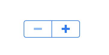
Views have a tintColor property that specifies the color of key elements within the view. Each subclass of UIView defines its own appearance and behavior for tintColor. For example, this property determines the color of the outline, divider, and icons on a stepper:
view有一个
tintColor属性指明了view中关键元素的颜色。每个UIView的子类都为tintColor定义了独有的外观和行为。比如说,这个属性决定了stepper的outline、divider、icons的颜色。
The tintColor property is a quick and simple way to skin your app with a custom color. Setting a tint color for a view automatically sets that tint color for all of its subviews. However, you can manually override this property for any of those subviews and its descendants. In other words, each view inherits its superview’s tint color if its own tint color is nil. If the highest level view in the view hierarchy has a nil value for tint color, it defaults to the system blue color.
tintColor属性是给你的app赋值自定义颜色的简单快速的方式。为一个view设置tintColor,就也自动地设置了其subview的tintColor。然而,你可以为任何subview以及其descendants手动重写这个属性。换句话说,如果view自己的tintColor是nil的话,每个view都继承其superview的tintColor。如果层级结构中最高层的view的tintColor是nil,那么就默认是系统的蓝色。
Template Images
In iOS 7, you can choose to treat any of the images in your app as a template—or stencil—image. When you elect to treat an image as a template, the system ignores the image’s color information and creates an image stencil based on the alpha values in the image (parts of the image with an alpha value of less than 1.0 get treated as completely transparent). This stencil can then be recolored using tintColor to match the rest of your user interface.
在iOS 7中,你可以将任何app中的图片都当做模版图片。当你选择将一个图片当做模版时,系统就忽略了图片的颜色信息,而基于其图片的alpha值生成一个图片模版(图片中alpha值小于1.0的话就会被处理成完全透明)。这个模版接下来就可以用tintColor来重新上色来match用户界面。
By default, an image (UIImage) is created with UIImageRenderingModeAutomatic. If you have UIImageRenderingModeAutomatic set on your image, it will be treated as template or original based on its context. Certain UIKit elements—including navigation bars, tab bars, toolbars, segmented controls—automatically treat their foreground images as templates, although their background images are treated as original. Other elements—such as image views and web views—treat their images as originals. If you want your image to always be treated as a template regardless of context, set UIImageRenderingModeAlwaysTemplate; if you want your image to always be treated as original, set UIImageRenderingModeAlwaysOriginal.
默认情况下,an image (UIImage) is created with UIImageRenderingModeAutomatic.如果你的图片设置了UIImageRenderingModeAutomatic ,它就会根据上下文被当做模版或者是原始文件。特定的UIKit元素--包括navigation bars, tab bars, toolbars, segmented controls--自动地将其foreground images当做模版,尽管其background images被处理为original。其他的元素--例如image views and web views--将其图片都当做originals。如果你想让你的图片不管在任何上下文中都当做模版,set UIImageRenderingModeAlwaysTemplate; 如果你想让你的图片永远被当做是original, set UIImageRenderingModeAlwaysOriginal。具体代码如下面这段:
To specify the rendering mode of an image, first create a standard image, and then call the imageWithRenderingMode: method on that image.
UIImage *myImage = [UIImage imageNamed:@"myImageFile.png"];
myImage = [myImage imageWithRenderingMode:UIImageRenderingModeAlwaysTemplate];
Using Auto Layout with Views
The Auto Layout system allows you to define layout constraints for user interface elements, such as views and controls. Constraints represent relationships between user interface elements. You can create Auto Layout constraints by selecting the appropriate element or group of elements and selecting an option from the menu in the bottom right corner of Xcode’s Interface Builder.
自动布局系统允许你为用户界面的元素(例如view和control)定义布局约束。约束代表了用户界面元素之间的关系。你可以通过选择合适的元素或者一组元素并且从Xcode IB的右下角界面菜单中选择一个选项,来创建一个自动布局约束。
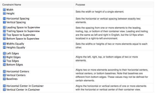
Auto layout contains two menus of constraints: pin and align. The Pin menu allows you to specify constraints that define some relationship based on a particular value or range of values. Some apply to the control itself (width) while others define relationships between elements (horizontal spacing). The following tables describes what each group of constraints in the Auto Layout menu accomplishes:
自动布局包含两个约束菜单:pin和align。Pin菜单允许你指明约束以定义一些基于特定值或者范围值的relationship。一些是应用到control自身(例如width)另一些定义了元素之间的relationship(例如horizontal spacing)。下面的表格描述了自动布局菜单中每组约束的功能:
The “Constant” value specified for any Pin constraints (besides Widths/Heights Equally) can be part of a “Relation.” That is, you can specify whether you want the value of that constraint to be equal to, less than or equal to, or greater than or equal to the value.
For more information, see Auto Layout Guide.
Making Views Accessible
To enhance the accessibility information for an item, select the object on the storyboard and open the Accessibility section of the Identity inspector.
要加强一个item的accessibility information,选中故事版上的对象,打开Accessibility section of the Identity inspector。
For more information, see Accessibility Programming Guide for iOS.
Debugging Views
When debugging issues with views, watch for this common pitfall:
Setting conflicting opacity settings. You should not set the opaque property to YES if your view has an alpha value of less than 1.0.
debug view时,注意一下这个陷阱:
设置了冲突的透明度设定。如果你的alpha值小于1.0的话,
不应该将 opaque属性设置为YES。

