【python】库丨画图工具matplotlib丨
资源汇总
- 官方文档
入门
- matplotlib已经很好上手了,为什么要有这个入门?
matplotlib给出了好几种画图的api,对于新手来说真是眼花缭乱。为了以后不再混乱,我想以后固定一种画图方法,因此我特地学习了一下matplotlib的原理。在学习过程中,我逐渐明白,原来有些api是为了快速上手准备的,真正的体现原理的方法流程应该是这样的:
import matplotlib.pyplot as plt

# 初始化一张图
fig = plt.figure(figsize=(10, 5),[一些参数])
# 在图中加入一个ax
ax1 = fig.add_subplot(111, [一些参数])
# 设置这个ax的参数
ax1.set_title('Distribution')
ax1.imshow( [参数] )   # 在ax1中画图
ax1.set_xlabel('x')
ax1.set_ylabel('y')
ax1.set_title('Turtorial')
plt.show()
上面这个代码就清楚的把matplotlib的原理进行了展示。它告诉我们,一张图(fig)包含ax(当然也可以有好几个),我们的图需要在ax中进行设置。以上是最最基本的原理了,稍微扩展一点的原理再官网有介绍:Tutorials
待整理
一、基础使用汇总。
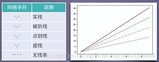
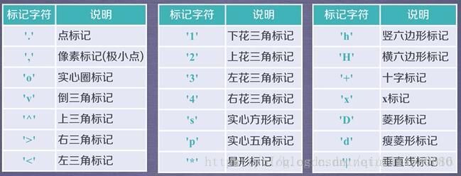
1、plt.plot(x,y,format_string,**kwargs)
解释:x轴数据,y轴数据,format_string控制曲线的格式字串
format_string 由颜色字符,风格字符,和标记字符

举个例子:
import matplotlib.pyplot as plt

plt.plot([1,2,3,6],[4,5,8,1],’g-s’)
plt.show()
结果:
作者:qiurisiyu2016
来源:CSDN
原文:https://blog.csdn.net/qiurisiyu2016/article/details/80187177
2、调整子图之间的间距。
from PIL import Image, ImageFilter
import matplotlib.pyplot as plt

img = Image.open('0004.jpg')

img2 = img.resize((64, 128), Image.ANTIALIAS)
img3 = img2.resize((img.size[0], img.size[1]), Image.BICUBIC)
img4 = img3.resize((64, 128), Image.ANTIALIAS)

fig = plt.figure()
plt.subplots_adjust(left=None, bottom=0, right=None, top=None, wspace=None, hspace=0.5)  # 调整子图间距

plt.subplot(2,2,1)
plt.title('orgin')
plt.imshow(img)
plt.subplot(2,2,2)
plt.title('downsampling')
plt.imshow(img2)
plt.subplot(2,2,3)
plt.title('upsampling')
plt.imshow(img3)
plt.subplot(2,2,4)
plt.title('downsampling2')
plt.imshow(img4)

plt.show()
- 选择
plt.imshow的 color_map:link
二、一些实用汇总
1、plt.cla()、 plt.clf() 、plt.close()的用途:丨参考文章丨
import matlibplot.pyplot as plt

plt.cla()   # Clear axis即清除当前图形中的当前活动轴。其他轴不受影响。
plt.clf()   # Clear figure清除所有轴,但是窗口打开,这样它可以被重复使用。
plt.close() # Close a figure window
三、实例备用
1、折线图
import matplotlib.pyplot as plt
# For plot curves
loss_g_list = [1,2,3,4]
loss_d_list = [3,4,5,6]
fig = plt.figure()
plt.suptitle('loss curve')
plt.subplots_adjust(hspace=0.5)

ax_loss_g = fig.add_subplot(121, title="loss_g")
ax_loss_d = fig.add_subplot(122, title="loss_d")

ax_loss_g.plot(range(4), loss_g_list, 'bo-')
ax_loss_d.plot(range(4), loss_d_list, 'ro-')

import os
fig.savefig(os.path.join('./', 'curve.pdf'))
fig.savefig(os.path.join('./', 'curve.eps'))
fig.savefig(os.path.join('./', 'curve.jpg'))
- 3D柱状图。链接 | 官网例子