字体设配
- 1.iPhone4和iPhone5宽度一样,5只是比4高176像素,所以5和4一套规范即可;
- 2.iPhone6的放大模式分辨率是640 x 1136,和iPhone5正好相同;
- 3.iPhone6的标准模式分辨率为750 x 1334,整体放大1.5倍正好是iPhone6 Plus的放大模式1125*2001。
总结:我们可以看出iPhone 4、5、6共用一套字体大小规范。iPhone6 plus在放大模式下的字体正好是在此基础上放大了1.5倍:
UI适配
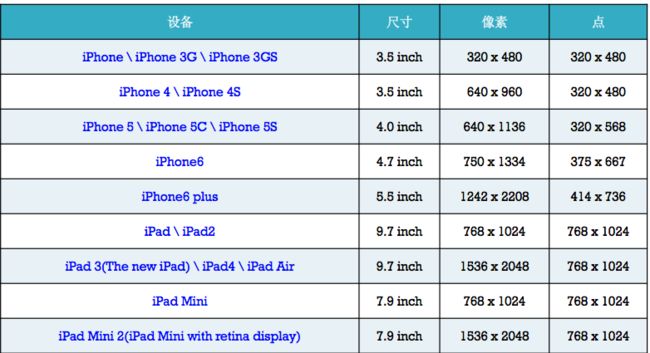
各版本iPhone的尺寸规格.png
手动
可以根据UIDevice 或直接使用屏幕宽度 判断设配的手机型号,并作适配,一般用于接口适配;UI适配不推荐使用!
Frame
简单的中点设置可以通过frame的设置方法,Autolayout出来之后还是推荐使用Autolayout,一句话:丢掉Frame,拥抱Autolayout!
Autoresizing
Autolayout之前的版本,使用相当方便,但只能控制当前子控件对于其父控件的排版。
-
sb,xib中直接设置
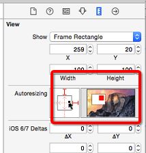 Autoresizing.jpg
正方形外 上下左右线:选中对应线代表子控件和父控件某个边缘的间距是固定的
正方形内 上下左右线: 选中对应线代表:对应的子控件的的长或宽自动跟随父控件改变 - 代码设置:通过属性:
autoresizingMask直接设置。
注意:位置设置方式与连线方式相反,是设置某边可伸缩,反之就是对应边角固定,伸缩方式一致。例如需要设置底部边固定,则需要设置top。
- UIViewAutoresizingFlexible`Left`Margin   = 1 << 0,
    - 距离父控件`左边`的间距是伸缩的
- UIViewAutoresizingFlexible`Right`Margin  = 1 << 2,
    - 距离父控件`右边`的间距是伸缩的
- UIViewAutoresizingFlexible`Top`Margin    = 1 << 3,
    - 距离父控件`上边`的间距是伸缩的
- UIViewAutoresizingFlexible`Bottom`Margin = 1 << 5
    - 距离父控件`下边`的间距是伸缩的
- UIViewAutoresizingFlexible`Width`        = 1 << 1,
    - `宽度`跟随父控件`宽度`进行伸缩
- UIViewAutoresizingFlexible`Height`       = 1 << 4,
    - `高度`跟随父控件`高度`进行伸缩
Autolayout
最常用的适配方法,在iOS6/Xcode4的时候被苹果引入两个核心概念:参照,约束.即参照其他控件的位置添加约束,来确定需要适配的控件的唯一大小和位置。核心公式为:
obj1.property1 =(obj2.property2 * multiplier)+ constant value
注意:
- 要先禁止autoresizing功能,view.translatesAutoresizingMaskIntoConstraints = NO;
- 添加约束之前,一定要保证相关控件都已经在各自的父控件上
- 不用再给view设置frame
- 各种适配方法不能混用
- 动画 :用强制更新约束方法(layoutIfNeeded),
- NSLayoutConstraint
直接是公式的代码化,添加代码相当繁琐,一般不适用!
/**
view1 :要约束的控件
attr1 :约束的类型(做怎样的约束)
relation :与参照控件之间的关系
view2 :参照的控件
attr2 :约束的类型(做怎样的约束)
multiplier :乘数
c :常量
*/
----创建约束
+(id)constraintWithItem:(id)view1 attribute:(NSLayoutAttribute)attr1 relatedBy:(NSLayoutRelation)relation toItem:(id)view2 attribute:(NSLayoutAttribute)attr2 multiplier:(CGFloat)multiplier constant:(CGFloat)c;
+(id)constraintWithItem:(id)view1 attribute:(NSLayoutAttribute)attr1 relatedBy:(NSLayoutRelation)relation toItem:(id)view2 attribute:(NSLayoutAttribute)attr2 multiplier:(CGFloat)multiplier constant:(CGFloat)c;
----添加约束
- (void)addConstraint:(NSLayoutConstraint *)constraint;
- (void)addConstraints:(NSArray *)constraints;
- VFL
VFL全称是Visual Format Language,翻译过来是“可视化格式语言” VFL是苹果公司为了简化Autolayout的编码而推出的抽象语言,是常用的约束添加方式。
// 水平方向
NSString *vlf = @"H:|-margin-[blueView]-margin-[redView(==blueView)]-margin-|";
NSDictionary *views = @{ @"blueView" : blueView,  @"redView" : redView };
NSDictionary *metrics = @{@"margin" : @20};

// 所有控件的顶部\底部对齐
NSLayoutFormatOptions opts = NSLayoutFormatAlignAllTop | NSLayoutFormatAlignAllBottom;
NSArray *lcs = [NSLayoutConstraint constraintsWithVisualFormat:vlf options:opts metrics:metrics views:views];
[self.view addConstraints:lcs];

// 垂直方向
[self.view addConstraints:[NSLayoutConstraint constraintsWithVisualFormat:@"V:[blueView(40)]-margin-|" options:kNilOptions metrics:metrics views:views]];
- masonry
一个非常不错的第三方库,基于块的方式来添加约束,使用非常简单
UIEdgeInsets padding = UIEdgeInsetsMake(10, 10, 10, 10);
[view1 mas_makeConstraints:^(MASConstraintMaker *make) {
make.top.equalTo(superview.mas_top).with.offset(padding.top);
make.left.equalTo(superview.mas_left).with.offset(padding.left);
make.bottom.equalTo(superview.mas_bottom).with.offset(-padding.bottom);
make.right.equalTo(superview.mas_right).with.offset(-padding.right);
}];
Size Classes
iOS8之后,苹果推出的适配的新技术。

Size Classes.png
- 它仅仅是对屏幕进行了分类, 真正排布UI元素还得使用autolayout
- 不再有横竖屏的概念, 只有屏幕尺寸概念
- 不再有具体尺寸的概念, 只有抽象尺寸的概念: 把宽度和高度各分为3种情况
- Compact : 紧凑(小)
- Any : 任意
- Regular : 宽松(大)
- 各屏幕适配
- iPhone4S,iPhone5/5s,iPhone6
竖屏:(w:Compact h:Regular) 横屏:(w:Compact h:Compact) i - Phone6 Plus:
竖屏:(w:Compact h:Regular) 横屏:(w:Regular h:Compact)
- iPhone4S,iPhone5/5s,iPhone6
- iPad
竖屏:(w:Regular h:Regular) 横屏:(w:Regular h:Regular) - Apple Watch(猜测)
竖屏:(w:Compact h:Compact) 横屏:(w:Compact h:Compact)
所以,正确的使用姿势应该是通过sizeclass对屏幕进行分类,再通过autolayout:对屏幕中各种元素进行约束(位置\尺寸)。