vue使用echarts学习实践(饼图、中国地图)
vue中如何使用echarts
- 前言
- 样式展现
-
- 中国地图散点图
- 饼图
- 中国地图散点图实现步骤
- 饼图实现步骤
- 事件
-
- echarts 支持常规的鼠标事件类型都有:
- 区分鼠标点击到了哪里
前言
近期写项目的时候使用到了echarts的图表,一个饼状图和一个中国地图散点图,之前也用过柱状图、关系图、饼图、折线图等等,但是都没总结过文档,这次就趁着来写一些关于饼图和中国地图的基本制作。
样式展现
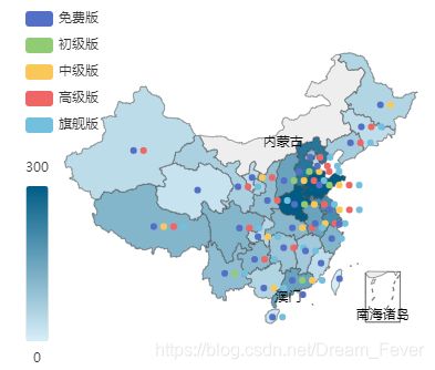
中国地图散点图
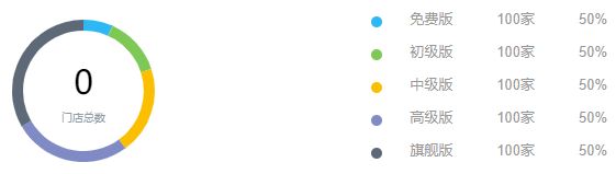
饼图
中国地图散点图实现步骤
- 在页面中引入echarts
import echarts from "echarts";
import "../../../node_modules/echarts/map/js/china.js"; // 数据
- 在页面中给地图创建一个容器
<div style="width: 50%;">
   <div id="main"></div>
</div>
- 在事件中实例化一个地图对象以及对它的属性设置
draw() {

  // 实例化
  const ec = echarts as any;
  const myChart = ec.init(document.getElementById("main"));
  // 设置属性
  const option = {

        // 标题,会出现在读题的正上方,这里的标题项目中没有用到,所以我没有写
        title: {

          text: "",
          subtext: "",
          left: "center",
        },
        tooltip: {

          trigger: "item",
          formatter: (params) => {

            let res = params.name + "
";
            let myseries: any = option.series;
            for (let val1 of myseries) {

              for (let val2 of val1.data) {

                if (val2.name == params.name) {

                  res += val1.name + " : " + val2.value + "";
                }
              }
            }
            return res;
          },
        },
        legend: {

          orient: "vertical",
          left: "left",
          data: ["免费版", "初级版", "中级版", "高级版", "旗舰版"],
        },
        visualMap: {

          min: 0,
          max: 150,
          left: "left",
          top: "bottom",
          text: ["300", "0"], // 文本,默认为数值文本
          calculable: false,
          color: ["#015C85", "#D7EEF8"],
        },
        series: [{

            name: "免费版",
            type: "map",
            mapType: "china",
            label: {

              normal: {

                show: true,
                color: "#000",
              },
              emphasis: {

                // 鼠标移入动态的时候显示的默认样式
                color: "green",
              },
            },
            data: this.sourceData[0],
          },
          {

            name: "初级版",
            type: "map",
            mapType: "china",
            label: {

              normal: {

                show: true,
                color: "#000",
              },
            },
            data: this.sourceData[1],
          },
          {

            name: "中级版",
            type: "map",
            mapType: "china",
            label: {

              normal: {

                show: true,
                color: "#000",
              },
            },
            data: this.sourceData[2],
          },
          {

            name: "高级版",
            type: "map",
            mapType: "china",
            label: {

              normal: {

                show: true,
                color: "#000",
              },
            },
            data: this.sourceData[3],
          },
          {

            name: "旗舰版",
            type: "map",
            mapType: "china",
            label: {

              normal: {

                show: true,
                color: "#000",
              },
            },
            data: this.sourceData[4], // 动态添加数据,这里你们可以放上自己的一些数据
          },
        ],
  }
}
// 事件写完之后将这个事件在created函数中调用一下
饼图实现步骤
它们的逻辑方法都是一样的,不同的是他们的属性会有变化,我引入和创建容器就不说了,上面都有,直接看方法里面的:
roundDraw() {

      // 同样需要先实例化
      const ec = echarts as any;
      const myChart = ec.init(document.getElementById('roundEcharts'))
      // 设置属性
      myChart.setOption({

        tooltip: {

          trigger: 'item',
          formatter: "{a}
{b}: {c} ({d}%)"
        },
        legend: {

          show: false
        },
        graphic: [{
      // 环形图中间添加文字
          type: 'text', // 通过不同top值可以设置上下显示
          left: 'center',
          top: '40%',
          style: {

            text: '' + this.vipDataNum, // 自定义文字
            textAlign: 'center',
            fill: '#000', // 文字的颜色
            width: 30,
            height: 30,
            fontSize: 30,
            color: "#4d4f5c",
            fontFamily: "Microsoft YaHei"
          }
        }, {

          type: 'text',
          left: 'center',
          top: '60%',
          style: {

            text: '门店总数',
            textAlign: 'center',
            fill: '#8D99A3',
            width: 30,
            height: 30,
            fontSize: 10,
          }
        }],
        // color: ['#F75B27', '#27F09F'],
        color: ['#2DB7F5', '#7EC856','#F9BF00','#808BC6','#5D6977'],
        series: [{

          name: "品牌概况",
          type: 'pie',
          radius: ['55%', '65%'], // 设置环形的宽度
          avoidLabelOverlap: false,
          label: {

            normal: {

              show: false,
              position: 'center'
            },
            // emphasis: { // 设置data 居中文字效果
            //     show: false,
            //     textStyle: {

            //         fontSize: '10',
            //         fontWeight: 'bold'
            //     }
            // }
          },
          labelLine: {

            normal: {

              show: false
            }
          },
          data: this.versions // 设置动态数据
        }]
      })
}
后来查询这饼图动态渲染数据,发现有位博主写的很好
ecgarts饼状图动态数据渲染
事件
echarts 支持常规的鼠标事件类型都有:
‘click’、‘dblclick’、‘mousedown’、‘mousemove’、‘mouseup’、‘mouseover’、‘mouseout’、‘globalout’、‘contextmenu’ 事件。
区分鼠标点击到了哪里
myChart.on('click', function (params) {

    if (params.componentType === 'markPoint') {

        // 点击到了 markPoint 上
        if (params.seriesIndex === 5) {

            // 点击到了 index 为 5 的 series 的 markPoint 上。
        }
    }
    else if (params.componentType === 'series') {

        if (params.seriesType === 'graph') {

            if (params.dataType === 'edge') {

                // 点击到了 graph 的 edge(边)上。
            }
            else {

                // 点击到了 graph 的 node(节点)上。
            }
        }
    }
});
这些方法是从官网拿过来了,还是建议大家多看看官网,官网有很多东西讲的很详细
echarts官网
echarts就分享到这里,以上讲解了一些皮毛,如他日遇到干货会继续来分享的。啾咪~
待续~