最近在做公众号项目,用的flex布局,发现真的很好用,可以少写好多css样式代码,在这里记录下最近项目里常用到的一些布局,后续也会一直更新。
附上flex布局参考链接:
阮一峰flex语法篇
阮一峰flex实例篇
flex布局
项目环境:vue3 + vant (css样式使用的less预处理器)
1. 平均分布并列一排效果图
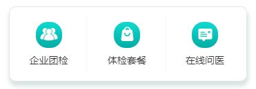
图片一排并列
// 后面重复的直接复制就可以了,包含样式


     企业团检
// css样式为less预处理
// &-menu&为简写,class名前面是一样的,不用重复写
.home-nav{
            width: 345px;
            height: 110px;
            min-height: 110px;
            background: #FFFFFF;
            border: 1px solid #E7E7E7;
            box-shadow: 1px 6px 6px 1px rgba(0, 70, 67, 0.15);
            border-radius: 10px;
            margin: 0 auto;
            display: flex;   //排列成一行
            padding: 13px 0;
            margin-top: 21px;
            &-menu{
                width: 33%; // 根据排列图片的多少来平均分配比例
                display: flex;
                flex-direction: column; //纵向排列
                align-items: center; //垂直
                justify-content: space-between; // 水平
            }
            &-img{
                margin-top: 9px;
                width: 38px;
                height: 38px;
            }
            &-content{
                font-size: 14px;
                font-weight: 400;
                color: #343434;
                line-height: 36px;
            }
        }
2. 平均分布并列一排效果图
注:和第1种类似,应用场景多行多个图片展示,这里包含一个样式用伪类实现的
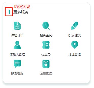
图片多行多列排列
        更多服务


           体检订单


           报告查询


           投诉建议
.center-more{
            width: 344px;
            height: 320px;
            background: #FFFFFF;
            border: 1px solid #E5E5E5;
            box-shadow: 1px 6px 6px 1px rgba(0, 70, 67, 0.15);
            border-radius: 15px;
            margin: 10px auto;
            flex-shrink: 0;
            &-service{
                display: flex;
                //左右两端对齐,即左右两侧项目都紧贴容器,且项目之间间距相等
                //写了这个属性后,就不需要再写padding、margin了,属性会根据div来自动平铺
                justify-content: space-between;
                align-items: center;  //居中
                padding: 28px 22px;
                &-title{
                    display: flex;
                    align-items: center;
                    color: #333333;
                    font-size: 15px;
                    &::before  //伪类
                    {
                        content: "";
                        display: block;
                        width: 4px;
                        height: 17px;
                        background: #02B0A7;
                        margin-right: 15px;
                        border-radius: 15px;
                    }
                }
            }
        }

.center-model{
            display: flex;
            //关键在于这个属性,是否换行,根据图片平均分布的百分比来
            flex-wrap: wrap;
            &-order{
                width: 33%; //根据这里设置的百分比
                display: flex;
                flex-direction: column;
                align-items: center;
                justify-content: space-between;
                &-img{
                    width: 28px;
                    height: 32px;
                }
                &-content{
                    font-size: 12px;
                    font-weight: 400;
                    color: #333333;
                    line-height: 44px;
                }
            }
        }
3. 左右分布效果图
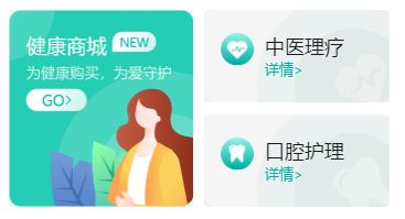
左右分布
            // 引入左边图片


                        中医理疗
                        详情>


                // 样式一样时,只是背景图不同,样式可以简写,也可以重新单独写


                        口腔护理
                        详情>
.home-mall{
            height: 179px;
            min-height: 179px;
            padding: 0 15px;
            display: flex;
            margin-top: 20px;
            justify-content: space-between; // 图片两端对齐
            &-img{
                width: 167px;
                height: 179px;
            }
            &-type{
                width: 168px;
                display: flex;
                flex-direction: column;
                align-items: center;
                justify-content: space-between;
                &-med{
                    width: 100%;
                    height: 84px;
                    //右边上面第一个图片,以背景图引入进来
                    background: url("../../assets/demo/chmedicine.png");
                    //把背景图片放大到适合元素容器的尺寸,图片比例不变
                    background-size: cover;
                    padding: 21px 15px;
                    display: flex;
                    //让左右两张图片顶部对齐
                    align-items: flex-start;
                    // 样式简写方式,只把不同的地同提取出来
                    &.oral{
                      background: url("../../assets/demo/oralcare.png");
                      background-size: cover;
                    }
                     //img可以直接这样写,是因为img是包含在&-med这个class下的,可以识别到
                    img
                    {
                        width: 30px;
                        margin-right: 10px;
                    }
                    &-title{
                        font-size: 18px;
                        font-weight: 400;
                        color: #181818;
                    }
                    &-detail{
                        font-size: 13px;
                        font-weight: 400;
                        color: #02B0A8;
                    }
                }
            }
        }
4. 同个容器里,填充剩余部分效果图
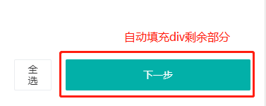
填充div剩余部分
    全选
    下一步
.invoice-type-all{
                display: flex;
                flex: auto;
                margin-top: 170px;
                padding: 20px;
                &-total{
                    flex: auto;
                    margin-right: 20px;
                }
                &-next{
                    flex: auto;
                }
            }
5. 一张图片分割为两部分,并且上部分是固定的,下部分是随着滚动而隐藏起来
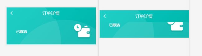
对比图
// 图片上部分结构


      订单详情


// 图片下部分结构


           已取消

// 图片上部分样式
.pay-background-title{
        display: flex;
        color: #ffffff;
        background: url("../../assets/images/backgroung.png") no-repeat;
        background-position: top;  // 图片的上部分
        background-size: 100%; // 按容器比例撑满,图片会有点变形
        height: 50px; // 图片切割为两部分后,上部分图片的高度,加起来等于完整图片的高度
        align-items: center;
        flex-shrink: 0;
        P{
            margin-left: 120px;
            font-size: 18px;
            font-weight: 400;
         }
        .van-icon{
            margin-left: 10px;
        }
    }
// 图片下部分样式
// 设置这个样式是以图片的下部分及后面内容为主体,只是下面部分滚动,上面的固定不动
.order-wrap{
        display: flex;
        flex-direction: column;
        width: 100%;
        overflow: auto;
        flex: auto;
    }

.pay-background-wrap
    {
        height: 122px; // 图片切割为两部分后,下部分图片的高度,加起来等于完整图片的高度
        background: url("../../assets/images/backgroung.png") no-repeat;
        background-position: bottom;  // 图片的下部分
        background-size: 100%;
        &-content{
            display: flex;
            justify-content: space-between;
            padding: 20px;
            p{
                font-size: 15px;
                font-weight: bold;
                color: #FFFFFF;
                margin-left: 20px;
                display: flex;
                align-items: center;
            }
            img{
                width: 77px;
                height: 67px;
            }
        }
    }
6. 页面底部固定,剩下部分滚动
效果图
       可在确认支付时修改分期


              客服

          立即预约
.org-select{
        display: flex;
        flex-direction: column;
        width: 100%;
        overflow: auto;
        /*这里设置padding-bottom距离底部距离的原因是:因为当前页面的高度是固定667px的,
          当超出这个高度时,底部的内容就被挡住了,所以需要设置下,再配合overflow使用就可以了*/
        /*这里没有使用padding-bottom样式是因为 苹果手机兼容问题,所以改用了下面那种样式*/
        /*padding-bottom: 96px;*/
        height: calc(100% - 96px);  // 页面总的高度 - 固定底部div的高度

    &-pay{
            position: fixed;  /*flex绝对定位*/
            bottom: 0;  // 距离底部0距离
            width: 100%;
            height: 96px;  // 需要给个高度,不然页面底部内容会被挡住
            z-index: 999;  // 浮在页上最上层
            background: #ffffff;
            &-btn{
                height: 30px; // 这是修改分期样式
            }
            &-wrap{
                display: flex;
                justify-content: space-between;
                align-items: center;
                padding: 10px;
                &-contact{
                    img{
                        width: 25px;
                        height: 26px;
                    }
                    p{
                        font-size: 12px;
                        font-weight: 400;
                        color: #343434;
                    }
                }
            }
        }
}
7. 在图片里写入文字
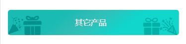
图片里写入文字

其它产品
.blue{
display: flex;
justify-content: center;
margin-top: 30px;
position: relative;
flex-shrink: 0;
&-img{
width: 345px;
height: 51px;
}
&-title{
position: absolute;
top: 0;
left: 0;
width: 100%;
height: 51px;
font-size: 16px;
font-weight: 400;
color: #FFFFFF;
// 第一种实现方法,与注释的第二种方法都可以实现,除了注释代码外,其它代码一样
display: flex;
align-items: center;
justify-content: center;
// 第二种实现方法,其它都一样,除了注释的这二行
// text-align: center;
// line-height: 51px;
}
&-other{
position: absolute;
top: 27%;
left: 40%;
font-size: 16px;
font-weight: 400;
color: #FFFFFF;
}
}
8. 标签固定在div右上角
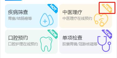 标签固定在div右上角
-
疾病筛查
胃幽/结肠癌等
HOT

-
中医理疗
中医理疗在线预约
NEW

.characteristic-service
{
padding: 0 15px;
margin-top: 24px;
&-warp
{
margin-top: 6px;
display: flex;
flex-wrap: wrap;
justify-content: space-between;
&-item
{
width: 170px;
height: 78px;
margin-top: 5px;
padding-left: 10px;
padding-top: 15px;
background: #E2F6FF;
border-radius: 10px;
position: relative;
overflow: hidden; // 右上角hot标签超出部分隐藏
img
{
position: absolute;
width: 45px;
right: 13px;
bottom: 4px;
}
&:nth-of-type(2) // 选择器匹配同类型中的第n个同级兄弟元素
{
background: #FCF6E8;
img
{
position: absolute;
width: 47px;
right: 12px;
bottom: 4px;
}
.hot
{
background: #FFD061; // 每个标签的颜色不同
}
}
&:nth-of-type(3)
{
background: #EFF8F5;
img
{
position: absolute;
width: 40px;
right: 17px;
bottom: 7px;
}
.hot
{
background:#35D1B2;
}
}
&:nth-of-type(4)
{
background: #F2F4FA;
img
{
position: absolute;
width: 44px;
right: 3px;
bottom: 6px;
}
.hot
{
background:#755DF7;
}
}
&-title
{
color: #2B2C2D;
font-size: 16px;
}
&-sub
{
color: #999999;
font-size: 12px;
margin-top: 2px;
}
.hot
{
width: 40px;
text-align: center;
height: 16px;
line-height: 16px;
background: #00AEFF;
color: #ffffff;
font-size: 12px;
font-weight: bold;
position: absolute;
top: 3px;
right: -6px;
transform: rotateZ(45deg); // 右上角hot标签旋转45度
}
}
}
}