matplotlib绘图及处理图片
1 绘制图片
1.0 二维图形
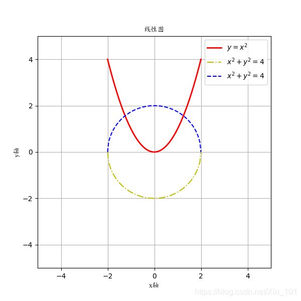
1.0.1 线性图像(plot)
【Demo】
import numpy as np
import matplotlib.pyplot as plt
from matplotlib.font_manager import FontProperties
# 字体配置:路径
font = FontProperties(fname='/usr/share/fonts/truetype/arphic/ukai.ttc')

x = np.linspace(-2, 2, 100)
y = x**2
z = np.sqrt(4-x**2)
plt.figure(figsize=(4,4))
plt.plot(x,y,label="$y=x^2$",color="red",linewidth=2)
plt.plot(x,z,"b--",label="$x^2+y^2=4$")
plt.plot(x, -z, "y--", label="$x^2+y^2=4$")
plt.xlabel("x轴", fontproperties=font)
plt.ylabel("y轴", fontproperties=font)
plt.title("线性图", fontproperties=font)
plt.xlim(-5, 5)
plt.ylim(-5, 5)
plt.legend()
plt.grid()
plt.savefig("ch_plot.png")
plt.show()
【Result】
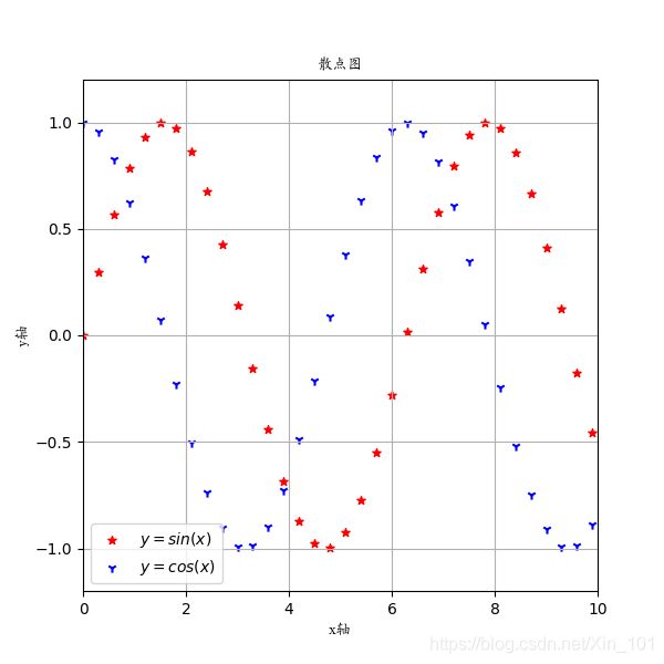
1.0.2 散点图(scatter)
【Demo】
import numpy as np
import matplotlib.pyplot as plt
from matplotlib.font_manager import FontProperties
# 字体配置:路径
font = FontProperties(fname='/usr/share/fonts/truetype/arphic/ukai.ttc')
x = np.arange(0, 10, 0.3)
y = np.sin(x)
z = np.cos(x)
plt.figure(figsize=(6, 6))
plt.scatter(x, y, label="$y=sin(x)$", color="red", s=30, marker="*")
plt.scatter(x, z, label="$y=cos(x)$", color="blue", s=35, marker="1")
plt.xlabel("x轴", fontproperties=font)
plt.ylabel("y轴", fontproperties=font)
plt.title("散点图", fontproperties=font)
plt.xlim(0, 10)
plt.ylim(-1.2, 1.2)
plt.grid()
plt.legend()
plt.savefig("scatter.png", format="png")
plt.show()
【Result】
1.0.3 分区图(subplot)
【Demo】
# x, y自给
import numpy as np
import matplotlib.pyplot as plt
from matplotlib.font_manager import FontProperties
# 字体配置:路径
font = FontProperties(fname='/usr/share/fonts/truetype/arphic/ukai.ttc')
a = 0
x = np.linspace(0, 10, 100, dtype=np.float32)
y_0 = x-5
y_1 = (x-5)**2 - 0.2*x
y_2 = np.sin(x)
y_3 = np.cos(x)
y = [y_0, y_1, y_2, y_3]
label_list = ["$y=x$", "$y=x^2$", "$y=sin(x)$", "$y=cos(x)$"]
color_list = ["red", "blue", "cyan", "magenta"]
plt.figure(figsize=(6, 6))
plt.title("分区图", fontproperties=font)
for i in range (4):
	a += 1
	plt.subplot(2,2, a).set_title("Figure {}".format(a))
	plt.subplots_adjust(wspace=0.5, hspace=0.5)
	plt.plot(x,y[i], label=label_list[i], color=color_list[i])
	plt.xlabel("x轴", fontproperties=font)
	plt.ylabel("y轴", fontproperties=font)
	plt.title("图{}".format(a), fontproperties=font)
	plt.legend()
	plt.xlim(0, 10)
	plt.ylim(-1.2, 1.2)
	plt.grid()
plt.savefig("subplot.png", format="png")
plt.show()
【Result】

1.0.4 直方图(histogram)
【Demo】
import numpy as np
import matplotlib.pyplot as plt
from matplotlib.font_manager import FontProperties
# 字体配置:路径
font = FontProperties(fname='/usr/share/fonts/truetype/arphic/ukai.ttc')
def histogram_test():
    np.random.seed(19680801)
    mu, sigma = 100, 15
    x = mu + sigma * np.random.randn(10000)
    plt.figure(figsize=(6, 6))
    n, bins, patches = plt.hist(x, 50, density=1, facecolor='b', alpha=0.75)
    plt.xlabel('智力', fontproperties=font)
    plt.ylabel('分布', fontproperties=font)
    plt.title('IQ直方图', fontproperties=font)
    plt.text(60, .025, r'$\mu=100,\ \sigma=15$')
    plt.axis([40, 160, 0, 0.03])
    plt.grid(True)
    plt.savefig("histogram.png", format="png")
    plt.show()
histogram_test()
【Result】

1.0.5 饼形图(pie)
【basic chart】
import numpy as np
import matplotlib.pyplot as plt
from matplotlib.font_manager import FontProperties
# 字体配置:路径
font = FontProperties(fname='/usr/share/fonts/truetype/arphic/ukai.ttc')
def pie():
    labels = ['青蛙', '猪头', '狗狗', '日记本']
    sizes = [15, 30, 45, 10]
    explode = (0, 0.1, 0, 0)  # only "explode" the 2nd slice (i.e. 'Hogs')

    fig1, ax1 = plt.subplots()
    test_pie = ax1.pie(sizes, explode=explode, labels=labels, autopct='%1.1f%%',
            shadow=True, startangle=90)
    # Text()设置字体属性
    test_font = [font_value.set_fontproperties(font) for font_value in test_pie[1]]
    ax1.axis('equal', fontproperties=font)  # Equal aspect ratio ensures that pie is drawn as a circle.
    plt.title('饼形图', fontproperties=font)
    plt.savefig("pie_test.png", format="png")
    plt.show()
pie()
【Result】

【label pie】
import numpy as np
import matplotlib.pyplot as plt
from matplotlib.font_manager import FontProperties
# 字体配置:路径
font = FontProperties(fname='/usr/share/fonts/truetype/arphic/ukai.ttc')
def pie_labels():
    fig, ax = plt.subplots(figsize=(5, 3), subplot_kw=dict(aspect="equal"))
	# 饼形图显示及图例信息
    recipe = ["375 克 面粉",
              "75 克 糖",
              "250 克 黄油",
              "300 克 浆果"]
    data = [float(x.split()[0]) for x in recipe]
    ingredients = [x.split()[-1] for x in recipe]

    def func(pct, allvals):
        absolute = int(pct/100.*np.sum(allvals))
        return "{:.1f}%\n({:d} 克)".format(pct, absolute)


    wedges, texts, autotexts = ax.pie(data, autopct=lambda pct: func(pct, data),
                                      textprops=dict(color="w"))

    font_test = ax.legend(wedges, ingredients,
              title="指标",
              loc="center left",
              bbox_to_anchor=(1, 0, 0.5, 1), prop=font, framealpha=1)
              # get_title设置字体属性
    font_test.get_title().set_fontproperties(font)
    plt.setp(autotexts, size=8, weight="bold", fontproperties=font, color="k")
	# set_title方法:设置字体属性
    ax.set_title("面包配料", fontproperties=font)
    plt.savefig("pie_labels.png", format="png")

    plt.show()
pie_labels()
【Result】

1.0.6 柱状图(bar)
【Demo】
import numpy as np
import matplotlib.pyplot as plt
from matplotlib.font_manager import FontProperties
# 字体配置:路径
font = FontProperties(fname='/usr/share/fonts/truetype/arphic/ukai.ttc')
def bar_test():
    N = 5
    menMeans = (20, 35, 30, 35, 27)
    womenMeans = (25, 32, 34, 20, 25)
    menStd = (2, 3, 4, 1, 2)
    womenStd = (3, 5, 2, 3, 3)
    ind = np.arange(N)
    width = 0.35
	# yerr标准差(图中黑线)
    p1 = plt.bar(ind, menMeans, width, yerr=menStd)
    # bottom以man为基准
    p2 = plt.bar(ind, womenMeans, width,
                 bottom=menMeans, yerr=womenStd)
    plt.xlabel("组别", fontproperties=font)
    plt.ylabel('分数', fontproperties=font)
    plt.title('每组性别的分数', fontproperties=font)
    plt.xticks(ind, ('第一组','第二组','第三组','第四组','第五组'), fontproperties=font)
    plt.yticks(np.arange(0, 81, 10))
    # legend: prop字体属性
    plt.legend((p1[0], p2[0]), ('男性', '女性'), prop=font)
    plt.grid()
    plt.savefig('bar_test.png', format='png')
    plt.show()
bar_test()
【Result】

1.2 三维图
1.2.1 曲面(surface)
【Demo】
import numpy as np
import matplotlib.pyplot as plt
from mpl_toolkits.mplot3d import Axes3D
# 字体配置:路径
font = FontProperties(fname='/usr/share/fonts/truetype/arphic/ukai.ttc')
def meshgrid_test():
	center = [0, 0, 0]
	radius = 6

	u = np.linspace(0, 2*np.pi, 100)
	v = np.linspace(0, 2*np.pi, 100)
	x = radius * np.outer(np.cos(u), np.sin(v) + center[0])
	y = radius * np.outer(np.sin(u), np.sin(v) + center[0])
	z = radius * np.outer(np.ones(np.size(u)), np.cos(v)) + center[2]
	# 第一张图
	fig1 = plt.figure(1, figsize=(6, 6))
	ax1 = Axes3D(fig1)
	plt.title("球", fontproperties=font)
	surf_1 = ax1.plot_surface(x, y, z, rstride=1, cstride=1, cmap=plt.cm.coolwarm)
	ax1.set_xlabel('x轴', color='r', fontproperties=font)
	ax1.set_ylabel('y轴', color='r', fontproperties=font)
	ax1.set_zlabel('z轴', color='r', fontproperties=font)
	fig1.colorbar(surf_1, shrink=0.5, aspect=10)
	plt.savefig("meshgrid_test.png", format="png")

	# 第二张图
	fig2 = plt.figure(2, figsize=(6, 6))
	ax2 = Axes3D(fig2)
	ax2.plot_wireframe(x, y, z, rstride=6, cstride=6)
	ax2.set_xlabel('x轴', color='r', fontproperties=font)
	ax2.set_ylabel('y轴', color='r', fontproperties=font)
	ax2.set_zlabel('z轴', color='r', fontproperties=font)
	plt.title("球", fontproperties=font)
	plt.savefig("meshgrid_test_1.png", format="png")
	plt.show()

meshgrid_test()
【Result】


1.2.2 三维网格平面
import matplotlib.pyplot as plt
import mpl_toolkits.mplot3d.axes3d as p3
import numpy as np
x = np.arange(1, 10, 1)
y = np.arange(1, 8, 1)
# y = np.ones(5)
z = np.arange(1, 10, 1)
X, Y = np.meshgrid(x, y)
Z = np.zeros([7, 9])
# Z = X + Y
print("Z vlaue: {}".format(Z))
print("shape of X: {}".format(X.shape))
print("shape of Y: {}".format(Y.shape))
print(X)
print(Y)
print(Z.shape)
fig = plt.figure()
ax = p3.Axes3D(fig)
surf = ax.plot_wireframe(X, Y, Z, rstride=1, cstride=1, cmap=plt.cm.jet, linewidth=1, antialiased=False)
ax.set_xlabel("x-label", color='r')
ax.set_ylabel("y-label", color='g')
ax.set_zlabel("z-label", color='b')
plt.savefig("./images/wireframe.png", format="png")
plt.show()

1.2.3 三维填充平面
import matplotlib.pyplot as plt
import mpl_toolkits.mplot3d.axes3d as p3
import numpy as np
x = np.arange(1, 10, 1)
y = np.arange(1, 8, 1)
# y = np.ones(5)
z = np.arange(1, 10, 1)
X, Y = np.meshgrid(x, y)
Z = np.zeros([7, 9])
# Z = X + Y
print("Z vlaue: {}".format(Z))
print("shape of X: {}".format(X.shape))
print("shape of Y: {}".format(Y.shape))
print(X)
print(Y)
print(Z.shape)
fig = plt.figure()
ax = p3.Axes3D(fig)
surf = ax.plot_surface(X, Y, Z, rstride=2, cstride=2, cmap=plt.cm.jet, linewidth=2, antialiased=False)
ax.set_xlabel("x-label", color='r')
ax.set_ylabel("y-label", color='g')
ax.set_zlabel("z-label", color='b')
fig.colorbar(surf, shrink=0.5, aspect=5)
plt.savefig("./images/wireframe.png", format="png")
plt.show()

2 辅助设置
2.1 图说明设置
【Demo】
plt.title("标题")
plt.xlabel("x轴")
plt.ylabel("y轴")
# 颜色设置
plt.plot(x,y, 'r')
# s设置点大小设置
# marker设置点形状
plt.scatter(x,y, s=10, marker='*')
# 分区标题
plt.subplot(2,2,2).set_title("标题")
plt.grid()
# 图例+位置
plt.legend(plt.plot(x,y),'图1', loc='upper right')
2.2 保存图片
【Demo】
plt.savefig('path/imageName.png', format='png')
2.3 显示中文
- Mac系统
下载simhei.ttf字体,放至
/home/xdq/.local/lib/python3.6/site-packages/matplotlib/mpl-data/fonts
【Demo】
from pylab import mpl
mpl.rcParams['font.sans-serif'] = ['SimHei']
- Ubuntu系统
from mpl_toolkits.mplot3d import Axes3D
# 字体配置:路径
font = FontProperties(fname='/usr/share/fonts/truetype/arphic/ukai.ttc')
2.4 调整分区图间距
【Demo】
import matplotlib as plt
plt.subplot(2,2,2)
plt.subplots_adjust(wspace=0.3,hspace=0.5)
2.5 设置图片显示框尺寸
【Demo】
import matplotlib.pyplot as plt
# 设置为1920*1080
plt.figure(figsize=(19.2, 10.8))
plt.show()
3 处理图片
3.1 读取图片
【Demo】
import matplotlib.image as mpimg
image_raw = mpimg.imread(image_path)
print("type of image raw value: {}".format(type(image_raw)))
print("image raw value: {}".format(image_raw))
print("shape of image raw: {}".format(image_raw.shape))
【Result】
type of image raw value:
image raw value: [[[255 255 255]
  [255 255 255]
  [255 255 255]
  ...
  ...
  ...
  [255 255 255]
  [255 255 255]
  [255 255 255]]]
shape of image raw: (327, 456, 3)
- Analysis
(1) imread读取原生图片,服务器只支持png格式,本地测试不限格式,处理为numpy.ndarray格式;
(2) 图形尺寸为(height, width, channels)=(y, x, channels)
3.2 显示图片
【Demo】
import matplotlib.image as mpimg
import matplotlib.pyplot as plt
image_raw = mpimg.imread(image_path)
plt.imshow(image_raw)
plt.show()
【Result】

【Analysis】
(1) 显示图片在ipython可正常执行,终端不显示;
(2) 显示处理的图片使用方法:imshow();
(3) 终端显示图像使用plt.show();
3.3 保存图片
【Demo】
import matplotlib.image as mpimg
import matplotlib.pyplot as plt
plt.figure(figsize=(1.0, 1.0))
image_raw = mpimg.imread(image_path)
plt.savefig(/path/a.png)
plt.close("all")
【Analysis】
(1) 服务器端智能保存png格式文件, 本地保存不限格式;
(2) close及时关闭打开的图像,因为matplotlib打开的图像数量有限制;
(3) 指定保存图像像素:figsize=(w, h),w和h分别为设计像素值除以100;
4 箭头图像
f ( x ) = { 1 , x ≥ 0 0 , x < 0 f\left(x\right)=\begin{cases}1,&\text {$x\geq0$}\\0,&\text{x < 0}\end{cases} f(x)={ 1,0,x≥0x < 0
import matplotlib.pyplot as plt
import mpl_toolkits.axisartist as axisartist
import numpy as np
fig = plt.figure(figsize=(6, 6))
ax = axisartist.Subplot(fig, 111)
fig.add_axes(ax)
# 隐藏坐标轴
ax.axis[:].set_visible(False)
# 添加坐标轴
ax.axis['x'] = ax.new_floating_axis(0, 0)
ax.axis['y'] = ax.new_floating_axis(1, 0)
# x轴添加箭头
# -|>实芯箭头,->空心箭头
ax.axis['x'].set_axisline_style('-|>', size=1.0)
ax.axis['y'].set_axisline_style('-|>', size=1.0)
# 设置坐标轴刻度显示方向
ax.axis['x'].set_axis_direction('top')
ax.axis['y'].set_axis_direction('right')
plt.ylim(-0.2, 1.25)
x_1 = np.arange(0, 10, 0.1)
y_1 = x_1 - x_1 + 1
x_axis = np.arange(-10, 10, 0.2)
y_axis = np.arange(-0, 1, 0.2)
plt.plot(x_1, y_1, 'r', label=r'threshold=$\{\stackrel{1, x>=0}{0, x<0}$')
plt.legend()
x_2 = np.arange(-5, 0, 0.1)
y_2 = x_2 - x_2
plt.plot(x_2, y_2, 'r', label='threshold')
plt.scatter(0, 1, color='r')
# 绘制圆圈:color设置为空
plt.scatter(0, 0, marker='o', color='', edgecolors='r')
plt.savefig("./image_test/threshold.png", format="png")

5 总结
(1) 服务器端matplotlib只支持png格式图片处理,本地不限格式;
(2) 绘制图形使用pyplot,显示绘制的图形使用pyplot.show(),保存使用pyplot.savefig();
(3) 处理图片使用image,显示使用pyplot.imshow(),保存使用pyplot.savefig();
[参考文献]
[1]https://matplotlib.org/api/index.html
[2]https://matplotlib.org/api/markers_api.html
[3]https://matplotlib.org/api/_as_gen/matplotlib.pyplot.legend.html?highlight=legend#matplotlib.pyplot.legend
[4]https://blog.csdn.net/Xin_101/article/details/93738819