各位小伙伴
俗话说
一个篱笆三根柱
一个好汉三个帮
只有 HTML 是做不出好看的页面的。今天我们来分享的就是,号称前端三剑客的第二个成员 css,关于 css 在之前也有在文章中分享过,这边就不复习了,今天主要是和大家一起看一下 css3 新增的选择器
先来做一下准备工作
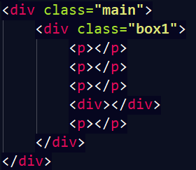
页面的效果:

看到上面的框框了吗?我们就是通过给这些框框添加背景色的方式,来让大家,了解css3的选择器的效果,下面正式开始:
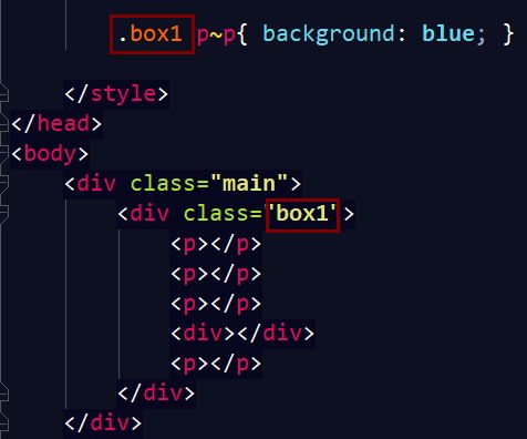
关联选择器
E1~E2
选择 E1 后面的兄弟 E2。
页面效果:
选择除了第一个 p 元素之外,后面所有的 p 元素,即使中间隔着一个 div 标签,也能被选中,背景色变成蓝色。
属性选择器新增
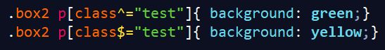
[^=" " ] 选中以...开头的元素
[$=" " ] 选中以...结束的元素
[*=" " ] 包含...都元素都被选中
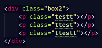
定义三个 p 标签,这个样式就是以 test 开头的 p 标签变成绿色,以 test 结尾的 p 标签变成黄色。
效果:

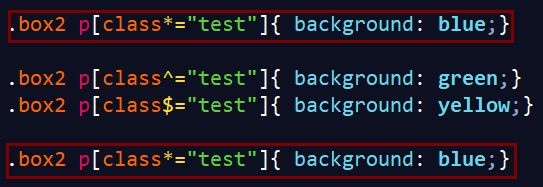
最后演示的就是包含,伙伴们使用的时候要注意,如果把这个选择器放在最下面那么,那么所有的三个标签都会被覆盖了之前的颜色,变成蓝色。放在最上面的话,也是同理,后面的样式会覆盖之前的样式。

伪类新增
first-of-type
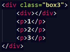
选择到 p,p 必须为其父级所有子元素为 p 的第一个 p 元素。
选择了,div 标签中的 第一个 p 元素。

p:last-of-type
选择到 p,p 必须为其父级所有子元素为 p 的最后一个 p 元素。

p:only-of-type
选择到 p,p 必须为其父级所有子元素为 p 的唯一一个 p 元素。

在上面的 div 中只有一个 p 元素,现在我们使用这个 only-of-type 看一下效果。

记住必须是唯一的一个哦,要是有两个的话,就选不中了。
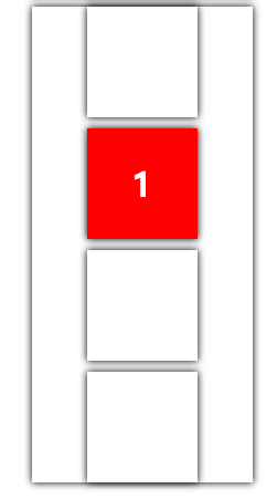
p:nth-of-type(n)
选择到 p, p 必须为其父级所有子元素为 p 的第 n 个 p 元素。
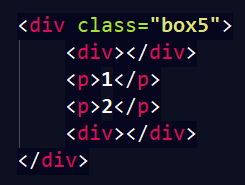

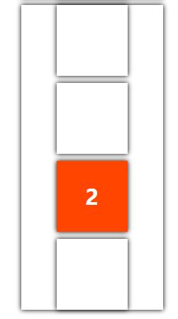
p:nth-last-of-type(n)
选择到 p, p 必须为父级所有子元素为 p 的 d 倒数第 n 个 p 元素。
下面是没有 of 的
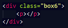
p:only-child
选择 p,p 必须为其父级的唯一一个子元素。
效果:
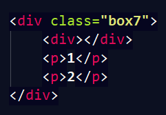
p:last-child
选择 p,p 必须为他们父元素的最后一个子元素。

效果:
p:nth-child(n)
选择 p,p 必须为其父级的第 n 个子元素。
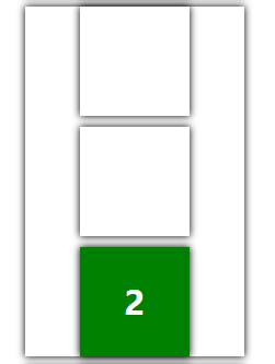
p:nth-last-child(n)
选择 p,p 必须为其父级的倒数第 n 个子元素。


效果:

这其中框住的这条背景颜色,没有成功,因为第二个元素不是 div 是 p,在使用的时候要注意,元素的类型,和位置一定要准确。
p:target
选择到 p,被锚点激活的 p

效果:

p::selection
被用户选中的 p

效果:

不用怀疑的确是两个冒号
上代码
Title
*{margin:0;padding:0;}
body,ul,li,ol,dl,dd,p,h1,h2,h3,h4,h5,h6{ margin:0;}
a{text-decoration:none;color: inherit;}
img{display: block;border:none;}
ol,ul{list-style:none;}
.clearfix:after content: "";display: block;clear:both;}
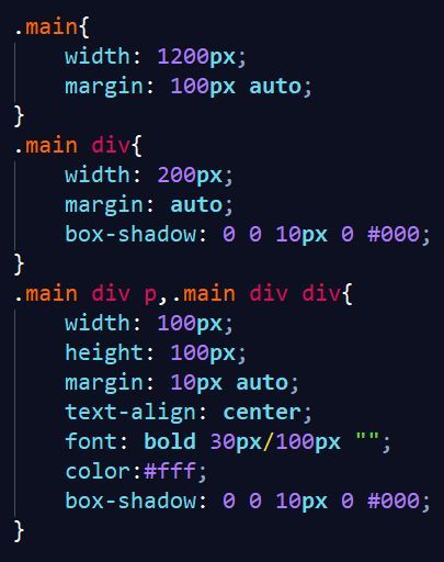
.main{
width: 1200px;
margin: 100px auto;
}
.main div{
width: 200px;
margin: auto;
box-shadow: 0 0 10px 0 #000;
}
.main div p,.main div div {
width: 100px;
height: 100px;
margin: 10px auto;
text-align: center;
font: bold 30px/100px "";
color:#fff;
box-shadow: 0 0 10px 0 #000;
}
.box1 p~p{ background: blue; }
.box2 p[class*="test"]{ background: blue;}
.box2 p[class^="test"]{ background: green;}
.box2 p[class$="test"]{ background: yellow;}
/*.box3 p:first-of-type{ background: purple;}*/
.box3 p:last-of-type{ background: purple;}
.box4 p:only-of-type{ background: blue;}
/*.box5 p:nth-of-type(2){ background: orangered;}*/
.box5 p:nth-last-of-type(2){ background: red;}
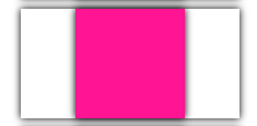
.box6 p:only-child{ background: deeppink;}
.box7 p:last-child{ background: green;}
.box8 p:nth-child(3){ background: yellow;}
.box8 div:nth-child(4){ background: blue;}
.box8 div:nth-child(2){ background: red;}
.box8 div:nth-last-child(4){ background: deeppink;}
.box9 p:target{ background: blue;}
.box10 span::selection{ background: deeppink; color:#fff;}
1
2
3
1
2
1
2
1
2
点我~点我~
点我~点我~
我是娜娜,一个小仙女~
好的今天的分享就到这里了
最后给大家露一手
看到这个轮播图了吗?
纯 css3 做的呦!
大家可以先试着做一下
下次告诉会大家怎么做
那么
伙伴们再见了