从零开始学WEB前端——网页进阶——HTML5+CSS3
项目介绍
先做个自我介绍,本人是一个没人写前端所以就自学前端的后端程序员。在此项目中我会和大家一起从零基础开始学习前端,从后端程序员的视角来看前端,受限于作者的水平本项目暂时只会更新到前端框架VUE,不会涉及node.js。该项目适合零基础的小白或者和我一样开发网站没人写前端所以自学前端的后端程序员。
该项目的学习顺序是按照我自己学习时总结出来的,其中的每个知识点都是我认真去理解的,同时也查了很多的资料,所有的参考资料我都放在了文章末尾。尊重开源,尊重知识产权。每一个案例我都亲手写过并觉得不错才放上去的。每次的代码和笔记我都放在了开源仓库里,有需要的同学请不要吝啬给我一个star。如果觉得本文写的不错的话记得点赞+关注,你们的支持是我坚持下去的动力。
白苎新袍入嫩凉。春蚕食叶响回廊。禹门已准桃花浪,月殿先收桂子香。
鹏北海,凤朝阳。又携书剑路茫茫。明年此日青云去,却笑人间举子忙。
——辛弃疾《鹧鸪天·送廓之秋试》
语雀地址:https://www.yuque.com/beilayanmen
Github地址:https://github.com/SuZui-cn/my-web
Gitee地址:https://gitee.com/north_gate/my-web
个人博客地址:https://foollyone.cn/
⌨本文知识点
- HTML5介绍
- HTML5新增内容
- 语义化标签
- HTML5表单
- HTML5表单属性
- 多媒体
- 拖拽元素
- 历史
- 地理定位
- Web存储
- CSS3介绍
- CSS3新增内容
- 选择器
- 属性
作者在HTML5+CSS3的学习比较薄弱,所以参考了大量的菜鸟教程以及千古壹号大佬的开源项目。
在实际的工作中HTML5+CSS3是一个重点,需要着重掌握。但是需要注意IE8 及以下版本的浏览器不支持 H5 和 CSS3。解决办法:引入html5shiv.js文件。
引入时,需要做if判断,具体代码如下:
上方代码是条件注释:虽然是注释,但是IE浏览器可以识别出来。解释一下:
-
l:less 更小
-
t:than 比
-
e:equal等于
-
g:great 更大
接下来我们先从HTML5入手。其中的很多案例都包含了js代码,可以在学习了js之后再回过头来看。所有的代码文件我都放在了仓库里,有需要的同学可以自取,别忘了给个star。

HTML5介绍
HTML5是HTML最新的修订版本,2014年10月由万维网联盟(W3C)完成标准制定。HTML5的设计目的是为了在移动设备上支持多媒体。
HTML5 是 W3C 与 WHATWG 合作的结果,WHATWG 指 Web Hypertext Application Technology Working Group。WHATWG 致力于 web 表单和应用程序,而 W3C 专注于 XHTML 2.0。在 2006 年,双方决定进行合作,来创建一个新版本的 HTML。
HTML5 中的一些有趣的新特性:
用于绘画的 canvas 元素
用于媒介回放的 video 和 audio 元素
对本地离线存储的更好的支持
新的特殊内容元素,比如 article、footer、header、nav、section
新的表单控件,比如 calendar、date、time、email、url、search
——菜鸟教程
HTML5并不仅仅只是做为HTML标记语言的一个最新版本,更重要的是它制定了Web应用开发的一系列标准,成为第一个将Web做为应用开发平台的HTML语言。HTML5定义了一系列新元素,如新语义标签、智能表单、多媒体标签等,可以帮助开发者创建富互联网应用,还提供了一些Javascript API,如地理定位、重力感应、硬件访问等,可以在浏览器内实现类原生应用。我们甚至可以结合 Canvas 开发网页版游戏。
HTML5的广义概念:HTML5代表浏览器端技术的一个发展阶段。在这个阶段,浏览器的呈现技术得到了飞跃发展和广泛支持,它包括:HTML5、CSS3、Javascript API在内的一套技术组合。
总结:HTML5是新一代开发 Web 富客户端应用程序整体解决方案。包括:HTML5,CSS3,Javascript API在内的一套技术组合。
HTML5新增内容
语义化的标签
在我们之前编写布局的时候是采用的是给div命名的方式。
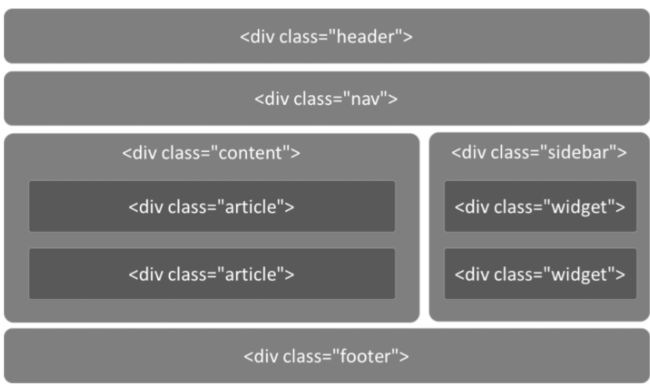
但是在HTML5中,可以直接用语义化的标签代替

HTML5下的代码布局如下:
<header>
  <ul class="nav">ul>
header>


<div class="main">

  <article>article>

  <aside>aside>
div>


<footer>footer>
下面是HTML5新添加的标签。
| 标签 | 描述 |
|---|---|
| 定义页面独立的内容区域。 | |
| 定义页面的侧边栏内容。 | |
| 允许您设置一段文本,使其脱离其父元素的文本方向设置。 | |
| 定义命令按钮,比如单选按钮、复选框或按钮 | |
| 用于描述文档或文档某个部分的细节 | |
| 定义对话框,比如提示框 | |
| 标签包含 details 元素的标题 | |
| 规定独立的流内容(图像、图表、照片、代码等等)。 | |
| 定义 元素的标题 | |
| 定义 section 或 document 的页脚。 | |
|
|
定义了文档的头部区域 |
| 定义带有记号的文本。 | |
| 定义度量衡。仅用于已知最大和最小值的度量。 | |
| 定义导航链接的部分。 | |
| 定义任何类型的任务的进度。 | |
| 定义 ruby 注释(中文注音或字符)。 | |
| 定义字符(中文注音或字符)的解释或发音。 | |
| 在 ruby 注释中使用,定义不支持 ruby 元素的浏览器所显示的内容。 | |
| 定义文档中的节(section、区段)。 | |
| 定义日期或时间。 | |
| 规定在文本中的何处适合添加换行符。 |
HTML5表单
表单在HTML5中变化很大,所有着重讲解一下表单。
新增的表达类型:
email只能输入email格式。自动带有验证功能。tel手机号码。url只能输入url格式。number只能输入数字。search搜索框range滑动条color拾色器time时间date日期datetime时间日期month月份week星期
下面是代码的演示:
DOCTYPE html>
<html lang="en">
  <head>
    <meta charset="UTF-8" />
    <meta
      name="viewport"
      content="width=device-width, initial-scale=1, user-scalable=no"
    />
    <title>表单类型title>
    <style>
      body {
        margin: 0;
        padding: 0;
        background-color: #f7f7f7;
      }
      form {
        max-width: 500px;
        width: 100%;
        margin: 32px auto 0;
        font-size: 16px;
      }
      label {
        display: block;
        margin: 10px 0;
      }
      input {
        width: 100%;
        height: 25px;
        margin-top: 2px;
        display: block;
      }
    style>
  head>
  <body>
    <form action="">

      <fieldset>
        <legend>表单类型legend>
        <label for="">
          email: <input type="email" name="email" required />
        label>
        <label for=""> color: <input type="color" name="color" /> label>
        <label for=""> url: <input type="url" name="url" /> label>
        <label for="">
          number: <input type="number" step="3" name="number" />
        label>
        <label for="">
          range: <input type="range" name="range" value="100" />
        label>
        <label for=""> search: <input type="search" name="search" /> label>
        <label for=""> tel: <input type="tel" name="tel" /> label>
        <label for=""> time: <input type="time" name="time" /> label>
        <label for=""> date: <input type="date" name="date" /> label>
        <label for=""> datetime: <input type="datetime" /> label>
        <label for=""> week: <input type="week" name="month" /> label>
        <label for=""> month: <input type="month" name="month" /> label>
        <label for="">
          datetime-local: <input type="datetime-local" name="datetime-local" />
        label>
        <input type="submit" />
      fieldset>
    form>
  body>
html>
效果图:

在HTML5中,input里的list属性和 datalist 进行了绑定。之后在输入框里会自动提示
<input type="text" list="myData">
<datalist id="myData">
    <option>本科option>
    <option>研究生option>
    <option>不明option>
datalist>

HTML5表单属性
-
placeholder占位符(提示文字) -
autofocus自动获取焦点 -
multiple文件上传多选或多个邮箱地址 -
autocomplete自动完成(填充的)。on 开启(默认),off 取消。用于表单元素,也可用于表单自身(on/off) -
form指定表单项属于哪个form,处理复杂表单时会需要 -
novalidate关闭默认的验证功能(只能加给form) -
required表示必填项 -
pattern自定义正则,验证表单。例如
代码举例:
DOCTYPE html>
<html>
<head lang="en">
    <meta charset="UTF-8">
    <title>title>
    <style>
        form {
            width: 100%;
            /* 最大宽度*/
            max-width: 640px;
            /* 最小宽度*/
            min-width: 320px;
            margin: 0 auto;
            font-family: "Microsoft Yahei";
            font-size: 20px;
        }

        input {
            display: block;
            width: 100%;
            height: 30px;
            margin: 10px 0;
        }
    style>
head>
<body>

<form action="">
    <fieldset>
        <legend>表单属性legend>
        <label for="">
            用户名:<input type="text" placeholder="例如:smyhvae" autofocus name="userName" autocomplete="on" required/>
        label>

        <label for="">
            电话:<input type="tel" pattern="1\d{10}"/>
        label>

        <label for="">
            multiple的表单: <input type="file" multiple>
        label>


        <input type="file" name="file" multiple/>

        <input type="submit"/>
    fieldset>
form>

body>
html>

多媒体
作者小时候很喜欢玩4399小游戏,有一天再上4399打开游戏的时候却发现不能玩了。

这是因为原本的游戏是以flash player为基础的。但是由于flash在最初设计的时候就存在缺陷,随着特性的扩充原本的问题越来越大,最终导致难以维护。
Adobe公司宣布,计划在2020年底逐步Flash Player。各大浏览器服务商也陆续宣布,将在2020年停止对Flash提供支持。
放弃使用Flash的真正原因是它的漏洞数量已经超过正常的可维护水平,在已有替代品的情况下,开发商不应在过时产品的维护上进行过大的开销。 ——知乎
而flash的替代就是HTML5技术。
音频
HTML5通过标签来解决音频播放的问题。
<audio src="music/yinyue.mp3" autoplay controls> audio>

我们可以通过附加属性,来更友好地控制音频的播放,如:
-
autoplay自动播放。写成autoplay或者autoplay = "",都可以。 -
controls控制条。(建议把这个选项写上,不然都看不到控件在哪里) -
loop循环播放。 -
preload预加载 同时设置 autoplay 时,此属性将失效。
视频
HTML5通过标签来解决视频播放的问题。
<video src="video/movie.mp4" controls autoplay>video>
简单的视频播放器案例
DOCTYPE html>
<html>
  <head lang="en">
    <meta charset="UTF-8" />
    <title>title>

    <link rel="stylesheet" href="css/font-awesome.min.css" />
    <style>
      * {
        margin: 0;
        padding: 0;
      }
      /*多媒体标题*/
      figcaption {
        text-align: center;
        line-height: 150px;
        font-family: 'Microsoft Yahei';
        font-size: 24px;
      }

      /* 播放器*/
      .palyer {
        width: 720px;
        height: 360px;
        margin: 10px auto;
        border: 1px solid #000;
        background: url(images/loading.gif) center no-repeat #000;
        background-size: auto 100%;
        position: relative;
        border-radius: 20px;
      }

      .palyer video {
        height: 100%;
        display: block;
        margin: 0 auto;
        /*display: none;*/
      }

      /* 控制条*/

      .controls {
        width: 700px;
        height: 40px;
        background-color: rgba(255, 255, 0, 0.3);
        position: absolute;
        bottom: 10px;
        left: 10px;
        border-radius: 10px;
      }
      /*开关*/
      .switch {
        position: absolute;
        width: 20px;
        height: 20px;
        left: 10px;
        top: 10px;

        text-align: center;
        line-height: 20px;
        color: yellow;
      }
      /*进度条*/
      .progress {
        width: 432px;
        height: 10px;
        position: absolute;
        background-color: rgba(255, 255, 255, 0.4);
        left: 40px;
        top: 15px;
        border-radius: 4px;
        overflow: hidden;
      }
      /* 当前进度*/
      .curr-progress {
        width: 50%;
        height: 10px;
        background-color: #fff;
      }
      /* 时间模块*/
      .time {
        width: 120px;
        height: 20px;
        text-align: center;
        line-height: 20px;
        color: #fff;
        position: absolute;
        left: 510px;
        top: 10px;
        font-size: 12px;
      }
      /*全屏*/
      .extend {
        position: absolute;
        width: 20px;
        height: 20px;

        right: 20px;
        top: 10px;

        text-align: center;
        line-height: 20px;
        color: yellow;
      }
    style>
  head>
  <body>

    <figure>

      <figcaption>视频案例figcaption>
      <div class="palyer">

        <video src="">video>


        <div class="controls">

          <a href="#" class="switch icon-play">a>
          <div class="progress">

            <div class="curr-progress">div>
          div>

          <div class="time">
            <span class="curr-time">00:00:00span>/<span class="total-time"
              >00:00:00span
            >
          div>

          <a href="#" class="extend icon-resize-full">a>
        div>
      div>
    figure>

    <script>
      // 思路:
      /*
       * 1、点击按钮 实现播放暂停并且切换图标
       * 2、算出视频的总时显示出出来
       * 3、当视频播放的时候,进度条同步,当前时间同步
       * 4、点击实现全屏
       */

      //        获取需要的标签
      var video = document.querySelector('video');
      //          播放按钮
      var playBtn = document.querySelector('.switch');
      //          当前进度条
      var currProgress = document.querySelector('.curr-progress');
      //          当前时间
      var currTime = document.querySelector('.curr-time');
      //          总时间
      var totalTime = document.querySelector('.total-time');
      //          全屏
      var extend = document.querySelector('.extend');

      var tTime = 0;

      //         1、点击按钮 实现播放暂停并且切换图标

      playBtn.onclick = function () {
        //               如果视频播放 就暂停,如果暂停 就播放
        if (video.paused) {
          //                   播放
          video.play();
          //切换图标
          this.classList.remove('icon-play');
          this.classList.add('icon-pause');
        } else {
          //                   暂停
          video.pause();
          //                   切换图标
          this.classList.remove('icon-pause');
          this.classList.add('icon-play');
        }
      };

      //        2、算出视频的总时显示出出来
      //        当时加载完成后的事件,视频能播放的时候
      video.oncanplay = function () {
        //             获取视频总时长
        tTime = video.duration;
        console.log(tTime);

        //          将总秒数 转换成 时分秒的格式:00:00:00
        //            小时
        var h = Math.floor(tTime / 3600);
        //            分钟
        var m = Math.floor((tTime % 3600) / 60);
        //            秒
        var s = Math.floor(tTime % 60);

        //            console.log(h);
        //            console.log(m);
        //            console.log(s);

        //            把数据格式转成 00:00:00
        h = h >= 10 ? h : '0' + h;
        m = m >= 10 ? m : '0' + m;
        s = s >= 10 ? s : '0' + s;

        console.log(h);
        console.log(m);
        console.log(s);
        //            显示出来
        totalTime.innerHTML = h + ':' + m + ':' + s;
      };
      //   * 3、当视频播放的时候,进度条同步,当前时间同步
      //         当时当前时间更新的时候触发
      video.ontimeupdate = function () {
        //            获取视频当前播放的时间
        //           console.log(video.currentTime);
        //            当前播放时间
        var cTime = video.currentTime;
        //           把格式转成00:00:00

        var h = Math.floor(cTime / 3600);
        //            分钟
        var m = Math.floor((cTime % 3600) / 60);
        //            秒
        var s = Math.floor(cTime % 60);

        //            把数据格式转成 00:00:00
        h = h >= 10 ? h : '0' + h;
        m = m >= 10 ? m : '0' + m;
        s = s >= 10 ? s : '0' + s;

        //            显示出当前时间
        currTime.innerHTML = h + ':' + m + ':' + s;

        //            改变进度条的宽度: 当前时间/总时间
        var value = cTime / tTime;

        currProgress.style.width = value * 100 + '%';
      };

      //        全屏
      extend.onclick = function () {
        //            全屏的h5代码
        video.webkitRequestFullScreen();
      };
    script>
  body>
html>
拖拽元素
在HTML5的规范中,我们可以通过为元素增加 draggable="true" 来设置此元素是否可以进行拖拽操作,其中图片、链接默认是开启拖拽的。
DOCTYPE html>
<html lang="en">
<head>
    <meta charset="UTF-8">
    <title>Titletitle>
    <link rel="stylesheet" href="css/font-awesome.min.css">
    <style>
    .box1{
        width: 200px;
        height: 200px;
        background-color: green;

    }
    style>
head>
<body>

    <div class="box1" draggable="true">div>
body>
html>

上图中,我们给 box1 增加了draggable="true" 属性之后,发现 box1 是可以拖拽的。但是拖拽之后要做什么事情呢?这就涉及到事件监听。
事件监听这里涉及到了javascript,可以之后学习了js再回过来看。
拖拽元素的事件监听:(应用于拖拽元素)
ondragstart当拖拽开始时调用ondragleave当鼠标离开拖拽元素时调用ondragend当拖拽结束时调用ondrag整个拖拽过程都会调用
DOCTYPE html>
<html>
<head lang="en">
    <meta charset="UTF-8">
    <title>title>
    <style>
        .box {
            width: 200px;
            height: 200px;
            background-color: green;
        }
    style>
head>
<body>
<div class="box" draggable="true">div>

<script>
    var box = document.querySelector('.box');

    //  绑定拖拽事件

    //  拖拽开始
    box.ondragstart = function () {
        console.log('拖拽开始.');
    }

    //  拖拽离开:鼠标拖拽时离开被拖拽的元素时触发
    box.ondragleave = function () {
        console.log('拖拽离开..');
    }

    //  拖拽结束
    box.ondragend = function () {
        console.log('拖拽结束...');
        console.log("---------------");
    }

    box.ondrag = function () {
        console.log('拖拽');
    }

script>
body>
html>
拖拽元素的事件监听
DOCTYPE html>
<html>
  <head>
    <meta charset="utf-8" />
    <title>菜鸟教程(runoob.com)title>
    <style type="text/css">
      #div1 {
        width: 350px;
        height: 70px;
        padding: 10px;
        border: 1px solid #aaaaaa;
      }
    style>
    <script>
      function allowDrop(ev) {
        ev.preventDefault();
      }

      function drag(ev) {
        ev.dataTransfer.setData('Text', ev.target.id);
      }

      function drop(ev) {
        ev.preventDefault();
        var data = ev.dataTransfer.getData('Text');
        ev.target.appendChild(document.getElementById(data));
      }
    script>
  head>
  <body>
    <p>拖动 RUNOOB.COM 图片到矩形框中:p>

    <div id="div1" ondrop="drop(event)" ondragover="allowDrop(event)">div>
    <br />
    <img
      id="drag1"
      src="https://gitee.com/north_gate/drawing-bed/raw/master/images/image-20220218234538140.png"
      draggable="true"
      ondragstart="drag(event)"
      width="336"
      height="69"
    />
  body>
html>


历史
界面上的所有JS操作不会被浏览器记住,就无法回到之前的状态。
在HTML5中可以通过 window.history 操作访问历史状态,让一个页面可以有多个历史状态
window.history对象可以让我们管理历史记录,可用于单页面应用,Single Page Application,可以无刷新改变网页内容。
-
window.history.forward(); // 前进
-
window.history.back(); // 后退
-
window.history.go(); // 刷新
-
window.history.go(n); //n=1 表示前进;n=-1 后退;n=0s 刷新。如果移动的位置超出了访问历史的边界,会静默失败,但不会报错。
-
通过JS可以加入一个访问状态
-
history.pushState; //放入历史中的状态数据, 设置title(现在浏览器不支持改变历史状态)
地理定位
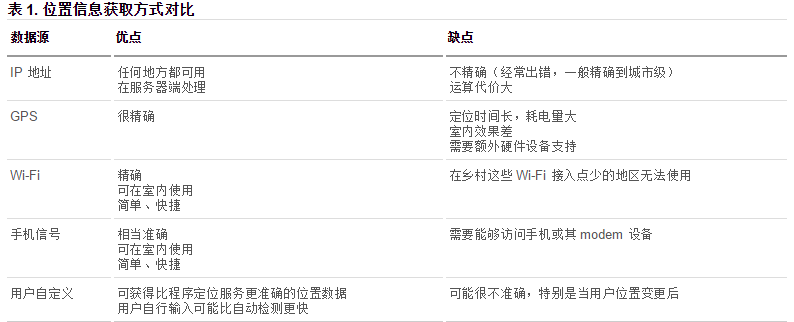
在HTML规范中,增加了获取用户地理信息的API,这样使得我们可以基于用户位置开发互联网应用,即基于位置服务 LBS (Location Base Service)。
获取地理信息的方式
1、IP地址
2、三维坐标
(1)GPS(Global Positioning System,全球定位系统)。
目前世界上在用或在建的第2代全球卫星导航系统(GNSS)有:
-
1.美国 Global Positioning System (全球定位系统) 简称GPS;
-
2.苏联/俄罗斯 GLOBAL NAVIGATION SATELLITE SYSTEM (全球卫星导航系统)简称GLONASS(格洛纳斯);
-
3.欧盟(欧洲是不准确的说法,包括中国在内的诸多国家也参与其中)Galileo satellite navigation system(伽利略卫星导航系统) 简称GALILEO(伽利略);
-
4.中国 BeiDou(COMPASS) Navigation Satellite System(北斗卫星导航系统)简称 BDS ;
-
5.日本 Quasi-Zenith Satellite System (准天顶卫星系统) 简称QZSS ;
-
6.印度 India Regional Navigation Satellite System(印度区域卫星导航系统)简称IRNSS。
以上6个系统中国都能使用。
(2)Wi-Fi定位:仅限于室内。
(3)手机信号定位:通过运营商的信号塔定位。
3、用户自定义数据
对不同获取方式的优缺点进行了比较,浏览器会自动以最优方式去获取用户地理信息:
通过百度API获取位置定位
DOCTYPE html>
<html>
<head>
    <meta charset="utf-8" />
    <title>title>

    <script type="text/javascript" src="https://api.map.baidu.com/api?v=2.0&ak=7a6QKaIilZftIMmKGAFLG7QT1GLfIncg">script>
head>
<body>
    <input type="button" onclick="getLocation()" value="确认" />
    <div id="position">div>
    <script type="text/javascript">
    var x = document.getElementById('position');
    function getLocation() {
        // 创建百度地理位置实例,代替 navigator.geolocation
        var geolocation = new BMap.Geolocation();
        geolocation.getCurrentPosition(function(e) {
            if(this.getStatus() == BMAP_STATUS_SUCCESS){
                // 百度 geolocation 的经纬度属性不同,此处是 point.lat 而不是 coords.latitude
                x.innerHTML = '纬度:' + e.point.lat + '
经度:' + e.point.lng;
            } else {
                x.innerHTML = 'failed' + this.getStatus();
            }
        });
    }
    script>
body>
html>
Web 存储
H5 中有两种存储的方式
localStorage(本地存储) 和 sessionStorage (会话存储)
客户端存储数据的两个对象为:
- localStorage - 用于长久保存整个网站的数据,保存的数据没有过期时间,直到手动去除。
- sessionStorage - 用于临时保存同一窗口(或标签页)的数据,在关闭窗口或标签页之后将会删除这些数据。
不管是 localStorage,还是 sessionStorage,可使用的API都相同,常用的有如下几个(以localStorage为例):
- 保存数据:localStorage.setItem(key,value);
- 读取数据:localStorage.getItem(key);
- 删除单个数据:localStorage.removeItem(key);
- 删除所有数据:localStorage.clear();
- 得到某个索引的key:localStorage.key(index);
Web 存储的特性
(1)设置、读取方便。
(2)容量较大,sessionStorage 约5M、localStorage 约20M。
(3)只能存储字符串,可以将对象 JSON.stringify() 编码后存储。
案例:记住用户名和密码
DOCTYPE html>
<html>
<head lang="en">
    <meta charset="UTF-8">
    <title>title>
head>
<body>
<label for="">
    用户名:<input type="text" class="userName"/>
label>
<br/><br/>
<label for="">
    密 码:<input type="text" class="pwd"/>
label>
<br/><br/>
<label for="">
    <input type="checkbox" class="check" id=""/>记住密码
label>
<br/><br/>
<button>登录button>

<script>
    var userName = document.querySelector('.userName');
    var pwd = document.querySelector('.pwd');
    var chk = document.querySelector('.check');
    var btn = document.querySelector('button');

    //        当点击登录的时候 如果勾选“记住密码”,就存储密码;否则就清除密码
    btn.onclick = function () {
        if (chk.checked) {
//                记住数据
            window.localStorage.setItem('userName', userName.value);
            window.localStorage.setItem('pwd', pwd.value);
        } else {
//                清除数据
            window.localStorage.removeItem('userName');
            window.localStorage.removeItem('pwd');
        }
    }
    //        下次登录时,如果记录的有数据,就直接填充
    window.onload = function () {
        userName.value = window.localStorage.getItem('userName');
        pwd.value = window.localStorage.getItem('pwd');

    }
script>
body>
html>
CSS3介绍
CSS3在CSS2基础上,增强或新增了许多特性, 弥补了CSS2的众多不足之处,使得Web开发变得更为高效和便捷。
CSS3 被拆分为"模块"。旧规范已拆分成小块,还增加了新的。
一些最重要 CSS3 模块如下:
- 选择器
- 盒模型
- 背景和边框
- 文字特效
- 2D/3D转换
- 动画
- 多列布局
- 用户界面
CSS3新增内容
选择器
在CSS3中添加了三种选择器:
- 属性选择器
- 结构伪类选择器
- 伪元素选择器
下表是菜鸟教程的选择器总览

属性选择器
属性选择器的标志性符号是 []。
匹配含义:
^:开头 $:结尾 *:包含
格式:
-
E[title]选中页面的E元素,并且E存在 title 属性即可。 -
E[title="abc"]选中页面的E元素,并且E需要带有title属性,且属性值完全等于abc。 -
E[attr~=val]选择具有 att 属性且属性值为:用空格分隔的字词列表,其中一个等于 val 的E元素。 -
E[attr|=val]表示要么是一个单独的属性值,要么这个属性值是以“-”分隔的。 -
E[title^="abc"]选中页面的E元素,并且E需要带有 title 属性,属性值以 abc 开头。 -
E[title$="abc"]选中页面的E元素,并且E需要带有 title 属性,属性值以 abc 结尾。 -
E[title*="abc"]选中页面的E元素,并且E需要带有 title 属性,属性值任意位置包含abc。
代码案例:
DOCTYPE html>
<html lang="en">
  <head>
    <meta charset="UTF-8" />
    <title>选择器 - 属性title>
    <style>
      body {
        margin: 0;
        padding: 0;
        font-family: '微软雅黑';
        background-color: #f7f7f7;
      }

      .wrapper {
        width: 1024px;
        margin: 0 auto;
      }

      .wrapper > section {
        min-height: 300px;
        margin-bottom: 30px;
        box-shadow: 1px 1px 4px #ddd;
        background-color: #fff;
      }

      .wrapper > header {
        text-align: center;
        line-height: 1;
        padding: 20px;
        margin-bottom: 10px;
        font-size: 30px;
      }

      .wrapper section > header {
        line-height: 1;
        padding: 10px;
        font-size: 22px;
        color: #333;
        background-color: #eee;
      }

      .wrapper .wrap-box {
        padding: 20px;
      }

      form {
        width: 300px;
        height: 300px;
        margin: 0 auto;
      }

      form input[type='text'] {
        width: 200px;
        height: 30px;
      }

      form input[type='password'] {
        width: 200px;
        height: 30px;
      }

      .attr1 {
      }

      .download {
      }

      .attr1 a[href='./a.rmvb'] {
        color: red;
      }

      .attr1 a[href='./b.rmvb'] {
        color: pink;
      }

      /*  E[attr~=val] 表示的一个单独的属性值 这个属性值是以空格分隔的*/
      .attr2 a[class~='download'] {
        color: red;
      }

      /*  E[attr|=val] 表示的要么一个单独的属性值 要么这个属性值是以"-"分隔的*/
      .attr3 a[class|='download'] {
        color: red;
      }

      /*  E[attr*=val] 表示的属性值里包含val字符并且在“任意”位置 */
      .attr4 a[class*='download'] {
        color: red;
      }

      /*  E[attr^=val] 表示的属性值里包含val字符并且在“开始”位置 */
      .attr5 a[class^='download'] {
        color: red;
      }

      /*  E[attr$=val] 表示的属性值里包含val字符并且在“结束”位置 */
      .attr6 a[class$='download'] {
        color: red;
      }
    style>
  head>
  <body>
    <div class="wrapper">
      <header>CSS3-属性选择器header>
      <section>
        <header>简介header>
        <div class="wrap-box">
          <form action="">
            <ul>
              <li>姓名: <input type="text" />li>
              <li>密码: <input type="password" />li>

              <li>性别: <input type="radio" />男 <input type="radio" /> 女li>
              <li>兴趣: <input type="checkbox" name="" id="" />写代码li>
              <li>
                <input type="submit" value="提交" />
              li>
            ul>
          form>
        div>
      section>
      <section class="attr1">
        <header>E[attr]header>
        <div class="wrap-box">
          <a href="./a.rmvb" class="download download-movie">下载a>
          <a href="./b.rmvb" class="download download-movie">下载a>
          <a href="./a.mp3" class="download download-music">下载a>
        div>
      section>
      <section class="attr2">
        <header>E[attr~=attr]header>
        <div class="wrap-box">
          <a href="./a.rmvb" class="download download-movie">下载a>
          <a href="./b.rmvb" class="download download-movie">下载a>
          <a href="./a.mp3" class="download download-music">下载a>
        div>
      section>
      <section class="attr3">
        <header>E[attr|=attr]header>
        <div class="wrap-box">
          <a href="./a.rmvb" class="download">下载a>
          <a href="./b.rmvb" class="download-movie">下载a>
          <a href="./a.mp3" class="download-music">下载a>
        div>
      section>
      <section class="attr4">
        <header>E[attr*=val]header>
        <div class="wrap-box">
          <a href="./a.rmvb" class="download">下载a>
          <a href="./b.rmvb" class="moviedownload">下载a>
          <a href="./a.mp3" class="downloadmusic">下载a>
        div>
      section>
      <section class="attr5">
        <header>E[attr^=val]header>
        <div class="wrap-box">
          <a href="./a.rmvb" class="download">下载a>
          <a href="./b.rmvb" class="moviedownload">下载a>
          <a href="./a.mp3" class="downloadmusic">下载a>
        div>
      section>
      <section class="attr6">
        <header>E[attr$=val]header>
        <div class="wrap-box">
          <a href="./a.rmvb" class="download">下载a>
          <a href="./b.rmvb" class="moviedownload">下载a>
          <a href="./a.mp3" class="downloadmusic">下载a>
        div>
      section>
    div>
  body>
html>
结构伪类选择器
CSS中有一些伪类选择器,比如:link、:active、:visited、:hover,这些是动态伪类选择器。
CSS3又新增了其它的伪类选择器。这一小段,我们来学习CSS3中的结构伪类选择器:即通过结构来进行筛选。
1、格式:(第一部分)
-
E:first-child匹配父元素的第一个子元素E。 -
E:last-child匹配父元素的最后一个子元素E。 -
E:nth-child(n)匹配父元素的第n个子元素E。注意,盒子的编号是从1开始算起,不是从0开始算起。 -
E:nth-child(odd)匹配奇数 -
E:nth-child(even)匹配偶数 -
E:nth-last-child(n)匹配父元素的倒数第n个子元素E。
理解:
(1)这里我们要好好理解父元素的含义,它指的是:以 E 元素的父元素为参考。
(2)注意:以上选择器中所选到的元素的类型,必须是指定的类型E,如果选不中,则无效。这个要好好理解,具体可以看CSS参考手册中的E:nth-child(n)的示例。我们可以理解成:先根据选择器找到选中的全部位置,如果发现某个位置不是类型E,则该位置失效。
(3)另外,E:nth-child(n)这个属性也很有意思。比如,针对下面这样一组标签:
    <ul>
        <li>1li>
        <li>2li>
        <li>3li>
        <li>4li>
        <li>5li>
        <li>6li>
        <li>7li>
        <li>8li>
        <li>9li>
        <li>10li>
    ul>
上方代码中:
-
如果选择器写成
li:nth-child(2),则表示第2个li。 -
如果选择器写成
li:nth-child(n),则表示所有的li。因为此时的n表示 0,1,2,3,4,5,6,7,8…(当n小于1时无效,因为n = 0 也是不会选中的) -
如果选择器写成
li:nth-child(2n),则表示所有的第偶数个 li。 -
如果选择器写成
li:nth-child(2n+1),则表示所有的第奇数个 li。 -
如果选择器写成
li:nth-child(-n+5),则表示前5个 li。 -
如果选择器写成
li:nth-last-child(-n+5),则表示最后5个 li。 -
如果选择器写成
li:nth-child(7n),则表示选中7的倍数。。
上面列举的选择器中,我们只要记住: n 表示 0,1,2,3,4,5,6,7,8…就很容易明白了。
2、格式:(第二部分)
-
E:first-of-type匹配同类型中的第一个同级兄弟元素E。 -
E:last-of-type匹配同类型中的最后一个同级兄弟元素E。 -
E:nth-of-type(n)匹配同类型中的第n个同级兄弟元素E。 -
E:nth-last-of-type(n)匹配同类型中的倒数第n个同级兄弟元素E。
既然上面这几个选择器带有type,我们可以这样理解:先在同级里找到所有的E类型,然后根据 n 进行匹配。
3、格式:(第三部分)
-
E:empty匹配没有任何子节点(包括空格等text节点)的元素E。 -
E:target匹配相关URL指向的E元素。要配合锚点使用。

伪元素选择器
1、格式:(第一部分)
-
E::before设置在 元素E 前面(依据对象树的逻辑结构)的内容,配合content属性一起使用。 -
E::after设置在 元素E 后面(依据对象树的逻辑结构)的内容,配合content属性一起使用。
E:after、E:before在旧版本里是伪类,在 CSS3 这个新版本里是伪元素。新版本里,E:after、E:before会被自动识别为E::after、E::before,按伪元素来对待,这样做的目的是用来做兼容处理。
举例:
DOCTYPE html>
<html>
<head lang="en">
<meta charset="UTF-8">
<title>title>
<style>
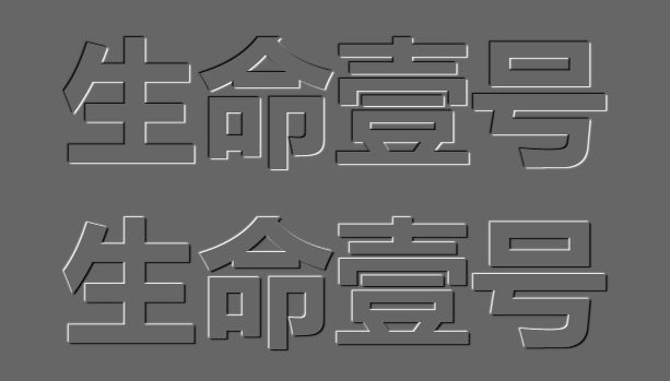
/*::before 和::after 是通过 css 模拟出的html标签的效果*/
span::before{
content:"smyhvae";
color:red;
background-color: pink;
width: 50px;
height: 50px;
display: inline-block;
}
span::after{
content:"永不止步";
color:yellowgreen;
}
/*给原本的span标签设置一个默认的属性*/
span{
border: 1px solid #000;
}
style>
head>
<body>
<span>生命壹号span>
body>
html>
效果如下:

上图可以看出:
-
通过伪元素选择器,就可以添加出类似于span标签的效果(记得要结合 content 属性使用)。
-
通过这两个属性添加的伪元素,是行内元素,需要转换成块元素才能设置宽高。
2、格式:(第二部分)
-
E::first-letter设置元素 E 里面的第一个字符的样式。 -
E::first-line设置元素 E 里面的第一行的样式。 -
E::selection设置元素 E 里面被鼠标选中的区域的样式(一般设置颜色和背景色)。
E::first-letter 的举例:

E::first-line的举例:

最后来张表格:

属性
文本
text-shadow:设置文本的阴影
这个我们之前在抖音风格的字体中使用过。
DOCTYPE html>
<html>
  <head lang="en">
    <meta charset="UTF-8" />
    <title>title>
    <style>
      body {
        background-color: #666;
      }

      div {
        font-size: 100px;
        text-align: center;
        font-weight: bold;
        font-family: 'Microsoft Yahei';
        color: #666;
      }

      /* text-shadow 可以设置多个阴影,每个阴影之间使用逗号隔开*/
      .tu {
        text-shadow: -1px -1px 1px #fff, 1px 1px 1px #000;
      }

      .ao {
        text-shadow: -1px -1px 1px #000, 1px 1px 1px #fff;
      }
    style>
  head>
  <body>
    <div class="ao">生命壹号div>
    <div class="tu">生命壹号div>
  body>
html>
边框
边框部分可以回过头去看“跳动的心”案例
边框圆角
DOCTYPE html>
<html>
  <head lang="en">
    <meta charset="UTF-8" />
    <title>title>
    <style>
      .parent {
        width: 400px;
      }
      .box {
        width: 100px;
        height: 100px;
        float: left;
        border: 1px solid rgb(144, 12, 63);
        margin: 20px;
        text-align: center;
        line-height: 100px;
        color: #fff;
        font-size: 50px;
        background-color: rgb(255, 141, 26);
      }

      /*画圆形的方式一*/
      .box:nth-child(1) {
        border-radius: 50px;
      }

      /*画圆形的方式二*/
      .box:nth-child(2) {
        border-radius: 50%;
      }

      .box:nth-child(3) {
        border-radius: 100px 0 0 0;
      }

      .box:nth-child(4) {
        border-radius: 100px/50px;
      }

      .box:nth-child(5) {
        border-radius: 10%;
      }

      .box:nth-child(6) {
        border-radius: 0 100px;
      }
    style>
  head>
  <body>
    <div class="parent">
      <div class="box">1div>
      <div class="box">2div>
      <div class="box">3div>
      <div class="box">4div>
      <div class="box">5div>
      <div class="box">6div>
    div>
  body>
html>

动画
过渡动画
transition的中文含义是过渡。过渡是CSS3中具有颠覆性的一个特征,可以实现元素不同状态间的平滑过渡(补间动画),经常用来制作动画效果。
-
补间动画:自动完成从起始状态到终止状态的的过渡。不用管中间的状态。
-
帧动画:通过一帧一帧的画面按照固定顺序和速度播放。如电影胶片。
参考链接:补间动画基础
transition 包括以下属性:
-
transition-property: all;如果希望所有的属性都发生过渡,就使用all。 -
transition-duration: 1s;过渡的持续时间。 -
transition-timing-function: linear;运动曲线。属性值可以是:linear线性ease减速ease-in加速ease-out减速ease-in-out先加速后减速
-
transition-delay: 1s;过渡延迟。多长时间后再执行这个过渡动画。
上面的四个属性也可以写成综合属性:
	transition: 让哪些属性进行过度 过渡的持续时间 运动曲线 延迟时间;

	transition: all 3s linear 0s;
其中,transition-property这个属性是尤其需要注意的,不同的属性值有不同的现象。
DOCTYPE html>
<html lang="en">
<head>
    <meta charset="UTF-8">
    <title>CSS 过渡title>
    <style>
        body {
            margin: 0;
            padding: 0;
            background-color: #eeeeee;
        }

        .content {
            width: 800px;
            height: 320px;
            padding-left: 20px;
            margin: 80px auto;
        }

        .item {
            width: 230px;
            height: 300px;
            text-align: center;
            margin-right: 20px;
            background-color: #FFF;
            float: left;
            position: relative;
            top: 0;
            overflow: hidden; /* 让溢出的内容隐藏起来。意思是让下方的橙色方形先躲起来 */
            transition: all .5s; /* 从最初到鼠标悬停时的过渡 */
        }

        .item img {
            margin-top: 30px;
        }

        .item .desc {
            position: absolute;
            left: 0;
            bottom: -80px;
            width: 100%;
            height: 80px;
            background-color: #ff6700;
            transition: all .5s;
        }

        /* 鼠标悬停时,让 item 整体往上移动5px,且加一点阴影 */
        .item:hover {
            top: -5px;
            box-shadow: 0 0 15px #AAA;
        }

        /* 鼠标悬停时,让下方的橙色方形现身 */
        .item:hover .desc {
            bottom: 0;
        }
    style>
head>
<body>
<div class="content">
    <div class="item">
        <img src="./images/1.png" alt="">
    div>

    <div class="item">
        <img src="./images/2.png" alt="">
        <span class="desc">span>
    div>
    <div class="item">
        <img src="./images/3.jpg" alt="">
        <span class="desc">span>
    div>
div>
body>
html>
位移动画
格式:
	transform: translate(水平位移, 垂直位移);

	transform: translate(-50%, -50%);
参数解释:
- 参数为百分比,相对于自身移动。
- 正值:向右和向下。 负值:向左和向上。如果只写一个值,则表示水平移动。
案例
DOCTYPE html>
<html>
<head lang="en">
    <meta charset="UTF-8">
    <title>title>
    <style>
        .box {
            width: 1000px;
            margin: 100px auto;
        }

        .box > div {
            width: 300px;
            height: 150px;
            border: 1px solid #000;
            background-color: red;
            float: left;
            margin-right: 30px;
        }

        div:nth-child(2) {
            background-color: pink;
            transition: all 1s;
        }

        /* translate:(水平位移,垂直位移)*/
        div:nth-child(2):hover {
            transform: translate(-50%, -50%);
        }
    style>

head>
<body>
<div class="box">
    <div class="box1">1div>
    <div class="box2">2div>
    <div class="box3">3div>
div>

body>
html>
旋转动画
格式:
	transform: rotate(角度);
	transform: rotate(45deg);
参数解释:正值 顺时针;负值:逆时针。
DOCTYPE html>
<html>
<head lang="en">
    <meta charset="UTF-8">
    <title>title>
    <style>
        .box {
            width: 200px;
            height: 200px;
            background-color: red;
            margin: 50px auto;
            color: #fff;
            font-size: 50px;
            transition: all 2s; /* 过渡:让盒子在进行 transform 转换的时候,有个过渡期 */
        }

        /* rotate(角度)旋转 */
        .box:hover {
            transform: rotate(-405deg); /* 鼠标悬停时,让盒子进行旋转 */
        }

    style>
head>
<body>
<div class="box">1div>

div>
body>
html>
3D 转换
1、旋转
3D坐标系(左手坐标系)

如上图所示,伸出左手,让拇指和食指成“L”形,大拇指向右,食指向上,中指指向前方。拇指、食指和中指分别代表X、Y、Z轴的正方向,这样我们就建立了一个左手坐标系。
浏览器的这个平面,是X轴、Y轴;垂直于浏览器的平面,是Z轴。
旋转的方向:(左手法则)
左手握住旋转轴,竖起拇指指向旋转轴的正方向,正向就是其余手指卷曲的方向。
从上面这句话,我们也能看出:所有的3d旋转,对着正方向去看,都是顺时针旋转。
格式:
	transform: rotateX(360deg);    //绕 X 轴旋转360度

	transform: rotateY(360deg);    //绕 Y 轴旋转360度

	transform: rotateZ(360deg);    //绕 Z 轴旋转360度
案例代码:
DOCTYPE html>
<html>
  <head lang="en">
    <meta charset="UTF-8" />
    <title>title>
    <style>
      .rotateX {
        width: 300px;
        height: 226px;
        margin: 200px auto;

        /* 透视 :加给变换的父盒子*/
        /* 设置的是用户的眼睛距离 平面的距离*/
        /* 透视效果只是视觉上的呈现,并不是正真的3d*/
        perspective: 110px;
      }

      img {
        /* 过渡*/
        transition: transform 2s;
      }

      /* 所有的3d旋转,对着正方向去看,都是顺时针旋转*/
      .rotateX:hover img {
        transform: rotateX(360deg);
      }
    style>
  head>
  <body>
    <div class="rotateX">
      <img
        src="https://gitee.com/north_gate/drawing-bed/raw/master/images/image-20220219002859863.png"
        alt=""
      />
    div>
  body>
html>
2、移动
格式:
transform: translateX(100px);    //沿着 X 轴移动

transform: translateY(360px);    //沿着 Y 轴移动

transform: translateZ(360px);    //沿着 Z 轴移动
DOCTYPE html>
<html>
  <head lang="en">
    <meta charset="UTF-8" />
    <title>title>
    <style>
      .box {
        width: 200px;
        height: 200px;
        background: green;
        transition: all 1s;
      }

      .box:hover {
        transform: translateX(100px);
      }
    style>
  head>
  <body>
    <div class="box">div>
  body>
html>
3、透视:perspective
电脑显示屏是一个 2D 平面,图像之所以具有立体感(3D效果),其实只是一种视觉呈现,通过透视可以实现此目的。
透视可以将一个2D平面,在转换的过程当中,呈现3D效果。但仅仅只是视觉呈现出 3d 效果,并不是正真的3d。
格式有两种写法:
-
作为一个属性,设置给父元素,作用于所有3D转换的子元素
-
作为 transform 属性的一个值,做用于元素自身。
格式举例:
perspective: 500px;
4、3D呈现(transform-style)
3D元素构建是指某个图形是由多个元素构成的,可以给这些元素的父元素设置transform-style: preserve-3d来使其变成一个真正的3D图形。属性值可以如下:
	transform-style: preserve-3d;     /* 让 子盒子 位于三维空间里 */

	transform-style: flat;            /* 让子盒子位于此元素所在的平面内(子盒子被扁平化) */
**案例:**立方体
DOCTYPE html>
<html>
<head lang="en">
    <meta charset="UTF-8">
    <title>title>
    <style>
        .box {
            width: 250px;
            height: 250px;
            border: 1px dashed red;
            margin: 100px auto;
            position: relative;
            border-radius: 50%;

            /* 让子盒子保持3d效果*/

            transform-style: preserve-3d;

            /*transform:rotateX(30deg) rotateY(-30deg);*/

            animation: gun 8s linear infinite;
        }

        .box > div {
            width: 100%;
            height: 100%;
            position: absolute;
            text-align: center;
            line-height: 250px;
            font-size: 60px;
            color: #daa520;
        }

        .left {
            background-color: rgba(255, 0, 0, 0.3);
            /* 变换中心*/
            transform-origin: left;
            /* 变换*/
            transform: rotateY(90deg) translateX(-125px);
        }

        .right {
            background: rgba(0, 0, 255, 0.3);
            transform-origin: right;
            /* 变换*/
            transform: rotateY(90deg) translateX(125px);
        }

        .forward {
            background: rgba(255, 255, 0, 0.3);
            transform: translateZ(125px);
        }

        .back {
            background: rgba(0, 255, 255, 0.3);
            transform: translateZ(-125px);
        }

        .up {
            background: rgba(255, 0, 255, 0.3);
            transform: rotateX(90deg) translateZ(125px);
        }

        .down {
            background: rgba(99, 66, 33, 0.3);
            transform: rotateX(-90deg) translateZ(125px);
        }

        @keyframes gun {
            0% {
                transform: rotateX(0deg) rotateY(0deg);
            }

            100% {
                transform: rotateX(360deg) rotateY(360deg);
            }
        }
    style>
head>
<body>
<div class="box">
    <div class="up">上div>
    <div class="down">下div>
    <div class="left">左div>
    <div class="right">右div>
    <div class="forward">前div>
    <div class="back">后div>
div>
body>
html>
Flex布局
CSS3中的 flex 属性,在布局方面做了非常大的改进,使得我们对多个元素之间的布局排列变得十分灵活,适应性非常强。其强大的伸缩性和自适应性,在网页开中可以发挥极大的作用。
flex 初体验
我们先来看看下面这个最简单的布局:
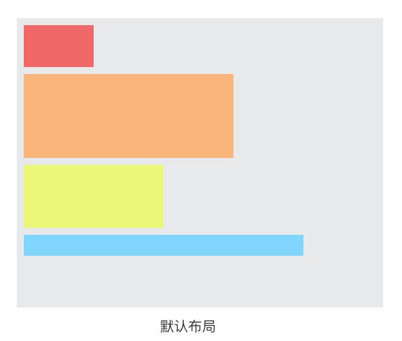
上面这张图中的布局是我们都熟悉的:默认文档流中,在一个父容器里放置多个块级的子元素,那么,这些子元素会默认从上往下排列。
在此基础之上,如果我给父容器仅仅加一个 display: flex属性,此时,这些子元素的布局会摇身一变:

没错,子元素们会在水平方向上,从左至右排列,就是这么神奇。到此为止,你已经掌握了关于 flex 的一半的知识。
flex 布局的优势
1、flex 布局的子元素不会脱离文档流,很好地遵从了“流的特性”。
但你如果用 float 来做布局,float 属性的元素会脱离文档流,而且会涉及到各种 BFC、清除浮动的问题。浮动相关的问题,比较麻烦,所以也成了面试必问的经典题目。但有了 flex 布局之后,这些问题都不存在的。
2、flex 是一种现代的布局方式,是 W3C 第一次提供真正用于布局的 CSS 规范。 flex 非常提供了丰富的属性,非常灵活,让布局的实现更佳多样化,且方便易用。
flex 唯一的缺点就在于,它不支持低版本的 IE 浏览器。
flex 的兼容性问题

上图中可以看到, flex 布局不支持 IE9 及以下的版本;IE10及以上也只是部分支持。如果你的页面不需要处理 IE浏览器的兼容性问题,则可以放心大胆地使用 flex 布局。
但是,比如网易新闻、淘宝这样的大型网站,面对的是海量用户,即便使用低版本浏览器的用户比例很少,但绝对基数仍然是很庞大的。因此,这些网站为了兼容低版本的 IE 浏览器,暂时还不敢尝试使用 flex 布局。
概念:弹性盒子、子元素
在讲 flex 的知识点之前,我们事先约定两个概念:
-
弹性盒子:指的是使用
display:flex或display:inline-flex声明的父容器。 -
子元素/弹性元素:指的是父容器里面的子元素们(父容器被声明为 flex 盒子的情况下)。
概念:主轴和侧轴
在上面的“初体验”例子中,我们发现,弹性盒子里面的子元素们,默认是从左至右排列的,这个方向,代表的就是主轴的方向。

如上图所示:
-
主轴:flex容器的主轴,默认是水平方向,从左向右。
-
侧轴:与主轴垂直的轴称作侧轴,默认是垂直方向,从上往下。
PS:主轴和侧轴并不是固定不变的,可以通过 flex-direction 更换方向,我们在后面会讲到。
弹性盒子
声明定义
使用 display:flex 或 display:inline-flex 声明一个父容器为弹性盒子。此时,这个父容器里的子元素们,会遵循弹性布局。
备注:一般是用 display:flex这个属性。display:inline-flex用得较少。
flex-direction 属性
flex-direction:用于设置盒子中子元素的排列方向。属性值可以是:
| 属性值 | 描述 |
|---|---|
| row | 从左到右水平排列子元素(默认值) |
| column | 从上到下垂直排列子元素 |
| row-reverse | 从右向左排列子元素 |
| column-reverse | 从下到上垂直排列子元素 |
备注:如果我们不给父容器写flex-direction这个属性,那么,子元素默认就是从左到右排列的。
代码演示:
DOCTYPE html>
<html>
<head lang="en">
    <meta charset="UTF-8">
    <title>title>
    <style>
        *{
            margin: 0;
            padding: 0;
            list-style: none;
        }
       body{
           background-color: #eee;
           font-family: "Microsoft Yahei";
           font-size:22px;
       }

        h3{
            font-weight: normal;
        }
        section{
            width: 1000px;

            margin:40px auto;
        }

        ul{
            background-color: #fff;
            border: 1px solid #ccc;

        }

        ul li{
            width: 200px;
            height: 200px;
            background-color: pink;
            margin:10px;
        }
        section:nth-child(1) ul{
            overflow: hidden; /* 清除浮动 */
        }
        section:nth-child(1) ul li{
            float: left;
        }
        /* 设置伸缩盒子*/
        section:nth-child(2) ul{
            display: flex;
        }

        section:nth-child(3) ul{
            /* 设置伸缩布局*/
            display: flex;
            /* 设置主轴方向*/
            flex-direction: row;
        }

        section:nth-child(4) ul{
            /* 设置伸缩布局*/
            display: flex;
            /* 设置主轴方向 :水平翻转*/
            flex-direction: row-reverse;
        }

        section:nth-child(5) ul{
            /* 设置伸缩布局*/
            display: flex;
            /* 设置主轴方向 :垂直*/
            flex-direction: column;
        }

        section:nth-child(6) ul{
            /* 设置伸缩布局*/
            display: flex;
            /* 设置主轴方向 :垂直*/
            flex-direction: column-reverse;
        }
    style>
head>
<body>
    <section>
        <h3>传统布局h3>
        <ul>
            <li>1li>
            <li>2li>
            <li>3li>
        ul>
    section>

    <section>
        <h3>伸缩布局 display:flexh3>
        <ul>
            <li>1li>
            <li>2li>
            <li>3li>
        ul>
    section>

    <section>
        <h3>主轴方向 flex-direction:rowh3>
        <ul>
            <li>1li>
            <li>2li>
            <li>3li>
        ul>
    section>

    <section>
        <h3>主轴方向 flex-direction:row-reverseh3>
        <ul>
            <li>1li>
            <li>2li>
            <li>3li>
        ul>
    section>

    <section>
        <h3>主轴方向 flex-direction:columnh3>
        <ul>
            <li>1li>
            <li>2li>
            <li>3li>
        ul>
    section>

    <section>
        <h3>主轴方向 flex-direction:column-reverseh3>
        <ul>
            <li>1li>
            <li>2li>
            <li>3li>
        ul>
    section>
body>
html>
flex-wrap 属性
flex-wrap:控制子元素溢出时的换行处理。
justify-content 属性
justify-content:控制子元素在主轴上的排列方式。
弹性元素
justify-content 属性
justify-content: flex-start;设置子元素在主轴上的对齐方式。属性值可以是:flex-start从主轴的起点对齐(默认值)flex-end从主轴的终点对齐center居中对齐space-around在父盒子里平分space-between两端对齐 平分
代码演示:(在浏览器中打开看效果)
DOCTYPE html>
<html>
<head lang="en">
    <meta charset="UTF-8">
    <title>title>
    <style>
        *{
            margin: 0;
            padding: 0;
            list-style:none;}
        body{
            background-color: #eee;
            font-family: "Microsoft Yahei";

        }
        section{
            width: 1000px;
            margin:50px auto;
        }
        section h3{
            font-size:22px;
            font-weight: normal;
        }

        ul{
            border: 1px solid #999;
            background-color: #fff;
            display: flex;

        }

        ul li{
            width: 200px;
            height: 200px;
            background: pink;
            margin:10px;

        }

        section:nth-child(1) ul{
            /* 主轴对齐方式:从主轴开始的方向对齐*/
            justify-content: flex-start;
        }

        section:nth-child(2) ul{
            /* 主轴对齐方式:从主轴结束的方向对齐*/
            justify-content: flex-end;
        }

        section:nth-child(3) ul{
            /* 主轴对齐方式:居中对齐*/
            justify-content: center;
        }

        section:nth-child(4) ul{
            /* 主轴对齐方式:在父盒子中平分*/
            justify-content: space-around;

           }

        section:nth-child(5) ul{
            /* 主轴对齐方式:两端对齐 平分*/
            justify-content: space-between;
        }
    style>
head>
<body>
    <section>
        <h3>主轴的对齐方式:justify-content:flex-starth3>
        <ul>
            <li>1li>
            <li>2li>
            <li>3li>
        ul>
    section>

    <section>
        <h3>主轴的对齐方式:justify-content:flex-endh3>
        <ul>
            <li>1li>
            <li>2li>
            <li>3li>
        ul>
    section>

    <section>
        <h3>主轴的对齐方式:justify-content:centerh3>
        <ul>
            <li>1li>
            <li>2li>
            <li>3li>
        ul>
    section>

    <section>
        <h3>主轴的对齐方式:justify-content:space-roundh3>
        <ul>
            <li>1li>
            <li>2li>
            <li>3li>
        ul>
    section>

    <section>
        <h3>主轴的对齐方式:justify-content:space-bettwenh3>
        <ul>
            <li>1li>
            <li>2li>
            <li>3li>
            <li>4li>
        ul>
    section>
body>
html>
align-items 属性
align-items:设置子元素在侧轴上的对齐方式。属性值可以是:
- flex-start 从侧轴开始的方向对齐
- flex-end 从侧轴结束的方向对齐
- baseline 基线 默认同flex-start
- center 中间对齐
- stretch 拉伸
代码演示:
DOCTYPE html>
<html>
<head lang="en">
    <meta charset="UTF-8">
    <title>title>
    <style>
        *{
            margin: 0;
            padding: 0;
            list-style:none;
        }
        body{
            background-color: #eee;
            font-family: "Microsoft Yahei";

        }
        section{
            width: 1000px;
            margin:50px auto;
        }
        section h3{
            font-size:22px;
            font-weight: normal;
        }

        ul{
            border: 1px solid #999;
            background-color: #fff;
            display: flex;
            height:500px;

        }

        ul li{
            width: 200px;
            height: 200px;
            background: pink;
            margin:10px;

        }

        section:nth-child(1) ul{
            /* 侧轴对齐方式 :从侧轴开始的方向对齐*/
            align-items:flex-start;
        }

        section:nth-child(2) ul{
            /* 侧轴对齐方式 :从侧轴结束的方向对齐*/
            align-items:flex-end;
        }

        section:nth-child(3) ul{
            /* 侧轴对齐方式 :居中*/
            align-items:center;
        }

        section:nth-child(4) ul{
            /* 侧轴对齐方式 :基线 默认同flex-start*/
            align-items:baseline;
        }

        section:nth-child(5) ul{
            /* 侧轴对齐方式 :拉伸*/
            align-items:stretch;

        }

        section:nth-child(5) ul li{
            height:auto;
        }


    style>
head>
<body>
<section>
    <h3>侧轴的对齐方式:align-items :flex-starth3>
    <ul>
        <li>1li>
        <li>2li>
        <li>3li>
    ul>
section>

<section>
    <h3>侧轴的对齐方式:align-items:flex-endh3>
    <ul>
        <li>1li>
        <li>2li>
        <li>3li>
    ul>
section>

<section>
    <h3>侧轴的对齐方式:align-items:centerh3>
    <ul>
        <li>1li>
        <li>2li>
        <li>3li>
    ul>
section>

<section>
    <h3>侧轴的对齐方式:align-itmes:baselineh3>
    <ul>
        <li>1li>
        <li>2li>
        <li>3li>
    ul>
section>

<section>
    <h3>侧轴的对齐方式:align-itmes: stretchh3>
    <ul>
        <li>1li>
        <li>2li>
        <li>3li>
    ul>
section>
body>
html>
flex属性:设置子盒子的权重
代码演示:
DOCTYPE html>
<html>
<head lang="en">
    <meta charset="UTF-8">
    <title>title>
    <style>
        *{
            margin: 0;
            padding: 0;
            list-style:none;
        }
        body{
            background-color: #eee;
            font-family: "Microsoft Yahei";

        }
        section{
            width: 1000px;
            margin:50px auto;
        }
        section h3{
            font-size:22px;
            font-weight: normal;
        }

        ul{
            border: 1px solid #999;
            background-color: #fff;
            display: flex;

        }

        ul li{
            width: 200px;
            height: 200px;
            background: pink;
            margin:10px;

        }

        section:nth-child(1) ul li:nth-child(1){
            flex:1;
        }

        section:nth-child(1) ul li:nth-child(2){
            flex:1;
        }

        section:nth-child(1) ul li:nth-child(3){
            flex:8;
        }

        section:nth-child(2) ul li:nth-child(1){

        }

        section:nth-child(2) ul li:nth-child(2){
            flex:1;
        }

        section:nth-child(2) ul li:nth-child(3){
           flex:4;
        }


    style>
head>
<body>
<section>
    <h3>伸缩比例:flexh3>
    <ul>
        <li>1li>
        <li>2li>
        <li>3li>
    ul>
section>

<section>
    <h3>伸缩比例:flexh3>
    <ul>
        <li>1li>
        <li>2li>
        <li>3li>
    ul>
section>


body>
html>