python数据可视化与matplotlib
数据可视化介绍:
数据可视化是指将数据放在可视环境中、进一步理解数据的技术,可以通过它更加详细地了解隐藏在数据表面之下的模式、趋势和相关性。
matplotlib:
是Python基础的画图库,官网为https://matplotlib.org/,在案例地址https://matplotlib.org/gallery/index.html中介绍了很多种类的图和代码示例。
matplotlib简介和简单使用:
matplotlib是Python最著名的绘图库,它提供了一整套和Matlab相似的命令API,十分适合进行交互式制图;也可以方便地将它作为绘图控件,嵌入GUI应用程序中。
文档相当完备,并且Gallery页面中有上百幅缩略图,打开之后都有源代码。如果需要绘制某种类型的图,只需要在这个页面中进行简单的浏览、复制、粘贴,就能实现画图。
https://matplotlib.org/gallery.html中有大量的缩略图案例可以使用。
matplotlib画图的子库:
pyplot子库
提供了和matlab类似的绘图API,方便用户快速绘制2D图表。
pylab模块
其中包括了许多numpy和pyplot中常用的函数,方便用户快速进行计算和绘图,可以用于IPython中的快速交互式使用。
pyplot画图简单使用如下:
通过一系列函数设置当前Axes对象的各个属性:
title
设置子图的标题。
x、y
分别设置X、Y轴的显示范围。
最后调用plt.show()显示出绘图窗口。
案例如下:
# _maximum_minimum_temperatures
import matplotlib.pyplot as plt
import numpy as np
x = np.arange(4,19)
y_max = np.array([32,33,34,34,33,31,30,29,30,29,26,23,21,25,31])
y_min = np.array([19,19,20,22,22,21,16,18,18,17,14,15,16,16,16])
plt.plot(x,y_max)
plt.plot(x,y_min)
plt.title("41")
plt.show()

import matplotlib.pyplot as plt
import numpy as np
x = np.arange(5)
y1 = np.array([10,8,7,11,13])
bar_width = 0.3
plt.bar(x,y1,tick_label=['a','b','c','d','e'], width=bar_width)
plt.title("41")
plt.show()

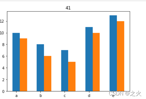
x = np.arange(5)
y1 = np.array([10,8,7,11,13])
y2 = np.array([9,6,5,10,12])
bar_width = 0.3
plt.bar(x,y1,tick_label=['a','b','c','d','e'], width=bar_width)
plt.bar(x+bar_width,y2,width=bar_width)
plt.title("41")
plt.show()
import matplotlib.pyplot as plt
import numpy as np
y = np.arange(5)
x1 = np.array([10,8,7,11,13])
bar_height=0.3
plt.barh(y,x1,tick_label=['a','b','c','d','e'], height=bar_height)
plt.title("41")
plt.show()

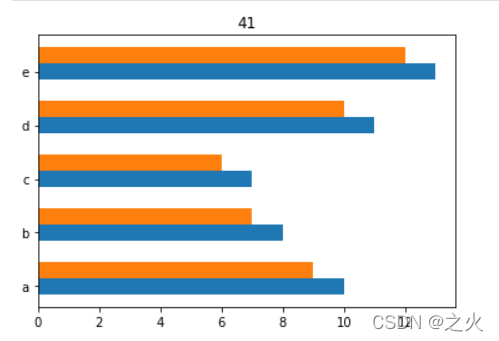
y = np.arange(5)
x1 = np.array([10,8,7,11,13])
x2 = np.array([9,7,6,10,12])
bar_height=0.3
plt.barh(y,x1,tick_label=['a','b','c','d','e'], height=bar_height)
plt.barh(y+bar_height,x2,height=bar_height)
plt.title("41")
plt.show()