Flutter 入门(Button控件基本使用)
Flutter 入门(Button控件基本使用)
所谓的 button 就是都有 onPressed 属性, 可以点击响应事件的 , 有点击的效果 , 如果 onPressed 设置为 null 的话,button 都是 disable 的,同时 button 有 disable 的样式 , 按下时 有高亮显示
MaterialButton
默认的是一个最小宽度为88,高度为36,有圆角,有阴影,点击的时候高亮,有 onpress 属性的一个控件。可以响应用户点击事件。但是:官方不推荐使用这个,推荐使用它的子类 RaisedButton、FlatButton 和 OutlineButton
Flutter中的按钮
Flutter中给我们预先定义好了一些按钮控件给我们用,常用的按钮如下
- RaisedButton :凸起的按钮,其实就是Android中的Material Design风格的Button ,继承自MaterialButton
- FlatButton :扁平化的按钮,继承自MaterialButton
- OutlineButton :带边框的按钮,继承自MaterialButton
- IconButton :图标按钮,继承自StatelessWidget
查看MaterialButton的构造方法可查看它的属性
常用属性进行备注
  const MaterialButton({
    Key key,
    @required this.onPressed,//值类型:VoidCallback ,一般接收一个方法	说明:必填参数,按下按钮抬起时触发的回调,接收一个方法,传null表示按钮禁用,会显示禁用相关样式
    this.onHighlightChanged,
    this.textTheme,
    this.textColor,//值类型:Color	说明:文本颜色
    this.disabledTextColor,//值类型:Color	说明:按钮禁用时的文本颜色
    this.color,//值类型:Color	说明:按钮的颜色
    this.disabledColor,//值类型:Color	说明:按钮禁用时的颜色
    this.focusColor,
    this.hoverColor,
    this.highlightColor,//值类型:Color	说明:点击(长按)按钮后按钮的颜色
    this.splashColor,//值类型:Color	说明:点击按钮时水波纹的颜色
    this.colorBrightness,
    this.elevation,//值类型:double	说明:阴影的范围,值越大阴影范围越大
    this.focusElevation,
    this.hoverElevation,
    this.highlightElevation,
    this.disabledElevation,
    this.padding,//值类型:EdgeInsetsGeometry (抽象类)	说明:内边距
    this.shape,//值类型:ShapeBorder(抽象类)	说明:设置按钮的形状
    this.clipBehavior = Clip.none,
    this.focusNode,
    this.autofocus = false,
    this.materialTapTargetSize,
    this.animationDuration,
    this.minWidth,//值类型:double	说明:最小宽度
    this.height,//值类型:double	说明:高度
    this.child,//值类型:Widget	说明:文本控件
  }) : assert(clipBehavior != null),
       assert(autofocus != null),
       assert(elevation == null || elevation >= 0.0),
       assert(focusElevation == null || focusElevation >= 0.0),
       assert(hoverElevation == null || hoverElevation >= 0.0),
       assert(highlightElevation == null || highlightElevation >= 0.0),
       assert(disabledElevation == null || disabledElevation >= 0.0),
       super(key: key);
基本样式代码示例
class MyMaterialButton extends StatelessWidget {
  @override
  Widget build(BuildContext context) {
    // TODO: implement build
    return new Center(
      child: MaterialButton(
        child: Text("MaterialButton"),
        // 按下之后松开的回调,也就是所谓的点击事件。其实是当用户手抬起来时的动作
        onPressed: () {
          _log('MaterialButton');
        },
        // 设置边框样式 , 在MaterialButton这里没用 在它子类里面有用
        shape: Border.all(
            color: Color(0xFFFF0000), style: BorderStyle.solid, width: 2),
        color: Colors.grey,
        // 高度, 阴影 默认是2
        elevation: 2,
        // 高亮时的阴影 默认是 8  button 被按下的时候
        highlightElevation: 14,
      ),
    );
  }
}
效果如下
RaisedButton
RaisedButton: 由于RaisedButton继承自MaterialButton,属性基本上和上面的父类一样,The [elevation], [highlightElevation], [disabledElevation], 和 [clipBehavior] 必须非空.
构造方法
  const RaisedButton({
    Key key,
    @required VoidCallback onPressed,
    ValueChanged<bool> onHighlightChanged,
    ButtonTextTheme textTheme,
    Color textColor,
    Color disabledTextColor,
    Color color,
    Color disabledColor,
    Color focusColor,
    Color hoverColor,
    Color highlightColor,
    Color splashColor,
    Brightness colorBrightness,
    double elevation,
    double focusElevation,
    double hoverElevation,
    double highlightElevation,
    double disabledElevation,
    EdgeInsetsGeometry padding,
    ShapeBorder shape,
    Clip clipBehavior = Clip.none,
    FocusNode focusNode,
    bool autofocus = false,
    MaterialTapTargetSize materialTapTargetSize,
    Duration animationDuration,
    Widget child,
  })
基本样式代码示例
修改水波纹
class MyRaisedButton extends StatelessWidget {
  @override
  Widget build(BuildContext context) {
    // TODO: implement build
    return new Center(
        child: RaisedButton(
      child: Text('RaisedButton'),
      onPressed: () {
        _log('RaisedButton');
      },
      splashColor: Colors.green,
    ));
  }
}
修改长按背景色
class MyRaisedButton1 extends StatelessWidget {
  @override
  Widget build(BuildContext context) {
    // TODO: implement build
    return new Center(
        child: RaisedButton(
      onPressed: () {
        _log('长按变色RaisedButton');
      },
      child: Text("长按变色RaisedButton"),
      color: Colors.red,
      textColor: Colors.white,
      splashColor: Colors.black,
      highlightColor: Colors.green,

    ));
  }
}
效果如下

FlatButton
FlatButton跟RaisedButton用法基本一致
基本样式代码示例
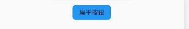
class FlatBtn extends StatelessWidget {
  @override
  Widget build(BuildContext context) {
    return new Center(
        child: FlatButton(
      onPressed:(){
          _log('扁平按钮');
      },
      child: Text("扁平按钮"),
      color: Colors.blue,
      textColor: Colors.black,
      shape: RoundedRectangleBorder(
          side: BorderSide(
            color: Colors.white,
            width: 1,
          ),
          borderRadius: BorderRadius.circular(8)),
    ));
  }
}
效果如下
OutlineButton
注意,OutlineButton是一个有默认边线且背景透明的按钮,也就是说我们设置其边线和颜色是无效的,其他属性跟MaterialButton中属性基本一致
基本样式代码示例
class outlineBtn extends StatelessWidget {
  @override
  Widget build(BuildContext context) {
    // TODO: implement build
    return OutlineButton(
      onPressed: (){
        _log('边线按钮');
      },
      child: Text("边线按钮"),
      textColor: Colors.red,
      splashColor: Colors.green,
      highlightColor: Colors.black,
      shape: BeveledRectangleBorder(
        side: BorderSide(
          color: Colors.red,
          width: 1,
        ),
        borderRadius: BorderRadius.circular(10),
      ),
    );
  }
}
效果如下

IconButton
IconButton默认是没有背景的
构造方法
const IconButton({
    Key key,
    this.iconSize = 24.0,
    this.padding = const EdgeInsets.all(8.0),
    this.alignment = Alignment.center,
    @required this.icon,//必填参数,接收一个Widget,但是一般我们都是传入一个Icon Widget
    this.color,
    this.highlightColor,
    this.splashColor,
    this.disabledColor,
    @required this.onPressed,
    this.tooltip
  })
基本样式代码示例
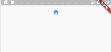
class IconBtn extends StatelessWidget {
  @override
  Widget build(BuildContext context) {
    return IconButton(
      icon: Icon(Icons.home),
      onPressed:(){
        _log("图片按钮");
      },
      color: Colors.blueAccent,
      highlightColor: Colors.red,
    );
  }
}
效果如下