python数据可视化07
一.学习的内容
1.使用matplotlib绘制高级图表
2.绘制高等线图
3.绘制矢量场流线图
4.绘制棉线图
5.绘制哑铃图
6.绘制金字塔图
7.绘制漏斗图
8.绘制桑基图
9.绘制华夫饼图
10.绘制树状图
11.代码及效果图
(1)
import numpy as np
import matplotlib.pyplot as plt
# 计算高度
def calcu_elevation(x1,y1):
    h=(1-x1/2 + x1**5+y1**3)*np.exp(-x1**2 - y1**2)
    return h
n = 256
x = np.linspace(-2,2,n)
y = np.linspace(-2,2,n)
#利用meshgrid()函数生成网格数据
x_grid,y_grid = np.meshgrid(x,y)
fig = plt.figure()
ax = fig.add_subplot(111)
# 绘制等高线
con = ax.contour(x_grid,y_grid,calcu_elevation(x_grid,y_grid),8,colors='black')
#绘制等高线的颜色
con = ax.contourf(x_grid,y_grid,calcu_elevation(x_grid,y_grid),8,alpha=0.75,cmap=plt.cm.copper)
#为等高线添加文字标签
ax.clabel(con,inline=True,fmt='%1.1f',fontsize=10)
ax.set_xticks([])
ax.set_yticks([])
plt.title('2020080603043')
plt.show()

(2)
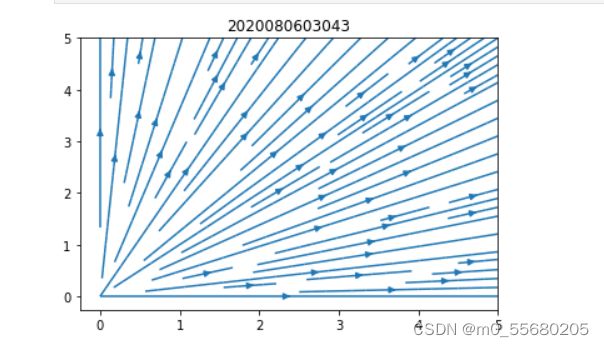
import numpy as np
import matplotlib.pyplot as plt
y,x = np.mgrid[0:5:50j,0:5:50j]
u = x
v = y
fig = plt.figure()
ax = fig.add_subplot(111)
#绘制矢量场流线图
ax.streamplot(x,y,u,v)
plt.title('2020080603043')
plt.show()
(3)
import numpy as np
import matplotlib.pyplot as plt
plt.rcParams['font.sans-serif']=["SimHei"]
plt.rcParams['axes.unicode_minus'] = False
x = np.arange(1,16)
y = np.array([5.9,6.2,6.7,7.0,7.0,7.1,7.2,7.4,7.5,7.6,7.7,7.7,7.7,7.8,7.9])
labels= np.array(['宝骏310','宝马i3','致享','焕驰','力帆530',
                  '派力奥','悦翔v3','乐风RV','奥迪A1','威驰FS',
                  '夏利N7','启辰R30','和悦A13RS','致炫','赛欧'])
fig = plt.figure(figsize=(10,6),dpi=80)
ax = fig.add_subplot(111)
# 绘制棉棒图
markerline,stemlines,baseline = ax.stem(x,y,linefmt='--',
                                       markerfmt='o',label='TesStem',use_line_collection=True)
#设置属性
plt.setp(stemlines,lw=1)
ax.set_title('不同品牌轿车的燃料消耗量 2020080603043',fontdict={'size':18})
ax.set_ylabel('燃烧消耗量(L/km)')
ax.set_xticks(x)
ax.set_xticklabels(labels,rotation=60)
ax.set_ylim([0,10])
for temp_x,temp_y in zip (x,y):
    ax.text(temp_x,temp_y+0.5,s='{}'.format(temp_y),ha='center',va='bottom',fontsize=14)
plt.show()

(4)
import pandas as pd
import matplotlib.pyplot as plt
import matplotlib.lines as mlines
plt.rcParams['font.sans-serif']=["SimHei"]
plt.rcParams['axes.unicode_minus'] = False
df = pd.read_excel(r"C:\Users\Administrator\python\health.xlsx")
df.sort_values('pct_2014',inplace=True)
df.reset_index(inplace=True)
df = df.sort_values(by="index")
def newline(p1,p2,color='black'):
    ax = plt.gca()
    l = mlines.Line2D([p1[0],p2[0]],[p1[1],p2[1]],color='skyblue')
    ax.add_line(l)
    return l
fig,ax =plt.subplots(1,1,figsize=(8,6))
#绘制散点
ax.scatter(y=df['index'],x=df['pct_2013'],s=50,
          color='#0e668b',alpha=0.7)
ax.scatter(y=df['index'],x=df['pct_2014'],s=50,
          color='#a3c4dc',alpha=0.7)
#绘制线条
for i,p1,p2 in zip(df['index'],df['pct_2013'],df['pct_2014']):
    newline([p1,i],[p2,i])
ax.set_title('2013年与2014年美国部分城市人口pct指标的变化率 2020080603043')
ax.set_xlim(0,.25)
ax.set_xticks([.05,.1,.15,.20])
ax.set_xticklabels(['5%','10%','15%','20%'])
ax.set_label('变化率')
ax.set_yticks(df['index'])
ax.set_yticklabels(df['city'])
ax.grid(alpha=0.5,axis='x')
plt.show()

(5)
import numpy as np
import matplotlib.pyplot as plt
plt.rcParams['font.sans-serif']=["SimHei"]
plt.rcParams['axes.unicode_minus'] = False
ticks = np.array(['报告提交','数据分析','数据记录','实地执行','问卷确认','试访','问卷设计','项目确定'])
y_data = np.arange(1,9)
x_data = np.array([0.5,1.5,1,3,0.5,1,1,2])
fig,ax=plt.subplots(1,1)
ax.barh(y_data,x_data,tick_label=ticks,left=[7.5,6,5.5,3,3,2,1.5,0],color='#CD5C5C')
[ax.spines[i].set_visible(False) for i in ['top','right']]
ax.set_title('任务甘特图 2020080603043')
ax.set_xlabel('日期')
ax.grid(alpha=0.5,axis='x')
plt.show()

(6)
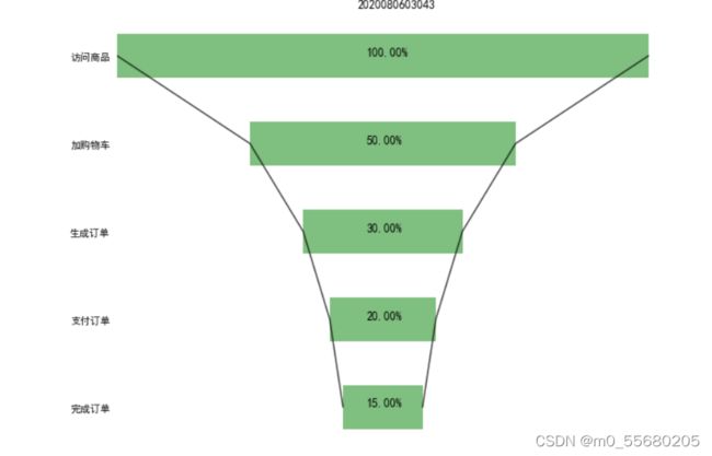
import numpy as np
import matplotlib.pyplot as plt
plt.rcParams['font.sans-serif']=["SimHei"]
plt.rcParams['axes.unicode_minus'] = False
num = 5
height =0.5
x1 = np.array([1000,500,300,200,150])
x2 = np.array((x1.max()-x1)/2)
x3 = [i+j for i,j in zip(x1,x2)]
x3 = np.array(x3)
y = -np.sort(-np.arange(num))
labels=['访问商品','加购物车','生成订单','支付订单','完成订单']
fig = plt.figure(figsize=(10,8))
ax = fig.add_subplot(111)
#绘制条形图
rects1= ax.barh(y,x3,height,tick_label=labels,color='g',alpha=0.5)
#绘制辅助
rects2= ax.barh(y,x2,height,tick_label=labels,color='w',alpha=1)
ax.plot(x3,y,'black',alpha=0.7)
ax.plot(x2,y,'black',alpha=0.7)
#添加无指向型注释文本
notes=[]
for i in range(0,len(x1)):
    notes.append('%.2f%%' %((x1[i] /x1[0]) *100))
for rect_one,rect_two,note in zip(rects1,rects2,notes):
    text_x=rect_two.get_width() +(rect_one.get_width()-rect_two.get_width()) /2-30
    text_y=rect_one.get_y() + height / 2
    ax.text(text_x,text_y,note,fontsize=12)
#隐藏轴脊刻度
ax.set_xticks([])
for direction in ['top','left','bottom','right']:
    ax.spines[direction].set_color('none')
ax.yaxis.set_ticks_position('none')
plt.title('2020080603043')
plt.show()
(7)
# 桑基图
import matplotlib.pyplot as plt
from matplotlib.sankey import Sankey
plt.rcParams['font.sans-serif']=["SimHei"]
plt.rcParams['axes.unicode_minus'] = False
#消费收入与支出数据
flows = [0.7,0.3,-0.3,-0.1,-0.3,-0.1,-0.1,-0.1]
#列表
labels=["工资","副业","生活","购物","深造","运动","其他","买书"]
#流的方向
orientations=[1,1,0,-1,1,-1,1,0]
#创建Sankey对象
sankey = Sankey()
#添加数据
sankey.add(flows=flows,labels=labels,orientations=orientations,color="black",fc="lightgreen",patchlabel="生活消费",alpha=0.7)
#完成对象
diagrams = sankey.finish()
diagrams[0].texts[4].set_color("r")
diagrams[0].texts[4].set_weight("bold")
diagrams[0].text.set_fontsize(20)
plt.title('日常生活开支的桑基图 2020080603043')
plt.show()

(8)
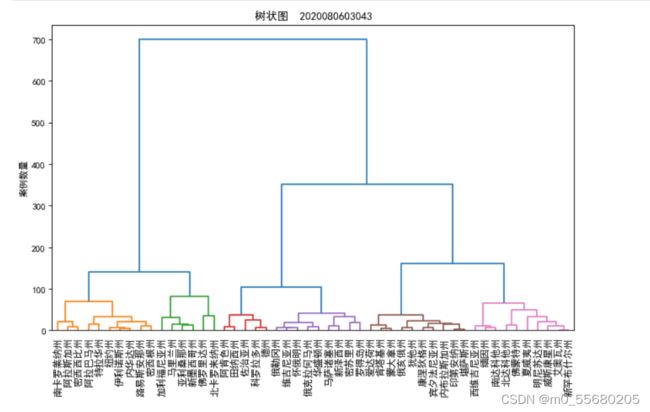
import pandas as pd
import matplotlib.pyplot as plt
import scipy.cluster.hierarchy as shc
plt.rcParams['font.sans-serif']=["SimHei"]
plt.rcParams['axes.unicode_minus'] = False
df = pd.read_excel(r"C:\Users\Administrator\python\USArrests.xlsx")
plt.figure(figsize=(10,6),dpi=80)
plt.title('树状图  2020080603043',fontsize=12)
dend =shc.dendrogram(shc.linkage(df[['Murder','Assault','UrbanPop']],
                     method='ward'),labels=df.State.values,color_threshold=100)
plt.xticks(fontsize=10.5)
plt.ylabel('案例数量')
plt.show()
(9)
import matplotlib.pyplot as plt
from pywaffle import Waffle
plt.rcParams['font.sans-serif']=["SimHei"]
plt.rcParams['axes.unicode_minus'] = False
plt.figure(FigureClass=Waffle,rows=10,columns=10,
           values=[95,5],vertical=True ,colors=['#20B2AA','#D3D3D3'],
           title={'label':'电影《少年的你》上座率'},
           legend={'loc':'upper right','labels':['占座','空座']})
plt.show()

(10)
import numpy as np
import pandas as pd
import matplotlib.pyplot as plt
import matplotlib.lines as mlines
plt.rcParams['font.sans-serif']=["SimHei"]
plt.rcParams['axes.unicode_minus'] = False
df = pd.read_excel(r"C:\Users\Administrator\python\population.xlsx")
df_male = df.groupby(by='Gender').get_group('Male')
list_male = df_male['Number'].values.tolist()
df_female=df.groupby(by='Gender').get_group('Female')
list_female= df_female['Number'].values.tolist()
df_age= df.groupby('AgeGroup').sum()
count =df_age.shape[0]
y = np.arange(1,11)
labels=[]
for i in range(count):
    age = df_age.index[i]
    labels.append(age)
fig =plt.figure()
ax =fig.add_subplot(111)
#绘制人口金字塔
ax.barh(y,list_male,tick_label=labels,label='男',color='#6600FF')
ax.barh(y,list_female,tick_label=labels,label='女',color='#CC6699')
ax.set_ylabel("年龄段(岁)")
ax.set_xticks([-100000,-75000,-50000,-25000,0,25000,50000,75000,100000])
ax.set_xticklabels(['100000','75000','50000','250000','0','25000','50000','75000','100000'])
ax.set_xlabel('人数')
ax.set_title('某城市人口金字塔 2020080603043')
ax.legend()
plt.show()
