元素进行文档布局不是表格的正确用法。
HTML 文本的容器
<html >
<head >
<meta charset ="utf-8" >
<title > 菜鸟教程(runoob.com)title >
head >
<body >
<div id ="container" style ="width:500px" >
<div id ="header" style ="background-color:#FFA500;" >
<h1 style ="margin-bottom:0;" > 主要的网页标题h1 >div >
<div id ="menu" style ="background-color:#FFD700;height:200px;width:100px;float:left;" >
<b > 菜单b ><br >
HTML<br >
CSS<br >
JavaScriptdiv >
<div id ="content" style ="background-color:#EEEEEE;height:200px;width:400px;float:left;" >
内容在这里div >
<div id ="footer" style ="background-color:#FFA500;clear:both;text-align:center;" >
版权 © runoob.comdiv >
div >
body >
html >HTML框架 通过使用框架,你可以在同一个浏览器窗口中显示不止一个页面。
<iframe src ="http://www.baidu.com" width ="400" height ="400" > iframe ><html >
<head >
<meta charset ="utf-8" >
<title > 菜鸟教程(runoob.com)title >
head >
<body >
<iframe src ="demo_iframe.htm" name ="iframe_a" > iframe >
<p > <a href ="//www.runoob.com" target ="iframe_a" > RUNOOB.COMa >p >
<p > <b > 注意:b > 因为 a 标签的 target 属性是名为 iframe_a 的 iframe 框架,所以在点击链接时页面会显示在 iframe框架中。p >
body >
html >HTML 符号实体参考手册
http://www.runoob.com/tags/ref-entities.html
HTML 速查列表 HTML 基本文档 <html >
<head >
<title > 文档标题title >
head >
<body >
可见文本...
body >
html ><h1 > 最大的标题h1 >
<h2 > . . . h2 >
<h3 > . . . h3 >
<h4 > . . . h4 >
<h5 > . . . h5 >
<h6 > 最小的标题h6 >
<p > 这是一个段落。p >
<br > (换行)
<hr > (水平线)
<b > 粗体文本b >
<code > 计算机代码code >
<em > 强调文本em >
<i > 斜体文本i >
<kbd > 键盘输入kbd >
<pre > 预格式化文本pre >
<small > 更小的文本small >
<strong > 重要的文本strong >
<abbr > (缩写)
<address > (联系信息)
<bdo > (文字方向)
<blockquote > (从另一个源引用的部分)
<cite > (工作的名称)
<del > (删除的文本)
<ins > (插入的文本)
<sub > (下标文本)
<sup > (上标文本)
链接(Links) 普通的链接:<a href ="http://www.example.com/" > 链接文本a >
图像链接: <a href ="http://www.example.com/" > <img src ="URL" alt ="替换文本" > a >
邮件链接: <a href ="mailto:webmaster@example.com" > 发送e-maila >
书签:
<a id ="tips" > 提示部分a >
<a href ="#tips" > 跳到提示部分a >图片(Images) <img src ="URL" alt ="替换文本" height ="42" width ="42" > 样式/区块(Styles/Sections) <style type ="text/css" >
h1 {color :red }
p {color :blue }
style >
<div > 文档中的块级元素div >
<span > 文档中的内联元素span >
无序列表 <ul >
<li > 项目li >
<li > 项目li >
ul >
有序列表 <ol >
<li > 第一项li >
<li > 第二项li >
ol >
定义列表 <dl >
<dt > 项目 1dt >
<dd > 描述项目 1dd >
<dt > 项目 2dt >
<dd > 描述项目 2dd >
dl >
表格(Tables) <table border ="1" >
<tr >
<th > 表格标题th >
<th > 表格标题th >
tr >
<tr >
<td > 表格数据td >
<td > 表格数据td >
tr >
table >框架(Iframe) <iframe src ="demo_iframe.htm" > iframe >
"demo_form.php" method ="post/get" >
type ="text" name="email" size="40" maxlength="50" >
type ="password" >
type ="checkbox" checked="checked" >
type ="radio" checked="checked" >
type ="submit" value ="Send" >
type ="reset" >
type ="hidden" >
<option>苹果option>
<option selected="selected">香蕉option>
<option>樱桃option>
实体(Entities) < ; 等同于 <
> ; 等同于 >
&
CSS3 transition transition 属性是一个简写属性,用于设置四个过渡属性:
transition-property 规定设置过渡效果的 CSS 属性的名称。
transition-duration 规定完成过渡效果需要多少秒或毫秒。
transition-timing -function 规定速度效果的速度曲线。
transition-delay 定义过渡效果何时开始。 transition: all 0.5 s ease-in 0.3 s;-webkit -transition : all .5 s ease-in -out 1 s;
-o -transition : all .5 s ease-in -out 1 s;
-moz -transition : all .5 s ease-in -out 1 s;
transition: all .5 s ease-in -out 1 s;<html >
<head >
<style >
div {
width :100 pxheight :100 pxbackground :blue transition :width 2 s -moz-transition :width 2 s -webkit-transition :width 2 s -o-transition :width 2 s }
div :hover {
width :300 px}
style >
head >
<body >
<div > div >
<p > 请把鼠标指针移动到蓝色的 div 元素上,就可以看到过渡效果。p >
<p > <b > 注释:b >本例在 Internet Explorer 中无效。p >
body >
html >
效果:
CSS-box-shadow 向 div 元素添加 box-shadow:
div {
box-shadow : 10 px 10 px 5 px #888888 } box-shadow 属性向框添加一个或多个阴影。
CSS-float <html lang ="en" >
<head >
<meta charset ="UTF-8" >
<title > Titletitle >
<style type ="text/css" >
*{
margin :0 padding :0 }
div img {
width :300 px}
div {
float : left }
.main {
// width : 900 px ;
}
style >
head >
<body >
<div class ="main" >
<div > <img src ="img/11.jpg" > div >
<div > <img src ="img/22.jpg" > div >
<div > <img src ="img/33.jpg" > div >
div >
body >
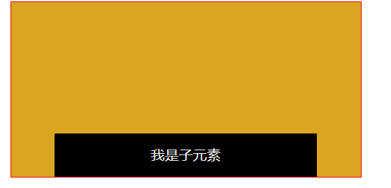
html >CSS-Position的嵌套 相对定位和绝对定位嵌套:
<html lang ="en" >
<head >
<meta charset ="UTF-8" >
<title > Positiontitle >
<style type ="text/css" >
div .div1 {
width : 400 px height : 200 px margin : 0 auto background : goldenrod border :1 px solid redposition : relative left :10 px}
.div2 {
margin : 0 auto position : absolute width : 300 px height : 50 px background : black color : white line-height : 50 px text-align : center left : 0 bottom :0 right :0 }
style >
head >
<body >
<div class ="div1" > <div class ="div2" > 我是子元素div >div >
body >
html >
CSS :position、Z-index position 属性规定元素的定位类型。
这个属性定义建立元素布局所用的定位机制。任何元素都可以定位,不过绝对或固定元素会生成一个块级框,而不论该元素本身是什么类型。相对定位元素会相对于它在正常流中的默认位置偏移。
relative的特点
relative的作用,就是在其默认显示的位置的基础上,偏移一定的尺寸,可以是上下左右四个参数来设置。但是这个偏移是悄悄的,只有它自己知道,仅仅是显示出来的效果偏移了,但它实际还占用着原来的位置 ,就像放风筝,风筝随着风向的改变而偏移relative了一定距离,而实际人还是站在原来的位置,且所占用的平面面积不变。
absolute的特点:
生成绝对定位的元素,相对于 static 定位以外的第一个父元素进行定位,如果在 body 中仅有一个 div 设置成 position:absolute ,则这个 div 的父元素就是body ,div相对于浏览器进行偏移,如果div 外嵌套了其他块级元素,并且,这个块级元素设置了 position:relative,则这个div 相对于这个块级元素进行偏移。
relative 不脱离文档流,absolute 脱离文档流。也就是说:relative 的元素尽管表面上看到它偏离了原来的位置,但它实际上在文档流中还是没变。absolute的元素不仅位置改变了,同时也脱离了文档流。
定位 h2 元素:
<html >
<head >
<style type ="text/css" >
h2 .pos_abs {
position :absolute left :100 pxtop :150 px
}
style >
head >
<body >
<h2 class ="pos_abs" > 这是带有绝对定位的标题h2 >
<p > 通过绝对定位,元素可以放置到页面上的任何位置。下面的标题距离页面左侧 100px,距离页面顶部 150px。p >
body >
html >h2标签相对于body这个容器定位。
可能的值
值
描述
absolute
生成绝对定位的元素,相对于 static 定位以外的第一个父元素进行定位。元素的位置通过 “left”, “top”, “right” 以及 “bottom” 属性进行规定。
fixed
生成绝对定位的元素,相对于浏览器窗口进行定位。元素的位置通过 “left”, “top”, “right” 以及 “bottom” 属性进行规定。
relative
生成相对定位的元素,相对于其正常位置进行定位。因此,”left:20” 会向元素的 LEFT 位置添加 20 像素。
static
默认值。没有定位,元素出现在正常的流中(忽略 top, bottom, left, right 或者 z-index 声明)。
inherit
规定应该从父元素继承 position 属性的值。
更多示例:http://www.w3school.com.cn/cssref/pr_class_position.asp
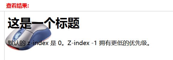
<html >
<head >
<style type ="text/css" >
img .x
{
position :absolute left :0 pxtop :0 pxz-index :-1
}
style >
head >
<body >
<h1 > 这是一个标题h1 >
<img class ="x" src ="/i/eg_mouse.jpg" />
<p > 默认的 z-index 是 0。Z-index -1 拥有更低的优先级。p >
body >
html >
z-index
z-index 属性设置元素的堆叠顺序。拥有更高堆叠顺序的元素总是会处于堆叠顺序较低的元素的前面
元素可拥有负的 z-index 属性值。 Z-index 仅能在定位元素上奏效(例如 position:absolute;)!
该属性设置一个定位元素沿 z 轴的位置,z 轴定义为垂直延伸到显示区的轴。如果为正数,则离用户更近,为负数则表示离用户更远。
auto 默认。堆叠顺序与父元素相等。
number 设置元素的堆叠顺序。
inherit 规定应该从父元素继承 z-index 属性的值。CSS :hover 选择器
选择鼠标指针浮动在其上的元素,并设置其样式:
a :hover {
background-color :yellow }
提示::hover 选择器可用于所有元素,不只是链接。
提示::link 选择器设置指向未被访问页面的链接的样式,:visited 选择器用于设置指向已被访问的页面的链接,:active选择器用于活动链接。
注释:在 CSS 定义中,:hover 必须位于 :link 和 :visited之后(如果存在的话),这样样式才能生效。
选择未访问、已访问、悬浮和活动链接,并设置它们的样式:
a :link {color :blue }
a :visited {color :blue }
a :hover {color :red }
a :active {color :yellow } CSS display 属性
display 属性规定元素应该生成的框的类型。
常用于< a> < span>这两个标签,因为这两个标签非块元素,如果不用display:block定义一下,那么定义width、height等和长宽相关的css属性时会发现完全不生效
块级元素(block-level elements):
占据一定矩形空间,可以通过设置高度、宽度、内外边距等属性,来调整的这个矩形的样子;
行内元素( inline elements ):
自己的独立空间,它是依附于其他块级元素存在的,因此,对行内元素设置高度、宽度、内外边距等属性,都是无效的。
block和inline
block和inline这两个概念是简略的说法,完整确切的说应该是 block-level elements (块级元素) 和 inline elements (内联元素)。block元素通常被现实为独立的一块,会单独换一行;inline元素则前后不会产生换行,一系列inline元素都在一行内显示,直到该行排满。>
大体来说HTML元素各有其自身的布局级别(block元素还是inline元素):
block元素可以包含block元素和inline元素;但inline元素只能包含inline元素。要注意的是这个是个大概的说法,每个特定的元素能包含的元素也是特定的,所以具体到个别元素上,这条规律是不适用的。比如 P 元素,只能包含inline元素,而不能包含block元素。
值 描述
none 此元素不会被显示。
block 此元素将显示为块级元素,此元素前后会带有换行符。
inline 默认。此元素会被显示为内联元素,元素前后没有换行符。
inline-block 行内块元素。(CSS2 .1 新增的值)
list-item 此元素会作为列表显示。
run-in 此元素会根据上下文作为块级元素或内联元素显示。
compact CSS 中有值 compact ,不过由于缺乏广泛支持,已经从 CSS2 .1 中删除。
marker CSS 中有值 marker ,不过由于缺乏广泛支持,已经从 CSS2 .1 中删除。
table 此元素会作为块级表格来显示(类似 <table >),表格前后带有换行符。
inline-table 此元素会作为内联表格来显示(类似 <table >),表格前后没有换行符。
table-row-group 此元素会作为一个或多个行的分组来显示(类似 <tbody >)。
table-header-group 此元素会作为一个或多个行的分组来显示(类似 <thead >)。
table-footer-group 此元素会作为一个或多个行的分组来显示(类似 <tfoot >)。
table-row 此元素会作为一个表格行显示(类似 <tr >)。
table-column-group 此元素会作为一个或多个列的分组来显示(类似 <colgroup >)。
table-column 此元素会作为一个单元格列显示(类似 <col >)
table-cell 此元素会作为一个表格单元格显示(类似 <td > 和 <th >)
table-caption 此元素会作为一个表格标题显示(类似 <caption >)
inherit 规定应该从父元素继承 display 属性的值。CSS-cursor
一些不同的光标:
<html >
<body >
<p > 请把鼠标移动到单词上,可以看到鼠标指针发生变化:p >
<span style ="cursor:auto" >
Autospan ><br />
<span style ="cursor:crosshair" >
Crosshairspan ><br />
<span style ="cursor:default" >
Defaultspan ><br />
<span style ="cursor:pointer" >
Pointerspan ><br />
<span style ="cursor:move" >
Movespan ><br />
<span style ="cursor:e-resize" >
e-resizespan ><br />
<span style ="cursor:ne-resize" >
ne-resizespan ><br />
<span style ="cursor:nw-resize" >
nw-resizespan ><br />
<span style ="cursor:n-resize" >
n-resizespan ><br />
<span style ="cursor:se-resize" >
se-resizespan ><br />
<span style ="cursor:sw-resize" >
sw-resizespan ><br />
<span style ="cursor:s-resize" >
s-resizespan ><br />
<span style ="cursor:w-resize" >
w-resizespan ><br />
<span style ="cursor:text" >
textspan ><br />
<span style ="cursor:wait" >
waitspan ><br />
<span style ="cursor:help" >
helpspan >
body >
html >
层模型–绝对定位
如果想为元素设置层模型中的绝对定位,需要设置position:absolute(表示绝对定位),这条语句的作用将元素从文档流中拖出来,然后使用left、right、top、bottom属性相对于其最接近的一个具有定位属性的父包含块 进行绝对定位。如果不存在这样的包含块,则相对于body元素,即相对于浏览器窗口。
如下面代码可以实现div元素相对于浏览器窗口向右移动100px,向下移动50px。
div {
width :200 pxheight :200 pxborder :2 px red solidposition :absolute left :100 pxtop :50 px}
<div id ="div1 ">div>效果如下:
<html >
<head >
<meta http-equiv ="Content-Type" content ="text/html; charset=utf-8" >
<title > absolute样式title >
<style type ="text/css" >
div {
width :200 pxheight :200 pxborder :2 px red solidposition :absolute right :100 pxtop :20 px}
style >
head >
<body >
<div id ="div1" > div >
body >
html >盒模型代码简写
外边距(margin)、内边距(padding)和边框(border)设置上下左右四个方向的边距是按照顺时针方向设置的:上右下左。具体应用在margin和padding的例子如下:
margin :10px 15px 12px 14px ;通常有下面三种缩写方法:
1、如果top、right、bottom、left的值相同,如下面代码:
margin :10px 10px 10px 10px ;可缩写为:
margin :10px ;2、如果top和bottom值相同、left和 right的值相同,如下面代码:
margin :10px 20px 10px 20px ;可缩写为:
margin :10px 20px ;3、如果left和right的值相同,如下面代码:
margin :10px 20px 30px 20px ;可缩写为:
margin :10px 20px 30px ;
注意:padding、border的缩写方法和margin是一致的。
<html >
<head >
<meta http-equiv ="Content-Type" content ="text/html; charset=utf-8" >
<title > relative样式title >
<style type ="text/css" >
p {
padding :13 px margin :10 px 40 pxborder-width :1 px 10 px 20 px 30 pxborder-color :red border-style :solid }
style >
head >
<body >
<p > 文本文本文本文本文本文本文本文本文本文本文本文本文本文本文本文本文本文本文本文本文本文本文本文本文本文本文本文本文本文本文本文本文本文本。p >
body >
html >颜色值缩写
关于颜色的css样式也是可以缩写的,当你设置的颜色是16进制的色彩值时,如果每两位的值相同,可以缩写一半。
例子1:
p {color :#000000 } 可以缩写为:
p {color : #000 } 例子2:
p {color : #336699 } 可以缩写为:
p {color : #369 } <html >
<head >
<meta http-equiv ="Content-Type" content ="text/html; charset=utf-8" >
<title > relative样式title >
<style type ="text/css" >
p {
color :#369 }
style >
head >
<body >
<p > 文本文本文本文本文本文本文本文本文本文本文本文本文本文本文本文本文本文本文本文本文本文本文本文本文本文本文本文本文本文本文本文本文本文本。p >
body >
html >字体缩写
网页中的字体css样式代码也有他自己的缩写方式,下面是给网页设置字体的代码:
body {
font-style :italic font-variant :small-caps font-weight :bold font-size :12 pxline-height :1.5 emfont-family :"宋体" ,sans-serif} 这么多行的代码其实可以缩写为一句:
body {
font :italic small-caps bold 12 px/1.5 em "宋体" ,sans-serif } 注意:
1、使用这一简写方式你至少要指定 font-size 和 font-family 属性 ,其他的属性(如 font-weight、font-style、font-varient、line-height)如未指定将自动使用默认值。
2、在缩写时 font-size 与 line-height 中间要加入“/”斜扛。
一般情况下因为对于中文网站,英文还是比较少的,所以下面缩写代码比较常用:
body {
font :12 px/1.5 em "宋体" ,sans-serif} 只是有字号、行间距、中文字体、英文字体设置。
<html >
<head >
<meta http-equiv ="Content-Type" content ="text/html; charset=utf-8" >
<title > 字体缩写title >
<style type ="text/css" >
body {
font-style :italic font-variant :small-caps font-weight :bold font-size :24 pxline-height :1.6 emfont-family :"宋体" ,sans-serif}
body {
font :12 px/1.5 em "宋体" ,sans-serif}
style >
head >
<body >
<p > Littering a dark and dreary road lay the past relics of browser-specific tags, incompatible DOMs, broken CSS support, and abandoned browsers.p >
<p > We must clear the mind of the past. Web enlightenment has been achieved thanks to the tireless efforts of folk like the W3C, WaSP, and the major browser creators.p >
<p > The CSS Zen Garden invites you to relax and meditate on the important lessons of the masters. Begin to see with clarity. Learn to use the time-honored techniques in new and invigorating fashion. Become one with the web.p >
body >
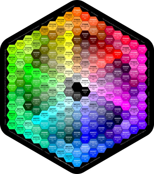
html >颜色值
在网页中的颜色设置是非常重要,有字体颜色(color)、背景颜色(background-color)、边框颜色(border)等,设置颜色的方法也有很多种:
1、英文命令颜色
前面几个小节中经常用到的就是这种设置方法:
p {color :red } 2、RGB颜色
这个与 photoshop 中的 RGB 颜色是一致的,由 R(red)、G(green)、B(blue) 三种颜色的比例来配色。
p {color :rgb(133 ,45 ,200 ) } 每一项的值可以是 0~255 之间的整数,也可以是 0%~100% 的百分数。如:
p {color :rgb(20 %,33 %,25 %) } 3、十六进制颜色
这种颜色设置方法是现在比较普遍使用的方法,其原理其实也是 RGB 设置,但是其每一项的值由 0-255 变成了十六进制 00-ff。
p {color :#00ffff } 配色表
HTML 颜色http://www.runoob.com/html/html-colors.html
长度值
长度单位总结一下,目前比较常用到px(像素)、em、% 百分比,要注意其实这三种单位都是相对单位。
1、像素
像素为什么是相对单位呢?因为像素指的是显示器上的小点(CSS规范中假设“90像素=1英寸”)。实际情况是浏览器会使用显示器的实际像素值有关,在目前大多数的设计者都倾向于使用像素(px)作为单位。
2、em
就是本元素给定字体的 font-size 值,如果元素的 font-size 为 14px ,那么 1em = 14px;如果 font-size 为 18px,那么 1em = 18px。如下代码:
p {font-size :12 pxtext-indent :2 em} 上面代码就是可以实现段落首行缩进 24px(也就是两个字体大小的距离)。
下面注意一个特殊情况:
但当给 font-size 设置单位为 em 时,此时计算的标准以 p 的父元素的 font-size 为基础。如下代码:
html:
<p >以这个<span >例子span>为例。p>css:
p {font-size :14 px }
span {font-size :0.8 em} 结果 span 中的字体“例子”字体大小就为 11.2px(14 * 0.8 = 11.2px)。
3、百分比
p {font-size :12 pxline-height :130 % }设置行高(行间距)为字体的130%(12 * 1.3 = 15.6px)。
<html >
<head >
<meta charset ="utf-8" >
<title > 长度title >
<style type ="text/css" >
p {font-size :14 px }
span {font-size :0.8 em}
style >
head >
<body >
<p > <span > 超酷的互联网span >、IT技术免费学习平台,创新的网络一站式学习、实践体验;<span > 服务及时贴心span >,内容专业、<span > 有趣易学span >。专注服务互联网工程师快速成为技术高手!p >
body >
html >水平居中设置-行内元素
我们在实际工作中常会遇到需要设置水平居中的场景,比如为了美观,文章的标题一般都是水平居中显示的。
这里我们又得分两种情况:行内元素 还是 块状元素 ,块状元素里面又分为定宽块状元素,以及不定宽块状元素。今天我们先来了解一下行内元素怎么进行水平居中?
如果被设置元素为文本、图片等行内元素时,水平居中是通过给父元素设置 text-align:center 来实现的。(父元素和子元素:如下面的html代码中,div是“我想要在父容器中水平居中显示”这个文本的父元素。反之这个文本是div的子元素 )如下代码:
html代码:
<body >
<div class ="txtCenter ">我想要在父容器中水平居中显示。div>
body>css代码:
<style >
.txtCenter {
text-align :center }
style><html >
<head >
<meta charset ="utf-8" >
<title > 定宽块状元素水平居中title >
<style >
div {
border :1 px solid redmargin :20 pxtext-align :center }
.txtCenter {
text-align :center }
style >
head >
<body >
<div class ="txtCenter" > 我想要在父容器中水平居中显示。div >
<div class ="imgCenter" > <img src ="http://img.mukewang.com/52da54ed0001ecfa04120172.jpg" /> div >
body >
html >水平居中设置-定宽块状元素
当被设置元素为 块状元素 时用 text-align:center 就不起作用了,这时也分两种情况:定宽块状元素和不定宽块状元素。
这一小节我们先来讲一讲定宽块状元素。(定宽块状元素:块状元素的宽度width为固定值。)
满足定宽和块状两个条件的元素是可以通过设置“左右margin”值为“auto”来实现居中的。我们来看个例子就是设置 div 这个块状元素水平居中:
html代码:
<body >
<div >我是定宽块状元素,哈哈,我要水平居中显示。div>
body>css代码:
<style >
div {
border :1 px solid redwidth :200 pxmargin :20 px auto}
style>也可以写成:
margin-left :auto ;
margin-right :auto ;注意:元素的“上下 margin” 是可以随意设置的。
水平居中总结-不定宽块状元素方法(一)
在实际工作中我们会遇到需要为“不定宽度的块状元素”设置居中,比如网页上的分页导航,因为分页的数量是不确定的,所以我们不能通过设置宽度来限制它的弹性。(不定宽块状元素:块状元素的宽度width不固定。)
不定宽度的块状元素有三种方法居中(这三种方法目前使用的都很多)
1.加入 table 标签
为什么选择方法一加入table标签? 是利用table标签的长度自适应性—即不定义其长度也不默认父元素body的长度(table其长度根据其内文本长度决定),因此可以看做一个定宽度块元素,然后再利用定宽度块状居中的margin的方法,使其水平居中。
第一步:为需要设置的居中的元素外面加入一个 table 标签 ( 包括 、、 )。
第二步:为这个 table 设置“左右 margin 居中”(这个和定宽块状元素的方法一样)。
html代码:
<div >
<table >
<tbody >
<tr ><td >
<ul >
<li >我是第一行文本li>
<li >我是第二行文本li>
<li >我是第三行文本li>
ul>
td>tr>
tbody>
table>
div>css代码:
<style >
table {
border :1 px solidmargin :0 auto}
style><html >
<head >
<meta charset ="utf-8" >
<title > 不定宽块状元素水平居中title >
<style >
table {
margin :0 autoborder :1 px solid}
.wrap {
background :#ccc display :table margin :0 px auto}
style >
head >
<body >
<div >
<table >
<tbody >
<tr > <td >
<ul >
<li > 我是第一行文本li >
<li > 我是第二行文本li >
<li > 我是第三行文本li >
ul >
td >tr >
tbody >
table >
div >
<div class ="wrap" >
设置我所在的div容器水平居中
div >
body >
html >水平居中总结-不定宽块状元素方法(二)
,可以使不定宽块状元素水平居中之外,本节介绍第2种实现这种效果的方法,改变元素的display类型为行内元素,利用其属性直接设置。
第二种方法:改变块级元素的 display 为 inline 类型(设置为 行内元素 显示),然后使用 text-align:center 来实现居中效果。如下例子:
html代码:
<body >
<div class ="container ">
<ul >
<li ><a href ="#">1a>li>
<li ><a href ="#">2a>li>
<li ><a href ="#">3a>li>
ul>
div>
body>css代码:
<style >
.container {
text-align :center }
.container ul {
list-style :none margin :0 padding :0 display :inline }
.container li {
margin-right :8 pxdisplay :inline }
style>这种方法相比第一种方法的优势是不用增加无语义标签,但也存在着一些问题:它将块状元素的 display 类型改为 inline,变成了行内元素,所以少了一些功能,比如设定长度值。
<html >
<head >
<meta charset ="utf-8" >
<title > 不定宽块状元素水平居中title >
<style >
.container {
text-align : center }
.container ul {
list-style : none margin : 0 padding : 0 display : inline }
.container li {
margin-right : 8 px display : inline }
style >
head >
<body >
<div class ="container" >
<ul >
<li > <a href ="#" > 1a >li >
<li > <a href ="#" > 2a >li >
<li > <a href ="#" > 3a >li >
ul >
div >
body >
html >水平居中总结-不定宽块状元素方法(三)
除了前两节讲到的插入table标签,以及改变元素的display类型,可以使不定宽块状元素水平居中之外,本节介绍第3种实现这种效果的方法,设置浮动和相对定位来实现。
方法三:通过给父元素设置 float,然后给父元素设置 position:relative 和 left:50%,子元素设置 position:relative 和 left: -50% 来实现水平居中。
我们可以这样理解:假想ul层的父层(即下面例子中的div层)中间有条平分线将ul层的父层(div层)平均分为两份,ul层的css代码是将ul层的最左端与ul层的父层(div层)的平分线对齐;而li层的css代码则是将li层的平分线与ul层的最左端(也是div层的平分线)对齐,从而实现li层的居中。
代码如下:
<body >
<div class ="container" >
<ul >
<li > <a href ="#" > 1a >li >
<li > <a href ="#" > 2a >li >
<li > <a href ="#" > 3a >li >
ul >
div >
body >css代码:
<style >
.container {
float :left position :relative left :50 %
}
.container ul {
list-style :none margin :0 padding :0 position :relative left :-50 % }
.container li {float :left display :inline margin-right :8 px}
style>这三种方法使用得都非常广泛,各有优缺点,具体选用哪种方法,可以视具体情况而定。
<html >
<head >
<meta charset ="utf-8" >
<title > 不定宽块状元素水平居中title >
<style >
.container {
float :left position :relative left :50 %
}
.container ul {
list-style :none margin :0 padding :0 position :relative left :-50 % }
.container li {float :left display :inline margin-right :24 px}
.wrap-center {
background :#ccc }
style >
head >
<body >
<div class ="container" >
<ul >
<li > <a href ="#" > 1a >li >
<li > <a href ="#" > 2a >li >
<li > <a href ="#" > 3a >li >
ul >
div >
<div class ="wrap" >
<div class ="wrap-center" > 我们来学习一下这种方法。div >
div >
body >
html >垂直居中-父元素高度确定的单行文本
这里我们又得分两种情况:父元素高度确定的单行文本,以及父元素高度确定的多行文本。
本节我们先来看第一种父元素高度确定的单行文本, 怎么设置它为垂直居中呢?
父元素高度确定的单行文本的竖直居中的方法是通过设置父元素的 height 和 line-height 高度一致来实现的。(height: 该元素的高度,line-height: 顾名思义,行高(行间距),指在文本中,行与行之间的 基线间的距离 )。
line-height 与 font-size 的计算值之差,在 CSS 中成为“行间距”。分为两半,分别加到一个文本行内容的顶部和底部。
这种文字行高与块高一致带来了一个弊端:当文字内容的长度大于块的宽时,就有内容脱离了块。
宽度100px,内容每行的行间距为50px,上面间距,下面间距,刚好100px。
<html >
<head >
<meta charset ="utf-8" >
<title > 垂直居中title >
<style >
.wrap h2 {
margin :0 height :50 pxline-height :50 pxtext-align :center background :#ccc }
style >
head >
<body >
<div class ="wrap" >
<h2 > hi,imooc!
h2 >
div >
body >
html >双行文字。
<html >
<head >
<meta charset ="utf-8" >
<title > 垂直居中title >
<style >
.wrap h2 {
margin :0 height :100 pxline-height :50 pxtext-align :center background :#ccc }
style >
head >
<body >
<div class ="wrap" >
<h2 > hi,imooc! <br >
我是第二行
h2 >
div >
body >
html >JavaScript
我的第一个 JavaScript 程序
<html >
<head >
<meta charset ="utf-8" >
<title > title >
<script >
function displayDate () {"demo" ).innerHTML=Date ();
}
script >
head >
<body >
<h1 > 我的第一个 JavaScript 程序h1 >
<p id ="demo" > 这是一个段落p >
<button type ="button" onclick ="displayDate()" > 显示日期button >
body >
html >windows.open
open() 方法用于打开一个新的浏览器窗口或查找一个已命名的窗口。
http://www.w3school.com.cn/jsref/met_win_open.asp 语法
window.open (URL ,name,features,replace )
参数
描述
URL
一个可选的字符串,声明了要在新窗口中显示的文档的 URL。如果省略了这个参数,或者它的值是空字符串,那么新窗口就不会显示任何文档。
name
一个可选的字符串,该字符串是一个由逗号分隔的特征列表,其中包括数字、字母和下划线,该字符声明了新窗口的名称。这个名称可以用作标记 和
features
一个可选的字符串,声明了新窗口要显示的标准浏览器的特征。如果省略该参数,新窗口将具有所有标准特征。
replace
一个可选的布尔值。规定了装载到窗口的 URL 是在窗口的浏览历史中创建一个新条目,还是替换浏览历史中的当前条目。支持下面的值: true - URL 替换浏览历史中的当前条目。 false - URL 在浏览历史中创建新的条目。
实例1
下面的例子讲在新浏览器窗口中打开 about:blank 页:
<html >
<body >
<script type ="text/javascript" >
myWindow=window.open('' ,'' ,'width=200,height=100' )
myWindow.document.write("This is 'myWindow'" )
myWindow.focus()
script >
body >
html >实例2
<td align ="center" > <a href ="#" onClick ="window.open('readerType?action=readerTypeModifyQuery&ID=<%=ID%>','','width=292,height=175')" > 修改a >td >DOM 文档对象模型
<input id ="userName" name ="userName2" type ="text" class ="input" > var userName = document.getElementById("userName" ).value;var userNameInput = document.getElementsByName("userName2" );
var userName = userNameInput[0 ].value;type ="button" value ="登录" onClick="login()" >var inputs = document.getElementByTagName("input" );
alert(inputs.length); var frms = document.forms;
var loginfm = frms[0 ];获取对象之后可以改变对象所在元素的样式
改变HTML样式
<html >
<head >
<meta http-equiv ="Content-Type" content ="text/html; charset=utf-8" />
<title > style样式title >
head >
<body >
<h2 id ="con" > I love JavaScriptH2 >
<p > JavaScript使网页显示动态效果并实现与用户交互功能。p >
<script type ="text/javascript" >
var mychar= document.getElementById("con" );
mychar.style.color="red" ;
mychar.style.backgroundColor="#CCC" ;
mychar.style.width="300px" ;
script >
body >
html >显示和隐藏(display属性)
<html >
<head >
<meta http-equiv ="Content-Type" content ="text/html; charset=gb2312" >
<title > displaytitle >
<script type ="text/javascript" >
function hidetext ()
{var mychar = document.getElementById("con" );
mychar.style.display="none" ;
}
function showtext ()
{var mychar = document.getElementById("con" );
mychar.style.display="block" ;
}
script >
head >
<body >
<h1 > JavaScripth1 >
<p id ="con" > 做为一个Web开发师来说,如果你想提供漂亮的网页、令用户满意的上网体验,JavaScript是必不可少的工具。p >
<form >
<input type ="button" onclick ="hidetext()" value ="隐藏内容" />
<input type ="button" onclick ="showtext()" value ="显示内容" />
form >
body >
html >控制类名(className 属性)
className 属性设置或返回元素的class 属性。
语法:
object.className = classname 作用:
1.获取元素的class 属性
<html >
<head >
<meta http-equiv ="Content-Type" content ="text/html; charset=gb2312" >
<title > className属性title >
<style >
body { font-size :16 px}
.one {
border :1 px solid #eee width :230 pxheight :50 pxbackground :#ccc color :red }
.two {
border :1 px solid #ccc width :230 pxheight :50 pxbackground :#9CF color :blue }
style >
head >
<body >
<p id ="p1" > JavaScript使网页显示动态效果并实现与用户交互功能。p >
<input type ="button" value ="添加样式" onclick ="add()" />
<p id ="p2" class ="one" > JavaScript使网页显示动态效果并实现与用户交互功能。p >
<input type ="button" value ="更改外观" onclick ="modify()" />
<script type ="text/javascript" >
function add () {var p1 = document.getElementById("p1" );
p1.className="one" ;
}
function modify () {var p2 = document.getElementById("p2" );
p2.className="two" ;
}
script >
body >
html >测试
小伙伴们,请编写”改变颜色”、”改变宽高”、”隐藏内容”、”显示内容”、”取消设置”的函数,点击相应按钮执行相应操作,点击”取消设置”按钮后,提示是否取消设置,如是执行操作,否则不做操作
<html >
<head >
<meta http-equiv ="Content-Type" Content ="text/html; charset=utf-8" />
<title > javascripttitle >
<style type ="text/css" >
body {
font-size : 12 px }
#txt {
height : 400 px width : 600 px border : #333 solid 1 px padding : 5 px }
p {
line-height : 18 px text-indent : 2 em }
style >
head >
<body >
<h2 id ="con" > JavaScript课程H2 >
<div id ="txt" >
<h5 > JavaScript为网页添加动态效果并实现与用户交互的功能。h5 >
<p > 1. JavaScript入门篇,让不懂JS的你,快速了解JS。p >
<p > 2. JavaScript进阶篇,让你掌握JS的基础语法、函数、数组、事件、内置对象、BOM浏览器、DOM操作。p >
<p > 3. 学完以上两门基础课后,在深入学习JavaScript的变量作用域、事件、对象、运动、cookie、正则表达式、ajax等课程。p >
div >
<form >
<input type ="button" value ="改变颜色" onclick ="changleColor()" >
<input type ="button" value ="改变宽高" onclick ="changleWH()" >
<input type ="button" value ="隐藏内容" onclick ="displayContext()" >
<input type ="button" value ="显示内容" onclick ="showContext()" >
<input type ="button" value ="取消设置" onclick ="cancelEdit()" >
form >
<script type ="text/javascript" >
function changleColor () {var mytxt = document.getElementById("txt" );
mytxt.style.background="#CCC" ;
mytxt.style.color="red" ;
}
function changleWH () {var mytxt = document.getElementById("txt" );
mytxt.style.width="400px" ;
mytxt.style.height="500px" ;
}
function displayContext () {var mytxt = document.getElementById("txt" );
mytxt.style.display="none" ;
}
function showContext () {var mytxt = document.getElementById("txt" );
mytxt.style.display="block" ;
}
function cancelEdit () {var rs = confirm("是否取消设置" );
if (rs){
document.getElementsByTagName("div" )[0 ].removeAttribute("style" );
}
else {}
}
script >
body >
html >保持先后顺序(操作符优先级)
我们都知道,除法、乘法等操作符的优先级比加法和减法高,例如:
var numa=3 ;
var numb=6
jq= numa + 30 / 2 - numb * 3 ; 如果我们要改变运算顺序,需添加括号的方法来改变优先级:
var numa=3 ;
var numb=6
jq= ((numa + 30 ) / (2 - numb)) * 3 ; 操作符之间的优先级(高到低):
算术操作符 → 比较操作符 → 逻辑操作符 → “=”赋值符号
如果同级的运算是按从左到右次序进行,多层括号由里向外。
var numa=3 ;
var numb=6 ;
jq= numa + 30 >10 && numb * 3 <2 ; <html xmlns ="http://www.w3.org/1999/xhtml" >
<head >
<meta http-equiv ="Content-Type" content ="text/html; charset=utf-8" />
<title > 操作符优先级title >
<script type ="text/javascript" >
var numa,numb,jq1;
numa=5 ;
numb=2 ;
jq1=numa + 30 >10 && numb * 3 <20 ;
jq2=((numa + 30 ) / (7 -numb)) * 3
document.write("jq1的值是:" +jq1+" );
document.write("jq2的值是:" +jq2);
script >
head >
<body >
body >
html >事件
事件分类
事件
事件句柄
窗口事件
当文档载入时
onload
当文档卸载时
onunload
表单元素事件
用户改变元素的内容
onchange
提交按钮被点击
onsubmit
被重置时
onreset
元素被选取时
onselect
元素失去焦点时
onblur
元素获取焦点
onfocus
鼠标事件
被单击
onclick
被双击
ondblclick
鼠标按钮被按下
onmousedown
鼠标指针移动时
onmousemove
鼠标移出某元素时
onmouseout
鼠标指针悬停于某元素之上
onmouseover
鼠标按钮被松开时
onmouseup
键盘事件
键盘被按下
onkeydown
键盘按下又松开时
onkeypress
键盘松开时
onkeyup
测试
使用JS完成一个简单的计算器功能。实现2个输入框中输入整数后,点击第三个输入框能给出2个整数的加减乘除。
<html >
<head >
<title > 事件title >
<script type ="text/javascript" >
function count () {var a = parseInt (document.getElementById("txt1" ).value);
var b = parseInt (document.getElementById("txt2" ).value);
var s = document.getElementById("select" ).value;
var sum;
switch (s){
case "+" :
sum=a+b;
break ;
case "-" :
sum=a-b;
break ;
case "*" :
sum=a*b;
break ;
case "/" :
sum=a/b;
break ;
}
document.getElementById("fruit" ).value=sum;
}
script >
head >
<body >
<input type ='text' id ='txt1' />
<select id ='select' >
<option value ='+' > +option >
<option value ="-" > -option >
<option value ="*" > *option >
<option value ="/" > /option >
select >
<input type ='text' id ='txt2' />
<input type ='button' value =' = ' onclick ="count()" />
<input type ='text' id ='fruit' />
body >
html >数组排序sort()
sort()方法使数组中的元素按照一定的顺序排列。
语法:
arrayObject.sort (方法函数)参数说明:
1.如果不指定<方法函数>,则按unicode码顺序排列。
2.如果指定<方法函数>,则按<方法函数>所指定的排序方法排序。
myArray.sort (sortMethod);注意: 该函数要比较两个值,然后返回一个用于说明这两个值的相对顺序的数字。比较函数应该具有两个参数 a 和 b,其返回值如下:
若返回值<=-1,则表示 A 在排序后的序列中出现在 B 之前。
1.使用sort()将数组进行排序,代码如下: