html+css制作3D七夕表白旋转相册特效
一个温暖的拥抱,一句轻声的问候,一个暖心的笑容,一双坚实的双手,让我们日久天长,健健康康,快乐每一天!祝你们七夕快乐!一个基于html+css制作简易的3D七夕表白旋转相册特效,就当送给你们当作七夕表白的礼物吧!记得送给自己喜欢的人,嘿嘿嘿。
3D七夕表白旋转相册特效
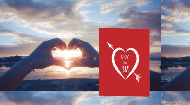
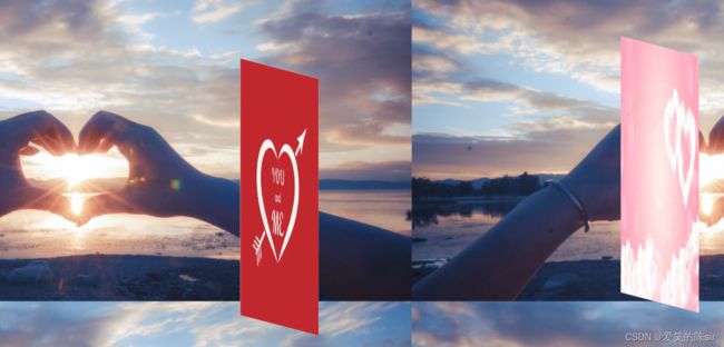
- 一、3D七夕表白旋转相册特效效果图
- 二、页面背景设置
- 三、animation属性的作用
- 四、什么是 @keyframes属性
- 五、放置图片的容器
- 六、视频演示
一、3D七夕表白旋转相册特效效果图
二、页面背景设置
   *{
       padding:0px;
       margin:0px;
   }
高度设置成100%,具体高度以自身所需为准
   body{
       height:100%;
   }
/* background-size:100% 100%;按容器比列撑满,图片变形 */
  body{
     /*  background-size:100% 100%;按容器比列撑满,图片变形 */
    background-image:url("images/3.png")
    /* background-size:100% 100%; */
   }
   #box{
       width:280px;
       height:400px;
   }
/*生成绝对定位的元素 */
   position:fixed;
   left:0px;
   right:0px;
   top:0;
   bottom:0px;
/* 元素水平居中 */
margin:auto;
/*指定嵌套元素,在3D空间中呈现 */
transform-style:preserve-3d;
/* 设置X,Y的旋转点 */
transform:rotateX(0deg) rotateY(0deg);
   /* 动画时长:   45s infinite 循环播放 每45s默认循环播放一次
   infinite 循环播放     linear 默认循环一次 */
三、animation属性的作用
animation:简易属性,用于设置六个动画属性
在这里先打三个???,后面我们会用到它,嘿嘿嘿
animation: go 45s linear infinite;
   #box img{
       width:280px;
       height:400px;
       /*绝对定位 */
       position:absolute;
       left:0px;
       top:0px;
   }
让图片向外推出,使用translateZ(650px);
rotateY(0deg):以Y轴0度为盒子的旋转中心点(如上图演示)
   #box img:nth-child(1){
       transform:rotateY(0deg) translateZ(650px);
   }

   #box img:nth-child(2){
       transform:rotateY(36deg) translateZ(650px);
   }
   #box img:nth-child(3){
       transform:rotateY(72deg) translateZ(650px);
   }
   #box img:nth-child(4){
       transform:rotateY(108deg) translateZ(650px);
   }
   #box img:nth-child(5){
       transform:rotateY(144deg) translateZ(650px);
   }
   #box img:nth-child(6){
       transform:rotateY(216deg) translateZ(650px);
   }
   #box img:nth-child(7){
       transform:rotateY(288deg) translateZ(650px);
   }
   #box img:nth-child(8){
       transform:rotateY(324deg) translateZ(650px);
   }
四、什么是 @keyframes属性
@keyframes :定义一个动画,并定义具体的动画效果,如,放大或者位移等等
@keyframes go:以百分比:来规定改变发生的时间
@keyframes它定义的动画并不能直接执行,需要借助animation来运转
百分比是指动画完成一遍的时间长度的百分比,
0%是动画的开始时间,50%是动画完成一半的时间,100%动画是动画的结束时间
   @keyframes go{
       0%{
           transform:rotateX(0deg) rotateY(0deg);
       }
       25%{
           transform:rotateX(20deg) rotateY(180deg);
       }
       50%{
           transform:rotateX(0deg) rotateY(360deg);
       }
       75%{
           transform:rotateX(0deg) rotateY(540deg);
       }
       100%{
           transform:rotateX(0deg) rotateY(720deg);
       }
   }
五、放置图片的容器
<-- 放置图片的容器–>
    "box">
    "images/1.png"alt="">
    "images/2.png"alt="">
    "images/3.png"alt="">
    "images/4.png"alt="">
    "images/5.png"alt="">
    "images/6.png"alt="">
    "images/7.png"alt="">
    "images/8.png"alt="">
"images/1.png"alt="">
"images/2.png"alt="">
"images/3.png"alt="">
"images/4.png"alt="">
"images/5.png"alt="">
"images/6.png"alt="">
"images/7.png"alt="">
"images/8.png"alt="">