Windows Store App Development Tip and Tricks - GridViewItem
This post talks about
* How to add ItemContainerStyleSelector to GridView
* How to remove GridViewItem selection and click animation
ItemContainerStyleSelector on MSDN:
Add GridViewItem styles
1. In Visual Studio 2012, create a blank Windows Store App project.
2. Open MainPage.xaml in design mode. Add a GridView.
<GridView
            SelectionMode="None"
            VerticalAlignment="Center"
            HorizontalAlignment="Center">

            <GridView.ItemsPanel>
                <ItemsPanelTemplate>
                    <VirtualizingStackPanel Orientation="Horizontal"/>
                </ItemsPanelTemplate>
            </GridView.ItemsPanel>

            <GridViewItem Width="300" Height="300" Margin="10" Background="Gray" FontSize="50">red</GridViewItem>
            <GridViewItem Width="300" Height="300" Margin="10" Background="Gray" FontSize="50">green</GridViewItem>
</GridView>
3. Run application, you can see both items in gray color.
Implement ItemContainerStyleSelector
1. Firstly we create a custom style for GridViewItem to set the items background color as Red.
2. In design mode, select GridViewItem with “red” text. Right click on it, choose “Edit Template”->”Edit a copy…”. In “Create Style Resource” dialog, fill the name (key) as “GridViewItemRedStyle”, choose “Define in” as “This document”. In MainPage.xaml, a new style “GridViewItemRedStyle” is added in Page.Resources section. We update the value of property “Background” from “Transparent” to “Red”.
<Page.Resources>
        <Style x:Key="GridViewItemRedStyle" TargetType="GridViewItem">
            <Setter Property="FontFamily" Value="{StaticResource ContentControlThemeFontFamily}"/>
            <Setter Property="FontSize" Value="{StaticResource ControlContentThemeFontSize}"/>
            <Setter Property="Background" Value="Red"/>
      …………
3. Create a new style with name “GridViewItemGreenStyle” similar with the step 2. Set the value of property “Background” as “Green”. Remove background settings from GridViewItems, the xaml looks lik
<GridViewItem Width="300" Height="300" Margin="10" FontSize="50" Style="{StaticResource GridViewItemRedStyle}">red</GridViewItem>
<GridViewItem Width="300" Height="300" Margin="10" FontSize="50" Style="{StaticResource GridViewItemGreenStyle}">green</GridViewItem>
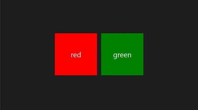
4. Run application. You can see the items in red and green.
5. Add new class named “MainItemContainerStyleSelector.cs” into project. Copy the below code to the class. You also need to add references.
using Windows.UI.Xaml;using Windows.UI.Xaml.Controls;
public class MainItemContainerStyleSelector : StyleSelector
    {
        public Style RedStyle { get; set; }

        public Style GreenStyle { get; set; }

        protected override Style SelectStyleCore(object item, DependencyObject container)
        {
            string content = ((GridViewItem)item).Content.ToString();

            switch(content)
            {
                case "red":
                    return RedStyle;
                    break;
                case "green":
                    return GreenStyle;
                    break;
            }

            return ((GridViewItem)item).Style;
        }
    }
6. In MainPage.xaml, add MainItemContainerStyleSelector as StaticResource.
<local:MainItemContainerStyleSelector x:Key="mainItemContainerStyleSelector" RedStyle="{StaticResource GridViewItemStyle1}" GreenStyle="{StaticResource GridViewItemStyle2}"/>
7. Update the GridView as below.
<GridView
            SelectionMode="None"
            VerticalAlignment="Center"
            HorizontalAlignment="Center"
            ItemContainerStyleSelector="{StaticResource mainItemContainerStyleSelector}">

            <GridView.ItemsPanel>
                <ItemsPanelTemplate>
                    <VirtualizingStackPanel Orientation="Horizontal"/>
                </ItemsPanelTemplate>
            </GridView.ItemsPanel>

            <GridViewItem Width="300" Height="300" Margin="10" FontSize="50">red</GridViewItem>
            <GridViewItem Width="300" Height="300" Margin="10" FontSize="50">green</GridViewItem>
</GridView>
8. Launch the application.
Remove selection and click animations from GridViewItem style
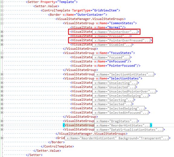
1. Sometimes we only want user to view the content of item, but cannot action it. In order to do this, we can update GridViewItem’s style to remove selection and click animations. saying the Red GridViewItem we created in the above steps. In “GridViewItemRedStyle”, find the visualState “PointerOver” and “PointerOverPressed”. Remove storyboard from them.
2. Rebuild and launch the application, move the pointer to red item and click on it. Comparing to the green item, the animations are removed from the red item now.
Source Code: http://files.cnblogs.com/Tealcwu/ItemContainerStyleSelectorDemo.zip


