数据分析之matplotlib
matplotlib数据可视化
- 什么是数据可视化
- 安装matplotlib
- 基本使用
-
- 添加文字
- 各类型图的使用
-
- 折线图
- 直方图
- 条形图
- 通过Axes绘图
- 饼图
- 箱形图
- 泡泡图
- 等高线(轮廓图)
- 开发环境jupyterlab
什么是数据可视化
https://matplotlib.org/
安装matplotlib
python -m pip install -U matplotlib
Matplotlib 一系列的依赖
Python (>= 3.6)
NumPy (>= 1.15)
setuptools
cycler (>= 0.10.0)
dateutil (>= 2.1)
kiwisolver (>= 1.0.0)
Pillow (>= 6.2)
pyparsing (>=2.0.3)
基本使用
# coding=utf-8
from matplotlib import pyplot as plt

x = range(2,26,2)
y = [15,13,14.5,17,20,25,26,26,27,22,18,15]

#设置图片大小,dpi让图像变得清晰
plt.figure(figsize=(20,8),dpi=80)

#绘图
plt.plot(x,y)
#显示图形
plt.show()

由x和y的每个值对应而组成的折线图
是不是这样看着太简单了
plt.xticks(range(2,29,2)) #设置x轴刻度
plt.yticks(range(2,29,2)) #y
plt.savefig('./01-test.png') #保存图片
结果如下

plt.xticks部分源代码
 >>> locs, labels = yticks()  # Get the current locations and labels.
    >>> yticks(np.arange(0, 1, step=0.2))  # Set label locations.
    >>> yticks(np.arange(3), ['Tom', 'Dick', 'Sue'])  # Set text labels.
    >>> yticks([0, 1, 2], ['January', 'February', 'March'],
    ...        rotation=45)  # Set text labels and properties.
    >>> yticks([])  # Disable yticks.
我们以添加额外参数时xy轴发生变化
plt.yticks(range(2,29,2),rotation=45)

添加文字
由于matplotlib默认是不支持中文的
需要添加配置
# windws和linux设置字体的放
font = {'family' : 'MicroSoft YaHei',
        'weight': 'bold',
        'size': '14'}
matplotlib.rc("font",**font)
matplotlib.rc("font",family='MicroSoft YaHei',weight="bold")
x = range(0,120)
y = [random.randint(20,35) for i in range(120)]
_xtick_labels = ["10点{}分".format(i) for i in range(60)]
_xtick_labels += ["11点{}分".format(i) for i in range(60)]

#取步长,数字和字符串一一对应,数据的长度一样
plt.xticks(list(x)[::3],_xtick_labels[::3],rotation=45,fontproperties=font) #rotaion旋转的度数
#添加描述信息
plt.xlabel("时间",fontproperties=font)
plt.ylabel("温度 单位(℃)",fontproperties=font)
plt.title("10点到12点每分钟的气温变化情况",fontproperties=font)

各类型图的使用
类型之间的切换需要更改绘制
plt.plot(x,y) -> plt.scatter(x,y)
折线图
折线图:以折线的上升或下降来表示统计数量的增减变化的统计图
特点:能够显示数据的变化趋势,反映事物的变化情况。(变化)
plt.plot(x,y)
@_copy_docstring_and_deprecators(Axes.plot)
def plot(*args, scalex=True, scaley=True, data=None, **kwargs):
    return gca().plot(
        *args, scalex=scalex, scaley=scaley,
        **({"data": data} if data is not None else {}), **kwargs)
直方图
直方图:由一系列高度不等的纵向条纹或线段表示数据分布的情况。
一般用横轴表示数据范围,纵轴表示分布情况。
特点:绘制连续性的数据,展示一组或者多组数据的分布状况(统计)
def hist(
        x, bins=None, range=None, density=False, weights=None,
        cumulative=False, bottom=None, histtype='bar', align='mid',
        orientation='vertical', rwidth=None, log=False, color=None,
        label=None, stacked=False, *, data=None, **kwargs):
    return gca().hist(
        x, bins=bins, range=range, density=density, weights=weights,
        cumulative=cumulative, bottom=bottom, histtype=histtype,
        align=align, orientation=orientation, rwidth=rwidth, log=log,
        color=color, label=label, stacked=stacked,
        **({"data": data} if data is not None else {}), **kwargs)
直方图用于统计数据出现的次数或者频率,有多种参数可以调整,见下例:
np.random.seed(19680801)

n_bins = 10
x = np.random.randn(1000, 3)

fig, axes = plt.subplots(nrows=2, ncols=2)
ax0, ax1, ax2, ax3 = axes.flatten()

colors = ['red', 'tan', 'lime']
ax0.hist(x, n_bins, density=True, histtype='bar', color=colors, label=colors)
ax0.legend(prop={'size': 10})
ax0.set_title('bars with legend')

ax1.hist(x, n_bins, density=True, histtype='barstacked')
ax1.set_title('stacked bar')

ax2.hist(x,  histtype='barstacked', rwidth=0.9)

ax3.hist(x[:, 0], rwidth=0.9)
ax3.set_title('different sample sizes')

fig.tight_layout()
plt.show()
参数中density控制Y轴是概率还是数量,与返回的第一个的变量对应。histtype控制着直方图的样式,默认是 ‘bar’,对于多个条形时就相邻的方式呈现如子图1, ‘barstacked’ 就是叠在一起,如子图2、3。 rwidth 控制着宽度,这样可以空出一些间隙,比较图2、3. 图4是只有一条数据时。
条形图
条形图:排列在工作表的列或行中的数据可以绘制到条形图中。
特点:绘制连离散的数据,能够一眼看出各个数据的大小,比较数据之间的差别。(统计)
plt.bar(x,y,width=1,height=1)
需要传入高度和一个可迭代的数组
# Autogenerated by boilerplate.py.  Do not edit as changes will be lost.
@_copy_docstring_and_deprecators(Axes.bar)
def bar(
        x, height, width=0.8, bottom=None, *, align='center',
        data=None, **kwargs):
    return gca().bar(
        x, height, width=width, bottom=bottom, align=align,
        **({"data": data} if data is not None else {}), **kwargs)
散点图:用两组数据构成多个坐标点,考察坐标点的分布,判断两变量
之间是否存在某种关联或总结坐标点的分布模式。
特点:判断变量之间是否存在数量关联趋势,展示离群点(分布规律)
plt.scatter(x,y)
源代码
# Autogenerated by boilerplate.py.  Do not edit as changes will be lost.
@_copy_docstring_and_deprecators(Axes.scatter)
def scatter(
        x, y, s=None, c=None, marker=None, cmap=None, norm=None,
        vmin=None, vmax=None, alpha=None, linewidths=None,
        verts=cbook.deprecation._deprecated_parameter,
        edgecolors=None, *, plotnonfinite=False, data=None, **kwargs):
    __ret = gca().scatter(
        x, y, s=s, c=c, marker=marker, cmap=cmap, norm=norm,
        vmin=vmin, vmax=vmax, alpha=alpha, linewidths=linewidths,
        verts=verts, edgecolors=edgecolors,
        plotnonfinite=plotnonfinite,
        **({"data": data} if data is not None else {}), **kwargs)
    sci(__ret)
    return __ret

通过Axes绘图
import matplotlib.pyplot as plt
import numpy as np

fig = plt.figure()
ax = fig.add_subplot(111)
ax.set(xlim=[0.5, 4.5], ylim=[-2, 8], title='An Example Axes',
       ylabel='Y-Axis', xlabel='X-Axis')
plt.show()
饼图
labels = 'Frogs', 'Hogs', 'Dogs', 'Logs'
sizes = [15, 30, 45, 10]
explode = (0, 0.1, 0, 0)  # only "explode" the 2nd slice (i.e. 'Hogs')

fig1, (ax1, ax2) = plt.subplots(2)
ax1.pie(sizes, labels=labels, autopct='%1.1f%%', shadow=True)
ax1.axis('equal')
ax2.pie(sizes, autopct='%1.2f%%', shadow=True, startangle=90, explode=explode,
    pctdistance=1.12)
ax2.axis('equal')
ax2.legend(labels=labels, loc='upper right')

plt.show()
饼图自动根据数据的百分比画饼.。labels是各个块的标签,如子图一。autopct=%1.1f%%表示格式化百分比精确输出,explode,突出某些块,不同的值突出的效果不一样。pctdistance=1.12百分比距离圆心的距离,默认是0.6.

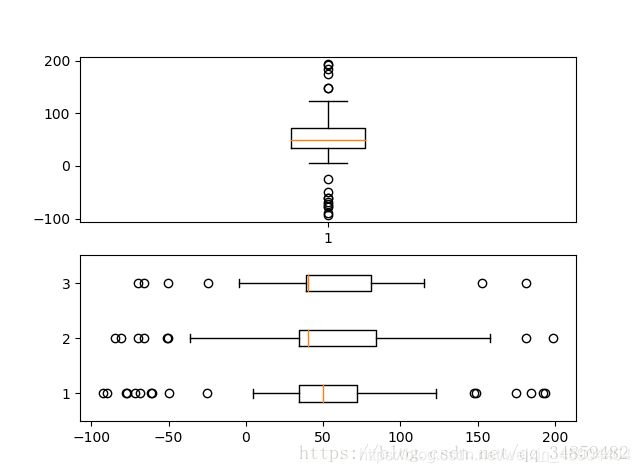
箱形图
为了专注于如何画图,省去数据的处理部分。 data 的 shape 为 (n, ), data2 的 shape 为 (n, 3)。
fig, (ax1, ax2) = plt.subplots(2)
ax1.boxplot(data)
ax2.boxplot(data2, vert=False) #控制方向
泡泡图
散点图的一种,加入了第三个值 s 可以理解成普通散点,画的是二维,泡泡图体现了Z的大小,如下例:
np.random.seed(19680801)


N = 50
x = np.random.rand(N)
y = np.random.rand(N)
colors = np.random.rand(N)
area = (30 * np.random.rand(N))**2  # 0 to 15 point radii

plt.scatter(x, y, s=area, c=colors, alpha=0.5)
plt.show()

等高线(轮廓图)
有时候需要描绘边界的时候,就会用到轮廓图,机器学习用的决策边界也常用轮廓图来绘画,见下例:
fig, (ax1, ax2) = plt.subplots(2)
x = np.arange(-5, 5, 0.1)
y = np.arange(-5, 5, 0.1)
xx, yy = np.meshgrid(x, y, sparse=True)
z = np.sin(xx**2 + yy**2) / (xx**2 + yy**2)
ax1.contourf(x, y, z)
ax2.contour(x, y, z)
上面画了两个一样的轮廓图,contourf会填充轮廓线之间的颜色。数据x, y, z通常是具有相同 shape 的二维矩阵。x, y 可以为一维向量,但是必需有 z.shape = (y.n, x.n) ,这里 y.n 和 x.n 分别表示x、y的长度。Z通常表示的是距离X-Y平面的距离,传入X、Y则是控制了绘制等高线的范围。
