【封装UI组件库】手把手教你仿一下Element-ui的Button组件(发布至npm)
所谓UI组件库,就是封装了平常项目开发中经常会使用的页面组件,发布至npm库中作为插件供项目组成员及其他开发者使用(不发布也行),目的就是为了避免多次重复劳动。
以插件的形式使用可以做到即插即用,非常方便。
市面上热门的UI组件库有Element-ui(与Vue框架配合使用)、Ant Design(与React框架配合使用)等等…
本文主要通过讲解Element-ui封装一个组件的思路,来带领大家自己上手实践一下如何封装自定义组件。最后也会讲述如何把成品发布至npm云端库来呈现我们的测试插件。
先上一张效果图:

实践之前,咱们先来瞅瞅Element-ui组件库的项目结构,以及Button组件的模块结构吧~
ELement-ui组件的源码的获取方式有两种:
- 使用
npm install来本地安装Element-ui - 去
github上拉取Element团队开源的代码
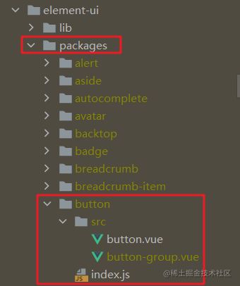
1. Element-ui项目结构
项目结构图如下:
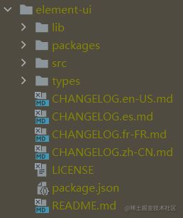
lib文件夹下的内容是Element-ui组件打包后的内容,是我们自己的项目使用Element-ui时真正的引用出处。
packages文件夹下包含了Element-ui的所有组件源码,感谢走在开源前沿的Element前端团队(听我说,谢谢你…)

src文件夹主要用于测试packages组件
types文件夹下是typescript的类型文件,咱们本次实践用不到,仅做了解

剩下一些文件CHANGELOG打头的是不同语言版本的维护日志,LICENSE是项目维护日志, package.json是项目依赖及配置信息,README.md是使用说明文档
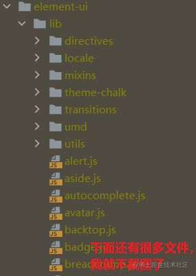
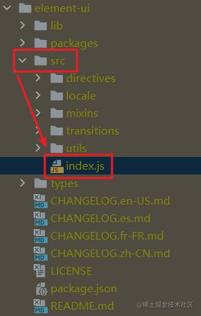
2. Element的Button模块项目结构
我们定位到Element文件夹下-package文件夹下-button组件,模块结构如下图所示:
其中button.vue组件中是button组件的具体实现:
按钮大小(size)、类型(type)、是否禁用(is-disabled)、是否加载(is-loading)、是否圆角(is-round)、是否圆形按钮(is-circle)都是通过props属性,从父组件接收到的。
@click事件通过emit发送出去供父组件调用使用。
单独的disabled属性是为了便于禁用绑定到button上的事件,比如:点击事件。class里的is-disabled是为了给按钮添加禁用的样式。
script标签里的inject是为了接收除直接父组件之外的其他更高级别父组件传递过来的属性,常与父组件中的provide属性配合使用。
<template>
  <button
    class="el-button"
    @click="handleClick"
    :disabled="buttonDisabled || loading"
    :autofocus="autofocus"
    :type="nativeType"
    :class="[
      type ? 'el-button--' + type : '',
      buttonSize ? 'el-button--' + buttonSize : '',
      {
        'is-disabled': buttonDisabled,
        'is-loading': loading,
        'is-plain': plain,
        'is-round': round,
        'is-circle': circle
      }
    ]"
  >
    <i class="el-icon-loading" v-if="loading"></i>
    <i :class="icon" v-if="icon && !loading"></i>
    <span v-if="$slots.default"><slot></slot></span>
  </button>
</template>
<script>
  export default {
    name: 'ElButton',

    inject: {
      elForm: {
        default: ''
      },
      elFormItem: {
        default: ''
      }
    },

    props: {
      type: {
        type: String,
        default: 'default'
      },
      size: String,
      icon: {
        type: String,
        default: ''
      },
      nativeType: {
        type: String,
        default: 'button'
      },
      loading: Boolean,
      disabled: Boolean,
      plain: Boolean,
      autofocus: Boolean,
      round: Boolean,
      circle: Boolean
    },

    computed: {
      _elFormItemSize() {
        return (this.elFormItem || {}).elFormItemSize;
      },
      buttonSize() {
        return this.size || this._elFormItemSize || (this.$ELEMENT || {}).size;
      },
      buttonDisabled() {
        return this.disabled || (this.elForm || {}).disabled;
      }
    },

    methods: {
      handleClick(evt) {
        this.$emit('click', evt);
      }
    }
  };
</script>
index.js文件的主要功能是把封装好的button组件给暴露出去:
关键点有install属性和Vue.component挂载。
import ElButton from './src/button';

/* istanbul ignore next */
ElButton.install = function(Vue) {
  Vue.component(ElButton.name, ElButton);
};

export default ElButton;
细心的同学可能发现了,为啥封装button组件的过程中没看到css相关的代码呢?
这是因为Element把所有组件的css样式代码都统一放在了packages文件夹下的theme-chalk文件夹下。
感兴趣的同学可以了解一下,涉及到scss预处理器的很多高级用法,鄙人能力目前还不能完全吃透:

以上就是对一个组件的封装,其实整个过程还是挺简单的。
组件的实现和平常写的业务代码基本一样。需要额外补充的地方就是需要一个index.js文件把封装的组件通过install属性和Vue.component方法挂载到要使用的项目上。
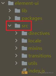
一般UI组件库包含的组件那可不止一个呢,因此,还有一个全局的index.js文件,就是用来把所有实现的组件汇总到一起进行挂载&&根据用户的需求来按需挂载。Element把这个index.js文件放在了src文件夹下:
文件源码如下:
components里存放Element的所有组件,使用components.forEach方法来依次把所有组件通过Vue.component方法挂载到Vue项目上。使用Vue.prototype来挂载弹窗、加载框等不直接在页面上展示的组件。
当然,我们也可以不把所有组件都挂载在Vue上,因为每个组件封装时也有一个index.js文件,因此我们可以直接在src下的这个index.js里直接把按需使用的组件使用export进行导出。
/* Automatically generated by './build/bin/build-entry.js' */

import Pagination from '../packages/pagination/index.js';
...
import Button from '../packages/button/index.js';
import ButtonGroup from '../packages/button-group/index.js';


const components = [
  ...
  Button,
  ButtonGroup,
  ...
];

const install = function(Vue, opts = {}) {
  locale.use(opts.locale);
  locale.i18n(opts.i18n);

  components.forEach(component => {
    Vue.component(component.name, component);
  });

  Vue.use(InfiniteScroll);
  Vue.use(Loading.directive);

  Vue.prototype.$ELEMENT = {
    size: opts.size || '',
    zIndex: opts.zIndex || 2000
  };

  Vue.prototype.$loading = Loading.service;
  Vue.prototype.$msgbox = MessageBox;
  Vue.prototype.$alert = MessageBox.alert;
  Vue.prototype.$confirm = MessageBox.confirm;
  Vue.prototype.$prompt = MessageBox.prompt;
  Vue.prototype.$notify = Notification;
  Vue.prototype.$message = Message;

};

/* istanbul ignore if */
if (typeof window !== 'undefined' && window.Vue) {
  install(window.Vue);
}

export default {
  version: '2.15.6',
  locale: locale.use,
  i18n: locale.i18n,
  install,
  ...
  Button,
  ButtonGroup,
  ...
};
3. 上手封装一个简易的UI组件库
了解了业界顶级的UI组件库实现一个组件的全过程后,咱们就可以自己上手来仿一个Element-ui的Button组件啦~
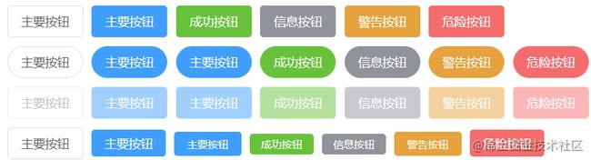
3.1 先上一张效果图
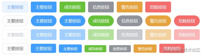
看上去是不是还挺像模像样滴~
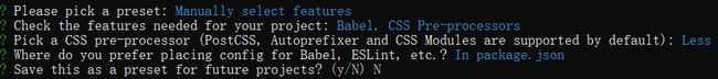
3.2 项目初始化
因为Element-ui主要用于Vue2.X版本,因此咱们就用vue-cli来初始化一个Vue2.X的项目结构吧:
可以借助脚手架vue-cli,也可以用vite。本文采用的是vue-cli:
- 执行
vue create sweet-ui-test来初始化项目
vue create sweet-ui-test
- 为了节省不必要的开支,这里采用手动配置

本次demo只需要Babel和CSS预处理器,因此只选中这两个就可以了。
(键盘上下键来切换选项,空格space键来切换选中)
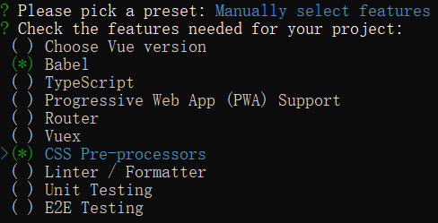
vue中预处理器常用Less,因此下面的选项中我们就选Less即可

配置文件我们选择package.json

是否将本次偏好作为以后项目初始化的模板?我们键入N,表示不作为模板
静静等待项目初始化即可:
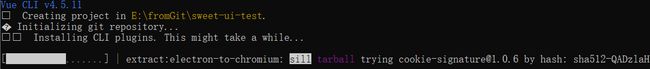
出现如下界面代表项目初始化完成:

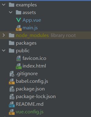
在编辑器里打开项目,结构应该长这个样:

3.2 项目结构调整
按照Element-ui的风格来调整我们的项目结构:
- 新增
package文件夹
首先需要新增一个packages文件夹来放我们的组件代码 - 修改
src文件夹的名称为examples
因为我们最终打包的只有package文件夹,src文件夹只是方便我们做测试用的。因此改个名来进行区分。 - 新增
vue.config.js文件
文件内容如下:
// vue.config.js
module.exports = {
    pages: {
        index: {
            // 修改入口
            entry: 'examples/main.js',
            template: 'public/index.html',
            filename: 'index.html'
        }
    },
    chainWebpack: config => {
        config.module
            .rule('js')
            .include
            .add('/packages')
            .end()
            .use('babel')
            .loader('babel-loader')
            .tap(options => {
                return options
            })
    }
}
- 清理
exapmples文件夹里不用的内容
删去assets里的logo.png图片; 删去components文件夹。
将examples的App.vue文件删除成下面这样:
<template>
  <div id="app">
    app.vue
  </div>
</template>

<script>
export default {
    name: 'App',
}
</script>
- 目前项目结构:
目前项目结构应该长这样:
- 测试项目能否正常跑通
出现如下界面,就代表上述改造项目结构成功
3.3 上手编写button组件
在packages文件夹下新建一个文件夹(名称自拟,本文中叫SweetButton),用来存放我们的button组件。
在SweetButton下新建src文件夹,在该文件夹下新增index.vue文件。
在SweetButton下新建index.js文件,用来导出我们完成的button组件。
在packages文件夹下新建index.js文件,用来导出所有组件。
上述几个步骤得到的packages文件夹下的模块结构如下图所示:

接下来我们就来依次填充代码:
填充index.vue
我们先来完善index.vue。仿照Element-ui中button组件的实现来完成我们的button:
因为只是封装简单的button组件,因此本次实践中使用less把css的代码写在了index.vue里,没有另起一个文件来写。如果是准备封装一个功能完善的UI组件库的话,还是建议把css部分抽离出去,不然像修改主题色这种需求就比较麻烦:
填充button组件的index.js
把完成的button组件给暴露出去
import SweetButton from './src/index'

SweetButton.install = function (Vue){
    Vue.component(SweetButton.name, SweetButton);
}

export default SweetButton;
填充packages文件夹下的index.js
import SweetButton from './SweetButton/index'
// 存放组件的数组
const components = [
    SweetButton
]

// 定义 install 方法,接收 Vue 作为参数。
const install = function (Vue) {
    // 判断是否安装
    if (install.installed) return
    // 遍历 components 数组,来进行全局注册
    components.map(component => {
        Vue.component(component.name, component)
    })
}

export{
    // 导出的对象必须具有 install,才能被 Vue.use() 方法安装
    install,
    SweetButton
}
至此,button组件的封装就基本完成啦~
咱们去examples文件夹下测试一下:
测试封装好的button组件
- 在
examples下的main.js里引入封装好的组件
import Vue from 'vue'
import App from './App.vue'
import { SweetButton } from '../packages/index'
import '../lib/index.css'

Vue.config.productionTip = false
Vue.use(SweetButton)
new Vue({
  render: h => h(App),
}).$mount('#app')
- 在
App.vue中进行测试
<template>
  <div id="app">
    <div class="first">
      <sweet-button>主要按钮</sweet-button>
      <sweet-button type="primary" @click="sayHai">主要按钮</sweet-button>
      <sweet-button type="success">成功按钮</sweet-button>
      <sweet-button type="info">信息按钮</sweet-button>
      <sweet-button type="warning">警告按钮</sweet-button>
      <sweet-button type="danger">危险按钮</sweet-button>
    </div>
    <div class="second">
      <sweet-button round>主要按钮</sweet-button>
      <sweet-button type="primary" round>主要按钮</sweet-button>
      <sweet-button type="primary" round>主要按钮</sweet-button>
      <sweet-button type="success" round>成功按钮</sweet-button>
      <sweet-button type="info" round>信息按钮</sweet-button>
      <sweet-button type="warning" round>警告按钮</sweet-button>
      <sweet-button type="danger" round>危险按钮</sweet-button>
    </div>
    <div class="third">
      <sweet-button disabled>主要按钮</sweet-button>
      <sweet-button type="primary" disabled>主要按钮</sweet-button>
      <sweet-button type="primary" disabled>主要按钮</sweet-button>
      <sweet-button type="success" disabled>成功按钮</sweet-button>
      <sweet-button type="info" disabled>信息按钮</sweet-button>
      <sweet-button type="warning" disabled>警告按钮</sweet-button>
      <sweet-button type="danger" disabled>危险按钮</sweet-button>
    </div>
    <div class="fourth">
      <sweet-button>主要按钮</sweet-button>
      <sweet-button type="primary" size="medium">主要按钮</sweet-button>
      <sweet-button type="primary" size="small">主要按钮</sweet-button>
      <sweet-button type="success" size="mini">成功按钮</sweet-button>
      <sweet-button type="info" size="mini">信息按钮</sweet-button>
      <sweet-button type="warning" size="small">警告按钮</sweet-button>
      <sweet-button type="danger" size="medium">危险按钮</sweet-button>
    </div>
  </div>
</template>

<script>

export default {
  name: 'App',
  methods:{
    sayHai(){
      alert('希望你天天开心~')
    }
  }
}
</script>
<style lang="less">
div{
  margin: 10px;
}
</style>
- 运行
npm run serve
如果页面上可以正常显示出这些样式各不相同的button的话,就证明成功~
3.4 打包组件
在3.3节中,我们实现了一个简易的button组件,并在App.vue中成功进行了测试。但上述测试只是通过项目内文件路径引用的方式来使用的组件,严格意义上来说,还需要进行打包,形成lib文件才算是封装结束:
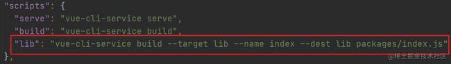
我们在package.json文件夹下的scripts脚本中新增一条脚本:
"lib": "vue-cli-service build --target lib --name index --dest lib packages/index.js"
用于把我们组件进行打包。之所以不用build,是因为build会把整个项目进行打包,而我们只想打包封装好的组件,因此需要自定义一条脚本。
运行npm run lib, 静静等待一会儿…
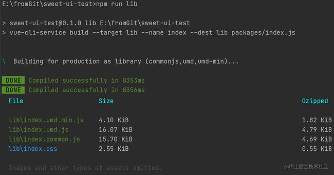
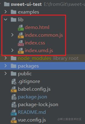
此时项目结构树中,应该就会出现打包后的lib文件夹:
我们修改examples文件夹下的main.js里SweetButton文件的引入方式:
import Vue from 'vue'
import App from './App.vue'
import { SweetButton } from '../lib/index.umd.min'
// import { SweetButton } from '../packages/index'
import '../lib/index.css' // 加载样式文件

Vue.config.productionTip = false
Vue.use(SweetButton)
new Vue({
  render: h => h(App),
}).$mount('#app')
重新运行项目,如果可以正常显示页面,说明打包成功!
此后,我们就可以在项目下任意一个.vue文件里使用我们的自定义button啦~
4. 发布组件库至npm
在第3节中,我们封装了一个仿element-ui的button组件,但目前这个组件库只能在我们当前的项目中使用,或者其他项目想使用的话需要拷贝lib文件至他们的项目文件夹下,十分不方便…
那些大神封装的插件不都直接通过npm install的方式进行导入的嘛,我也想自己封装的插件这么高级。
因此我们就需要把自己封装好的组件库发布至npm中,作为插件方便其他开发者引用。
4.1 注册成为npm的用户
npm官网链接
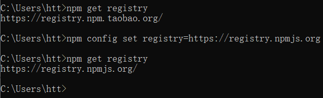
4.2 修改本地npm镜像源
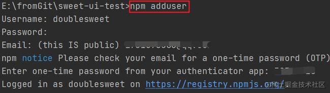
4.3 为封装组件的项目添加npm用户信息
4.4 修改项目package.json文件信息
name是插件名称,必填
插件名称不能和npm已有的名称冲突,建议先去npm里搜一下,冲突的话会发布失败。version是版本号,必填private一定要为false,必填
private默认为true,记得修改,否则发布失败。

4.5 执行发布命令
执行npm publish,出现类似下图界面就代表发版成功!success~

回到npm官网中,输入我们的插件名,如果出现对应的插件,代表发版成功:

5. 插件测试
为了测试我们发版的插件,咱们需要新开一个Vue的项目,不然在当前项目里执行npm install时会提示和项目名称冲突。
项目初始化步骤就不重复了,初始化完成后,执行npm install xxx(我们的插件名称),即可安装成功。
之后在main.js里全局引用一下(引入步骤和其他UI组件库一样),或者在对应的组件里按需引入(引入步骤和其他UI组件库一样),即可方便的使用啦~
源码地址