matplotlib绘制折线图
matplotlib绘制折线图
这阳春三月的邵大白在家过的什么日子,幽栖地僻经过少,花径不曾缘客扫~
开个逗b号纪念下这段闭关的时光=^=万一他以后就变成一个数据分析的大v号了来~
好了邵大白课堂开课了
折线图绘制
咱先画个图,载慢悠的加东西
#导包
import matplotlib.pyplot as plt
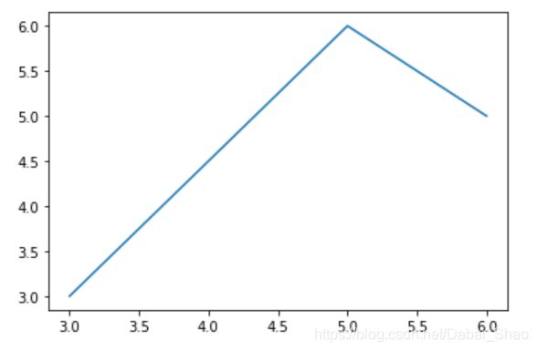
#绘图
plt.plot([3,5,6],[3,6,5]) #显然这就是x,y轴的坐标啦
#显示
plt.show()
当然x,y轴坐标多了这样写就不帅了。改~
#导包
import matplotlib.pyplot as plt
#绘图
x = range(1,10)
y = [1,1,1,7,1,2,2,3,2]
plt.plot(x,y)
#显示
plt.show()

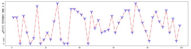
唉~实在是没有数据可以分析。要不先随机生成吧=_=
import random
x = range(1,100,2)
y = [random.randint(1,30) for i in x]
这样可能就需要改图片大小了,挤一堆可不帅~
plt.figure(figsize=(20,5),dpi=80)
figsize设置长宽,单位是英寸
dpi像素
对面的女孩看过来~
额太丑了。就不符合我这个英姿飒爽风流倜傥玉树临风的形象。改~
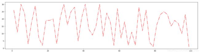
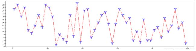
折线颜色和形状设置
#导包
import matplotlib.pyplot as plt
import random
#绘图
x = range(1,100,2)
y = [random.randint(1,30) for i in x]
plt.figure(figsize=(20,5),dpi=80)
plt.plot(x,y,color='red',alpha=0.5,linewidth=3,linestyle='-.')
'''
color = 'red' 颜色
alpha = 0.5 透明度(0-1)
linestyle='-.'线的样式  -实线  --短线  -.短点相见线  :虚线
linewidth = 3  线宽

'''
#显示
plt.show()
还差点事儿啊。改~
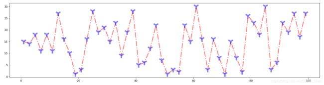
折点颜色和形状设置
#导包
import matplotlib.pyplot as plt
import random
#绘图
x = range(1,100,2)
y = [random.randint(1,30) for i in x]
plt.figure(figsize=(20,5),dpi=80)
plt.plot(x,y,color='red',alpha=0.5,linewidth=3,linestyle='-.',marker='*',markersize='20',markeredgecolor='b',markeredgewidth = 5)
'''
不注释了,哈哈哈干了程序员最讨厌的事
啥?你问我size什么意思?问就是20cm
'''
#显示
plt.show()
至于邵大白的审美~啊这就是个见仁见智的问题了[捂脸]不过折点标记的选择倒是有不少
character description
‘’ solid line style
‘__’ dashed line style
'.’ dash- dot line style
‘:’ dotted line style
‘.’ point marker
‘,’ pixel marker
‘o’ circle marker
‘v’ triangle_down marker
‘^’ triangle_up marker
‘<’ triangle_left marker
‘>’ triangle_right marker
‘1’ tri_down marker
‘2’ tri_up marker
‘3’ tri_left marker
‘4’ tri_right marker
‘s’ square marker
‘p’ pentagon marker
‘*’ star marker
‘h’ hexagon1 marker
‘H’ hexagon2 marker
‘+’ plus marker
‘x’ x marker
‘D’ diamond marker
‘d’ thin_diamond marker
‘1’ vline marker
‘_’ hline marker
不管你们觉得怎么样,邵大白觉得他很帅了。现在我要跟我的前端约个名字把他返给我的前端了。
保存
我就放当前文件夹下吧
#导包
import matplotlib.pyplot as plt
import random

#绘图
x = range(1,100,2)
y = [random.randint(1,30) for i in x]
plt.figure(figsize=(20,5),dpi=80)
plt.plot(x,y,color='red',alpha=0.5,linewidth=3,linestyle='-.',marker='*',markersize='20',markeredgecolor='b',markeredgewidth = 5)

#显示
plt.show()

#保存
plt.savefig('/邵大白的帅图')
然后我的前端打开我的帅图
诶!邵大白!你这是皇帝的图嘛??!
啊。。。我的锅。。。改。。。
#导包
import matplotlib.pyplot as plt

#绘图
x = range(1,10)
y = [1,1,1,7,1,2,2,3,2]
plt.figure(figsize=(20,5),dpi=80)
plt.plot(x,y,color='red',alpha=0.5,linewidth=3,linestyle='-.',marker='*',markersize='20',markeredgecolor='b',markeredgewidth = 5)

#保存
plt.savefig('/邵大白的帅图')

#显示
plt.show()

#保存要在绘图下面
#plt.show会释放figure资源,如果在显示后保存将只能看见空白文件
害。尴不尴尬。
欸,他坐标轴的刻度哪来的啊,我不给他设置他就根据我的点的坐标自动生成是吧。
不行!邵大白就是不喜欢被他控制!改!
修改坐标轴坐标
#修改Y轴刻度
plt.yticks(y)
e…这个y轴受不了啊…改!
plt.yticks(range(0,30,2))
或者这样
plt.yticks(range(min(y),max(y)+1,2))
en…我给X轴附点实际意义吧
一百天中邵大白隔一天去骚扰一个小哥哥一次,为什么是隔一天呢,因为每次去戳冷人家就会闹笑话导致我不好意思马上再去戳冷人家;那为什么是一百天呢,因为一百天之后我彻底不好意思去打扰人家了[捂脸]
#导包
import matplotlib.pyplot as plt
import random

#绘图
x = range(1,100,2)
y = [random.randint(1,30) for i in x]
plt.figure(figsize=(20,5),dpi=80)
plt.plot(x,y,color='red',alpha=0.5,linewidth=3,linestyle='-.',marker='1',markersize='20',markeredgecolor='b',markeredgewidth = 5)

#修改x,y轴刻度
xticks_label=['邵大白第{}天搞出的笑话'.format(i)for i in range(1,100,2)]
plt.xticks(x,xticks_label)
plt.yticks(range(min(y),max(y)+1,2))

#保存
plt.savefig('/邵大白的帅图')

#显示
plt.show()

e…坐标刻度写得太长都叠一起了鸭
没关系我让他倾斜下
#修改x,y轴刻度
xticks_label=['邵大白第{}天搞出的笑话'.format(i)for i in range(1,100,2)]
plt.xticks(x,xticks_label,rotation = 45)
plt.yticks(range(min(y),max(y)+1,2))

e…什么玩意!他居然不给我显示中文!我作为炎黄子孙我龙的传人我怎么能不用中文呐!
害,为了不用英语我得搞出他来
导字体包
import matplotlib
from matplotlib import font_manager
my_font=font_manager.FontProperties(fname='C:\Windows\Fonts\msyh.ttc',size=10)
#fname字体路径,本电脑

#修改x,y轴刻度
xticks_label=['第{}天'.format(i)for i in range(1,100,2)]
plt.xticks(x,xticks_label,rotation=45,fontproperties=my_font)
plt.yticks(range(min(y),max(y)+1,2),y)

中文能用了,但是我还是嫌他长啊
我改改标题好了
#修改x,y轴刻度
xticks_label=['第{}天'.format(i)for i in range(1,100,2)]
plt.xticks(x,xticks_label,rotation=45,fontproperties=my_font)
plt.yticks(range(min(y),max(y)+1,2))

#标题
plt.xlabel('时间',fontproperties=my_font)
plt.ylabel('次数',fontproperties=my_font)
plt.title('时间/次数',fontproperties=my_font,color='red',size=20)

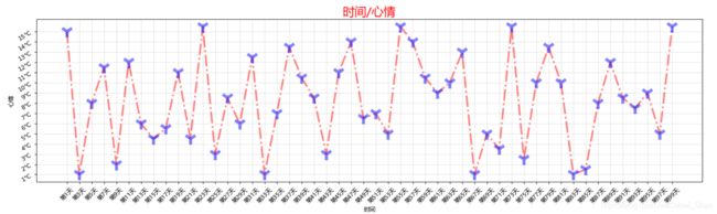
那么问题又来了,坐标这么远我不知道哪天具体对应着几次啊
没关系,我给他打个框吧
绘制网格
#绘制网格
plt.grid(alpha=0.4)

恩,这样就顺眼多了。
顺便想象下对面小哥哥的心情~
#导包
import matplotlib.pyplot as plt
import random
import matplotlib
from matplotlib import font_manager
my_font=font_manager.FontProperties(fname='C:\Windows\Fonts\msyh.ttc',size=10)
#fname字体路径,本电脑

#绘图
x = range(1,100,2)
y = [random.randint(1,30) for i in x]
plt.figure(figsize=(20,5),dpi=80)
plt.plot(x,y,color='red',alpha=0.5,linewidth=3,linestyle='-.',marker='1',markersize='20',markeredgecolor='b',markeredgewidth = 5)

#修改x,y轴刻度
xticks_label=['第{}天'.format(i)for i in range(1,100,2)]
plt.xticks(x,xticks_label,rotation=45,fontproperties=my_font)
yticks_label=['{}℃'.format(i) for i in range(min(y),max(y)+1)]
plt.yticks(range(min(y),max(y)+1,2),yticks_label,rotation=30)

#绘制网格
plt.grid(alpha=0.4)

#标题
plt.xlabel('时间',fontproperties=my_font)
plt.ylabel('心情',fontproperties=my_font)
plt.title('时间/心情',fontproperties=my_font,color='red',size=20)

#保存
plt.savefig('./邵大白的帅图')

#显示
plt.show()
PS:
以上情节纯属虚构~
邵大白既没有不好意思~
也没有小哥哥=_=
唉~想想这些年虚度的青春,不禁又一次羡慕我的同桌W哥
做个图比较一下吧=_=太难过了
多线并行
#导包
import matplotlib.pyplot as plt
import random
import matplotlib
from matplotlib import font_manager
my_font=font_manager.FontProperties(fname='C:\Windows\Fonts\msyh.ttc',size=10)
my_font1=font_manager.FontProperties(fname='C:\Windows\Fonts\msyh.ttc',size=20)
#fname字体路径,本电脑

y1 = [0,0,0,0,0,0,0,1,0,0]
y2 = [1,0,3,1,2,5,3,4,3,2]

x = range(11,21)
# 设置图形
plt.figure(figsize=(20,5),dpi=80)

plt.plot(x,y1,color = 'green',label='邵大白')
plt.plot(x,y2,color = 'red',label='W哥')
# 图例
plt.legend(prop=my_font1,loc='upper left')

# 网格
plt.grid(alpha=0.4,linestyle='-.')
# plt.show()

# 设置x轴刻度
xticks_label = ['{}岁'.format(i) for i in x]
plt.xticks(x,xticks_label,fontproperties=my_font,rotation=45)

#展示
plt.show()
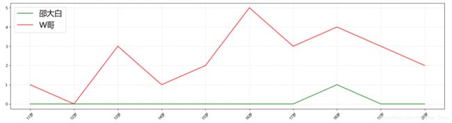
PS:咱其实也不清楚W哥女朋友的数量,咱也不敢问
PS:别问我关于颜色的问题,无可奉告=_=
# 图例
plt.legend(prop=my_font1,loc='upper left')
#注意啦,这里调字体的参数变啦,不是propreties啦
#loc默认是upper right
#设置位置loc : upper left、 lower left、 center left、 upper center
PS:
通常情况下,一张matplotlib图像可以分成三层结构:
1.底层的容器层,主要包括canvas,figure,axes;
2.辅助显示层,主要包括axis,spines,legend,tittle等;
3.图像层,即通过plot,scatter等方法绘制图像。
这就意味着我们可以
一图绘制多个子图
# add_subplot方法----给figure新增子图
#figure对象
fig=plt.figure(figsize=(20,10),dpi=80)
#子图1
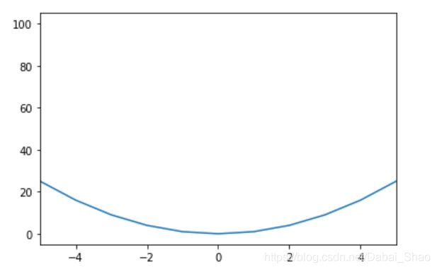
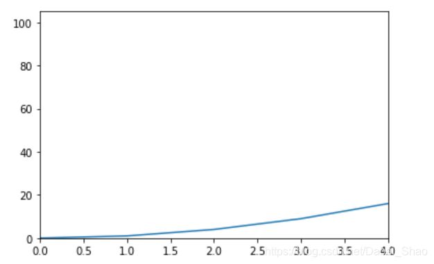
ax1=fig.add_subplot(2,2,1)
ax1.plot(x, x)
#子图2
ax2=fig.add_subplot(2,2,2)
ax2.plot(x, x ** 2)
#子图3
ax3=fig.add_subplot(2,2,3)
ax3.plot(x, x**0.5)
plt.show()


邵大白突然想起来,他还控制着我的坐标轴呐!不过也没想到怎么改,但是咱有招啊
设置坐标轴范围
也没得个例子放[捂脸]
上numpy吧(可不能说这是搬来了panda的想法)
import matplotlib.pyplot as plt
import numpy as np
x= np.arange(-10,11,1)
y = x**2
plt.plot(x,y)

en…
# 可以调x轴的左右两边
plt.xlim([-5,5])
# 只调一边
plt.xlim(xmin=-4)
plt.xlim(xmax=4)
plt.ylim(ymin=0)
plt.xlim(xmin=0)
plt.show()
那有的图我还不想坐标轴交于原点呢
没事,我们可以
改变坐标轴默认显示方式
import matplotlib.pyplot as plt
import numpy as np
y = range(0,14,2) # x轴的位置
x = [-3,-2,-1,0,1,2,3]
# plt.figure(figsize=(20,8),dpi=80)

# 获得当前图表的图像
ax = plt.gca()

# 设置图型的包围线
ax.spines['right'].set_color('none')
ax.spines['top'].set_color('none')
ax.spines['bottom'].set_color('blue')
ax.spines['left'].set_color('red')

# 设置底边的移动范围,移动到y轴的0位置,'data':移动轴的位置到交叉轴的指定坐标
ax.spines['bottom'].set_position(('data', 0))
ax.spines['left'].set_position(('data', 1))

plt.plot(x,y)
plt.show()

啊~不小心暴露了英语水平=_=
a终于完事儿啦~
第一次用博客好奇怪啊,看网上大佬们说typora写完贴上就行,我这边就傻傻的复制粘贴了,这个排版悲催啊!还把我的图都给我整没了(想想也是,图片都是本地链接[捂脸])太难过了=_=