python plot画柱状图_matplotlib使用:画柱状图
matplotlib画柱状图十分简单,首先需要导入matplotlib中的pyplot,这个就是能够画图的类啦
import matplotlib.pyplot as plt
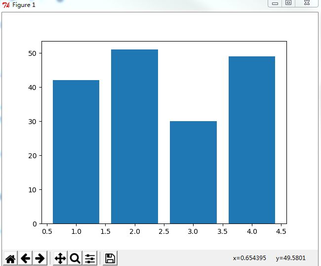
画柱状图十分简单,使用bar方法,比如画一个各个班级的人数吧,先准备一些数据,有两组数据,students为人数,这里放到y坐标系中,变量x就放在x坐标系中
students = [42,51,30,49]
x = [1,2,3,4]
好了,现在我们可以直接画出来,调用bar方法,最后再调用show就能画图啦,代码如下
plt.bar(x=x, height=students)
plt.show()
完整代码如下
#coding:utf-8
import matplotlib.pyplot as plt
students = [42,51,30,49]
x = [1,2,3,4]
plt.bar(x=x, height=students)
plt.show()
效果是这样的
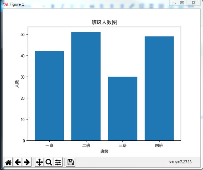
自定义X轴文字
然后我们可以对上面的图进行一些扩充,bar方法里面有很多的参数,比如x轴的数据我们要显示班级,那么我们可以这样
plt.xticks(x, [u"一班", u"二班", u"三班", u"四班"])
如果遇到中文显示方块的问题,原因是字体不支持中文,可以在代码中指定字体
plt.rcParams['font.sans-serif'] = ['simHei']
plt.rcParams['axes.unicode_minus'] = False

这样就能显示中文了
给X轴和Y轴命名以及加上标题
x轴和y轴分别代表什么呢,只看这个图可能会不太清楚,那么我们就给x轴和y轴命名吧,贴上一个label
plt.xlabel(u"班级")
plt.ylabel(u"人数")
plt.title(u"班级人数图")
完整代码如下
#coding:utf-8
import matplotlib.pyplot as plt
#解决中文乱码问题
plt.rcParams['font.sans-serif'] = ['simHei']
plt.rcParams['axes.unicode_minus'] = False
students = [42,51,30,49]
x = [1,2,3,4]
plt.xlabel(u"班级")
plt.ylabel(u"人数")
plt.xticks(x, [u"一班", u"二班", u"三班", u"四班"])
plt.bar(x=x, height=students)
plt.show()
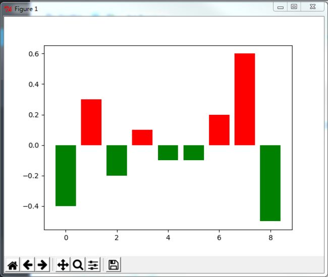
根据以上信息,能够画出绝大部分的柱状图了,下面有一些有意思并且实用的东西,比如说根据柱状图显示股票的资金进出,下面就用自定义颜色来说明吧。
自定义柱状图颜色
现在要准备全新的数据了,首先是Y轴,现在有正负之分了,在x轴上面的颜色上色为红色,x轴下方的上色为绿色
#coding:utf-8
import matplotlib.pyplot as plt
height = [-0.4, 0.3, -0.2, 0.1, -0.1, -0.1, 0.2, 0.6, -0.5]
x = range(0,len(height))
#颜色参数,设定在X轴上方为红色,X轴下方为绿色
colors = []
for i in height:
if i > 0:
colors.append("red")
else:
colors.append("green")
plt.bar(x = x, height=height, color = colors)
plt.show()
结果如下图所示
另外可以给X轴设定自定义文字之类的,上面已经有说明,这里就不演示了。另外附带一下bar的参数表
x : sequence of scalars
the x coordinates of the bars.
align controls if x is the bar center (default) or left edge.
height : scalar or sequence of scalars
the height(s) of the bars
width : scalar or array-like, optional
the width(s) of the bars default: 0.8
bottom : scalar or array-like, optional
the y coordinate(s) of the bars default: None
align : {‘center’, ‘edge’}, optional, default: ‘center’
If ‘center’, interpret the x argument as the coordinates of the centers of the bars. If ‘edge’, aligns bars by their left edges
To align the bars on the right edge pass a negative width and align='edge'
color : scalar or array-like, optional
the colors of the bar faces
edgecolor : scalar or array-like, optional
the colors of the bar edges
linewidth : scalar or array-like, optional
width of bar edge(s). If None, use default linewidth; If 0, don’t draw edges. default: None
tick_label : string or array-like, optional
the tick labels of the bars default: None
xerr : scalar or array-like, optional
if not None, will be used to generate errorbar(s) on the bar chart default: None
yerr : scalar or array-like, optional
if not None, will be used to generate errorbar(s) on the bar chart default: None
ecolor : scalar or array-like, optional
specifies the color of errorbar(s) default: None
capsize : scalar, optional
determines the length in points of the error bar caps default: None, which will take the value from theerrorbar.capsize rcParam.
error_kw : dict, optional
dictionary of kwargs to be passed to errorbar method. ecolor and capsize may be specified here rather than as independent kwargs.
log : boolean, optional
If true, sets the axis to be log scale. default: False
orientation : {‘vertical’, ‘horizontal’}, optional
This is for internal use, please do not directly use this, call barh instead.
The orientation of the bars.
赞赏
 微信赞赏
微信赞赏 支付宝赞赏
支付宝赞赏