ComplexHeatmap学习笔记和总结
ComplexHeatmap学习笔记和总结
声明:
本文档是在学习ComplexHeatmap和测试例子过程中,相关方法的小结,方便回顾查看,快速实现数据可视化,理解错误之处,欢迎批评指正
1. ComplexHeatmap总览
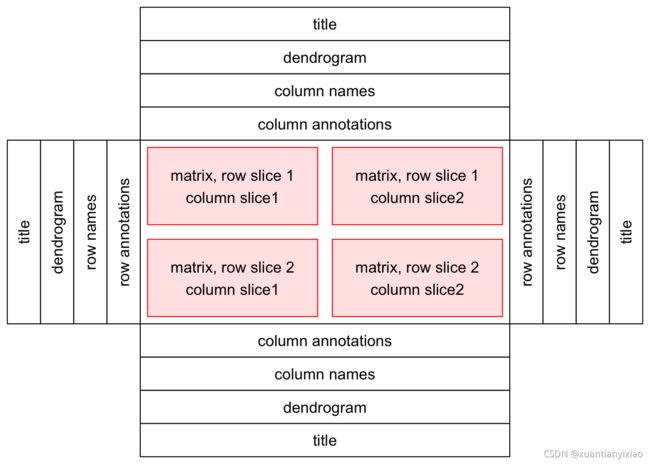
ComplexHeatmap软件包主要用来展现热图,常说的热图包括,body和components(title, dendrograms, matrix names 和热图注释(放在热图旁,该可根据注释组合不同的复杂图形)。
heatmap body部分可以根据行和列分割。
整体上讲,这个包类似于ggplot,layout操作,不同track和使用+组合,此外可以将注释图形直接加入主图中。
2. 单个热图
2.1 input 格式
单个热图和pheatmap功能较一致,且二者可以兼容使用
输入是一个数值矩阵,行和列名可以使用rownames和colnames分别命名
library(circlize)
col_fun = colorRamp2(c(-2, 0, 2), c(“green”, “white”, “red”)) # 矩阵的值会映射到-2和2之间,需要根据实际数据进行调整
colorRamp2() 如果使用同一个mapping color, 允许比较,可以清晰的看出不同处理的数据差异
对于连续型数据,可以提供颜色向量,eg: colorRamp2(seq(min(mat), max(mat), length = 10), rev(rainbow(10))), 会自动mapping,但是会受到离群值影响较大,discrete values(数字或字符)需要提供一个颜色向量
Heatmap(mat, name = "mat", col = col_fun)
Heatmap(mat, name = "mat", col = col_fun, column_title = "mat")
Heatmap(mat/4, name = "mat", col = col_fun, column_title = "mat/4")
Heatmap(abs(mat), name = "mat", col = col_fun, column_title = "abs(mat)")
**discrete values:**
discrete_mat = matrix(sample(letters[1:4], 100, replace = TRUE), 10, 10)
colors = structure(1:4, names = letters[1:4])
Heatmap(discrete_mat, name = "mat", col = colors,
    column_title = "a discrete character matrix")
pheatmap 介绍:
pheatmap(test, legend = FALSE),如下常用参数和作用
border_color: cells 格子的颜色,颜色值
border:逻辑值,是否显示边框
show_rownames和show_colnames: 逻辑值,是否显示名字
display_numbers:逻辑,是否显示数字
number_format:格式调整
cellwidth 和cellheight: cell的宽和高调整,调整cells的大小
**annotation_col:添加列注释
annotation_row: 添加行注释,注意row和col要和矩阵一致,需要加个对应的rownames和colnames
annotation_colors:各个注释水平的颜色对应列表, 列表每个元素 var=c(注释水平="")
gaps_row 和gaps_col:数值向量,提供需要gap的索引,cluster_rows 和cluster_cols需要设置False
fontsize:数值,字体大小
scale:对row进行归一化
**labels_row:**重点显示几个基因名字,类似Mark annotaion, #labels_row = c("", “”, “”, “”, “”, “”, “”, “”, “”, “”, “”, “”, “”, “”, “”,
“”, “”, “Il10”, “Il15”, “Il1b”)
angle_col = 45
fontsize_row和fontsize_col:row和col字体的大小
pheatmap
2.2 颜色选取和相关参数介绍
默认linearly interpolated in LAB color space,但是可以根据数据使用colorRamp2()调整。
f1 = colorRamp2(seq(min(mat), max(mat), length = 3), c("blue", "#EEEEEE", "red"))
f2 = colorRamp2(seq(min(mat), max(mat), length = 3), c("blue", "#EEEEEE", "red"), space = "RGB")
Heatmap(mat, name = "mat1", col = f1, column_title = "LAB color space")
Heatmap(mat, name = "mat2", col = f2, column_title = "RGB color space")
border/border_gp 和 rect_gp 分别控制heatmap body 和 cell区域
border可以是逻辑值T或颜色向量,border_gp是一个gpar对象,个人理解这个gpar(grid::gpar())类似于R 的par 和 html style 可以设置相关的属性
Heatmap(mat, name = "mat", border_gp = gpar(col = "black", lty = 2),
    column_title = "set heatmap borders")
Heatmap(mat, name = "mat", column_title = "I am a column title at the bottom", column_title_side = "bottom")
Heatmap(mat, name = "mat", column_title = "I am a column title",
    column_title_gp = gpar(fill = "red", col = "white", border = "blue"))
2.3 聚类track
Heatmap(mat, name = "mat", clustering_distance_rows = "pearson",
    column_title = "pre-defined distance method (1 - pearson)")   #pearson
Heatmap(mat, name = "mat", clustering_distance_rows = function(m) dist(m), column_title = "a function that calculates distance matrix")  #距离
Heatmap(mat, name = "mat", clustering_distance_rows = function(x, y) 1 - cor(x, y), column_title = "a function that calculates pairwise distance")  #pairwise distance
#pairwise distance 去除离群值,(0.1,0.9)之间过滤筛选
at_with_outliers = mat
for(i in  1:10) mat_with_outliers[i, i] = 1000
robust_dist = function(x, y) {
    qx = quantile(x, c(0.1, 0.9))
    qy = quantile(y, c(0.1, 0.9))
    l = x > qx[1] & x < qx[2] & y > qy[1] & y < qy[2]
    x = x[l]
    y = y[l]
    sqrt(sum((x - y)^2))
}
Heatmap(mat_with_outliers, name = "mat",
    col = colorRamp2(c(-2, 0, 2), c("green", "white", "red")),
    clustering_distance_rows = robust_dist,
    clustering_distance_columns = robust_dist,
    column_title = "robust_dist")
cell_fun: 控制cell显示,聚类方法通过clustering_method_rows 和 clustering_method_columns设置,与**hclust()**方法类似
library(cluster)
Heatmap(mat, name = "mat", cluster_rows = diana(mat),
   cluster_columns = agnes(t(mat)), column_title = "clustering objects")
如果想修改旁边的系统树的 style,可以先得到dendrogram对象,通过nodePar 和 edgePar来设置边和顶点,这个用的不多,
ibrary(dendextend)
row_dend = as.dendrogram(hclust(dist(mat)))
row_dend = color_branches(row_dend, k = 2) # `color_branches()` returns a dendrogram object
Heatmap(mat, name = "mat", cluster_rows = row_dend)
同样的,row_dend_gp 和 column_dend_gp控制系统树的设置
Heatmap(mat, name = "mat", cluster_rows = row_dend, row_dend_gp = gpar(col = "red"))
控制行和列的显示顺序,使用row_order和column_order,使用factors也可以,自然,行和列聚类关闭才生效。
Heatmap(mat, name = "mat", row_order = order(as.numeric(gsub("row", "", rownames(mat)))), column_order = order(as.numeric(gsub("column", "", colnames(mat)))), column_title = "reorder matrix")
列和行名显示位置参数
row_names_side # rowname 显示
row_dend_side #行进化树
column_names_side # 列名
column_dend_side # 列进化树
Heatmap(mat, name = "mat", row_names_side = "left", row_dend_side = "right", column_names_side = "top", column_dend_side = "bottom")
2.4 热图分割 split
控制分割的参数: row_km, row_split, column_km, column_split
row_km and column_km按照均值分割,另外可以设置row_km_repeats和column_km_repeats分别跑多次,最后取个一致性的分割值,比默认的要小。
Heatmap(mat, name = "mat",  row_km = 2, row_km_repeats = 100,
 column_km = 3, column_km_repeats = 100)
可根据字符向量分割,比较常用,row_split or column_split字符向量或数据框,需要和矩阵的维度一致。
Heatmap(mat, name = "mat",
    row_split = rep(c("A", "B"), 9), column_split = rep(c("C", "D"), 12))
    #字符型矩阵
    # split by the first column in `discrete_mat`
Heatmap(discrete_mat, name = "mat", col = 1:4, row_split = discrete_mat[, 1])
slices(subgroups)顺序问题,默认是排序的,可以设置cluster_row_slices or cluster_column_slices为False, 这样顺序就按照column_split分割的顺序了
Heatmap(mat, name = "mat",
  row_split = rep(LETTERS[1:3], 6),
    column_split = rep(letters[1:6], 4))
Heatmap(mat, name = "mat", row_split = factor(rep(LETTERS[1:3], 6), levels = LETTERS[3:1]),column_split=factor(rep(letters[1:6], 4), levels = letters[6:1]), cluster_row_slices = FALSE, cluster_column_slices = FALSE)
slices的其他属性,graphic parameters需要和slices的个数一致
ht_opt$TITLE_PADDING = unit(c(4, 4), "points")
Heatmap(mat, name = "mat",
    row_km = 2, row_title_gp = gpar(col = c("red", "blue"), font = 1:2),
    row_names_gp = gpar(col = c("green", "orange"), fontsize = c(10, 14)),
    column_km = 3, column_title_gp = gpar(fill = c("red", "blue", "green"), font = 1:3),
    column_names_gp = gpar(col = c("green", "orange", "purple"), fontsize = c(10, 14, 8)))
slices之间的距离:row_gap = unit(5, “mm”)
row_gap = unit(5, “mm”)
边框: border = TRUE
另外分割时,注释图形一起分割,cell_fun分别画一个cells,layer_fun垂直版本,
small_mat = mat[1:9, 1:9]
col_fun = colorRamp2(c(-2, 0, 2), c("green", "white", "red"))
Heatmap(small_mat, name = "mat", col = col_fun,
    cell_fun = function(j, i, x, y, width, height, fill) {
        grid.text(sprintf("%.1f", small_mat[i, j]), x, y, gp = gpar(fontsize = 10))
})
3. 热图注释
热图注释赋予图形丰富的内容,可以展示轴相关的row和columns额外的信息,op_annotation, bottom_annotation, left_annotation 和 right_annotation控制位置参数。参数的值需要是HeatmapAnnotation 类,有HeatmapAnnotation和rowAnnotation() [注释row] 构建产生,官方文档说明,rowAnnotation只是HeatmapAnnotation(…, which = “row”)的特殊情况。
set.seed(123)
mat = matrix(rnorm(100), 10)
rownames(mat) = paste0("R", 1:10)
colnames(mat) = paste0("C", 1:10)
column_ha = HeatmapAnnotation(foo1 = runif(10), bar1 = anno_barplot(runif(10)))
row_ha = rowAnnotation(foo2 = runif(10), bar2 = anno_barplot(runif(10)))
Heatmap(mat, name = "mat", top_annotation = column_ha, right_annotation = row_ha)
注意注释列,行维度需要和热图中数据分别一致,注释图形函数以anno_*形式,可以注释block,图片,points, lines,Barplot, Boxplot, histogram, Density, Text, Mark,分别格式如下:
# blocks
Heatmap(matrix(rnorm(100), 10), name = "mat",
    top_annotation = HeatmapAnnotation(foo = anno_block(gp = gpar(fill = 2:4))),
    column_km = 3)
#images
image_png = sample(dir("IcoMoon-Free-master/PNG/64px", full.names = TRUE), 10)
ha = HeatmapAnnotation(foo = anno_image(image_png))
ha = HeatmapAnnotation(foo = anno_image(image_png, space = unit(3, "mm")))

#points
ha = HeatmapAnnotation(foo = anno_points(matrix(runif(20), nc = 2),
    pch = 1:2, gp = gpar(col = 2:3)))   #  foo 只是个名字,可以修改
  # lines
  ha = HeatmapAnnotation(foo = anno_lines(cbind(c(1:5, 1:5), c(5:1, 5:1)),
    gp = gpar(col = 2:3), add_points = TRUE, pt_gp = gpar(col = 5:6), pch = c(1, 16)))   # 数据可以是一个向量或者矩阵
 # barplot
 ha = HeatmapAnnotation(foo = anno_barplot(1:10, gp = gpar(fill = 1:10)))  #  向量是普通的bar图
 ha = HeatmapAnnotation(foo = anno_barplot(cbind(1:10, 10:1),                     #矩阵堆叠在一起,stack
    gp = gpar(fill = 2:3, col = 2:3)))
    # boxplot
    ha = HeatmapAnnotation(foo = anno_boxplot(m, height = unit(4, "cm"),
    gp = gpar(fill = 1:10)))
#Histogram,对于row注释比较合适,输入数据类似 anno_boxplot()  [***a matrix or a list***]
‘m = matrix(rnorm(1000), nc = 100)
ha = rowAnnotation(foo = anno_histogram(m))
#Density, 类似Histogram,拟合曲线分布,type参数比较重要,可以取heatmap, violin,数据形式需要数值矩阵

m2 = matrix(rnorm(50*10), nrow = 50)
m = matrix(rnorm(1000), nc = 100)

ha = rowAnnotation(foo = anno_density(m, joyplot_scale = 2,
    gp = gpar(fill = "#CCCCCC80")))
  ha = rowAnnotation(foo = anno_density(m2, type = "heatmap", width = unit(6, "cm")))
# Mark 注释,行和列有多个时,需要mark一部分,使用anno_mark(),至少需要两个参数,at  原始矩阵的索引,labels相应的text
m = matrix(rnorm(1000), nrow = 100)
rownames(m) = 1:100
ha = rowAnnotation(foo = anno_mark(at = c(1:4, 20, 60, 97:100), labels = month.name[1:10]))
Heatmap(m, name = "mat", cluster_rows = FALSE, right_annotation = ha,
    row_names_side = "left", row_names_gp = gpar(fontsize = 4))
Heatmap(m, name = "mat", cluster_rows = FALSE, right_annotation = ha,
    row_names_side = "left", row_names_gp = gpar(fontsize = 4), row_km = 4)
多个注释的,只需要name-value写到HeatmapAnnotation即可
ha = HeatmapAnnotation(foo = 1:10,
    bar = cbind(1:10, 10:1),
    pt = anno_points(1:10),
    show_legend = c("bar" = FALSE)
)
Heatmap(matrix(rnorm(100), 10), name = "mat", top_annotation = ha)
小结:
注释同通过anno_*获取对象,通过 [right|left|bottom|top]_annotation显示注释的位置,所有注释对象可以使用+连接
hitlist<-anno1+anno1 draw(hitlist),和多个下面介绍的多个热图组合一样
4. 热图列表操作
热图列表操作类似于,上面的注释,多个热图可以组合成一个list,使用draw进行显示,可以水平黏贴和垂直黏贴,水平黏贴比较常用,便于比较,所有热图和对应注释的的row数量 需要相同,即行数需要相同,
ht1 = Heatmap(mat1, name = "rnorm")
ht2 = Heatmap(mat2, name = "runif")
ht3 = Heatmap(le, name = "letters")
draw(ht_list, row_title = "Three heatmaps, row title", row_title_gp = gpar(col = "red"),
    column_title = "Three heatmaps, column title", column_title_gp = gpar(fontsize = 16))
ht_list =ht1 + ht2 + ht3 #返回heatmap list,会面可以任意追加 (+)热图
组合图常用调整参数:
- size: width = unit(5, “mm”)
- 热图间Gap: draw(ht_list, ht_gap = unit(1, “cm”))
3)Row annotations,水平heatmaplist 可以连接注释
ha1 = rowAnnotation(foo = 1:12, bar = anno_barplot(1:12, width = unit(4, "cm")))
ht1 = Heatmap(mat1, name = "rnorm", col = col_rnorm, row_km = 2)
ht1 + ha1

Heatmap(mat1, name = "rnorm", col = col_rnorm, row_km = 2) +
    rowAnnotation(foo = 1:12) +
    rowAnnotation(bar = anno_barplot(1:12, width = unit(4, "cm")))
4)adding a text annotation row names
ht1 + ha1 + rowAnnotation(rn = anno_text(rownames(mat1),
    location = unit(0, "npc"), just = "left"))
5)adjust_annotation_extension,是否考虑轴和names之间的自动调整,heatmap name 和heatbody之间的空白区域
其他参数参考官方文档:
https://jokergoo.github.io/ComplexHeatmap-reference/book/upset-plot.html