分类结果可视化python
I love good data visualizations. Back in the days when I did my PhD in particle physics, I was stunned by the histograms my colleagues built and how much information was accumulated in one single plot.
我喜欢出色的数据可视化。 早在我获得粒子物理学博士学位时,我就被同事建立的直方图以及在一张图中积累了多少信息而感到震惊。
绘图中的信息 (Information in Plots)
It is really challenging to improve existing visualization methods or to transport methods from other research fields. You have to think about the dimensions in your plot and the ways to add more of them. A good example is the path from a boxplot to a violinplot to a swarmplot. It is a continuous process of adding dimensions and thus information.
改善现有的可视化方法或从其他研究领域转移方法确实是一项挑战。 您必须考虑绘图中的尺寸以及添加更多尺寸的方法。 一个很好的例子是从箱形图到小提琴图再到黑线的路径。 这是添加维度和信息的连续过程。
The possibilities of adding information or dimensions to a plot are almost endless. Categories can be added with different marker shapes, color maps like in a heat map can serve as another dimension and the size of a marker can give insight to further parameters.
向地块添加信息或尺寸的可能性几乎是无限的。 可以添加具有不同标记形状的类别,像热图一样的颜色图可以用作另一个维度,标记的大小可以洞察其他参数。
分类器效果图 (Plots of Classifier Performance)
When it comes to machine learning, there are many ways to plot the performance of a classifier. There is an overwhelming amount of metrics to compare different estimators like accuracy, precision, recall or the helpful MMC.
在机器学习方面,有许多方法可以绘制分类器的性能。 有大量指标可以比较不同的估算器,例如准确性,准确性,召回率或有用的MMC。
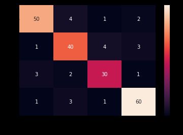
All of the common classification metrics are calculated from true positive, true negative, false positive and false negative incidents. The most popular plots are definitely ROC curve, PRC, CAP curve and the confusion matrix.
所有常见分类指标都是根据真实肯定,真实否定 , 错误肯定和错误否定事件计算的。 最受欢迎的图肯定是ROC曲线,PRC,CAP曲线和混淆矩阵。
I won’t get into detail of the three curves, but there are many different ways to handle the confusion matrix, like adding a heat map.
我不会详细介绍这三个曲线,但是有许多不同的方法来处理混淆矩阵,例如添加热图。
分类拼接图 (A Classification Mosaic Diagram)
For many cases, this is probably sufficient and easy to pick up all relevant information, but for a multi class problem, it can get much harder to do so.
在许多情况下,这可能足够容易地提取所有相关信息,但是对于多类问题,这样做会变得更加困难。
While reading some papers, I stumbled across:
在阅读一些论文时,我偶然发现:
Jakob Raymaekers, Peter J. Rousseeuw, Mia Hubert. Visualizing classification results. arXiv:2007.14495 [stat.ML]
Jakob Raymaekers,Peter J.Rousseeuw和Mia Hubert。 可视化分类结果。 arXiv:2007.14495 [stat.ML]
and from there to
然后从那里
Friendly, Michael. “Mosaic Displays for Multi-Way Contingency Tables.” Journal of the American Statistical Association, vol. 89, no. 425, 1994, pp. 190–200. JSTOR, www.jstor.org/stable/2291215. Accessed 13 Aug. 2020.
友好,迈克尔。 “多向列联表的马赛克显示。” 美国统计协会杂志 ,第一卷。 89号 425,1994,第190-200页。 JSTOR , www.jstor.org / stable / 2291215。 于2020年8月13日访问。
The authors propose a mosaic diagram to plot discrete values. We can transport this idea to the field of machine learning with the predicted classes as the discrete values.
作者提出了一个马赛克图来绘制离散值。 我们可以将这种思想以预测的类作为离散值传输到机器学习领域。
In a multi class environment, such a plot would look like the following:
在多类环境中,这种绘图如下所示:
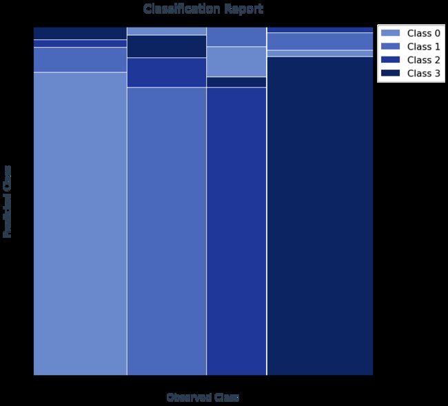
It has several advantages over a classical confusion matrix. One can easily see the predicted classes on the y-axis and the number proportion of each class on the x-axis. The big difference from a simple bar plot is the width of the bars, which are giving an idea of the class imbalance.
与经典的混淆矩阵相比,它具有多个优点。 可以轻松地在y轴上看到预测的类别,并在x轴上看到每个类别的数量比例。 与简单条形图的最大区别在于条形的宽度,这使人们对类的不平衡有所了解。
You can find the code for such a plot fed with a confusion matrix here:
您可以在此处找到此类代码的代码,其中包含混淆矩阵:
Have fun plotting your next classification results!
祝您规划下一个分类结果愉快!
翻译自: https://towardsdatascience.com/a-different-way-to-visualize-classification-results-c4d45a0a37bb
分类结果可视化python