ARIMA模型学习笔记
ARIMA模型学习笔记
目录
- ARIMA模型学习笔记
-
- ARIMA模型
- 时间序列平稳性
-
- 什么是平稳性
-
- 严平稳
- 弱平稳
- 平稳性检验
-
- ADF检验(Augmented Dickey-Fuller test)
-
- 单位根
- ADF检验的原理
- ADF检验的python实现
- 数据平稳化
-
- 对数变换
- 平滑法
-
- 移动平均法
- 指数平均法
- 差分法
- ARIMA模型介绍
-
- AR(Autoregressive)模型
- MA(moving average)模型
- ARMA(Autoregressive moving average)模型
- ARIMA(Autoregressive Integrated Moving Average model)模型
- 相关函数评估方法
-
- 自相关函数ACF
- 偏自相关函数PACF
- 如何选择模型
-
- ACF和PACF定阶
-
- 拖尾和截尾
- 信息准则函数法定阶
-
- **AIC准则**
- **BIC准则**
- 热力图定阶
- 模型的检验
-
-
- 残差
- QQ图
- D-W检验
- 白噪声检验
-
- 模型的预测
- 建立ARIMA模型
-
- ARIMA建模流程
- 导入数据集
- 对数据进行预处理
- 检查数据平稳性
- 数据的平稳化
-
- 平滑法处理数据
- 差分法处理数据
- 选择模型和定阶
- 建立模型和预测
-
- ARMA模型
-
- 建立模型
- 模型好坏检验
- ARIMA模型构建
-
- 建立模型
- 预测结果
ARIMA模型
Autoregressive Integrated Moving Average model
差分整合移动平均自回归模型
又称整合移动平均自回归模型(移动也可称作滑动)
时间序列平稳性
什么是平稳性
平稳性就是要求经由样本时间序列所得到的拟合曲线在未来一段时间内仍能顺着现有的形态惯性地延续下去。
平稳性要求序列的均值和方差不发生明显变化。
严平稳
严平稳表示的分布不随时间的改变而改变
弱平稳
期望与相关系数(依赖性)不变。
未来某时刻的t的值Xt就要依赖于它的过去信息,所以需要依赖性。
这种依赖性不能有明显的变化。
平稳性检验
ADF检验(Augmented Dickey-Fuller test)
也叫单位根检验
单位根
在一个自回归过程中: y t = b y t − 1 + a + ϵ t y_t=by_{t-1}+a+\epsilon_t yt=byt−1+a+ϵt,如果滞后项系数b为1,就称为单位根
当单位根存在时,自变量和因变量之间的关系具有欺骗性,因为残差序列的任何误差都不会随着样本量(即时期数)增大而衰减,也就是说模型中的残差的影响是永久的。
这种回归又称作伪回归。如果单位根存在,这个过程就是一个随机漫步(random walk)。
ADF检验的原理
判断序列是否存在单位根:
如果序列平稳,就不存在单位根;否则,就会存在单位根。
ADF检验的 H0 假设就是存在单位根,如果得到的显著性检验统计量小于三个置信度(10%,5%,1%),则对应有(90%,95,99%)的把握来拒绝原假设。
ADF检验的python实现
导入adfuller函数
from statsmodels.tsa.stattools import adfuller
adfuller(x, maxlag=None, regression=“c”, autolag=‘AIC’,store=False, regresults=False)
adfuller函数的参数意义分别是:
- x:一维的数据序列。
- maxlag:最大滞后数目。
- regression:回归中的包含项(c:只有常数项,默认;ct:常数项和趋势项;ctt:常数项,线性二次项;nc:没有常数项和趋势项)
- autolag:自动选择滞后数目(AIC:赤池信息准则,默认;BIC:贝叶斯信息准则;t-stat:基于maxlag,从maxlag开始并删除一个滞后直到最后一个滞后长度基于 t-statistic 显著性小于5%为止;None:使用maxlag指定的滞后)
- store:True False,默认。
- regresults:True 完整的回归结果将返回。False,默认。
返回值意义为:
- adf:Test statistic,T检验,假设检验值。
- pvalue:假设检验结果。
- usedlag:使用的滞后阶数。
- nobs:用于ADF回归和计算临界值用到的观测值数目。
- icbest:如果autolag不是None的话,返回最大的信息准则值。
- resstore:将结果合并为一个dummy。(啥是dummy??)
import numpy as np
from statsmodels.tsa.stattools import adfuller #ADF检验


x=np.array(train)
adftest=adfuller(x,autolag='AIC')
print(adftest)
(-0.6884153463469793, 0.8497274481606903, 3, 102, {'1%': -3.4961490537199116, '5%': -2.8903209639580556, '10%': -2.5821223452518263}, -444.50694059828345)
要确定序列平稳,需要两个条件
-
t-statistic值是否小于三个level?
t检验值为-0.68,大于1%(-3.49),大于5%(-2.89),大于10%(-2.58),则拒绝原假设(即不存在单位根的可能性)小于90%
-
P-value是否非常接近0?
数据平稳化
数据不稳定的原因主要有以下两点:
- 趋势(trend)-数据随着时间变化。比如说升高或者降低。
- 季节性(seasonality)-数据在特定的时间段内变动。比如说节假日,或者活动导致数据的异常。
对数变换
平滑法
一般情况下,这种方法更适合带有周期性稳步上升的数据类型。
移动平均法
利用一定时间间隔内的平均值作为某一期的估计值
指数平均法
用变权的方法来计算均值
差分法
import pandas as pd
import matplotlib.pyplot as plt

#parse_date参数可以将csv中的时间字符串转换成日期格式
CB=pd.read_csv('ChinaBank.csv',parse_dates=['Date']).set_index(['Date'])
CB.head()
| Unnamed: 0 | Open | High | Low | Close | Volume | |
|---|---|---|---|---|---|---|
| Date | ||||||
| 2014-01-02 | 1 | 2.62 | 2.62 | 2.59 | 2.61 | 41632500 |
| 2014-01-03 | 2 | 2.60 | 2.61 | 2.56 | 2.56 | 45517700 |
| 2014-01-06 | 3 | 2.57 | 2.57 | 2.50 | 2.53 | 68674700 |
| 2014-01-07 | 4 | 2.51 | 2.52 | 2.49 | 2.52 | 53293800 |
| 2014-01-08 | 5 | 2.51 | 2.54 | 2.49 | 2.51 | 69087900 |
#对close这一列一阶差分
CB['Close_diff1']=CB['Close'].diff(1)
#二阶差分
CB['Close_diff2']=CB['Close_diff1'].diff(1)

cbdata=CB['2014-01':'2014-06']
plt.figure(figsize=(15, 5))
#plt.figure(figsize=(20,20))
cbdata['Close'].plot()

plt.figure(figsize=(15, 5))
cbdata['Close_diff1'].plot(style='r')

plt.figure(figsize=(15, 5))
cbdata['Close_diff2'].plot(style='b')

可以看出二阶差分之后的数据变得平稳了
再对一阶差分后的数据进行ADF检验
diff1=train.diff(1).dropna()

x1=np.array(diff1)
adftest1=adfuller(x1,autolag='AIC')
print(adftest1)
(-7.135100351267679, 3.4373575189577454e-10, 2, 102, {'1%': -3.4961490537199116, '5%': -2.8903209639580556, '10%': -2.5821223452518263}, -442.1879434989652)
可以看到t检验的值为-7.13,小于1%( -3.49)等三个level,因此有把握拒绝原假设,数据平稳
ARIMA模型介绍
AR(Autoregressive)模型
自回归模型描述当前值和历史值之间的关系,变量自身的历史时间数据对自身进行预测。
自回归模型必须满足平稳性的要求。
自回归模型首先需要确定一个阶数p,表示用几期的历史值来预测当前值。p阶自回归模型的公式定义为:
y t = μ + Σ i = 1 p γ i y t − 1 + ϵ t y_{t} = \mu + \Sigma_{i=1}^{p}\gamma_{i}y_{t-1}+\epsilon_{t} yt=μ+Σi=1pγiyt−1+ϵt
上式中是当前值, $\mu $是常数项, p是阶数 , γ i \gamma_i γi是自相关系数, ϵ t \epsilon_{t} ϵt是误差。
自回归模型有很多的限制:
- 自回归模型是用自身的数据进行预测
- 时间序列数据必须具有平稳性
- 时间序列数据必须具有自相关性,若自相关系数 γ i \gamma_i γi小于0.5,则不宜采用
- 自回归只适用于预测与自身前期相关的现象
MA(moving average)模型
移动平均模型关注的是自回归模型中的误差项的累加
q阶自回归过程的公式定义:
y t = μ + ϵ t + Σ i = 1 q θ i ϵ t − i y_{t} = \mu + \epsilon_t +\Sigma_{i=1}^{q}\theta_i\epsilon_{t-i} yt=μ+ϵt+Σi=1qθiϵt−i
移动平均法能有效地消除预测中的随机波动
ARMA(Autoregressive moving average)模型
自回归模型AR和移动平均模型MA模型相结合
公式:
y t = μ + Σ i = 1 p γ i y t − 1 + ϵ t + Σ i = 1 q θ i ϵ t − i y_t = \mu +\Sigma_{i=1}^{p}\gamma_{i}y_{t-1}+\epsilon_t+\Sigma_{i=1}^{q}\theta_i\epsilon_{t-i} yt=μ+Σi=1pγiyt−1+ϵt+Σi=1qθiϵt−i
ARIMA(Autoregressive Integrated Moving Average model)模型
差分自回归移动平均模型
将自回归模型、移动平均模型和差分法结合
ARIMA(p,d,q):
- p为自回归项
- q为移动的平均项数
- d为时间序列成为平稳时所做的差分次数(一般就1)
原理:将非平稳时间序列转化为平稳时间序列然后将因变量仅对它的滞后值以及随机误差项的现值和滞后值进行回归所建立的模型
相关函数评估方法
自相关函数ACF
(autocorrelation function)
描述的是时间序列观测值与其过去的观测值之间的线性相关性
A C F ( k ) = ρ k = C o v ( y t , y t − k ) V a r ( y t ) ACF(k)=\rho_k=\frac{Cov(y_t,y_{t-k})}{Var(y_t)} ACF(k)=ρk=Var(yt)Cov(yt,yt−k)
其中k代表滞后期数,如果k=2,则代表yt和yt-2
偏自相关函数PACF
(partial autocorrelation function)
偏自相关函数PACF描述的是在给定中间观测值的条件下,时间序列观测值预期过去的观测值之间的线性相关性。
举个简单的例子,假设k=3,那么我们描述的是yt和yt-3之间的相关性,但是这个相关性还受到yt-1和yt-2的影响。PACF剔除了这个影响,而ACF包含这个影响。
from scipy import  stats
import statsmodels.api as sm


plt.figure(figsize=(20,8))

#画ACF图形
sm.graphics.tsa.plot_acf(cbdata['Close'], lags=20)
#画PACF图形
sm.graphics.tsa.plot_pacf(cbdata['Close'], lags=20)

plt.show()


如何选择模型
ACF和PACF定阶
拖尾和截尾
拖尾指序列以指数率单调递减或者震荡衰减
截尾指序列从某个时点变得非常小(落在置信区间内)
| 模型 | ACF自相关函数 | PACF偏自相关函数 |
|---|---|---|
| AR§ | 衰减趋于零(几何型或震荡型)拖尾 | p阶后截尾 |
| MA(q) | q阶后截尾 | 衰减趋于零(几何型或震荡型)拖尾 |
| ARMA(p,q) | q阶后衰减趋于零(几何型或震荡型)拖尾 | p阶后衰减趋于零(几何型或震荡型)拖尾 |
根据不同的拖尾和截尾情况选择适合的模型
简单来说,ACF决定p,PACF决定q
- p值的选择:对于AR自回归模型,主要观察PACF在多少阶之后截尾(落到置信区间内),得到p值
- q值的选择:对于MA移动平均模型,主要观察ACF在多少阶后截尾,得到q值
信息准则函数法定阶
AIC准则
AIC准则全称为全称是最小化信息量准则(Akaike Information Criterion),也称为赤池信息量准则
计算公式为: A I C = 2 k − 2 l n ( L ) AIC=2k-2ln(L) AIC=2k−2ln(L)
其中,k是参数的数量,L是似然函数
模型复杂度提高(k增大)时,似然函数L也增大,使得AIC变小
但是k过大时,似然函数增速减缓,导致AIC增大,模型过于复杂容易导致过拟合
因此引入惩罚项2k,使得模型参数尽可能少,有助于降低过拟合可能性
从一组可供选择的模型中选择最佳模型时,通常选择AIC最小的模型
BIC准则
BIC(Bayesian InformationCriterion)贝叶斯信息准则
计算公式: B I C = k l n ( n ) − 2 l n ( L ) BIC=kln(n)-2ln(L) BIC=kln(n)−2ln(L)
训练模型时,增加参数的数量,也就是增加模型复杂度,会增大似然函数,但也会导致过拟合现象
AIC准则存在一定的不足之处。当样本容量很大时,在AIC准则中拟合误差提供的信息就要受到样本容量的放大,而参数个数的惩罚因子却和样本容量没关系(一直是2)
BIC的惩罚项比AIC更大,考虑了样本数量,在样本过多时可有效防止模型精度过高导致的模型复杂度过高
#计算AIC值最小的模型
sm.tsa.arma_order_select_ic(ts, ic='aic', max_ar=4, max_ma=8)['aic_min_order']
#max_ar: 限制AR的最大阶数,控制计算量
#max_ma:限制MA的最大阶数

#计算BIC值最小的模型
sm.tsa.arma_order_select_ic(ts, ic='bic', max_ar=4, max_ma=8)['bic_min_order']
热力图定阶
和信息准则函数法差不多
#设置遍历循环的初始条件,以热力图的形式展示,跟AIC定阶作用一样
ts=train
p_min = 0
q_min = 0
p_max = 5
q_max = 5
d_min = 0
d_max = 5
# 创建Dataframe,以BIC准则
results_aic = pd.DataFrame(index=['AR{}'.format(i) for i in range(p_min,p_max+1)],columns=['MA{}'.format(i) for i in range(q_min,q_max+1)])
#itertools.product 返回p,q中的元素的笛卡尔积的元组
for p,d,q in itertools.product(range(p_min,p_max+1),range(d_min,d_max+1),range(q_min,q_max+1)):
    if p==0 and q==0:
        results_aic.loc['AR{}'.format(p), 'MA{}'.format(q)] = np.nan
        continue
    try:
        model = sm.tsa.ARIMA(ts, order=(p, d, q))
        results = model.fit()
        #返回不同pq下的model的BIC值
        results_aic.loc['AR{}'.format(p), 'MA{}'.format(q)] = results.aic
    except:
        continue
results_aic = results_aic[results_aic.columns].astype(float)
#print(results_bic)

fig,ax = plt.subplots(figsize=(10, 8))
ax = sns.heatmap(results_aic,
                 #mask=results_aic.isnull(),
                 ax=ax,
                 annot=True, #将数字显示在热力图上
                 fmt='.2f',
                 )
ax.set_title('AIC')
plt.show()
[外链图片转存失败,源站可能有防盗链机制,建议将图片保存下来直接上传(img-bcD6bs8h-1604328744682)(pic6.png)]
越黑的地方越好
模型的检验
残差
残差在数理统计中指实际观察值与估计值(拟合值)之间的差
ARIMA模型的残差应该为平均值0,方差为常数的正态分布
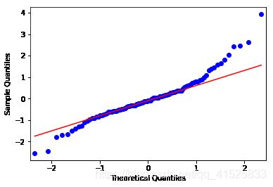
QQ图
分位数图示法Quantile Quantile Plot,简称 Q-Q 图
主要用于检验数据分布的相似性
通过把测试样本数据的分位数与已知分布相比较,从而来检验数据的分布情况
D-W检验
用来检验变量的自相关性
一般来说得到的DW值越接近2越好,说明自变量的自相关性越不明显
from statsmodels.stats.stattools import durbin_watson #DW检验
from statsmodels.graphics.api import qqplot #qq图

#残差
resid = result.resid

#利用QQ图检验残差是否满足正态分布
plt.figure(figsize=(12,8))
qqplot(resid,line='q',fit=True)

#利用D-W检验,检验残差的自相关性
print('D-W检验值为{}'.format(durbin_watson(resid.values)))
D-W检验值为2.015512264596415
- QQ图接近红色直线,证明残差数据基本满足了正态分布
- 当D-W检验值接近于2时,不存在自相关性,说明模型较好。
白噪声检验
from statsmodels.stats.diagnostic import acorr_ljungbox
acorr_ljungbox(x, lags=None, boxpierce=False)函数
lags: 延迟期数
boxpierce为True时表示除开返回LB统计量还会返回Box和Pierce的Q统计量
返回值:
lbvalue: 测试的统计量
pvalue: 基于卡方分布的p统计量
bpvalue:((optionsal), float or array) – test statistic for Box-Pierce test
bppvalue:((optional), float or array) – p-value based for Box-Pierce test on chi-square distribution
pvalue<0.05时,可认为序列非白噪声序列
模型的预测
predict函数:可以预测给定的日期或之后的数据
forcast函数:只能预测给定的日期之后的数据
建立ARIMA模型
ARIMA建模流程
- 将序列平稳(差分法确定d)
- p和q阶数确定:ACF和PACF
- ARIMA(p,d,q)
导入数据集
import seaborn as sns #热力图
import itertools
import numpy as np
import pandas as pd
import matplotlib.pyplot as plt #画图用
from statsmodels.tsa.stattools import adfuller #ADF检验
import statsmodels.api as sm #acf和pacf
from statsmodels.stats.stattools import durbin_watson #DW检验
from statsmodels.graphics.api import qqplot #qq图
from statsmodels.stats.diagnostic import acorr_ljungbox #白噪声检验
from statsmodels.tsa.arima_model import ARIMA #模型
中国银行股票数据
#parse_date参数可以将csv中的时间字符串转换成日期格式
CB=pd.read_csv('中国银行股市数据//ChinaBank.csv',parse_dates=['Date']).set_index(['Date'])
CB.head()
| Date | Unnamed: 0 | Open | High | Low | Close | Volume |
|---|---|---|---|---|---|---|
| 2014-01-02 | 1 | 2.62 | 2.62 | 2.59 | 2.61 | 41632500 |
| 2014-01-03 | 2 | 2.60 | 2.61 | 2.56 | 2.56 | 45517700 |
| 2014-01-06 | 3 | 2.57 | 2.57 | 2.50 | 2.53 | 68674700 |
| 2014-01-07 | 4 | 2.51 | 2.52 | 2.49 | 2.52 | 53293800 |
| 2014-01-08 | 5 | 2.51 | 2.54 | 2.49 | 2.51 | 69087900 |
对数据进行预处理
观察数据表:
有四列数据,使用Close列来建模
数据表的日期索引不连续,只有工作日的数据
sub=CB['2014-01':'2014-06']['Close']

print(sub.head())
print(type(sub.index))
Date
2014-01-02    2.61
2014-01-03    2.56
2014-01-06    2.53
2014-01-07    2.52
2014-01-08    2.51
Name: Close, dtype: float64
这里有一个问题,sub数据的索引是datetime类型
但是因为上面说了数据的日期索引是不连续的,就会造成一些问题:
- 下面计算AIC和BIC定阶的时候会报warning
- 建模之后的预测数据也不能用日期来索引
所以要把这里的索引类型变成有固定频率的period时间周期
sub.index=sub.index.to_period(freq='B')
这时候index就变成了PeriodIndex类型
type(sub.index)
pandas.core.indexes.period.PeriodIndex
把数据分成训练集和测试集,并画图
#把数据分为训练集和测试集
train=sub['2014-01':'2014-5']
test=sub['2014-06']

fig=plt.figure(figsize=(10,5))

#对训练集的数据画图
train.plot()

检查数据平稳性
使用ADF检验来检测数据的平稳性
"""

ADF检验,若单位根检验p值小于0.05则认为是平稳的。

"""
def data_adf(ts):
    x=np.array(rol_weighted_mean)
    adftest=adfuller(x,autolag='AIC')
    print(adftest)

    #pvalue:假设检验结果
    p=adftest[1]
    if p<=0.01:
        print('p值小于0.01,严格拒绝原假设,序列平稳')
    elif p>0.01 and p<0.05:
        print('p值小于0.05,拒绝原假设,凑合也算平稳')
    else:
        print('不行这不平稳')
(-0.7272076089437921, 0.8395757356538416, 4, 101, {'1%': -3.4968181663902103, '5%': -2.8906107514600103, '10%': -2.5822770483285953}, -867.8494801352304)
不行这不平稳
数据的平稳化
其实通过观察就可以发现,这个数据很明显是不平稳的
首先尝试用平滑法来进行数据的平稳化
平滑法处理数据
ts=train
size=20

#对以size天为长度的窗口数据进行移动平均
rol_mean=ts.rolling(window=size).mean()

#对size个数据进行指数加权移动平均
#Series.ewm(halflife=size,min_periods=0,adjust=True,ignore_na=False).mean()
rol_weighted_mean=ts.ewm(span=size).mean()

fig=plt.figure(figsize=(20,8))

train.plot(style='b')
rol_mean.plot(style='r')
rol_weighted_mean.plot(color='black')

plt.show()

好像没什么效果
data_adf(rol_weighted_mean)
(-0.7272076089437921, 0.8395757356538416, 4, 101, {'1%': -3.4968181663902103, '5%': -2.8906107514600103, '10%': -2.5822770483285953}, -867.8494801352304)
不行这不平稳
data_adf(rol_mean.dropna())
(-0.03721043459534694, 0.955344477456524, 8, 78, {'1%': -3.517113604831504, '5%': -2.8993754262546574, '10%': -2.5869547797501644}, -739.8488484260898)
不行这不平稳
差分法处理数据
#差分平稳化
ts=train


#一阶差分
diff1=ts.diff(1).dropna()

diff1.plot()
data_adf(diff1)
(-7.135100351267674, 3.437357518957822e-10, 2, 102, {'1%': -3.4961490537199116, '5%': -2.8903209639580556, '10%': -2.5821223452518263}, -442.1879434989652)
p值小于0.01,严格拒绝原假设,序列平稳

所以选择对数据进行一阶差分的方法来平稳化
选择模型和定阶
def draw_acf_pacf(ts):#画ACF和PACF

    fig=plt.figure(figsize=(12,8))

    #把画布分为2*1(两行一列,竖着分两份),第一份(上面那份)画acf
    ax1=fig.add_subplot(211)
    fig=sm.graphics.tsa.plot_acf(ts,lags=40,ax=ax1)
    ax1.xaxis.set_ticks_position('bottom')
    fig.tight_layout()
    #tight_layout会自动调整子图参数,使之填充整个图像区域

    ax2=fig.add_subplot(212)
    fig=sm.graphics.tsa.plot_pacf(ts,lags=40,ax=ax2)
    ax2.xaxis.set_ticks_position('bottom')
    fig.tight_layout()

    plt.show()


def determinate_order(ts):#定阶

    #画acf和pacf图定阶
    draw_acf_pacf(ts)

    #计算AIC
    print(sm.tsa.arma_order_select_ic(ts, ic='aic', max_ar=4, max_ma=8)['aic_min_order'])
    #计算BIC
    print(sm.tsa.arma_order_select_ic(ts, ic='bic', max_ar=4, max_ma=8)['bic_min_order'])

    #热力图定阶
    #设置遍历循环的初始条件,以热力图的形式展示,跟AIC定阶作用一样
    p_min = 0
    q_min = 0
    p_max = 5
    q_max = 5
    d_min = 0
    d_max = 5
    # 创建Dataframe,分别遍历p和q的值作为行索引和列索引
    results_aic = pd.DataFrame(index=['AR{}'.format(i) for i in range(p_min,p_max+1)],
                               columns=['MA{}'.format(i) for i in range(q_min,q_max+1)])
    #itertools.product 返回p,q中的元素的笛卡尔积的元组
    for p,d,q in itertools.product(range(p_min,p_max+1),
                                   range(d_min,d_max+1),
                                   range(q_min,q_max+1)):
        if p==0 and q==0:
            results_aic.loc['AR{}'.format(p),
                            'MA{}'.format(q)]=np.nan
            continue
        try:
            #对每一个元组的p、q值进行拟合
            model = sm.tsa.ARIMA(ts,order=(p, d, q))
            results = model.fit()
            #返回不同pq下的model的BIC值
            results_aic.loc['AR{}'.format(p),
                            'MA{}'.format(q)]=results.aic
        except:
            continue
    results_aic = results_aic[results_aic.columns].astype(float)
    #print(results_bic)

    fig,ax = plt.subplots(figsize=(10, 8))
    ax = sns.heatmap(results_aic,
                     #mask=results_aic.isnull(),
                     ax=ax,
                     annot=True, #将数字显示在热力图上
                     fmt='.2f',
                     )
    ax.set_title('AIC')
    plt.show()
determinate_order(diff1)
(2, 6)
(0, 0)


根据热力图,选择(0,4)或(4,4)都比较好
建立模型和预测
ARMA模型
建立模型
#建立ARMA模型
order = (4,4)
#diff1.index=diff1.index.to_period('D')
arma_model=sm.tsa.ARMA(diff1,order)

#激活模型
result1=arma_model.fit()
模型好坏检验
#残差
resid = result1.resid

#利用QQ图检验残差是否满足正态分布
plt.figure(figsize=(12,8))
qqplot(resid,line='q',fit=True)


#利用D-W检验,检验残差的自相关性
print('D-W检验值为{}'.format(durbin_watson(resid.values)))

#白噪声检查:检查残差是否为白噪声
print('白噪声检测结果:p={}'.format(acorr_ljungbox(resid, lags=1)[1][0]))
D-W检验值为1.9099578593106104
白噪声检测结果:p=0.9087150339709792
qq图基本满足正态分布
D-W值接近2
白噪声检验结果p值远大于0.1,证明残差是白噪声序列
ARIMA模型构建
建立模型
#建立ARIMA模型
ts=train

arima_model=ARIMA(ts,order=(4,1,4))#建立ARIMA模型
result=arima_model.fit()

#预测结果
pred=result.predict(typ='levels')
因为我们设定了d=1也就是建模过程中对数据进行了一阶差分
但是我们希望得到的预测结果是还原之后的,所以要设置typ='levels’这个参数
pred.head()
Date
2014-01-03    2.610575
2014-01-06    2.565913
2014-01-07    2.530495
2014-01-08    2.521368
2014-01-09    2.503571
Freq: B, dtype: float64
预测结果
fig=plt.figure(figsize=(20,8))

pred.plot(color="blue")
train.plot(color="red")

plt.show()

也可预测未来的数据(虽然一点都不准)