Python数据可视化(坐标轴的定制与3D绘图)
1 隐藏轴脊
import numpy as np
import matplotlib.pyplot as plt
import matplotlib.patches as mpathes
polygon = mpathes.RegularPolygon((0.5, 0.5), 6, 0.2, color=‘g’)
ax = plt.axes((0.3, 0.3, 0.5, 0.5))
ax.add_patch(polygon)
#隐藏全部轴脊
ax.axis(‘off’)
plt.show()

2 隐藏部分轴脊
import numpy as np
import matplotlib.pyplot as plt
import matplotlib.patches as mpathes
xy = np.array([0.5,0.5])
polygon = mpathes.RegularPolygon(xy, 5, 0.2,color=‘y’)
ax = plt.axes((0.3, 0.3, 0.5, 0.5))
ax.add_patch(polygon)
#依次隐藏上轴脊、左轴脊和右轴脊
ax.spines[‘top’].set_color(‘none’)
ax.spines[‘left’].set_color(‘none’)
ax.spines[‘right’].set_color(‘none’)
ax.yaxis.set_ticks_position(‘none’)
ax.set_yticklabels([])
plt.show()

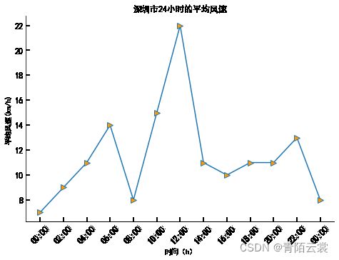
3 实例2:深圳市24小时的平均风速(隐藏部分轴脊)
import numpy as np
from datetime import datetime
import matplotlib.pyplot as plt
from matplotlib.dates import DateFormatter, HourLocator
plt.rcParams[“font.sans-serif”] = [“SimHei”]
plt.rcParams[“axes.unicode_minus”] = False
dates = [‘201910240’,‘2019102402’,‘2019102404’,‘2019102406’,
‘2019102408’,‘2019102410’,‘2019102412’, ‘2019102414’,
‘2019102416’,‘2019102418’,‘2019102420’,‘2019102422’,‘201910250’ ]
x_date = [datetime.strptime(d, ‘%Y%m%d%H’) for d in dates]
y_data = np.array([7, 9, 11, 14, 8, 15, 22, 11, 10, 11, 11, 13, 8])
fig = plt.figure()
ax = fig.add_axes((0.0, 0.0, 1.0, 1.0))
ax.plot(x_date, y_data, ‘->’, ms=8, mfc=’#FF9900’)
ax.set_title(‘深圳市24小时的平均风速’)
ax.set_xlabel(‘时间(h)’)
ax.set_ylabel(‘平均风速(km/h)’)
date_fmt = DateFormatter(’%H:%M’)
ax.xaxis.set_major_formatter(date_fmt)
ax.xaxis.set_major_locator(HourLocator(interval=2))
ax.tick_params(direction=‘in’, length=6, width=2, labelsize=12)
ax.xaxis.set_tick_params(labelrotation=45)
#隐藏上轴脊和右轴脊
ax.spines[‘top’].set_color(‘none’)
ax.spines[‘right’].set_color(‘none’)
plt.show()
4 移动轴脊的位置
import numpy as np
import matplotlib.pyplot as plt
import matplotlib.patches as mpathes
xy = np.array([0.5,0.5])
polygon = mpathes.RegularPolygon(xy, 5, 0.2,color=‘y’)
ax = plt.axes((0.3, 0.3, 0.5, 0.5))
ax.add_patch(polygon)
#隐藏上轴脊和右轴脊
ax.spines[‘top’].set_color(‘none’)
ax.spines[‘right’].set_color(‘none’)
#移动轴脊的位置
ax.spines[‘left’].set_position((‘data’, 0.5))
ax.spines[‘bottom’].set_position((‘data’, 0.5))
plt.show()

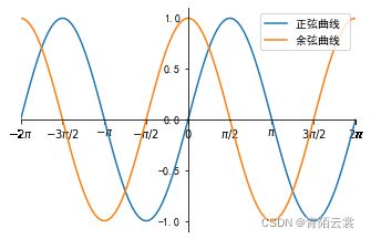
5 实例3:正弦与余弦曲线
import numpy as np
import matplotlib.pyplot as plt
plt.rcParams[“font.sans-serif”] = [“SimHei”]
plt.rcParams[“axes.unicode_minus”] = False
x_data = np.linspace(-2 * np.pi, 2 * np.pi, 100)
y_one = np.sin(x_data)
y_two = np.cos(x_data)
fig = plt.figure()
ax = fig.add_axes((0.2, 0.2, 0.7, 0.7))
ax.plot(x_data, y_one, label='正弦曲线 ')
ax.plot(x_data, y_two, label=‘余弦曲线 ‘)
ax.legend()
ax.set_xlim(-2 * np.pi, 2 * np.pi)
ax.set_xticks([-2 * np.pi, -3 * np.pi / 2, -1 * np.pi, -1 * np.pi / 2,
0, np.pi / 2, np.pi, 3 * np.pi / 2, 2 * np.pi])
ax.set_xticklabels([’ − 2 π -2\pi −2π’, ‘ − 3 π / 2 -3\pi/2 −3π/2’, ‘ − π -\pi −π’, ’ − π / 2 -\pi/2 −π/2 ', ‘ 0 0 0’,
‘ π / 2 \pi/2 π/2’, ‘ π \pi π’, ‘ 3 π / 2 3\pi/2 3π/2’, ‘ 2 π 2\pi 2π’])
ax.set_yticks([-1.0, -0.5, 0.0, 0.5, 1.0])
ax.set_yticklabels([-1.0, -0.5, 0.0, 0.5, 1.0])
#隐藏右轴脊和上轴脊
ax.spines[‘right’].set_color(‘none’)
ax.spines[‘top’].set_color(‘none’)
#移动左轴脊和下轴脊的位置
ax.spines[‘left’].set_position((‘data’, 0))
ax.spines[‘bottom’].set_position((‘data’, 0))
plt.show()
6 使用mplot3d绘制3D图表
import matplotlib.pyplot as plt
from mpl_toolkits.mplot3d import Axes3D
fig = plt.figure()
ax = Axes3D(fig)
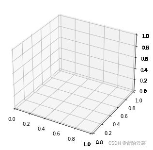
import matplotlib.pyplot as plt
from mpl_toolkits.mplot3d import Axes3D
fig = plt.figure()
ax = fig.add_subplot(111, projection=‘3d’)
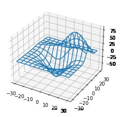
7 绘制常见的3D图表
import matplotlib.pyplot as plt
from mpl_toolkits.mplot3d import axes3d
fig = plt.figure()
ax = fig.add_subplot(111, projection=‘3d’)
#获取测试数据
X, Y, Z = axes3d.get_test_data(0.05)
#绘制 3D线框图
ax.plot_wireframe(X, Y, Z, rstride=10, cstride=10)
plt.show()
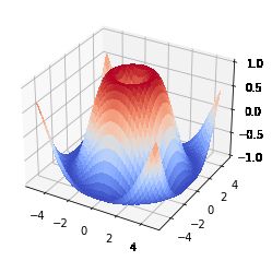
from mpl_toolkits.mplot3d import Axes3D
import matplotlib.pyplot as plt
from matplotlib import cm
import numpy as np
x1 = np.arange(-5, 5, 0.25)
y1 = np.arange(-5, 5, 0.25)
x1, y1 = np.meshgrid(x1, y1)
r1 = np.sqrt(x1** 2 + y1 ** 2)
z1 = np.sin(r1)
fig = plt.figure()
ax = fig.add_subplot(111, projection=‘3d’)
#绘制曲面图
ax.plot_surface(x1, y1, z1, cmap=cm.coolwarm, linewidth=0, antialiased=False)
#设置 z 轴刻度的范围、位置、格式
ax.set_zlim(-1.01, 1.01)
plt.show()
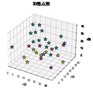
8 实例1:三维空间的星星
import numpy as np
import matplotlib.pyplot as plt
from mpl_toolkits.mplot3d import Axes3D
plt.rcParams[“font.sans-serif”] = [“SimHei”]
plt.rcParams[“axes.unicode_minus”] = False
#生成测试数据
x = np.random.randint(0, 40, 30)
y = np.random.randint(0, 40, 30)
z = np.random.randint(0, 40, 30)
#创建三维坐标系的绘图区域, 并在该区域中绘制3D散点图
fig = plt.figure()
ax = fig.add_subplot(111, projection=‘3d’)
for xx, yy, zz in zip(x, y, z):
color = ‘y’
if 10 < zz < 20:
color = ‘#C71585’
elif zz >= 20:
color = ‘#008B8B’
ax.scatter(xx, yy, zz, c=color, marker=’*’, s=160, linewidth=1, edgecolor=‘black’)
ax.set_xlabel(‘x轴’)
ax.set_ylabel(‘y轴’)
ax.set_zlabel(‘z轴’)
ax.set_title(‘3D散点图’, fontproperties=‘simhei’, fontsize=14)
plt.tight_layout()
plt.show()
9 使用animation制作动图
#以qt5为图形界面后端
%matplotlib qt5
import numpy as np
import matplotlib.pyplot as plt
from matplotlib.animation import FuncAnimation # 导入动画类
x = np.arange(0, 2 *np.pi, 0.01)
fig, ax = plt.subplots()
line, = ax.plot(x, np.sin(x))
#定义每帧动画调用的函数
def animate(i):
line.set_ydata(np.sin(x + i / 10.0))
return line
#定义初始化帧的函数
def init():
line.set_ydata(np.sin(x))
return line
ani = FuncAnimation(fig=fig, func=animate, frames=100,
init_func=init, interval=20, blit=False)
plt.show()

import numpy as np
import matplotlib.pyplot as plt
from matplotlib.animation import ArtistAnimation
x = np.arange(0, 2 * np.pi, 0.01)
fig, ax = plt.subplots()
arr = []
for i in range(5):
line = ax.plot(x, np.sin(x + i))
arr.append(line)
#根据arr存储的一组图形创建动画
ani = ArtistAnimation(fig=fig, artists=arr, repeat=True)
plt.show()

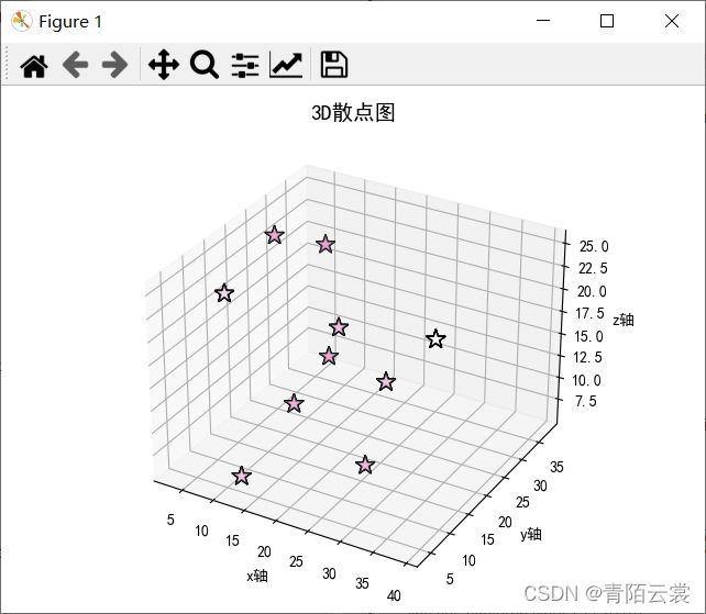
10 实例2:三维空间闪烁的星星
import numpy as np
import matplotlib.pyplot as plt
from mpl_toolkits.mplot3d import Axes3D
from matplotlib.animation import FuncAnimation
plt.rcParams[“font.sans-serif”] = [“SimHei”]
plt.rcParams[“axes.unicode_minus”] = False
#生成测试数据
xx = np.array([13, 5, 25, 13, 9, 19, 3, 39, 13, 27])
yy = np.array([4, 38, 16, 26, 7, 19, 28, 10, 17, 18])
zz = np.array([7, 19, 6, 12, 25, 19, 23, 25, 10, 15])
fig = plt.figure()
ax = fig.add_subplot(111, projection=‘3d’)
#绘制初始的3D散点图
star = ax.scatter(xx, yy, zz, c=’#C71585’, marker=’’, s=160,
linewidth=1, edgecolor=‘black’)
#每帧动画调用的函数
def animate(i):
if i % 2:
color = ‘#C71585’
else:
color = ‘white’
next_star = ax.scatter(xx, yy, zz, c=color, marker=’’, s = 160, linewidth=1, edgecolor=‘black’)
return next_star
def init():
return star
ani = FuncAnimation(fig=fig, func=animate, frames=None, init_func =init, interval=1000, blit=False)
ax.set_xlabel(‘x轴’)
ax.set_ylabel(‘y轴’)
ax.set_zlabel(‘z轴’)
ax.set_title(‘3D散点图’, fontproperties=‘simhei’, fontsize=14)
plt.tight_layout()
plt.show()
11 实例3:美国部分城镇人口分布
#注意:在使用(from mpl_toolkits.basemap import Basemap)时,需要安装mpl_toolkits.basemap,其安装方法请访问百度查找,我没有安装成功,所以就没放运行效果截图,抱歉。
import numpy as np
import pandas as pd
import matplotlib.pyplot as plt
from mpl_toolkits.basemap import Basemap
plt.rcParams[“font.sans-serif”] = [“SimHei”]
plt.rcParams[“axes.unicode_minus”] = False
#创建 Basemap 对象
map = Basemap(projection=‘stere’, lat_0=90, lon_0=-105, llcrnrl at=23.41,
urcrnrlat=45.44, llcrnrlon=-118.67, urcrnrlon=-64.52,
rsphere=6371200., resolution=‘l’, area_thresh=10000)
map.drawmapboundary() # 绘制地图投影周围边界
map.drawstates() # 绘制州界
map.drawcoastlines() # 绘制海岸线
map.drawcountries() # 绘制国家边界
#绘制纬线
parallels = np.arange(0., 90, 10.)
map.drawparallels(parallels, labels=[1, 0, 0, 0], fontsize=10)
#绘制经线
meridians = np.arange(-110., -60., 10.)
map.drawmeridians(meridians, labels=[0, 0, 0, 1], fontsize=10)
posi = pd.read_csv(r"C:\Users\admin\Desktop\2014_us_cities.csv")
#从3228组城市数据中选择500 组数据
lat = np.array(posi[“lat”][0:500]) # 获取纬度值
lon = np.array(posi[“lon”][0:500]) # 获取经度值
pop = np.array(posi[“pop”][0:500], dtype=float) # 获取人口数
#气泡图的气泡大小
size = (pop / np.max(pop)) * 1000
x, y = map(lon, lat)
map.scatter(x, y, s=size)
plt.title(‘2014年美国部分城镇的人口分布情况’)
plt.show()