Matplotlib数据可视化
文章目录
-
- 线条
- 颜色控制符
- 线条控制符
- set_titcks
- set_limits
- 图例legend
- 指定可视区域
- 设置刻度标签
- moving spines
- 显示中文
- 插入文字
- 统计图表
-
- 条形图
- 散点图
- 饼状图
- 茎叶图
- 堆叠图
- 直方图
- 箱线图
- 极坐标图
- 十大热门城市排行
- 天气温度表
- subplot
- figure
- axes
- 共享x轴
- annotate text
- openfile
- 3d作图
- 3d文字
- 图像
- 增加颜色类标
- camp
- 读入图像
- RGB三通道
'''
    Matplotlib作为数据科学的的必备库,算得上是python可视化领域的元老,更是很多高级可视化库的底层
    基础,其重要性不言而喻。

    Matplotlib 是 Python 的绘图库。 它可与 NumPy 一起使用,提供了一种有效的 MatLab 开源替代方案。

    matplotlib.pyplot是一个命令风格函数的集合,使matplotlib的机制更像 MATLAB。
    每个绘图函数对图形进行一些更改:例如,创建图形,在图形中创建绘图区域,在绘图区域绘制一些线条
    ,使用标签装饰绘图等。
    在matplotlib.pyplot中,各种状态跨函数调用保存,以便跟踪诸如当前图形和绘图区域之类的东西,
    并且绘图函数始终指向当前轴域(请注意,这里和文档中的大多数位置中的『轴域』(axes)是指图形的
    一部分(两条坐标轴围成的区域),而不是指代多于一个轴的严格数学术语)。
        将 pyplot 导入为 plt ,这是使用 pylot 的 python 程序的传统惯例
    调用 plot 的 .plot 方法绘制一些坐标。plt.plot 在后台『绘制』这个绘图,但绘制了想要的一切之后,
    需要把它带到屏幕上。
    这个窗口是一个 matplotlib 窗口,它允许我们查看图形,以及与它进行交互和访问。
    可以将鼠标悬停在图表上,并查看通常在右下角的坐标。 也可以使用按钮。
    ★用matplotlib画二维图像时,默认情况下的横坐标和纵坐标显示的值有时达不到自己的需求,需要借
    助xticks()和yticks()分别对横坐标x-axis和纵坐标y-axis进行设置。

    ★xticks()中有3个参数:xticks(locs, [labels], **kwargs)  # Set locations and labels
    locs参数为数组参数(array_like, optional),表示x-axis的刻度线显示标注的地方,即ticks放置的地
    方,第二个参数也为数组参数(array_like, optional),可以不添加该参数,表示在locs数组表示的位
    置添加的标签,labels不赋值,在这些位置添加的数值即为locs数组中的数。
    ★Figure对象可以拥有自己的文字、线条以及图像等简单类型的Artist。
    缺省的坐标系统为像素点,但是可以通过设置Artist对象的transform属性修改坐标系的转换方式。
    最常用的Figure对象的坐标系是以左下角为坐标原点(0,0),右上角为坐标(1,1)。

    ★Figure语法
    ★fig = figure(num=None, figsize=None, dpi=None, facecolor=None, edgecolor=None, frameon=True)
    ★num:图像编号或名称,数字为编号 ,字符串为名称
    ★figsize:指定figure的宽和高,单位为英寸;
    ★dpi参数指定绘图对象的分辨率,即每英寸多少个像素,缺省值为80   1英寸等于2.5cm,A4纸是 21*30cm的纸张
    ★facecolor:背景颜色
    ★edgecolor:边框颜色
    ★frameon:是否显示边框
    *******************plt.plot***********************
    ★plt.plot(x, y, format_string, **kwargs)
    函数的本质就是根据点连接线。plot()是一个通用命令,并且可接受任意数量的参数。

    ★参数             说明
    ★x                X轴数据,列表[列表],元组(元组)或数组np.array,pd.Series,可传入多组x, y
    ★y                Y轴数据,列表或数组
                       x,y可以不等长
    ★format_string    控制曲线的格式字符串,可选,format_string 由颜色、风格、标记等字符组成
                       "格式控制字符串"最多可以包括三部分, "颜色", "点型", "线型"
    ★**kwargs         第二组或更多(x,y,format_string),可画多条曲线
	*******************plt.plot***********************
    ★plt.plot(x, y, format_string, **kwargs)
    函数的本质就是根据点连接线。plot()是一个通用命令,并且可接受任意数量的参数。

    ★参数             说明
    ★x                X轴数据,列表[列表],元组(元组)或数组np.array,pd.Series,可传入多组x, y
    ★y                Y轴数据,列表或数组
                       x,y可以不等长
    ★format_string    控制曲线的格式字符串,可选,format_string 由颜色、风格、标记等字符组成
                       "格式控制字符串"最多可以包括三部分, "颜色", "点型", "线型"
    ★**kwargs         第二组或更多(x,y,format_string),可画多条曲线
'''
线条
'''
*****************  Controlling line properties  *****************

    ★plot 函数在官方文档的语法中只要求填入不定长参数,实际可以填入的主要参数如下:

    ★参数名称 说明
    ★color 接收特定 string,指定线条的颜色。默认为 None。
                "颜色"格式控制字符串可以输入英文全称, 如"red",
                也可十六进制RGB字符串'#1f77b4', '#ff7f0e'
    ★linestyle 接收特定 string。指定线条类型,默认为“-“
    ★marker 接收特定 string。表示绘制的点的类型。默认为 None
    ★alpha 接收 0-1 的小数。表示点的透明度。默认为 None
    ★在 pyplot 中几乎所有的默认属性都是可以控制的,例如视图窗口大小以及每英寸点数、 线条宽度、
    颜色和样式、坐标轴、坐标和网格属性、文本、字体等
'''
颜色控制符
'''
*****************  颜色控制符  *****************

    ★要想使用丰富,炫酷的图标,可以使用更复杂的格式设置,主要颜色,线的样式,点的样式。
    ★默认的情况下,只有一条线,是蓝色实线。多条线的情况下,生成不同颜色的实线。

    ★color 接收特定 string,指定线条的颜色。默认为 None。
                "颜色"格式控制字符串可以输入英文全称, 如"red",
                也可十六进制RGB字符串'#1f77b4', '#ff7f0e'

    ★字符           颜色
    ★'b'            蓝色
    ★'g'            绿色
    ★'r'            红色
    ★'c'            青色
    ★'m'            品红色
    ★'y'            黄色
    ★'k'            黑色
    ★'w'            白色
'''
https://finthon.com/matplotlib-color-list/
线条控制符
'''
*****************  线形控制符  *****************

    ★字符 类型
    ★'-' 实线
    ★'--' 虚线
    ★'-.' 虚点线
    ★':' 点线
    ★' ' 空类型,不显示线
'''
'''
*****************  点(标记)的类型控制符  *****************

    ★'.' 点
    ★',' 像素点
    ★'o' 圆点

    ★'^' 上三角点
    ★'v' 下三角点
    ★'<' 左三角点
    ★'>' 右三角点

    ★'1' 下三叉点
    ★'2' 上三叉点
    ★'3' 左三叉点
    ★'4' 右三叉点

    ★'s' 正方点
    ★'p' 五角点
    ★'*' 星形点
    ★'h' 六边形1
    ★'H' 六边形2

    ★'+' 加号点
    ★'x' 乘号点
    ★'D' 实心菱形点
    ★'d' 细菱形点
    ★'_' 横线点
    ★'|' 竖线点
'''
import matplotlib.pyplot as plt
import numpy as np
x = np.linspace(-np.pi,np.pi,256,endpoint=True)
y_sin = np.sin(x)
y_cos = np.cos(x)
sin_fig = plt.figure('x--sinx',figsize=(4,2),facecolor='blue')
cos_fig = plt.figure('x--cos',figsize=(4,2),facecolor='wheat')
ax_sin = sin_fig.gca()
ax_cos = cos_fig.gca()
ax_sin.plot(x,y_sin)
ax_cos.plot(x,y_cos)
ax_cos = cos_fig.add_axes([0.15,0.2,0.3,0.1])
plt.show()

set_titcks
'''
*****************  Setting ticks  *****************

    ★用matplotlib画二维图像时,默认情况下的横坐标和纵坐标显示的值有时达不到自己的需求,需要借
    助xticks()和yticks()分别对横坐标x-axis和纵坐标y-axis进行设置。

    ★xticks()中有3个参数:xticks(locs, [labels], **kwargs)  # Set locations and labels
    locs参数为数组参数(array_like, optional),表示x-axis的刻度线显示标注的地方,即ticks放置的地
    方,第二个参数也为数组参数(array_like, optional),可以不添加该参数,表示在locs数组表示的位
    置添加的标签,labels不赋值,在这些位置添加的数值即为locs数组中的数。
    #xticks()函数中,locs参数为数组x,即1到12所有的整数,
    #即画出的图像会在这12个位置画出ticks,即上图中的刻度线。
    #当赋予labels的值为空时,则在locs决定的位置上虽然会画出ticks,但不会显示任何值。
'''
import numpy as np
import matplotlib.pyplot as plt
import calendar
x = range(1,13,1)
y = range(1,13,1)
plt.xticks(x, calendar.month_name[1:13],color='#ff00ff',rotation=60)
plt.yticks([1,5,10], calendar.month_name[1:4], color='#00ff00',rotation=30)
plt.xlabel('x')
plt.ylabel('y')
plt.title('x-y')
plt.plot(x,y)
plt.show()
'''
*****************  Setting ticks  *****************

    ★用matplotlib画二维图像时,默认情况下的横坐标和纵坐标显示的值有时达不到自己的需求,需要借
    助xticks()和yticks()分别对横坐标x-axis和纵坐标y-axis进行设置。

    ★xticks()中有3个参数:xticks(locs, [labels], **kwargs)  # Set locations and labels
    locs参数为数组参数(array_like, optional),表示x-axis的刻度线显示标注的地方,即ticks放置的地
    方,第二个参数也为数组参数(array_like, optional),可以不添加该参数,表示在locs数组表示的位
    置添加的标签,labels不赋值,在这些位置添加的数值即为locs数组中的数。
    #xticks()函数中,locs参数为数组x,即1到12所有的整数,
    #即画出的图像会在这12个位置画出ticks,即上图中的刻度线。
    #当赋予labels的值为空时,则在locs决定的位置上虽然会画出ticks,但不会显示任何值。
'''
import numpy as np
import matplotlib.pyplot as plt
import calendar
x = range(1,13,1)
y = range(1,13,1)
plt.xticks(x, calendar.month_name[1:13],color='#ff00ff',rotation=60)
plt.yticks([1,5,10], calendar.month_name[1:4], color='#00ff00',rotation=30)
plt.xlabel('x')
plt.ylabel('y')
plt.title('x-y')
plt.plot(x,y)
plt.show()

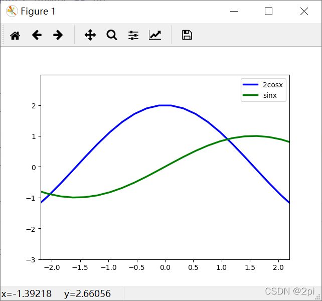
set_limits
'''
    ★plt.xlim(xmin, xmax), 函数功能:设置x轴的数值显示范围。
    ★plt.ylim(ymin, ymax), 函数功能:设置y轴的数值显示范围。
'''
import matplotlib.pyplot as plt
import numpy as np
x = np.linspace(-np.pi,np.pi,30,endpoint=True)
c,s = 2*np.cos(x), np.sin(x)
# fig = plt.figure()
# ax = fig.add_axes([0.2,0.2,1,1])
plt.plot(x,c,'b',linewidth=2.5,linestyle='-')
plt.plot(x,s,'g',linewidth=2.5,linestyle='-')

plt.xlim(x.min()*0.7, x.max()*0.7)
plt.ylim(c.min()*1.5, c.max()*1.5)

plt.legend(["2cosx", "sinx"])

plt.show()
图例legend
'''
★Let's add a legend in the upper left corner. This only requires adding the keyword
argument label (that will be used in the legend box) to the plot commands.
★legend entry
★A legend is made up of one or more legend entries.
★An entry is made up of exactly one key and one label.
★legend key
★The colored/patterned marker to the left of each legend label.
★legend label
★The text which describes the handle represented by the key.
★legend handle
★The original object which is used to generate an appropriate entry in the legend.
★(1)设置图列位置
plt.legend(loc='upper center')
0: ‘best'
1: ‘upper right'
2: ‘upper left'
3: ‘lower left'
4: ‘lower right'
5: ‘right'
6: ‘center left'
7: ‘center right'
8: ‘lower center'
9: ‘upper center'
10: ‘center'
★(2)设置图例字体大小
fontsize : int or float or {‘xx-small’, ‘x-small’, ‘small’, ‘medium’, ‘large’, ‘x-large’, ‘xx-large’}
★(3)设置图例边框及背景
plt.legend(loc='best',frameon=False) #去掉图例边框
plt.legend(loc='best',edgecolor='blue') #设置图例边框颜色
plt.legend(loc='best',facecolor='blue') #设置图例背景颜色,若无边框,参数无效
设置图例标题
legend = plt.legend(["CH", "US"], title='China VS Us')
★(5)设置图例名字及对应关系
legend = plt.legend([p1, p2], ["CH", "US"])
'''
#导入包
import numpy as np
import matplotlib.pyplot as plt
#加载数据
# train_x = np.linspace(-1, 1, 100)
# train_y_1 = 2*train_x + np.random.rand(*train_x.shape)*0.3
# train_y_2 = train_x**2+np.random.randn(*train_x.shape)*0.3
# #作图
# p1 = plt.scatter(train_x, train_y_1, c='red', marker='v' )
# p2= plt.scatter(train_x, train_y_2, c='blue', marker='o' )
# #修饰
# legend = plt.legend([p1, p2], ["CH", "US"], facecolor='blue')
# #显示
# plt.show()
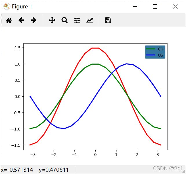
import numpy as np
import matplotlib.pyplot as plt
X = np.linspace(-np.pi, np.pi, 20, endpoint=True)
C,S = np.cos(X), np.sin(X)
C_plot_list=plt.plot(X, 1.5*C, color="r", linewidth=2.5, linestyle="-")
#注:C_plot_list是一个列表
C_plot,=plt.plot(X, C, color="g", linewidth=2.5, linestyle="-")
S_plot,=plt.plot(X, S, color="b", linewidth=2.5, linestyle="-")
#要将长度为1的元组或列表中元素提取出来可以用,简化赋值操作
print(type(C_plot_list),type(C_plot))
legend = plt.legend([C_plot, S_plot], ["CH", "US"], facecolor='#005588')
plt.show()
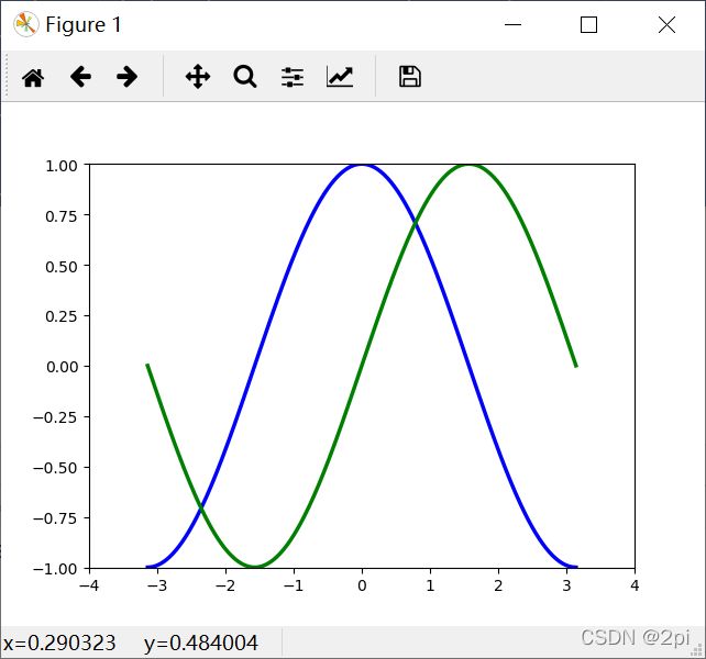
指定可视区域
'''
★The axis() command in the example takes a list of [xmin, xmax, ymin, ymax] and specifies
    the viewport of the axes.
★axis()命令接收[xmin,xmax,ymin,ymax]的列表,并指定轴域的可视区域。
'''
import matplotlib.pyplot as plt
import numpy as np
x = np.linspace(-np.pi,np.pi,256,endpoint=True)
c,s = np.cos(x), np.sin(x)
fig = plt.figure()
plt.plot(x,c,'b',linewidth=2.5,linestyle='-')
plt.plot(x,s,'g',linewidth=2.5,linestyle='-')

plt.axis([-4,4,-1,1])

plt.show()
设置刻度标签
'''
*****************  Setting tick labels  *****************
    ★Ticks are now properly placed but their label is not very explicit. We could guess that
    3.142 is π but it would be better to make it explicit. When we set tick values, we can
    also

    ★字符串前边的r代表是原始字符串,也就是里边的内容不需要转义,
    ★这个一般在正则表达式的时候用,而这里是laText的用法,
    ★在python中使用laText,需要在文本的前后加上$符号,
    ★然后就是laText的文本了,当输入了以上内容,matplotlib会自动解析的,
    ★\pi代表的就是π。
'''
import numpy as np
import matplotlib.pyplot as plt
X = np.linspace(-np.pi, np.pi, 256, endpoint=True)
C,S = np.cos(X), np.sin(X)
plt.plot(X, C, color="blue", linewidth=2.5, linestyle="-")
plt.plot(X, S, color="red", linewidth=2.5, linestyle="-")
plt.xlim(X.min()*1.1, X.max()*1.1)
plt.ylim(C.min()*1.1, C.max()*1.1)
# plt.xticks([-np.pi, -np.pi/2, 0, np.pi/2, np.pi])
plt.xticks([-np.pi, -np.pi/2, 0, np.pi/2, np.pi],['$-\pi$', '$-\pi/2$', '$0$', '$+\pi/2$', '$+\pi$'])
# plt.xticks([-np.pi, -np.pi/2, 0, np.pi/2, np.pi],[r'$-\pi$', r'$-\pi/2$', r'$0$', r'$+\pi/2$', r'$+\pi$'])
plt.yticks([-1, 0, +1],[r'$-1$', r'$0$', r'$+1$'])
plt.show()

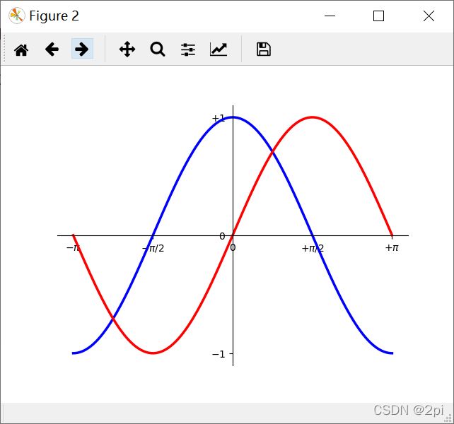
moving spines
'''
*****************  Moving spines  *****************
    ★脊梁:包围图表的线条
    ★Spines are the lines connecting the axis tick marks and noting the boundaries of the data
    area. They can be placed at arbitrary positions and until now, they were on the border of
    the axis. We'll change that since we want to have them in the middle. Since there are four
    of them (top/bottom/left/right), we'll discard the top and right by setting their color to
    none and we'll move the bottom and left ones to coordinate 0 in data space coordinates.
    ★如果要移动坐标到中心点,那么我们可以移动其中的两条边,并隐藏两条边即可
    ★ax.xaxis.set_ticks_position(‘bottom’)
    ★ax.yaxis.set_ticks_position(‘left’)
    ★ax.spines[‘right’].set_color(‘none’)
    ★ax.spines[‘top’].set_color(‘none’)

    ★接下来就是指定x轴以及y轴的绑定:
    ★ax.spines[‘bottom’].set_position((‘data’, 0))
    ★ax.spines[‘left’].set_position((‘data’, 0))
    ★结果是将x,y轴绑定到特定位置,即坐标轴的交点是(0, 0),

    ★如果两条线的交点要设置为(1,0)
    ★ax.spines[‘bottom’].set_position((‘data’, 0))
    ★ax.spines[‘left’].set_position((‘data’, 1))
'''
import numpy as np
import matplotlib.pyplot as plt
X = np.linspace(-np.pi, np.pi, 256, endpoint=True)
C,S = np.cos(X), np.sin(X)
fig = plt.figure()
plt.plot(X, C, color="blue", linewidth=2.5, linestyle="-")
plt.plot(X, S, color="red", linewidth=2.5, linestyle="-")
plt.xlim(X.min()*1.1, X.max()*1.1)
plt.ylim(C.min()*1.1, C.max()*1.1)
plt.xticks([-np.pi, -np.pi/2, 0, np.pi/2, np.pi],[r'$-\pi$', r'$-\pi/2$', r'$0$', r'$+\pi/2$', r'$+\pi$'])
plt.yticks([-1, 0, +1],[r'$-1$', r'$0$', r'$+1$'])
#上下比较
fig = plt.figure()
plt.plot(X, C, color="blue", linewidth=2.5, linestyle="-")
plt.plot(X, S, color="red", linewidth=2.5, linestyle="-")
plt.xlim(X.min()*1.1, X.max()*1.1)
plt.ylim(C.min()*1.1, C.max()*1.1)
plt.xticks([-np.pi, -np.pi/2, 0, np.pi/2, np.pi],[r'$-\pi$', r'$-\pi/2$', r'$0$', r'$+\pi/2$', r'$+\pi$'])
plt.yticks([-1, 0, +1],[r'$-1$', r'$0$', r'$+1$'])

ax = plt.gca()#获得当前的Axes对象或图
ax.spines['right'].set_color('none')
ax.spines['top'].set_color('none')
ax.xaxis.set_ticks_position('bottom')
ax.spines['bottom'].set_position(('data',0))
ax.yaxis.set_ticks_position('left')
ax.spines['left'].set_position(('data',0))

plt.show()
显示中文
'''
***************** 正常显示中文 *****************
★plt.rcParams['font.sans-serif']=['SimHei'] #用来正常显示中文标签
★'SimHei':中文黑体;'Kaiti':中文楷体;'LiSu':中文隶书;
★'FangSong':中文仿宋;'YouYuan':中文幼圆;'STSong':华文宋体;
★plt.rcParams['axes.unicode_minus']=False #用来正常显示负号
----------------------------------------------------------------
import numpy as np
import matplotlib.pyplot as plt
X = np.linspace(-np.pi, np.pi, 20, endpoint=True)
C,S = np.cos(X), np.sin(X)
fig = plt.figure()
plot_C,=plt.plot(X, C, color="blue", linewidth=2.5, linestyle="-")
plot_S,=plt.plot(X, S, color="red", linewidth=2.5, linestyle="-")
plt.xlim(X.min()*1.1, X.max()*1.1)
plt.ylim(C.min()*1.1, C.max()*1.1)
plt.xticks([-np.pi, -np.pi/2, 0, np.pi/2, np.pi],[r'$-\pi$', r'$-\pi/2$', r'$0$', r'$+\pi/2$', r'$+\pi$'])
plt.yticks([-1, 0, +1],[r'$-1$', r'$0$', r'$+1$'])
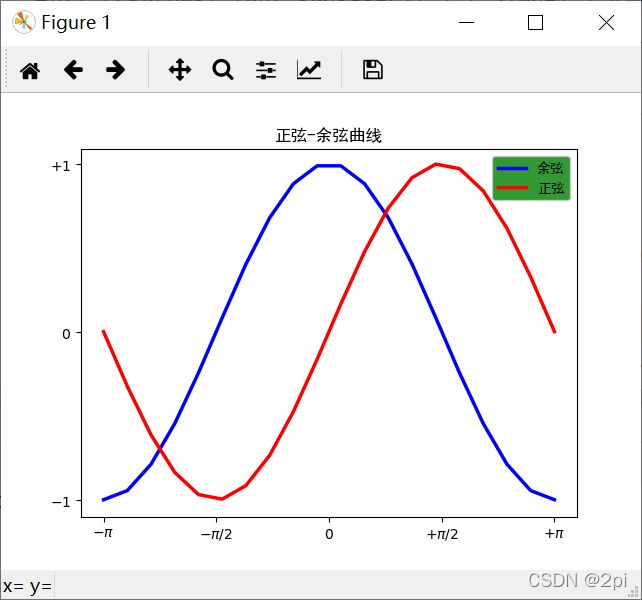
plt.title('正弦-余弦曲线')
legend = plt.legend([plot_C, plot_S], ["余弦", "正弦"], facecolor='g')
plt.show()
'''
import numpy as np
import matplotlib.pyplot as plt
plt.rcParams['font.sans-serif']=['SimHei'] #用来正常显示中文标签
plt.rcParams['axes.unicode_minus']=False #用来正常显示负号
X = np.linspace(-np.pi, np.pi, 20, endpoint=True)
C,S = np.cos(X), np.sin(X)
fig = plt.figure()
plot_C,=plt.plot(X, C, color="blue", linewidth=2.5, linestyle="-")
plot_S,=plt.plot(X, S, color="red", linewidth=2.5, linestyle="-")
plt.xlim(X.min()*1.1, X.max()*1.1)
plt.ylim(C.min()*1.1, C.max()*1.1)
plt.xticks([-np.pi, -np.pi/2, 0, np.pi/2, np.pi],[r'$-\pi$', r'$-\pi/2$', r'$0$', r'$+\pi/2$', r'$+\pi$'])
plt.yticks([-1, 0, +1],[r'$-1$', r'$0$', r'$+1$'])
plt.title('正弦-余弦曲线')
legend = plt.legend([plot_C, plot_S], ["余弦", "正弦"], facecolor='g')
plt.show()
插入文字
'''
***************************************** CH5 *****************************************
***************************************** CH5 *****************************************
***************** 插入文字 *****************
★The text() command can be used to add text in an arbitrary location, and the xlabel(),
ylabel() and title() are used to add text in the indicated locations
★plt.text(x, y, s, fontsize, verticalalignment,horizontalalignment,rotation , **kwargs)
★x,y:标签添加的位置,注释文本内容所在位置的横/纵坐标,默认是根据坐标轴的数据来度量的,
★是绝对值,也就是说图中点所在位置的对应的值,特别的,如果你要变换坐标系的话,
★要用到transform=ax.transAxes参数。
★s:标签的符号,字符串格式,比如你想加个“我爱python”,更多的是你标注跟数据有关的主体。
★fontsize:加标签字体大小,取整数。
★verticalalignment:垂直对齐方式 ,可选 ‘center’ ,‘top’ , ‘bottom’,‘baseline’ 等
★horizontalalignment:水平对齐方式 ,可以填 ‘center’ , ‘right’ ,‘left’ 等
★rotation:标签的旋转角度,以逆时针计算,取整
★family :设置字体
★style: 设置字体的风格
★weight:设置字体的粗细
★wrap:要不要换行
★bbox:给字体添加框, 如 bbox=dict(facecolor=‘red’, alpha=0.5) 等。
★string:注释文本内容
★color:注释文本内容的字体颜色
import matplotlib.pyplot as plt
import numpy as np
x = np.linspace(0.05, 10, 1000)
y = np.sin(x)
plt.plot(x, y, ls="-.", lw=2, c="c", label="plot figure")
plt.legend()
plt.text(3.10, 0.09, "y=sin(x)",fontsize=25 ,weight="bold", color="b")
plt.show()
-----------------------------------------------------------------------------------
import numpy as np
import matplotlib.pyplot as plt
fig = plt.figure()
plt.axis([0, 10, 0, 10])
t = "This is a really long string that I'd rather have wrapped so that it"\
" doesn't go outside of the figure, but if it's long enough it will go"\
" off the top or bottom!"
plt.text(4, 1, t, ha='center', rotation=15, wrap=True)
plt.text(0, 10, t, ha='left', rotation=-30, wrap=False)
plt.text(7, 7, 123456, ha='right', rotation=-15, wrap=True)
plt.show()
-----------------------------------------------------------------------------------------
完整代码
#加载包
import numpy as np
import matplotlib.pyplot as plt
#修改配置
plt.rcParams['font.sans-serif']=['SimHei'] #用来正常显示中文标签
plt.rcParams['axes.unicode_minus']=False
#数据处理
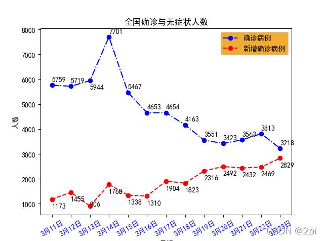
date=list(range(1,14,1))
datelabel=[]
for i in date:
datelabel.append('3月'+str(i+10)+'日')
newdiag=[5759,5719,5944,7701,5467,4653,4654,4163,3551,3423,3563,3813,3218]
newasymptomatic=[1173,1455,906,1768,1338,1310,1904,1823,2316,2492,2432,2469,2829]
#画图
fig = plt.figure()
pl1,=plt.plot(date,newdiag,'o-.b')
pl2,=plt.plot(date,newasymptomatic,'o--r')
#每个点写文字
for i in range(len(date)):
if i==2:
plt.text(date[i], newdiag[i]-350, str(newdiag[i]), ha='left')
plt.text(date[i], newasymptomatic[i]-350, str(newasymptomatic[i]), ha='left')
else:
plt.text(date[i], newdiag[i]+150, str(newdiag[i]), ha='left')
plt.text(date[i], newasymptomatic[i]-350, str(newasymptomatic[i]), ha='left')
plt.xticks(date,datelabel,color='blue',rotation=30)
plt.legend([pl1, pl2], ["新增确诊", "新增无症状"], facecolor='#ee9900')
plt.xlabel('日期')
plt.ylabel('人数')
plt.title('全国确诊与无症状人数')
plt.show()
'''
#导入包
import numpy as np
import matplotlib.pyplot as plt
#修改配置
plt.rcParams['font.sans-serif']=['SimHei'] #用来正常显示中文标签
plt.rcParams['axes.unicode_minus']=False#正常显示正负号
# 生成数据
date=list(range(1,14,1))
datelabel=[]
for i in date:
datelabel.append('3月'+str(i+10)+'日')
newdiag=[5759,5719,5944,7701,5467,4653,4654,4163,3551,3423,3563,3813,3218]#新增确诊new diagnosed
newasymptomatic=[1173,1455,906,1768,1338,1310,1904,1823,2316,2492,2432,2469,2829]#新增无症状感染者
#画图
fig = plt.figure()
pl1,=plt.plot(date,newdiag,'o-.b')
pl2,=plt.plot(date,newasymptomatic,'o--r')
#每个点写文字
for i in range(len(date)):
if i==2:
plt.text(date[i], newdiag[i]-350, str(newdiag[i]), ha='left')
plt.text(date[i], newasymptomatic[i], str(newasymptomatic[i]), ha='left')
else:
plt.text(date[i], newdiag[i]+150, str(newdiag[i]), ha='left')
plt.text(date[i], newasymptomatic[i]-350, str(newasymptomatic[i]), ha='left')
plt.xticks(date,datelabel,color='blue',rotation=30)
plt.legend([pl1, pl2], ["确诊病例", "新增确诊病例"], facecolor='#ee9900')
plt.xlabel('日期')
plt.ylabel('人数')
plt.title('全国确诊与无症状人数')
plt.show()
统计图表
条形图
'''
#***************** 统计图表 *****************
#***************** 统计图表 *****************
#===============
#条形图
#===============
★柱状图(bar chart)是一种以长方形的长度为变量的表达图形的统计报告图,由一系列高度不等的纵向
条纹表示数据分布的情况,用来比较两个或以上的价值(不同时间或者不 同条件),只有一个变量,
通常利用于较小的数据集分析,用柱状图可以比较直观地看出各组数据之间的差别
★plt.bar(x, height, width=0.8, bottom=None, ***, align='center', data=None, **kwargs)
★参数 说明 类型
★x x坐标 int,float
★height 条形的高度 int,float
★width 宽度 0~1,默认0.8
★botton 条形的起始位置 也是y轴的起始坐标
★align 条形的中心位置 “center”,"lege"边缘
★color 条形的颜色 “r","b","g","#123465",默认“b"
★edgecolor 边框的颜色 同上
★linewidth 边框的宽度 像素,默认无,int
★tick_label 下标的标签 可以是元组类型的字符组合
★log y轴使用科学计算法表示 bool
★orientation 是竖直条还是水平条 竖直:"vertical",水平条:"horizontal"
'''
# import numpy as np
# import matplotlib.pyplot as plt
# N = 5
# y = [20, 10, 30, 25, 15]
# x = np.arange(N)
# p1 = plt.bar(x, height=y, width=0.5, )
# plt.show()
import numpy as np
import matplotlib.pyplot as plt
N = 5
x = [20, 10, 30, 25, 15]
y = np.arange(N)
# 绘图 x= 起始位置, bottom= 水平条的底部(左侧), y轴, height 水平条的宽度, width 水平条的长度
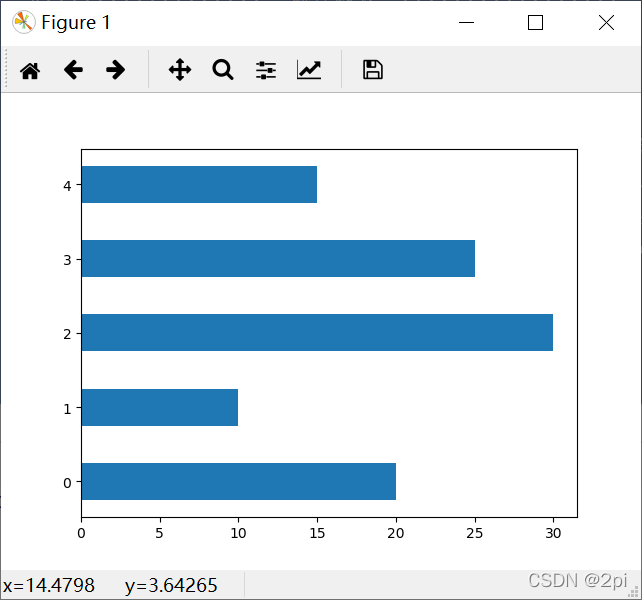
p1 = plt.bar(x=0, bottom=y, height=0.5, width=x, orientation="horizontal")
plt.show()
散点图
'''
#===============
#散点图
#===============
★plt.scatter(x, y, s=None, c=None, marker=None, cmap=None, norm=None, vmin=None,
vmax=None, alpha=None, linewidths=None, verts=None, edgecolors=None, *, data=None, **kwargs)
★x,y:表示的是大小为(n,)的数组,也就是我们即将绘制散点图的数据点
★s:是一个实数或者是一个数组大小为(n,),这个是一个可选的参数。
若传入一维 array 则表示每个点的大小
★c:表示的是颜色,也是一个可选项。默认是蓝色'b',表示的是标记的颜色,或者可以是一个表示颜色
的字符,或者是一个长度为n的表示颜色的序列等等,感觉还没用到过现在不解释了。但是c不可以是一
个单独的RGB数字,也不可以是一个RGBA的序列。可以是他们的2维数组(只有一行)。
★marker:表示的是标记的样式,默认的是'o'。
★cmap:Colormap实体或者是一个colormap的名字,cmap仅仅当c是一个浮点数数组的时候才使用。
如果没有申明就是image.cmap
★norm:Normalize实体来将数据亮度转化到0-1之间,也是只有c是一个浮点数的数组的时候才使用。
如果没有申明,就是默认为colors.Normalize。
★vmin,vmax:实数,当norm存在的时候忽略。用来进行亮度数据的归一化。
★alpha:实数,0-1之间。
★linewidths:也就是标记点的长度。
'''
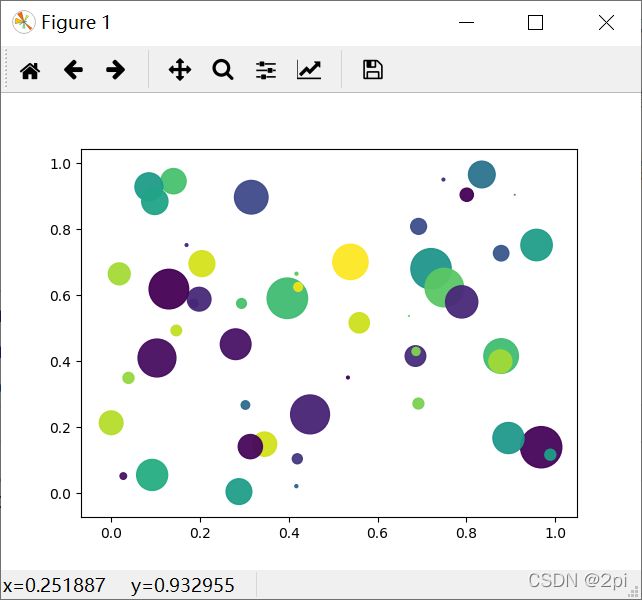
import numpy as np
import matplotlib.pyplot as plt
dotN=50
np.random.seed(1)
x = np.random.rand(dotN)
y = np.random.rand(dotN)
colors = np.random.rand(dotN)
area = (30 * np.random.rand(dotN)) ** 2
plt.scatter(x, y, s=area, c=colors, alpha=np.random.rand())
plt.show()
饼状图
'''
#===============
#饼图
#===============

    ★def pie(x, explode=None, labels=None, colors=None, autopct=None,
        pctdistance=0.6, shadow=False, labeldistance=1.1, startangle=None,
        radius=None, counterclock=True, wedgeprops=None, textprops=None,
        center=(0, 0), frame=False, rotatelabels=False, hold=None, data=None)
    ★x       :        (每一块)的比例,如果sum(x) > 1会使用sum(x)归一化;
    ★labels  :        (每一块)饼图外侧显示的说明文字;
    ★explode :        (每一块)离开中心距离;
    ★startangle :     起始绘制角度,默认图是从x轴正方向逆时针画起,如设定=90则从y轴正方向画起;
    ★shadow  :        在饼图下面画一个阴影。默认值:False,即不画阴影;
    ★labeldistance :  label标记的绘制位置,相对于半径的比例,默认值为1.1, 如<1则绘制在饼图内侧;
    ★autopct :        控制饼图内百分比设置,可以使用format字符串或者format function
                 '%1.1f'指小数点前后位数(没有用空格补齐);
    ★pctdistance :    类似于labeldistance,指定autopct的位置刻度,默认值为0.6;
    ★radius  :        控制饼图半径,默认值为1;
    ★counterclock :  指定指针方向;布尔值,可选参数,默认为:True,即逆时针。将值改为False即可改为顺时针。
    ★wedgeprops :    字典类型,可选参数,默认值:None。参数字典传递给wedge对象用来画一个饼图。例如:wedgeprops={'linewidth':3}设置wedge线宽为3。
    ★textprops :     设置标签(labels)和比例文字的格式;字典类型,可选参数,默认值为:None。传递给text对象的字典参数。
    ★center :        浮点类型的列表,可选参数,默认值:(0,0)。图标中心位置。
    ★frame :         布尔类型,可选参数,默认值:False。如果是true,绘制带有表的轴框架。
    ★rotatelabels :  布尔类型,可选参数,默认为:False。如果为True,旋转每个label到指定的角度。
'''
import matplotlib.pyplot as plt
plt.rcParams['font.sans-serif']=['SimHei'] #用来正常显示中文标签
labels = 'A','B','C','D'
sizes = [10,20,10,70]
plt.pie(sizes,explode=(0,0.3,0,0),labels=labels)
plt.title("饼图详解示例")
plt.text(1,-1.2,'By:张三')
plt.show()

茎叶图
'''
#===============
#Stem Plot茎叶图
#===============

    ★plt.stem(x,y, linefmt=None, markerfmt=None, basefmt=None)

    ★x:       棉棒的x轴基线的取值范围
    ★y:       棉棒的长度
    ★linefmt: 棉棒的样式,可选择{'-','--',':','-.'},根据实际需求来选择
    ★linefmt=‘r-’,代表红色的实线。
    ★markerfmt: 棉棒末端的样式,markerfmt设置顶点的类型和颜色,比如C3.
           C(大写字母C)是默认的,后面数字应该是0-9,改变颜色,最后的.或者o(小写字母o)分别可以设置顶点为小实点或者大实点。
    ★basefmt: 指定基线的样式,basefmt指y=0那条直线。
    ★label:   图例显示内容
'''
import numpy as np
import matplotlib.pyplot as plt
# 生成模拟数据集
x=np.linspace(0,10,20)
y=np.random.randn(20)
# 绘制棉棒图
markerline, stemlines, baseline = plt.stem(x,y,linefmt='-',markerfmt='o',basefmt='--',label='TestStem')
# 可单独设置棉棒末端,棉棒连线以及基线的属性
plt.setp(markerline, color='k')#将棉棒末端设置为黑色
plt.legend()
plt.show()

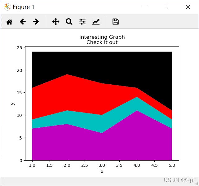
堆叠图
'''
#===============
#堆叠图
#===============

    ★plt.stackplot(x, y, labels, colors)

    ★堆叠图用于显示『部分对整体』随时间的关系。 堆叠图基本上类似于饼图,只是随时间而变化。
    --------------------------------------------------------------------------
    import matplotlib.pyplot as plt
    # 处理中文乱码
    plt.rcParams['font.sans-serif']=['SimHei']
    x_data = [2011,2012,2013,2014,2015,2016,2017]
    y_data = [58000,60200,63000,71000,84000,90500,107000]
    y_data_1 = [78000,80200,93000,101000,64000,70500,87000]
    plt.title('xxx 公司 xxx 产品销量')
    plt.stackplot(x_data, y_data, y_data_1, labels=['产品销量', '用户增长数'])
    plt.legend()
    plt.show()
'''
import matplotlib.pyplot as plt
days = [1,2,3,4,5]
sleeping = [7,8,6,11,7]
eating = [2,3,4,3,2]
working = [7,8,7,2,2]
playing = [8,5,7,8,13]
plt.stackplot(days, sleeping,eating,working,playing, colors=['m','c','r','k'])
plt.xlabel('x')
plt.ylabel('y')
plt.title('Interesting Graph\nCheck it out')
plt.show()
直方图
'''
#===============
#直方图
#===============
    ★直方图(Histogram)又称质量分布图,是统计报告图的一种,由一系列高度不等的纵向条纹或线段
    表示数据分布的情况,一般用横轴表示数据所属类别,纵轴表示数量或者占比。
    ★用直方图可以比较直观地看出产品质量特性的分布状态,便于判断其总体质量分布情况,直方图可以
    发现分布表无法发现的数据模式、样本的频率分布和总体的分布
    ★plt.hist(x, bins=None, range=None, density=None, weights=None, cumulative=False,
    bottom=None, histtype='bar', align='mid', orientation='vertical', rwidth=None, log=False,
    color=None, label=None, stacked=False, normed=None, hold=None, data=None, **kwargs)
    ★属性 说明 类型
    ★x 数据 数值类型
    ★bins 条形数 int
    ★color 颜色 "r","g","y","c"
    ★density 是否以密度的形式显示 bool
    ★range x轴的范围 数值元组(起,终)
    ★bottom y轴的起始位置 数值类型
    ★histtype 线条的类型 "bar":方形,"barstacked":柱形,
"step":"未填充线条"
"stepfilled":"填充线条"
    ★align 对齐方式 "left":左,"mid":中间,"right":右
    ★orientation orientation "horizontal":水平,"vertical":垂直
    ★log 单位是否以科学计术法 bool
'''
import numpy as np
import matplotlib.pyplot as plt
#修改配置
plt.rcParams['font.sans-serif']=['SimHei'] #用来正常显示中文标签
plt.rcParams['axes.unicode_minus']=False
movies_time = [131,98, 125, 131, 124, 139, 131, 117, 128, 108, 135, 138, 131, 102, 107,114,\
119, 128, 121, 142, 127, 130, 124, 101, 110, 116, 117, 110, 128, 128, 115,  99,136, 126,\
134,  95, 138, 117, 111,78, 132, 124, 113, 150, 110, 117,  86,  95, 144, 105, 126, 130,126,\
130, 126, 116, 123, 106, 112, 138, 123,  86, 101,  99, 136,123,117, 119, 105, 137, 123, 128,\
125, 104, 109, 134, 125, 127,105, 120, 107, 129, 116,108, 132, 103, 136, 118, 102, 120, 114,\
105, 115, 132, 145, 119, 121, 112, 139, 125,138, 109, 132, 134,156, 106, 117, 127, 144, 139,\
139, 119, 140,  83, 110, 102,123,107, 143, 115, 136, 118, 139, 123, 112, 118, 125, 109, 119,\
133,112, 114, 122, 109,106, 123, 116, 131, 127, 115, 118, 112, 135,115, 146, 137, 116, 103,\
144, 83, 123, 111, 110, 111, 100, 154,136, 100, 118, 119, 133, 134, 106, 129, 126, 110, 111,\
109, 141,120, 117, 106, 149, 122, 122, 110, 118, 127, 121, 114, 125, 126,114, 140, 103,130,\
141, 117, 106, 114, 121, 114, 133, 137,  92,121, 112, 146, 97, 137, 105, 98,117,112, 81, 97,\
139, 113,134, 106, 144, 110, 137, 137, 111, 104, 117, 100, 111,101, 110,105, 129, 137, 112,\
120, 113, 133, 112,  83,  94, 146, 133, 101,131, 116, 111,  84, 137, 115, 122, 106, 144, 109,\
123, 116, 111,111, 133, 150]
distance=2   #设置组距
groups_num=int((max(movies_time)-min(movies_time))/distance)
plt.hist(movies_time,bins=groups_num)
plt.xticks(range(min(movies_time),max(movies_time))[::3*distance])#跳跃读取 读取的数之间相差3*distance
plt.grid(linestyle='--',alpha=0.5)
plt.xlabel('电影时长')
plt.ylabel('频数')
plt.show()

箱线图
#===============
#箱线图(箱须图、箱形图、盒图、盒须图、盒式图、盒状图)
#===============
'''
★箱线图,一种被广泛应用在数据可视化上的图表,它可以用来反映一组或多组连续型定
★量数据分布的中心位置和散布范围,因形状如箱子而得名。它最大的优点是可以不受异常
★值的影响,能够准确稳定地描绘出数据的离散分布情况
★统计学知识
★上限值:Q1-1.5×IQR
★上相邻值:距离上限值最近的值
★须线:上下分位数各自与上下相邻值的距离
★上四分位数(Q1):一组数据按顺序排列,从小至大第25%位置的数值
★中位数:一组数据按顺序排列,从小至大第50%位置的数值
★中位线(IQR):Q3-Q1上四分位数至下四分位数的距离
★下四分位数(Q3):一组数据按顺序排列,从小至大第75%位置的数值
★下相邻值:距离下限值最近的值
★下限值:Q3+1.5×IQR
★离群值(异常值):一组数据中超过上下限的真实值
★axes.boxplot(x, notch=None, sym=None, vert=None, whis=None, positions=None,
★widths=None, patch_artist=None, meanline=None, showmeans=None, showcaps=None,
★showbox=None, showfliers=None, boxprops=None, labels=None, flierprops=None,
★medianprops=None, meanprops=None, capprops=None, whiskerprops=None)
★x:指定要绘制箱线图的数据
★notch:是否以凹口的形式展现箱线图,默认非凹口
★sym:指定异常点的形状,默认为+号显示
★vert:是否需要将箱线图垂直摆放,默认垂直摆放
★whis:指定上下须与上下四分位的距离,默认为1.5倍的四分位差
★positions:指定箱线图的位置,默认为[0,1,2…]
★widths:指定箱线图的宽度,默认为0.5
★patch_artist:bool类型参数,是否填充箱体的颜色;默认为False
★meanline:bool类型参数,是否用线的形式表示均值,默认为False
★showmeans:bool类型参数,是否显示均值,默认为False
★showcaps:bool类型参数,是否显示箱线图顶端和末端的两条线(即上下须),默认为True
★showbox:bool类型参数,是否显示箱线图的箱体,默认为True
★showfliers:是否显示异常值,默认为True
★boxprops:设置箱体的属性,如边框色,填充色等
★labels:为箱线图添加标签,类似于图例的作用
★filerprops:设置异常值的属性,如异常点的形状、大小、填充色等
★medianprops:设置中位数的属性,如线的类型、粗细等
★meanprops:设置均值的属性,如点的大小、颜色等
★capprops:设置箱线图顶端和末端线条的属性,如颜色、粗细等
★whiskerprops:设置须的属性,如颜色、粗细、线的类型等
#绘制单个箱图
import numpy as np
import matplotlib.pyplot as plt
#修改配置
plt.rcParams['font.sans-serif']=['SimHei'] #用来正常显示中文标签
plt.rcParams['axes.unicode_minus']=False
movies_time = [131,98, 125, 131, 124, 139, 131, 117, 128, 108, 135, 138, 131, 102, 107,114,\
119, 128, 121, 142, 127, 130, 124, 101, 110, 116, 117, 110, 128, 128, 115, 99,136, 126,\
134, 95, 138, 117, 111,78, 132, 124, 113, 150, 110, 117, 86, 95, 144, 105, 126, 130,126,\
130, 126, 116, 123, 106, 112, 138, 123, 86, 101, 99, 136,123,117, 119, 105, 137, 123, 128,\
125, 104, 109, 134, 125, 127,105, 120, 107, 129, 116,108, 132, 103, 136, 118, 102, 120, 114,\
105, 115, 132, 145, 119, 121, 112, 139, 125,138, 109, 132, 134,156, 106, 117, 127, 144, 139,\
139, 119, 140, 83, 110, 102,123,107, 143, 115, 136, 118, 139, 123, 112, 118, 125, 109, 119,\
133,112, 114, 122, 109,106, 123, 116, 131, 127, 115, 118, 112, 135,115, 146, 137, 116, 103,\
144, 83, 123, 111, 110, 111, 100, 154,136, 100, 118, 119, 133, 134, 106, 129, 126, 110, 111,\
109, 141,120, 117, 106, 149, 122, 122, 110, 118, 127, 121, 114, 125, 126,114, 140, 103,130,\
141, 117, 106, 114, 121, 114, 133, 137, 92,121, 112, 146, 97, 137, 105, 98,117,112, 81, 97,\
139, 113,134, 106, 144, 110, 137, 137, 111, 104, 117, 100, 111,101, 110,105, 129, 137, 112,\
120, 113, 133, 112, 83, 94, 146, 133, 101,131, 116, 111, 84, 137, 115, 122, 106, 144, 109,\
123, 116, 111,111, 133, 150]
fig = plt.figure()
ax=fig.add_subplot(111)
ax.boxplot(movies_time,vert=False)
plt.show()
'''
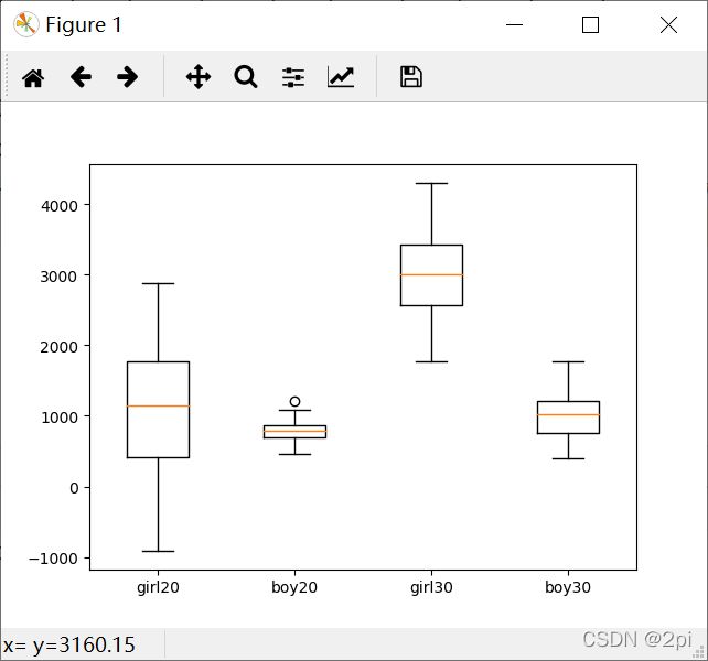
#绘制多个箱图
import numpy as np
import matplotlib.pyplot as plt
fig, ax = plt.subplots() # 子图
# 分别代表男生、女生在20岁和30岁的花费分布
girl20=[2884,1386,1940,506,1457,111,479,392,-19,476,1178,2248,
57,4,1918,-909,1210,1412,3,1925,1055,828,391,2351,
523,1023,1795,1924,815,115,1358,1490,295,488,1841,157,
1683,969,249,1732,2142,1185,1145,1495,786,2145,1139,98,
2046,1794]
boy20=[585,749,777,864,866,761,551,949,553,797,689,1027,
806,850,830,1204,733,676,738,925,897,817,757,778,
866,469,461,882,710,728,568,1084,999,868,657,886,
729,742,489,872,801,847,863,925,617,961,688,669,
876,687]
girl30=[3090,2938,3209,4113,2550,3416,3285,2661,3347,3426,4149,4100,
2660,1883,2284,2831,2493,2727,2101,3288,1773,3615,2267,2078,
1773,2981,2464,2622,2337,3510,2895,3328,4184,2868,3179,3705,
3963,2358,3163,3300,2922,3848,2656,4300,2201,3353,4007,2646,
3804,3037]
boy30=[790,1040,1021,1542,1389,488,1011,1040,399,1386,1122,547,
1614,1386,700,981,1112,774,1055,1320,1206,1066,1276,1165,
1490,474,1118,1164,913,963,616,1323,813,741,620,1771,
484,759,991,1008,673,1363,1131,791,1451,865,1210,1205,
595,626]
data=[girl20,boy20,girl30,boy30,]
ax.boxplot(data)
ax.set_xticklabels(["girl20", "boy20", "girl30", "boy30",]) # 设置x轴刻度标签
plt.show()
极坐标图
'''
************************  极坐标图  ************************
************************  极坐标图  ************************
    ★圆是几何中最讲究对称的图形,也是最别致的曲线。
    ★在论文、报告的写作中,柱状图、条形图露脸次数应该是最多的。
    ★虽然说柱状图、条形图可以清晰的展现出数据的变化趋势,但出现的次数多了,
    ★终究还是会有审美疲劳。
    ★极坐标图在数据统计和分析中也经常会用到。
    ★matplotlib的pyplot子库提供了绘制极坐标图的方法
    ★在调用subplot()创建子图时通过设置projection='polar',便可创建一个极坐标子图,
    ★然后调用plot()在极坐标子图中绘图。
    #ax1 = plt.subplot(111):直角坐标系
    #ax2 = plt.subplot(111, projection='polar') :极坐标坐标系
'''
'''
************************  极坐标图  ************************
****************  比较直角坐标图与极坐标图  ****************

    ★dir()命令可以得到一个对象的所有方法属性,
    ★通过比较ax1与ax2的方法属性便可知道极坐标有哪些设置方法。
import numpy as np
import matplotlib.pyplot as plt

ax1 = plt.subplot(122, projection='polar') #:极坐标坐标系
ax2 = plt.subplot(121) #直角坐标
x = np.arange(0.0, 2*np.pi, 0.1)
y = x
ax1.plot(x,y)
ax2.plot(x,y)

# print(dir(ax1))#打印属性或方法
# print(dir(ax2))
print(sorted(set(dir(ax1))-set(dir(ax2))))
plt.show()
'''


'''
************************  极坐标图  ************************
**********************  极坐标图参数  **********************
import numpy as np
import matplotlib.pyplot as plt
#fig = plt.figure(figsize=(5, 5))  #新建画布,其长宽均为5英寸
ax1 = plt.subplot(111, projection='polar')  #
#设置极坐标系角度间隔为15°,并设置起始角度及字体属性
ax1.set_thetagrids(np.arange(0.0, 360.0, 15.0))
ax1.set_thetamin(0.0)  # 设置极坐标图开始角度为0°
ax1.set_thetamax(180.0)  # 设置极坐标结束角度为180°
plt.show()
import numpy as np
import matplotlib.pyplot as plt
#fig = plt.figure(figsize=(5, 5))  #新建画布,其长宽均为5英寸
ax1 = plt.subplot(111, projection='polar')  #
#设置极坐标系角度间隔为15°,并设置起始角度及字体属性
ax1.set_thetagrids(np.arange(0.0, 360.0, 15.0))
x=np.arange(0,2*np.pi,0.02)
y1=x
y2=np.sin(x)
ax1.plot(x,y1,'r',x,y2,'b')
plt.show()
'''
# import numpy as np
# import matplotlib.pyplot as plt
# ax = plt.subplot(111, projection='polar')
#
# #设置极坐标系角度间隔为15°,并设置起始角度
# ax.set_thetagrids(np.arange(0.0, 360.0, 15.0))
# ax.set_thetamin(0.0)  # 设置极坐标图开始角度为0°
# ax.set_thetamax(180.0)  # 设置极坐标结束角度为180°
#
# #设置极坐标径向网格线范围、标签位置等
# ax.set_rgrids(np.arange(0, 5000.0, 1000.0))
# ax.set_rlabel_position(0.0)  # 标签显示在0°
# ax.set_rlim(0.0, 5000.0)  # 标签范围为[0, 5000)
# ax.set_yticklabels(['0', '1000', '2000', '3000', '4000', '5000'])
#
# #显示网格线,并使根据数据绘制的散点覆盖在坐标系之上
# ax.grid(True, linestyle="-", color="k", linewidth=0.5, alpha=0.5)
# ax.set_axisbelow('True')  # 使散点覆盖在坐标系之上
#
# plt.show()
'''
    ★set_rlim方法用于设置显示的极径范围,参数为极径最小值,最大值
    ★set_rmax方法用于设置显示的极径最大值,该方法要在绘制完图像后使用才有效
    ★set_rmin方法用于设置显示的极径最小值,该方法要在绘制完图像后使用才有效
    ★set_rscale方法用于设置极径对数坐标,参数值为'linear','log','symlog',默认值为'linear'
    该方法要在绘制完图像后使用才有效
    ★set_rticks方法用于设置极径网格线的显示范围
    ★set_theta_direction方法用于设置极坐标的正方向
    当set_theta_direction的参数值为1,'counterclockwise'或者是'anticlockwise'的时候,
    正方向为逆时针;
    当set_theta_direction的参数值为-1或者是'clockwise'的时候,正方向为顺时针;默认情况下正方向为逆时针
import matplotlib.pyplot as plt
import numpy as np
theta=np.arange(0,2*np.pi,0.02)
ax1= plt.subplot(121, projection='polar')
ax2= plt.subplot(122, projection='polar')
ax2.set_theta_direction(-1)
ax1.plot(theta,theta/6,'--',lw=2)
ax2.plot(theta,theta/6,'--',lw=2)
plt.show()
'''
'''
    ★set_theta_zero_location方法用于设置极坐标0°位置
    0°可设置在八个位置,分别为N, NW, W, SW, S, SE, E, NE
    ★当set_theta_zero_location的参数值为'N','NW','W','SW','S','SE','E','NE'时,
    0°分别对应的位置为方位N, NW, W, SW, S, SE, E, NE;
    默认情况下0°位于E方位
import matplotlib.pyplot as plt
import numpy as np
theta=np.arange(0,2*np.pi,0.02)
ax1= plt.subplot(121, projection='polar')
ax2= plt.subplot(122, projection='polar')
ax2.set_theta_zero_location('N')
ax1.plot(theta,theta/6,'--',lw=2)
ax2.plot(theta,theta/6,'--',lw=2)
plt.show()
'''
'''
    ★set_thetagrids方法用于设置极坐标角度网格线显示,参数为所要显示网格线的角度值列表
    默认显示0°、45°、90°、135°、180°、225°、270°、315°的网格线
import matplotlib.pyplot as plt
import numpy as np
theta=np.arange(0,2*np.pi,0.02)
ax1= plt.subplot(121, projection='polar')
ax2= plt.subplot(122, projection='polar')
ax2.set_thetagrids(np.arange(0.0, 360.0, 15.0))
ax1.plot(theta,theta/6,'--',lw=2)
ax2.plot(theta,theta/6,'--',lw=2)
plt.show()
'''


'''
    ★set_theta_offset方法用于设置角度偏离,参数值为弧度值数值
    ★set_rgrids方法用于设置极径网格线显示,参数值为所要显示网格线的极径值列表,
    最小值不能小于等于0
import matplotlib.pyplot as plt
import numpy as np
theta=np.arange(0,2*np.pi,0.02)
ax1= plt.subplot(121, projection='polar')
ax2= plt.subplot(122, projection='polar')
ax2.set_rgrids(np.arange(0.2,1.0,0.4))
ax1.plot(theta,theta/6,'--',lw=2)
ax2.plot(theta,theta/6,'--',lw=2)
plt.show()
'''

'''
    ★set_rlabel_position方法用于设置极径标签显示位置,参数为标签所要显示在的角度
    ax2.set_rlabel_position('90')
'''

'''
    ★在 plt 中建立雷达图是用 polar() 方法的,这个方法其实是用来建立极坐标系的,而雷达图就是
    先在极坐标系中将各个点找出来,然后再将他们连线连起来。

    ★plt.polar(theta, r, **kwargs)
    theta : 每一个点在极坐标系中的角度
    r : 每一个点在极坐标系中的半径
import numpy as np
import matplotlib.pyplot as plt
barSlices = 12
theta = np.linspace(0.0, 2*np.pi, barSlices,endpoint=False)#角度
r = 30*np.random.rand(barSlices)#值
plt.polar(theta,r,color="chartreuse",linewidth=5,marker="*",mfc="b",ms=6)
#mfc-------->星的颜色  ms-------->星的大小
plt.show()
'''

'''
************************  极坐标图  ************************
**********************  极坐标雷达图  **********************
#雷达图也称网络图,蜘蛛图等,用于比较和评估多个指标之间的强弱关系。
import numpy as np
import matplotlib.pyplot as plt
plt.rcParams['font.sans-serif']=['SimHei'] #用来正常显示中文标签
plt.rcParams['axes.unicode_minus']=False #用来正常显示负号
# 使用ggplot的绘图风格
plt.style.use('ggplot')
# 构造数据
values = [3.2, 2.1, 3.5, 2.8, 3]
feature = ['攻击力', '防御力', '恢复力', '法术强度', '生命值']
N = len(values)
# 设置雷达图的角度,用于平分切开一个圆面
angles = np.linspace(0, 2 * np.pi, N, endpoint=False)
# 绘图
fig = plt.figure()
# 这里一定要设置为极坐标格式
ax = fig.add_subplot(111, polar=True)
# 绘制折线图
ax.plot(angles, values, 'o-', linewidth=2)
# 填充颜色
ax.fill(angles, values, alpha=0.25)
# 添加每个特征的标签
ax.set_thetagrids(angles * 180 / np.pi, feature)
# 设置雷达图的范围
ax.set_ylim(0, 5)
# 添加标题
plt.title('游戏人物属性')

# 添加网格线
ax.grid(True)

# 显示图形
plt.show()
------------------------------------------------
import numpy as np
import matplotlib.pyplot as plt
plt.rcParams['font.sans-serif']=['SimHei']
plt.rcParams['axes.unicode_minus'] = False

#生成数据,注意第一组与最后一组数据是相同的,确保可以连成一个闭合多边形
country = ["CHINA", "USA", "JAPAN", "KOREA", "ENGLAND"]
index1= [4.5, 4.9, 3.9, 2.8, 2.6, 4.5]
index2= [4.9, 4.7, 4.5, 3.9, 3.8, 4.9]
plt.figure(figsize = (10, 6)) #设置图形大小
plt.subplot(polar = True) #设置图形为极坐标图
theta = np.linspace(0, 2 * np.pi, len(index1)) #根据index1的数量将圆均分
#设置网格,标签
lines, labels = plt.thetagrids(range(0, 360, int(360/len(country))), (country))
#绘制index1
plt.plot(theta,index1 )
plt.fill(theta,index1 , 'g', alpha=0.1) #设置颜色与透明度
#绘制index2
plt.plot(theta, index2)

# 添加图例和标题
plt.legend(labels=('index1', 'index2'), loc = 'best',frameon = True) # loc为图例位置
plt.title("index1 vs index2")

# 显示图形
plt.show()
'''
'''
************************  极坐标图  ************************
**********************  极坐标散点图  **********************
import numpy as np
import matplotlib.pyplot as plt
plt.rcParams['font.sans-serif']=['SimHei'] #用来正常显示中文标签
plt.rcParams['axes.unicode_minus']=False #用来正常显示负号

r = 2 * np.random.rand(100) #生成100个服从“0~1”均匀分布的随机样本值
theta = 2 * np.pi * np.random.rand(100) #生成角度
area = 100 * r**2 #面积
colors = theta #颜色
ax = plt.subplot(111, projection='polar')
#projection为画图样式,除'polar'外还有'aitoff', 'hammer', 'lambert'等
c = ax.scatter(theta, r, c=colors, s=area, cmap='cool', alpha=0.75)
#ax.scatter为绘制散点图函数
plt.show()
'''

'''
************************  极坐标图  ************************
**********************  极坐标柱状图  **********************
import numpy as np
import matplotlib.pyplot as plt
plt.rcParams['font.sans-serif']=['SimHei'] #用来正常显示中文标签
plt.rcParams['axes.unicode_minus']=False #用来正常显示负号
N = 10
theta = np.linspace(0.0, 2 * np.pi, N, endpoint=False)
# 从0到2pi生成均匀间隔的20个数,endpoint为Flase表示不包含末尾数字2pi,默认为True,这里指的是角度

R = 10 * np.random.rand(N) # 随机生成20个半径
width = np.pi / 8 * np.random.rand(N) # 线的宽度

ax = plt.subplot(111, projection = 'polar') # 极坐标图'polar'

bars = ax.bar(theta,R, width = width, bottom = 0.0) # 绘制柱子

# 利用循环设置每个柱子的颜色、透明度
for r, bar in zip(R, bars): bar.set_facecolor(plt.cm.viridis(r / 10.)) # 设置颜色 bar.set_alpha(0.5) # 设置透明度
plt.show()
'''

'''
#=================================
#       我国7次人口普查数据
#=================================
'''
import numpy as np
import  matplotlib.cm  as  cm
import matplotlib.pyplot as plt
# 将全局的字体设置为黑体
plt.rcParams['font.family'] = 'SimHei'
figsize = 7
colormap = lambda r:cm.Paired(r)
fig = plt.figure(figsize=(figsize, figsize))
ax=fig.add_axes ( [0.2,0.2,0.7,0.7],polar = True)#极坐标系
# 数据
x =['1953','1964','1982','1990','2000','2010','2020']
y = [5.82,6.95 ,10.08,11.34,12.65,13.39,14.18]#单位:亿
N = len(x)  # number of bars
bars = plt.bar(x, height=y, width=0.8 )# 绘图
for r,bar  in  zip(range(N),bars):
    bar.set_facecolor ( colormap (r+1))
    bar.set_alpha (0.9)
plt.xticks(fontsize=12)
plt.title('我国7次人口普查数据')
for a, b in zip(x, y):# 添加数据标签
    plt.text(a, b + 0.05, '%.2f' % b, ha='center', va='bottom', fontsize=12)
plt.show()
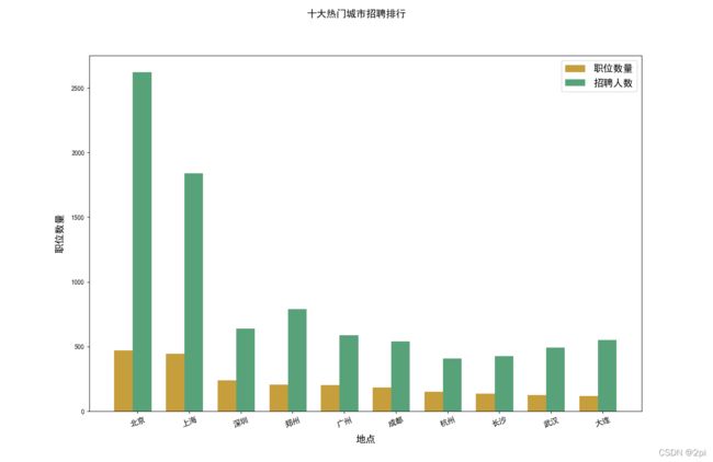
十大热门城市排行
#*****************************十大热门城市招聘排行**************************
#*****************************十大热门城市招聘排行**************************
import matplotlib.pyplot as plt
import numpy as np

plt.rcParams['font.sans-serif'] = 'SimHei'
#设置正常显示字符
plt.rcParams['axes.unicode_minus'] = False
job_data = [470, 443, 240, 207, 202, 184, 151, 136, 124, 118]#供给
how_many = [2620,1841,640,790,589,538,408,425,493,550]#需求
labels =["北京","上海","深圳","郑州","广州","成都","杭州","长沙","武汉","大连"]
xlocation =  np.linspace(1, len(job_data) * 0.6, len(job_data)) #len(data个序列)
# print(xlocation)
height01 = job_data
height02 = how_many
width = 0.2
color01='darkgoldenrod'
color02 = 'seagreen'
# 画柱状图
fig = plt.figure('十大热门城市招聘排行',figsize=(15,10)) #指定了图的名称 和画布的大小
fig.tight_layout()
#ax1 = fig.add_subplot(221) #2X2 中的第一个子图
plt.suptitle('十大热门城市招聘排行', fontsize=15) # 添加图标题
#画图
rects01 = plt.bar(xlocation, height01, width = 0.2, color=color01,linewidth=1,alpha=0.8)
rects02 = plt.bar(xlocation+0.2,height02 ,width = 0.2, color=color02,linewidth=1,alpha=0.8)
#添加x轴标签
plt.xticks(xlocation+0.15,labels, fontsize=12 ,rotation = 20)  # rotation x轴标签旋转的角度
# 横纵坐标分别代表什么
plt.xlabel(u'地点', fontsize=15, labelpad=10)
plt.ylabel(u'职位数量', fontsize=15, labelpad=10)
plt.legend((rects01,rects02),( u'职位数量',u'招聘人数'), fontsize=15)  # 图例
plt.show()
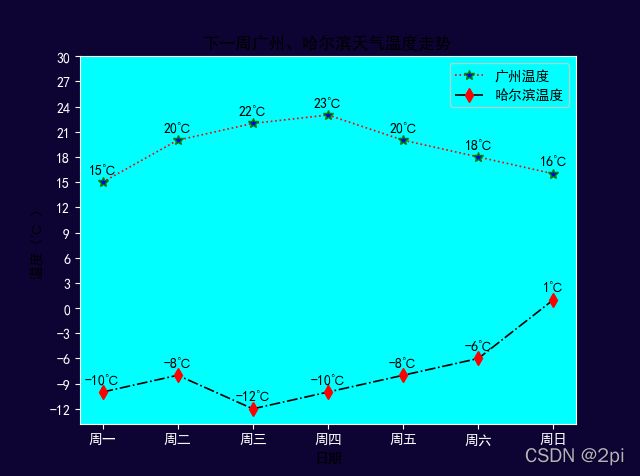
天气温度表
# 导包
import matplotlib.pyplot as plt
import numpy as np

# 1、创建画布
# figsize : 画布大小,元组形式,可以给定画布的宽、高
# dpi :像素大小
# 返回值:画布对象
plt.figure()

# 默认不支持中文 ---修改RC参数
plt.rcParams['font.sans-serif'] = 'SimHei'
# 增加字体之后变得不支持负号,需要修改RC参数让其继续支持负号
plt.rcParams['axes.unicode_minus'] = False
# 如果需要更改画布颜色、坐标轴字体颜色、坐标轴、边框颜色等,也可以去更改 rcParams 参数
# x轴字体颜色
plt.rcParams['xtick.color'] = '#FFFFFF'
# y轴字体颜色
plt.rcParams['ytick.color'] = '#FFFFFF'
# 背景颜色
plt.rcParams['axes.facecolor'] = '#00FFFF'

# 边框颜色
plt.rcParams['axes.edgecolor'] = '#FFFFFF'
# 保存的画布的颜色
plt.rcParams['savefig.facecolor'] = '#0D0434'
# 2、绘图及修饰
# 以下一周某城市的天气温度走势 来理解绘图流程
# 折线图
# 折线图 ---要素:点  --->坐标(x,y)
# (x1,y1) (x2,y2) ...(xn,yn) ---n个点的坐标
# 注意:在绘制折线图时,要求单独传入横坐标、纵坐标,绘制的时候会一一对应
#  准备 横轴数组 ---周一、周二、....、周日
# 注意:如果横轴为中文,绘制的时候,需要用序号来代替中文,后续再替换过来
x = np.arange(1, 8)
#  准备 纵轴数组
y1 = np.array([15, 20, 22, 23, 20, 18, 16])
y2 = np.array([-10, -8, -12, -10, -8, -6, 1])
# 绘制折线图
# 如果想要一张图中绘制多条折线,那么只需要多绘制几次就可以了
# color : 线的颜色
# linestyle : 线的样式
# linewidth: 线的宽度
# marker :点的样式
# markersize :点的大小
# markerfacecolor:点的填充颜色
# markeredgecolor:点的边缘颜色
plt.plot(x, y1, color='r', linestyle=':', linewidth=1.2, marker="*", markersize=7, markerfacecolor='b',
         markeredgecolor='g')
plt.plot(x, y2, color='k', linestyle='-.', linewidth=1.2, marker="d", markersize=7, markerfacecolor='r',
         markeredgecolor='r')
# 增加标题
plt.title('下一周广州、哈尔滨天气温度走势')
# 设置横轴名称
plt.xlabel('日期')
# 设置纵轴名称
plt.ylabel('温度(℃ )')
# 修改横轴刻度
# 注意:如果是需要将刻度修改为中文,传递2个参数
# 参数1 : 序号
# 参数2 :设置的中文刻度
xticks = ['周一', '周二', '周三', '周四', '周五', '周六', '周日']
plt.xticks(x, xticks)
# 修改纵轴刻度
# 注意:如果只是重新设置刻度范围,只需要传递1个参数
# 参数:新的刻度范围
yticks = np.arange(-12, 33, 3)
plt.yticks(yticks)
# 增加图例
# loc :表示 图例的设置位置
plt.legend(['广州温度', '哈尔滨温度'], loc=0)
# 进行标注
# plt.text --->每次只能标记一个点
# 循环标注
for i, j in zip(x, y1):
    # 参数1 : 标注位置的横坐标
    # 参数2 : 标注位置的纵坐标
    # 参数3 : 标注的内容,字符串
    plt.text(i, j + 1, '%d℃' % j, horizontalalignment='center')
for i, j in zip(x, y2):
    # 参数1 : 标注位置的横坐标
    # 参数2 : 标注位置的纵坐标
    # 参数3 : 标注的内容,字符串
    plt.text(i, j + 1, '%d℃' % j, horizontalalignment='center')
# 保存图片
# plt.savefig('./下一周广州哈尔滨天气温度走势.png')

# 3、图形展示
plt.show()
#***************************************************************************
#***************************************************************************
subplot
#===============
#定义子图
#===============
# 导包
'''
import matplotlib.pyplot as plt
import numpy as np
x = np.linspace(0, 2, 100)
y1 = x
y2 = x**2
y3 = x**3
fig, ax = plt.subplots() # Create a figure and an axes.
ax.plot(x, y1, label='linear') # Plot some data on the axes.
ax.plot(x, y2, label='quadratic') # Plot more data on the axes...
ax.plot(x, y3, label='cubic') # ... and some more.
ax.set_xlabel('x label') # Add an x-label to the axes.
ax.set_ylabel('y label') # Add a y-label to the axes.
ax.set_title("Simple Plot") # Add a title to the axes.
ax.legend() # Add a legend.
plt.show()
'''
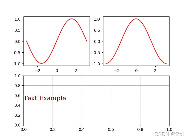
import matplotlib.pyplot as plt
import numpy as np
fig = plt.figure()
ax1 = fig.add_subplot(221)#221 表示两行两列的第一个位置.它的工作原理是使用 行数( numRows )、列数( numCols )和绘图编号( plotNum )。
x = np.linspace(-np.pi, np.pi, 201)
y1=np.sin(x)
ax1.plot(x,y1 ,color='r')
ax2 = fig.add_subplot(222)#221 表示两行两列的第一个位置.它的工作原理是使用 行数( numRows )、列数( numCols )和绘图编号( plotNum )。
x = np.linspace(-np.pi, np.pi, 201)
y1=np.cos(x)
ax2.plot(x,y1 ,color='r')
ax3 = fig.add_subplot(212)#212 是两行一列的第二个位置
font_dict = {'family':'serif','color':'darkred','size':15}
ax3.text(0,0.5,'Text Example', fontdict=font_dict)#向图形添加文本
ax3.grid(True)
plt.show()
figure
'''
★figure(num=None, figsize=None, dpi=None, facecolor=None, edgecolor=None, frameon=True,
★FigureClass=, clear=False, **kwargs) # returns:返回一个图形
★参数详解:
★1、num : integer or string, optional, default: None
★默认None则创建一个图形,图形标号自动递增;
★如果提供了一个数,并且与已有id重合,激活它并返回索引;
★如果提供的数不存在,创建并返回。
★如果提供的是str,就返回到窗口标题上。
★提供的num参数存放在figure对象的number属性里
★2、figsize : (float, float), optional, default: None
★英寸单位的宽和高,默认为 rcParams["figure.figsize"] = [6.4, 4.8].
★3、dpi : integer, optional, default: None
★图像的分辨率,默认 rcParams["figure.dpi"] = 100.
★4、facecolor :
★背景颜色,默认 rcParams["figure.facecolor"] = 'w'.
★5、edgecolor :
★边的颜色,默认 rcParams["figure.edgecolor"] = 'w'.
★6、frameon : bool, optional, default: True
★是否显示边框, 如果设为False, 禁止绘制图形边框.
★7、FigureClass : subclass of Figure
★Optionally use a custom Figure instance.
★8、clear : bool, optional, default: False
★如果是True,并且图形已经存在,则清楚该图形
★如果创建了很多张图片,一定要采用pyplot.close()关闭不用的图片,避免内存占用过大。
'''
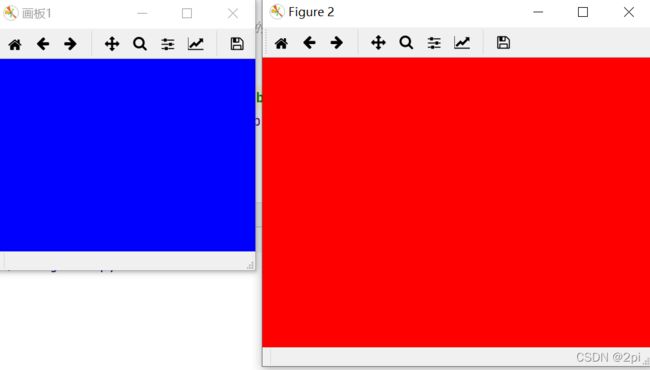
import matplotlib.pyplot as plt
fig1 = plt.figure('画板1', figsize=(4,3), facecolor='blue')
fig2 = plt.figure(2, figsize=(4,3), facecolor='r', dpi=150)
plt.show()
axes
'''
************************ axes *********************
★因为在绘制子图过程中,对于每一个子图的不同设置,ax 可以直接实现对于单个子图的设定,因此掌握必要的 ax 设置命令尤为重要!
★参数传递,返回新的 AXES 对象:
★matplotlib.axes.Axes(fig,rect,*,facecolor = None,frameon = True,sharex = None,
★sharey = None,label ='',xscale = None,yscale = None,box_aspect = None,** kwargs)
★一、绘图
★1、基本
★Axes.plot 将y对x绘制为线条或标记。
★Axes.errorbar 将y与x绘制为带有错误栏的线和/或标记。
★Axes.scatter y与y的散点图
★Axes.plot_date 绘制强制轴以将浮点数视为日期的图。
★Axes.step 绘制一个阶梯图。
★Axes.loglog 在x轴和y轴上使用对数缩放绘制图。
★Axes.semilogx 在x轴上绘制具有对数比例的图。
★Axes.semilogy 用y轴上的对数比例绘制图。
★Axes.fill_between 填充两条水平曲线之间的区域。
★Axes.fill_betweenx 填充两条垂直曲线之间的区域。
★Axes.bar 绘制条形图。
★Axes.barh 绘制水平条形图。
★Axes.bar_label 标记条形图。
★Axes.stem 创建一个茎图。
★Axes.eventplot 在给定位置绘制相同的平行线。
★Axes.pie 绘制饼图。
★Axes.stackplot 绘制堆积面积图。
★Axes.broken_barh 绘制矩形的水平序列。
★Axes.vlines 在每个x上绘制从ymin到ymax的垂直线。
★Axes.hlines 在从xmin到xmax的每个y上绘制水平线。
★Axes.fill 绘制填充的多边形。
★2、跨度,光谱,填充,2D数组。
★Axes.axhline 在轴上添加一条水平线。
★Axes.axhspan 在轴上添加水平跨度(矩形)。
★Axes.axvline 在轴上添加一条垂直线。
★Axes.axvspan 在轴上添加垂直跨度(矩形)。
★Axes.axline 添加无限长的直线。
★Axes.acorr 绘制x的自相关。
★Axes.angle_spectrum 绘制角度光谱。
★Axes.cohere 绘制x和y之间的相干性。
★Axes.csd 绘制交叉光谱密度。
★Axes.magnitude_spectrum 绘制幅度谱。
★Axes.phase_spectrum 绘制相位谱。
★Axes.psd 绘制功率谱密度。
★Axes.specgram 绘制频谱图。
★Axes.xcorr 绘制x和y之间的互相关。
★Axes.clabel 标注等高线图。
★Axes.contour 绘制轮廓线。
★Axes.contourf 绘制填充轮廓。
★Axes.imshow 将数据显示为图像,即在2D常规栅格上。
★Axes.matshow 将2D矩阵或数组的值绘制为颜色编码的图像。
★Axes.pcolor 创建具有非规则矩形网格的伪彩色图。
★Axes.pcolorfast 创建具有非规则矩形网格的伪彩色图。
★Axes.pcolormesh 创建具有非规则矩形网格的伪彩色图。
★Axes.spy 绘制2D阵列的稀疏模式。
★二、坐标轴
★1、外部
★Axes.axis 获取或设置某些轴属性的便捷方法。
★Axes.set_axis_off 关闭x和y轴。
★Axes.set_axis_on 开启x和y轴。
★Axes.set_frame_on 设置是否绘制轴矩形补丁。
★Axes.get_frame_on 获取是否绘制了轴矩形补丁。
★Axes.set_axisbelow 设置轴刻度线和网格线是在图上方还是下方。
★Axes.get_axisbelow 获取轴刻度和网格线是在图上方还是下方。
★Axes.grid 增加网格线。
★Axes.get_facecolor 获取轴的表面色。
★Axes.set_facecolor 设置轴的表面色。
★2、轴的范围、方向、标签、标题、图例
★Axes.invert_xaxis 反转x轴。
★Axes.xaxis_inverted 返回x轴是否沿“反”方向定向。
★Axes.invert_yaxis 反转y轴。
★Axes.yaxis_inverted 返回y轴是否沿“反”方向定向。
★Axes.set_xlim 设置x轴范围。
★Axes.get_xlim 返回x轴范围。
★Axes.set_ylim 设置y轴范围。
★Axes.get_ylim 返回y轴范围。
★Axes.set_xbound 设置x轴的上下边界。
★Axes.get_xbound 以递增顺序返回x轴的上下边界。
★Axes.set_ybound 设置y轴的上下边界。
★Axes.get_ybound 以递增顺序返回y轴的上下边界。
★Axes.set_xlabel 设置x轴的标签。
★Axes.get_xlabel 获取xlabel文本字符串。
★Axes.set_ylabel 设置y轴的标签。
★Axes.get_ylabel 获取ylabel文本字符串。
★Axes.set_title 为轴设置标题。
★Axes.get_title 获取轴标题。
★Axes.legend 在轴上放置一个图例。
★Axes.get_legend 返回Legend实例,如果未定义图例,则返回None。
★Axes.get_legend_handles_labels 返回图例的句柄和标签
★Axes.set_xscale 设置x轴比例。
★Axes.get_xscale 返回xaxis的比例尺(以str表示)。
★Axes.set_yscale 设置y轴比例。
★Axes.get_yscale 返回yaxis的比例尺(以str表示)。
★Axes.set_xticks 设置xaxis的刻度位置。
★Axes.get_xticks 返回数据坐标中xaxis的刻度位置。
★Axes.set_xticklabels 使用字符串标签列表设置xaxis的标签。
★Axes.get_xticklabels 获取xaxis的刻度标签。
★Axes.get_xmajorticklabels 返回xaxis的主要刻度标签,作为的列表Text。
★Axes.get_xminorticklabels 返回xaxis的次刻度标签,作为的列表Text。
★Axes.get_xgridlines 返回xaxis的网格线作为Line2Ds的列表。
★Axes.get_xticklines 以x的列表形式返回xaxis的刻度线Line2D。
★Axes.xaxis_date 设置轴刻度和标签,以将沿x轴的数据视为日期。
★Axes.set_yticks 设置yaxis的刻度位置。
★Axes.get_yticks 返回数据坐标中yaxis的刻度位置。
★Axes.set_yticklabels 使用字符串标签列表设置yaxis标签。
★Axes.get_yticklabels 获取yaxis的刻度标签。
★Axes.get_ymajorticklabels 返回yaxis的主要刻度标签,作为的列表Text。
★Axes.get_yminorticklabels 返回yaxis的次要刻度标签,作为的列表Text。
★Axes.get_ygridlines 返回yaxis的网格线作为Line2Ds的列表。
★Axes.get_yticklines 返回yaxis的刻度线作为Line2Ds的列表。
★Axes.yaxis_date 设置轴刻度和标签,以将沿y轴的数据视为日期。
★Axes.minorticks_off 去除轴上的细小滴答声。
★Axes.minorticks_on 在轴上显示较小的刻度。
★Axes.ticklabel_format 配置ScalarFormatter默认情况下用于线性轴。
★Axes.tick_params 更改刻度线,刻度线标签和网格线的外观。
★
★三、投影
★Axes.get_xaxis_transform 获取用于绘制x轴标签,刻度线和网格线的转换。
★Axes.get_yaxis_transform 获取用于绘制y轴标签,刻度线和网格线的转换。
★Axes.get_data_ratio 返回缩放数据的纵横比。
'''
import numpy as np
import matplotlib.pyplot as plt
plt.rcParams['font.sans-serif']=['SimHei'] #用来正常显示中文标签
plt.rcParams['axes.unicode_minus']=False #用来正常显示负号
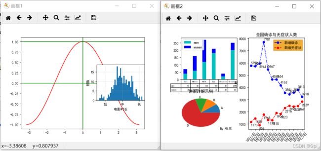
fig1 = plt.figure('画框1')
fig2 = plt.figure('画框2')
ax1 = fig1.add_subplot(1,1,1)#子图,axes
x = np.linspace(-np.pi, np.pi, 201)
y1=np.cos(x)
ax1.plot(x,y1 ,color='r')
ax1.axhline(1, color ='green', lw = 2, alpha = 0.75)
ax1.axhline(0, color ='green', lw = 2, alpha = 0.75)
ax1.axvline(0, color ='green', lw = 2, alpha = 0.75)
ax2 = fig2.add_subplot(221) #mxn,编号(上到下,左到右)
data_m=(40,60,120,180,20,200)
data_f=(30,100,150,30,20,50)
index=np.arange(6)
width=0.4
ax2.bar(index, data_m, width,color='c', label='men')
ax2.bar(index, data_f,width, color='b' , bottom=data_m, label='women')
ax2.set_xticks([])
ax2.legend()
#添加表
data=(data_m,data_f)
rows=('men','women')
columns=('Taxi','Metro','Walk','Bus','Bicycle','Driving')
ax2.table(cellText=data,rowLabels=rows,colLabels=columns)
ax3 = fig1.add_axes((0.6,0.35,0.3,0.3))
#数据
movies_time = [131,98, 125, 131, 124, 139, 131, 117, 128, 108, 135, 138, 131, 102, 107,114,\
119, 128, 121, 142, 127, 130, 124, 101, 110, 116, 117, 110, 128, 128, 115, 99,136, 126,\
134, 95, 138, 117, 111,78, 132, 124, 113, 150, 110, 117, 86, 95, 144, 105, 126, 130,126,\
130, 126, 116, 123, 106, 112, 138, 123, 86, 101, 99, 136,123,117, 119, 105, 137, 123, 128,\
125, 104, 109, 134, 125, 127,105, 120, 107, 129, 116,108, 132, 103, 136, 118, 102, 120, 114,\
105, 115, 132, 145, 119, 121, 112, 139, 125,138, 109, 132, 134,156, 106, 117, 127, 144, 139,\
139, 119, 140, 83, 110, 102,123,107, 143, 115, 136, 118, 139, 123, 112, 118, 125, 109, 119,\
133,112, 114, 122, 109,106, 123, 116, 131, 127, 115, 118, 112, 135,115, 146, 137, 116, 103,\
144, 83, 123, 111, 110, 111, 100, 154,136, 100, 118, 119, 133, 134, 106, 129, 126, 110, 111,\
109, 141,120, 117, 106, 149, 122, 122, 110, 118, 127, 121, 114, 125, 126,114, 140, 103,130,\
141, 117, 106, 114, 121, 114, 133, 137, 92,121, 112, 146, 97, 137, 105, 98,117,112, 81, 97,\
139, 113,134, 106, 144, 110, 137, 137, 111, 104, 117, 100, 111,101, 110,105, 129, 137, 112,\
120, 113, 133, 112, 83, 94, 146, 133, 101,131, 116, 111, 84, 137, 115, 122, 106, 144, 109,\
123, 116, 111,111, 133, 150]
distance=2 #设置组距
groups_num=int((max(movies_time)-min(movies_time))/distance)
timegrade=['短','中','长']
ax3.hist(movies_time,bins=groups_num)
ax3.set_xticks([90,120,150])
ax3.set_xticklabels(timegrade)
ax3.grid(linestyle='--',alpha=0.5)
ax3.set_xlabel('电影时长')
ax3.set_ylabel('频数')
#ax4 = fig2.add_subplot(223)
ax4 = fig2.add_axes((0.1,0.1,0.3,0.3))
labels = 'A','B','C','D'
sizes = [10,10,10,70]
ax4.pie(sizes,labels=labels)
ax4.set_title("饼图详解示例")
ax4.text(1,-1.2,'By:张三')
ax5 = fig2.add_subplot(122)
#数据处理
date=list(range(1,14,1))
datelabel=[]
for i in date:
datelabel.append('3月'+str(i+10)+'日')
newdiag=[5759,5719,5944,7701,5467,4653,4654,4163,3551,3423,3563,3813,3218]
newasymptomatic=[1173,1455,906,1768,1338,1310,1904,1823,2316,2492,2432,2469,2829]
pl1,=ax5.plot(date,newdiag,'o-.b')
pl2,=ax5.plot(date,newasymptomatic,'o--r')
#每个点写文字
for i in range(len(date)):
if i==2:
ax5.text(date[i], newdiag[i]-350, str(newdiag[i]), ha='left')
ax5.text(date[i], newasymptomatic[i]-350, str(newasymptomatic[i]), ha='left')
else:
ax5.text(date[i], newdiag[i]+150, str(newdiag[i]), ha='left')
ax5.text(date[i], newasymptomatic[i]-350, str(newasymptomatic[i]), ha='left')
ax5.set_xticks(date)
ax5.set_xticklabels(datelabel,rotation=45)
ax5.legend([pl1, pl2], ["新增确诊", "新增无症状"], facecolor='#ee9900')
ax5.set_xlabel('日期')
ax5.set_ylabel('人数')
ax5.set_title('全国确诊与无症状人数')
plt.show()
共享x轴
#===============
#共享 X 轴
#===============
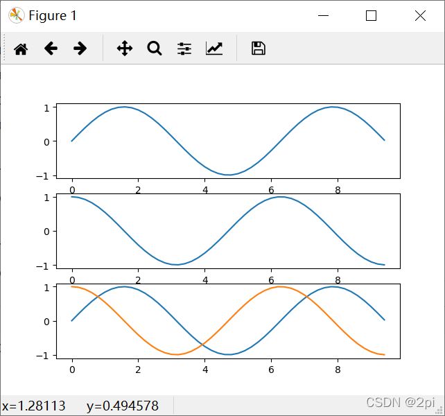
import numpy as np
import matplotlib.pyplot as plt
x = np.arange(0, 3 * np.pi, 0.2)
y_sin = np.sin(x) # 计算正弦
y_cos = np.cos(x) # 计算余弦
ax1=plt.subplot(3, 1, 1)
plt.plot(x, y_sin)
ax2=plt.subplot(312)
plt.plot(x, y_cos)
ax3=plt.subplot(313,sharex=ax1)
plt.plot(x, y_sin,x, y_cos)
plt.show()
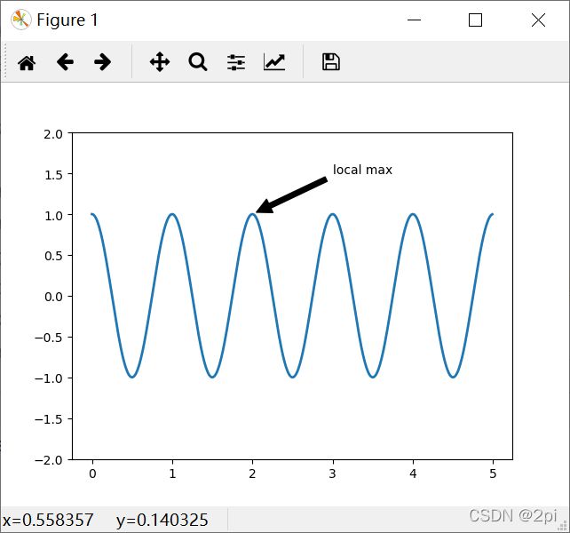
annotate text
'''
    ★Axes.annotate(s, xy, *args, **kwargs)

    ★s:注释文本的内容
    ★xy:被注释的坐标点,二维元组形如(x,y)
    ★xytext:注释文本的坐标点,也是二维元组,默认与xy相同
    ★xycoords:被注释点的坐标系属性,允许输入的值如下:
    属性值         含义
    'figure points' 以绘图区左下角为参考,单位是点数
    'figure pixels' 以绘图区左下角为参考,单位是像素数
    'figure fraction' 以绘图区左下角为参考,单位是百分比
    'axes points' 以子绘图区左下角为参考,单位是点数(一个figure可以有多个axex,默认为1个)
    'axes pixels' 以子绘图区左下角为参考,单位是像素数
    'axes fraction' 以子绘图区左下角为参考,单位是百分比
    'data'         以被注释的坐标点xy为参考 (默认值)
    'polar'         不使用本地数据坐标系,使用极坐标系
        ★textcoords :注释文本的坐标系属性,默认与xycoords属性值相同,也可设为不同的值。除了允许输
    入xycoords的属性值,还允许输入以下两种:
    属性值         含义
    'offset points' 相对于被注释点xy的偏移量(单位是点)
    'offset pixels' 相对于被注释点xy的偏移量(单位是像素)
        ★arrowprops:箭头的样式,dict(字典)型数据,如果该属性非空,则会在注释文本和被注释点之间
    画一个箭头。
    如果不设置'arrowstyle' 关键字,则允许包含以下关键字:
    关键字         说明
    width         箭头的宽度(单位是点)
    headwidth         箭头头部的宽度(点)
    headlength         箭头头部的长度(点)
    shrink         箭头两端收缩的百分比(占总长)
        ★如果设置了‘arrowstyle’关键字,以上关键字就不能使用。允许的值有:
    箭头的样式          属性
    '-'                  None
    '->'         head_length=0.4,head_width=0.2
    '-['         widthB=1.0,lengthB=0.2,angleB=None
    '|-|'         widthA=1.0,widthB=1.0
    '-|>'         head_length=0.4,head_width=0.2
    '<-'         head_length=0.4,head_width=0.2
    '<->'         head_length=0.4,head_width=0.2
    '<|-'         head_length=0.4,head_width=0.2
    '<|-|>'         head_length=0.4,head_width=0.2
    'fancy'         head_length=0.4,head_width=0.4,tail_width=0.4
    'simple'         head_length=0.5,head_width=0.5,tail_width=0.2
    'wedge'         tail_width=0.3,shrink_factor=0.5
        ★FancyArrowPatch的关键字包括:
    Key                 Description
    arrowstyle         箭头的样式
    connectionstyle 连接线的样式
    relpos         箭头起始点相对注释文本的位置,默认为 (0.5, 0.5),即文本的中心,
                        (0,0)表示左下角,(1,1)表示右上角
    patchA 箭头起点处的图形(matplotlib.patches对象),默认是注释文字框
    patchB 箭头终点处的图形(matplotlib.patches对象),默认为空
    shrinkA 箭头起点的缩进点数,默认为2
    shrinkB 箭头终点的缩进点数,默认为2
    mutation_scale default is text size (in points)
    mutation_aspect default is 1.
    annotation_clip : 布尔值,可选参数,默认为空。设为True时,只有被注释点在子图区内时才绘制注
    释;设为False时,无论被注释点在哪里都绘制注释。仅当xycoords为‘data’时,默认值空相当于True。

'''
import numpy as np
import matplotlib.pyplot as plt

ax = plt.subplot(111)
t = np.arange(0.0, 5.0, 0.01)
s = np.cos(2*np.pi*t)
line, = plt.plot(t, s, lw=2)
plt.annotate('local max', xy=(2, 1), xytext=(3, 1.5),arrowprops=dict(facecolor='black', shrink=0.05),)
plt.ylim(-2, 2)
plt.show()
openfile
'''
**************** 打开文件 ****************
    要以读文件的模式打开一个文件对象,使用Python内置的open() 函数,传入文件名和标示符:

    open(file_name[,access_mode][,buffering][,encoding=None][,errors=None][,newline=None][,closefd=True][,opener=None])

    file_name:一个包含了你要访问的文件路径及文件名称的字符串值。尽量使用绝对路径
    access_mode:打开文件的方式:这个参数是非强制的,默认文件访问模式为只读(r)
        操作    说明
        r       以只读方式打开文件。文件的指针将会放在文件的开头。这是默认模式。
        w       以写方式打开,
        a       以追加模式打开 (从 EOF 开始, 必要时创建新文件)
        r+      以读写模式打开
        w+      以读写模式打开 (参见 w )
        a+      以读写模式打开 (参见 a )
        rb      以二进制读模式打开
        wb      以二进制写模式打开 (参见 w )
        ab      以二进制追加模式打开 (参见 a )
        rb+     以二进制读写模式打开 (参见 r+ )
        wb+     以二进制读写模式打开 (参见 w+ )
        ab+     以二进制读写模式打开 (参见 a+ )
            buffering:先写到缓存中
        如果buffering的值被设置为0,就不会有寄存;如果值为1,访问文件时会缓存行;如果值位大于1
        的整数,表明了这就是寄存区的缓冲大小;如果取负值,寄存区的缓冲大小则为系统默认。
        该参数也是非强制性的。

        encoding: 一般使用utf-8
        errors: 报错级别
        newline: 区分换行符
        closefd: 传入的file参数类型
        opener: 可调用对象传递为* opener *来使用自定义的opener
            该语句表示返回的File_object是一个指向文件的指针(一个文件对象)文件句柄。比如:
        fp=open('D:/TEACH/Undergraduate/数据可视化/Python可视化/Sample2.txt', 'r')
            通过open获取到的文件句柄可以对文件作的操作

        (1)fp.closed
            判断文件是否已经关闭。返回true如果文件已被关闭,否则返回false
        (2)fp.mode
            输出读写模式。返回被打开文件的访问模式。
        (3)fp.name:
            返回文件的名称。
        (4) fp.softspace
            如果用print输出后,是否跟一个空格符,false不打印,true则打印。
        (5)fp.close()
            刷新缓冲区里任何还没写入的信息,并关闭该文件,这之后便不能再进行写入。
        (6)flush()
            把缓冲区中的内容持久化写到磁盘里
            缓存区写满的情况,系统会自动调用flush()方法。
        (7)next()
            把一个file用for...in file这样的循环遍历语句时,就是调用next()函数来实现。
            fr = open('28_1file.txt', 'r')
            fw = open('28_2file.txt', 'w')
            i=0
            while i<10:
                s = fr.read(1)
                print(s)
                fw.write(s)
                i+=1
            fr.close()
            fw.close()
        **************** with 语句 ****************

    但是每次都这么写实在太繁琐,所以,Python引入了with 语句来自动帮我们调用close() 方法:

    with open('D:/TEACH/Undergraduate/数据可视化/Python可视化/Sample1.txt', 'r') as f:
    print(f.read())

    with open('28_1file.txt', 'r') as f:
    s = f.read()
    print(f.read())


'''

f_name = '28_1file.txt'
data_time=[]
data_buy_amt=[]
data_buy_pri=[]
data_sal_amt=[]
data_sal_pri=[]
with open(f_name, 'r') as f:
    alllines=f.readlines()
    for line in alllines:
        line.strip()
        list_line=line.split('\t')
        len_list=len(list_line)
        for fieldi in range(2,len_list):
            if fieldi==2:
                data_time.append(int(list_line[fieldi]))
            if fieldi==7:
                data_buy_amt.append(int(list_line[fieldi]))
            if fieldi==8:
                data_buy_pri.append(float(list_line[fieldi]))
print(data_time)
print(data_buy_amt)
print(data_buy_pri)
import numpy as np
import matplotlib.pyplot as plt
plt.plot(data_buy_amt)
plt.show()
3d作图
'''
************************  3d画图  ************************
    ★在遇到三维数据时,三维图像能给我们对数据带来更加深入地理解。
    ★python的matplotlib库就包含了丰富的三维绘图工具。
    ★创建Axes3D主要有两种方式:
    ★一种是利用关键字projection='3d'来实现,
    ★另一种则是通过从mpl_toolkits.mplot3d导入对象Axes3D来实现,
    ★目的都是生成具有三维格式的对象Axes3D.
    ***********************  空间曲线  ***********************
    ★Axes3D.plot(self, xs, ys, *args, zdir=’z’, **kwargs)

    ★xs [1D array-like] x coordinates of vertices.
    ★ys [1D array-like] y coordinates of vertices.
    ★zs [scalar or 1D array-like] z coordinates of vertices; either one for all points
    ★or one for each point.
    ★zdir [{’x’, ’y’, ’z’}] When plotting 2D data, the direction to use as z (’x’, ’y’
    ★or ’z’); defaults to ’z’.
    ★**kwargs Other arguments are forwarded to matplotlib.axes.Axes.plot.
import numpy as np
import matplotlib.pyplot as plt
from mpl_toolkits.mplot3d import Axes3D

plt.rcParams['font.sans-serif']=['SimHei']
plt.rcParams['axes.unicode_minus'] = False

fig = plt.figure()
ax = plt.subplot(111, projection='3d')

t=np.linspace(0,13,100)
x=np.cos(t)
y=2*np.sin(t)
z=x*x+y*y

ax.plot3D(x,y,z)

plt.show()
'----------------------------------------------------------------------------------------------'
import numpy as np
import matplotlib as mpl
import matplotlib.pyplot as plt
from mpl_toolkits.mplot3d import Axes3D

mpl.rcParams['legend.fontsize'] = 20  # mpl模块载入的时候加载配置信息存储在rcParams变量中,rc_params_from_file()函数从文件加载配置信息

font = {
    'color': 'b',
    'style': 'oblique',
    'size': 20,
    'weight': 'bold'
}
fig = plt.figure(figsize=(16, 12))  #参数为图片大小
ax = plt.axes(projection='3d')  # get current axes,且坐标轴是3d的

# 准备数据
theta = np.linspace(-8 * np.pi, 8 * np.pi, 100)  # 生成等差数列,[-8π,8π],个数为100
z = np.linspace(-2, 2, 100)  # [-2,2]容量为100的等差数列,这里的数量必须与theta保持一致,因为下面要做对应元素的运算
r = z ** 2 + 1
x = r * np.sin(theta)  # [-5,5]
y = r * np.cos(theta)  # [-5,5]

ax.set_xlabel("X", fontdict=font)
ax.set_ylabel("Y", fontdict=font)
ax.set_zlabel("Z", fontdict=font)

ax.set_title("Line Plot", alpha=0.5, fontdict=font) #alpha参数指透明度transparent
ax.plot(x, y, z, label='parametric curve')
ax.legend(loc='upper right') #legend的位置可选:upper right/left/center,lower right/left/center,right,left,center,best等等

plt.show()

'''
'''
********************  meshgrid()函数  ********************
    ★np.meshgrid(*xi, **kwargs):函数常用于生成二维网格,比如图像的坐标点。
    ★Return coordinate matrices from coordinate vectors. 从坐标向量中返回坐标矩阵

    ★直观的例子
    ★二维坐标系中,X轴可以取三个值 1,2,3, Y轴可以取三个值 7,8, 请问可以获得多少个点的坐标?
    ★显而易见是 6 个:
    ★(1, 7) (2, 7) (3, 7)
    ★(1, 8) (2, 8) (3, 8)
'-----------------------------------------------------------------'
import numpy as np
x = np.array([1, 2, 3])#生成一位数组,其实也就是向量
y = np.array([7, 8])
matx,maty= np.meshgrid(x,y)#将两个一维数组变为二维矩阵
print(matx)
print(maty)
'''


'''
***********************  outer()函数  ***********************
    ★np.outer(a, b) 用来求外积的,非常直观,比矩阵相乘简单
    ★a,b是两个数组,如果a,b是高维数组,函数会自动将其flatten成1维
    ★a的长度是m,b的长度是n,外积的结果result是 m * n的数组

    ★np.outer([1,2,3],[4,5,6])
    ★np.outer([[1],[2],[3]],[4,5,6])
    ★上面两句运行结果都是
    ★array([[ 4, 5, 6],
    ★      [ 8, 10, 12],
    ★      [12, 15, 18]])
'''

'''
**********************  3D曲面  **********************
    ★ax.plot_surface(self, X, Y, Z, *args, norm=None, vmin=None, vmax=None, lightsource=None, **kwargs)

    ★曲面图和线框图类似,它们都是描述三维空间中的曲面的。区别在于:曲面图中的面是着色的。

    ★By default it will be colored in shades of a solid color, but it also supports color mapping
    ★by supplying the cmap argument.

    ★X, Y, Z [2d arrays] Data values.
    ★rcount, ccount [int] Maximum number of samples used in each direction.
    ★If the input data is larger, it will be downsampled (by slicing) to these
    ★numbers of points. Defaults to 50.
    ★New in version 2.0.
    ★rstride, cstride [int] Downsampling stride in each direction. These arguments
    ★are mutually exclusive with rcount and ccount. If only one of
    ★rstride or cstride is set, the other defaults to 10.
    ★’classic’ mode uses a default of rstride = cstride = 10 instead of the new
    ★default of rcount = ccount = 50.
    ★color [color-like] Color of the surface patches.
    ★cmap [Colormap] Colormap of the surface patches.
    ★facecolors [array-like of colors.] Colors of each individual patch.
    ★norm [Normalize] Normalization for the colormap.
    ★vmin, vmax [float] Bounds for the normalization.
    ★shade [bool] Whether to shade the facecolors. Defaults to True. Shading is
    ★always disabled when cmap is specified.
    ★lightsource [LightSource] The lightsource to use when shade is True.
    ★**kwargs Other arguments are forwarded to Poly3DCollection.
    ★matplotlib内置的颜色图:

    ★1)Accent, Blues, BrBG, BuGn, BuPu, CMRmap, Dark2, GnBu, Greens, Greys,
    ★OrRd, Oranges, PRGn, Paired, Pastel1, Pastel2, PiYG, PuBu, PuBuGn, PuOr,
    ★PuRd, Purples, RdBu RdGy, RdPu, RdYlBu, RdYlGn, Reds, Set1, Set2, Set3,
    ★Spectral, Wistia, YlGn, YlGnBu, YlOrBr, YlOrRd
    ★2)afmhot, autumn, binary, bone, brg bwr, cividis, cool, coolwarm,
    ★copper, cubehelix, flag, gist_earth, gist_gray, gist_heat, gist_ncar
    ★gist_rainbow, gist_stern, gist_yarg, gnuplot, gnuplot2, gray, hot,
    ★hsv, inferno, jet, magma, nipy_spectral, ocean, pink, plasma, prism,
    ★rainbow, seismic, spring, summer, tab10, tab20, tab20b, tab20c, terrain,
    ★twilight, twilight_shifted, viridis, winter
---------------------------------------------------------------------
import numpy as np
import matplotlib.pyplot as plt
from mpl_toolkits.mplot3d import Axes3D
fig = plt.figure()
ax = fig.add_subplot(111, projection='3d')
# Make data
u = np.linspace(0, 2 * np.pi, 100)
v = np.linspace(0, np.pi, 100)
x = 10 * np.outer(np.cos(u), np.sin(v))
y = 10 * np.outer(np.sin(u), np.sin(v))
z = 10 * np.outer(np.ones(np.size(u)), np.cos(v))
# Plot the surface
ax.plot_surface(x, y, z, cmap='rainbow')
plt.show()
----------------------------------------------------------------------------
import matplotlib.pyplot as plt
import numpy as np
from matplotlib import cm
from mpl_toolkits.mplot3d import Axes3D

fig = plt.figure()
ax = fig.gca(projection='3d')

x = np.arange(-10, 10, 0.1)
y = np.arange(-5, 5, 0.1)
X, Y = np.meshgrid(x, y)
Z = np.add(-np.power(X, 2), np.power(Y, 2))

surf = ax.plot_surface(X, Y, Z, cmap=cm.gist_rainbow)
#这里通过cmap=cm.gist_rainbow指定了曲面的颜色。

fig.colorbar(surf, shrink=0.5, aspect=5)
#通过 fig.colorbar(surf, shrink=0.5, aspect=5)添加了一个色彩条。
#shrink指定了色彩条与图形高度的比例,aspect指定了色彩条本身的长宽比。

plt.show()
---------------------------------------------------------------------------------
import matplotlib.pyplot as plt  # 绘图用的模块
from mpl_toolkits.mplot3d import Axes3D  # 绘制3D坐标的函数
import numpy as np


def fun(x, y):
    return np.power(x, 2) + np.power(y, 2)


fig = plt.figure()
ax = fig.add_subplot(111, projection='3d')

X = np.arange(-2, 2, 0.1)
Y = np.arange(-2, 2, 0.1)  # 创建了从-2到2,步长为0.1的arange对象

X, Y = np.meshgrid(X, Y)
Z = fun(X, Y)
plt.title("This is main title")  # 总标题
# ax.plot_wireframe(X, Y, Z, rstride=1, cstride=2)
ax.plot_surface(X, Y, Z, rstride=1, cstride=1, cmap=plt.cm.coolwarm)  # 用取样点(x,y,z)去构建曲面

ax.set_xlabel('x label', color='r')
ax.set_ylabel('y label', color='g')
ax.set_zlabel('z label', color='b')  # 给三个坐标轴注明
plt.show()

'''
'''
    ★等高线顾名思义,就是描述高度相等的线。
    ★等高线通常伴随主体图形一起出现,辅助我们观察主体图形的一些特性。

    ★Axes3D.contour(self, X, Y, Z, *args, extend3d=False, stride=5,
                     zdir=’z’, offset=None,**kwargs)

    ★X, Y, Z [array-likes] Input data.
    ★extend3d [bool] Whether to extend contour in 3D; defaults to False.
    ★stride [int] Step size for extending contour.
    ★zdir [{’x’, ’y’, ’z’}] The direction to use; defaults to ’z’.
    ★offset [scalar] If specified, plot a projection of the contour lines at this position
    ★in a plane normal to zdir
    ★*args, **kwargs Other arguments are forwarded to matplotlib.axes.Axes.
    ★contour.
import matplotlib.pyplot as plt
import numpy as np
from matplotlib import cm
from mpl_toolkits.mplot3d import Axes3D

fig = plt.figure()
ax = fig.gca(projection='3d')

x = np.arange(-10, 10, 0.1)
y = np.arange(-10, 10, 0.1)
X, Y = np.meshgrid(x, y)

Z = np.add(-np.power(X, 4), np.power(Y, 4))

ax.set_xlabel("X")
ax.set_ylabel("Y")

surf = ax.plot_surface(X, Y, Z, cmap=cm.gist_rainbow, alpha=0.3)
# surf = ax.plot_surface(X, Y, Z, cmap='gist_gray')
wiref=ax.plot_wireframe(X, Y, Z, alpha=0.1)
ax.contour(X, Y, Z, linewidths=2)
plt.show()
'''
'''
**********************  3D 线框图  **********************
    ★Axes3D.plot_wireframe(self, X, Y, Z, *args, **kwargs)

    ★X, Y, Z [2d arrays] Data values.
    ★rcount, ccount [int] Maximum number of samples used in each direction.
    ★If the input data is larger, it will be downsampled (by slicing) to these
    ★numbers of points. Setting a count to zero causes the data to be not
    ★sampled in the corresponding direction, producing a 3D line plot rather
    ★than a wireframe plot. Defaults to 50.
    ★New in version 2.0.
    ★rstride, cstride [int] Downsampling stride in each direction. These arguments
    ★are mutually exclusive with rcount and ccount. If only one of
    ★rstride or cstride is set, the other defaults to 1. Setting a stride to zero
    ★causes the data to be not sampled in the corresponding direction, producing
    ★a 3D line plot rather than a wireframe plot.
    ★’classic’ mode uses a default of rstride = cstride = 1 instead of the new
    ★default of rcount = ccount = 50.
    ★**kwargs Other arguments are forwarded to Line3DCollection.
---------------------------------------------------------------------------------------
import matplotlib.pyplot as plt
import numpy as np
from mpl_toolkits.mplot3d import Axes3D

fig = plt.figure()
ax = fig.gca(projection='3d')

x = np.arange(-10, 10, 0.1)
y = np.arange(-10, 10, 0.1)
X, Y = np.meshgrid(x, y)
Z = np.add(-np.power(X, 3), np.power(Y, 4))#z=-x^3+y^4,-10

'''
**********************  3D 散点图  **********************
    ★Axes3D.scatter(self, xs, ys, zs=0, zdir=’z’, s=20, c=None, depthshade=True, *args,**kwargs)

    ★xs, ys [array-like] The data positions.
    ★zs [float or array-like, optional, default: 0] The z-positions. Either an array
    ★of the same length as xs and ys or a single value to place all points in the same plane.
    ★zdir [{’x’, ’y’, ’z’, ’-x’, ’-y’, ’-z’}, optional, default: ’z’] The axis direction for
    ★the zs. This is useful when plotting 2D data on a 3D Axes. The data must
    ★be passed as xs, ys. Setting zdir to ’y’ then plots the data to the x-z-plane.

    ★s [scalar or array-like, optional, default: 20] The marker size in points**2.
    ★Either an array of the same length as xs and ys or a single value to make
    ★all markers the same size.
    ★c [color, sequence, or sequence of colors, optional] The marker color. Possible
    ★values:
    ★• A single color format string.
    ★• A sequence of colors of length n.
    ★• A sequence of n numbers to be mapped to colors using cmap and norm.
    ★• A 2-D array in which the rows are RGB or RGBA.

    ★depthshade [bool, optional, default: True] Whether to shade the scatter
    ★markers to give the appearance of depth. Each call to scatter() will
    ★perform its depthshading independently.
    ★**kwargs All other arguments are passed on to scatter.
-----------------------------------------------------------------------------------
import matplotlib.pyplot as plt
import numpy as np
from mpl_toolkits.mplot3d import Axes3D

fig = plt.figure()
ax = fig.gca(projection='3d')

count = 100
range = 100
xs = np.random.rand(count) * range
ys = np.random.rand(count) * range
zs = np.random.rand(count) * range

ax.scatter(xs, ys, zs, s=zs, c=zs)

ax.set_xlabel('X Label')
ax.set_ylabel('Y Label')
ax.set_zlabel('Z Label')

plt.show()
-----------------------------------------------------------------------------------------
import numpy as np
import matplotlib.pyplot as plt
from mpl_toolkits.mplot3d import axes3d

fig = plt.figure()#创建一个绘图对象
ax1 = fig.add_subplot(211, projection='3d')#用这个绘图对象创建一个Axes对象(有3D坐标)
ax2 = fig.add_subplot(212, projection='3d')
#ax1 = plt.subplot(111, projection='3d')

x = [1,2,3,4,5,6,7,8,9,10]
y = [5,6,7,8,2,5,6,3,7,2]
z = [1,2,6,3,2,7,3,3,7,2]

x2 = [-1,-2,-3,-4,-5,-6,-7,-8,-9,-10]
y2 = [-5,-6,-7,-8,-2,-5,-6,-3,-7,-2]
z2 = [1,2,6,3,2,7,3,3,7,2]

ax1.scatter(x, y, z, c='g', marker='o')
ax2.scatter(x2, y2, z2, c ='r', marker='o')

ax1.set_xlabel('x axis')
ax1.set_ylabel('y axis')
ax1.set_zlabel('z axis')

ax2.set_xlabel('x axis')
ax2.set_ylabel('y axis')
ax2.set_zlabel('z axis')

plt.show()
'''
'''
**********************  2D 条形图  **********************
    ★Axes3D.bar(self, left, height, zs=0, zdir=’z’, *args, **kwargs)

    ★left [1D array-like] The x coordinates of the left sides of the bars.
    ★height [1D array-like] The height of the bars.
    ★zs [scalar or 1D array-like] Z coordinate of bars; if a single value is specified,
    ★it will be used for all bars.
    ★zdir [{’x’, ’y’, ’z’}] When plotting 2D data, the direction to use as z (’x’, ’y’
    ★or ’z’); defaults to ’z’.
    ★**kwargs Other arguments are forwarded to matplotlib.axes.Axes.bar.
import matplotlib.pyplot as plt
import numpy as np
from mpl_toolkits.mplot3d import Axes3D

fig = plt.figure()
ax = fig.gca(projection='3d')

np.random.seed(59)
month = np.arange(1, 12)
years = [2016, 2017, 2018, 2019]

def get_color(value_array):
    color = []
    for v in value_array:
        if (v < 50):
            color.append('y')
        elif (v < 100):
            color.append('g')
        elif (v < 150):
            color.append('b')
        elif (v < 200):
            color.append('c')
        elif (v < 250):
            color.append('m')
        else:
            color.append('r')
    return color

for year, c in zip(years, ['b','c','r','m']):
    value = np.random.rand(len(month)) * 300
    ax.bar(month, value, year, zdir='y', color=get_color(value), alpha=0.7)

ax.set_xlabel('Month')
ax.set_xticks(np.arange(1, 13))
ax.set_ylabel('Year')
ax.set_yticks(np.arange(2016, 2020))
ax.set_zlabel('Precipitation')

plt.show()
'''

'''
**********************  3D 条形图  **********************
    ★Axes3D.bar3d(self, x, y, z, dx, dy, dz, color=None, zsort='average',
    ★shade=True, *args, **kwargs)

    ★x,y,z:分别用来指定每个柱地面的坐标,如果这个三个参数都是标量则指定一个柱的底面坐标,
    ★如果是三个等长的数组则指定多个柱的底面坐标
    ★dx,dy,dz:分别用来指定柱在三个坐标轴上的跨度,即x方向的宽度,y方向的厚度和z方向的高度。
    ★color:指定柱的表面颜色
import numpy as np
import matplotlib.pyplot as plt
from mpl_toolkits.mplot3d import axes3d

fig = plt.figure()
ax1 = fig.add_subplot(111, projection='3d')

x3 = [1,2,3,4,5,6,7,8,9,10]
y3 = [5,6,7,8,2,5,6,3,7,2]
z3 = np.zeros(10)
dx = np.ones(10)
dy = np.ones(10)
dz = [1,2,3,4,5,6,7,8,9,10]
ax1.bar3d(x3, y3, z3, dx, dy, dz)

ax1.set_xlabel('x axis')
ax1.set_ylabel('y axis')
ax1.set_zlabel('z axis')

plt.show()
'''
import numpy as np
import matplotlib.pyplot as plt
from mpl_toolkits.mplot3d import axes3d

fig = plt.figure()
ax1 = fig.add_subplot(111, projection='3d')

x3 = [1,2,3,4,5,6,7,8,9,10]
y3 = [5,6,7,8,2,5,6,3,7,2]
z3 = np.zeros(10)
dx = np.ones(10)
dy = np.ones(10)
dz = [1,2,3,4,5,6,7,8,9,10]
ax1.bar3d(x3, y3, z3, dx, dy, dz)

ax1.set_xlabel('x axis')
ax1.set_ylabel('y axis')
ax1.set_zlabel('z axis')

plt.show()
3d文字
'''
***********************  3D 文字  ***********************
    ★mpl_toolkits.mplot3d.art3d.Text3D
    ★class mpl_toolkits.mplot3d.art3d.Text3D(x=0, y=0, z=0, text=”, zdir=’z’, **kwargs)
    ★Bases: matplotlib.text.Text
    ★Text object with 3D position and direction.
    ★Parameters
    ★x, y, z The position of the text.
    ★text [str] The text string to display.
    ★zdir [{’x’, ’y’, ’z’, None, 3-tuple}] The direction of the text.
    ★Other Parameters
    ★**kwargs All other parameters are passed on to Text.
    ★Create a Text instance at x, y with string text.
----------------------------------------------------------------------------------------
import numpy as np
import matplotlib.pyplot as plt
from mpl_toolkits.mplot3d import Axes3D
plt.rcParams['font.sans-serif']=['SimHei'] #用来正常显示中文标签
plt.rcParams['axes.unicode_minus']=False #用来正常显示负号
fig = plt.figure()
ax = fig.add_subplot(111,projection='3d')
ax.text(0,0,0,'texttext',zdir='z',color='r')
ax.text(0,0,1,'texttext',zdir='x',color='b')
ax.text(0,0,0.3,'texttext',color='black')#始终平行与屏幕
ax.text(0,0,0.3,'-------指定方向----------------------------',zdir=(1,1,1),color='g')#始终平行与屏幕
plt.show()
--------------------------------------------------------------------------------------------------
'''
import numpy as np
from mpl_toolkits.mplot3d import Axes3D
import matplotlib.pyplot as plt

fig = plt.figure()
ax = fig.add_subplot(121, projection='3d')
ax1 = fig.add_subplot(122)

# Demo 1: zdir
zdirs = (None, 'x', 'y', 'z', (1, 1, 0), (1, 1, 1))
xs = (1, 4, 4, 9, 4, 1)
ys = (2, 5, 8, 10, 1, 2)
zs = (10, 3, 8, 9, 1, 8)

for zdir, x, y, z in zip(zdirs, xs, ys, zs):
    label = '(%d, %d, %d), dir=%s' % (x, y, z, zdir)
    ax.text(x, y, z, label, zdir)

# Demo 2: color
ax.text(9, 0, 0, "red", color='red')

# Demo 3: text2D
# Placement 0, 0 would be the bottom left, 1, 1 would be the top right.
ax.text2D(0.05, 0.95, "2D Text", transform=ax.transAxes)

# Tweaking display region and labels
ax.set_xlim(0, 10)
ax.set_ylim(0, 10)
ax.set_zlim(0, 10)
ax.set_xlabel('X axis')
ax.set_ylabel('Y axis')
ax.set_zlabel('Z axis')
ax1.text(0.25, 0.55, "2D Text")
plt.show()
图像
'''
*****************  图像  **********************************  图像  *****************
    ★图形,图像
    ★imshow()其实就是将数组的值以图片的形式展示出来,数组的值对应着不同的颜色深浅,而数值的横纵坐标
    ★就是数组的索引,比如一个1000X1000的数组,图片里的点也就有1000X1000个,比如第一个行第一个点的坐标
    ★就是(0,0),它的值会通过colorbar(也就是cmap)反映出来,所以imshow()函数的功能就是把数值展示成热图。
    ★imshow(X, cmap=None, norm=None, aspect=None, interpolation=None, alpha=None,
       vmin=None, vmax=None, origin=None, extent=None, shape=None, filternorm=1,
       filterrad=4.0, imlim=None, resample=None, url=None, hold=None, data=None, **kwargs)
    ★其中,X变量存储图像,可以是浮点型数组、unit8数组以及PIL图像,如果其为数组,则需满足以下形状:
    ★(1) M*N      此时数组必须为浮点型,其中值为该坐标的灰度;M代表rows,N代表colums
    ★(2) M*N*3  RGB(浮点型或者unit8类型)
    ★(3) M*N*4  RGBA(浮点型或者unit8类型),即包括透明度。
    ★cmap: 将标量数据映射到色彩图,    颜色默认为:rc:image.cmap。
-------------------------------------------------------------------------------------
import numpy as np
import matplotlib.pyplot as plt

X = [[1,2,3],
     [4,5,6],
     [7,8,9],
     [10,11,12]]
plt.imshow(X)
plt.show()
--------------------------------------------------------------------------------------
import numpy as np
import matplotlib.pyplot as plt

t = np.arange(-1,1,0.01)
xs,ys = np.meshgrid(t,t)
z = np.sqrt(xs**2 + ys**2)
# print(z)

fig = plt.figure()
ax = fig.add_subplot(111)

ax.imshow(z)

plt.show()

import numpy as np
from matplotlib import pyplot as plt
x=np.linspace(0,10,1000)
y=np.sin(x)*np.cos(x[:,np.newaxis])  #x[:,np.newaxis],将x转置为列
print(y)
plt.imshow(y)
plt.show()
----------------------------------------------------------------------------------
import numpy as np
from matplotlib import pyplot as plt
X=[[1,2,3],[4,5,6],[7,8,9],[10,11,12]]
plt.imshow(X)   #mXn热图,值:热量,亮度
plt.colorbar()  #增加颜色类标
plt.show()
-----------------------------------------------------------------------------------
-----------------------------------------------------------------------------------
'''
import numpy as np
import matplotlib.pyplot as plt

t1 = np.arange(-1,1,0.1)
t2 = np.arange(-1,1,0.2)
xs,ys = np.meshgrid(t1,t2)#t1:x坐标,#t2:y坐标,从上到下
#z = xs**2 + ys**2
z = np.sqrt(xs**2 + ys**2)#坐标:(0,0),(0,1),...
                          #值:z
print(z.shape)
plt.imshow(z)
plt.colorbar()
plt.show()
增加颜色类标
'''
*****************  增加颜色类标  *****************
    ★当给图配渐变色时,常常需要在图旁边把colorbar显示出来
    ★颜色条是从标量值到颜色的映射的可视化。在Matplotlib中,它们被绘制到专用轴中。
    ★注意:通常通过Figure.colorbar或其pyplot包装器pyplot.colorbar创建颜色条
    ★matplotlib.pyplot.colorbar(mappable=None, cax=None, ax=None, **kwarg)
    ★plt.colorbar(cax=None,ax=None,shrink=0.5)可设置Bar为一半长度。
    ★需要将plt.colorbar()放在要显示图像命令后边

    ★参数:
    ★ax:此参数是可选参数,它包含轴或轴列表。
    ★** kwarg(关键字参数):此参数是可选参数
    ★label:彩条的长轴上的标签。
------------------------------------------------------------------------------------------------------
import numpy as np
from matplotlib import pyplot as plt
X=[[1,2,3],
   [4,5,6],
   [7,8,9],
   [10,11,12]]
plt.imshow(X)
plt.colorbar()
plt.show()
------------------------------------------------------------------------------------------------------
import numpy as np
import matplotlib.pyplot as plt

points = np.arange(-1,1,0.1)
xs,ys = np.meshgrid(points,points)
#z = xs**2 + ys**2
z = np.sqrt(xs**2 + ys**2)#坐标:(0,0),(0,1),...
                          #值:z
plt.imshow(z)

plt.colorbar()

plt.show()
------------------------------------------------------------------------------------------------------
import numpy as np
import matplotlib.pyplot as plt
t = np.arange(-1,1,0.1)
xs,ys = np.meshgrid(t,t)
z = np.sqrt(xs**2 + ys**2)
fig1 = plt.figure()
im1=plt.imshow(z)
plt.colorbar(im1)

fig2 = plt.figure()
im2=plt.contourf(z)
plt.colorbar(im2)

plt.show()
------------------------------------------------------------------------------------------------------

------------------------------------------------------------------------------------------------------

'''
import numpy as np
import matplotlib.pyplot as plt

t = np.arange(-1,1,0.1)
xs,ys = np.meshgrid(t,t)
z = np.sqrt(xs**2 + ys**2)

fig=plt.figure()

ax1=plt.subplot(211)
ax2=plt.subplot(223)
ax3=plt.subplot(224)

im1=ax1.contourf(z)
fig.colorbar(im1,ax=ax1)

im2=ax2.imshow(z)
fig.colorbar(im2,ax=ax2)

im3=ax3.contourf(z)
fig.colorbar(im3,ax=ax3,ticks=[0,0.5,1,1.5,5])

plt.show()
camp
'''
*****************  cmap  *****************
    ★cmap参数接受一个值(每个值代表一种配色方案),并将该值对应的颜色图分配给当前图窗。
    ★获取图谱使用plt.get_cmap(‘xxx’)

    ★plt.contourf(X,Y,Z,6,cmap=plt.get_cmap('YlOrBr'))
    ★plt.contourf(X,Y,Z,6,cmap=plt.get_cmap('YlOrBr_r'))#加_r表示颜色反过来

    ★其值有很多,如官网:https://matplotlib.org/users/colormaps.html
    ★或https://matplotlib.org/examples/color/colormaps_reference.html
Temp_camp=['Accent','Accent_r','Blues','Blues_r','BrBG','BrBG_r','BuGn','BuGn_r','BuPu',\
'BuPu_r','CMRmap','CMRmap_r','Dark2','Dark2_r','GnBu','GnBu_r','Greens','Greens_r',\
 'Greys','Greys_r','OrRd','OrRd_r','Oranges','Oranges_r','PRGn','PRGn_r','Paired','Paired_r',\
'Pastel1','Pastel1_r','Pastel2','Pastel2_r','PiYG','PiYG_r','PuBu','PuBuGn','PuBuGn_r','PuBu_r',\
'PuOr','PuOr_r','PuRd','PuRd_r','Purples','Purples_r','RdBu','RdBu_r','RdGy','RdGy_r','RdPu',\
'RdPu_r','RdYlBu','RdYlBu_r','RdYlGn','RdYlGn_r','Reds','Reds_r','Set1','Set1_r','Set2',\
'Set2_r','Set3','Set3_r','Spectral','Spectral_r','Wistia','Wistia_r','YlGn','YlGnBu','YlGnBu_r',\
'YlGn_r','YlOrBr','YlOrBr_r','YlOrRd','YlOrRd_r','afmhot','afmhot_r','autumn','autumn_r',\
'binary','binary_r','bone','bone_r','brg','brg_r','bwr','bwr_r','cividis','cividis_r','cool','cool_r',\
'coolwarm','coolwarm_r','copper','copper_r','cubehelix','cubehelix_r','flag','flag_r',\
'gist_earth','gist_earth_r','gist_gray','gist_gray_r','gist_heat','gist_heat_r','gist_ncar',\
'gist_ncar_r','gist_rainbow','gist_rainbow_r','gist_stern','gist_stern_r','gist_yarg','gist_yarg_r',\
'gnuplot','gnuplot2','gnuplot2_r','gnuplot_r','gray','gray_r','hot','hot_r','hsv','hsv_r','icefire',\
'icefire_r','inferno','inferno_r','jet','jet_r','magma','magma_r','mako','mako_r',\
'nipy_spectral','nipy_spectral_r','ocean','ocean_r','pink','pink_r','plasma','plasma_r','prism',\
'prism_r','rainbow','rainbow_r','rocket','rocket_r','seismic','seismic_r','spring','spring_r',\
'summer','summer_r','tab10','tab10_r','tab20','tab20_r','tab20b','tab20b_r','tab20c',\
'tab20c_r','terrain','terrain_r','twilight','twilight_r','twilight_shifted','twilight_shifted_r',\
'viridis','viridis_r','vlag','vlag_r','winter','winter_r']
import numpy as np
from matplotlib import pyplot as plt

x=np.linspace(0,1,10)
#for i in range(len(Temp_camp)):
for i in range(10):
    figi=plt.figure()
    plt.imshow([x],cmap=Temp_camp[i])
    cb=plt.colorbar(label='color bar settings')
    plt.title(Temp_camp[i])
    plt.show()
--------------------------------------------------------------------------------------------------
'''


from matplotlib import pyplot as plt

X=[[1,2],[3,4]]

fig=plt.figure()
ax=fig.add_subplot(231)
ax.imshow(X)

ax=fig.add_subplot(232)
ax.imshow(X,cmap=plt.cm.gray)

ax=fig.add_subplot(233)
im=ax.imshow(X,cmap=plt.cm.spring)
plt.colorbar(im)

ax=fig.add_subplot(234)
im=ax.imshow(X,cmap=plt.cm.summer)
plt.colorbar(im,cax=None,ax=None,shrink=0.5) #长度为半

ax=fig.add_subplot(235)
im=ax.imshow(X,cmap=plt.cm.autumn)
plt.colorbar(im,shrink=0.5,ticks=[-1,0,1])

ax=fig.add_subplot(236)
im=ax.imshow(X,cmap='winter')
plt.colorbar(im,shrink=0.5)

plt.show()
读入图像
'''
 *****************  读入图像  *****************
'''
import numpy as np
import matplotlib.pyplot as plt # plt 用于显示图片
import matplotlib.image as mpimg # mpimg 用于读取图片

fig = plt.figure()
#matplotlib只支持PNG图像,其他格式需要安装加载相应的包opencv
lena = mpimg.imread('./image/34_2.png')
print(lena.shape)
# plt.imshow(lena) # 显示图片
plt.imshow(lena,origin='lower') # 显示图片
plt.show()
RGB三通道
'''
#*****************  RBG图像3通道  *****************
import numpy as np
import matplotlib.pyplot as plt # plt 用于显示图片
import matplotlib.image as mpimg # mpimg 用于读取图片

fig = plt.figure()
#matplotlib只支持PNG图像
lena = mpimg.imread('./image/34_2.png')
ax1=fig.add_subplot(321)
ax1.imshow(lena)# 显示图片

lena_r=np.zeros(lena.shape) #3通道
lena_r[:,:,0]=lena[:,:,0]#红色通道
ax2=fig.add_subplot(322)
ax2.imshow(lena_r)# 显示R通道

lena_g=np.zeros(lena.shape)#3通道
lena_g[:,:,1]=lena[:,:,1]
ax3=fig.add_subplot(323)
ax3.imshow(lena_g)# 显示G通道

lena_b=np.zeros(lena.shape)#3通道
lena_b[:,:,2]=lena[:,:,2]
ax4=fig.add_subplot(324)
ax4.imshow(lena_b)# 显示B通道

lena_heap=lena[:,:,0]
ax5=fig.add_subplot(325)
ax5.imshow(lena_heap,cmap='winter')# 以B通道的值作为热值

lena_heap=lena[:,:,0]   #1通道
ax5=fig.add_subplot(325)
imax5=ax5.imshow(lena_heap)# 显示热图
plt.colorbar(imax5,ax=ax5)# 显示色度条

lena_heap=lena[:,:,0]  #1通道
ax6=fig.add_subplot(326)
imax6=ax6.imshow(lena_heap,cmap='rainbow')# 显示热图
plt.colorbar(imax6,ax=ax6)

plt.show()
-------------------------------------------------------------------------------------

'''
#*****************  图像通道编辑  *****************
import numpy as np
import matplotlib.pyplot as plt # plt 用于作、显示图
import matplotlib.image as mpimg # mpimg 用于读取图片

fig = plt.figure()
#matplotlib只支持PNG图像
lena = mpimg.imread('./image/34_2.png')
ax1=fig.add_subplot(321)
ax1.imshow(lena)# 显示图片

sues = mpimg.imread('./image/34.png')
ax2=fig.add_subplot(322)
ax2.imshow(sues)# 显示图片


lena_rg=np.zeros(lena.shape)#3通道
lena_rg[:,:,0]=lena[:,:,0]#红色通道
lena_rg[:,:,1]=lena[:,:,1]#绿色通道
ax3=fig.add_subplot(323)
ax3.imshow(lena_rg)


sues_b=np.zeros(lena.shape)#3通道
sues_b[:,:,2]=sues[:,:,2]#蓝色通道
ax4=fig.add_subplot(324)
ax4.imshow(sues_b)


lena_rg_sues_b=np.zeros(lena.shape)#3通道
lena_rg_sues_b[:,:,0]=lena[:,:,0]
lena_rg_sues_b[:,:,1]=lena[:,:,1]
lena_rg_sues_b[:,:,2]=sues[:,:,2]
ax5=fig.add_subplot(325)
ax5.imshow(lena_rg_sues_b)


lena_rgb=np.zeros(lena.shape)#3通道
lena_rgb[:,:,0]=lena[:,:,0]
lena_rgb[:,:,1]=lena[:,:,1]
(m,n)=lena[:,:,2].shape
for i in range(m):
    for j in range(n):
        if sues[i,j,2]>0.5:
            lena_rgb[i,j,0]=0
            lena_rgb[i,j,1]=lena[i,j,2]-0.5
            lena_rgb[i,j,2]=sues[i,j,2]
        else:
            lena_rgb[i,j,0]=lena[i,j,0]
            lena_rgb[i,j,1]=1-lena[i,j,1]
            lena_rgb[i,j,2]=1-lena[i,j,2]

print(lena_rgb[200:220,200:220,0])
ax6=fig.add_subplot(326)
ax6.imshow(lena_rgb)


plt.show()