人口密度可视化
GeoVisualization /菲律宾。 (GeoVisualization /Philippines.)
Population density is a crucial concept in urban planning. Theories on how it affects economic growth are divided. Some claim, as Rappaport does, that an economy is a form of “spatial equilibrium”: that net flows of residents and employment gradually move to be balanced with one another.
人口密度是城市规划中的关键概念。 关于它如何影响经济增长的理论存在分歧。 就像拉帕波特所做的那样,有人声称经济是“空间均衡”的一种形式: 居民和就业的净流动逐渐走向相互平衡。
The thought that density has some sort of relationship with economic growth has long been established by multiple studies. But whether the same theory holds for the Philippines and to what predates what (density follows urban development or urban development follows density) is a classic data science problem.
关于密度与经济增长之间存在某种关系的观点早已由多项研究确立。 但是,对于菲律宾来说,是否适用相同的理论以及先于什么(密度跟随城市发展,密度跟随城市发展)是一个经典的数据科学问题。
Before we can test out any models, however, let’s do a fun exercise and visualize our dataset.
但是,在测试任何模型之前,让我们做一个有趣的练习并使数据集可视化。
The 2015 Philippines’ Population Dataset
2015年菲律宾的人口数据集
The Philippine Statistic Authority publishes population data every five (5) years. At the time of the writing, only the 2015 Dataset is published so we will be using this.
菲律宾统计局每五(5)年发布一次人口数据。 在撰写本文时,仅发布了2015年数据集,因此我们将使用它。
Importing Packages
导入包
import pandas as pd
import matplotlib.pyplot as plt
import matplotlib.colors as colors #to customize our colormap for legendimport numpy as np
import seaborn as sns; sns.set(style="ticks", color_codes=True)import geopandas as gpd
import descartes #important for integrating Shapely Geometry with the Matplotlib Library
import mapclassify #You will need this to implement a Choropleth
import geoplot #You will need this to implement a Choropleth%matplotlib inline
A lot of the packages we will be using needs to be installed. For those having trouble installing GeoPandas, check out my article about this. Note that geoplot requires cartopy package and can be installed as any dependencies discussed in my article.
我们将要使用的许多软件包都需要安装。 对于那些在安装GeoPandas时遇到麻烦的人,请查看有关此的文章 。 请注意,geoplot需要cartopy软件包,并且可以作为本文中讨论的任何依赖项进行安装。
Loading Shapefiles
加载Shapefile
Shapefiles are needed to create “shape” to your geographical or political boundaries.
需要Shapefile来为您的地理或政治边界创建“形状”。
Download the shapefile and load it using GeoPandas.
下载shapefile并使用GeoPandas加载它。
An important note here when extracting the zip package: all the contents should be in one folder, even though you will simply be using the “.shp” file or else it won’t work. (this means that the “.cpg”, “.dbf”, “.prj” and so forth should be in the same location as your “.shp” file.
解压缩zip包时的重要注意事项:所有内容都应放在一个文件夹中,即使您只是使用“ .shp”文件,否则它也将不起作用。 (这意味着“ .cpg”,“。dbf”,“。prj”等应与“ .shp”文件位于同一位置。
You can download the shapefile of the Philippines in gadm.org (https://gadm.org/).
您可以在gadm.org( https://gadm.org/ )中下载菲律宾的shapefile。
Note: You can likewise download the shapefiles from: PhilGIS (http://philgis.org/). It will probably be better for Philippine data though some of it is sourced with GADM, but let’s go with GADM as I have more experience in it.
注意:您也可以从以下位置下载shapefile:PhilGIS( http://philgis.org/ )。 尽管其中一些数据来自GADM,但对于菲律宾数据而言可能会更好一些,但是随着我对GADM的更多了解,让我们开始吧。
#The level of adminsitrative boundaries are given by 0 to 3; the details and boundaries get more detailed as the level increasecountry = gpd.GeoDataFrame.from_file("Shapefiles/gadm36_PHL_shp/gadm36_PHL_0.shp")
provinces = gpd.GeoDataFrame.from_file("Shapefiles/gadm36_PHL_shp/gadm36_PHL_1.shp")
cities = gpd.GeoDataFrame.from_file("Shapefiles/gadm36_PHL_shp/gadm36_PHL_2.shp")
barangay = gpd.GeoDataFrame.from_file("Shapefiles/gadm36_PHL_shp/gadm36_PHL_3.shp")
At this point, you can view the shapefiles and examine the boundaries. You can do this by plotting the shapefiles.
此时,您可以查看shapefile并检查边界。 您可以通过绘制shapefile来实现。
#the GeoDataFrame of pandas has built-in plot which we can use to view the shapefilefig, axes = plt.subplots(2,2, figsize=(10,10));#Color here refers to the fill-color of the graph while
#edgecolor refers to the line colors (you can use words, hex values but not rgb and rgba)country.plot(ax=axes[0][0], color='white', edgecolor = '#2e3131');
provinces.plot(ax=axes[0][1], color='white', edgecolor = '#2e3131');
cities.plot(ax=axes[1][0], color='white', edgecolor = '#2e3131');
barangay.plot(ax=axes[1][1], color='white', edgecolor = '#555555');#Adm means administrative boundaries level - others refer to this as "political boundaries"
adm_lvl = ["Country Level", "Provincial Level", "City Level", "Barangay Level"]
i = 0
for ax in axes:
    for axx in ax:
        axx.set_title(adm_lvl[i])
        i = i+1
        axx.spines['top'].set_visible(False)
        axx.spines['right'].set_visible(False)
        axx.spines['bottom'].set_visible(False)
        axx.spines['left'].set_visible(False)
Load Population Density Data
负荷人口密度数据
Population data and Density per SQ Kilometers are usually collected by the Philippine Statistics Authority (PSA).
人口数据和每SQ公里的密度通常由菲律宾统计局(PSA)收集。
You can do this with other demographics or macroeconomic data as the Philippines have been advancing on the provision of these. (Good Job Philippines!)
您可以使用其他人口统计数据或宏观经济数据来做到这一点,因为菲律宾一直在提供这些数据。 (菲律宾好工作!)
Because we want to amp up the challenge, let’s go with the most detailed one: the city and municipality level.
因为我们要应对挑战,所以让我们来探讨最详细的挑战:城市和市政级别。
We first load the data and examine it:
我们首先加载数据并检查它:
df = pd.read_excel(r'data\2015 Population Density.xlsx',
                  header=1,
                  skipfooter=25,
                   usecols='A,B,D,E',
                  names=["City", 'Population', "landArea_sqkms", "Density_sqkms"])
Cleaning the Data
清理数据
Before we can proceed, we have to clean our data. We should:
在继续之前,我们必须清除数据。 我们应该:
- drop rows with empty values 删除具有空值的行
- remove non-alphabet characters after the names (* denoting footnotes) 删除名称后的非字母字符(*表示脚注)
- remove the words “(capital)” and “excluding” after each city name 在每个城市名称后删除“(大写)”和“排除”
- remove leading and trailing spaces 删除前导和尾随空格
- and many more…. 还有很多…。
Cleaning really will take the bulk of the work when merging data with shapefiles.
将数据与shapefile合并时,清理确实会占用大量工作。
This is true for the Philippines, which have cities that are named similarly after one another. (e.g. San Isidro, San Juan, San Pedro, etc).
对于菲律宾来说,这是正确的,因为菲律宾的城市彼此之间有着相似的名字。 (例如,圣伊西德罗,圣胡安,圣佩德罗等)。
Let’s skip this part in the article but for those who would like to know how I did it, visit my Github repository. The code will apply to any PSA data on a municipality/city level.
让我们跳过本文的这一部分,但是对于那些想知道我是如何做到的,请访问我的Github存储库 。 该代码将适用于市政/城市级别的任何PSA数据。
Exploratory Data Analysis
探索性数据分析
One of my favorite way to implement EDA is through a scatter plot. Let’s do it just to see which cities have high densities in chart form.
我最喜欢的实现EDA的方法之一是通过散点图。 让我们来看一下图表中哪些城市的人口密度高。
Matplotlib is workable but I like the style of seaborn plots so I prefer to use it more often.
Matplotlib是可行的,但是我喜欢海洋情节的风格,因此我更喜欢使用它。
#First sort the dataframe according to Density from highest to lowest
sorted_df = df.sort_values("Density_sqkms", ascending=False,ignore_index=True )[:50]fig, ax = plt.subplots(figsize=(10,15));
scatter = sns.scatterplot(x=df.index, y=df.Density_sqkms)#Labeling the top 20 data (limiting so it won't get too cluttered)
#First sort the dataframe according to Density from highest to lowest
sorted_df = df.sort_values("Density_sqkms", ascending=False)[:20]#Since text annotations,overlap for something like this, let's import a library that adjusts this automatically
from adjustText import adjust_texttexts = [ax.text(p[0], p[1],"{},{}".format(sorted_df.City.loc[p[0]], round(p[1])),
          size='large') for p in zip(sorted_df.index, sorted_df.Density_sqkms)];adjust_text(texts, arrowprops=dict(arrowstyle="->", color='r', lw=1), precision=0.01)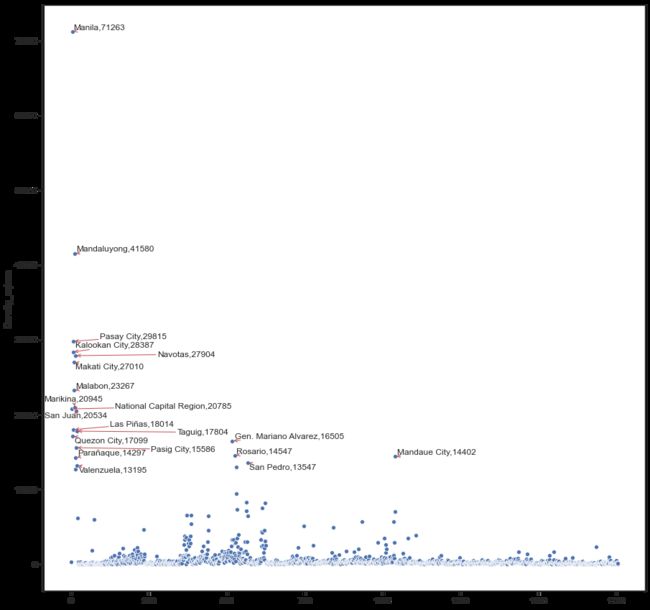
With this chart, we can already see which cities are above the average of “Nationa Capital Region”, namely, Mandaluyong, Pasay, Caloocan, Navotas, Makati, Malabon, and Marikina.
通过此图表,我们已经可以看到哪些城市位于“国家首都地区”的平均水平之上,即曼达卢永 , 帕赛 , 卡卢奥坎 , 纳沃塔斯 , 马卡蒂 , 马拉本和马利基纳 。
Within the top 20 as well, we can see that most of these cities are located in the “National Capital Region” and nearby provinces such as Laguna. Notice as well how the city of Manila is an outlier for this dataset.
同样在前20名中,我们可以看到这些城市中的大多数都位于“国家首都地区”和附近的省份,例如拉古纳。 还要注意,马尼拉市是该数据集的离群值。
GeoPandas Visualization
GeoPandas可视化
The First Law of Geography, according to Waldo Tobler, is “everything is related to everything else, but near things are more related than distant things.”
根据沃尔多· 托伯勒 (Waldo Tobler)的说法, “地理第一定律”是“所有事物都与其他事物相关,但近处的事物比远处的事物更相关”。
This is why in real estate, it is important to examine and visualize, how proximity affects values. Ultimately, GeoVisualization is one of the ways we can do this.
这就是为什么在房地产中,重要的是检查和可视化邻近性如何影响价值。 最终,GeoVisualization是我们执行此操作的方法之一。
We can already visualize our data using the builtin plot method of GeoPandas.
我们已经可以使用GeoPandas的内置绘图方法来可视化我们的数据。
k = 1600 #I find that the more colors, the smoother the viz becomes as data points are spread across gradients
cmap = 'Blues'
figsize=(12,12)
scheme= 'Quantiles'ax = merged_df.plot(column='Density_sqkms', cmap=cmap, figsize=figsize,
                          scheme=scheme, k=k, legend=False)ax.spines['top'].set_visible(False)
ax.spines['right'].set_visible(False)
ax.spines['bottom'].set_visible(False)
ax.spines['left'].set_visible(False)#Adding Colorbar for legibility
# normalize color
vmin, vmax, vcenter = merged_df.Density_sqkms.min(), merged_df.Density_sqkms.max(), merged_df.Density_sqkms.mean()
divnorm = colors.TwoSlopeNorm (vmin=vmin, vcenter=vcenter, vmax=vmax)# create a normalized colorbar
cbar = plt.cm.ScalarMappable(norm=divnorm, cmap=cmap)
fig.colorbar(cbar, ax=ax)
# plt.show()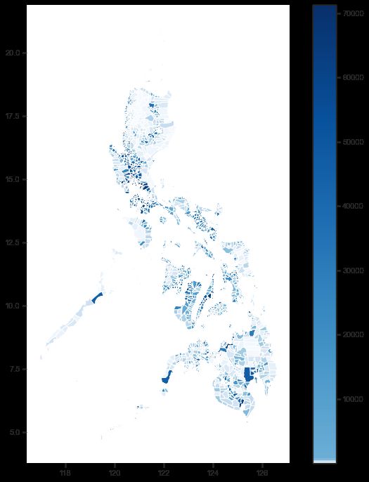
Some analysts prefer monotonic colormaps such as Blues or Greens, but when data is highly-skewed (having many outliers), I find it is better to use diverging colormaps.
一些分析人员更喜欢单调的颜色图,例如蓝色或绿色,但是当数据高度偏斜(具有许多离群值)时,我发现使用分散的颜色图更好。
Using diverging colormaps, we can visualize the dispersion of density values. Even looking at the colorbar legend indicates how density values in the Philippines contain outliers on the high side.
使用发散的颜色图,我们可以可视化密度值的分散。 即使查看色标图例,也表明菲律宾的密度值如何包含较高的离群值。
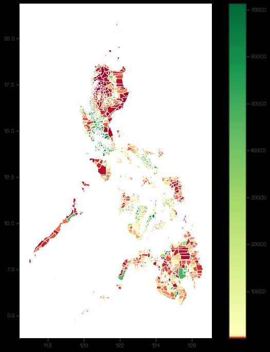
Plotting using Geoplot
使用Geoplot进行绘图
In addition to the built-in plot function of GeoPandas, you can plot this using geoplot.
除了GeoPandas的内置绘图功能外,您还可以使用geoplot对其进行绘图。
k = 1600
cmap = 'Greens'
figsize=(12,12)
scheme= 'Quantiles'geoplot.choropleth(
    merged_df, hue=merged_df.Density_sqkms, scheme=scheme,
    cmap=cmap, figsize=figsize
)
In the next series, let’s try to plot this more interactively or use some machine learning algorithms to extract more insights.
在下一个系列中,让我们尝试以更具交互性的方式进行绘制,或者使用一些机器学习算法来提取更多的见解。
For the full code, check out my Github repository.
有关完整的代码,请查看我的Github存储库 。
The code to preprocess data on the municipality and city level applies to other PSA reported statistics as well.
预处理市政和城市级别数据的代码也适用于PSA报告的其他统计数据。
Let me know what dataset you would like for us to try and visualize in the future.
让我知道您希望我们将来尝试并可视化的数据集。
翻译自: https://towardsdatascience.com/psvisualizing-the-philippines-population-density-using-geopandas-ab8190f52ed1
人口密度可视化