Python3数据分析与挖掘建模:数据可视化——柱状图(bar)
前言
本篇文章中使用到了numpy、pandas、matplotlib以及seaborn库。数据格式为csv文件,本次实验用于了解和学习用python绘制柱状图的相关内容,所以数据量很小很小,只有15条数据。
首先引入四个库并且读入数据:
import numpy as np
import pandas as pd

df=pd.read_csv("./data/trydata.csv")

import matplotlib.pyplot as plt
import seaborn as sns
绘制过程
因为记录实验的过程是从简到繁,重点关注每段code中不同的部分,即每段code中新增的部分
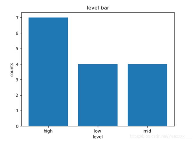
对柱状图的结构进行分析,我们要统计level列中的三个值出现的次数,所以横轴为high,mid,low,纵轴为出现的次数,所以:
x=np.arange(len(df["level"].value_counts()))
y=df["level"].value_counts()
最简单的bar
代码如下:
plt.bar(x,y)
plt.show()
绘图结果:

向柱状图中增加标题,x、y轴的名字,以及标识
代码如下:
plt.title("level bar")
plt.ylabel("counts")
plt.xlabel("level")
plt.bar(x,y)
plt.xticks(x,df["level"].value_counts().index)
plt.show()
plt.xticks 第一个参数的标识改为第二个参数中的内容(数字改为high、mid、low),注意维度要一样。
绘图结果:
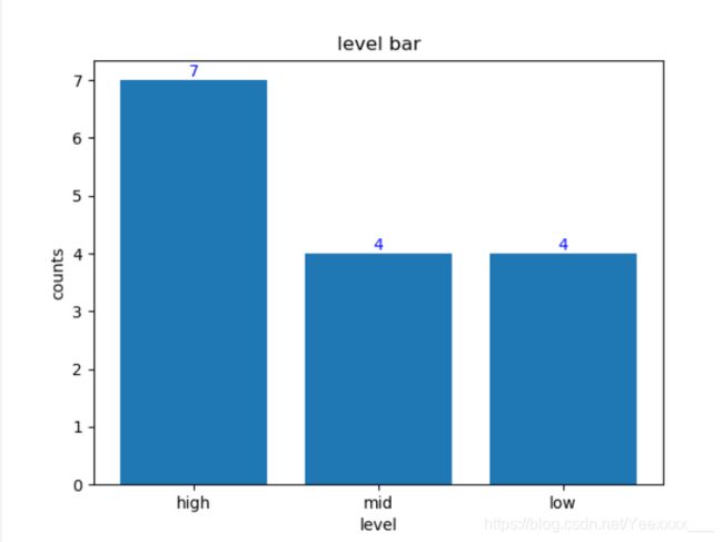
给每个柱子加上对应的数值
代码如下:
# 给每个柱子上加上对应的数字
plt.title("level bar")
plt.ylabel("counts")
plt.xlabel("level")
plt.bar(x,y)
plt.xticks(x,df["level"].value_counts().index)
for x,y in zip(x,y):
    plt.text(x,y,y,ha="center",va="bottom",fontsize=10,color="blue")   # 前两个参数是坐标 第三个参数是要标记的数
plt.show()
plt.text()的第一二个参数为标值的位置,第三个参数为要展示的值,ha是水平对齐方式,va是垂直对齐方式,fontsize是字体大小,color是字体颜色。
绘图结果:
调整柱子的位置
显示范围:plt.axis([xmin,xmax,ymin,ymax])
代码如下:
plt.title("level bar")
plt.ylabel("counts")
plt.xlabel("level")
plt.bar(x+,y,width=0.5)
plt.xticks(x,df["level"].value_counts().index)
for x,y in zip(x,y):
    plt.text(x,y,y)   # 前两个参数是坐标 第三个参数是要标记的数
plt.axis([0,5,0,10])
plt.show()
绘图结果:

增加了plt.axis后会发现图显示不完全,high有一半并没有显示出来。
于是我们要调整坐标,bar,xticks,text都要改动。这里我们加0.8。
代码如下:
plt.title("level bar")
plt.ylabel("counts")
plt.xlabel("level")
plt.bar(x+0.8,y,width=0.5)
plt.xticks(x+0.8,df["level"].value_counts().index)
for x,y in zip(x,y):
    plt.text(x+0.8,y,y)   # 前两个参数是坐标 第三个参数是要标记的数
plt.axis([0,5,0,10])
plt.show()
绘图结果:

利用seaborn增添效果
具体使用方法可以自行查看官方文档~
sns.set_style 官方文档
sns.set_context 官方文档
sns.set_palette 官方文档
代码如下:
sns.set_style(style="darkgrid")  highlight=set_style
sns.set_context(context="talk",font_scale=0.8)
sns.set_palette(sns.color_palette("RdBu",n_colors=7))
plt.title("level bar")
plt.ylabel("counts")
plt.xlabel("level")
plt.bar(x+0.8,y,width=0.5)
plt.xticks(x+0.8,df["level"].value_counts().index)
for x,y in zip(x,y):
    plt.text(x+0.8,y,y)   # 前两个参数是坐标 第三个参数是要标记的数
plt.axis([0,5,0,10])
plt.show()
绘图结果:

结果中,我们会发现图的标题level没有显示完全,此时我们增加
plt.tight_layout()
后即可显示完整。

利用seaborn绘图
以上我们绘制柱状图使用的都是plt.bar(),接下来我们使用sns.countplot().
代码如下:
sns.set_style(style="whitegrid")
sns.set_context(context="notebook",font_scale=0.8)
sns.set_palette(sns.color_palette("husl", 9))
sns.countplot(x="level",data=df)
plt.show()
绘图结果:

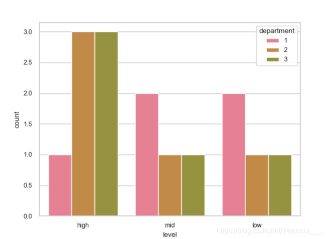
在sns.countplot()中增加hue进行分层绘制
代码如下:
sns.set_style(style="whitegrid")
sns.set_context(context="notebook",font_scale=0.8)
sns.set_palette(sns.color_palette("husl", 9))
sns.countplot(x="level",hue="department",data=df)
plt.show()
按department分类绘制柱状图。
绘制结果:
对各位有帮助的话,请点个赞再走吧~