python绘制作业车间甘特图(plotly库之create_gantt和timeline)
绘制作业车间调度甘特图
数据来自python实现GA求解基于多层编码的柔性作业车间调度问题
42.0 15
best se:[0. 3. 1. 2. 1. 5. 4. 0. 4. 5. 1. 2. 3. 1. 3. 2. 0. 0. 3. 5. 4. 1. 4. 0.
 5. 1. 5. 3. 0. 2. 5. 2. 3. 2. 4. 4. 0. 0. 0. 0. 0. 0. 0. 0. 1. 0. 0. 0.
 0. 0. 1. 0. 0. 1. 0. 1. 0. 0. 1. 1. 0. 0. 0. 0. 0. 0. 0. 0. 0. 0. 0. 0.]
best pt:[[ 0.  0.  0.  3.  6.  6.  0.  3.  6.  8. 14. 12. 13. 15. 18. 20. 13. 24.
  24. 12. 18. 20. 25. 28. 23. 23. 24. 29. 31. 25. 29. 30. 30. 41. 33. 38.]
 [ 3.  7.  6.  4. 14.  8.  6. 13. 18. 12. 15. 17. 17. 20. 24. 25. 22. 28.
  27. 21. 25. 23. 33. 31. 24. 26. 29. 30. 41. 30. 32. 39. 33. 42. 38. 42.]]
best ma:[3. 4. 2. 3. 3. 2. 5. 1. 7. 4. 5. 4. 1. 6. 7. 6. 2. 7. 2. 9. 3. 1. 9. 8.
 1. 4. 5. 5. 5. 1. 3. 2. 6. 5. 1. 4.]
将数据变成create_gantt中的df格式,task加工机器,start每个操作的开始时间,finish每个操作的结束时间,resource作业编号
task = list(best_ma.astype(int))
start = list(best_pt[0].astype(int))
finish = list(best_pt[1].astype(int))
resource = list(best_se[:36].astype(int))

import pandas as pd

Resource = pd.Series(resource)
Task = pd.Series(task)
Start = pd.Series(start)
Finish = pd.Series(finish)

df = pd.DataFrame(list(zip(Task,Start,Finish,Resource)))
df.columns = ['Task','Start','Finish','Resource']

此时的df中Start和Finish是用整数表示的时间,因此需要转换成时间格式,可任取某时间戳数据作为基准,加上Start和Finish(假设为分钟)即可。注意此处的作业编号resource要变成字符类型。
datetime = pd.Timestamp('20190627 19:00:00')
for i in range(len(df)):
    df['Start'].loc[i] = datetime + pd.Timedelta(minutes = df['Start'].loc[i])
    df['Finish'].loc[i] = datetime + pd.Timedelta(minutes = df['Finish'].loc[i])

df['Resource'] = df['Resource'].astype(str)

df.head()
转换后的数据如下:

使用下文介绍的create_gantt绘制甘特图
from plotly.figure_factory import create_gantt

fig = create_gantt(df,colors=['rgb(200,50,25)',(1,0,1),'#6c4774','rgb(114, 44, 121)','rgb(255,0,0)',(1,1,0.2)],
                   index_col = 'Resource',reverse_colors=True,show_colorbar=True,group_tasks = True)
fig.show()

plotly库中甘特图绘制最开始是plotly.figure_factory.create_gantt,现已更新成为plotly.express.timeline
plotly库简介
Plotly是一个非常著名且强大的开源数据可视化框架,它通过构建基于浏览器显示的web形式的可交互图表来展示信息,可创建多达数十种精美的图表和地图
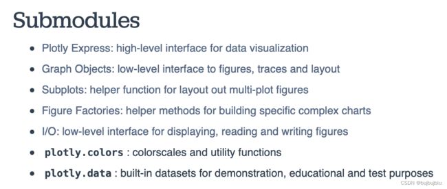
plotly库子模块
(一)plotly.figure_factory.create_gantt
create_gantt参数
plotly中绘制甘特图的函数:plotly.figure_factory.create_gantt
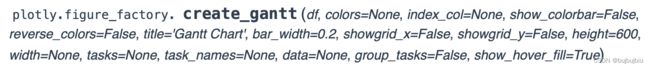
- df ((array|list)):甘特图的输入数据,表格型数据或者列表,如果是dataframe,列一定包括 Task,Start ,Finish,其他列用于索引。如果是list,它的元素必须是有相同列标题Task,Start ,Finish等的字典。
- colors ((str|list|dict|tuple)):每个类别的颜色,形式包括rgb,十六进制,颜色元组和颜色列表。rgb形式如rgb(x, y, z),x,y,z取值[0, 255]。颜色元组形式如(a, b, c),a,b,c取值[0, 1]。如果颜色是一个列表,它必须包含作为其成员的上述有效颜色类型。如果颜色是一个字典,字典里的键就是列索引即index_col
- index_col ((str|float)):作为列索引的列标题(如果df是dataframe),如果df是一个列表,index_col是列表中其中一个元素的键
- show_colorbar ((bool)):决定颜色条是否可见,只有在列索引为数字时可用
- show_hover_fill ((bool)):启用/禁用图表填充区域的悬停文本
- reverse_colors ((bool)):反转设定颜色顺序
- title ((str)):图标标题
- bar_width ((float)):图中水平条的宽度
- showgrid_x ((bool)):显示/隐藏 X 轴网格
- showgrid_y ((bool)):显示/隐藏 Y 轴网格
- height ((float)):图标高度
- width ((float)):图标宽度
实例
1.简单甘特图
from plotly.figure_factory import create_gantt
# 创建数据
df = [dict(Task="Job A", Start='2009-01-01', Finish='2009-03-30'),
      dict(Task="Job B", Start='2009-03-05', Finish='2009-04-15'),
      dict(Task="Job C", Start='2009-02-20', Finish='2009-05-30')]
# 创建甘特图
fig=create_gantt(df)
fig.show()
2.列索引为数字
列索引为Complete(10,60,95)
from plotly.figure_factory import create_gantt

df = [dict(Task='job A', Start='2009-01-01',Finish='2009-03-30', Complete=10),
      dict(Task="Job B", Start='2009-03-05',Finish='2009-04-15', Complete=60),
      dict(Task="Job C", Start='2009-02-20',Finish='2009-05-30', Complete=95)]

fig = create_gantt(df,colors='Blues',index_col='Complete',show_colorbar=True,
                bar_width=0.5,showgrid_x=True,showgrid_y=True)
fig.show()
3.列索引为字符串
列索引为Resource(Apple,Grape,Banana)
from plotly.figure_factory import create_gantt

df = [dict(Task="Job A", Start='2009-01-01',Finish='2009-02-15', Resource='Apple'),
      dict(Task="Job B", Start='2009-03-05',Finish='2009-04-15', Resource='Grape'),
      dict(Task="Job C", Start='2009-02-20',Finish='2009-05-30', Resource='Banana')]

fig = create_gantt(df,colors=['rgb(200,50,25)',(1,0,1),'#6c4774'],
                  index_col='Resource',reverse_colors=True,show_colorbar=True)
fig.show()
4.使用颜色字典
from plotly.figure_factory import create_gantt

df = [dict(Task="Job A", Start='2009-01-01',Finish='2009-02-15', Resource='Apple'),
      dict(Task="Job B", Start='2009-03-05',Finish='2009-04-15', Resource='Grape'),
      dict(Task="Job C", Start='2009-02-20',Finish='2009-05-30', Resource='Banana')]

colors = {'Apple':'rgb(255,0,0)',
         'Grape':'rgb(170,14,200)',
         'Banana':(1,1,0.2)}

fig = create_gantt(df,colors=colors,index_col='Resource',show_colorbar=True)
fig.show()
5.使用表格型数据(dataframe)
from plotly.figure_factory import create_gantt
import pandas as pd

df = pd.DataFrame([['Run',  '2010-01-01', '2011-02-02', 10],
                   ['Fast', '2011-01-01', '2012-06-05', 55],
                   ['Eat', '2012-01-05', '2013-07-05', 94]],
                  columns=['Task', 'Start', 'Finish', 'Complete'])

fig = create_gantt(df,colors='Blues',index_col='Complete',show_colorbar=True,
                  bar_width=0.5,showgrid_x=True, showgrid_y=True)
fig.show()
(二)plotly.express.timeline
timeline参数
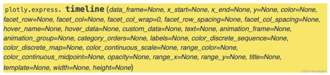
在timeline甘特图中,data_frame的每行都表示为日期类型在x轴上的矩形标记,范围从x_start到x_end
- data_frame (DataFrame or array-like or dict):同上df
- x_start (str or int or Series or array-like):df中某列名或者自定义pandas Series or array_like,标记每个水平条的开始位置
- x_end (str or int or Series or array-like) :df中某列名或者自定义pandas Series or array_like,标记每个水平条的结束位置
- y (str or int or Series or array-like):df中某列名,标记y轴
- color (str or int or Series or array-like) :df中某列名或者自定义pandas Series or array_like,标记颜色
剩余参数如下:
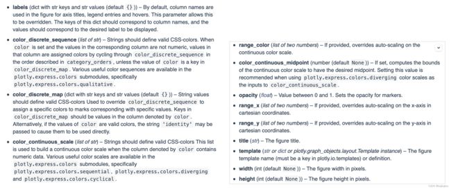
实例
from plotly.express import timeline

df = pd.DataFrame([dict(Task="项目1", Start='2021-02-01', Finish='2021-03-25',Manager='Lemon',Completion_pct=90),
                   dict(Task="项目2", Start='2021-03-05', Finish='2021-04-15',Manager='Lee',Completion_pct=60),
                   dict(Task="项目3", Start='2021-02-20', Finish='2021-05-30',Manager='Zhang',Completion_pct=70),
                   dict(Task="项目4", Start='2021-04-20', Finish='2021-09-30',Manager='Bob',Completion_pct=20),])

fig = timeline(df, x_start="Start", x_end="Finish", y="Task",color='Manager')
fig.show()
设置颜色和数字比例
import plotly.express as px
from plotly.express import timeline

df = pd.DataFrame([dict(Task="项目1", Start='2021-02-01', Finish='2021-03-25',Manager='Lemon',Completion_pct=90),
                   dict(Task="项目2", Start='2021-03-05', Finish='2021-04-15',Manager='Lee',Completion_pct=60),
                   dict(Task="项目3", Start='2021-02-20', Finish='2021-05-30',Manager='Zhang',Completion_pct=70),
                   dict(Task="项目4", Start='2021-04-20', Finish='2021-09-30',Manager='Bob',Completion_pct=20),])

fig = timeline(df, x_start="Start", x_end="Finish", y="Task",color='Completion_pct',
               color_continuous_scale=px.colors.sequential.Turbo)
fig.show()
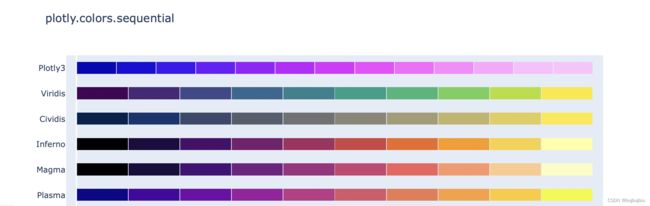
(三)plotly内置颜色
px.colors.sequential
import plotly.express as px
px.colors.sequential.swatches()
部分颜色如下:
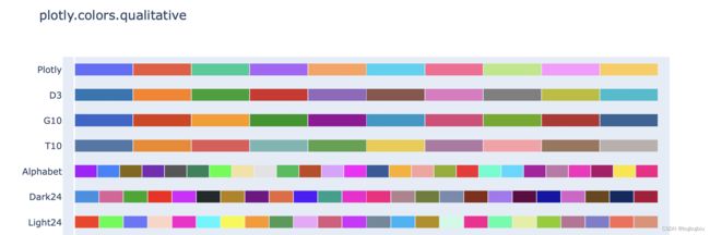
px.colors.qualitative
import plotly.express as px
px.colors.qualitative.swatches()
部分颜色如下: