轻量级、无依赖的原生 JavaScript 引擎,可将用户的注意力集中在整个页面上;这是一个功能强大且高度可定制的基于原生JavaScript开发的新用户引导库。
简介及使用教程
Driver.js是一个功能强大且高度可定制的基于原生JavaScript开发的新用户引导库。它没有依赖项,支持所有主要浏览器。
特点:
- 简单:简单易用,完全没有外部依赖
- 高度可定制:有一个强大的api,可以用于你希望突出显示任何内容
- 高亮显示:页面功能介绍上的任意元素(字面上的任意)
- 功能介绍:为你的web应用程序创建强大的功能介绍
- 焦点移位器:为用户友好添加焦点移位器
- 用户友好:通过键盘行为控制一切
- 一致行为:所有浏览器(包括著名的IE)都可以使用
- MIT声明:免费用于个人和商业用途。
安装
Npm
npm i driver.js
Yarn
yarn add driver.js
浏览器
使用
引入
import Driver from 'driver.js';
import 'driver.js/dist/driver.min.css';
简单示例
const driver = new Driver();
driver.highlight('#create-post');

交互时高亮元素
const focusDriver = new Driver();

// Highlight the section on focus
document.getElementById('creation-input')
  .addEventListener('focus', (e) => {
    focusDriver.focus('#creation-input');
  });

带弹窗
const driver = new Driver();
driver.highlight({
  element: '#some-element',
  popover: {
    title: 'Title for the Popover',
    description: 'Description for it',
  }
});

弹窗支持定义位置、HTML内容等
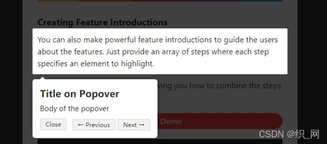
创建功能介绍
const driver = new Driver();
// Define the steps for introduction
driver.defineSteps([
  {
    element: '#first-element-introduction',
    popover: {
      className: 'first-step-popover-class',
      title: 'Title on Popover',
      description: 'Body of the popover',
      position: 'left'
    }
  },
  {
    element: '#second-element-introduction',
    popover: {
      title: 'Title on Popover',
      description: 'Body of the popover',
      position: 'top'
    }
  },
  {
    element: '#third-element-introduction',
    popover: {
      title: 'Title on Popover',
      description: 'Body of the popover',
      position: 'right'
    }
  },
]);
// Start the introduction
driver.start();
弹出框定位
您还可以将弹出框的位置更改为
left, left-center, left-bottom, top, top-center, top-right, right, right-center,right-bottom或bottom, bottom-center, bottom-right, mid-center。
const driver = new Driver();
driver.highlight({
  element: '#some-element',
  popover: {
    title: 'Title for the Popover',
    description: 'Description for it',
    // position can be left, left-center, left-bottom, top,
    // top-center, top-right, right, right-center, right-bottom,
    // bottom, bottom-center, bottom-right, mid-center
    position: 'left',
  }
});
如果不指定位置或者指定为 be auto,它会自动为popover找到合适的位置并显示出来

选项
Driver 选项
const driver = new Driver({
  className: 'scoped-class', //包裹driver.js弹窗的类名 className to wrap driver.js popover
  animate: true,  // 高亮元素改变时是否显示动画 Animate while changing highlighted element
  opacity: 0.75,  //背景透明度(0 表示只有弹窗并且没有遮罩) Background opacity (0 means only popovers and without overlay)
  padding: 10,   //  元素与边缘的距离 Distance of element from around the edges
  allowClose: true, // 是否允许点击遮罩时关闭 Whether clicking on overlay should close or not
  overlayClickNext: false, //是否允许点击遮罩时移到到下一步 Should it move to next step on overlay click
  doneBtnText: 'Done', // 最终按钮上的文本 Text on the final button
  closeBtnText: 'Close', // 当前步骤关闭按钮上的文本 Text on the close button for this step
  nextBtnText: 'Next', //当前步骤下一步按钮上的文本 Next button text for this step
  prevBtnText: 'Previous', // 当前步骤上一步按钮上的文本 Previous button text for this step
  showButtons: false, //是否在底部显示控制按钮 Do not show control buttons in footer
  keyboardControl: true, // 是否允许通告键盘控制(escape关闭,箭头键用于移动)Allow controlling through keyboard (escape to close, arrow keys to move)
  scrollIntoViewOptions: {}, //  `scrollIntoView()` 方法的选项 We use `scrollIntoView()` when possible, pass here the options for it if you want any
  onHighlightStarted: (Element) {}, // 元素开将要高亮时调用Called when element is about to be highlighted
  onHighlighted: (Element) {}, // 元素开完全高亮时调用Called when element is fully highlighted
  onDeselected: (Element) {}, // 取消选择时调用 Called when element has been deselected
  onReset: (Element) {},        // 遮罩将要关闭时调用 Called when overlay is about to be cleared
  onNext: (Element) => {},      // 任何步骤中移到到下一步时调用Called when moving to next step on any step
  onPrevious: (Element) => {},  // 任何步骤中移到到上一步时调用Called when moving to next step on any step
});
step 选项
const stepDefinition = {
  element : '#some-item' ,         // 查询要突出显示的选择器字符串或节点
  stageBackground : '#ffffff' ,    // 这将覆盖驱动程序中设置的
  popover : {                     // 不会有 popover如果为空或未给定
    className : 'popover-class' ,  // 除了驱动程序选项中的一般 className 之外,还要包装此特定步骤 popover 的 className
    title : 'Title' ,              // 弹出框上的标题
    description : 'Description' , // 弹出框的主体
    showButtons : false ,          // 不要在页脚中显示控制按钮
    doneBtnText : 'Done' ,         // 最后一个按钮上的文本
    closeBtnText : 'Close' ,       // 关闭按钮上的文本
    nextBtnText : 'Next' ,         // 下一个按钮文本
    prevBtnText : 'Previous' ,     // 上一个按钮文本
  } ,
  onNext : ( )  =>  { } ,              // 从当前步骤移动到下一步时调用
  onPrevious :( )  =>  { } ,          // 从当前步骤移动到上一步时调用
} ;
API方法
const driver = new Driver(driverOptions);

const isActivated = driver.isActivated; // 检查driver是否激活Checks if the driver is active or not
driver.moveNext();     // 移动到步骤列表中的下一步 Moves to next step in the steps list
driver.movePrevious(); // 移动到步骤列表中的上一步 Moves to previous step in the steps list
driver.start(stepNumber = 0);  // 从指定的步骤开始 Starts driving through the defined steps
driver.highlight(string|stepDefinition); // 高亮通过查询选择器指定的或步骤定义的元素 highlights the element using query selector or the step definition
driver.reset(); // 重置遮罩并且清屏Resets the overlay and clears the screen
driver.hasHighlightedElement(); //检查是否有高亮元素 Checks if there is any highlighted element
driver.hasNextStep(); // 检查是否有可移动到的下一步元素 Checks if there is next step to move to
driver.hasPreviousStep(); // 检查是否有可移动到的上一步元素。Checks if there is previous step to move to

driver.preventMove();// 阻止当前移动。如果要执行某些异步任务并手动移动到下一步,则在“onNext”或“onPrevious”中很有用 Prevents the current move. Useful in `onNext` or `onPrevious` if you want to
// perform some asynchronous task and manually move to next step


const activeElement = driver.getHighlightedElement();// 获取屏幕上当前高亮元素 Gets the currently highlighted element on screen
const lastActiveElement = driver.getLastHighlightedElement();
activeElement.getCalculatedPosition(); // 获取活动元素的屏幕坐标Gets screen co-ordinates of the active element
activeElement.hidePopover();  // 隐藏弹窗Hide the popover
activeElement.showPopover();  // 显示弹窗Show the popover

activeElement.getNode();  // 获取此元素后面的DOM元素Gets the DOM Element behind this element
你可以使用各种各样的选项来实现你想要的一切。You can use a variety of options to achieve whatever you may want.
引导页效果
Driver.js -Demo 是一个指南性质的库
访问GitHub
通用引导页
新建主页面文件
layout
新建
steps.js文件
// 定义介绍的步骤
const steps = [
  {
    element: '#hamburger-container',
    stageBackground: '#fff',
    popover: {
      title: '侧边栏按钮',
      description: '打开或者关闭侧边栏',
      position: 'bottom'
    }
  },
  {
    element: '#sidebar-container',
    popover: {
      title: '侧边栏',
      description: '侧边栏及路由',
      position: 'right-center'
    }
  },
  {
    element: '#breadcrumb-container',
    popover: {
      title: '面包屑导航',
      description: '指示当前页的位置',
      position: 'bottom'
    }
  },
  {
    element: '#header-search',
    popover: {
      title: '页面搜索',
      description: '页面搜索,快速导航',
      position: 'left'
    }
  },
  {
    element: '#screenfull',
    popover: {
      title: '满屏',
      description: '将页面设置为全屏',
      position: 'left'
    }
  },
  {
    element: '#size-select',
    popover: {
      title: '开关的大小',
      description: '系统切换大小',
      position: 'left'
    }
  },
  {
    element: '#lang-select',
    popover: {
      title: '国际化',
      description: '中英文切换',
      position: 'left'
    },
    padding: 0
  },
  {
    element: '#personal_settings',
    popover: {
      title: '个人中心',
      description: '个人账号设置及操作',
      position: 'left'
    },
    padding: 0
  },
  {
    element: '#tags-view-container',
    popover: {
      title: '标签视图',
      description: '您访问的页面的历史',
      position: 'bottom-center'
    },
    padding: 0
  },
  {
    element: '#theme_settings',
    popover: {
      title: '主题设置',
      description: '设置自己喜欢的主题',
      position: 'right-center'
    },
    padding: 0
  },
  {
    element: '#app_main',
    stageBackground: '#fff',
    popover: {
      className: 'app-container',
      title: '主体内容区',
      // description: '主体内容的一系列操作',
      position: 'top-center'
    },
    padding: -30
  }
]

export default steps
到此这篇关于Vue使用driver.js做引导页的文章就介绍到这了,更多相关Vue driver.js引导页内容请搜索脚本之家以前的文章或继续浏览下面的相关文章希望大家以后多多支持脚本之家!