html八卦绘制,HTML+CSS实现画出一个太极八卦图案
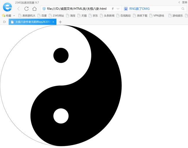
太极八卦是中华文化的象征。
今天我就用了html+css画出来一个太极八卦的图案,喜欢的可以拿去研究下!
代码:
太极八卦作者无陌然qq2633544207 aide技术网aidezy.com/* CSS Document */
html, body, div, span, object, iframe,h1, h2,
h3, h4, h5, h6, p, blockquote, pre,abbr, address, cite, code,del, dfn,
em, img, ins,kbd, q, samp,small, strong, sub, sup, var,b, i,dl, dt, dd,
ol, ul, li,fieldset, form, label, legend,table, caption, tbody,
tfoot,thead,tr, th, td,article, aside, canvas, details, figcaption,
figure, footer, header, hgroup, menu, nav, section, summary,time, mark,
audio, video {
margin:0;
padding:0;
border:0;
outline:0;
vertical-align:baseline;
background:transparent;
outline-style:none;/*FF*/
}
body {
line-height:1;
}
a{
margin:0;
padding:0;
border:0;
vertical-align:baseline;
background:transparent;
}
a:hover,a:focus{
text-decoration:none;
bblr:expression(this.onFocus=this.blur());/*IE*/
outline-style:none;/*FF*/
}
table {
border-collapse:collapse;
border-spacing:0;
}
input, select {
vertical-align:middle;
}
/*css为clearfix,清除浮动*/
.clearfix::before,
.clearfix::after{
content: "";
height: 0;
line-height: 0;
display: block;
visibility: hidden;
clear: both;
}
.clearfix:after{clear:both;}
.clearfix{
*zoom:1;/*IE/7/6*/
}
li{
list-style:none;
}
a {
text-decoration: none
}
/*上面这个style为css初始化代码*/
#one{
height: 800px;
border: black solid 1px;
border-radius: 400px;
width: 800px;
background-color:#F00;
clear: both;
background: black;
}
#tow{
width: 200px;
height: 400px;
border: white solid 1px;
border-radius: 0px 200px 200px 0px;
margin: 0px 100px 0px 400px;
box-sizing:border-box;
display: block; /*转为块状元素*/
background: white;
}
#three{
width: 200px;
height: 400px;
border: black solid 1px;
border-radius: 200px 0px 0px 200px;
margin: 0px 0px 0px 200px;
box-sizing:border-box;
display: block; /*转为块状元素*/
background: black;
}
#for{
width: 100px;
height: 100px;
box-sizing:border-box;
display: block; /*转为块状元素*/
border-radius: 50px;
margin: 150px 0px 0px -50px;
background: black;
}
#six{
width: 100px;
height: 100px;
box-sizing:border-box;
display: block; /*转为块状元素*/
border-radius: 50px;
margin: 150px 0px 0px 150px;
background: white;
}
#se{
height: 800px;
border-radius: 400px 0px 0px 400px;
width: 400px;
background-color:white;
clear: both;
}
代码ZIP打包下载: