背景(Background)
Over the last several months, I’ve been working at the Discourse Processing Lab at Simon Fraser University (under the leadership of Dr. Maite Taboada), where we’ve been actively developing and extending the Gender Gap Tracker, an automated Natural Language Processing (NLP) system that measures men and women’s voices on seven major Canadian news outlets in real time. The Gender Gap Tracker is a collaboration between Informed Opinions, a non-profit dedicated to amplifying women’s voices in the media and Simon Fraser University, through the Discourse Processing Lab and the Big Data Initiative.
在过去的几个月中,我一直在西蒙·弗雷泽大学的话语处理实验室工作(在Maite Taboada博士的领导下),我们一直在积极开发和扩展Gender Gap Tracker (自动自然语言处理) (NLP)系统,可实时测量加拿大七个主要新闻媒体上男女的声音。 性别差距追踪器是非盈利组织Informed Opinions与西蒙·弗雷泽大学之间的合作,该非营利组织致力于通过媒体,话语处理实验室和大数据倡议来扩大媒体中女性的声音。
At a high level, we perform the following steps on a daily basis to generate statistics that allow us to quantify the number of men and women quoted in the news:
在较高级别上,我们每天执行以下步骤来生成统计信息,以使我们能够量化新闻中引用的男女人数:
- Scrape the text and metadata of news articles from the daily web content of seven Canadian English-language news outlets. 从七个加拿大英语新闻媒体的日常网络内容中删除新闻文章的文本和元数据。
- Process each article’s text using a variety of NLP techniques (syntactic parsing, named entity recognition, quote extraction) and gender services in order to identify quoted people and their genders. 使用各种NLP技术(语法分析,命名实体识别,引用提取)和性别服务来处理每篇文章的文本,以识别引用的人及其性别。
Compute and store individual/aggregated statistics that measure the number of quoted people (i.e., sources) from either gender.
计算和存储个人/汇总统计数据,这些统计数据可以衡量来自任一性别的被引用人数(即来源)。
Disclaimer: We acknowledge that gender is non-binary, and that there are different social, cultural, and linguistic conceptualizations of gender. For this project, we rely on name lookups from internal/external gender services in order to classify people mentioned and quoted as female, male, or other.
免责声明:我们承认性别是非二元的,并且性别,社会,文化和语言的概念不同。 对于此项目,我们依靠内部/外部性别服务中的姓名查找来对提及和引用的人进行分类,分为女性,男性或其他。
In addition to our daily pipeline, we also run a monthly topic modelling pipeline that performs large-scale discovery of topics using Latent Dirichlet Allocation (LDA), on each month’s English news articles. On average, we process 20,000–30,000 articles’ worth of text per month to generate 15 topics (i.e., keyword distributions) for that month, that are then labelled by a human based on real-world knowledge of the month’s events.
除了我们的日常管道外,我们还运行每月的主题建模管道,该管道使用每月的英语新闻对潜在的狄利克雷分配(LDA)进行主题的大规模发现。 平均而言,我们每个月处理20,000至30,000条文章的文本,以生成该月的15个主题(即关键字分布),然后由人类根据该月事件的真实知识对其进行标记。
All our NLP utilities (including the upstream tools that perform named entity recognition and quote extraction to extract gender statistics) are developed using Python and spaCy. Topic modelling, for reasons involving the sheer size of data being handled, is done using PySpark’s scalable implementation of LDA.
我们所有的NLP实用程序(包括执行命名实体识别和引用提取以提取性别统计信息的上游工具)都是使用Python和spaCy开发的。 由于涉及要处理的数据量庞大的原因,主题建模是使用PySpark的LDA可伸缩实现实现的。
Although we do showcase our primary gender statistics (i.e., the proportion of female/male sources quoted by each outlet) on a live, interactive tracker website (hosted by Informed Opinions), we quickly realized the value of building our own custom dashboard for research and exploration purposes. The aim of our research dashboard (hosted here, on Simon Fraser University’s servers) is to provide data scientists and software developers at the Discourse Processing Lab with the means to easily extend the existing data analysis framework, and to help answer new research questions that may arise in the future.
尽管我们确实在一个实时的交互式跟踪器网站(由Informed Opinions托管)上展示了我们的主要性别统计数据(即,每个网点引用的女性/男性信息来源的比例),但我们很快意识到构建自己的自定义仪表盘进行研究的价值和勘探目的。 我们的研究仪表板(托管在西蒙弗雷泽大学的服务器上)的目的是为话语处理实验室的数据科学家和软件开发人员提供轻松扩展现有数据分析框架的方法,并帮助回答可能将来出现。
We chose the Dash framework (by Plotly) to build our own custom interactive applications within a multi-page dashboard, all in Python. In this article, I’ll highlight some of our results, design decisions, and why Dash is a great framework for tasks related to data science research and exploration.
我们选择了Dash框架(由Plotly设计)在多页仪表板中构建自己的自定义交互式应用程序,全部使用Python。 在本文中,我将重点介绍我们的一些结果,设计决策,以及Dash为什么是与数据科学研究和探索相关的任务的出色框架。
现有应用程序的简要概述 (A brief overview of the existing apps)
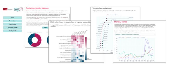
This section highlights a range of interactive tools implemented in the dashboard. Each high-level function is separated into its own application, accessible by clicking the respective button on the home page.
本节重点介绍了仪表板中实现的一系列交互式工具。 通过单击主页上的相应按钮,可以将每个高级功能划分为自己的应用程序。
文字分析仪 (Text analyzer)
This app takes in a user’s input text, typically from a news article or blog post, and runs an NLP algorithm on the backend server to extract the text’s quoted sources and people mentioned. The detected names are passed through our internal cache and gender service scripts to assign each name a gender (any one of ‘female’, ‘male’ or ‘unknown’). A doughnut chart showing the proportion of sources from each gender is displayed, along with the detected names and the quotes in the article/blog post.
该应用程序通常从新闻报道或博客文章中获取用户输入的文本,并在后端服务器上运行NLP算法以提取文本引用的来源和提及的人。 检测到的姓名将通过我们的内部缓存和性别服务脚本传递,以为每个姓名分配性别(“女”,“男”或“未知”中的任何一个)。 将显示一个甜甜圈图,其中显示了每种性别来源的比例,以及在文章/博客文章中检测到的名称和引号。

Because journalists employ a wide range of styles in naming the persons they quote, a naive system that simply looks for quotation marks in the text is nowhere near sufficient. The dependency-based parse tree of a text block, obtained using spaCy, plays a key role in our quote extraction system, locating the beginning and end of quotations using a sentence’s syntactic structure. We first identify key verbs that are commonly used in quotation (defined using a custom, hand-curated verb list), and then locate the objects of each verb, i.e., clauses that are dependent on the verb, based on the parse tree. This allows us to find speakers of quotes regardless of the sentence structure and the presence of quotation marks.
因为新闻工作者在命名他们引用的人物时采用了多种样式,所以仅在文本中寻找引号的幼稚系统远远不够。 使用spaCy获得的文本块的基于依存关系的解析树在我们的报价提取系统中起着关键作用,它使用句子的句法结构来定位报价的开始和结束。 我们首先确定在引号中常用的关键动词(使用自定义的手工编写的动词列表定义),然后根据语法分析树找到每个动词的对象,即依赖于该动词的从句。 这使我们能够找到引述说话者,而不论句子结构和引号是否存在。
In addition, a coreference resolution algorithm (powered by neuralcoref) is used to link pronoun mentions (‘he’ or ‘she’) to a prior named entity of the type ‘PERSON’. This allows us to capture quotes that do not directly name the speaker. The example snippet shown below highlights the range of quotes detected by our system.
另外,使用共指称解析算法(由Neurocoref支持)将代词提及(“ he”或“ she”)链接到类型为“ PERSON”的先前命名实体。 这使我们可以捕获未直接命名说话者的引用。 下面显示的示例代码片段突出显示了系统检测到的报价范围。
Prime Minister Justin Trudeau said Saturday that Canada will contribute $300 million towards the international effort to battle COVID-19.
总理贾斯汀·特鲁多(Justin Trudeau)周六表示,加拿大将为打击COVID-19的国际努力捐款3亿加元。
“None of us have been spared from the effects of COVID-19 and none of us can beat it alone.”
“我们谁也无法幸免于COVID-19的影响,而且我们谁也无法独自击败它。”
Canada will contribute $180 million to address the immediate humanitarian and development impacts of the pandemic, he said.
他说,加拿大将提供1.8亿美元,以应对这一流行病对人道主义和发展的直接影响。
“We are happy to see Minister Gould pushing for more investment because more is desperately needed,” said Stuart Hickox, the Canadian director of the One Campaign.
“一个运动”的加拿大总监斯图尔特·希克斯说:“我们很高兴看到古尔德部长敦促增加投资,因为迫切需要更多。”
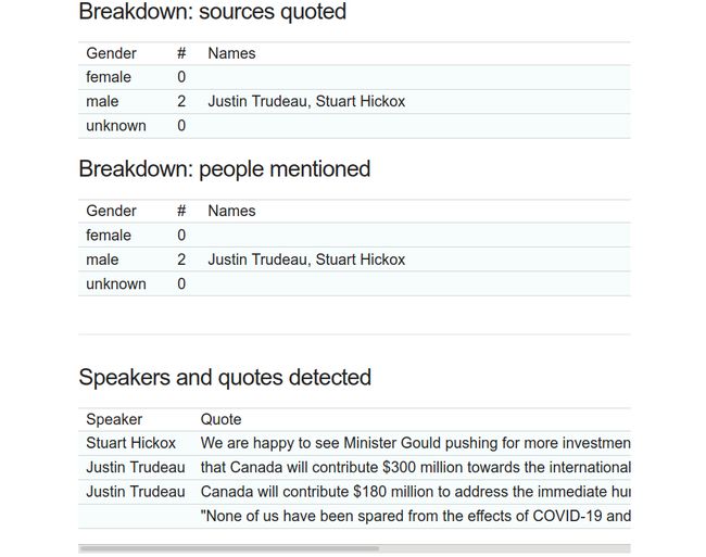
Try out your own custom news snippets on the text analyzer app to get the gender breakdown of the people quoted/mentioned!
在文本分析器应用上尝试自己的自定义新闻摘要,以获取引用/提及的人员的性别细分!
主题模型浏览器 (Topic model explorer)
In this app, we showcase a new way to visualize the relationship between the topics covered in a news corpus and the gender of those quoted. Our primary goal through this app is to analyze whether female or male sources are more likely to be associated with specific topics in the news. As described earlier, we perform large-scale topic discovery on each month’s data using an LDA algorithm implemented in Spark. The topic keywords discovered for that month, along with other relevant metadata, are written to a MongoDB database (which also hosts all the raw text data from the news articles). These keywords are then inspected by a human, at the start of each month, and labelled manually based on knowledge of the month’s events.
在这个应用程序中,我们展示了一种新的方式来可视化新闻语料库所涵盖的主题与所引用主题的性别之间的关系。 我们通过此应用程序的主要目标是分析新闻来源中的女性还是男性来源更可能与特定主题相关联。 如前所述,我们使用Spark中实现的LDA算法对每个月的数据执行大规模主题发现。 该月发现的主题关键字以及其他相关的元数据将写入MongoDB数据库(该数据库还托管新闻文章中的所有原始文本数据)。 然后,每个月初,人工检查这些关键字,并根据对当月事件的了解手动对其进行标记。
Because we store the topic distribution (as predicted by LDA) on a per-document basis, we can average these values based on the outlet that published the article. We plot the topic names, as labelled by a human, and these mean ‘topic intensities’ by outlet on a heat map, as shown below for the month of August 2019. The darker the colour, the more strongly that topic was covered, on average, by that outlet in that particular month.
因为我们基于每个文档存储主题分布(如LDA所预测),所以我们可以根据发布该文章的渠道对这些值取平均值。 我们绘制了以人为标签的主题名称,并通过热图在出口上表示了``主题强度'',如下图所示(2019年8月)。颜色越深,覆盖的主题越强烈。平均,由该特定月份的网点得出。
To study the relationship between topics and the gender of those quoted in articles pertaining to that topic, we first divide our article set for a given month into two subsets — those that quote a majority of female sources (i.e., at least one more female source quoted than male sources), and those that quote a majority of male sources. We then perform a similar averaging of topic intensities (i.e., the topic weights per article obtained from LDA) for each outlet. The results are once again plotted as a heat map, this time with a divergent colour scale from red to blue.
为了研究主题和与该主题相关的文章中所引用主题的性别之间的关系,我们首先将给定月份的文章集分为两个子集-引用大多数女性资料的主题(即,至少有一个女性资料来源)引用的内容要比男性来源)以及那些引用大多数男性资源的网站。 然后,我们对每个出口进行主题强度的平均(即,从LDA获得的每篇文章的主题权重)。 结果再次绘制为热图,这次是从红色到蓝色的不同色标。
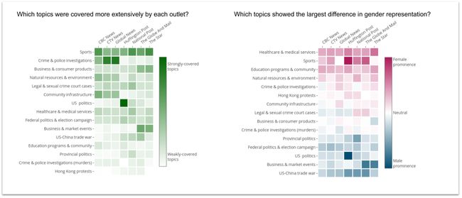
The topic intensity plot (green) for August 2019 clearly shows that ‘Sports’ was a major topic that month, as were ‘Crime and police investigations’ and ‘Business and consumer products’. ‘U.S. politics’ was covered particularly extensively by Huffington Post Canada, in comparison to the other outlets. What is more interesting, however, is that in the second heat map, the ‘Sports’ and ‘Healthcare & medical services’ topics exhibit a strong female prominence, which is a term we use to describe topics that are strongly associated with women being quoted the majority of the time on average for that topic. The darker the red colour, the stronger the female prominence for a given topic and a given outlet. Conversely, the darker the blue colour, the stronger the male prominence for that topic.
2019年8月的主题强度图(绿色)清楚地表明,``体育''是当月的主要主题,``犯罪和警察调查''以及``商业和消费品''也是如此。 与其他媒体相比,加拿大《赫芬顿邮报》特别广泛地报道了“美国政治”。 但是,更有趣的是,在第二个热点图中,“体育”和“保健与医疗服务”主题表现出强烈的女性突出性,这是我们用来描述与被引用的女性紧密相关的主题的术语该主题平均大部分时间。 红色越深,在给定主题和给定出路下,女性的突出性就越强。 相反,蓝色越深,男性对该主题的关注就越强。
A deeper analysis on the ‘Sports’ topic for August 2019 showed that this was the period in the aftermath of the US women’s soccer team winning the FIFA 2019 women’s world cup. In addition, Canadian tennis player Bianca Andreescu had a dominant performance in the U.S. Open (which she later went on to win in September). As a result of numerous female players and coaches being quoted over the course of August 2019, the sports topic, which would normally be dominated by the quotes of male players and coaches, showed a strong female prominence in this particular month. Unsurprisingly, the ‘U.S. politics’ and Canadian ‘Federal politics’ topics exhibit strong male prominence, due to the sheer number of male politicians in both the U.S. and Canada being regularly quoted in articles pertaining to politics.
对2019年8月``体育''主题的更深入分析表明,这是美国女子足球队赢得2019年FIFA女足世界杯的余波。 此外,加拿大网球选手比安卡·安德列斯库(Bianca Andreescu)在美国公开赛上表现出色(她后来在9月份继续获胜)。 由于在2019年8月期间引用了许多女性球员和教练,因此通常在男性球员和教练的报价中占主导地位的体育话题在这一特定月份表现出强烈的女性地位。 毫不奇怪,“美国政治”和加拿大“联邦政治”主题展现出强烈的男性知名度,这是因为在有关政治的文章中经常引用美国和加拿大的男性政治人物数量庞大。
Overall, we obtained some very interesting findings from the topic model app, which can be explored in more detail for all months dating back to October 2018.
总体而言,我们从主题模型应用程序中获得了一些非常有趣的发现,这些发现可以追溯到2018年10月的所有月份。
热门报价来源应用 (Top-quoted sources app)
In this app, the quoted persons (male or female) from each article for are collected from our MongoDB database (after having been calculated independently by the NLP modules that run on a daily basis), and then aggregated to retrieve the number of quotes per person for any given month. These lists of top-quoted men and women are plotted as lollipops, the top 15 of which are shown below for the month of May 2020. Each dot represents the man/woman’s quote count, and the length of the line connecting them represents the disparity in counts between either gender.
在此应用中,从我们的MongoDB数据库中收集每个文章中被引用的人(男性或女性)(经过每天运行的NLP模块独立计算后),然后进行汇总以得出每个任何给定月份的人。 这些被引用最多的男人和女人的列表被绘制为棒棒糖,下面显示了2020年5月的前15个。每个点表示男人/女人的报价数量,连接它们的线的长度表示差异。两种性别之间的计数。
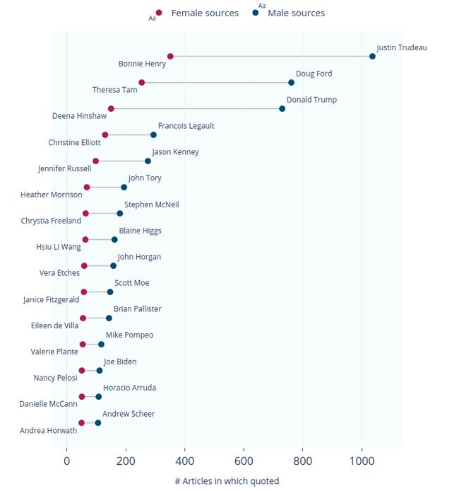
It is very interesting that 10 of the top 15 quoted women in May 2020 are either medical officers or healthcare experts, as opposed to just 1 of the top 15 quoted men being from the healthcare domain. Due to the COVID-19 pandemic, many expert women (provincial/regional medical officers and physicians) holding prominent positions in various regions of Canada were brought to the forefront in the news. In fact, our data shows that Bonnie Henry, the Chief Provincial Health Officer of British Columbia, was the most quoted woman all through March-July 2020. The top-quoted men during the same period overwhelmingly tended to be politicians, both Canadian and American, presumably due to over-representation of men in this domain.
有趣的是,在2020年5月被引用的前15名女性中,有10位是医务人员或医疗保健专家,而在被引用的前15名男性中,只有1名来自医疗领域。 由于发生了COVID-19大流行,许多在加拿大各个地区担任重要职务的专家妇女(省/地区医务人员和医师)被带到了新闻的最前沿。 实际上,我们的数据显示,不列颠哥伦比亚省首席卫生官Bonnie Henry在2020年3月至7月期间是被引用次数最多的女性。同一时期,被引用最多的男人绝大多数是加拿大和美国的政治人物。 ,大概是由于该领域男性人数过多所致。
Another interesting aspect of the lollipop plot shown above is its distribution — not only are men always quoted much more frequently than women, but also, the top-quoted people (both men and women) tend to be quoted far more often than people in the middle or bottom. This points to the Pareto principle, i.e., that a large proportion of resources is held by a small percentage of the population, also known as the 80/20 rule. While it is certainly possible that some people (especially politicians) get preferential treatment by the media because they already have a voice, recent evidence from the COVID-19 pandemic suggests that having more women in positions of power can increase the likelihood of journalists quoting them and improve gender parity overall.
上面显示的棒棒糖情节的另一个有趣的方面是它的分布-不仅是男人总是报的机会大大多于女性,而且,上面引述的人(无论男女)倾向于更常被引用的比人还要中间或底部。 这指出了帕累托原则,即,大部分资源由一小部分人拥有,也称为80/20规则。 虽然某些人(尤其是政治人物)肯定已经有可能因为他们已经有发言权而受到媒体的优惠待遇,但最近发生在COVID-19大流行中的证据表明,让更多的妇女担任政权可以增加记者引用她们的机会。并全面提高性别平等。
演示地址
Similar trends and patterns can be explored in detail using the top-quoted sources app, for all months dating back to October 2018.
自2018年10月起的所有月份,都可以使用报价最高的来源应用程序详细探索类似的趋势和模式。
每月趋势应用 (Monthly trends app)
This app visualizes a monthly time series of the number of quotes for a given person (male or female). Because of the size of our data (500,000+ articles with thousands of unique male/female sources over two years, and counting), we only display the names of prominent, public-facing men/women that appear in a month’s top 50 quoted people. The trends are displayed using a line chart, as shown below.
该应用程序可视化给定人(男性或女性)的报价数量的每月时间序列。 由于我们的数据量庞大(两年来有500,000多篇文章,其中有数千种独特的男性/女性来源,并且还在不断增加),因此,我们仅显示在当月被引用次数排在前50位的人物中出现的知名,面向公众的男性/女性的名字。 使用折线图显示趋势,如下所示。

Exposing the number of quotes as a time series allows us to study interesting phenomena pertaining to individuals, such as “the rise of Bonnie Henry”. In the early months of the COVID-19 pandemic (March-April 2020), a sharp increase was observed in the quote count for Bonnie Henry, the Chief Provincial Health Officer of British Columbia. Interestingly, her quote count is significantly higher than that of her federal counterparts (Theresa Tam, the Chief Public Health Officer of Canada and Patty Hajdu, the Federal Minister of Health), as well as that of Christine Elliott, Minister of Health for Ontario, a province with a much higher population than British Columbia. We think this could be due to two factors: 1) British Columbia was a success story in the early days of the COVID-19 pandemic, leading to Bonnie Henry being talked about (and hence quoted) more frequently, and 2) both Ontario and Ottawa had multiple prominent public-facing women for journalists to quote, reducing each woman’s overall share.
将报价的数量作为一个时间序列显示出来,使我们能够研究与个人有关的有趣现象,例如“邦妮·亨利的崛起”。 在COVID-19大流行的前几个月(2020年3月至4月),不列颠哥伦比亚省首席卫生官Bonnie Henry的报价数量急剧增加。 有趣的是,她的报价数量大大高于联邦政府的报价数量(加拿大首席公共卫生官谭丽珊和联邦卫生部长Patty Hajdu)以及安大略省卫生部长Christine Elliott的报价,一个人口比不列颠哥伦比亚省高得多的省。 我们认为这可能是由于两个因素造成的:1)不列颠哥伦比亚省在COVID-19大流行初期是一个成功的故事,导致邦妮·亨利被更频繁地谈论(因此被引用),以及2)安大略省和渥太华有多位杰出的面向公众的女性供记者引用,从而减少了每位女性的整体份额。
Seeing whether the monthly trends app can help predict future outcomes, for example, the dominant players in elections, is a very interesting prospect, and we are keen to explore this further.
看看月度趋势应用程序是否可以帮助预测未来的结果,例如选举中的主要参与者,是非常有趣的前景,我们希望对此进行进一步的探索。
引擎盖下的外观 (A look under the hood)
In this section, I’ll explain some of the technical details involved in building the dashboard, including some ideological and design decisions.
在本节中,我将解释构建仪表板所涉及的一些技术细节,包括一些意识形态和设计决策。
为什么短跑? (Why Dash?)
In a research-focused environment such as ours, front-end web development skills (and knowledge of the associated JavaScript tools) are not easily available. Python is the natural choice of language for all aspects of this project, because of its massive, robust NLP and data science ecosystem. However, the Python visualization ecosystem is immensely complex, and it can quickly become overwhelming to decide between the multitude of options for the specific tasks at hand. There exist a number of great libraries for building dashboards and interactive visualizations in Python, such as Panel, Bokeh, Streamlit, and Dash.
在像我们这样的注重研究的环境中,前端Web开发技能(以及相关JavaScript工具的知识)不容易获得。 由于Python强大,强大的NLP和数据科学生态系统,Python是该项目所有方面的自然语言选择。 但是,Python可视化生态系统非常复杂,在为特定任务选择众多选项之间时,它很快就会变得不知所措。 有许多很棒的库,可以用Python构建仪表板和交互式可视化文件,例如Panel , Bokeh, Streamlit和Dash 。
Panel is a novel, high-level dashboarding solution for Python that allows users to create interactive web apps and connect user-defined widgets to plots, images, tables or text. Unlike many other approaches, Panel attempts to be plotting library and environment-agnostic, i.e., it is designed to support nearly all Python plotting libraries, and work just as well in a Jupyter notebook or on a standalone web server. The key defining feature of Panel is that it allows users to separate their science/engineering/business logic from their GUI implementation, without getting tied to any particular GUI or web frameworks. Developed under the support of Anaconda Inc., Panel is an ambitious project that provides users the flexibility to move expensive computations and data processing between the server side and the client side, depending on the application’s requirements and the size of the data. The Panel documentation contains a rich and detailed explanation of its features in comparison with other Python dashboarding frameworks.
Panel是一种适用于Python的新颖的高级仪表板解决方案,它允许用户创建交互式Web应用程序并将用户定义的小部件连接到绘图,图像,表格或文本。 与许多其他方法不同,Panel尝试绘制库并且与环境无关,即,Panel旨在支持几乎所有Python绘制库,并且在Jupyter笔记本电脑或独立的Web服务器上都可以正常工作。 Panel的关键定义功能是,它允许用户将其科学/工程/业务逻辑与GUI实施分开,而不必与任何特定的GUI或Web框架绑定。 在Anaconda Inc.的支持下开发的Panel是一个雄心勃勃的项目,它为用户提供了灵活性,可以根据应用程序的要求和数据大小在服务器端和客户端之间移动昂贵的计算和数据处理。 与其他Python仪表板框架相比, Panel文档包含其功能的丰富而详细的说明。
Streamlit is a light-weight, minimalistic framework to build dashboards in Python. The main focus of Streamlit is to provide users with the ability to rapidly prototype their UI designs using as few lines of code as possible. All the heavy lifting typically required to deploy a web application, such as defining the backend server and its routes, handling HTTP requests, etc., are abstracted away from the user. A certain degree of customizability is traded off for ease of use and rapid setup, making it ideal for early-stage interactive exploration of data and modelling results.
Streamlit是一个轻量级的简约框架,用于在Python中构建仪表板。 Streamlit的主要重点是使用户能够使用尽可能少的代码行快速原型化UI设计。 部署Web应用程序通常所需的所有繁重工作(例如定义后端服务器及其路由,处理HTTP请求等)都从用户那里抽象出来。 为了易于使用和快速设置,需要对一定程度的可定制性进行权衡,这使其非常适合于数据和建模结果的早期交互式探索。
Bokeh, also developed with the support of Anaconda Inc., is a visualization library that provides lower-level primitives for charts and widgets that can be used to power other higher-level charting libraries (such as Panel, or chartify). In Bokeh, high-level “model objects” (representing plots, axes, or other attributes related to plotting) are created in Python (or any other language), converted to JSON, and then consumed by a JavaScript client library, BokehJS. This decoupled architecture allows Bokeh to extend to other languages than Python, provide the backend code that runs the server, and ultimately power the UI event in the front-end (browser) via JavaScript.
Bokeh ,也是在Anaconda Inc.的支持下开发的,是一个可视化库,它为图表和小部件提供了较低级的原语,可用于为其他较高级的图表库(例如Panel或chartify )提供动力。 在Bokeh中,使用Python(或任何其他语言)创建高级“模型对象” (代表绘图,轴或其他与绘图相关的属性),将其转换为JSON,然后由JavaScript客户端库BokehJS使用。 这种分离的体系结构允许Bokeh扩展到Python以外的其他语言,提供运行服务器的后端代码,并最终通过JavaScript在前端(浏览器)中增强UI事件。
Dash is a powerful, highly customizable library for building dashboards in Python. It is written on top of Flask, Plotly.js and React.js, allowing for fluid, reactive web applications that scale well to multiple client sessions. In terms of its architecture and functionality, Dash is most similar to Bokeh, in that it allows users to define higher-level plot objects in Python (using an underlying Flask web server), whose underlying attributes are then consumed by a JavaScript library (Plotly.js) that fires events on the client side. Unlike Streamlit and Panel, Dash does require users to have some knowledge of the underlying HTML and CSS details, greatly increasing users’ ability to customize the UI to their needs. Although Dash’s web server can support other Python visualization libraries (such as Altair, Seaborn or matplotlib), it is still somewhat opinionated, with users encouraged to stick to the Plotly graph API for the most part, because this API has been tried and tested in production.
Dash是一个功能强大且高度可定制的库,用于在Python中构建仪表板。 它是在Flask,Plotly.js和React.js之上编写的,允许流畅,React灵敏的Web应用程序很好地扩展到多个客户端会话。 就其架构和功能而言,Dash与Bokeh最相似,因为它允许用户在Python中定义高级绘图对象(使用基础的Flask Web服务器),然后其基础属性由JavaScript库使用(Plotly .js)会在客户端触发事件。 与Streamlit和Panel不同,Dash确实要求用户对基础HTML和CSS详细信息有所了解,从而极大地提高了用户根据需要自定义UI的能力。 尽管Dash的Web服务器可以支持其他Python可视化库(例如Altair,Seaborn或matplotlib),但仍然有些自以为是,建议用户在大多数情况下坚持使用Plotly graph API,因为该API已在以下环境中进行了尝试和测试:生产。
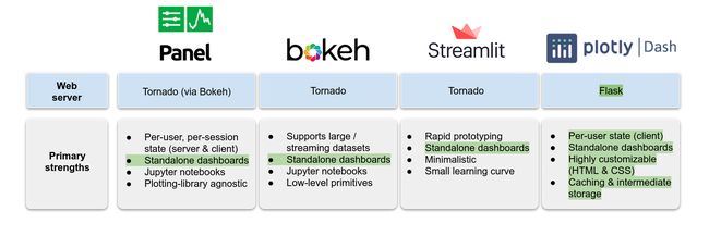
As can be seen in the above figure, Dash provides the ideal combination of all our primary requirements. To start with, Dash uses a web server built on top of Flask (unlike the other three frameworks, which use Tornado), and is deployed just like traditional Flask servers using WSGI. Because we already had other dashboards and backend APIs based on Flask, it made more sense to build our new system with some level of compatibility. Dash is designed to store a session’s state on a per-user basis, within the client (i.e., the browser). This is apt in terms of scalability for our use case, because we need a system where many simultaneous client sessions are able to view results from the database without necessarily using up server resources.
从上图中可以看出,Dash提供了我们所有主要需求的理想组合。 首先,Dash使用在Flask之上构建的Web服务器(与其他三个使用Tornado的框架不同),并像使用WSGI的传统Flask服务器一样进行部署。 因为我们已经有其他基于Flask的仪表板和后端API,所以构建具有一定程度兼容性的新系统更加有意义。 Dash旨在将会话的状态存储在 每位使用者 客户端(即浏览器)内部的基础。 就我们的用例而言,这在扩展性方面很合适,因为我们需要一个系统,其中许多同时进行的客户端会话能够查看数据库中的结果,而不必消耗服务器资源。
We opt to work around any potential computational bottlenecks on the server side by designing our apps such that they never request huge amounts of data from the server at any one time. Any NLP computations (e.g., in our text analyzer app) only request highly specific data (such as gender values for a given name) and run in near real-time, so the server is unlikely to be bogged down due to compute-heavy requests by many simultaneous client sessions. To avoid repeating expensive calculations for each user, a number of options are available for caching intermediate results (on the client side) that can be reused within the session. Most importantly, Dash offers a great deal of freedom in terms of page design and layout— it allows the developer to directly modify the underlying HTML and CSS attributes, providing much greater flexibility in customizing the dashboard’s appearance.
通过设计我们的应用程序,我们选择解决服务器端上任何潜在的计算瓶颈,以使它们永远不会从服务器请求大量数据。 任何NLP计算(例如,在我们的文本分析器应用程序中)仅请求高度特定的数据(例如给定名称的性别值)并几乎实时运行,因此由于计算量大的请求,服务器不太可能陷入瘫痪通过许多同时进行的客户会话。 为避免为每个用户重复进行昂贵的计算,有许多选项可用于缓存中间结果(在客户端),这些结果可在会话中重用。 最重要的是,Dash在页面设计和布局方面提供了很大的自由度-它允许开发人员直接修改基础HTML和CSS属性,从而在自定义仪表板外观方面提供了更大的灵活性。
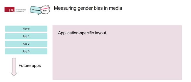
多页结构 (Multi-page structure)
The dashboard is deployed using a multi-page layout, to make it more extensible as time goes on. A simple, responsive HTML layout based on this CSS template is used to allow for flexible rearrangement of components based on the user device’s display resolution. Each app’s layout and source code is self-contained, in its own Python file, and within a clearly defined zone outside the sidebar as shown below. An arbitrary number of independent apps can be added using this structure.
仪表板使用多页布局进行部署,以使其随着时间的流逝而更加可扩展。 基于此CSS模板的简单,响应式HTML布局用于允许根据用户设备的显示分辨率灵活地重新排列组件。 每个应用程序的布局和源代码都是独立的,位于其自己的Python文件中,并且位于侧边栏外部的明确定义的区域内,如下所示。 使用此结构可以添加任意数量的独立应用程序。
模块化和代码可读性 (Modularity and code readability)
A Dash app can be conceptualized as being made of three main blocks of code. The first of these is the application layout, which contains the structure of the web page, including all the interactive widgets and core components (dropdowns, text inputs, etc.) required by the user to modify an app’s state. All code is written in Python, using Dash’s wrappers around Plotly’s graph objects and generic HTML.
可以将Dash应用程序概念化为由三个主要代码块组成。 其中第一个是应用程序布局,其中包含网页的结构,包括用户修改应用程序状态所需的所有交互式小部件和核心组件(下拉菜单,文本输入等)。 所有代码都是用Python编写的,使用Dash的包装程序围绕Plotly的图形对象和通用HTML编写。
import dash
import dash_core_components as dcc
import dash_html_components as html
import pandas as pd


app = dash.Dash('app', server=server)
df = pd.read_csv('input_data.csv')


# ========== App Layout ================
app.layout = html.Div([
    html.H1('Example app'),
    dcc.Dropdown(
        id='dropdown-1',
        options=[
            {'label': 'Oct 2018', 'value': '201810'},
            {'label': 'Nov 2018', 'value': '201811'},
        ],
        value='201810',
    ),
    dcc.Graph(id='line-chart-1'),
])
The next block defines the callbacks for the app, which are functions (defined using Python’s decorator syntax) that allow users to observe, modify and update the properties of any component in the UI. Because all Dash code is written in Python, it integrates very well with pandas, allowing specific results to be returned on the fly based on user input. In this example, a dropdown’s selected value is passed as an input argument to a callback, which executes asynchronously to filter the contents of a preloaded pandas DataFrame, returning just the required data. This data is output as a Plotly figure object and rendered as a line chart on the browser.
下一个块定义了应用程序的回调,这些回调函数(使用Python的装饰器语法定义)允许用户观察,修改和更新UI中任何组件的属性。 由于所有Dash代码都是用Python编写的,因此它与熊猫集成良好,可以根据用户输入即时返回特定结果。 在此示例中,下拉列表的选定值作为输入参数传递给回调,该回调以异步方式执行以过滤预加载的熊猫DataFrame的内容,仅返回所需的数据。 此数据作为Plotly figure对象输出,并在浏览器中呈现为折线图。
# ========== Callbacks ================
@app.callback(Output('line-chart-1', 'figure'),
              [Input('dropdown-1', 'value')])
def update_graph(selected_dropdown_value):
    dff = df[df['Date'] == selected_dropdown_value]
    return {
        'data': [{
            'x': dff.Date,
            'y': dff.QuoteCount,
            'line': {
                'width': 3,
            }
        }],
    }
}
The third block contains user-defined, custom functions, primarily written to make the callbacks and the application layout more readable. For example, if we were performing a slightly more complicated action along with filtering the DataFrame, that portion of code could be factored out into a separate function, making the callback much more readable. The example below is the same as the one above, except that the filtering steps are factored out to an external function, greatly improving readability in complex cases.
第三块包含用户定义的自定义函数,主要是为了使回调和应用程序布局更具可读性而编写的。 例如,如果我们执行一个稍微复杂些的操作以及过滤DataFrame,则可以将那部分代码分解为一个单独的函数,从而使回调更具可读性。 下面的示例与上面的示例相同,除了过滤步骤是外部函数的一部分,从而在复杂情况下大大提高了可读性。
# ========== Callbacks ================
@app.callback(Output('line-chart-1', 'figure'),
              [Input('dropdown-1', 'value')])
def update_graph(selected_dropdown_value):
    dff = filter_df(selected_dropdown_value)
    return {
        'data': [{
            'x': dff.Date,
            'y': dff.QuoteCount,
            'line': {
                'width': 3,
            }
        }],
    }
}


# ========== Functions ================
def filter_df(df, names):
    dff = df[df['Date'] == selected_dropdown_value]
    # Perform more complex actions here
    # .
    # .
    return dff
Using this 3-block structure, arbitrarily complex apps can be designed to perform data manipulation and NLP tasks on the fly.
使用这种3块结构,可以设计任意复杂的应用程序以实时执行数据处理和NLP任务。
中间数据存储 (Intermediate data storage)
One common problem that arises when performing NLP tasks is that of expensive bottleneck computations that can increase an app’s response time. For example, in the text analyzer app described earlier, we are required to perform named entity recognition, coreference resolution and gender prediction on a potentially large list of names, all in real time, based on arbitrary text input by the user. This is further complicated by the fact that multiple components in the app — the doughnut charts and multiple data tables — all need to access the same intermediate data.
执行NLP任务时出现的一个常见问题是昂贵的瓶颈计算问题,这会增加应用程序的响应时间。 例如,在前面描述的文本分析器应用程序中,我们需要根据用户输入的任意文本,实时对潜在的大型名称列表执行命名实体识别,共指解析和性别预测。 应用程序中的多个组件(甜甜圈图和多个数据表)都需要访问相同的中间数据,这使情况更加复杂。
Rather than perform the same (potentially expensive) calculation multiple times for each callback, we apply Dash’s inbuilt mechanisms to share state between callbacks. The simplest way to do this is to store expensive-to-compute intermediate data as in-memory JSON, that can be accessed by every subsequent callback without wasteful recomputation. An example is shown below.
我们没有对每个回调多次执行相同(可能很昂贵)的计算,而是应用Dash的内置机制在回调之间共享状态。 最简单的方法是将计算成本高昂的中间数据存储为内存中的JSON,随后的每个回调都可以访问该数据而不会浪费大量的计算时间。 一个例子如下所示。
# ========== Callbacks ================
@app.callback(Output('topic-data', 'data'), [Input('date-dropdown', 'value')])
def get_topic_data(value):
    with pymongo.MongoClient(**MONGO_ARGS) as connection:
        read_collection = connection[READ_DB][READ_COL]
        data = read_collection.find({'_id': value})
        # Collect data
        data = list(data)[0]
        # Perform some expensive calculation
        data_transformed = expensive_calc(data)
    return data_transformed


@app.callback(Output('bar_plot', 'figure'), [Input('topic-data', 'data')])
def update_gender_bars(data):
    df = convert_json_to_pandas(data)  # Convert JSON data to a pandas DataFrame
    return = {
        'data' = [
            {
                'type': 'bar',
                'x': df['x'],
                'y': df['y']
            }
        ]
    }
In the snippet shown above, a user first inputs a condition (e.g., a date filter), for which we read specific data from a MongoDB database using the pymongo library. Then, we perform some expensive calculation on this data (using the function expensive_calc) within the first callback. The data computed from this callback is stored as JSON and kept in memory on the client side, where it can then be accessed for free by the second callback. It is trivial to then transform the JSON data blob into a pandas DataFrame, following which it can be output to a Plotly figure object and rendered as a chart on the client side.
在上面显示的代码段中,用户首先输入条件(例如,日期过滤器),为此我们使用pymongo库从MongoDB数据库中读取特定数据。 然后,我们在第一个回调中对此数据执行一些昂贵的计算(使用函数expensive_calc )。 从此回调计算出的数据将以JSON的形式存储并保存在客户端的内存中,然后第二个回调可免费访问该数据。 然后将JSON数据blob转换为pandas DataFrame是很简单的,然后可以将其输出到Plotly figure对象并在客户端呈现为图表。
结论 (Conclusions)
In building each application for the Gender Gap Tracker research dashboard, design decisions were taken to minimize the amount of data being transferred between the server and the client. Because our primary data storage layer is in MongoDB, all data must be passed around as JSON. Due to the immense size of the data in this project (500,000+ news articles from over a two year period, and counting), we only work with aggregated quantities (precomputed through intermediate operations on these JSON objects) in all our visual components. All charts (heat maps, lollipop plots and line charts) display precomputed values that either sum up or average the individual values over a specified time period. This is mainly done to maintain reasonable response times and to provide a fluid run time experience.
在为Gender Gap Tracker研究仪表板构建每个应用程序时,做出了设计决策,以最大程度地减少服务器与客户端之间传输的数据量。 因为我们的主要数据存储层在MongoDB中,所以所有数据都必须作为JSON传递。 由于该项目中的数据量巨大(两年内有500,000余篇新闻文章,并且还在不断增加),因此我们只能在所有可视组件中使用汇总数量(通过对这些JSON对象进行中间运算来预先计算)。 所有图表(热图,棒棒糖图和折线图)都显示预先计算的值,这些值在指定的时间段内将各个值相加或取平均值。 这样做主要是为了保持合理的响应时间并提供流畅的运行时体验。
The Gender Gap Tracker is the result of many months’ work by a team of eight at Simon Fraser University, whose findings draw from various fields, including big data, computer science, social science, media and linguistics. We are excited to present more nuanced results of this interdisciplinary work for consumption by the broader public, and are always open to feedback!
性别差距追踪器是西蒙弗雷泽大学(Simon Fraser University)一个由8人组成的团队几个月的工作的成果,该团队的发现来自各个领域,包括大数据,计算机科学,社会科学,媒体和语言学。 我们很高兴提出这项跨学科工作的细微差别成果,以供广大公众使用,并且我们随时欢迎反馈!
致谢 (Acknowledgements)
We thank Alexandra Wilson at Simon Fraser University, who provided invaluable guidance on the design, layout and colour styles for the dashboard. We’re also grateful to to Alexandre Lopes at SFU Research Computing, who built and maintains the database and server infrastructure for the Gender Gap Tracker.
感谢Simon Fraser University的Alexandra Wilson,他为仪表板的设计,布局和颜色样式提供了宝贵的指导。 我们也感谢SFU Research Computing的Alexandre Lopes ,他为“性别差距跟踪器”构建并维护了数据库和服务器基础结构。
资源资源 (Resources)
The research dashboard for the Gender Gap Tracker and our most recent results can be explored in detail here:
性别差距追踪器的研究仪表板和我们的最新结果可以在此处进行详细探讨:
The code for the dashboard described in this article is available on the project’s GitHub repo, shown below. Please note that the code for the NLP functions will be added soon (pending publication).
本文所述的仪表板代码可在该项目的GitHub存储库中找到,如下所示。 请注意,将很快添加NLP功能的代码(正在发布中)。
翻译自: https://towardsdatascience.com/an-extensible-interactive-visualization-framework-to-measure-gender-bias-in-the-news-56e33ba1655c