Python基础之利用Matplotlib和Tkinter在应用程序中内嵌图表
在日常应用程序开发中,图表(折线图,柱状图等)以其直观显示,清晰明了的优势,使得应用范围越来越广泛,本文以一个简单的小例子,简述如何将Tkinter和Matplotlib相互关联起来,在应用程序中嵌入图表,仅供学习分享使用,如有不足之处,还请指正。
涉及知识点
- Tkinter 是Python内置的桌面程序开发组件库,包含日常使用的基础组件(如:Label,Button,Entry等),利用Tkinter可以方便的开发可视化程序。
- Matplotlib 是一个开源的数据可视化类库,利用matplotlib可以绘制各种类型的图表(如:折线图,柱状图,散点图等)。
- Numpy 是一个开源的数学相关的类库,广泛应用于数学计算等领域。本例主要使用Numpy提供的数学函数和随机数生成数据源。
操作步骤
如果要将matplotlib生成图表和Tkinter生成的GUI程序关联起来,需要以下3个步骤:
- 创建Matplotlib的figure(画布)对象,并在figure上进行绘图。
- 创建FigureCanvasTkAgg(画布容器)对象,参数为第1步生成的figure对象和容器存放的父对象,并调用创建对象的draw函数。
- 调用FigureCanvasTkAgg对应组件的Pack方法,将对象显示在页面上。
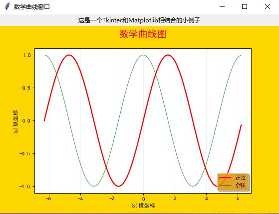
示例效果图
将Matplotlib生成的曲线图,嵌入到普通的windows程序中,如下图所示:
核心代码
创建图表代码
def create_matplotlib(self):
        """创建绘图对象"""
        # 设置中文显示字体
        mpl.rcParams['font.sans-serif'] = ['SimHei']  # 中文显示
        mpl.rcParams['axes.unicode_minus'] = False  # 负号显示
        # 创建绘图对象f figsize的单位是英寸 像素 = 英寸*分辨率
        self.figure = plt.figure(num=2, figsize=(7, 4), dpi=80, facecolor="gold", edgecolor='green', frameon=True)
        # 创建一副子图
        fig1 = plt.subplot(1, 1, 1)  # 三个参数,依次是:行,列,当前索引
        # 创建数据源:x轴是等间距的一组数
        x = np.arange(-2 * np.pi, 2 * np.pi, 0.1)
        y1 = np.sin(x)
        y2 = np.cos(x)

        line1 = fig1.plot(x, y1, color='red', linewidth=2, label='y=sin(x)', linestyle='--')  # 画第一条线
        line2 = fig1.plot(x, y2, color='green', label='y=cos(x)')
        plt.setp(line2, linewidth=1, linestyle='-', alpha=0.7)  # 华第二条线 color='',

        fig1.set_title("数学曲线图", loc='center', pad=20, fontsize='xx-large', color='red')  # 设置标题
        # line1.set_label("正弦曲线")  # 确定图例
        # 定义legend 重新定义了一次label
        fig1.legend(['正弦', '余弦'], loc='lower right', facecolor='orange', frameon=True, shadow=True, framealpha=0.7)
        # ,fontsize='xx-large'
        fig1.set_xlabel('(x)横坐标')  # 确定坐标轴标题
        fig1.set_ylabel("(y)纵坐标")
        fig1.set_yticks([-1, -1 / 2, 0, 1 / 2, 1])  # 设置坐标轴刻度
        fig1.grid(which='major', axis='x', color='gray', linestyle='-', linewidth=0.5, alpha=0.2)  # 设置网格
创建图表容器,并显示代码
def createWidget(self, figure):
        """创建组件"""
        self.label = Label(self, text='这是一个Tkinter和Matplotlib相结合的小例子')
        self.label.pack()
        # 创建画布
        self.canvas = FigureCanvasTkAgg(figure, self)
        self.canvas.draw()
        self.canvas.get_tk_widget().pack(side=TOP, fill=BOTH, expand=1)
        # 把matplotlib绘制图形的导航工具栏显示到tkinter窗口上
        # toolbar = NavigationToolbar2Tk(self.canvas, self)
        # toolbar.update()
        # self.canvas._tkcanvas.pack(side=TOP, fill=BOTH, expand=1)
        # self.button = Button(master=self, text="退出", command=quit)
        # # 按钮放在下边
        # self.button.pack(side=BOTTOM)
整体代码及调用逻辑,如下所示:
from tkinter import *
import numpy as np
import matplotlib
import matplotlib.pyplot as plt
from matplotlib.pylab import mpl
from matplotlib.backends.backend_tkagg import FigureCanvasTkAgg, NavigationToolbar2Tk


class Application(Frame):
    """一个经典的GUI写法"""

    def __init__(self, master=None):
        '''初始化方法'''
        super().__init__(master)  # 调用父类的初始化方法
        self.master = master
        self.pack(side=TOP, fill=BOTH, expand=1)  # 此处填充父窗体
        self.create_matplotlib()
        self.createWidget(self.figure)

    def createWidget(self, figure):
        """创建组件"""
        self.label = Label(self, text='这是一个Tkinter和Matplotlib相结合的小例子')
        self.label.pack()
        # 创建画布
        self.canvas = FigureCanvasTkAgg(figure, self)
        self.canvas.draw()
        self.canvas.get_tk_widget().pack(side=TOP, fill=BOTH, expand=1)
        # 把matplotlib绘制图形的导航工具栏显示到tkinter窗口上
        # toolbar = NavigationToolbar2Tk(self.canvas, self)
        # toolbar.update()
        # self.canvas._tkcanvas.pack(side=TOP, fill=BOTH, expand=1)
        # self.button = Button(master=self, text="退出", command=quit)
        # # 按钮放在下边
        # self.button.pack(side=BOTTOM)

    def create_matplotlib(self):
        """创建绘图对象"""
        # 设置中文显示字体
        mpl.rcParams['font.sans-serif'] = ['SimHei']  # 中文显示
        mpl.rcParams['axes.unicode_minus'] = False  # 负号显示
        # 创建绘图对象f figsize的单位是英寸 像素 = 英寸*分辨率
        self.figure = plt.figure(num=2, figsize=(7, 4), dpi=80, facecolor="gold", edgecolor='green', frameon=True)
        # 创建一副子图
        fig1 = plt.subplot(1, 1, 1)  # 三个参数,依次是:行,列,当前索引
        # 创建数据源:x轴是等间距的一组数
        x = np.arange(-2 * np.pi, 2 * np.pi, 0.1)
        y1 = np.sin(x)
        y2 = np.cos(x)

        line1 = fig1.plot(x, y1, color='red', linewidth=2, label='y=sin(x)', linestyle='--')  # 画第一条线
        line2 = fig1.plot(x, y2, color='green', label='y=cos(x)')
        plt.setp(line2, linewidth=1, linestyle='-', alpha=0.7)  # 华第二条线 color='',

        fig1.set_title("数学曲线图", loc='center', pad=20, fontsize='xx-large', color='red')  # 设置标题
        # line1.set_label("正弦曲线")  # 确定图例
        # 定义legend 重新定义了一次label
        fig1.legend(['正弦', '余弦'], loc='lower right', facecolor='orange', frameon=True, shadow=True, framealpha=0.7)
        # ,fontsize='xx-large'
        fig1.set_xlabel('(x)横坐标')  # 确定坐标轴标题
        fig1.set_ylabel("(y)纵坐标")
        fig1.set_yticks([-1, -1 / 2, 0, 1 / 2, 1])  # 设置坐标轴刻度
        fig1.grid(which='major', axis='x', color='gray', linestyle='-', linewidth=0.5, alpha=0.2)  # 设置网格

    def destroy(self):
        """重写destroy方法"""
        super().destroy()
        quit()

    def quit():
        """点击退出按钮时调用这个函数"""
        root.quit()  # 结束主循环
        root.destroy()  # 销毁窗口


if __name__ == '__main__':
    root = Tk()
    root.title('数学曲线窗口')
    root.geometry('560x400+200+200')
    app = Application(master=root)

    root.mainloop()
多图示例
如何利用Matplotlib在一张图里面,包含多张子图,如下所示:

多图核心代码
其他代码和上例保持一致,只是在创建图表时略有差异。主要是利用plt.subplot(2, 2, 1)方法对图片进行切分。如下所示:
def create_matplotlib(self):
        """创建绘图对象"""
        # 设置中文显示字体
        mpl.rcParams['font.sans-serif'] = ['SimHei']  # 中文显示
        mpl.rcParams['axes.unicode_minus'] = False  # 负号显示
        # 创建绘图对象f figsize的单位是英寸 像素 = 英寸*分辨率
        self.figure = plt.figure(num=2, figsize=(7, 4), dpi=80, facecolor="gold", edgecolor='green', frameon=True)
        self.figure.text(0.45, 0.94, '这是四幅图') # 设置显示的文本
        # 一张图上显示4张小图
        x = np.linspace(-6, 6, 100)
        y = np.sin(x)  # 正弦曲线
        y2 = np.cos(x)  # 余弦曲线
        y3 = np.tan(x)  # tan函数
        y4 = np.square(x)  # 平方函数
        fig1 = plt.subplot(2, 2, 1)  # 先进行分块,最后一个参数是序号
        self.setplot(fig1, x, y, 'y=sin(x)', 'red')
        fig2 = plt.subplot(2, 2, 2)
        self.setplot(fig2, x, y2, 'y=cos(x)', 'green')
        fig3 = plt.subplot(2, 2, 3)
        self.setplot(fig3, x, y3, 'y=tan(x)', 'black')
        fig4 = plt.subplot(2, 2, 4)
        self.setplot(fig4, x, y4, 'y=square(x)', 'gold')

    def setplot(self, fig, x, y, text, color='r'):
        """绘制子图"""
        line = fig.plot(x, y, color=color, label=text)
        fig.set_xlabel('(x)横坐标')  # 确定坐标轴标题
        fig.set_ylabel("(y)纵坐标")
        fig.grid(which='major', axis='x', color='gray', linestyle='-', linewidth=0.5, alpha=0.2)  # 设置网格
        fig.legend(loc='lower right', facecolor='orange', frameon=True, shadow=True, framealpha=0.7)
柱状图示例
如何利用Matplotlib绘制柱状图,如下所示:

柱状图核心代码
其他代码和上例保持一致,只是在创建图表时略有差异。主要是通过bar 函数创建柱状图,如下所示:
def create_matplotlib(self):
        """创建绘图对象"""
        # 设置中文显示字体
        mpl.rcParams['font.sans-serif'] = ['SimHei']  # 中文显示
        mpl.rcParams['axes.unicode_minus'] = False  # 负号显示
        # 创建绘图对象f figsize的单位是英寸 像素 = 英寸*分辨率
        self.figure = plt.figure(num=2, figsize=(7, 4), dpi=80, facecolor="gold", edgecolor='green', frameon=True)
        self.figure.text(0.45, 0.94, '这是柱状图图') # 设置显示的文本
        x = np.arange(12)
        y = np.random.uniform(0.5, 1.0, 12) * (1 - x / float(12))
        loc = zip(x, y)  # 将x, y 两两配对
        plt.ylim(0, 1.2)  # 设置y轴的范围
        plt.bar(x, y, facecolor='green', edgecolor='black')  # 绘制柱状图(填充颜色绿色,边框黑色)
        for x, y in loc:
            plt.text(x + 0.1, y + 0.01, '%.2f' % y, ha='center', va='bottom')  # 保留小数点2位
备注
Matplotlib的图表形式还有很多,本例只是抛砖引玉,简述两种图表的生成方式,其他的图表则不做赘述。
如需源码链接,可点击链接下载。一首小词,舒缓一下心情。
浣溪沙·堤上游人逐画船
宋代:欧阳修
堤上游人逐画船,拍堤春水四垂天。绿杨楼外出秋千。
白发戴花君莫笑,六幺催拍盏频传。人生何处似樽前!