Ant Design vue 组件 button自定义
封装Ant Design vue 组件 button按钮 自定义颜色,大小等
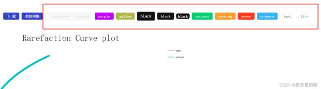
效果图如下:
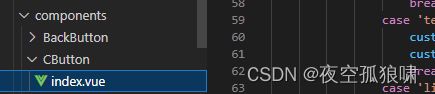
在component文件中新建一个组件代码如下:
<template>
    <a-button :type="customType" :class="customClass" :size="customSize" :disabled="disabled">
        <template v-if="iconType" #icon>
            <component :is="iconType" />
        </template>
        <slot />
    </a-button>
</template>
<script>
import { defineComponent, ref, watch } from 'vue'
export default defineComponent({
    name: 'CButtonIndex',
    props: {
        type: { type: String, default: '' },
        size: { type: String, default: '' },
        icon: { type: String, default: '' },
        disabled: { type: Boolean, default: false },
        permission: { type: [String, Boolean], default: true }
    },
    setup(props) {
        const customClass = ref('c-button-primary')
        const customType = ref('')
        const customSize = ref('middle')
        const iconType = ref('')
        watch(() => props.type, (v) => {
            switch (v) {
                case 'yellow':
                    customClass.value = 'c-button-yellow'
                    customType.value = 'default'
                    break
                case 'warning':
                    customClass.value = 'c-button-warning'
                    customType.value = 'default'
                    break
                case 'error':
                    customClass.value = 'c-button-error'
                    customType.value = 'default'
                    break
                case 'success':
                    customClass.value = 'c-button-success'
                    customType.value = 'default'
                    break
                case 'primary':
                    customClass.value = 'c-button-primary'
                    customType.value = 'primary'
                    break
                case 'cyan':
                    customClass.value = 'c-button-cyan'
                    customType.value = 'default'
                    break
                case 'black':
                    customClass.value = 'c-button-black'
                    customType.value = 'default'
                    break
                case 'purple':
                    customClass.value = 'c-button-purple'
                    customType.value = 'default'
                    break
                case 'text':
                    customClass.value = ''
                    customType.value = 'text'
                    break
                case 'link':
                    customClass.value = ''
                    customType.value = 'link'
                    break
                default:
                    customClass.value = ''
                    customType.value = 'default'
                    break
            }
        }, { immediate: true })
        watch(() => props.size, v => {
            customSize.value = !v ? 'middle' : v
        }, { immediate: true })
        watch(() => props.icon, v => {
            iconType.value = v
        }, { immediate: true })
        watch(() => props, () => { }, { immediate: true })
        return {
            customClass,
            customType,
            customSize,
            iconType
        }
    }
})
</script>
<style scoped>
.c-button-yellow {
    color: #fff;
    background-color: rgb(180, 180, 63);
    border-color: rgb(180, 180, 63);
}

.c-button-yellow:hover {
    color: #fff;
    background-color: rgb(202, 202, 67);
    border-color: yellow;
}

.c-button-yellow[disabled],
.c-button-yellow[disabled]:hover,
.c-button-yellow[disabled]:focus,
.c-button-yellow[disabled]:active {
    color: rgba(0, 0, 0, 0.25);
    background: #f5f5f5;
    border-color: #d9d9d9;
    text-shadow: none;
    box-shadow: none;
}


.c-button-primary {
    color: #fff;
    background-color: #2db7f5;
    border-color: #2db7f5;
}

.c-button-primary:hover {
    color: #fff;
    background-color: #3dc1fc;
    border-color: #2db7f5;
}

.c-button-primary[disabled],
.c-button-primary[disabled]:hover,
.c-button-primary[disabled]:focus,
.c-button-primary[disabled]:active {
    color: rgba(0, 0, 0, 0.25);
    background: #f5f5f5;
    border-color: #d9d9d9;
    text-shadow: none;
    box-shadow: none;
}

.c-button-warning {
    color: #fff;
    background-color: #ff9900;
    border-color: #ff9900;
}

.c-button-warning:hover {
    color: #fff;
    background-color: #fcac35;
    border-color: #ff9900;
}

.c-button-warning[disabled],
.c-button-warning[disabled]:hover,
.c-button-warning[disabled]:focus,
.c-button-warning[disabled]:active {
    color: rgba(0, 0, 0, 0.25);
    background: #f5f5f5;
    border-color: #d9d9d9;
    text-shadow: none;
    box-shadow: none;
}

.c-button-error {
    color: #fff;
    background-color: #ff3300;
    border-color: #ff3300;
}

.c-button-error:hover {
    color: #fff;
    background-color: #fc653f;
    border-color: #ff3300;
}

.c-button-error[disabled],
.c-button-error[disabled]:hover,
.c-button-error[disabled]:focus,
.c-button-error[disabled]:active {
    color: rgba(0, 0, 0, 0.25);
    background: #f5f5f5;
    border-color: #d9d9d9;
    text-shadow: none;
    box-shadow: none;
}

.c-button-success {
    color: #fff;
    background-color: #00cc66;
    border-color: #00cc66;
}

.c-button-success:hover {
    color: #fff;
    background-color: #03e071;
    border-color: #00cc66;
}

.c-button-success[disabled],
.c-button-success[disabled]:hover,
.c-button-success[disabled]:focus,
.c-button-success[disabled]:active {
    color: rgba(0, 0, 0, 0.25);
    background: #f5f5f5;
    border-color: #d9d9d9;
    text-shadow: none;
    box-shadow: none;
}

.c-button-cyan {
    color: #fff;
    background-color: #04c1e1;
    border-color: #04c1e1;
}

.c-button-cyan:hover {
    color: #fff;
    background-color: #0ad5f8;
    border-color: #04c1e1;
}

.c-button-cyan[disabled],
.c-button-cyan[disabled]:hover,
.c-button-cyan[disabled]:focus,
.c-button-cyan[disabled]:active {
    color: rgba(0, 0, 0, 0.25);
    background: #f5f5f5;
    border-color: #d9d9d9;
    text-shadow: none;
    box-shadow: none;
}

.c-button-black {
    color: #fff;
    background-color: #131313;
    border-color: #131313;
}

.c-button-black:hover {
    color: #fff;
    background-color: #313131;
    border-color: #131313;
}

.c-button-black[disabled],
.c-button-black[disabled]:hover,
.c-button-black[disabled]:focus,
.c-button-black[disabled]:active {
    color: rgba(0, 0, 0, 0.25);
    background: #f5f5f5;
    border-color: #d9d9d9;
    text-shadow: none;
    box-shadow: none;
}

.c-button-purple {
    color: #fff;
    background-color: #B500FE;
    border-color: #B500FE;
}

.c-button-purple:hover {
    color: #fff;
    background-color: #c951fa;
    border-color: #B500FE;
}

.c-button-purple[disabled],
.c-button-purple[disabled]:hover,
.c-button-purple[disabled]:focus,
.c-button-purple[disabled]:active {
    color: rgba(0, 0, 0, 0.25);
    background: #f5f5f5;
    border-color: #d9d9d9;
    text-shadow: none;
    box-shadow: none;
}
</style>
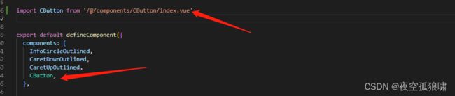
vue3引入组件,自行百度,
在需要的页面直接引用
      <a-button type="primary" @click="downPdf">下载a-button>
      <a-button type="primary" @click="showDrawer(taskId)">参数调整a-button>

      <c-button type="purple" :disabled="true" :loading="true">disabled---loadingc-button>
      <c-button type="purple">purplec-button>
      <c-button type="yellow">yellowc-button>
      <c-button type="black" size="large">blackc-button>
      <c-button type="black" size="middle">blackc-button>
      <c-button type="black" size="small">blackc-button>
      <c-button type="success" icon="plus-outlined">successc-button>
      <c-button type="warning">warningc-button>
      <c-button type="error">errorc-button>
      <c-button type="primary">primaryc-button>
      <c-button type="text">textc-button>
      <c-button type="link">linkc-button>