mekko 教程_Power BI桌面Mekko图表
mekko 教程
In my last articles on Power BI Desktop (see the index at the bottom of the article), we have explored that Power BI has a rich set of visualizations. We can present data using various custom visuals available from Microsoft AppSource. These visuals are available free to download and use it as per our requirements.
在有关Power BI Desktop的最后几篇文章中(请参阅文章底部的索引),我们探索了Power BI具有丰富的可视化集。 我们可以使用Microsoft AppSource提供的各种自定义视觉效果来呈现数据。 这些视觉效果可根据我们的要求免费下载和使用。
Some of the articles for references are:
一些供参考的文章是:
- Word Cloud 词云
- Pulse Charts 脉搏图
- Interactive chord diagrams 互动和弦图
Note: You should have Power BI Desktop installed in order to use the custom Visuals along with a work account to download them from Microsoft AppSource.
注意:您应该已安装Power BI Desktop,以便与工作帐户一起使用自定义Visuals从Microsoft AppSource下载它们。
Normally we use stacked bar charts in Excel to analyze the data in excel with the help of 100% Stacked Column Charts as shown below.
通常,我们在Excel中使用堆积条形图借助100%堆积柱形图来分析excel中的数据,如下所示。

There is another way to represent data in terms of the stacked bar chart as shown below.
还有另一种以堆积条形图表示数据的方式,如下所示。
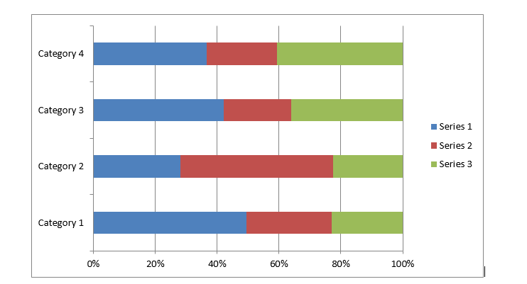
In the stacked chart, as shown here, the length or width of the bar shows the particular category data. It helps to analyze the data from a single category perspective but if we want to add more categories into the chart, it would be difficult to get these from the stacked charts.
在堆叠的图表中,如此处所示,条的长度或宽度显示了特定的类别数据。 它有助于从单个类别的角度分析数据,但是如果我们想在图表中添加更多类别,则很难从堆叠的图表中获取这些类别。
Power BI presents a unique way to represent data into a two-dimensional stacked chart called Mekko charts aka Marimekko Charts. In Mekko Charts both x and y-axis represent a percentage scale. This percentage scale represents both height and width of the segment. The column width of each segment is scaled so that total width matches the chart width. Therefore, Mekko charts are two way 100% stacked charts.
Power BI提供了一种独特的方式来将数据表示为称为Mekko图又称为Marimekko图的二维堆叠图。 在Mekko图表中,x轴和y轴均表示百分比刻度。 该百分比比例代表该段的高度和宽度。 缩放每个段的列宽,以便总宽度与图表宽度匹配。 因此,Mekko图表是两种100%堆叠图表。
将数据导入Power BI Desktop (Import Data into Power BI Desktop)
Let us first prepare the sample data for creating the Mekko Chart. We will prepare both the 100% stacked charts and Mekko Charts to see the difference in both the charts.
让我们首先准备用于创建Mekko图表的样本数据。 我们将准备100%堆叠图表和Mekko图表,以查看两个图表之间的差异。
In this example, let us import data from the source as an Excel file. Therefore, to import the data follow the steps below
在此示例中,让我们从源导入数据作为Excel文件。 因此,要导入数据,请按照以下步骤操作
Click on Get Data -> Excel Data Source
单击获取数据-> Excel数据源

Go the Excel file to import data into Power BI Desktop
转到Excel文件以将数据导入Power BI Desktop
We can view sample data as shown below
我们可以查看示例数据,如下所示

We need to load the data into Power BI Desktop, therefore ‘click on Load’. We can view the sample data and make changes if required. In order to make changes, click on Edit and save the data.
我们需要将数据加载到Power BI Desktop中,因此需要“单击加载”。 我们可以查看样本数据,并根据需要进行更改。 为了进行更改,请单击“编辑”并保存数据。
Now we have the data set into Power BI Desktop.
现在,我们将数据设置到Power BI Desktop中。
100%堆积柱形图 (100% Stacked Column chart)
Let us create a 100% stacked column chart from the sample data set. 100% Stacked Column charts are available in the Power BI Desktop itself, we can use them without download it separately.
让我们根据示例数据集创建100%堆叠的柱形图。 Power BI Desktop本身提供100%堆积柱形图,我们可以使用它们而无需单独下载。
Launch the Stacked Bar chart and adjust the width and height of the chart as shown below.
启动堆积条形图,并如下图所示调整图表的宽度和高度。

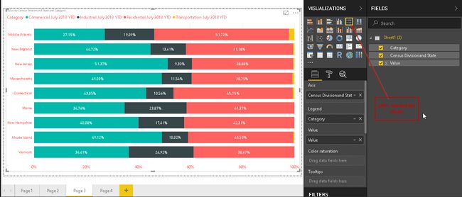
Create the 100% Stacked Column Chart by selecting the data columns from the dataset as shown below. We can see here that it shows category for each Census division and as per the category. Each Census has its own data bars, which are further divided into the category.
通过从数据集中选择数据列来创建100%堆积柱形图,如下所示。 我们在这里可以看到,它显示了每个人口普查部门的类别以及类别。 每个人口普查都有自己的数据栏,这些数据栏进一步分为几类。

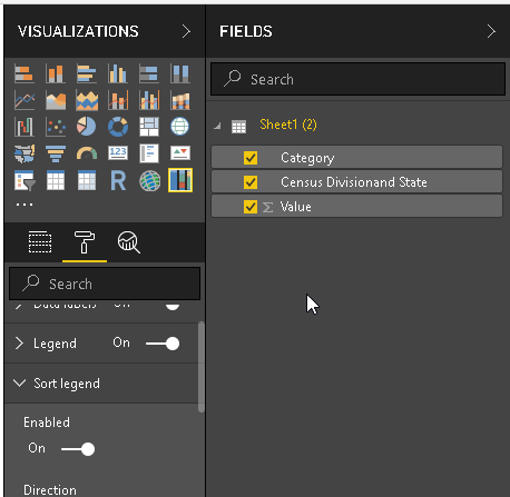
Now in order to show more details in the chart, go to ‘Data labels’ section and switch it on. Just move the slider to turn it ‘On’. The Mekko Chart now chart shows data labels as well in terms of percentage. Each vertical bar category sum of percentage is 100%
现在,为了在图表中显示更多详细信息,请转到“数据标签”部分并将其打开。 只需移动滑块将其打开即可。 Mekko图表现在的图表还显示了数据标签的百分比。 每个垂直条类别的百分比总和为100%

100%堆积条形图 (100% Stacked Bar chart)
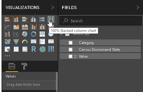
Now let us create the 100% Stacked Bar chart from the Visualization section. This chart is also available by default in Power BI Desktop. Therefore, click on the 100% Stacked Bar chart icon and create a chart from the same data set.
现在,让我们从“可视化”部分创建100%堆积的条形图。 默认情况下,此图表在Power BI Desktop中也可用。 因此,单击100%堆积的条形图图标,然后从同一数据集创建一个图表。
We can see here that as compared with the 100% stacked Column chart, this chart shows data into bar format.
我们在这里可以看到,与100%堆积的柱状图相比,此图以条形格式显示数据。
Mekko图 (Mekko chart)
Mekko Charts are a mix of 100% Stacked Column Chart and 100% Stacked Bar chart combined into one view. In today’s data analytics, we need to analyze the complex data, which we require multiple data fields, dimensions. We can do the segmentation and pattern analysis with the help of Mekko Charts. By default, this chart is not available in Power BI Desktop, go to the AppSource and install it.
Mekko图表是将100%堆积柱形图和100%堆积条形图组合成一个视图的组合。 在当今的数据分析中,我们需要分析复杂的数据,这需要多个数据字段和维度。 我们可以借助Mekko Charts进行细分和模式分析。 默认情况下,此图表在Power BI Desktop中不可用,请转到AppSource并安装它。

We can download the file from here and then import later in Power BI Desktop or we can directly import the Mekko Chart. We need to have an active internet connection to connect and download the package.
我们可以从此处下载文件,然后稍后在Power BI Desktop中导入,也可以直接导入Mekko图表。 我们需要建立有效的Internet连接才能连接和下载软件包。
We will import the Mekko Chart directly using Power BI Desktop Import function. To import the Mekko Chart, Go to Marketplace and search Mekko Chart
我们将使用Power BI Desktop导入功能直接导入Mekko图表。 要导入Mekko图表,请转到市场并搜索Mekko图表

We can see in the description “A mix of 100% stacked column chart and 100% stacked bar chart combined into a single view”.
我们可以在“将100%堆积的柱形图和100%堆积的条形图组合成一个视图的描述”中看到。
Click on Add to import this customized visualization. It shows below message once the import is successful.
单击添加以导入此定制的可视化。 导入成功后,将显示以下消息。

In the below image, we can see the Mekko Chart icon (
在下图中,我们可以看到Mekko图表图标(

Click on Mekko Chart icon and adjust the height, the width of the Mekko Chart to have a better visual.
单击Mekko图表图标并调整Mekko图表的高度和宽度,以获得更好的视觉效果。

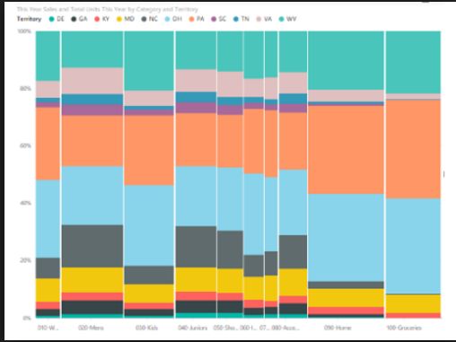
Now we need to define the fields to create the Mekko Chart. We will use the existing data that we used in the 100% stacked Column chart and 100% Stacked Bar chart. Define the columns to the Category, Series, Y-Axis fields. In the below image, Mekko Chart is generated with defined columns.
现在,我们需要定义字段以创建Mekko图表。 我们将使用在100%堆积柱形图和100%堆积条形图中使用的现有数据。 在“类别”,“系列”,“ Y轴”字段中定义列。 在下图中,使用定义的列生成了Mekko图表。

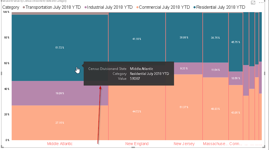
We can see here the Mekko chart is showing data in terms of both columns and Bars as per the data values and categories. We can highlight any particular category by clicking on that section. For example, below if we click on Commercial July 2018 YTD, we can highlight the section below.
我们可以在此处看到Mekko图表根据数据值和类别以列和条形显示数据。 我们可以通过单击该部分来突出显示任何特定类别。 例如,如果下面单击``2018年7月商业年初至今'',则可以突出显示以下部分。
Note: In the above Image of Mekko chart, we have customized the x-axis, a category to give a better look. You can customize them as per your requirement from the format section.
注意:在上面的Mekko图表图像中,我们自定义了x轴,这是一个使外观更好的类别。 您可以根据需要在格式部分自定义它们。

Currently, the width of the bars is the same for all categories. It does not reflect any change in the width of bars due to our data. If we want to show this width as per our data then we need to set that particular column into the Axis Width section. For example, below we can see that Mekko chart after we set the Axis width as Value.
当前,所有类别的条形宽度均相同。 由于我们的数据,它不反映条形宽度的任何变化。 如果要根据数据显示此宽度,则需要将该特定列设置为“轴宽度”部分。 例如,在下面将“轴宽”设置为“值”后,可以看到该Mekko图表。
Therefore, the width of the bars in the Mekko chart is now changed as per the data values.
因此,现在根据数据值更改了Mekko图表中条形的宽度。

If we hover mouse to any particular segment, we can see the detailed description for that particular field. For example, we can see the highlighted value in a pop box as shown.
如果将鼠标悬停在任何特定段上,我们可以看到该特定字段的详细说明。 例如,我们可以在弹出框中看到突出显示的值,如图所示。
对焦模式格式化 (Focus Mode formatting)
We can view the chart in the focus mode in which we can view the visual with the highlighted mode and with all filters. Click on the small icon on the top right corner to enable focus mode.
我们可以在焦点模式下查看图表,在该模式下,我们可以使用突出显示模式和所有过滤器来查看视觉效果。 单击右上角的小图标以启用聚焦模式。

We can see the below Mekko Chart in the focus mode.
我们可以在聚焦模式下看到下面的Mekko图表。

列边框格式 (Column Border formatting)
By default, Mekko charts categories or segments are separated by a while column border. You can view the column border in the above image.
默认情况下,Mekko图表类别或细分由while列边框分隔。 您可以在上图中查看列边框。
We can control the properties of the column border using ‘Column Border’ section in the format area. We can change the column border color, width. We can turn it off as column border also.
我们可以使用格式区域中的“列边框”部分来控制列边框的属性。 我们可以更改列边框的颜色,宽度。 我们也可以将其关闭为列边框。
In the below example, I changed the column border color and we can see the change in the Mekko Chart.
在下面的示例中,我更改了列边框颜色,我们可以在Mekko图表中看到更改。

In below example, we turned off ‘Column Border’ setting. You can notice the difference in Mekko Chart without any border.
在下面的示例中,我们关闭了“列边框”设置。 您会注意到Mekko图表中的差异没有任何边界。

结论 (Conclusion)
Mekko Charts in Power BI desktop allows data to be displayed along with two dimensions simultaneously. These charts are useful for the analysis or representing complex data and provide a better view as compared to 100% Stacked Column and bar charts.
Power BI桌面中的Mekko图表允许同时显示数据和两个维度。 与100%堆积柱形图和条形图相比,这些图表可用于分析或表示复杂数据,并提供更好的视图。
目录 (Table of contents)
| Power BI Desktop Interactive chord diagrams |
| Power BI Desktop Pulse Charts |
| How to create a Word Cloud generator in Power BI Desktop |
| Power BI desktop Mekko Charts |
| Hexbin Scatterplot in Power BI Desktop |
| Candlestick chart for stock data analysis in Power BI Desktop |
| Enlighten World Flag Slicer in Power BI Desktop |
| Flow Map Chart in Power BI Desktop |
| Ask a Question feature in Power BI Desktop |
| Power BI Desktop Q&A data interaction examples |
| Power BI Desktop and Python; like Peanut Butter and Chocolate |
| Power BI Desktop Pie Chart Tree |
| Importing data from a PDF file in Power BI Desktop |
| Power BI Desktop交互式和弦图 |
| Power BI桌面脉冲图 |
| 如何在Power BI Desktop中创建词云生成器 |
| Power BI桌面Mekko图表 |
| Power BI Desktop中的Hexbin散点图 |
| 用于Power BI Desktop中的库存数据分析的烛台图 |
| 在Power BI桌面中启发世界国旗切片器 |
| Power BI Desktop中的流程图 |
| Power BI Desktop中的“提问”功能 |
| Power BI桌面问答数据交互示例 |
| Power BI Desktop和Python; 像花生酱和巧克力 |
| Power BI桌面饼图树 |
| 从Power BI Desktop中的PDF文件导入数据 |
翻译自: https://www.sqlshack.com/power-bi-desktop-mekko-charts/
mekko 教程