移动端网页特效
1. 触屏事件
移动端浏览器兼容性较好,我们不需要考虑以前JS的兼容性问题,可以放心的使用原生JS书写效果,但是移动端也有自己独特的地方,比如触屏事件touch(也称触摸事件),Android和IOS都有
touch对象代表一个触摸点,触摸点可以是一根手指,也可能是一根触摸笔。触屏事件可相应用户手指(或触控笔)对屏幕或者触控板操作
常见的触屏事件如下:
| 触屏touch事件 | 说明 |
|---|---|
| touchstart | 手指触摸到一个DOM元素时触发 |
| touchmove | 手指在一个DOM元素上滑动时触发 |
| touchend | 手指从一个DOM元素移开时触发 |

1.2 触摸事件对象(TouchEvent)
TouchEvent是一类描述手指在触摸平面(触摸屏、触摸板等)的状态变化的事件,这类事件用于描述一个或多个触点,使开发者可以检测缺点的移动,触电的增加和减少,等等
touchstart、touchmove、touchend三个事件都会各自有事件对象
div.addEventListener('touchstart', function (e) {
console.log(e);
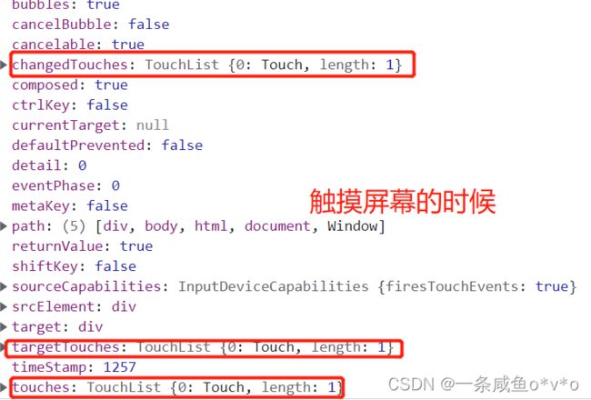
});触摸事件对象重点看三个常见对象列表:
| 触摸列表 | 说明 |
|---|---|
| touches | 正在触摸屏幕的所有手指的一个列表 |
| targetTouches | 正在触摸当前DOM元素上的手指的一个列表 |
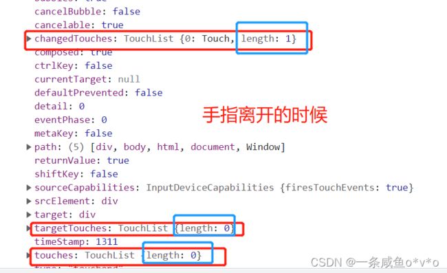
| changedTouches | 手指状态发生了改变的列表,从无到有,从有到无变化 |
注意:
- touches正在触摸屏幕的所有手指列表
- targetTouches正在触摸当前DOM元素的手指列表
- 如果侦听的是一个DOM元素,他们两个是一样的
- 因为我们平时都是给元素注册触摸事件,所以重点记住targetTouches
- changedTouches和touches、targetTouches的区别:
- 当我们手指触摸屏幕的时候,touches、targetTouches和changedTouches里的值是一样的
- 当我们手指离开屏幕的时候,touches、targetTouches就没有了,但是changedTouches还有

1.3 移动端拖动元素
- touchstart、touchmove、touchend可以实现拖动元素
- 但是拖动元素需要当前手指的坐标值,我们可以使用targetTouches[0]里面的pageX和pageY
- 移动端拖动的原理:手指移动中,计算出手指移动的距离,然后用盒子原来的位置+手指移动的距离
- 手指移动的距离:手指滑动的位置减去 手指刚开始触摸的位置
拖动元素三部曲:
- 触摸元素touchstart:获取手指初始坐标,同时获得盒子原来的位置
- 移动手指touchmove:计算手指的滑动距离,并且移动盒子
- 离开手指touchend
注意:手指移动也会触发滚动屏幕所以这里要阻止默认的屏幕滚动e.preventDefault()
2. 移动端常见特效
案例:移动端轮播图
步骤:
-------------------------------------------布局-------------------------------------------------------------------------------
1.把所有的图片放在一个ul的li中
2.设置小圆点,子绝父相
3.当前选中的小圆点长度会变长
4.因为图片显示到最后一张还有在第一张拖动的时候会留白,将第一张图片和倒数第二张图片复制
5.图片一行显示 设置浮动 把ul的宽度设为父元素的百分之500,但是,百分比都是按照父元素来说的,所以每个图片的宽度也会成百分之500,因为图片宽度100%,而图片的父元素li没有设置宽度,父元素的父元素ul设置了宽度(500%),所以图片的宽度和ul相同,所以才会变大,为了解决这个问题,就给图片的父元素li设置宽度,因为一共有5张图片,每个li就设置成父元素的20%
6.因为li设置了浮动,会脱标,影响下面的元素显示,所以清除浮动
7.小圆点设置了margin 清除margin
8.因为一开始显示的是第三张图,为了显示第一张图,把整个ul向左移一个图片的宽度(图片的宽度就是整个父盒子focus的宽度)
注意:
1.

图上写错了,是第一张图片向左拖的时候,会留白

------------------------------------------------自动播放---------------------------------------------------------

步骤:
- 先引入js文件
- 要等页面所有元素加载完,所以是load事件
- 获取元素,获取图片的大小,定义一个下标index初值0
- 开启定时器,每开启一次,index都加1
- 移动端使用translate移动,移动的距离是index*图片宽度,注意是负值
- 为了使自动播放的效果缓慢一点,添加过渡效果
ul.style.transition = 'all .3s';
注意:

---------------------------------------------无缝滚动-----------------------------------------------------------

步骤:
- 执行判断条件之前,先等待过渡完成 transitionend事件
- 判断条件,如果图片滚动到了最后一张,index重新赋值为0,图片快速的跳到第一张(注意,是index为0 的那一张,不是最左边的第三张),而且要清除过渡,为了让图片跳的快
- 因为后面还要做在第一张往左边拖的效果,所以,当index索引号小于0的时候,图片要快速的跳到倒数第二张,同样也要清除过渡

注意:
- 要实现无缝滚动,就是要判断是否图片滚动到了最后一张,然后再迅速的跳到第一张
- 而我们之前添加了过渡时间,可能会影响判断,所以要等到过渡完成之后再判断
- 监测过渡完成时间transitionend
- 第一张图片的索引号才是0,而不是最头上的第三张图片,最左边的第三张图片看不见
----------------------------------------------------------------------------------------------------------------------
classList 属性
classList属性是HTML5新增的一个属性,返回元素的类名。但是ie10以上版本支持

该属性用于在元素中添加,移除及切换CSS类。有以下方法
添加类:
element.classList.add('类名');
focus.classList.add('current');

注意:添加类名,是在后面追加类名,不会覆盖以前的类名 注意前面不要加.
移除类:
element.classList.remove('类名');

切换类:
element.classList.toggle('类名');
原来有这个类名,就删除这个类名,没有这个类名,就给添加这个类名


--------------------------------------------小圆点跟随变化---------------------------------------------
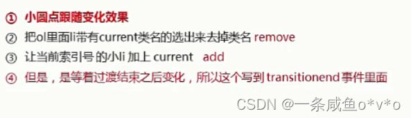
步骤:
- 选出所有带有current类名的ol里面的li元素
- 去掉类名current remove
- 再给当前索引号的li加上current类 注意是在过渡完成之后
----------------------------------------------手指滑动轮播图----------------------------------------------------

步骤:
- 通过触摸元素touchstart事件,获取手指的初始位置
- 通过移动手指touchmove事件,获取手指移动的距离
- 因为初始距离和移动距离在其他函数中也会使用,所以定义成全局变量
- 手指拖动的时候,盒子原来的位置加上手指移动的距离,就是ul元素移动的距离
- 手指拖动的时候不需要过渡
- 拖动图片的时候,图片就不需要自动播放了,所以在手指触摸的时候取消定时器
- 手指离开,根据移动的距离去判断回弹还是播放上一张下一张
- 是在手指离开touchend的事件里完成的
- 确定一个数值,使得滑动的距离超过这个距离的时候就实现直接播放上/下一张
- 如果移动的距离是正值,说明向右划,就播放下一张,如果是负值,说明向左划,播放上一张
- 实现回弹效果
- 如果手指拖动的距离小于一定数值,就不需要播放上一张/下一张,直接让图片等于它原来的位置
- 因为之前在手指触摸屏幕的时候关闭定时器,所以手指离开的时候再开启,开启定时器的时候要清除之前的定时器
- 使程序更加严谨的几个操作:
- 判断用户有没有拖动
- 阻止滚动屏幕的默认行为
注意:
- 因为移动的距离可以是负值,所以判断是否超过一定距离的时候,要加绝对值
- 如果移动的距离是正的,说明向右滑,图片播放上一张,如果移动的距离是负的,说明向左滑,图片播放下一张
- 播放哪一张图还是通过下标index来决定
- translateX是相对于元素最开始位置进行移动的,不是元素的新位置
- (很开心,学会了思考,不再是闭着眼抄代码,虽然是这么简单的问题完全是因为前面没学扎实)
- 如果用户只是点击了屏幕,而没有拖动,就根本不用执行判断移动距离的一系列操作,所以增加一个标志位flag判断用户的手指是否移动
- 如果我们的图片过长,拖动的时候可能会产生滚动屏幕,所以要阻止滚动屏幕的默认行为
--------------------------------------------------------完整代码-----------------------------------------------------------
index.html
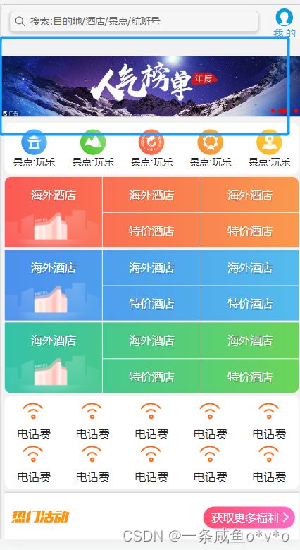
携程在手,说走就走 \
搜索:目的地/酒店/景点/航班号
我 的


热门活动
获取更多福利


index.css
body {
    max-width: 540px;
    min-width: 320px;
    margin: 0 auto;
    font: normal 14px/1.5 Tahoma, "Lucida Grande", Verdana, "Microsoft Yahei", STXihei, hei;
    color: #000;
    background: #f2f2f2;
    overflow-x: hidden;
    -webkit-tap-highlight-color: transparent;
}

ul {
    list-style: none;
    margin: 0;
    padding: 0;
}

a {
    text-decoration: none;
    color: #222;
}

div {
    box-sizing: border-box;
}


/* 搜索模块 */

.search-index {
    display: flex;
    /* 固定定位跟父级没有关系 它以屏幕为准 */
    position: fixed;
    top: 0;
    left: 50%;
    z-index: 999;
    /* 固定的盒子应该有宽度 */
    -webkit-transform: translateX(-50%);
    transform: translateX(-50%);
    width: 100%;
    min-width: 320px;
    max-width: 540px;
    height: 44px;
    /* background-color: pink; */
    background-color: #F6F6F6;
    border-top: 1px solid #ccc;
    border-bottom: 1px solid #ccc;
}

.search {
    position: relative;
    height: 26px;
    line-height: 24px;
    border: 1px solid #ccc;
    flex: 1;
    font-size: 12px;
    color: #666;
    margin: 7px 10px;
    padding-left: 25px;
    border-radius: 5px;
    box-shadow: 0 2px 4px rgba(0, 0, 0, .2);
}

.search::before {
    content: "";
    position: absolute;
    top: 5px;
    left: 5px;
    width: 15px;
    height: 15px;
    background: url(../images/sprite.png) no-repeat -59px -279px;
    background-size: 104px auto;
}

.user {
    width: 44px;
    height: 44px;
    /* background-color: purple; */
    font-size: 12px;
    text-align: center;
    color: #2eaae0;
}

.user::before {
    content: "";
    display: block;
    width: 23px;
    height: 23px;
    background: url(../images/sprite.png) no-repeat -59px -194px;
    background-size: 104px auto;
    margin: 4px auto -2px;
}


/* goBack */

.goBack {
    display: none;
    position: fixed;
    bottom: 50px;
    right: 20px;
    width: 38px;
    height: 38px;
    background: url(../images/back.png) no-repeat;
    background-size: 38px 38px;
}


/* focus */

.focus {
    overflow: hidden;
    position: relative;
    padding-top: 44px;
}

.focus img {
    width: 100%;
}

.focus ul {
    width: 500%;
    margin-left: -100%;
}

.focus ul li {
    float: left;
    width: 20%;
}

.focus ol {
    position: absolute;
    bottom: 5px;
    right: 5px;
    margin: 0;
}

.focus ol li {
    display: inline-block;
    width: 5px;
    height: 5px;
    background-color: red;
    list-style: none;
    border-radius: 2px;
}

.focus ol li.current {
    width: 15px;
}

/* local-nav */

.local-nav {
    display: flex;
    height: 64px;
    margin: 3px 4px;
    background-color: #fff;
    border-radius: 8px;
}

.local-nav li {
    flex: 1;
}

.local-nav a {
    display: flex;
    flex-direction: column;
    /* 侧轴居中对齐 因为是单行 */
    align-items: center;
    font-size: 12px;
}

.local-nav li [class^="local-nav-icon"] {
    width: 32px;
    height: 32px;
    background-color: pink;
    margin-top: 8px;
    background: url(../images/localnav_bg.png) no-repeat 0 0;
    background-size: 32px auto;
}

.local-nav li .local-nav-icon-icon2 {
    background-position: 0 -32px;
}

.local-nav li .local-nav-icon-icon3 {
    background-position: 0 -64px;
}

.local-nav li .local-nav-icon-icon4 {
    background-position: 0 -96px;
}

.local-nav li .local-nav-icon-icon5 {
    background-position: 0 -128px;
}


/* nav */

nav {
    overflow: hidden;
    border-radius: 8px;
    margin: 0 4px 3px;
}

.nav-common {
    display: flex;
    height: 88px;
    background-color: pink;
}

.nav-common:nth-child(2) {
    margin: 3px 0;
}

.nav-items {
    /* 不冲突的 */
    flex: 1;
    display: flex;
    flex-direction: column;
}

.nav-items a {
    flex: 1;
    text-align: center;
    line-height: 44px;
    color: #fff;
    font-size: 14px;
    /* 文字阴影 */
    text-shadow: 1px 1px rgba(0, 0, 0, .2);
}

.nav-items a:nth-child(1) {
    border-bottom: 1px solid #fff;
}

.nav-items:nth-child(1) a {
    border: 0;
    background: url(../images/hotel.png) no-repeat bottom center;
    background-size: 121px auto;
}


/* -n+2就是选择前面两个元素 */

.nav-items:nth-child(-n+2) {
    border-right: 1px solid #fff;
}

.nav-common:nth-child(1) {
    background: -webkit-linear-gradient(left, #FA5A55, #FA994D);
}

.nav-common:nth-child(2) {
    background: -webkit-linear-gradient(left, #4B90ED, #53BCED);
}

.nav-common:nth-child(3) {
    background: -webkit-linear-gradient(left, #34C2A9, #6CD559);
}


/* subnav-entry */

.subnav-entry {
    display: flex;
    border-radius: 8px;
    background-color: #fff;
    margin: 0 4px;
    flex-wrap: wrap;
    padding: 5px 0;
}

.subnav-entry li {
    /* 里面的子盒子可以写 % 相对于父级来说的 */
    flex: 20%;
}

.subnav-entry a {
    display: flex;
    flex-direction: column;
    align-items: center;
}

.subnav-entry-icon {
    width: 28px;
    height: 28px;
    background-color: pink;
    margin-top: 4px;
    background: url(../images/subnav-bg.png) no-repeat;
    background-size: 28px auto;
}


/* sales-box */

.sales-box {
    border-top: 1px solid #bbb;
    background-color: #fff;
    margin: 4px;
}

.sales-hd {
    position: relative;
    height: 44px;
    border-bottom: 1px solid #ccc;
}

.sales-hd h2 {
    position: relative;
    text-indent: -999px;
    overflow: hidden;
}

.sales-hd h2::after {
    position: absolute;
    top: 5px;
    left: 8px;
    content: "";
    width: 79px;
    height: 15px;
    background: url(../images/hot.png) no-repeat 0 -20px;
    background-size: 79px auto;
}

.more {
    position: absolute;
    right: 5px;
    top: 0px;
    background: -webkit-linear-gradient(left, #FF506C, #FF6BC6);
    border-radius: 15px;
    padding: 3px 20px 3px 10px;
    color: #fff;
}

.more::after {
    content: "";
    position: absolute;
    top: 9px;
    right: 9px;
    width: 7px;
    height: 7px;
    border-top: 2px solid #fff;
    border-right: 2px solid #fff;
    transform: rotate(45deg);
}

.row {
    display: flex;
}

.row a {
    flex: 1;
    border-bottom: 1px solid #eee;
}

.row a:nth-child(1) {
    border-right: 1px solid #eee;
}

.row a img {
    width: 100%;
}
index.js
window.addEventListener('load', function () {
    // 1.获取元素
    var focus = document.querySelector('.focus');
    var ul = focus.children[0];
    var w = focus.offsetWidth; //图片的宽度,即focus的宽度
    var index = 0;
    var ol = focus.children[1];
    var flag = false; //标志位,判断用户有没有移动手指
    // 2.利用定时器自动轮播图片
    var timer = setInterval(function () {
        index++;
        var transformx = -index * w;
        ul.style.transition = 'all .3s';
        ul.style.transform = 'translateX(' + transformx + 'px)';
    }, 2000);

    // 3.实现无缝滚动
    // 等待过渡完成
    ul.addEventListener('transitionend', function () {
        if (index >= ul.children.length - 2) {
            index = 0;
            // 去掉过渡效果 这样让我们的ul快速的跳到目标位置
            ul.style.transition = 'none';
            // 利用最新的索引号乘以宽度,去滚动图片
            var transformx = -index * w;
            ul.style.transform = 'translateX(' + transformx + 'px)';
        } else if (index < 0) {
            index = ul.children.length - 3;
            ul.style.transition = 'none';
            var transformx = -index * w;
            ul.style.transform = 'translateX(' + transformx + 'px)';
        }
        // 小圆点跟随变化
        ol.querySelector('.current').classList.remove('current');
        ol.children[index].classList.add('current');

    });
    //4.手指拖动图片
    var startX = 0; //手指起始的距离
    var moveX = 0;  //手指滑动的距离
    ul.addEventListener('touchstart', function (e) {
        startX = e.targetTouches[0].pageX;
        // 手指触摸的时候停止定时器
        clearInterval(timer);
    });
    ul.addEventListener('touchmove', function (e) {
        moveX = e.targetTouches[0].pageX - startX;
        // 盒子移动的距离=盒子原来的距离+手指移动的距离
        var translatex = -index * w + moveX;
        ul.style.transition = 'none';
        ul.style.transform = 'translateX(' + translatex + 'px)';
        flag = true;
        e.preventDefault(); //阻止屏幕滚动的默认行为
    });

    //5.手指离开,根据移动的距离去判断回弹还是播放上一张下一张

    ul.addEventListener('touchend', function () {
        if (flag) {
            // 如果移动的距离超过50 就去播放上一张/下一张
            if (Math.abs(moveX) > 50) {
                // 如果右滑就是播放上一张 moveX是正值
                if (moveX > 0) {
                    index--;
                } else {
                    // 如果左滑就是播放上一张 moveX是负值
                    index++;
                }
                var translatex = -index * w;
                ul.style.transition = 'all .3s';
                ul.style.transform = 'translateX(' + translatex + 'px)';
            } else {
                // 如果移动距离不超过50就回弹(回到原来的距离)
                var translatex = -index * w;
                ul.style.transition = 'all .1s';
                ul.style.transform = 'translateX(' + translatex + 'px)';
            }
        }
        // 再开启定时器
        clearInterval();
        timer = setInterval(function () {
            index++;
            var transformx = -index * w;
            ul.style.transition = 'all .3s';
            ul.style.transform = 'translateX(' + transformx + 'px)';
        }, 2000);
    });
})
------------------------------------------运行效果-----------------------------------------------------------------------