python数据分析基础2_matplotlib
python科学计算——绘图篇
1.matplotlib库的使用介绍
本课时对matplotlib库的介绍来讲解其安装,并通过实例来讲解其基础使用方法。
in
%matplotlib inline    #把图形绘制在页面里
import numpy as np
import matplotlib.pyplot as plt

x = np.linspace(0,10,1000)
y = np.sin(x)
z = np.cos(x)

plt.figure(figsize=(8,4))    #指定图形的尺寸,和像素点是一一对应的
plt.plot(x,y,color='red',label='$sin(x)$')
plt.plot(x,z,"b--",label='$cos(x)$')    #b  blue
plt.xlabel(("Time(s)"))
plt.ylabel("")
plt.title("matplotlib")
plt.ylim(-1.2,1.2)
plt.legend()

fig = plt.gcf()
ax = plt.gca()
print(fig)
print(ax)

plt.show()
out

2.mpl_toolkits库使用介绍(一)
通过对mpl_toolkits库的介绍来讲解其安装,并通过结合matplotlib来制作一些简单的3D效果图
3.mpl_toolkits库使用介绍(二)
通过对mpl_toolkits库的介绍来绘制更高级的3D效果图
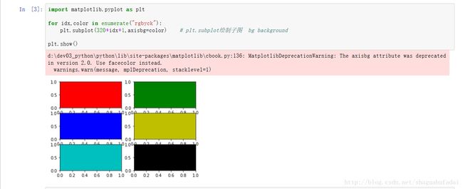
in
import matplotlib.pyplot as plt

for idx,color in enumerate("rgbyck"):
    plt.subplot(320+idx+1,axisbg=color)    # plt.subplot绘制子图  bg background

plt.show()
out
in
#!/usr/bin/env python
#-*-coding: utf-8-*-

import numpy as np
import matplotlib.pyplot as plt

w = np.linspace(0.1,1000,1000)    #0.1~1000这样的1000段的数据
p = np.abs(1 / (1+0.1j*w))

plt.subplot(221)
plt.plot(w,p,linewidth=2)
plt.ylim(0,1.5)

plt.subplot(222)
plt.semilogx(w,p,linewidth=2)    #对数坐标轴 对x轴取对数坐标
plt.ylim(0,1.5)

plt.subplot(223)
plt.semilogy(w,p,linewidth=2)    #对数坐标轴 对y轴取对数坐标
plt.ylim(0,1.5)

plt.subplot(224)
plt.loglog(w,p,linewidth=2)    #对数坐标轴 对x轴、y轴都取对数坐标
plt.ylim(0,1.5)
out

in
#!/usr/bin/env python
#-*-coding: utf-8-*-

import numpy as np
import matplotlib.pyplot as plt

data = np.loadtxt("1.txt")
width = (data[1,0] - data[0,0])*0.4

plt.figure(figsize=(8,5))
plt.bar(data[:,0]-width/2, data[:,1],width,label='person')    #bar 柱状图
plt.xlim(-width, 40+width)
plt.xlabel("Age")
plt.ylabel("Num")
plt.legend()
plt.show()
out

in
#!/usr/bin/env python
#-*-coding: utf-8-*-

import numpy as np
import matplotlib.pyplot as plt

plt.figure(figsize=(8,4))
x = np.random.random(100)    #0~1之间100个随机数
y = np.random.random(100)

plt.scatter(x,y,s=x*1000,c=y,marker=(5,1),alpha=0.8,lw=2,facecolor="none")    #c=y是指color
plt.xlim(0,1)    #lim  limit
plt.ylim(0,1)
plt.show()
out

in
plt.scatter?out
截图


