Kotlin第三章:AndroidUI简介
1. 常见的基础布局容器
笔记来源https://songyubao.com/book/primary/ui/viewgroup.html
视频来源 https://www.bilibili.com/video/BV1264y1474A
Android 的UI可以分为两类,一类叫做
ViewGroup容器,一类叫做View视图
- View视图:(TextView,Button,ImageView)常见的视图
- ViewGroup容器:内部可以承载、放置、添加View视图
1. 基础布局容器
- LinearLayout线性布局:横着或竖着按顺序排列
- RelativeLayout相对布局:起始坐标时屏幕坐上角,以同级或上级为参考系定位位置
- FrameLayout帧布局:像千层饼一样,一层压着一层
- ConstraintLayout约束布局:google于2016年新发布的一种布局方式,它不在android的基础api包里,需要额外引入
AbsoluteLayout绝对布局(以屏幕左上角为参考系,定位自己的位置,从android 2.2版本后废弃)GridLayout网格布局(可以指定行数列数,子控件自动根据行列数进行分配位置,于android 4.0后新增进api中)TableLayout表格布局(类似于网格布局,以一个TableRow标签定义为一行或一列)
1. LinearLayout 线性布局
线性布局就是从左到右或从上到下按顺序排列的一种布局。
| 序号 | 属性 | 可选值 | 说明 |
|---|---|---|---|
| 1 | orientation | 1.vertical:垂直排列 2.horizontal:水平排列 |
也就是这个线性布局到底是水平方向逐个排列还是垂直方向逐个排列 |
| 2 | layout_width layout_height | 1.match_parent:填充父容器的剩余空间 2.wrap_content:根据子视图宽高自适应自己的宽高 3.自定义大小50dp |
layout_width和layout_height是android中控件的必要属性,规定了控件的宽度和高度,这个两个属性的值可以是指定的值,也可以根据内容自适应,还可以填充整个剩余空间 |
| 3 | background | #ff0000 红色 | 填充背景色 |
| 4 | gravity | 1.center:所有子视图相对于父容器居中显示 2.horizontal_center:所有子容器的横向方向上相对父容器居中显示 3.vertical_center:所有子视图的纵向方向上相对父容器居中显示 |
决定子控件相对该父容器的位置 |
| 5 | layout_gravity | 1.center:该容器相对于它的父容器居中显示 2.horizontal_center:该容器横向方向上相对它的父容器居中显示 3.vertical_center:该容器纵向方向上相对它的父容器居中显示 |
决定该容器相对它的父容器的位置 |
| 6 | weight | 按比例分配父容器剩余的宽度或高度 |
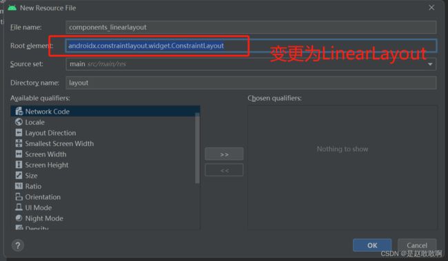
在
res/layout文件夹下创建自己的布局文件,右键layout文件夹,new -> layout Resource File --> components_linearlayout,注意文件名称**不能包含 - 或者是大写字母,可以使用_**。Android Studio推荐使用的
Root Element是androidx.constraintlayout.widget.ConstraintLayout,这里为了学习使用LinearLayout,将之变更为LinearLayout
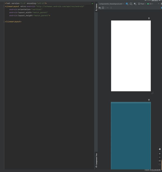
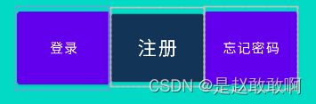
<LinearLayout xmlns:android="http://schemas.android.com/apk/res/android"
    android:orientation="horizontal"
    android:layout_width="match_parent"
    android:layout_height="match_parent"
    android:gravity="center"
    android:background="@color/teal_200">


    <Button
        android:layout_width="100dp"
        android:layout_height="90dp"
        android:text="登录"/>


    <Button
        android:layout_width="100dp"
        android:layout_height="84dp"
        android:backgroundTint="#123456"
        android:text="注册"
        android:textSize="20dp"/>
    <Button
        android:layout_width="100dp"
        android:layout_height="90dp"
        android:text="忘记密码"/>
LinearLayout>
2. RelativeLayout 相对布局
相对布局在摆放子视图位置时,按照指定的参考系来摆放子视图的位置,默认以屏幕左上角(0,0)位置作为参考系摆放位置
- 相对于父元素 7个常用属性
| 属性 | 可选值 | 说明 |
|---|---|---|
| layout_alignParentTop | true/false | 是否让控件相对于父容器顶部对齐 |
| layout_alignParentBottom | true/false | 是否让控件相对于父容器底部对齐 |
| layout_alignParentLeft | true/false | 是否让控件相对于父容器左边对齐 |
| layout_alignParentRight | true/false | 是否让控件相对于父容器右边对齐 |
| layout_centerHorizontal | true/false | 相对父容器水平居中显示 |
| layout_centerVertical | true/false | 相对父容器垂直居中显示 |
| centerInParent | true/false | 相对父容器居中显示 |
- 相对于兄弟元素 4个常用属性
| 属性 | 可选值 | 说明 |
|---|---|---|
| layout_above | @+id/ | 指定在那个控件的上侧 |
| layout_below | @+id/ | 指定在那个控件的上侧 |
| android:layout_toLeftOf | @+id/ | 指定在那个控件的左侧 |
| android:layout_toRightOf | @+id/ | 指定在那个控件的右侧 |
- 相对于兄弟元素的对齐方式
| 属性 | 可选值 | 说明 |
|---|---|---|
| layout_alignLeft | @+id/ | 该控件的左边沿与指定控件的左边对齐 |
| layout_aliginRight | @+id/ | 该控件的右边沿与指定控件的右边对齐 |
| layout_alignTop | @+id/ | 该控件的上边沿与指定控件的上边沿对齐 |
| layout_alignBottom | @+id/ | 该控件的下边沿与指定控件的下边沿对齐 |
同样在
res/layout文件夹下创建文件components_relativelayout,Root Element变更为RelativeLayout
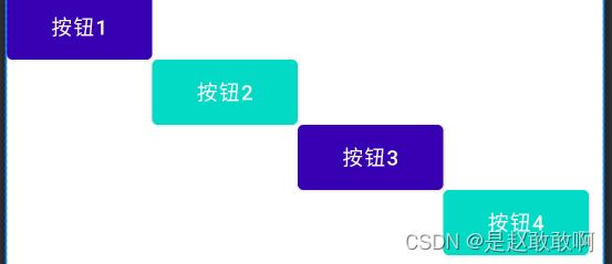
<RelativeLayout xmlns:android="http://schemas.android.com/apk/res/android"
    android:layout_width="match_parent"
    android:layout_height="match_parent">

    <Button
        android:id="@+id/btn1"
        android:layout_width="100dp"
        android:layout_height="45dp"
        android:backgroundTint="@color/purple_700"
        android:insetTop="0dp"
        android:insetBottom="0dp"
        android:text="按钮1"
        />
    <Button
        android:id="@+id/btn2"
        android:layout_width="100dp"
        android:layout_height="45dp"
        android:backgroundTint="@color/teal_200"
        android:layout_toRightOf="@id/btn1"
        android:layout_below="@id/btn1"
        android:insetTop="0dp"
        android:insetBottom="0dp"
        android:text="按钮2"
        />
    <Button
        android:id="@+id/btn3"
        android:layout_width="100dp"
        android:layout_height="45dp"
        android:backgroundTint="@color/purple_700"
        android:layout_toRightOf="@id/btn2"
        android:layout_below="@id/btn2"
        android:insetTop="0dp"
        android:insetBottom="0dp"
        android:text="按钮3"
        />
    <Button
        android:id="@+id/btn4"
        android:layout_width="100dp"
        android:layout_height="45dp"
        android:backgroundTint="@color/teal_200"
        android:layout_toRightOf="@id/btn3"
        android:layout_below="@id/btn3"
        android:insetTop="0dp"
        android:insetBottom="0dp"
        android:text="按钮4"
        />
RelativeLayout>
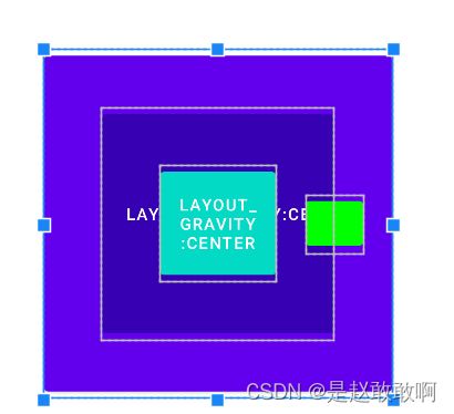
3. FrameLayout帧布局
组件的默认位置都是左上角,组件之间可以重叠。像千层饼一样,一层压着一层 可以设置上下左右的对齐、水平垂直居中、设置方式与线性布局相似
- 常用属性
| 属性 | 可选值 | 说明 |
|---|---|---|
| layout_gravity | center/center_vertical/center_horizontal | 组件相对父容器的位置 |
| layout_marginLeft | 具体的数值100dp | 左侧外间距 |
| layout_marginTop | 具体的数值100dp | 上侧外间距 |
| layout_marginRight | 具体的数值100dp | 右侧外间距 |
| layout_marginBottom | 具体的数值100dp | 下侧外间距 |
同样在
res/layout文件夹下创建文件components_framelayout,Root Element变更为FrameLayout
<FrameLayout xmlns:android="http://schemas.android.com/apk/res/android"
    android:layout_width="match_parent"
    android:layout_height="match_parent">
    <Button
        android:layout_width="300dp"
        android:layout_height="300dp"
        android:layout_gravity="center"
        android:text="Layout_gravity:Center"
        />
    <Button
        android:layout_width="200dp"
        android:layout_height="200dp"
        android:layout_gravity="center"
        android:backgroundTint="@color/purple_700"
        android:text="Layout_gravity:Center"
        />
    <Button
        android:layout_width="100dp"
        android:layout_height="100dp"
        android:layout_gravity="center"
        android:backgroundTint="@color/teal_200"
        android:text="Layout_gravity:Center"
        />
    <Button
        android:layout_width="50dp"
        android:layout_height="50dp"
        android:layout_gravity="center"
        android:backgroundTint="#00ff00"
        android:layout_marginLeft="100dp"
        />
FrameLayout>
2. MaterialButton
MaterialButton是Google于SDK28推出的新控件,当遇到按钮需要圆角、或者描边等,就不必使用xml文件或者Github上找第三方库实现。

1. 依赖引入
- 在
app下的build.gradle中的dependencies模块添加相关依赖,
implementation 'com.google.android.material:material:1.3.0'
- 刷新gradle等待下载完成
- 修改android的theme文件,打开
AndroidManifest.xml,找到android:theme,ctrl + b进入themes.xml主题文件 - 修改
themes.xml中的parent
<style name="Theme.MyApplication" parent="Theme.MaterialComponents.DayNight.DarkActionBar" >

<style name="Theme.MyApplication" parent="Theme.MaterialComponents.Light.NoActionBar">
- 修改
MainActivity中的代码
// 因为主题里边设置了没有主题,所以调用这句话会报错
// setupActionBarWithNavController(navController, appBarConfiguration)
2. 关键属性
| 属性 | 描述 | 参数 |
| app:backgroundTint | 背景着色 | 默认为?attr/colorPrimary |
| app:backgroundTintMode | 着色模式 | add,multiply,screen,src_atop,src_in,src_over |
| app:strokeColor | 描边颜色 | |
| app:strokeWidth | 描边宽度 | |
| app:cornerRadius | 圆角大小 | |
| app:rippleColor | 按压水波纹颜色 | |
| app:icon | 图标icon | |
| app:iconSize | 图标大小 | |
| app:iconGravity | 图标重心 | start,end.textStart,textEnd |
| app:iconTint | 图标着色 | |
| app:iconTintMode | 图标着色模式 | add,multiply,screen,src_atop,src_in,src_over |
| app:iconPadding | 图标和文本之间的间距 |
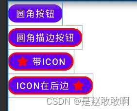
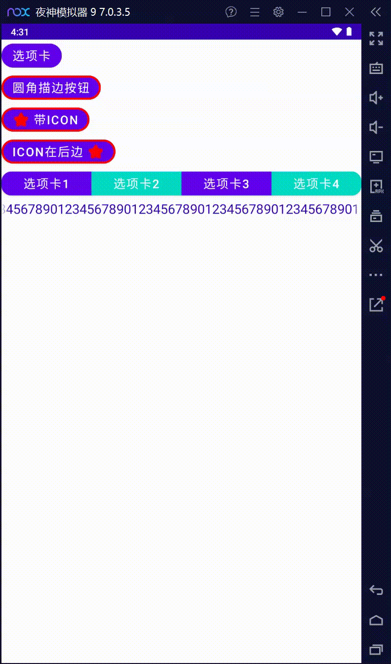
3. 按钮demo
<LinearLayout xmlns:android="http://schemas.android.com/apk/res/android"
    xmlns:app="http://schemas.android.com/apk/res-auto"
    android:orientation="vertical"
    android:layout_width="match_parent"
    android:layout_height="match_parent">


    <com.google.android.material.button.MaterialButton
        android:layout_width="wrap_content"
        android:layout_height="wrap_content"
        app:cornerRadius="30dp"
        android:text="圆角按钮"
        android:textSize="18dp"
        android:textColor="#ffffff"
        />


    <com.google.android.material.button.MaterialButton
        android:layout_width="wrap_content"
        android:layout_height="wrap_content"
        app:cornerRadius="30dp"
        android:text="圆角描边按钮"
        android:textSize="18dp"
        android:textColor="#ffffff"
        app:strokeColor="#ff0000"
        app:strokeWidth="3dp"
        />

    <com.google.android.material.button.MaterialButton
        android:layout_width="wrap_content"
        android:layout_height="wrap_content"
        app:cornerRadius="30dp"
        android:text="带Icon"
        android:textSize="18dp"
        android:textColor="#ffffff"
        app:strokeColor="#ff0000"
        app:strokeWidth="3dp"
        app:icon="@android:drawable/star_on"
        app:iconTint="#ff0000"
        app:iconPadding="5dp"
        app:iconGravity="textStart"
        />
    <com.google.android.material.button.MaterialButton
        android:layout_width="wrap_content"
        android:layout_height="wrap_content"
        app:cornerRadius="30dp"
        android:text="Icon在后边"
        android:textSize="18dp"
        android:textColor="#ffffff"
        app:strokeColor="#ff0000"
        app:strokeWidth="3dp"
        app:icon="@android:drawable/star_on"
        app:iconTint="#ff0000"
        app:iconPadding="5dp"
        app:iconGravity="textEnd"
        />
LinearLayout>
4. 注意事项
-
不可以使用
android:background设置按钮背景,会破坏MaterialButton本身的绘制,而设置背景则推荐使用app:backgroundTint -
MaterialButton创建后,按钮实际长度并不是设定值,因为它上下有留空,可以使用
android:insetBottom="0dp"
和android:insetTop="0dp"去除 -
去除阴影
MD控件默认有阴影效果,但是有时候我们并不想要按钮有阴影,那么这时候可以指定style为
style="@style/Widget.MaterialComponents.Button.UnelevatedButton"这样就能去掉阴影,让视图看起来扁平化 -
闪退
修改APP主题
android:theme="@style/Theme.MaterialComponents.Light.NoActionBar"
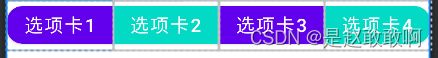
5. 选项卡
使用
MaterialButtonToggleGroup实现选项组,这个组件继承自LinearLayout,所以可以横向摆放也可以纵向摆放,类似一个LinearLayout,但只能添加MaterialButton,只有第一个子元素的最左边角和最后一个子元素的最右边角才能保留它们的形状外观圆角大小,类似于iOS中的SegmentedControl, 用户可以从组中选择一个或多个选项。
- 公共属性
| 属性 | 描述 | 参数 |
|---|---|---|
| app:checkedButton | 默认选中 | 按钮ID |
| app:singleSelection | 是否单项选择 | true/false |
| app:selectionRequired | 设置为true后,强制至少选中一个 | true/false |
- 例子
<LinearLayout xmlns:android="http://schemas.android.com/apk/res/android"
    xmlns:app="http://schemas.android.com/apk/res-auto"
    android:orientation="vertical"
    android:layout_width="match_parent"
    android:layout_height="match_parent">

    <com.google.android.material.button.MaterialButtonToggleGroup
        android:layout_width="match_parent"
        android:layout_height="wrap_content"
        android:id="@+id/toggle_group"
        app:checkedButton="@+id/sub1"
        app:selectionRequired="false"
        app:singleSelection="false">
        <com.google.android.material.button.MaterialButton
            android:layout_width="0dp"
            android:layout_height="wrap_content"
            android:layout_weight="1"
            app:cornerRadius="15dp"
            android:text="选项卡1"
            android:textSize="18dp"
            android:textColor="#ffffff"
            android:id="@+id/sub1"
            />
        <com.google.android.material.button.MaterialButton
            android:layout_width="0dp"
            android:layout_height="wrap_content"
            android:layout_weight="1"
            app:cornerRadius="30dp"
            android:backgroundTint="@color/teal_200"
            android:text="选项卡2"
            android:textSize="18dp"
            android:textColor="#ffffff"
            android:id="@+id/sub2"
            />
        <com.google.android.material.button.MaterialButton
            android:layout_width="0dp"
            android:layout_height="wrap_content"
            android:layout_weight="1"
            app:cornerRadius="30dp"
            android:text="选项卡3"
            android:textSize="18dp"
            android:textColor="#ffffff"
            android:id="@+id/sub3"
            />
        <com.google.android.material.button.MaterialButton
            android:layout_width="0dp"
            android:layout_height="wrap_content"
            android:layout_weight="1"
            app:cornerRadius="15dp"
            android:backgroundTint="@color/teal_200"
            android:text="选项卡4"
            android:textSize="18dp"
            android:textColor="#ffffff"
            android:id="@+id/sub4"
            />

    com.google.android.material.button.MaterialButtonToggleGroup>
LinearLayout>
-
效果
-
修改App的
MainActivity中绑定的view
//绑定layout下边的comps_materialbutton.xml
//        setContentView(binding.root)
 setContentView(R.layout.comps_materialbutton)
//        val navView: BottomNavigationView = binding.navView
//
//        val navController = findNavController(R.id.nav_host_fragment_activity_main)
//        // Passing each menu ID as a set of Ids because each
//        // menu should be considered as top level destinations.
//        val appBarConfiguration = AppBarConfiguration(
//            setOf(
//                R.id.navigation_home, R.id.navigation_dashboard, R.id.navigation_notifications
//            )
//        )
//        setupActionBarWithNavController(navController, appBarConfiguration)
//        navView.setupWithNavController(navController)
- 添加tab切换监听事件
// 获取页面上id是toggle_group的组件
var toggleGroup = findViewById<MaterialButtonToggleGroup>(R.id.toggle_group)
// 因为addOnButtonCheckedListener需要传入一个接口 OnButtonCheckedListener
// 但是接口是不能进行实例化的,所以需要添加 object: 来声明
toggleGroup.addOnButtonCheckedListener(object :
    MaterialButtonToggleGroup.OnButtonCheckedListener{
    override fun onButtonChecked(
        group: MaterialButtonToggleGroup?,
        checkedId: Int,
        isChecked: Boolean
    ) {
        println("选项组是 $group,选中的id是 $checkedId ,是否选中 $isChecked")
    }
})
- 简化操作
因为传入的是一个函数,所以可以简化函数,将方法体省略,放置到后边的大括号里,因为该方法需要参数传入,所以将参数写出来
toggleGroup.addOnButtonCheckedListener { group, checkedId, isChecked -> println("选项组是 $group,选中的id是 $checkedId ,是否选中 $isChecked") }
3. TextView文本控件
1. 常用属性
| 属性 | 属性值示例 | 属性说明 |
|---|---|---|
| id | @+id/tv | 设置一个组件id,通过findViewById()的方法获取到该对象,然后进行相关设置 |
| layout_width | 100dp | 组件宽度 |
| layout_height | wrap_content | 组件高度 |
| text | 设置文本内容 | |
| background | #ff0000 | 背景颜色(或背景图片) |
| textColor | #ff0000 | 设置字体颜色 |
| textStyle | bold/ italic/normal | 设置字体样式 |
| textSize | 16sp | 字体大小 |
| gravity | center/center_horizontal/center_vertical | 内容的对齐方向 |
| drawableTop | @drawable/icon | TextView上部出现一个图片 |
| drawablePadding | 10dp | 图片和文本的间距 |
| drawableTint | #ffffff | 图片着色 |
| ellipsize | end,middle,marquee,start | 文字超出时的截断方式 |
| singleLine | true/false | 单行显示 |
| padding paddingLeft paddingTop paddingRight paddingBottom |
10dp | 内间距 |
| marginLeft marginTop marginRight marginBottom |
10dp | 外间距 、空间见的间距 |
2. 示例代码
<TextView
          android:layout_width="match_parent"
          android:layout_height="30dp"
          android:singleLine="true"
          android:ellipsize="marquee"
          android:marqueeRepeatLimit="2"
          android:clickable="true"
          android:focusable="true"
          android:focusableInTouchMode="true"
          android:textSize="20dp"
          android:textColor="@color/purple_700"
          android:text="1234567890123456789012345678901234567890123456789012345678901234567890123456789012345678901234567890123456789012345678901234567890123456789012345678901234567890"
          />
4. ImageView 图像控件
1. 常见属性
| 属性 | 属性值示例 | 属性说明 |
|---|---|---|
| android:src | @drawable/icon_home | 给ImageView设置要显示的图片 |
| android:alpha | 0.5[0.0~1.0] | 设置透明度 |
| android:background | @drawable/background | 给ImageView设置背景色、背景图片 |
| android:scaleType | 用于设置图片如何缩放以适应ImageView的大小 |
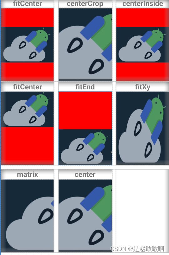
2. ScaleType
- center :保持原图的大小,显示在ImageView的中心。当原图的长(宽)大于ImageView的长(宽),超过部分裁剪处理。
- centerCrop :以填满整个ImageView为目的,将原图的中心对准ImageView的中心,等比例放大原图,直到填满ImageView为止(指的是ImageView的宽和高都要填满),原图超过ImageView的部分作裁剪处理。
- centerInside :以原图完全显示为目的,将图片的内容完整居中显示,通过按比例缩小原图的长(宽)等于或小于ImageView的长(宽)。如果原图的长宽本身就小于ImageView的长宽,则原图不作任何处理,居中显示在ImageView。
- fitCenter :把原图按比例扩大或缩小到ImageView的ImageView的高度,居中显示
- fitEnd :把原图按比例扩大(缩小)到ImageView的高度,显示在ImageView的下部分位置
- fitStart :把原图按比例扩大(缩小)到ImageView的高度,显示在ImageView的上部分位置
- fitXY :把原图按照指定的大小在View中显示,拉伸显示图片,不保持原比例,填满ImageView.
- matrix :不改变原图的大小,从ImageView的左上角开始绘制原图,原图超过ImageView的部分作裁剪处理。
3. 示例demo
<LinearLayout xmlns:android="http://schemas.android.com/apk/res/android"
    xmlns:app="http://schemas.android.com/apk/res-auto"
    xmlns:tools="http://schemas.android.com/tools"
    android:layout_width="match_parent"
    android:layout_height="match_parent"
    android:orientation="vertical">

    <LinearLayout
        android:layout_width="match_parent"
        android:layout_height="wrap_content"
        android:orientation="horizontal">

        <LinearLayout xmlns:android="http://schemas.android.com/apk/res/android"
            android:layout_width="0dp"
            android:layout_height="wrap_content"
            android:layout_weight="1"
            android:orientation="vertical">

            <TextView
                android:layout_width="match_parent"
                android:layout_height="wrap_content"
                android:gravity="center"
                android:text="fitCenter"
                android:textSize="18dp"
                android:textStyle="bold" />

            <ImageView
                android:layout_width="match_parent"
                android:layout_height="match_parent"
                android:background="#ff0000"
                android:scaleType="fitCenter"
                android:src="@drawable/jetpack" />
        LinearLayout>

        <LinearLayout
            android:layout_width="0dp"
            android:layout_height="wrap_content"
            android:layout_weight="1"
            android:orientation="vertical"
            android:layout_marginLeft="10dp"
            android:layout_marginRight="10dp"
            >

            <TextView
                android:layout_width="match_parent"
                android:layout_height="match_parent"
                android:gravity="center"
                android:text="centerCrop"
                android:textSize="18dp"
                android:textStyle="bold" />

            <ImageView
                android:layout_width="match_parent"
                android:layout_height="match_parent"
                android:background="#ff0000"
                android:contentDescription="jetpack"
                android:scaleType="centerCrop"
                android:src="@drawable/jetpack"
                />
        LinearLayout>

        <LinearLayout xmlns:android="http://schemas.android.com/apk/res/android"
            android:layout_width="0dp"
            android:layout_height="wrap_content"
            android:layout_weight="1"
            android:orientation="vertical">

            <TextView
                android:layout_width="match_parent"
                android:layout_height="match_parent"
                android:gravity="center"
                android:text="centerInside"
                android:textSize="18dp"
                android:textStyle="bold" />

            <ImageView
                android:layout_width="match_parent"
                android:layout_height="match_parent"
                android:background="#ff0000"
                android:scaleType="centerInside"
                android:src="@drawable/jetpack" />
        LinearLayout>
    LinearLayout>

    <LinearLayout
        android:layout_width="match_parent"
        android:layout_height="wrap_content"
        android:orientation="horizontal">

        <LinearLayout xmlns:android="http://schemas.android.com/apk/res/android"
            android:layout_width="0dp"
            android:layout_height="wrap_content"
            android:layout_weight="1"
            android:orientation="vertical">

            <TextView
                android:layout_width="match_parent"
                android:layout_height="wrap_content"
                android:gravity="center"
                android:text="fitCenter"
                android:textSize="18dp"
                android:textStyle="bold" />

            <ImageView
                android:layout_width="match_parent"
                android:layout_height="match_parent"
                android:background="#ff0000"
                android:scaleType="fitStart"
                android:src="@drawable/jetpack" />
        LinearLayout>

        <LinearLayout
            android:layout_width="0dp"
            android:layout_height="wrap_content"
            android:layout_weight="1"
            android:orientation="vertical"
            android:layout_marginLeft="10dp"
            android:layout_marginRight="10dp"
            >

            <TextView
                android:layout_width="match_parent"
                android:layout_height="match_parent"
                android:gravity="center"
                android:text="fitEnd"
                android:textSize="18dp"
                android:textStyle="bold" />

            <ImageView
                android:layout_width="match_parent"
                android:layout_height="match_parent"
                android:background="#ff0000"
                android:contentDescription="jetpack"
                android:scaleType="fitEnd"
                android:src="@drawable/jetpack"
                />
        LinearLayout>

        <LinearLayout xmlns:android="http://schemas.android.com/apk/res/android"
            android:layout_width="0dp"
            android:layout_height="wrap_content"
            android:layout_weight="1"
            android:orientation="vertical">

            <TextView
                android:layout_width="match_parent"
                android:layout_height="match_parent"
                android:gravity="center"
                android:text="fitXy"
                android:textSize="18dp"
                android:textStyle="bold" />

            <ImageView
                android:layout_width="match_parent"
                android:layout_height="match_parent"
                android:background="#ff0000"
                android:scaleType="fitXY"
                android:src="@drawable/jetpack" />
        LinearLayout>
    LinearLayout>

    <LinearLayout xmlns:android="http://schemas.android.com/apk/res/android"
        android:layout_width="match_parent"
        android:layout_height="wrap_content"
        android:orientation="horizontal"
        android:layout_marginTop="10dp"
        >
        <LinearLayout xmlns:android="http://schemas.android.com/apk/res/android"
            android:layout_width="0dp"
            android:layout_height="wrap_content"
            android:layout_weight="1"
            android:orientation="vertical">

            <TextView
                android:layout_width="match_parent"
                android:layout_height="match_parent"
                android:gravity="center"
                android:text="matrix"
                android:textSize="18dp"
                android:textStyle="bold" />

            <ImageView
                android:layout_width="match_parent"
                android:layout_height="match_parent"
                android:background="#ff0000"
                android:scaleType="matrix"
                android:src="@drawable/jetpack" />
        LinearLayout>
        <LinearLayout xmlns:android="http://schemas.android.com/apk/res/android"
            android:layout_width="0dp"
            android:layout_height="wrap_content"
            android:layout_weight="1"
            android:layout_marginLeft="10dp"
            android:layout_marginRight="10dp"
            android:orientation="vertical">

            <TextView
                android:layout_width="match_parent"
                android:layout_height="match_parent"
                android:gravity="center"
                android:text="center"
                android:textSize="18dp"
                android:textStyle="bold" />

            <ImageView
                android:layout_width="match_parent"
                android:layout_height="match_parent"
                android:background="#ff0000"
                android:scaleType="center"
                android:src="@drawable/jetpack" />
        LinearLayout>
        <View
            android:layout_width="0dp"
            android:layout_height="match_parent"
            android:layout_weight="1"
            />
    LinearLayout>
LinearLayout>
- 效果
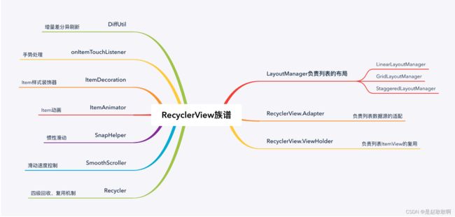
5. RecyclerView 高级UI控件
1. 使用插件简化代码
1. 使用kotlin-android-extensions
使用
kotlin-android-extensions可以简化代码的开发,不需要在每个文件里边通过findViewById查找控件,简化了开发,但是这个组件已经被弃用了,现在建议用kotlinx.android.synthetic
1. 低版本的AndroidStudio
低版本需要在项目级别的build.gradle中添加相关依赖
buildscript {
    ext.kotlin_version = "1.3.72"
    repositories {
        google()
        jcenter()
    }
    dependencies {
        classpath "com.android.tools.build:gradle:4.1.0"
        classpath "org.jetbrains.kotlin:kotlin-gradle-plugin:$kotlin_version"
        classpath "org.jetbrains.kotlin:kotlin-android-extensions:$kotlin_version"
    }
}
然后在模块级别的build.gradle中添加依赖
plugins {
    id 'com.android.application'
    id 'org.jetbrains.kotlin.android'
    id 'kotlin-android-extensions'
}
2. 高版本AndroidStudio >3.6(好像,不确定)
添加在module级别的build.gradle中即可,同样也需要添加plugins
implementation 'org.jetbrains.kotlin:kotlin-android-extensions:1.3.72'
在我的本地Android Studio 2021.2.1 中完全不需要添加这个依赖,就能运行
3. 使用ViewBinding
在模块级别的build.gradle中配置,会为每一个xml生成一个Binding实体类
android {
    buildFeatures {
        viewBinding true
    }
    // 低版本是
	buildFeatures{
        viewBinding{
            enabled true
        }
    }
}
3. 使用com.hi-dhl:binding
使用
com.hi-dhl:binding:1.1.8简化ViewBinding的使用,不需要配置
implementation 'com.hi-dhl:binding:1.1.8'
4. 使用jetpack开发框架
使用 jetpack compose开发,省略xml,简化代码操作
2. LinerLayoutManage
- 新创建出来一个RecyclerView用来存放数据
<LinearLayout xmlns:android="http://schemas.android.com/apk/res/android"
    android:orientation="vertical"
    android:layout_width="match_parent"
    android:layout_height="80dp"
    android:paddingLeft="10dp"
    android:paddingRight="10dp"
    >
    <LinearLayout
        android:layout_width="match_parent"
        android:layout_height="0dp"
        android:layout_weight="1"
        android:orientation="horizontal"
        >
        <ImageView
            android:layout_width="60dp"
            android:layout_height="60dp"
            android:src="@drawable/logo"
            android:id="@+id/item_image"
            android:layout_gravity="center_vertical"
            />
        <LinearLayout
            android:layout_width="match_parent"
            android:layout_height="match_parent"
            android:orientation="vertical"
            android:layout_gravity="center_vertical"
            >
            <TextView
                android:layout_width="match_parent"
                android:layout_height="wrap_content"
                android:text="移动端课程"
                android:textSize="18dp"
                android:textStyle="bold"
                android:textColor="#000000"
                android:paddingLeft="20dp"
                android:singleLine="true"
                android:ellipsize="end"
                android:maxLength="15"
                android:id="@+id/item_title"/>
            <TextView
                android:layout_width="match_parent"
                android:layout_height="wrap_content"
                android:text="描述,移动端开发没有正好的东西,之哟啊能用就行了,哈哈哈哈"
                android:textSize="14dp"
                android:paddingLeft="15dp"
                android:layout_marginTop="6dp"
                android:singleLine="true"
                android:ellipsize="end"
                android:id="@+id/item_message"/>
        LinearLayout>
    LinearLayout>
    <View
        android:layout_width="match_parent"
        android:layout_height="1dp"
        android:backgroundTint="#f3f3f3"
        />
LinearLayout>
-
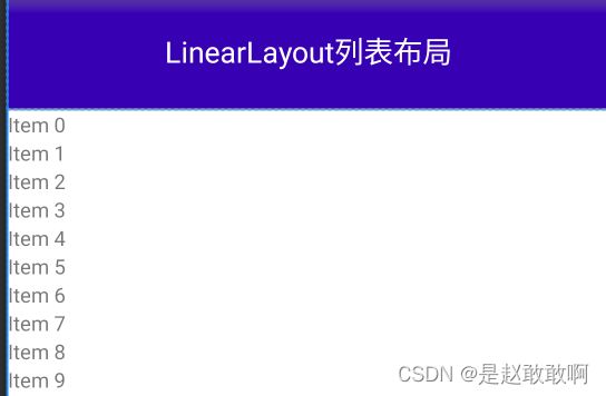
效果如下
-
修改原来的
fragment_home.xml,添加上这个列表布局
<LinearLayout xmlns:android="http://schemas.android.com/apk/res/android"
    xmlns:app="http://schemas.android.com/apk/res-auto"
    xmlns:tools="http://schemas.android.com/tools"
    android:layout_width="match_parent"
    android:layout_height="match_parent"
    android:orientation="vertical"
    tools:context=".ui.home.HomeFragment">

    <TextView
        android:id="@+id/text_home"
        android:layout_width="match_parent"
        android:layout_height="80dp"
        android:gravity="center"
        android:text="LinearLayout列表布局"
        android:textColor="@color/white"
        android:background="@color/purple_700"
        android:textSize="20sp" />
    <androidx.recyclerview.widget.RecyclerView
        android:id="@+id/recycler_view"
        android:layout_width="match_parent"
        android:layout_height="match_parent">
    androidx.recyclerview.widget.RecyclerView>
LinearLayout>
-
效果
-
修改HomeFragment.kt文件,映射布局
package com.example.myapplication.ui.home

import android.os.Bundle
import android.view.LayoutInflater
import android.view.View
import android.view.ViewGroup
import androidx.fragment.app.Fragment
import androidx.recyclerview.widget.LinearLayoutManager
import androidx.recyclerview.widget.RecyclerView
import com.example.myapplication.R
import com.example.myapplication.databinding.FragmentHomeBinding
import com.hi.dhl.binding.viewbind
import kotlinx.android.synthetic.main.fragment_home.*
import kotlinx.android.synthetic.main.item_view_linear_vertical.view.*

class HomeFragment : Fragment(R.layout.fragment_home) {
	// 此处采用的是 com.hi-dhl:binding:1.1.8
    private val binding: FragmentHomeBinding by viewbind()


    override fun onViewCreated(view: View, savedInstanceState: Bundle?) {
        super.onViewCreated(view, savedInstanceState)
//        binding.apply {
//            recyclerView.layoutManager = LinearLayoutManager(context,LinearLayoutManager.VERTICAL,false)
//            textHome.text = "测试binding绑定"
//            recyclerView.adapter
//        }
        // 这里改成 HORIZONTAL就能变成横向布局
        recycler_view.layoutManager = LinearLayoutManager(context,LinearLayoutManager.VERTICAL,false)
        recycler_view.adapter = MyAdapter()

    }

    inner class MyAdapter: RecyclerView.Adapter<MyViewHolder>() {
        override fun onCreateViewHolder(parent: ViewGroup, viewType: Int): MyViewHolder {
            var view = LayoutInflater.from(context)
                .inflate(R.layout.item_view_linear_vertical, parent, false)
            return MyViewHolder(view)
        }

        override fun onBindViewHolder(holder: MyViewHolder, position: Int) {
            // 设置图片的三种方式
            holder.itemView.item_image.setImageResource(R.drawable.jetpack)
			/*
			holder.itemView
            *.item_image
            *.setImageDrawable(ContextCompat.getDrawable(context!!,R.drawable.jetpack))
            */
			/*holder.itemView.item_image
			*.setImageBitmap(
			*BitmapFactory.decodeResource(context!!.resources,R.drawable.jetpack))
			*/
            holder.itemView.item_title.text = "【$position】移动端架构师体系课"
            holder.itemView.item_message.text = "移动端开发两极分化,没有差不多的中间层,唯有尽早成为架构师,才能走的更稳更远"
        }

        override fun getItemCount(): Int {
            return 20
        }

    }

    inner class MyViewHolder(view: View): RecyclerView.ViewHolder(view){

    }
}
- 效果
3. GridLayoutManager
网格布局,需要设置布局中的行和列
- 新建一个文件
item_view_grid.xml
<LinearLayout xmlns:android="http://schemas.android.com/apk/res/android"
    android:orientation="vertical"
    android:layout_width="match_parent"
    android:layout_height="wrap_content"
    android:paddingLeft="10dp"
    android:paddingRight="10dp"
    >
    <LinearLayout
        android:layout_width="match_parent"
        android:layout_height="0dp"
        android:layout_weight="1"
        android:orientation="vertical"
        >
        <ImageView
            android:layout_width="200dp"
            android:layout_height="200dp"
            android:src="@drawable/logo"
            android:id="@+id/item_image"
            android:layout_gravity="center"
            />
        <LinearLayout
            android:layout_width="match_parent"
            android:layout_height="match_parent"
            android:orientation="vertical"
            android:layout_gravity="center_vertical"
            >
            <TextView
                android:layout_width="match_parent"
                android:layout_height="wrap_content"
                android:text="移动端课程"
                android:textSize="18dp"
                android:textStyle="bold"
                android:textColor="#000000"
                android:paddingLeft="20dp"
                android:singleLine="true"
                android:ellipsize="end"
                android:maxLength="15"
                android:id="@+id/item_title"/>
            <TextView
                android:layout_width="match_parent"
                android:layout_height="wrap_content"
                android:text="描述,移动端开发没有正好的东西,之哟啊能用就行了,哈哈哈哈"
                android:textSize="14dp"
                android:paddingLeft="15dp"
                android:layout_marginTop="6dp"
                android:singleLine="true"
                android:ellipsize="end"
                android:id="@+id/item_message"/>
        LinearLayout>
    LinearLayout>
    <View
        android:layout_width="match_parent"
        android:layout_height="1dp"
        android:backgroundTint="#f3f3f3"
        />
LinearLayout>
-
效果
-
修改
HomeFragment.kt
// 修改 布局管理器为 GridLayoutManager,设置为两列
recycler_view.layoutManager = GridLayoutManager(context,2)
recycler_view.adapter = MyAdapter()
// 修改MyAdapteer中的方法使之绑定为item_view_grid.xml
override fun onCreateViewHolder(parent: ViewGroup, viewType: Int): MyViewHolder {
    var view = LayoutInflater.from(context)
    .inflate(R.layout.item_view_grid, parent, false)
    return MyViewHolder(view)
}
- 效果
4. StaggeredGridLayoutManager
瀑布流布局
- 修改
HomeFrament.kt
recycler_view.layoutManager = StaggeredGridLayoutManager(2,StaggeredGridLayoutManager.VERTICAL)

//修改MyAdapter
override fun onBindViewHolder(holder: MyViewHolder, position: Int) {
    holder.itemView.item_image.setImageResource(R.drawable.jetpack)
    holder.itemView.item_message.isSingleLine = position % 2 != 0
    holder.itemView.item_title.text = "【$position】移动端架构师体系课"
    holder.itemView.item_message.text = "移动端开发两极分化,没有差不多的中间层,唯有尽早成为架构师,才能走的更稳更远"
}
- 修改
HomeFragment.kt
// 修改 布局管理器为 GridLayoutManager,设置为两列
recycler_view.layoutManager = GridLayoutManager(context,2)
recycler_view.adapter = MyAdapter()
// 修改MyAdapteer中的方法使之绑定为item_view_grid.xml
override fun onCreateViewHolder(parent: ViewGroup, viewType: Int): MyViewHolder {
    var view = LayoutInflater.from(context)
    .inflate(R.layout.item_view_grid, parent, false)
    return MyViewHolder(view)
}
- 效果
项目参考kotlin_android