Python 使用matplotlib进行数据分析
使用 Python 画出饼图、柱状图、雷达图、折线图、散点图
这次数据分析使用的是一个大赛的乡村振兴数据
主要是如何画出这些图,数据分析的比较草率哈
接下来上代码啦
1、饼图
def bingzhuangtu():  # 饼状图
    d = pd.read_csv('E:\jtcyxx.csv')
    plt.rcParams['font.sans-serif'] = ['SimHei']  # 用来正常显示中文标签
    c = d['JKZK'].value_counts()
    #print(c)
    explode = (0, 0, 0, 0)
    plt.pie(c[0:4], explode=explode, labels=c.index[0:4], autopct='%1.1f%%', shadow=False, startangle=150)
    plt.legend(bbox_to_anchor=(1.0, 0.3))
    plt.title("家庭成员健康状况(01:健康,02:长期慢性病,03:大病,04:残疾)")
    plt.show()
在这里插入代码片
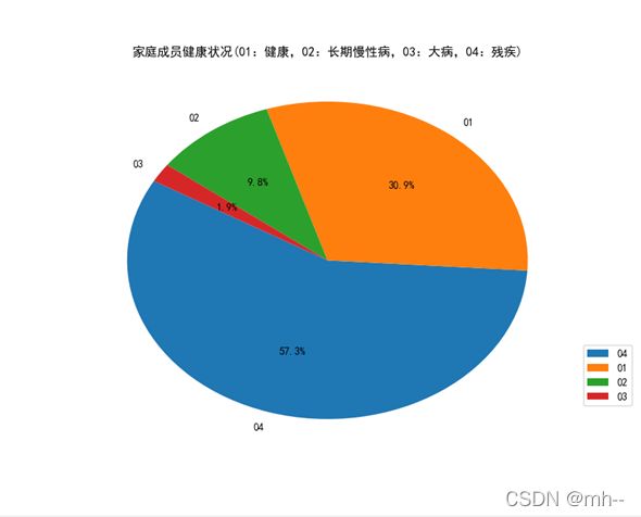 饼图
饼图
2、柱状图
def ldjn_zhuzt():  ##劳动技能柱状图
    d = pd.read_csv('E:\jtcyxx.csv')
    plt.rcParams['font.sans-serif'] = ['SimHei']  # 用来正常显示中文标签
    c = d['LDJN'].value_counts()
    c.sort_index(inplace=True)
    #print(c)
    plt.bar(range(len(c)), c, color='rgb', tick_label=c.index)
    plt.legend(bbox_to_anchor=(1.0, 0.3))
    plt.title("家庭成员劳动技能(0:其它,1:技能劳动力,2:普通劳动力,3:弱劳动力或半劳动力,4:丧失劳动力,5:无劳动力)")
    plt.show()
在这里插入代码片
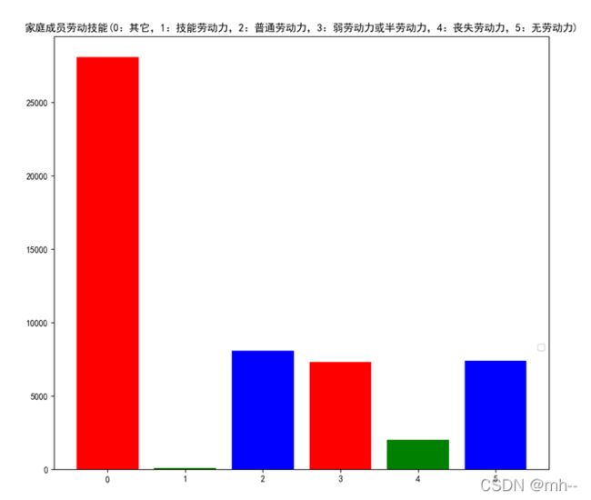
柱状图分析数据,按范围统计数据
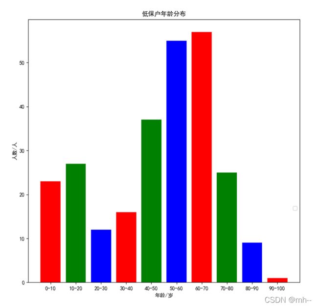
def nlfb_zhuzt():
    d = pd.read_csv('E:\T_XCZXJ_DBHXX.csv')
    plt.rcParams['font.sans-serif'] = ['SimHei']  # 用来正常显示中文标签
    #c = d['NL'].value_counts()
    #c.sort_index(inplace=True)
    c=d['NL']
    #print(c)
    #c["NL"] = (pd.to_datetime(data['报道日期']) - pd.to_datetime(data['出生年月'])) / pd.Timedelta('365 days')
    age = []
    ##[23, 27, 12, 16, 37, 55, 57, 25, 9, 1]
    age.append(len(c.loc[(c >= 0) & (c < 10)]))
    age.append(len(c.loc[(c >= 10) & (c < 20)]))
    age.append(len(c.loc[(c >= 20) & (c < 30)]))
    age.append(len(c.loc[(c >= 30) & (c < 40)]))
    age.append(len(c.loc[(c >= 40) & (c < 50)]))
    age.append(len(c.loc[(c >= 50) & (c < 60)]))
    age.append(len(c.loc[(c >= 60) & (c < 70)]))
    age.append(len(c.loc[(c >= 70) & (c < 80)]))
    age.append(len(c.loc[(c >= 80) & (c < 90)]))
    age.append(len(c.loc[(c >= 90) & (c < 100)]))
    #print(age)
    #len(age)
    labels=['0-10','10-20','20-30','30-40','40-50','50-60','60-70','70-80','80-90','90-100']
    plt.bar(range(len(age)), age, color='rgb', tick_label=labels)
    plt.legend(bbox_to_anchor=(1.0, 0.3))
    plt.xlabel("年龄/岁")
    plt.ylabel("人数/人")
    plt.title("低保户年龄分布")
    plt.show()
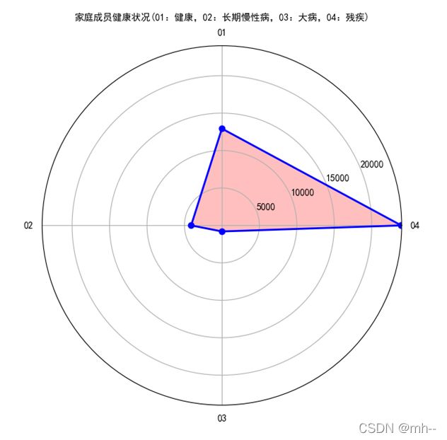
3、雷达图
def jkzk_leidt():##健康状况雷达图
    d = pd.read_csv('E:\jtcyxx.csv')
    plt.rcParams['font.sans-serif'] = ['SimHei']  # 用来正常显示中文标签
    c = d['JKZK'].value_counts()
    #print(c)
    dataLenth = 4
    angles = np.linspace(0, 2 * np.pi, dataLenth, endpoint=False)
    data = np.concatenate((c[0:4], [c[0:4][0]]))  # 闭合
    angles = np.concatenate((angles, [angles[0]]))  # 闭合
    fig = plt.figure()
    ax = fig.add_subplot(111, polar=True)  # polar参数!!
    ax.plot(angles, data, 'bo-', linewidth=2)  # 画线
    ax.fill(angles, data, facecolor='r', alpha=0.25)  # 填充
    ax.set_thetagrids(angles * 180 / np.pi, c.index[0:4], fontproperties="SimHei")
    ax.set_title("家庭成员健康状况(01:健康,02:长期慢性病,03:大病,04:残疾)", va='bottom', fontproperties="SimHei")
    ax.set_rlim(0, 24000)
    ax.grid(True)
    plt.show()
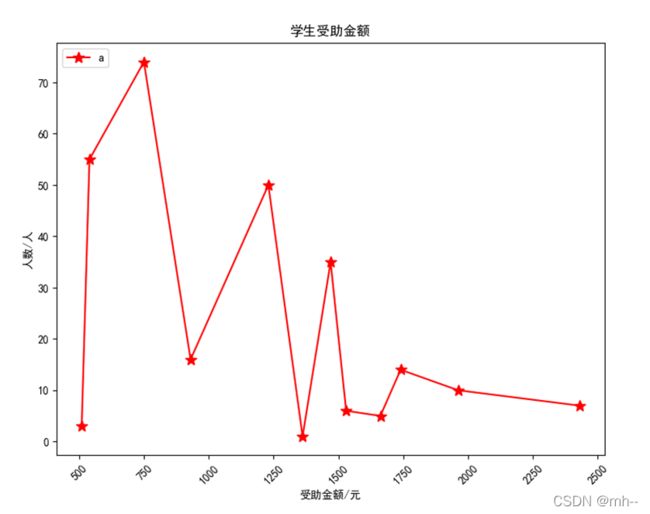
4、折线图
def szje_zhext():##受助金额折线图
    d = pd.read_csv('E:\T_XCZXJ_JYBMXX.csv')
    plt.rcParams['font.sans-serif'] = ['SimHei']  # 用来正常显示中文标签
    c = d['SZJE'].value_counts()
    c.sort_index(inplace=True)
    print(c)
    # "r" 表示红色,ms用来设置*的大小
    plt.plot(c.index, c, "r", marker='*', ms=10, label="a")
    plt.xticks(rotation=45)
    plt.xlabel("受助金额/元")
    plt.ylabel("人数/人")
    plt.title("学生受助金额")
    # upper left 将图例a显示到左上角
    plt.legend(loc="upper left")
    # 在折线图上显示具体数值, ha参数控制水平对齐方式, va控制垂直对齐方式
    plt.show()
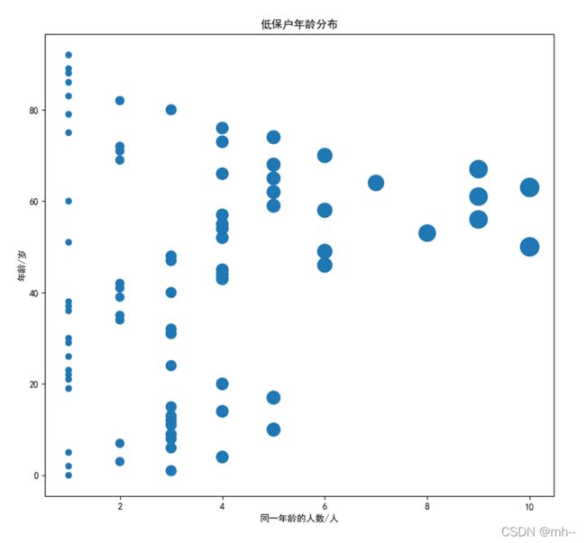
5、散点图
def nlfb_sandt():##年龄散点图
    d = pd.read_csv('E:\T_XCZXJ_DBHXX.csv')
    plt.rcParams['font.sans-serif'] = ['SimHei']  # 用来正常显示中文标签
    c = d['NL'].value_counts()
    #print(c)
    c.sort_index(inplace=True)
    x = c
    y = c.index
    s = (40 * c)
    plt.scatter(x, y,s=s)
    plt.xlabel("同一年龄的人数/人")
    plt.ylabel("年龄/岁")
    plt.title("低保户年龄分布")
    plt.show()
有什么问题可以在评论区交流
结束!!!