fffffffasdfasfds哈哈哈s哈哈哈s哈哈哈s哈哈哈s哈哈哈s哈哈哈s哈哈哈s哈哈哈哈
fffffffasdfasfds哈哈哈s哈哈哈s哈哈哈s哈哈哈s哈哈哈s哈哈哈s哈哈哈s哈哈哈哈
fffffffasdfasfds哈哈哈s哈哈哈s哈哈哈s哈哈哈s哈哈哈s哈哈哈s哈哈哈s哈哈哈哈
如有不对或者需要补充的地方请大家指出
在网上和课程里面找了很多种方案,来把每种方案都试一下
1、flexible+pxtorem插件(flexible作者推荐用viewport方案也就是vw(Viewport Width))
2、postcss-px-to-viewport插件
3、vw+rem
4、媒体查询
没有做任何适配操作的情况 代码见这里
安装依赖
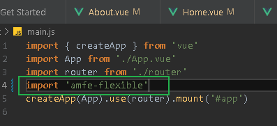
npm i amfe-flexible
npm install postcss-pxtorem -D
1.main.js加载amfe-flexible
2.新建.postcssrc.js, 复制粘贴这些代码
module.exports = {

  plugins: {
    'autoprefixer': {
      overrideBrowserslist: [
        "Android 4.1",
        "iOS 7.1",
        "Chrome > 31",
        "ff > 31",
        "ie >= 8"
      ]
    },
    'postcss-pxtorem': {
      rootValue: 37.5,
      propList: ['*']
    }
  }
}
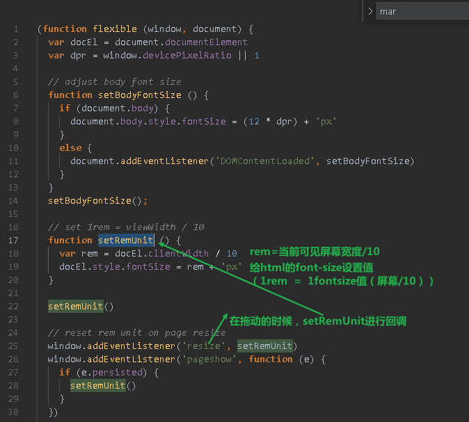
flexible库的作用是什么呢 , 让html的fontsize进行随着屏幕的宽度大小变化而变化, flexible库内部进行换算:屏幕宽度/10=html的fontsize
浏览器表现:

这时候进行拖动改变大小,发现和前面一样,在屏幕变大以后,我们的元素并没有变大,这是为什么呢, 因为postcss-pxtorem不会转换style里面的样式 所以需要在style里面写上rem的值,而不是px
而且还有个问题我们切换手机之后刷新一下,可以看到字体变的很大

dpr换成3以后就更大了
先扩展一个知识
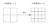
当前的手机一般设备像素比是2(像是苹果手机)或2.5、3等(这样的话,假如dpr=2那么一个css像素格子能显示手机像素点4个格子的内容,画质更加的细腻),随着技术的发展,基本上没有dpr=1的手机了(物理像素/设备独立像素 = dpr) 物理像素就是手机上的一个一个像素点,设备独立像素就是css像素 。 一般iphone678的设计稿是750px的,但是他们的css像素是350px 。还有一个就是二倍图的设计也是这个原因(如100px * 100px的图片在100px * 100px的盒子展示,高分辨率屏幕比低分辨率屏幕上要小,需要放大图片,放大了之后,图片就变得不细腻了,这时候设计成二倍图以后,原始图片变成200px * 200px ,盒子还是100px*100px,还要把图片的大小样式设成100px * 100px )
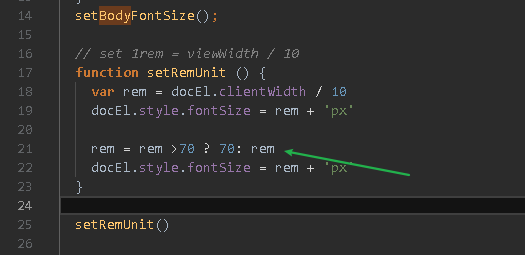
回到原来的问题,为什么文字会变大呢,因为在flexible源码里面我们可以看到这里
其实我不是很了解这个的用意 暂时先把*dpr删掉吧 为什么不把整个setBodyFontSize删掉呢, 因为我们需要重置一下body的fontSize, 不然的话,子元素都会用html的fontsize。需要重置为默认的12px(收回我说的话 应该删掉的 不删掉的话字体大小不会自适应,因为他是style设置的行内样式,不会自适应; 或者是这里改成rem也可以)

现在就正常了

再来看一下pxtorem配置
在网上说 rootValue要改成3
7.5 改成其他的行不行呢(这个要根据设计稿来,因为html的fontsize设置成屏幕可见宽度的1/10 也就是说在iphone678下 fontsize是37.5 ; 但是如果自己设定html下的fontsize值的话,是要改rootvalue的;)
但是如果按照设计稿(750px)来写的话,写成37.5的话,需要把设计稿的像素值/2, 所以为了方便, 可以把rootValue写成75
简易的说,rootValue就是设计稿/10的大小(在使用lib-flexible的情况)
如何计算出来的?
1rem = 1个fontsize的大小, 因为chrome调试都是在iphone567的屏幕大小下调试的,所以此时1rem = 1fontsize=37.5
1rem = 37.5px
那么rootvalue=px/rem = 37.5
现在我有一个样式必须写在style里面 如何计算是多少rem呢 – px值/37.5 (为什么要手动计算? 因为行内样式不能进行转换)
如果是个100px的图片, 那就是100/37.5 = 2.6667 rem
如何算的?
1rem = 37.5px
?rem = 100px
有没有觉得挺麻烦的,每次还要开计算器算, 这时候就可以用vscode里面的插件了,
设好换算值,之后alt+z 让他自动帮我们换算就行了
或者我们可以写个函数来让他进行转换

来看看用这两个库实现的自适应效果
代码在这里
有没有感觉如果在pc端看的话, 会太大了
我们是可以对fontsize做一个限制的
在flexible里面进行修改
效果 放大一定程度以后就不会再变大了
rem是相对于html元素字体单位的一个相对单位,从本质上来说,它属于一个字体单位,用字体单位来布局,并不是太合适
安装依赖
npm install postcss-px-to-viewport --save-dev
.postcssrc.js写入
module.exports = {
  plugins: {
    autoprefixer: {}, // 用来给不同的浏览器自动添加相应前缀,如-webkit-,-moz-等等
    "postcss-px-to-viewport": {
      unitToConvert: "px", // 要转化的单位
      viewportWidth: 350, // UI设计稿的宽度
      unitPrecision: 6, // 转换后的精度,即小数点位数
      propList: ["*"], // 指定转换的css属性的单位,*代表全部css属性的单位都进行转换
      viewportUnit: "vw", // 指定需要转换成的视窗单位,默认vw
      fontViewportUnit: "vw", // 指定字体需要转换成的视窗单位,默认vw
      selectorBlackList: ["wrap"], // 指定不转换为视窗单位的类名,
      minPixelValue: 1, // 默认值1,小于或等于1px则不进行转换
      mediaQuery: true, // 是否在媒体查询的css代码中也进行转换,默认false
      replace: true, // 是否转换后直接更换属性值
      exclude: [/node_modules/], // 设置忽略文件,用正则做目录名匹配
      landscape: false // 是否处理横屏情况
    }
  }
};
把原始代码粘贴进去,同样是style里面的样式不生效 ,可以用插件来进行计算 – px-to-vw
flexible+pxtorem这种方法是通过计算可见屏幕的宽度来动态设置fontsize的
因为有了viewport 可以用viewport来动态计算屏幕宽度(但是我觉得 既然已经用了vw,已经可以通过vw自适应了,为啥还要转成rem)
现在想让一个1rem = 100px 这样口算的话就比较方便了(flexible+pxtorem里面1rem = 36.5px 不好计算)
100vw = 375px
? vw = 100px
26.6667vw = 100px
所以让1rem = 26.6667vw
代码见这里
前面三种方案都是设置html的fontsize 只是有的是用function来动态设置fontsize,有的是利用vw动态设置fontsize;之后用rem单位来进行编写代码,有的是库自己帮我们对px进行转换,有的是自己计算rem,有的是编写pxtorem css函数进行转换 , 其实本质上都是一样的
这个的话是利用css的特性进行移动和pc适配的,主要是控制在某某区间内,对布局和样式进行修改
案例:蓝桥杯web第六个练习题
沙盒链接 https://codesandbox.io/embed/zen-shockley-yeliij?fontsize=14&hidenavigation=1&theme=dark
https://github.com/youzan/vant/issues/5728
postcss.config.js

module.exports = ({ file }) => {
    let remUnit
    if (file && file.dirname && file.dirname.indexOf("vant")>-1) {
        remUnit = 37.5
    } else {
        remUnit = 75
    }
    return {
        plugins: {
            'postcss-pxtorem': {
                rootValue: remUnit,
                propList: ['*']
            },
            'autoprefixer': {}
        }
    }
}
https://www.cnblogs.com/zhangnan35/p/12682925.html#4583934

<template>
  <div>
    <div
      class="tab"
      style="
        width: 100%;
        display: flex;
        justify-content: space-around;
        margin: 10px;
      "
    >
      <div style="border-bottom: 1px solid red">我的收藏div>
      <div>我的历史div>
    div>
    <div class="content">
      <div class="item" style="display: flex; margin-bottom:10px">
        <div class="left" >
          <img
            src="https://img-blog.csdnimg.cn/3912ff1cb6bf4270b6630cd33473bfd5.png"
            alt=""
            width="100px"
          />

        div>
        <div>fffffffasdfasfds哈哈哈s哈哈哈s哈哈哈s哈哈哈s哈哈哈s哈哈哈s哈哈哈s哈哈哈哈div>
      div>

       <div class="item" style="display: flex; margin-bottom:10px">
        <div class="left" >
          <img
            src="https://img-blog.csdnimg.cn/3912ff1cb6bf4270b6630cd33473bfd5.png"
            alt=""
            width="100px"
          />

        div>
        <div>fffffffasdfasfds哈哈哈哈div>
      div>
    div>
  div>
template>

<style>

html, body, div, span, applet, object, iframe,
h1, h2, h3, h4, h5, h6, p, blockquote, pre,
a, abbr, acronym, address, big, cite, code,
del, dfn, em, img, ins, kbd, q, s, samp,
small, strike, strong, sub, sup, tt, var,
b, u, i, center,
dl, dt, dd, ol, ul, li,
fieldset, form, label, legend,
table, caption, tbody, tfoot, thead, tr, th, td,
article, aside, canvas, details, embed,
figure, figcaption, footer, header, hgroup,
menu, nav, output, ruby, section, summary,
time, mark, audio, video {
	margin: 0;
	padding: 0;
	border: 0;
	font-size: 100%;
	font: inherit;
	vertical-align: baseline;
    text-decoration: none;
}
/* HTML5 display-role reset for older browsers */
article, aside, details, figcaption, figure,
footer, header, hgroup, menu, nav, section {
	display: block;
}
body {
	line-height: 1;
	font-family:"Helvetica Neue",Helvetica,"PingFang SC","Hiragino Sans GB","Microsoft YaHei","微软雅黑",Arial,sans-serif;
}
ol, ul {
	list-style: none;
}
blockquote, q {
	quotes: none;
}
blockquote:before, blockquote:after,
q:before, q:after {
	content: '';
	content: none;
}
table {
	border-collapse: collapse;
	border-spacing: 0;
}


/*清除浮动*/
.clearfix:before,
.clearfix:after{
    content:"";
    display:block;
    visibility:hidden;
    clear:both;
}

/*容器*/
.container {
	margin: 10px auto 0px;
	width: 95%;
}

style>
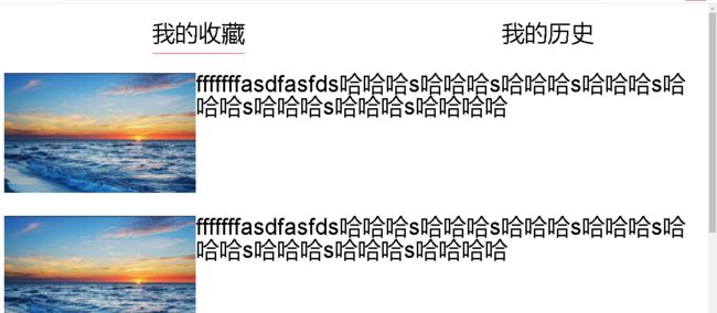
我的收藏
我的历史
fffffffasdfasfds哈哈哈s哈哈哈s哈哈哈s哈哈哈s哈哈哈s哈哈哈s哈哈哈s哈哈哈哈
fffffffasdfasfds哈哈哈s哈哈哈s哈哈哈s哈哈哈s哈哈哈s哈哈哈s哈哈哈s哈哈哈哈
fffffffasdfasfds哈哈哈s哈哈哈s哈哈哈s哈哈哈s哈哈哈s哈哈哈s哈哈哈s哈哈哈哈
<template>
  <div>
    <div
      class="tab"
      style="
        width: 100%;
        display: flex;
        justify-content: space-around;
        margin: .1rem;
      "
    >
      <div style="border-bottom: 0.01rem solid red">我的收藏div>
      <div>我的历史div>
    div>
    <div class="content">
      <div class="item" style="display: flex; margin-bottom:.1rem">
        <div class="left" >
          <img
            src="https://img-blog.csdnimg.cn/3912ff1cb6bf4270b6630cd33473bfd5.png"
            alt=""
            style="width:1rem"
          />

        div>
        <div>fffffffasdfasfds哈哈哈s哈哈哈s哈哈哈s哈哈哈s哈哈哈s哈哈哈s哈哈哈s哈哈哈哈div>
      div>

       <div class="item" style="display: flex; margin-bottom:.1rem">
        <div class="left" >
          <img
            src="https://img-blog.csdnimg.cn/3912ff1cb6bf4270b6630cd33473bfd5.png"
            alt=""
          style="width:1rem"
          />

        div>
        <div>fffffffasdfasfds哈哈哈哈div>
      div>


       <div class="item" style="display: flex; margin-bottom:.1rem">
        <div class="left" >
          <img
            src="https://img-blog.csdnimg.cn/3912ff1cb6bf4270b6630cd33473bfd5.png"
            alt=""
            style="width:1rem"
          />

        div>
        <div>fffffffasdfasfds哈哈哈哈div>
      div>


       <div class="item" style="display: flex; margin-bottom:.1px">
        <div class="left" >
          <img
            src="https://img-blog.csdnimg.cn/3912ff1cb6bf4270b6630cd33473bfd5.png"
            alt=""
            style="width:1rem"
          />

        div>
        <div>fffffffasdfasfds哈哈哈哈div>
      div>
    div>
  div>
template>

<style>

html{
  font-size: 26.67vw;
}
body{
  font-size: .16rem;
}
style>