unity死者之书_死者之书:角色和英雄资产
unity死者之书
In this blog series, we will go over every aspect of the creation of our demo “Book of the Dead”. If you haven’t already, make sure to check our previous posts on the Book of the Dead creation process: Introduction to Unity’s Demo team and Book of the Dead: Concept Art.
在这个博客系列中,我们将介绍演示“ 死者之书 ”的创建过程的各个方面。 如果您还没有的话,请确保查看我们在《死者之书》创建过程中的先前文章: Unity演示团队简介和《死者之书:概念艺术》 。
My name is Plamen ‘Paco’ Tamnev, and I’ve been working as a Character/Environment artist on the Unity Demo team for the last couple of years. Some of the previous projects I worked on were Adam, The Blacksmith, Viking Village and a few other smaller projects. In this blog I will go through some of the work I did for Book of the Dead, my process and the pipeline for the creation of the characters and hero assets in the demo.
我叫Plamen'Paco'Tamnev,最近几年我一直在Unity Demo团队担任角色/环境艺术家。 我之前从事的一些项目是Adam,铁匠,Viking Village和其他一些较小的项目。 在此博客中,我将介绍为《亡灵之书》所做的一些工作,我的过程以及在演示中创建角色和英雄资产的流程。
创建主螺丝钉 (Creating the Main Screwie)
After our concept art director Georgi Simeonov explored lots of quick ideas in 2d, we decided to try and blend different elements that we liked in those sketches. To do that, I started with some rough sculpts in ZBrush to flesh out some of those ideas. Since we worked in parallel from such an early stage, we didn’t intend for these sculpts to end up as the final art, we were rather looking for the opportunity to try things that we otherwise wouldn’t. I also wanted to have the chance to play around with different types of surface treatment and some material explorations. Some of the design elements that can be found in those draft sculpts stayed persistent through the entire character creation process. The proportions, on the other hand, changed quite a bit, because it was an important part of the narrative that the Screwie characters had to be realistic, as opposed to the earlier more stylized designs.
在我们的概念艺术总监Georgi Simeonov在2d中探索了许多快速的想法之后,我们决定尝试融合那些草图中我们喜欢的不同元素。 为此,我从ZBrush的一些粗糙造型开始,充实了其中的一些想法。 由于我们是从这样的早期阶段开始并行工作的,因此我们不希望这些雕塑最终成为最终的艺术作品,我们宁愿寻找机会尝试其他本来可以做的事情。 我也想有机会尝试不同类型的表面处理和一些材料探索。 这些草图中可以找到的一些设计元素在整个角色创建过程中一直保持不变。 另一方面,比例发生了很大变化,这是因为叙事中重要的一环是,与以前更风格化的设计相反,斯皮里(Scillie)角色必须具有现实感。
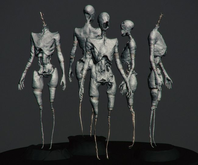
One of the very first exploration sculpts based on Georgi’s designs. The surface drips and hollow bits remained persistent through most of the design iterations.
基于Georgi的设计的最早的雕塑之一。 在大多数设计迭代中,表面滴落和空心钻头一直保持不变。
I took the opportunity to do some material exploration as early as possible to hopefully give better context to the draft sculpts. Those tests helped to explore the dripping sap that made it into the final design.
我借此机会尽早进行了一些材料探索,以期为草稿提供更好的背景。 这些测试有助于探索滴液到最终设计中。
Quick sketches in 3ds Max during the exploration phase. Loosely based on the more experimental designs of Georgi.
探索阶段在3ds Max中快速绘制草图。 松散地基于Georgi的更多实验设计。
For the final design, I started from a male scan from an online scan library. starting with a scan gave me the base proportions and general features. After cleaning up the mesh in ZBrush, The final sculpt of the screwie was challenging in the sense that It had to be easily recognizable as a normal human at first glance, especially from the back. We had a slow approaching shot from the back and seeing all of the decay right away would have ruined the buildup. I started by blocking out the bigger cavities that were needed for the front of the character and for the back I stayed closer to the original silhouette and muscle flow. Then I’ve added some bits of bark to break up the silhouette just a bit in certain places, but still careful to not break the outline of the body too much. Most of the low to mid-level detail was hand sculpted and then I used some scanned alphas to add breakup. It was also a matter of balance to not go overboard in terms of detailing the sculpt in ZBrush, since I’m adding quite a bit of detail in Substance Painter later.
对于最终设计,我从在线扫描库中的男性扫描开始。 从扫描开始,就给了我基本的比例和一般特征。 在清理完ZBrush中的网格之后,小螺钉的最终造型颇具挑战性,因为它乍一看必须易于识别为正常人,尤其是从背面。 我们从后面缓慢进场,看到所有衰减立即破坏了积聚。 我首先屏蔽了角色正面所需的较大空腔,而背面则紧贴原始轮廓和肌肉流动。 然后,我添加了一些树皮以在某些位置稍微破坏轮廓,但仍要注意不要过多地破坏身体的轮廓。 大部分低级到中级细节都是手工雕刻的,然后我使用一些扫描的Alpha来添加分解。 在ZBrush中详细雕刻造型方面也要保持平衡,因为稍后我将在Substance Painter中添加很多细节。
An example of some early back and forth between me and Georgi, trying out different ideas for the mouth on an earlier version of the face.
我和Georgi之间来回早一些的示例,尝试在较早版本的脸部上尝试不同的嘴部想法。
A single texture set was used for the screwie character in order to keep the number of textures down.
单个纹理集用于螺丝字符,以减少纹理数量。
The first bake that I made for the game res mesh in Substance with some base materials.
我为游戏制作的第一个烘焙资源是在Substance中使用一些基础材料进行网格划分。
Once the overall look of the character was in place, I continued polishing the textures to their final state.
角色的整体外观到位后,我继续将纹理抛光到最终状态。
Unity中的材料探索 (Material explorations in Unity)
The backstory of the Screwies required that their look incorporates a combination of solid resin for the dried up bits, and a more liquid resin for the fresh leaks. This complex material was going to be a challenge. We had the very talented Yibing Jiang do some RnD testing for the shader setup of the amber. She came up with the approach of using two layers of geometry. The base layer of amber acted as the core, and we had a slightly offset version of the same geometry as the top layer. The top layer had a dithered alpha as well as a different set of detail maps, in order to give breakup and variety to the core layer. This, in combination with the Subsurface scattering (SSS) profile adjusted the core layer and gave us a nice looking material with some depth to it.
螺丝钉的背景要求其外观要结合使用固态树脂(用于干燥的钻头)和更多液态树脂(用于新鲜泄漏)的组合。 这种复杂的材料将是一个挑战。 我们让非常有才华的Yibing Jiang对琥珀的着色器设置进行了一些RnD测试。 她想出了使用两层几何体的方法。 琥珀色的基础层充当了核心,而我们拥有与顶层相同的几何形状的稍微偏移的版本。 顶层具有抖动的Alpha以及一组不同的详细信息贴图,以便为核心层提供分解和多样性。 结合地下散射(SSS)轮廓调整了芯层,并为我们提供了具有一定深度的美观材料。
The animated sap dripping from the head was made by Zdravko Pavlov, he will talk more about it in his upcoming blog post.
Zdravko Pavlov制作了从头上滴落的动画汁液,他将在即将发表的博客文章中详细介绍这一点。
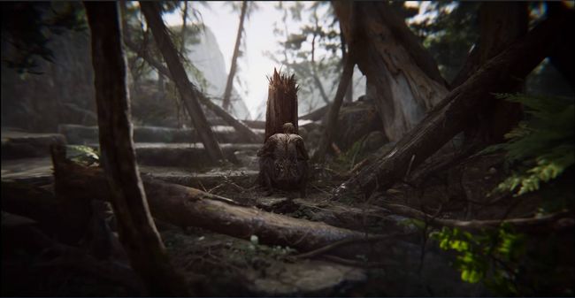
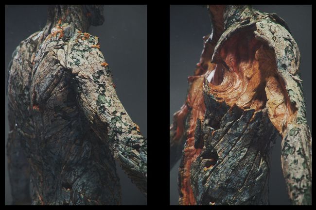
The final character as seen in the Book of the Dead teaser with the dripping simulation applied.
最终角色,如应用了滴水模拟的《死亡之书》预告片所示。
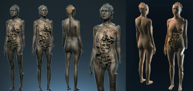
Preview renders of the final assembled asset with all of the textures and details applied.
使用所有纹理和细节预览最终组装资产的渲染。
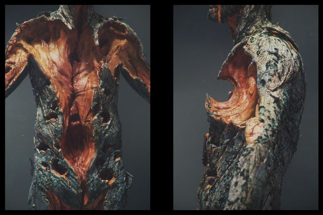
I created some custom flaking bark materials in Substance Painter to help with the displacement
我在Substance Painter中创建了一些自定义的剥落树皮材料以帮助置换
创建螺丝钉人群 (Creating the Screwies Crowd)
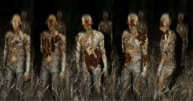
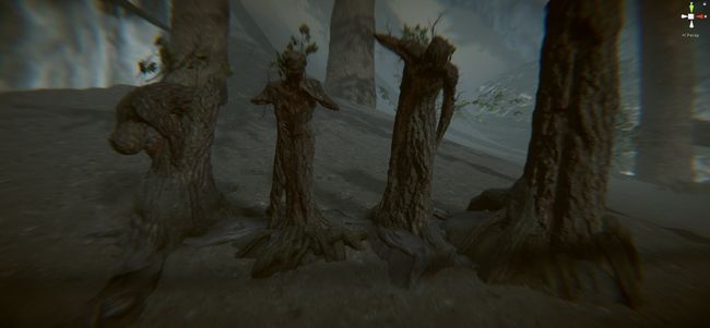
We wanted a quick way to have a crowd of characters with some variety to them, without actually having to build a whole new set of characters. We knew the crowd would be mainly visible in the mid to far distance, so we pushed for them to be good enough without wasting too much time on them. I started by using the clone brush in Substance Painter to create a few fully bark covered versions. I repeated the same process to create the amber layer that was undneath the bark.
我们希望有一种快速的方法来容纳大量具有各种变化的字符,而实际上不必构建全新的字符集。 我们知道人群主要集中在中远距离,因此我们力求使他们足够好,而又不浪费太多时间。 我首先使用Substance Painter中的克隆笔刷创建了一些完全被树皮覆盖的版本。 我重复相同的过程来创建树皮下的琥珀色层。
An example of one of the transition masks in Painter and a rough draft in Unity as a proof of concept.
Painter中过渡遮罩之一的示例以及Unity中的粗略草稿作为概念证明。
At this point, we still had no height maps placed. They helped to give a more organic feeling to the final material by adding parallax and breakup to the bark bits. After it was all set up and working, it was easy to make alterations to the decay of the crowd members through only editing the masks.
此时,我们仍未放置高度图。 通过增加视差和使树皮碎片破碎,它们有助于使最终材料更具有机感。 全部设置并运行之后,仅通过编辑蒙版就可以轻松更改人群的衰减。
The picture above is one of the first tests of the two layers approach, with a few random masks to test the breakup and decay. Shader-wise, there is a height map with tesselation to help with the offset and overall material definition.
上图是两层方法的第一个测试之一,其中带有一些随机遮罩以测试分解和衰减。 在明暗器方面,存在带有镶嵌的高度图,以帮助补偿偏移和整体材质。
For the final look, we added the broken hollow bits by using both opacity and height maps. This workflow gave us the chance to add things like missing limbs easily.
为了最终外观,我们通过使用不透明度和高度图添加了破碎的空心位。 此工作流程使我们有机会轻松添加四肢缺失之类的东西。
A shot of the final crowd with all of the effects applied.
应用了所有效果的最终人群的镜头。
创建玩家角色“ Karen” (Creating the Player Character “Karen”)
Karen’s hands and bracelet are seen for a very short time in the teaser, but they are important for the entire experience. As such, we had to treat them properly and give them enough care, even when compared to their short on-screen presence.
在预告片中看到Karen的手和手镯的时间很短,但是它们对于整个体验都很重要。 因此,即使与屏幕上短暂出现的情况相比,我们也必须对它们进行适当对待并给予足够的照顾。
Screenshots from Substance Painter of the final bracelet that I did.
我所做的最后一个手镯的Substance Painter的屏幕截图。
For the hands of the player character, I started with a scan from the online library Ten24 that I had retopologized and cleaned up. Then I separated the nails and brought the hands into Substance Painter for the texture pass. Some basic weathering was needed as well, but without being covered in mud or being too distracting when on screen.
对于玩家角色,我首先从在线图书馆Ten24中进行了扫描,该扫描已重新拓扑并清理了。 然后我分开指甲,然后将手带到Substance Painter中进行纹理传递。 还需要一些基本的耐候性,但是在屏幕上时不要被泥土覆盖或太分心。
Screenshots from the Unity editor of the bracelet and the hands of the player character.
手镯和玩家角色的双手的Unity编辑器的屏幕截图。
创建主教 (Creating the Bishop)
The Bishop went through quite a few blockouts in Unity. This gave us the chance of trying out interesting ideas such as playing with scale, pose, and how they affected what the character had to convey. Once the final design of the character was finished, and approved by the whole team, we started to build the actual asset.
主教在Unity中经历了很多封锁。 这使我们有机会尝试一些有趣的想法,例如玩比例尺,姿势以及它们如何影响角色传达的内容。 一旦角色的最终设计完成并获得整个团队的认可,我们便开始建造实际资产。
We worked with freelance 3D artist Alex Ponomarev to create the high poly sculpt in ZBrush. Once the sculpt was finalized, I began building the game resolution mesh and used the rigging tools in ZBrush to help make the final pose. These tools are a great way to get a quick static pose and tweak the model, without having to build a complex rig and just gives more room for exploration. I then brought it into Substance Painter and made a few quick explorations for the materials and weathering. Given the size of the Bishop, we had to use several tiled detail maps to help with the resolution and sense of scale.
我们与自由3D艺术家Alex Ponomarev合作,在ZBrush中创建了高多边形造型。 雕刻完成后,我开始构建游戏分辨率网格,并使用ZBrush中的装配工具来完成最终姿势。 这些工具是获得快速静态姿势和调整模型的好方法,而无需构建复杂的装备并仅提供更多的探索空间。 然后,我将其带入Substance Painter,并对材料和耐候性进行了一些快速探索。 鉴于主教的规模,我们不得不使用多个平铺的细节图来帮助提高分辨率和比例感。
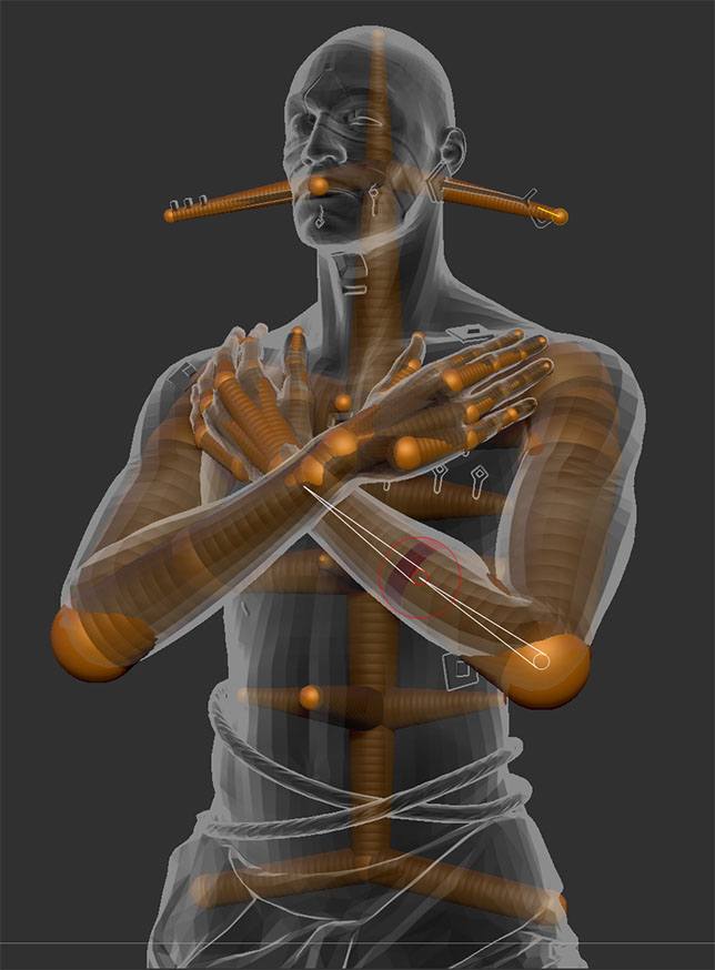
The first thing I did after I got the high poly sculpt from Alex, was to build a quick ZSphere rig and pose the character. We didn’t need him to do any gesturing other than turn his torso slightly, it didn’t make sense to make a complex rig for him. In this case, the ZBrush posing worked just fine.
从Alex获得高多边形造型后,我要做的第一件事是构建一个快速的ZSphere装备并摆出角色。 除了稍微扭动他的躯干之外,我们不需要他做任何手势,为他制造复杂的装备没有任何意义。 在这种情况下,ZBrush的姿势很好用。
As far as materials go, we decided to go with the more traditional type of look you would see for a large monument. I created several custom materials and for the final Bishop, we used detail maps to complement the sense of scale.
就材料而言,我们决定采用大型纪念碑的传统外观。 我创建了几种自定义材料,在最终的Bishop中,我们使用了局部贴图来补充比例感。
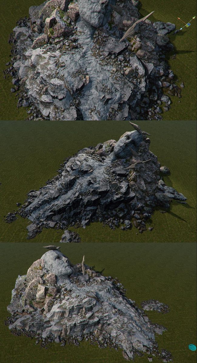
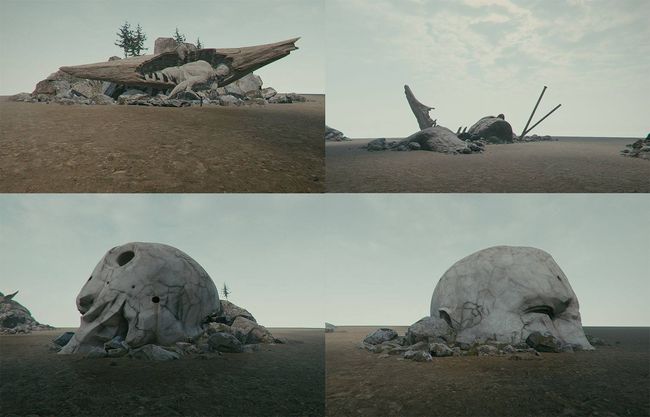
Before we settled on the final design for the Bishop, I tried a few of Georgi’s earlier designs and brought them into Unity. It was important to try them out and see how they feel when you approach them from the POV of the game character.
在确定Bishop的最终设计之前,我尝试了Georgi的一些早期设计,并将它们带入Unity。 重要的是要尝试一下它们,看看从游戏角色的POV接近它们时的感受。
The first one was the largest of those tests, with steps that led from the bottom of the torso to the very top, slowly revealing the face of the Bishop to the player.
第一个是这些测试中最大的一个,其步骤从躯干的底部一直延伸到顶部,并逐渐将Bishop的脸暴露给玩家。
Quick placeholders that I did based on some of Georgi’s sketches. Images are taken from the Unity editor.
我根据Georgi的草图设计的快速占位符。 图像取自Unity编辑器。
创建壳和其他道具 (Creating Shells and Additional Props)
We approached Environment and Character artist Tinko Wiezorrek for the modeling and texturing of the shells, cars, and hive.
我们与环境和角色艺术家Tinko Wiezorrek进行了联系,以对贝壳,汽车和蜂巢进行建模和纹理化。
He started by making several different sculpts of the shells based on Georgi’s concepts and notes. His approach was to use the sculpt as a base, add a few texture sets of the different scanned bark that we already had, and combine them with the sculpted details.
他首先根据Georgi的概念和注释制作了几种不同的贝壳造型。 他的方法是以雕刻为基础,添加一些我们已经拥有的不同扫描树皮的纹理集,并将它们与雕刻的细节结合在一起。
Four material ID’s were used to apply the different types of bark to the asset.
四个物料ID用于将不同类型的树皮应用于资产。
The final shell by Tinko with the tiled textures applied and some branches for silhouette breakup
Tinko的最终外壳,应用了平铺纹理和一些用于轮廓分解的分支
In the teaser, you encounter cars and other mundane objects found in the world. Since those had to have a handcrafted look to them, we used custom baked geometry with opacity and sap added here and there.
在预告片中,您会遇到世界上发现的汽车和其他普通物品。 由于这些对象必须具有手工制作的外观,因此我们使用了自定义烘焙的几何体,并在此处和位置添加了不透明度和树液。
When creating the hive entrance, Tinko used the same approach he had for the cars. To help add visual interest and scale, the hive was built with even more variety and custom objects.
在创建蜂巢入口时,Tinko使用了与汽车相同的方法。 为了帮助增加视觉趣味和规模,该配置单元内置了更多种类和自定义对象。
There were a lot more assets and work done by the team, but I think for the purpose of this blog post, we covered most of our more interesting assets and how we approached their creation.
团队还有更多的资产和工作要做,但是我认为出于本博客文章的目的,我们涵盖了我们大多数更有趣的资产以及我们如何实现它们。
You can follow my work on Artstation & Instagram
您可以在Artstation和Instagram上关注我的工作
—
-
Stay tuned for our next posts in the series. Next week Zdravko Pavlov explores the themes and process of asset creation in Book of the Dead with his approach to the trees. After that, Julien Heijmans brings you through the tools and tricks used to make the environment believable. More to come after that.
请继续关注本系列的下一篇文章。 下周,兹德拉夫科·帕夫洛夫(Zdravko Pavlov)用他的树木方法探索了《死者之书》中资产创造的主题和过程。 之后,朱利安·海曼斯(Julien Heijmans)为您介绍了使环境令人信服的工具和技巧。 之后还会有更多。
Meet us at Unite Berlin on June 19 to walk through the Book of the Dead environment on a console yourself, and attend Julien Heijmans’s presentation about Environment art in the demo. See the full schedule here.
6月19日在柏林团结公园与我们会面,亲自在控制台上浏览《死亡之书》环境,并在演示中参加朱利安·海曼斯(Julien Heijmans)关于环境艺术的演讲。 请在此处查看完整时间表 。
More information on Book of the Dead
有关死者之书的更多信息
翻译自: https://blogs.unity3d.com/2018/06/08/book-of-the-dead-character-and-hero-assets/
unity死者之书


