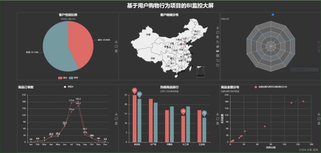
简易的可视化大屏魔板(Pycharts)
不说废话直接上代码,嘿嘿
from pyecharts import Page,Bar,Map,Line,Pie,Radar,Scatter

import  os

from bs4 import BeautifulSoup

#饼图

page = Page()

attr = ["美女","帅哥"]

value =[150,200]

pie = Pie("客户性别比例","好友总人数:350",title_pos="center")

pie.use_theme("dark")

pie.add('',attr,value,is_label_show=True,is_legend_show=True,legend_top='bottom')

page.add_chart(pie,name="pie")


#全国地图

value =[155,10,66,78]
attr =["福建","山东","北京","上海"]

maps = Map("客户地域分布",title_color="#fff",title_pos="center",width=1200,height=600,background_color="#333333")

maps.add('',attr,value,maptype='china',is_label_show=True,is_more_utils=True,)

maps.use_theme("dark")
page.add_chart(maps,name="maps")


#雷达图

radar =Radar("客户年龄分布","年龄分布")

radar.use_theme("dask")

radar_data1 =[[2.0,4.9,7.0,23.2,25.6,76.7,135.6,162.2,32.6,20.0]]
radar_data2 =[[2.6,5.9,9.0,26.4,28.7,70.7,175.6,182.2,48.7,18.8]]

schema =[ ("10",5),("20",10),("30",10),("40",50),("50",50),("60",200),("70",200),("80",200),("90",50),("100",50) ]


radar.config(schema)
radar.add("本月数据",radar_data1)
radar.add("上月数据",radar_data2,item_color="#1C86EE")

page.add_chart(radar,name="radar")


#折线图

line = Line("商品订单数")
line.use_theme("dark")

line_data1 = [2.0,4.9,7.0,23.2,25.6,76.7,135.6,162.2,32.6,20.0,6.4,3.3]
line_data2 = [2.6,5.9,9.0,26.4,28.7,70.7,175.6,182.2,48.7,18.8,6.0,2.3]

columns=["Jan","Feb","Mar","Apr","May","Jun","Jul","Aug","Sep","Oct","Nov","Dec"]

line.add("商品A",columns,line_data1,is_label_show=True)
line.add("商品A",columns,line_data2,is_label_show=True)

page.add_chart(line,name="line")

#柱形图

bar =Bar("热销商品排行","近两个月的商品销量",title_pos="center")

bar.use_theme("dark")

bar.add("2018Q3",["食品类","水产类","书籍类","化工类","五金类"],[25,23,17,14,17],mark_point=["min","max"])
bar.add("2018Q4",["食品类","水产类","书籍类","化工类","五金类"],[23,21,19,19,13],mark_point=["min","max"],bar_category_gap=45,
        is_legend_show=False)  #追加最大标记点,最小标记点,修改柱间隔,是否显示图例

page.add_chart(bar,name="bar")

#散点图

scatter=Scatter("商品金额分布","消费金额与购买数量")

scatter.use_theme("dark")

scatter_data1 = [2.0,4.9,7.0,23.2,25.6,76.7,135.6,162.2,32.6,20.0,6.4,3.3]
scatter_data2 = [2.6,5.9,9.0,26.4,28.7,70.7,175.6,182.2,48.7,18.8,6.0,2.3]

scatter.add("消费金额与购买纪律的散点分布",scatter_data1,scatter_data2,xaxis_name="消费金额",yaxis_name="购买数量",yaxis_name_gap=40)

page.add_chart(scatter,name="scattle")

#形成 html 界面

page.render("page.html")

with open(os.path.join(os.path.abspath("."),"page.html"),"r+",encoding="utf-8") as html:

     html_bf = BeautifulSoup(html,"html.parser")

     divs = html_bf.find_all("div")


     divs[0]["style"] ="width:600px;height:400px;position:absolute;top:70px;left:100px;border-style:solid;border-color:#444444;border-width:3px;"
     divs[1]["style"] = "width:600px;height:400px;position:absolute;top:70px;left:700px;border-style:solid;border-color:#444444;border-width:3px;"
     divs[2]["style"] = "width:600px;height:400px;position:absolute;top:70px;left:1300px;border-style:solid;border-color:#444444;border-width:3px;"

     divs[3]["style"] = "width:600px;height:400px;position:absolute;top:500px;left:100px;border-style:solid;border-color:#444444;border-width:3px;"
     divs[4]["style"] = "width:600px;height:400px;position:absolute;top:500px;left:700px;border-style:solid;border-color:#444444;border-width:3px;"
     divs[5]["style"] = "width:600px;height:400px;position:absolute;top:500px;left:1300px;border-style:solid;border-color:#444444;border-width:3px;"

     body=html_bf.find("body")
     body["style"]="background-color:#333333;"
     div_title ="\n基于用户购物行为项目的BI监控大屏"
     body.insert(0,BeautifulSoup(div_title,"html.parser").div)

     html_new=str(html_bf)
     html.seek(0,0)
     html.truncate()
     html.write(html_new)

     html.close()
运行结果: