Flutter之SegmentedButton
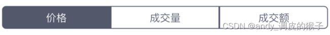
项目的设计图出现分段选项卡UI,如图:
作为一名iOS开发工程师,看见图第一瞬间就想起来UISegmentedControl这个控件,用法其实也比较简单,但是当前项目是用Flutter写的跨平台项目,研究了一下,Flutter里面也有相应的Widget,记录一下使用过程
1.CupertinoSegmentedControl
这个是iOS版的segmented控件,基本是差不多的,使用方法也比较简单:
final Map
Obx(() {
                return CupertinoSegmentedControl(
                  //子标签
                  children: const  {
                    0: Text("价格"),
                    1: Text("成交量"),
                    2: Text("成交额"),
                  },
                  //当前选中的索引
                  groupValue: logic.segmentIndex.value,
                  //点击回调
                  onValueChanged: (int index) {
                    print("当前选中 $index");
                    logic.segmentIndex.value = index;
                  },
                  //选中的背景颜色
                  selectedColor: ColorsUtil.hexToColor("#52596D"),
                  //未选中的背景颜色
                  unselectedColor: Colors.white,
                  //边框颜色
                  borderColor: ColorsUtil.hexToColor("#52596D"),
                  //按下的颜色
                  pressedColor: ColorsUtil.hexToColor("#52596D").withOpacity(0.4),
                );
              })
我这里是使用的Getx来处理的,更改选中,也可以 setState((){})也一样的,看个人习惯就好。
效果:

2.SegmentedButton
可以先定义一个类型,来具体区分点击和不同需求处理,当然,也可以直接用int来代替,都可以的,都比较容易区分,我这里定义了一个type,仿照的官方文档形式
enum SegmentType {
price, //价格
turnover, //成交量
volume, //成交额
marketValue, //市值
}
这个Widget有固定的高度,过高,不太符合我项目具体需求,我就尝试从外部固定了widget的高度,也基本能实现,具体情况仅供参考哈
Obx(() =>
                  Padding(
                    padding:
                    const EdgeInsets.symmetric(vertical: 10, horizontal: 10),
                    child: SizedBox(
                      height: 35,
                      child: SegmentedButton<SegmentType>(
                        segments: const [
                          ButtonSegment<SegmentType>(
                            value: SegmentType.price,
                            label: SizedBox(height: 35, child: Text("价格")),
                            //icon: Icon(Icons.add),
                            enabled: true,
                          ),
                          ButtonSegment<SegmentType>(
                            value: SegmentType.turnover,
                            label: SizedBox(height: 35, child: Text("成交量")),
                            // icon: Icon(Icons.safety_check),
                          ),
                          ButtonSegment<SegmentType>(
                            value: SegmentType.volume,
                            label: SizedBox(height: 35, child: Text("成交额")),
                            // icon: Icon(Icons.safety_check),
                          ),
                        ],
                        style: ButtonStyle(
                          side: MaterialStateProperty.all(
                              const BorderSide(color: Colors.black, width: 1)),
                          shape: MaterialStateProperty.all(
                              const RoundedRectangleBorder(
                                borderRadius: BorderRadius.all(
                                    Radius.circular(3)),
                              )),
                          textStyle: MaterialStateProperty.all(
                              const TextStyle(fontSize: 13)),
                          backgroundColor: MaterialStateProperty.resolveWith<
                              Color>(
                                (Set<MaterialState> states) {
                              if (states.contains(MaterialState.selected)) {
                                return ColorsUtil.hexToColor("#52596D");
                              }
                              return Colors.white;
                            },
                          ),
                        ),
                        showSelectedIcon: false,
                        // 是否允许多选
                        // multiSelectionEnabled: false,
                        // 可选空
                        // emptySelectionAllowed: false,
                        selected: {logic.selectSegmentType.value},
                        onSelectionChanged: (Set<SegmentType> segmentType) {
                          print("点击的是:$segmentType");
                          logic.selectSegmentType.value = segmentType.first;
                        },
                      ),
                    ),
                  )),
一些自定义样式,都基本上用ButtonStyle来处理实现的,可根据自己设计图UI来修改调整哈~
我这里是使用的Getx来处理的,更改选中,也可以 setState((){})也一样的,看个人习惯就好。
效果:

长风破浪会有时,直挂云帆济沧海~一起加油!!!