时间序列生成数据,TimeGAN
文章目录
- 前言
- 一、安装ydata-synthetic
- 二、使用步骤
-
- 1.引入库
- 2.训练并保存模型
- 3.生成虚拟数据
- 4.查看生成虚拟数据与真实值差异
- 5.分析生成数据
- 总结
前言
如果你的时间序列数据比较短,样本少不适合进行深度学习,那就可以考虑用生成的方式扩增一些数据。
一、安装ydata-synthetic
这个库包含了TimeGAN的方法,还有基于GAN的许多个方法生成表格数据,详情看他的GitHub。我们只用到了TimeGAN。
pip install ydata-synthetic
这个pip会安装最新版的tensorflow,如果你不想换你的tf版本,建议虚拟一个专门的环境用来安装它。
二、使用步骤
1.引入库
代码如下(示例):
from os import path

import pandas as pd
import numpy as np
import matplotlib.pyplot as plt
import matplotlib.gridspec as gridspec

from ydata_synthetic.synthesizers import ModelParameters
from ydata_synthetic.preprocessing.timeseries import processed_stock
from ydata_synthetic.synthesizers.timeseries import TimeGAN

seq_len=24
n_seq = 6
hidden_dim=24
gamma=1

noise_dim = 32
dim = 128
batch_size = 128

log_step = 100
learning_rate = 5e-4

stock_data = processed_stock(path='stock_data.csv', seq_len=seq_len)
print(len(stock_data),stock_data[0].shape)
2.训练并保存模型
gan_args = ModelParameters(batch_size=batch_size,lr=learning_rate,noise_dim=noise_dim,layers_dim=dim)
synth = TimeGAN(model_parameters=gan_args, hidden_dim=24, seq_len=seq_len, n_seq=n_seq, gamma=1)
synth.train(stock_data, train_steps=100)
synth.save('synthesizer_stock.pkl')
3.生成虚拟数据
synth_data = synth.sample(len(stock_data))
print(synth_data.shape)
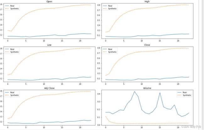
4.查看生成虚拟数据与真实值差异
#Reshaping the data
cols = ['Open','High','Low','Close','Adj Close','Volume']

#Plotting some generated samples. Both Synthetic and Original data are still standartized with values between [0,1]
fig, axes = plt.subplots(nrows=3, ncols=2, figsize=(15, 10))
axes=axes.flatten()

time = list(range(1,25))
obs = np.random.randint(len(stock_data))

for j, col in enumerate(cols):
    df = pd.DataFrame({'Real': stock_data[obs][:, j],'Synthetic': synth_data[obs][:, j]})
    df.plot(ax=axes[j],title = col,secondary_y='Synthetic data', style=['-', '--'])
fig.tight_layout()
5.分析生成数据
from sklearn.decomposition import PCA
from sklearn.manifold import TSNE

sample_size = 250
idx = np.random.permutation(len(stock_data))[:sample_size]

real_sample = np.asarray(stock_data)[idx]
synthetic_sample = np.asarray(synth_data)[idx]

#for the purpose of comparision we need the data to be 2-Dimensional. For that reason we are going to use only two componentes for both the PCA and TSNE.
synth_data_reduced = real_sample.reshape(-1, seq_len)
stock_data_reduced = np.asarray(synthetic_sample).reshape(-1,seq_len)

n_components = 2
pca = PCA(n_components=n_components)
tsne = TSNE(n_components=n_components, n_iter=300)

#The fit of the methods must be done only using the real sequential data
pca.fit(stock_data_reduced)

pca_real = pd.DataFrame(pca.transform(stock_data_reduced))
pca_synth = pd.DataFrame(pca.transform(synth_data_reduced))

data_reduced = np.concatenate((stock_data_reduced, synth_data_reduced), axis=0)
tsne_results = pd.DataFrame(tsne.fit_transform(data_reduced))

fig = plt.figure(constrained_layout=True, figsize=(20,10))
spec = gridspec.GridSpec(ncols=2, nrows=1, figure=fig)

#TSNE scatter plot
ax = fig.add_subplot(spec[0,0])
ax.set_title('PCA results', fontsize=20,color='red',pad=10)

#PCA scatter plot
plt.scatter(pca_real.iloc[:, 0].values, pca_real.iloc[:,1].values,c='black', alpha=0.2, label='Original')
plt.scatter(pca_synth.iloc[:,0], pca_synth.iloc[:,1], c='red', alpha=0.2, label='Synthetic')
ax.legend()

ax2 = fig.add_subplot(spec[0,1])
ax2.set_title('TSNE results',fontsize=20,color='red', pad=10)

plt.scatter(tsne_results.iloc[:sample_size, 0].values, tsne_results.iloc[:sample_size,1].values,c='black', alpha=0.2, label='Original')
plt.scatter(tsne_results.iloc[sample_size:,0], tsne_results.iloc[sample_size:,1],c='red', alpha=0.2, label='Synthetic')

ax2.legend()

fig.suptitle('Validating synthetic vs real data diversity and distributions',fontsize=16,color='grey')

总结
csv文件可以留言获取。