超市零售数据可视化分析(Plotly 指南)
CSDN 上不能插入 HTML,可以在 GitHub Page 上查看: https://paradiseeee.github.io/2022/07/30/超市零售数据可视化分析/
项目首次发布于 Kesci 上 – 超市零售数据分析。感兴趣的可以直接上去 Fork 之后自己做。由于上面只能用 Jupyter Notebook,而且还没有权限 DIY 工作环境,于是线下重新做一下。
项目数据来自 Kaggle:https://www.kaggle.com/jr2ngb/superstore-data,包含全球范围内的大型超市四年间的零售订单数据,有 24 个字段,5w+ 条订单记录。下面将详细了解数据内容,进行数据清洗以及可视化分析。

一、数据理解和数据清洗
首先导入数据。从 Kaggle 下载的数据集文件的行尾序列为 CRLF ,直接使用 pandas 导入会编码错误,需要转换为 LF 行尾(或者使用 ISO-8859-1 编码)。本项目中的数据集已经转换。
项目数据比较规整,简单清洗一下即可,重点在于后续的取数运算和可视化分析。
import pandas as pd
import warnings
warnings.filterwarnings('ignore')

df = pd.read_csv('./superstore_dataset2011-2015.csv')
df.info(verbose=False)
print('\nAll columns: ' + ' | '.join(list(df.columns)))

# 将列名中的空格和横杠转换为下划线
df.columns = df.columns.str.replace(' ', '_').str.replace('-', '_')
# 将日期字符串转换为 datetime 对象
df['Order_Date'] = pd.to_datetime(df.Order_Date)
# Post Code 字段含有很多缺失值,删掉
df.dropna(axis=1, how='any', inplace=True)
# 增加用于分组的字段
df['year'] = df.Order_Date.dt.year
df['month'] = df.Order_Date.dt.month
df['months'] = df.year.astype(str) + '-' + df.month.astype(str)
二、绘图环境
不关心这部分的读者可以直接跳到 第三节
以下的绘图主要使用 Plotly,在线绘图需要在 Chart Studio 上注册账号获取 API,然后再在本地的配置文件中设定 API。具体可以参考 简书上的文章 。需要注意到在线绘图功能已经从 Plotly 中分离到独立的库 chart_studio,原先的 plotly.plotly 现在是 chart_studio.plotly 。(另外在 Kesci 的 K-Lab 上是 python3.6 + plotly3.x,现在最新的已经是 4.6.0 了。需要自己在 Conda 环境中配置)
然后还用到 Cufflinks 这个库,这货的文档支持相当不丰富,所以写这篇东西主要想给自己留下个操作指南。比如使用 cufflinks.pd.DataFrame.ta_plot 的时候就会出现 **kwargs 被无视的情况,也找不到相关提示,最后在 Github 上发现这是一个 Bug,而且已经有一个未 merge 的 PR :

查看具体的 Changes,发现竟然只是在某个函数中写漏了个参数,所以直接 cd 到 %PYTHON_HOME%/Lib/site-packages/cufflinks 里面改一下对应的文件就好了:

然后绘图结果是交互式的,体现为文件是带有 plotly.js 的 HTML 文件。有多种显示方式:
- 嵌入在 Notebook 中显示
- 输出离线 HTML 文件(带 js 脚本,不小于 3M)
- 使用 dash 搭建 localhost 服务本地查看
- 直接 plot 到 chart-studio.plotly.com 的服务器上面
- Cufflinks 绘图时输出的 HTML 文件中会贴心地带上一个 API 的链接,直接点击它就可以 export 到 Plotly 的服务器上
- 输出图片、svg 等其他没什么用的格式
所以要先了解一下不同的显示方法,因为它输出的是网页式的图表,所以会跟 Matplotlib 完全不一样,按照 Matplotlib 的路子去理解就会一脸蒙。其实搞得这么复杂主要是因为我不想用 Jupyter Notebook,在 Notebook 上搞其实很简单,就是导入 plotly.offline 设置一下就好了,绘图结果就会自动嵌入到输出区了。
上面完全是凭着个人理解信口雌黄,以作备忘。请小白参考更多的文档,请大神不吝赐教指出错误。
完成以上一大堆乱七八糟的配置和排错,就可以愉快地绘图了:
import plotly as py
import chart_studio
import plotly.offline
import plotly.graph_objs as go
import cufflinks as cf

# 这一堆是使用 Jupyter Notebook 的时候需要设置的
# (好像不是全部需要,whatever)
'''
%matplotlib inline
plotly.offline.init_notebook_mode(connected=True)
cf.go_offline()
'''
三、可视化分析
关注以下问题:
- 关键指标的计算:销售额、利润
- 各指标的地域性差异
- 不同产品类别的指标差异
- 时间上的纵向对比
(1)总体销售额和利润率
# 按月份分组计算总销售额
months_sales = df.groupby('months').Sales.sum().sort_index()
months_sales.index = pd.to_datetime(months_sales.index)

# 由于后续需要进行优化,使用 asFigure 参数生成字典对象以更新参数
# 也可以直接把 iplot 的参数写进 ta_plot,一步到位
fig = months_sales.sort_index().ta_plot(
    asFigure=True, study='sma', periods=[3, 6],
    study_colors=['lightblue', 'blue'],
    title='Sales Trend with Moving Average',
    theme='solar')
# 更新线型(如果直接使用 interpolation 参数所有的线型将会一样,不易区分)
fig['data'][0].update(line={'color': 'rgba(255, 153, 51, 1.0)', 'dash': 'dot', 'shape': 'hv', 'width': 1.5})
cf.iplot(fig, filename='Sales Trend with Moving Average.html', asUrl=True)
在 Chart Studio 上查看:https://chart-studio.plotly.com/~Paradiseeee/15.embed
通过以一季度和半年为周期的移动平均,可以明确看到销售额的变化趋势和周期性

# 按月分组计算总利润
months_profits = df.groupby('months').Profit.sum().sort_index()
months_profits.index = pd.to_datetime(months_profits.index)
# 计算利润率
months_rates = months_profits / months_sales
months_rates.name = 'Profit-Rates'

months_rates.sort_index().ta_plot(
    asFigure=True, study='sma', periods=[3, 6],
    study_colors=['lightblue', 'blue'],
    title='Profit-Rates Trend with Moving Average',
    vspan={'x0':'2013-02', 'x1':'2013-10',
        'color':'lightblue', 'fill':True, 'opacity':.1},
    theme='solar')
fig['data'][0].update(line={'color': 'rgba(255, 153, 51, 1.0)', 'dash': 'dot', 'shape': 'hv', 'width': 1.5})
cf.iplot(fig, filename='Sales Trend with Moving Average.html', asUrl=True)
在 Chart Studio 上查看:https://chart-studio.plotly.com/~Paradiseeee/17.embed
利润率以不同的规律在震荡,其中季度周期性明显;2013 年利润率大幅下降

(2)各大市场的销售额和利润对比
# 各市场订单总数
counts = df.Market.value_counts().reset_index().rename({'index': 'Market', 'Market': 'Counts'}, axis=1)
# 各市场订单均价
argprice = df.groupby('Market').Sales.sum() / df.Market.value_counts()

fig = py.subplots.make_subplots(1, 2,
    subplot_titles=['All-Order Counts', 'All-Order Average Price'])
fig.append_trace(go.Bar(x=counts.Market, y=counts.Counts, name='Counts'), 1, 1)
fig.append_trace(go.Bar(x=argprice.index, y=argprice.values, name='Prices'), 1, 2)
fig.update_layout({'template': 'plotly_dark'})
chart_studio.plotly.iplot(fig, filename='Overviews of Markets', sharing='public')
在 Chart Studio 上查看:https://chart-studio.plotly.com/~Paradiseeee/19.embed
总体销售情况速览:亚太、欧盟区的客单价明显高于其他地区

# 生成需要的数据格式 -- 行观测为不同的月份分组,列为不同类别的特定字段数据
def unpack_months(field, func, first_group='Market'):
    '''分组聚合流程打包'''
    group = df.groupby([first_group, 'months'])
    names = list(df[first_group].value_counts().index)
    tmp = group[field].apply(func).astype(int)
    ret = pd.DataFrame(columns=names)
    for name in names:
        ret[name] = tmp[name]
    ret.index = pd.to_datetime(ret.index)
    return ret.sort_index()
# 各市场按月分组销售额
sales = unpack_months('Sales', sum)
sales.iplot(
	title='Superstore Sales Grouped by Months and Markets',
	xTitle='Months', yTitle='Sales',
	fill=True, theme='solar', interpolation='hv', asUrl=True
	)
在 Chart Studio 上查看:https://chart-studio.plotly.com/~Paradiseeee/3.embed
上图显示了世界主要贸易区域的零售销售额时间分布,可点击 Legends 中的标签显示或隐藏某一个市场的曲线
从图中可以看到,销售额最大的依次是亚太地区、欧盟、南美和北美(不相上下)
并且存在较明显的季度和年份周期趋势(与市场交易习惯有关)

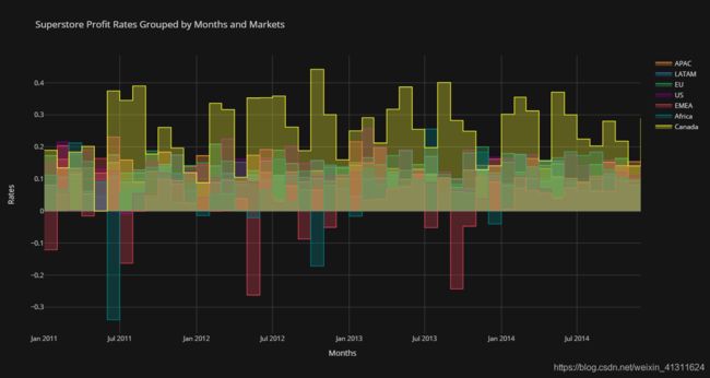
# 各市场按月分组利润率
profit_rates = unpack_months('Profit', sum) / sales
profit_rates.iplot(
	title='Superstore Profit Rates Grouped by Months and Markets',
	xTitle='Months', yTitle='Rates',
	fill=True, theme='solar', interpolation='hv', asUrl=True
	)
在 Chart Studio 上查看:https://chart-studio.plotly.com/~Paradiseeee/5.embed
可以看到利润率仍保持类似销售额的周期性趋势
其中加拿大的利润率遥遥领先,主要是因为订单总数较少而且地区单一
而非洲和中东地区在特定时间出现较严重的负盈利,且盈利情况波动较大
(3)不同商品类别的销售数据对比
# 计算不同类别的销售额
catsales = unpack_months('Sales', sum, 'Category')
catsales.iplot(
    title='Sales Grouped by Months of Different Categories',
	yTitle='Sales', xTitle='Months',
    theme='solar', kind='bar', barmode='stack', asUrl=True
    )
在 Chart Studio 上查看:https://chart-studio.plotly.com/~Paradiseeee/7.embed
三大类商品的销售额数据差异不大,基本平分秋色;Technology 和 Furniture 相对占比较高

# 计算不同类别的利润率
catrates = unpack_months('Profit', sum, 'Category') / catsales
# 均值辅助线
lines = [
	{'y': catrates.iloc[:,0].mean(), 'color':'orange', 'dash':'dot'},
	{'y': catrates.iloc[:,1].mean(), 'color':'blue', 'dash':'dot'},
	{'y': catrates.iloc[:,2].mean(), 'color':'green', 'dash':'dash'}]

catrates.iplot(
    title='Profit-Rates Grouped by Months of Different Categories',
	yTitle='Rates', xTitle='Months',
	theme='solar', hline=lines, asUrl=True
	)
在 Chart Studio 上查看:https://chart-studio.plotly.com/~Paradiseeee/9.embed
家居市场的销售额和利润绝对值都较大,但是利润率的均值明显偏低

(4)具体到不同国家地区的对比
# 提取不同国家地区的销售额和利润
countries = df.groupby(['Region', 'Country'])['Sales', 'Profit'].sum().reset_index()
# 增加利润率字段
countries['Profit-Rates(%)'] = pd.Series(countries.Profit / countries.Sales * 1e4).round() / 100
# 一共 147 个国家,忽略销售额较小的国家
top_sales = countries.sort_values('Sales', ascending=False).head(20).sort_index()
# 生成颜色表,并对 DataFrame 映射,生成序列用于绘图
colormap = dict(zip(top_sales.Region.value_counts().index, py.tools.DEFAULT_PLOTLY_COLORS))
top_sales['colors'] = top_sales.Region.map(colormap)

top_sales.iplot(
    kind='bubble',
    x='Country', y='Profit-Rates(%)', size='Sales',
    title='Profit Rates of Top-20 Countries in Sales',
    yTitle='Profit Rates (%)',
    theme='solar', colors=list(top_sales.colors), asUrl=True
    )
在 Chart Studio 上查看:https://chart-studio.plotly.com/~Paradiseeee/11.embed
上图不同颜色代表不同地区,其中棕色为中国。销售额大且利率高的国家依次有印度、中国、英国

最后利用上面计算得到的表 countries ,借助 Tableau 在地图上绘制具体数据:
上图颜色代表总利润,数字标签代表利润率;从地图可以看到:
累计利润最大的依次是美国、中国、以及欧洲国家;
中东、非洲以及拉美地区的一些国家出现负的利润;
美国的零售市场总量遥遥领先,但是利润处于下游(拉低了均值)。

END