【前端】实践中常用css样式总结
Eric Reset Css
/* http://meyerweb.com/eric/tools/css/reset/
   v2.0 | 20110126
   License: none (public domain)
*/

html, body, div, span, applet, object, iframe,
h1, h2, h3, h4, h5, h6, p, blockquote, pre,
a, abbr, acronym, address, big, cite, code,
del, dfn, em, img, ins, kbd, q, s, samp,
small, strike, strong, sub, sup, tt, var,
b, u, i, center,
dl, dt, dd, ol, ul, li,
fieldset, form, label, legend,
table, caption, tbody, tfoot, thead, tr, th, td,
article, aside, canvas, details, embed,
figure, figcaption, footer, header, hgroup,
menu, nav, output, ruby, section, summary,
time, mark, audio, video {
	margin: 0;
	padding: 0;
	border: 0;
	font-size: 100%;
	font: inherit;
	vertical-align: baseline;
}
/* HTML5 display-role reset for older browsers */
article, aside, details, figcaption, figure,
footer, header, hgroup, menu, nav, section {
	display: block;
}
body {
	line-height: 1;
}
ol, ul {
	list-style: none;
}
blockquote, q {
	quotes: none;
}
blockquote:before, blockquote:after,
q:before, q:after {
	content: '';
	content: none;
}
table {
	border-collapse: collapse;
	border-spacing: 0;
}
清除浮动
.clearfix{
	*zoom:1;
}
.clearfix:before,
.clearfix:after{
	display: table;
	content: "";
}
.clearfix:after{
	clear: both;
}
文字隐藏
.reader-main-action li{
	text-indent: -9999px;
}
实现下拉菜单的箭头
.navbar .nav>li>.dropdown-menu:before{
	position: absolute;
	top: -7px;
	left: 9px;
	display: inline-block;
	border-right: 7px solid transparent;
	border-bottom: 7px solid #ccc;
	border-left: 7px solid transparent;
	border-bottom-color: rgba(0,0,0.2);
	content: '';
}

.navbar .nav>li>.dropdown-menu:after{
	position: absolute;
	top: -6px;
	left: 10px;
	display: inline-block;
	border-right: 6px solid transparent;
	border-bottom: 6px solid #fff;
	border-left: 6px solid transparent;
	content: '';
}
JS排序方法
v-for
v-for
-
{{item}}
-
{{index+1}}:{{student.name}}-{{student.age}}
设置超出文本显示
.textOverflow{
	white-space: nowrap;
	overflow: hidden;
	text-overflow: ellipsis;   /*clip 剪切文本  ellipsis 省略号  string  使用给定的字符串*/
}
多行文本溢出显示省略号
display: -webkit-box;
-webkit-box-orient: vertical;
-webkit-line-clamp: 3;
overflow: hidden;
用filter:drop-shadow实现尖角带阴影的提示面板
/*CSS代码:*/
.box {
    margin: 40px; padding: 50px;
    background-color: #fff;
    position: relative;
    font-size: 24px;
}
.cor {
    position: absolute;
    left: -40px;
    widtd: 0; height: 0;
    overflow: hidden;
    border: 20px solid transparent;
    border-right-color: #fff;
}
.box-shadow {
    box-shadow: 5px 5px 10px black;
}
.drop-shadow {
    filter: drop-shadow(5px 5px 10px black);
}
/*HTML代码:*/


    box-shadow


    filter: drop-shadow
使用了CSS3滤镜filter中的drop-shadow改变svg img的颜色
/*HTML代码:*/


  {item.line1}
  {item.line2}
/* CSS代码:*/
section{
      .image{
        display: inline-block;
        overflow: hidden;
      }
      img{
        position: relative;
        left: 0;
        margin-bottom: .1rem;
        filter: drop-shadow(#ffffff 80px 0);
         border-left: 30px solid transparent;  //防止drop-shadow主体超出视线隐藏后阴影消失
         border-right: 30px solid transparent;
} &:hover{ background-color: gray; img{ left: -80px; } } }
主要的实现原理就是设置需要的阴影效果,并隐藏,hover时切换显示就好。
css绝对定位居中
使用transform代替margin. transform中translate偏移的百分比值是相对于自身大小的
.conter{
    width: 600px; height: 400px;
    position: absolute; left: 50%; top: 50%;
    transform: translate(-50%, -50%);    /* 50%为自身尺寸的一半 */
}
margin:auto实现绝对定位元素的居中(上下左右均0位置定位;margin: auto)
.conter{
    width: 600px; height: 400px;
    position: absolute; left: 0; top: 0; right: 0; bottom: 0;
    margin: auto;    /* 有了这个就自动居中了 */
}
让position: fixed定位的DIV元素居中
.zxbm_xf{
    position: fixed;
    z-index: 999;
    left: 0;
    top: 0;
    bottom: 0;
    right: 0;
    margin:auto;
}
浮动后的
html标签
css样式
#footer {
    text-align: center;
}
#footer ul {
    display: inline-block;
    overflow: auto;
}

#footer ul li {
    display: inline;
    float: left;
}
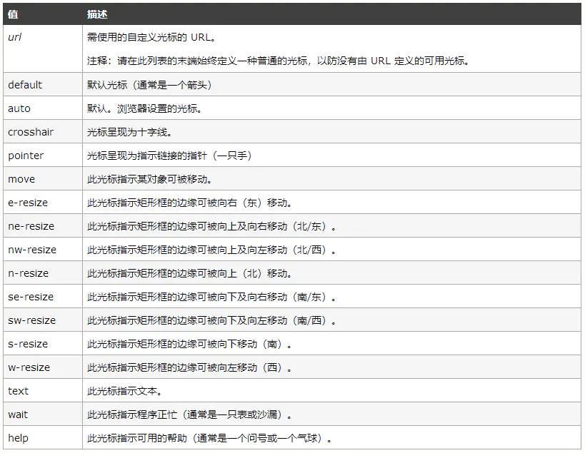
css cursor 鼠标样式
cursor: pointer; // 光标呈现为指示链接的指针(一只手)
cursor:no-drop; //是一个红色的圈加一个斜杠,表示禁止的意思
cursor:not-allowed; //是一个红色的圈加一个斜杠,表示禁止的意思
cursor: move; //指示某对象可被移动
cursor: help; //指示可用的帮助