学完一起做个走马灯吧 - CSS 3D 转换学习笔记&学习案例
学完一起做个走马灯吧 - CSS 3D 转换学习笔记&学习案例
3D 转换是之前学的 CSS 2D Transform 的进阶,顾名思义,即物体看起来并非在平面上产生形变,而是在空间中进行位置改变。
笔记内容不是很长,所以学习笔记和学习案例整合在一起了。上半部分是学习笔记,一些基础的语法,第二大部分是学习案例,一些应用。
学习案例包括以下几个:
perspective的重要性- xyz 三轴的旋转
- 怎样使得元素在三维空间中旋转
- 三维空间转换的两个案例
- 综合案例
笔记
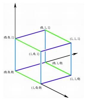
三维坐标系
-
x 轴
右正左负,与传统坐标系相同
-
y 轴
下正上负,与传统坐标系相反
-
z 轴
外正里负,越靠近人的肉眼的值越大,参考 z-index
3D 位移
3D 移动在 3D 移动的基础上多了 z 轴这个可移动的方向
-
transform:translateX(100px)仅仅在 x 轴上移动
-
transform:translateY(100px)仅仅在 y 轴上移动
-
transform:translateZ(100px)仅仅在 z 轴上移动,一般以 px 为单位
不用 perspective 肉眼上难以分辨 z 轴上的移动
缩写的方式: transform: translate3d(x, y, z),x, y, z 三个参数无法省略,没有就写 0
透视, perspective
重点就是:近大远小
透视又被称之为视距——人眼睛到屏幕的距离,单位是像素。距离视觉点越近的,在电脑平面成像越大,越远成像越小
注:透视写在被观察元素的父盒子上
3D 旋转
3D 旋转 指可以让元素在三维平面内沿着 x 轴、y 轴、z 轴,或是自定义轴旋转。
语法:
transform: rotateX(45deg);
transform: rotateY(45deg);
transform: rotateZ(45deg);
transform: rotate3d(x, y, z, deg);
对于元素旋转的方向,需要了解左手准则:
左手准则
- 左手的拇指指向 旋转轴 的正值
- 四根手指弯曲的方向就是该元素沿着 旋转轴 旋转的方向
沿着 z 轴旋转效果与传统的 2d 旋转效果肉眼上看来 相似。
3D 呈现
即 transform-style,它:
- 控制子元素是否开启三维立体环境
transform-style: flat;子元素不开启 3d 立体空间,默认值transform-style: perserve-3d;子元素开启立体空间- 代码写在父级上,但是影响的是子元素
学习案例
perspective 的效果
没有 perspective 就无法实际的展现出 3D 的效果,毕竟,现在的网页不管怎么说都是平面的。
perspective 的案例是元素沿着 z 轴进行移动,这是在没有设置 perspective 前的效果:

看起来没有任何的变化,这是因为 z 轴代表的是元素距离肉眼的距离,但是在人垂直于 z 轴的时候,并且没有透视关系的时候,这个意义不是很大。perspective 就是加上了透视关系,真正的让元素模拟在真实世界里移动一样:

因为 perspective 只能加在父元素上对子元素产生效果,因此下列实现中将 perspective 加在了 body 上。
<html lang="en">
  <head>
    <meta charset="UTF-8" />
    <meta http-equiv="X-UA-Compatible" content="IE=edge" />
    <meta name="viewport" content="width=device-width, initial-scale=1.0" />
    <title>Documenttitle>
    <style>
      body {
        perspective: 500px;
      }
      div {
        width: 200px;
        height: 200px;
        background-color: #eee;
        margin: 100px auto;
        animation: enlarging-div 1s linear forwards;
      }
      @keyframes enlarging-div {
        0% {
          transform: translateZ(0);
        }
        100% {
          transform: translateZ(100px);
        }
      }
    style>
  head>
  <body>
    <div>div>
  body>
html>
xyz 三轴的旋转
以下案例都加了 perspective
沿 x 轴的旋转
效果如同水平旋转:
实现代码:
<html lang="en">
  <head>
    <meta charset="UTF-8" />
    <meta http-equiv="X-UA-Compatible" content="IE=edge" />
    <meta name="viewport" content="width=device-width, initial-scale=1.0" />
    <title>Documenttitle>
    <style>
      body {
        perspective: 500px;
      }
      img {
        display: block;
        margin: 100px auto;
        transition: all 1s;
      }
      img:hover {
        transform: rotateX(45deg);
      }
    style>
  head>
  <body>
    <img src="./R71e404b4afae9db6247dc2e97188a2ec.jfif" alt="" srcset="" />
  body>
html>
沿 y 轴的旋转
<html lang="en">
  <head>
    <meta charset="UTF-8" />
    <meta http-equiv="X-UA-Compatible" content="IE=edge" />
    <meta name="viewport" content="width=device-width, initial-scale=1.0" />
    <title>Documenttitle>
    <style>
      body {
        perspective: 500px;
      }
      img {
        display: block;
        margin: 100px auto;
        transition: all 1s;
      }
      img:hover {
        transform: rotateY(45deg);
      }
    style>
  head>
  <body>
    <img src="./R71e404b4afae9db6247dc2e97188a2ec.jfif" alt="" srcset="" />
  body>
html>
沿 z 轴的旋转
沿 z 轴旋转看起来就和 2d 的旋转没什么区别了:
<html lang="en">
  <head>
    <meta charset="UTF-8" />
    <meta http-equiv="X-UA-Compatible" content="IE=edge" />
    <meta name="viewport" content="width=device-width, initial-scale=1.0" />
    <title>Documenttitle>
    <style>
      body {
        perspective: 500px;
      }
      img {
        display: block;
        margin: 100px auto;
        transition: all 1s;
      }
      img:hover {
        transform: rotateZ(180deg);
      }
    style>
  head>
  <body>
    <img src="./R71e404b4afae9db6247dc2e97188a2ec.jfif" alt="" srcset="" />
  body>
html>
在三维空间中旋转
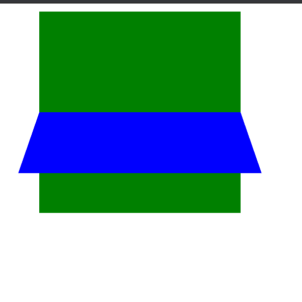
多个元素叠加的旋转也并不是说直接就能够实现的——当多个元素叠加的时候,默认是不显示 3D 效果:
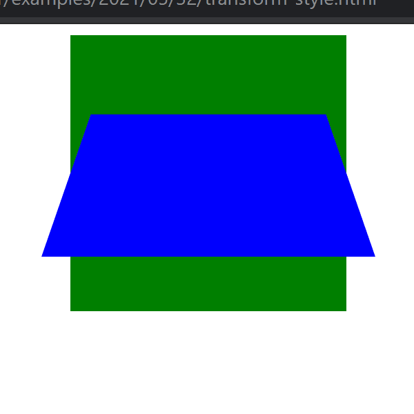
只有在父元素上添加 transform-style: preserve-3d;,保留子元素的 3d 呈现效果时,展现的内容才能如人所愿:
实现代码:
<html lang="en">
  <head>
    <meta charset="UTF-8" />
    <meta http-equiv="X-UA-Compatible" content="IE=edge" />
    <meta name="viewport" content="width=device-width, initial-scale=1.0" />
    <title>Documenttitle>
    <style>
      .box {
        position: relative;
        width: 200px;
        height: 200px;
        margin: 0 auto;
        perspective: 500px;
        transition: all 1s;
        transform-style: preserve-3d;
      }
      .box:hover {
        transform: rotateY(60deg);
      }
      .box div {
        position: absolute;
        top: 0;
        left: 0;
        width: 100%;
        height: 100%;
        background-color: green;
      }
      .box div:last-child {
        background-color: blue;
        transform: rotateX(60deg);
      }
    style>
  head>
  <body>
    <div class="box">
      <div>div>
      <div>div>
    div>
  body>
html>
三维旋转的案例
案例 1,元素翻转
这是垂直翻转,效果如下:
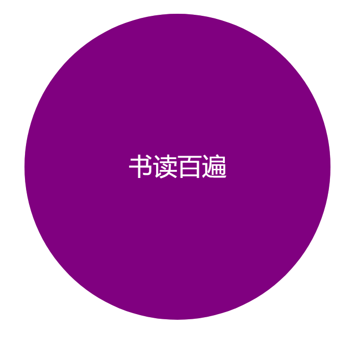
这样的效果与硬币很相似,需要注意,背面的那个元素需要先沿着 y 轴翻转 180 度,否则其背面的元素就像镜像一样。
实现代码:
<html lang="en">
  <head>
    <meta charset="UTF-8" />
    <meta http-equiv="X-UA-Compatible" content="IE=edge" />
    <meta name="viewport" content="width=device-width, initial-scale=1.0" />
    <title>Documenttitle>
    <style>
      body {
        perspective: 400px;
      }
      .box {
        position: relative;
        width: 300px;
        height: 300px;
        margin: 100px auto;
        transition: all 1s;
        transform-style: preserve-3d;
      }
      .box:hover {
        transform: rotateY(180deg);
      }
      .front,
      .back {
        position: absolute;
        top: 0;
        left: 0;
        width: 100%;
        height: 100%;
        border-radius: 50%;
        text-align: center;
        font-size: 1.5em;
        line-height: 300px;
      }
      .front {
        background-color: purple;
        color: #fff;
        z-index: 1;
      }
      .back {
        background-color: pink;
        transform: rotateY(180deg);
      }
    style>
  head>
  <body>
    <div class="box">
      <div class="front">书读百遍div>
      <div class="back">其义自见div>
    div>
  body>
html>
案例 2,3d 导航栏
效果图如下:
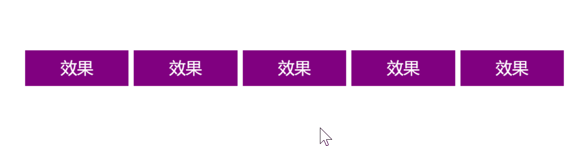
这里也有一个小技巧,就是将元素的中心设置在 x 轴
即将立方体沿着 z 轴向前延伸 50%,再沿着 y 轴向下延伸 50%,这样中心就会坐落于 x 轴上。
实现代码:
<html lang="en">
  <head>
    <meta charset="UTF-8" />
    <meta http-equiv="X-UA-Compatible" content="IE=edge" />
    <meta name="viewport" content="width=device-width, initial-scale=1.0" />
    <title>Documenttitle>
    <style>
      * {
        margin: 0;
        padding: 0;
      }
      ul {
        display: flex;
        margin: 100px;
      }
      li {
        list-style: none;
        margin-right: 10px;
        width: 120px;
        height: 35px;
        perspective: 400px;
      }
      .box {
        position: relative;
        width: 100%;
        height: 100%;
        transform-style: preserve-3d;
        transition: all 0.5s;
      }
      .box:hover {
        transform: rotateX(90deg);
      }
      .front,
      .bottom {
        position: absolute;
        left: 0;
        top: 0;
        height: 100%;
        width: 100%;
        text-align: center;
        line-height: 35px;
      }
      .front {
        background-color: purple;
        color: #fff;
        transform: translateZ(17.5px);
      }
      .bottom {
        background-color: pink;
        transform: translateY(17.5px) rotateX(-90deg);
      }
    style>
  head>
  <body>
    <nav>
      <ul>
        <li>
          <div class="box">
            <div class="front">效果div>
            <div class="bottom">效果div>
          div>
        li>
        <li>
          <div class="box">
            <div class="front">效果div>
            <div class="bottom">效果div>
          div>
        li>
        <li>
          <div class="box">
            <div class="front">效果div>
            <div class="bottom">效果div>
          div>
        li>
        <li>
          <div class="box">
            <div class="front">效果div>
            <div class="bottom">效果div>
          div>
        li>
        <li>
          <div class="box">
            <div class="front">效果div>
            <div class="bottom">效果div>
          div>
        li>
      ul>
    nav>
  body>
html>
综合案例
将学的 animation 和 3d transform 结合起来的一个,类似于游乐场旋转木马的案例:
实现代码:
<html lang="en">
  <head>
    <meta charset="UTF-8" />
    <meta http-equiv="X-UA-Compatible" content="IE=edge" />
    <meta name="viewport" content="width=device-width, initial-scale=1.0" />
    <title>Documenttitle>
    <style>
      body {
        perspective: 1200px;
      }
      section {
        position: relative;
        width: 300px;
        height: 225px;
        margin: 100px auto;
        transform-style: preserve-3d;
        animation: rotate 10s linear infinite;
      }
      section:hover {
        animation-play-state: paused;
      }

      @keyframes rotate {
        0% {
          transform: rotateY(0);
        }
        100% {
          transform: rotateY(360deg);
        }
      }

      div {
        position: absolute;
        top: 0;
        left: 0;
        width: 100%;
        height: 100%;
        background: url("./R71e404b4afae9db6247dc2e97188a2ec.jfif");
        background-size: contain;
      }

      section div:nth-child(1) {
        transform: translateZ(300px);
      }
      section div:nth-child(2) {
        /* 先旋转,再移动 */
        transform: rotateY(60deg) translateZ(300px);
      }
      section div:nth-child(3) {
        /* 先旋转,再移动 */
        transform: rotateY(120deg) translateZ(300px);
      }
      section div:nth-child(4) {
        /* 先旋转,再移动 */
        transform: rotateY(180deg) translateZ(300px);
      }
      section div:nth-child(5) {
        /* 先旋转,再移动 */
        transform: rotateY(240deg) translateZ(300px);
      }
      section div:nth-child(6) {
        /* 先旋转,再移动 */
        transform: rotateY(300deg) translateZ(300px);
      }
    style>
  head>
  <body>
    <section>
      <div>div>
      <div>div>
      <div>div>
      <div>div>
      <div>div>
      <div>div>
    section>
  body>
html>